
UPDATE! The paper where this dataset comes from is now published in Collabra. You can read the paper here and download all the raw data and analysis scripts here.
ERP graphs are often subjected to daft plotting practices that make them highly frustrating to look at.

Negative voltage is often (but not always) plotted upwards, which is counterintuitive but generally justified with “oh but that’s how we’ve always done it”. Axes are rarely labelled, apart from a small key tucked away somewhere in the corner of the graph which still doesn’t give you precise temporal accuracy (which is kind of the point of using EEG in the first place). And finally, these graphs are often generated using ERP programmes then saved as particular file extensions, which then get cramped up or kind of blurry when resized to fit journals’ image criteria. This means that a typical ERP graph looks something a little like this:

…and the graph is supposed to be interpreted something a little like this:

…although realistically, reading a typical ERP graph is a bit more like this:

Some of these problems are to do with standard practices; others, due to lack of expertise in generating graphics; and more still are due to journal requirements, which generally specify that graphics must conform to a size which is too small to allow for proper visual inspection of somebody’s data, and also charge approximately four million dollars for the privilege of having these little graphs in colour because of printing costs despite the fact that nobody really reads actual print journals anymore.
Anyway. Many researchers grumble about these pitfalls, but accept that it comes with the territory.
However, one thing I’ve rarely heard discussed, and even more rarely seen plotted, is the representation of different statistical information in ERP graphs.
ERP graphs show the mean voltage across participants on the y-axis at each time point represented on the x-axis (although because of sampling rates, it generally isn’t a different mean voltage for each millisecond, it’s more often a mean voltage for every two milliseconds). Taking the mean readings across trials and across participants is exactly what ERPs are for – they average out the many, many random or irrelevant fluctuations in the EEG data to generate a relatively consistent measure of a brain response to a particular stimulus.
Decades of research have shown that many of these ERPs are reliably generated, so if you get a group of people to read two sentences – one where the sentence makes perfect sense, like the researcher wrote the blog, and one where the final word is replaced with something that’s kind of weird, like the researcher wrote the bicycle – you can bet that there will be a bigger (i.e. more negative) N400 after the kind of weird final words than the ones that make sense. The N400 is named like that because it’s a negative-going wave that normally peaks at around 400ms.
Well, that is, it’ll look like that when you average across the group. You’ll get a nice clean average ERP showing quite clearly what the effect is (I’ve plotted it with positive-up axes, with time points labelled in 100ms intervals, and with two different colours to show the conditions):

But, the strength of the ERP – that it averages out noisy data – is also its major weakness. As Steve Levinson points out in a provocative and entertaining jibe at the cognitive sciences, individual variation is huge, both between different groups across the world and between the thirty or so undergraduates who are doing ERP studies for course credit or beer money. The original sin of the cognitive sciences is to deny the variation and diversity in human cognition in an attempt to find the universal human cognitive capabilities. This means that averaging across participants in ERP studies and plotting that average is quite misleading of what’s actually going on… even if the group average is totally predictable. To test this out, I had a look at the ERP plot of a study that I’m writing up now (and to generate my plots, I use R and the ggplot2 package, both of which are brilliant). When I average across all 29 participants and plot the readings from the electrode right in the middle of the top of the head, it looks like this:

There’s a fairly clear effect of the green condition; there’s a P3 followed by a late positivity. This comes out as hugely statistically significant using ANOVAs (the traditional tool of the ERPist) and cluster-based permutation tests in the FieldTrip toolbox (which is also brilliant).
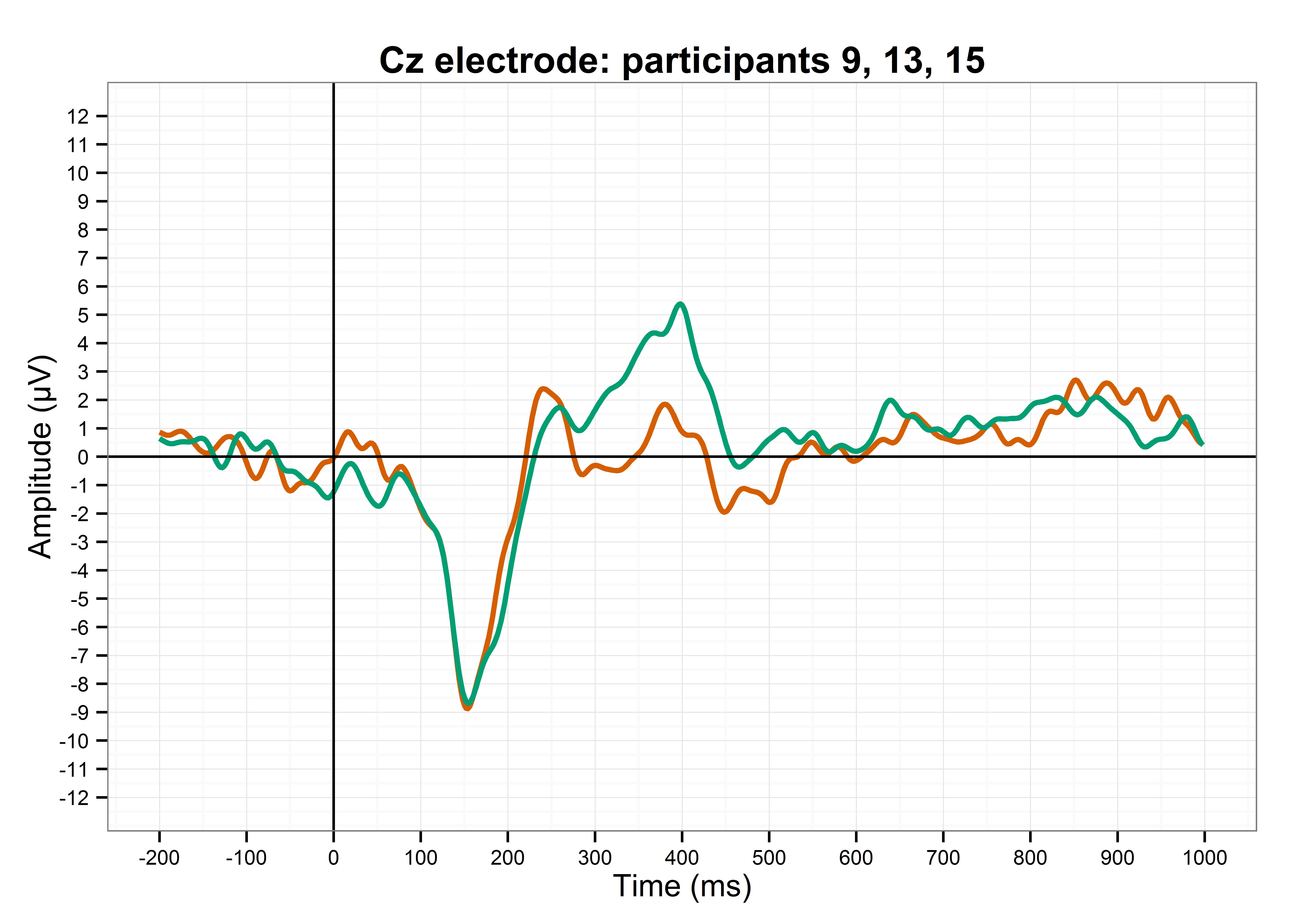
But. What’s it like for individual participants? Below, I’ve plotted some of the participants where no trials were lost to artefacts, meaning that the ERPs for each participant are clearer since they’ve been averaged over all the experimental trials.
Here’s participant 9:

Participant 9 reflects the group average quite well. The green line is much higher than the orange line, peaking at about 300ms, and then the green line is also more positive than the orange line for the last few hundred milliseconds. This is nice.
Here’s participant 13:

Participant 13 is not reflective of the group average. There’s no P3 effect, and the late positivity effect is actually reversed between conditions. There might even be a P2 effect in the orange condition. Oh dear. I wonder if this individual variation will get lost in the averaging process?
Here’s participant 15:

Participant 15 shows the P3 effect, albeit about 100ms later than participant 9 does, but there isn’t really a late positivity here. Swings and roundabouts, innit.
However, despite this variation, if I average the three of them together, I get a waveform that is relatively close to the group average:
The P3 effect is fairly clear, although the late positivity isn’t… but then again, it’s only from three participants, and EEG studies should generally use at least 20-25 participants. It would also be ideal if participants could do hundreds or thousands of trials so that the ERPs for each participant are much more reliable, but this experiment took an hour and a half as it is; nobody wants to sit in a chair strapped into a swimming cap full of electrodes for a whole day.
So, on the one hand, this shows that ERPs from a tenth of the sample size can actually be quite reflective of the group average ERPs… but on the other hand, this shows that even ERPs averaged over only three participants can still obscure the highly divergent readings of one of them.
Now, if only there were a way of calculating an average, knowing how accurate that average is, and also knowing what the variation in the sample size is like…
…which, finally, brings me onto the main point of this blog:
Why do we only plot the mean across all participants when we could also include measures of confidence and variance?
In behavioural data, it’s relatively common to plot line graphs where the line is the mean across participants, while there’s also a shaded area around the line which typically shows 95% confidence intervals. Graphs with confidence intervals look a bit like this (although normally a bit less like an earthworm with a go-faster stripe on it):
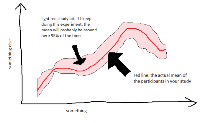
This is pretty useful in visualising data. It’s taking a statistical measure of how reliable the measurement is, and plotting it in a way that’s easy to see.
So. Why aren’t ERPs plotted with confidence intervals? The obvious stumbling point is the ridiculous requirements of journals (see above), which would make the shading quite hard to do. But, if we all realised that everything happens on the internet now, where colour printing isn’t a thing, then we could plot and publish ERPs that look like this:

It’s nice, isn’t it? It also makes it fairly clear where the main effects are; not only do the lines diverge, the shaded areas do too. This might even go some way towards addressing Steve Levinson’s valid concerns about cognitive science data ignoring individual data… although only within one population. My data was acquired from 18-30 year old Dutch university students, and cannot be generalised to, say, 75 year old illiterate Hindi speakers with any degree of certainty, let alone 95%.
This isn’t really measuring the variance within a sample, though. How can we plot an ERP graph which gives some indication of how participant 13 had a completely different response from participants 9 and 15? Well, we could try plotting it with the shaded areas showing one standard deviation either side of the mean instead. It looks like this:

…which, let’s face it, is pretty gross. The colours overlap a lot, and it’s just kind of messy. But, it’s still informative; it indicates a fair chunk of the variation within my 29 participants, and it’s still fairly clear where the main effects are.
Is this a valid way of showing ERP data? I quite like it, but I’m not sure if other ERP researchers would find this useful (or indeed sensible). I’m also not sure if I’ve missed something obvious about this which makes it impractical or incorrect. It could well be that the amplitudes at each time point aren’t normally distributed, which would require some more advanced approaches to showing confidence intervals, but it’s something to go on at least.
I’d love to hear people’s opinions in the comments below.
To summarise, then:
– ERP graphs aren’t all that great
– but they could be if we plotted them logically
– and they could be really great if we plotted more than just the sample mean

Great post! I’ll use it in my reviews from now on!
Here is a link to my sister post:
https://garstats.wordpress.com/2016/04/02/simple-steps-for-more-informative-erp-figures/#comments
And my best antidote to sparse group figures:
http://journal.frontiersin.org/article/10.3389/fpsyg.2011.00137/full
LikeLike
Pingback: Kickstarting a Plotting Revolution | CogTales
Hi Gwilym,
Great post – check out our kickstarter on better data visualization, partly inspired by your twitter comment: https://cogtales.wordpress.com/2016/05/06/kickstarting-a-plotting-revolution/?preview=true
LikeLiked by 1 person
Backed! (apologies for the delay, took me a little while to figure out my kickstarter password)
LikeLike
I totally agree with you that showing the variance around the ERP average is useful; I’ve started doing it in my own stuff recently too (http://users.ox.ac.uk/~cpgl0080/pubs/Politzer-Ahlesetal2016_XHP.pdf#page=29; http://www.tandfonline.com/doi/pdf/10.1080/23273798.2016.1151058#page=9). However, one caveat I think worth mentioning is, this works great when you’re just comparing two ERPs, but if you have three or more conditions it can get very messy. Sometimes this can be avoided (for example, if you have a 2×2 design and you’re interested in the two simple effects, you can separate them out into two different subplots rather than plotting all four together; or you can let one plot show the actual condition waves, and have another plot showing the two difference waves with their CIs around them) but sometimes not (e.g. when you have a 1×3 design). So, I try to plot waves with 95% CIs when I can, but I haven’t always been able to do it, because sometimes with more than 2 waves on a plot them adding the ribbons just makes things busy and obscures the point.
LikeLike
Hi Steve, really nice MMNs there! Yes, I totally agree that it’s horribly messy with three or more ERPs. I’m having that difficulty at the moment with plotting a graded four-way comparison of one main effect…
LikeLike
Oh yeah, that sounds difficult… if you come up with a good solution I’d love to see it! I’ll keep an eye out.
LikeLike
Pingback: How to chase ERP monsters hiding behind bars | basic statistics
Pingback: ERP graph competition! | Talking Sense