
I’ve got an unsubstantiated hunch (the best kind of hunch!) about cricket. Well, not just one, I have loads, but this particular hunch is about the first innings of a cricket match, and that bigger isn’t always better.
I greatly enjoyed following England’s first innings against South Africa in the second Test in Cape Town. But, even with the high run rate while Stokes was smashing it everywhere, I was convinced that the higher that first innings got, the less likely we’d be to win it. This goes against the received wisdom in cricket, which is that the bigger the first innings score, the better it is.
So, I’ve had a look at all first innings scores in Tests from 1990 until now (there’s just over a thousand of them). Here’s simple density plot of the distributions of runs scored in the first innings per match result:

What this seems to show is that there’s a limited sweet spot from just over 380 runs to about 500 runs where a win is the most likely result. Once a team scores over about 500 runs in the first innings, the most likely match result is a draw.
Part of that is probably because of how much time posting a huge first innings takes out of the game. What happens when we look at runs scored vs. balls taken in the first innings?
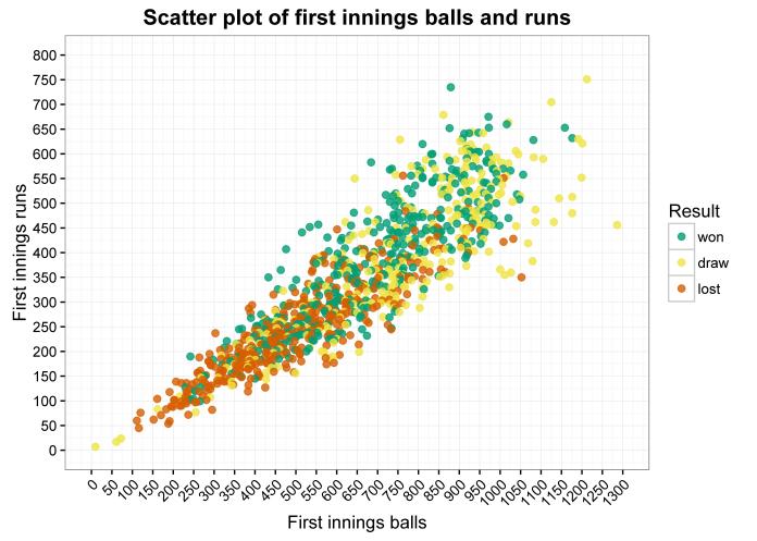
There’s a green cluster in the middle between about 350 and 550 runs and between about 700 and 800 balls. That, I reckon, is the sweet spot for the perfect first innings: scoring a high but not massive number of runs, without taking too much time. England took 755 balls (125.5 overs) in their first innings in Cape Town, so a win was still just about the most likely result there… but, this may just be an exception. We’ll see.
Here’s the same plot with some lines showing a run rate of 2, 3, and 4 runs per over (the steeper the line, the greater the run rate):
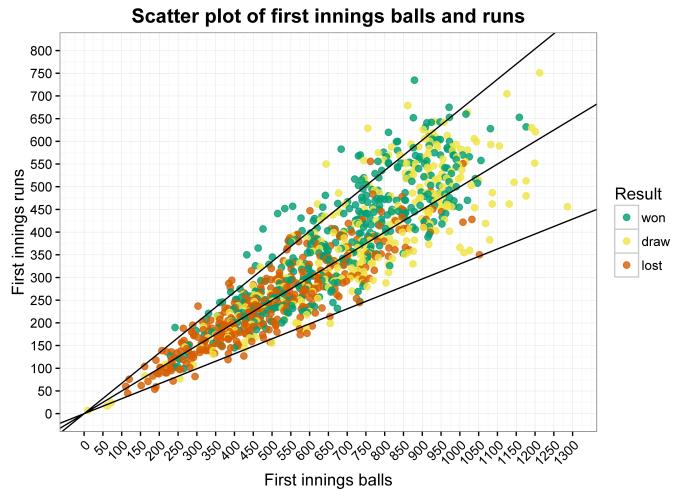
Visually, I’m convinced the sweet spot of 380-500 runs at a decent run rate is obviously there. So, let’s try looking at some simple percentages by comparing scores between 380-500 runs with scores over 500 runs, where runs are scored at over 3.5 runs an over:
Run rate over 3.5, runs between 380 and 500
won draw lost = 62.32% win rate
43 16 10 = 2.69 win:draw ratio
Run rate over 3.5, runs over 500
won draw lost = 54.29% win rate
57 47 1 = 1.21 win:draw ratio
The win rate goes down slightly for the higher scores, and the win:draw ratio goes down too. i.e. even if you’re scoring well, going beyond 500 just makes the draw more likely and doesn’t actually help your chances of winning.
But, that’s not quite a fair comparison. I said earlier that if you’re going to score more runs, you have to do it at a higher run rate, so comparing all scores above 3.5 an over isn’t exactly fair. Let’s now compare a good score at a good run rate with a high score at a high run rate. Again, I’m taking a good score to be 380-500 and a high score to be over 500. In terms of run rate, I’m quantifying a good run rate as between the mean run rate of all innings and the mean plus one standard deviation (i.e. between 3.13 and 3.72 runs per over), and a high run rate as above the mean plus one standard deviation (i.e. above 3.72 runs per over).
So, is a score of 380-500 at 3.13-3.72 runs per over better than a score of 500+ at 3.72+ ?
380-500 runs at 3.13-3.72 RPO (mean runs: 438 , mean RPO: 3.40)
won draw lost = 56.10% win rate
46 20 16 = 2.3 win:draw ratio
500+ runs at 3.72+ RPO (mean runs: 587, mean RPO: 4.90)
won draw lost = 57.14% win rate
44 32 1 = 1.375 win:draw ratio
…the lower, slower score isn’t better, but it isn’t worse either. The likelihood of winning stays the same; the only difference is that batting on makes losing much less likely and drawing much more likely.
This is really counterintuitive, and I find it hard to wrap my head around the fact that scoring 438 at 3.4 an over is about as likely to result in a win as scoring 587 at 4.9 an over. One possibility is that the matches which feature high first innings scores are played on absolute roads, like in the 1997 Colombo snoozeathon between India and Sri Lanka, meaning that a high second innings score is also pretty likely. Therefore, you’d expect the first and second innings scores to correlate in matches where the first innings was 500+ runs at 3.72+ RPO… but they don’t (r=0.07, p=0.52). Nor do the first and second innings scores correlate in matches where the first innings was between 380-500 runs at 3.13-3.72 RPO (r=-0.15, p=0.18). The only indication that a massive first innings score may mean that the pitch is easier to bat on is that the mean second innings score in response to a massive first innings score is 346.90, while the mean second innings score in response to a good first innings score is 307.09. A t-test between the two set of second innings scores is “relatively significant” (as an ever-hopeful colleague of mine used to say) with a p-value of 0.07, but that doesn’t cut it. This is another mystery for another blog post.
Right, back to looking at just the first innings scores and win rate. One last way of exploring this is by creating a matrix of win rates in bins of runs scored and run rate.
I’ve put all innings into bins of 50 runs and bins of 0.5 RPO. This means that every square in the following graphs is represented by a set of matches where that many runs have been scored at that rate. It’s only done for bins with at least five matches in (because you can’t really extrapolate from things where only one or two matches have happened, as that leads to a lot of 0% and 100% win rates).
This graph visualises the win rate per bin; the darker the green, the greater the likelihood of winning based on that kind of first innings:
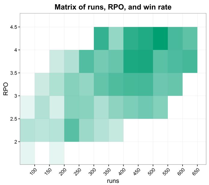
But what if, instead of plotting the simple win likelihood for all bins, we plot the most likely result based on that bin, along with the likelihood of that result? In this graph, the colour represents the top result – win, draw, or loss – and the intensity of that colour represents the likelihood – the more intense the colour, the more likely that result:

In both matrices, the sweet spot with the most green and the most intense green falls within 400 and 500 runs… although it turns out that in terms of overall win likelihood, the best first innings is to score between 500 and 550 runs, scored at over 4 runs per over.
Ultimately, what this shows is that batting on past 500 or so makes losing the match hugely unlikely (but definitely not impossible), so if safety first is your watchword, have at it. However, if you want to win a Test match, there’s not much point in batting on past 500 or so in the first innings, 550 at most, no matter how fast you score (and if you do decide to go for the big imposing total, you’d better hurry up about it). Ben Stokes might have set a load of records, but with a bit of statistical sleuthing, he’d have realised it was pointless because his batting blitz was actually just making it harder for England to win.
Why bother creating these incredible cricketing memories when the statistics say hold back?
…because it’s much more entertaining. If you focus on the statistics all the time, you end up with a team like England under Peter Moores, where nobody knows anything before they’ve looked at the data. Fair enough, then.

Hi Gwilym – this is fascinating stuff. I’m someone who loves cricket statistics and I’ve been teaching myself R to investigate questions just like these. It’d be great to see the code you used to create these plots?
LikeLike
Hi Imran! Glad you like it. I’ll email you.
LikeLike