
Tableau
My Tableau Public profile is here, and there’s all kinds of stuff on there. Some of my personal favourites are:
Sensitivity and specificity: a visual explainer
When you hear that the accuracy of a diagnostic test is 96%, that sounds pretty good. But the high percentages you hear relating to sensitivity (the % of positive people who test positive) and specificity (the % of negative people who test negative) don’t exactly translate into what people are most concerned about – what’s the probability that I’m actually positive if I’ve tested positive? This is a visual explainer of how it works.

Root, Williamson, Smith, and Kohli
Comparing the Big Four batsmen in modern Test cricket, with rolling averages and form comparisons.

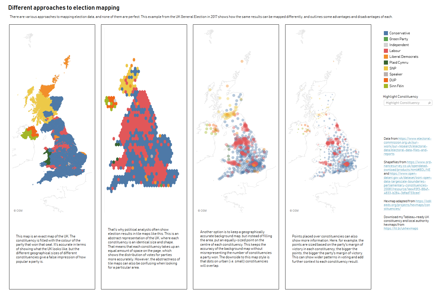
Different approaches to election mapping
Looking at the 2017 UK general election and how the same result can be conveyed differently depending on the mapping choice.
Gwilym’s bloody toll
An homage to the SCMP’s Iraq’s Bloody Toll visualisation, but with my own blood donation data.

Alteryx
Dynamic Date Filter macro
This macro works much like a regular filter tool, with T and F outputs based on a filter condition. But instead of coding up a calculation like “DatePartYear([MyDateField]) = DatePartYear(DateTimeNow()) AND [MyDateField] <= DateTimeNow()” for a Year-to-Date filter, you can simply tick the Year-to-Date option. I built this with scheduled workflows in mind so that you can spend less time copy/pasting chunks of date filter code, and less time trawling through custom filter code when the year changes and the workflows break.

