Twice a year, clock changes in the UK cause mild chaos. The extent of this chaos depends on your computer settings, your remote desktop/server settings, and how exactly you’ve set stuff up to figure out what the time is.
We normally describe it by saying that the clocks go forward at the end of March, and the clocks go back at the end of October. I don’t find this particularly intuitive; it doesn’t actually address what we’re doing or why, it just describes what you need to do with your watch.
I think it’s easier to think of it not as the clocks changing, but as the whole country shifting time zones, because that’s what we’re actually doing.
What’s the time?
Firstly, though… what’s the time?
As I write this, sitting in the office in Leeds, the UK, it’s about 11am on 21st May 2025. Thing is, yes, that’s the time, but it’s just my local definition of the time. To help with understanding time zones, we need to know The Time.
This is UTC, or Coordinated Universal Time. UTC isn’t just the time. UTC is The Time, and it’s the same wherever you are. Try googling it:
We could simply sack off the concept of time zones and run everything off UTC. The world of data would be a lot easier if we did and it’d save me a load of hassle at work.
But, this is a rubbish idea. Culturally, we’re used to the time being something meaningful about when it’s light and when it’s dark. The whole point of “AM” is that it means “before the middle of the day where the sun as at its highest point” and “PM” means “after that”.
If we ran everything off UTC, then “midday” in the UK would be grand, but “midday” in Japan would be a few hours after the sun has set. Also, “midnight”, when the date changes, would be around when people are starting work or school. You’d get on the school bus on Tuesday at 2315, get to school, and start Maths at “midnight” on Wednesday. Not a great way to run things. This very much not-to-scale diagram shows what that’s like during the northern hemisphere summer:
What are time zones?
So, each country (or each region of big wide countries) chooses what they want the time to be in that country, based on what makes sense for daylight in that country. Luckily, everybody around the world is pretty much in agreement that you generally want “midday” i.e. 1200 to be around the time that the sun is at its highest point and you want the date to change from Tuesday to Wednesday overnight.
You do this by setting the time where you are relative to The Time, i.e. relative to UTC.
It’s easier to explain time zones using places far away from the UK because it’s more obvious why you’d do it. If Japan used UTC time for everything, then, as I’m writing right now, 11am UTC time on 21st May 2025, the time in Japan would be 11am on 21st May 2025 but everything would be dark because the sun has already gone down.
In Japan’s case, they’ve looked at the clocks and the daylight and thought “we want the time here to be 9 hours ahead of the UTC time, so the time in Japan is UTC+9, which means that when it’s midday UTC, it’s 9pm here, which makes much more sense than just using UTC time like in Gwilym’s diagram above”. This time zone is called Japan Standard Time, or JST.
South Korea have done the same thing (Korea Standard Time, KST), as have North Korea (Pyongyang Time, PYT), Palau (Palau Time, PWT), Timor-Leste (Timor-Leste Time, TLT), most of the Sakha Republic in Russia (Yakutsk Time, YAKT), and some of Indonesia (Eastern Indonesia Time, WIT). These are all individual time zones defined by being UTC+9, and you can kind of think of them as all living in one super time zone UTC+9. At least, I do.
In the UK, UTC already aligns almost exactly with what we want. Midday UTC is pretty much at the sun’s highest point. Midnight is pretty much at the midpoint between when the sun goes down and when it comes back up again. So, we could just use UTC as the time by creating a time zone where the time is UTC+0.
However, there is no single UK time zone. We switch between UTC+0, which we call Greenwich Mean Time or GMT, and UTC+1, which we call British Summer Time, or BST. Because of this, sometimes people think that UTC and GMT are the same thing. They’re not; they give you the same end result, but GMT is a time zone based on UTC+0.
What happens when the clocks change?
In the UK, we change the clocks at the end of March, when the clocks go forward, and end of October, when the clocks go back.
We talk about the clocks “going forward” because of the act of how you adjust a clock. At 1am on a Saturday night/Sunday morning in late March, we skip an hour, and move straight from it being 1am to it being 2am. Then in October, we reverse it; the clocks go back because we get to 2am, and then move the clock back to being 1am again, essentially repeating an hour.
I find that it’s a lot easier to think of it as moving time zone rather than just changing the clocks. In the winter (late October through late March), we’re on GMT, i.e. UTC+0. This means that the time in the UK is the same time as The Time, UTC.
Then, in late March, we switch time zones to BST, i.e. suddenly the time in the UK is UTC+1 instead of UTC+0. It’s the same experience as going to France and changing your watch; you’ve changed time zone, but without physically travelling.
In late October, we switch back to GMT, i.e. UTC+0. It’s the same experience as coming back from France and changing your watch back.
The implications for daylight in the UK is that the we’re shifting the when sunrise and sunset happen. Well, sort of – sunrise and sunset still happen at the same time, based on UTC, it’s more that we’re shifting when our experience of it happens.
In late March, switching to UTC+1 means that the sun rises an hour later and also sets an hour later. So, we get more light in the evenings for longer, but less light first thing in the morning. It also means that the sun’s highest point is at about 1pm rather than literally midday.
In late October, switching back to UTC+0 means that the sun rises an hour earlier and also sets an hour later. So, we get more light earlier in the mornings, but it gets darker earlier in the evenings. It also means that the sun’s highest point is at about 12 noon.
It’s probably easiest to show this using some actual clock times throughout the year. Where I live, in Leeds, what this means is (using 2025 dates):
Mar 29th, the last day in GMT: sunrise is 0546, sunset is 1836
Mar 30th, the first day in BST: sunrise is 0643, sunset is 1938
I notice this on my cycling club rides on Wednesday evenings, which start at 6.30pm. Suddenly we go from meeting up in the twilight and having bike lights on constantly to having a bit more light and being able to see the sun set in the Dales.
June 21st, longest day: sunrise is 0435, sunset is 2141
Oct 25th, last day in BST: sunrise is 0753, sunset is 1746
Oct 26th, first day in GMT: sunrise is 0654, sunset is 1644
I notice this shift at work. I’ve gone from arriving at the office in the dark to arriving in the office in the light again, at least for another couple of weeks.
Dec 21st, shortest day: sunrise is 0822, sunset is 1546
If we stuck with GMT the whole year round, then on June 21st, we’d have sunrise at 0335 and sunset at 2041. Personally, I’d find this pretty annoying because I love the UK’s long summer evenings. It’s really nice to sit in a beer garden in daylight at 9.30pm, or to go for a long bike ride after work without needing bike lights, whereas I get up at about 6am so the difference between a 0335 sunrise and a 0435 sunrise makes no difference to me.
If we stuck with BST the whole year round, then on Dec 21st, we’d have sunrise at 0922 and sunset at 1646. These late, late mornings can be pretty depressing, and some arguments go that it’s important for traffic safety to have more daylight in the morning. I’m less convinced; in December, based on a 8.30am to 5pm working day, you’ll either be driving to work in the dark or driving home in the dark anyway. Personally, I’d stick to BST the whole year round and simply rebrand it “British Standard Time” instead of British Summer Time, which funnily enough is exactly what we did from 1968 to 1971. This UK parliamentary document is a nice long read about it.
What does this mean for data?
Right, 1600 words in, time to finally get to the point. For anybody working in data, it’s really important to know what time your processes run, and what definition of time you’re using for it.
People (i.e. your non-data colleagues) will expect things to happen at the same time based on their experience of time. Let’s say you automate a data model refresh at 8.30am and automate an email subscription to this report called “the daily 9am report” which gets sent out at 9am. The people receiving this report will expect it to be available at 9am *as they experience 9am*, regardless of whether we’re on UTC+0 or UTC+1.
The problem is, a lot of default data settings are set to UTC time. For example, maybe your Power BI / Tableau / SQL server is fixed to UTC time (or maybe it’s defaulted to the time in California if it’s some kind of service you’re buying from a tech company). That means:
If you first set up the daily 9am report subscription for 9am during late March to late October when we’re on UTC+1, then it’s happening at 8am UTC time. So, in late October when we switch to UTC+0, that subscription will still get sent out at 8am UTC time, but to your report recipients, it’ll happen at 8am as we experience it. This also means that, if the reason you’ve scheduled the data refresh for 8.30am and the report subscription for 9am in the first place is that the source data is only available at 8am (regardless of what time zone we’re in), then the report will get sent out at 8am with no data in it. Or in other words, the report will be an hour early, but it’ll be useless because it’s got nothing in it.
If you first set up the daily 9am report subscription for 9am during late October to late March when we’re on UTC+0, then it’s happening at 9am UTC time. So, in late March when we switch to UTC+1, the daily 9am report subscription will land in people’s inboxes at 10am as we experience it, i.e. it’s getting sent out an hour later than expected, which people won’t be happy about.
Luckily, a lot of services let you specify time zones in your refresh schedules or processes, and adapt to local time settings. Or you can set your server time to reflect local time settings rather than UTC, which means that the server running the jobs will automatically keep the right definition of what 9am means.
But, whenever you’re doing anything that involves automating something at a particular time, watch out for UTC. If something’s being done based on UTC, then it’ll cause problems next March or October. Especially if, for example, you’ve automated something or set a date field definition based on getdate()/now() just after midnight, or taken a date and converted it to a datetime which will set that datetime to midnight, and then suddenly after the clocks change, that’s now 11pm on the day before!
You also want to make sure you understand the difference between your local time and your server time. For example, my laptop auto-updates between GMT and BST, so I never have to worry about it. But some of the servers we use run on UTC only. So, there’s sometimes a mismatch between my local laptop time and my server time, meaning that when I automate something, it might not do what I think it’s doing. Just because a query with getdate() or now() works fine on my laptop, that doesn’t mean it’ll return the same result when I schedule it on a server.
Finally, this has just focused on the UK and when we change our clocks – some countries also do this, other countries don’t, and of the other counties that also do this, they might not do it at the same time! So if you’re working internationally, it’s all compounded.
First things first – keeping and updating important data in an Excel file is not a good idea. There’s a massive risk of human error, which is why there’s a whole industry of information management tools that do a much better job at it.
But sometimes it’s inevitable, and you’ll end up with a situation where a file called CrucialInformation.csv or something like that is feeding into all kinds of different systems, meaning that it’s now a production file that other things depend on. And maybe you’re the person who’s been given the responsibility of keeping it updated. The data person at your job has said “this file is really important, make sure you don’t accidentally put wrong information in or delete anything out of it because then everything will break, okay, have fun, bye!”, and left you to it.
So, how do you responsibly manage a production csv file without breaking things and while minimising mistakes?
In this example, let’s say we work for a shop that sells food items, and the government has introduced new restrictions around items with the ingredient madeupylose in them. Items with high levels of madeupylose can only be sold to over 18s from behind the counter with the cigarettes, items with medium levels of madeupylose can be sold to over 18s from the normal shelves, and items with low levels of madeupylose can be sold to anybody as normal. This isn’t one of the main ingredients that we track in the proper systems yet, so while the data team are working on getting this set up in the databases, we need to manually track which items have madeupylose in them as a short-term solution.
(just to be explicit, this is a completely made-up ingredient in a completely made-up example! but I do use this approach for making targeted updates to large files)
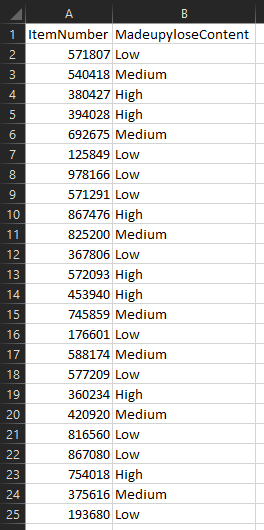
We’ve got a production file called MadeupyloseItems.csv which stores the data, and it looks like this:
Let’s go through how to make controlled updates to this file and not break everything.
Step 1: don’t even touch it, just make copies
First of all, the safest thing to do is to pretty much never touch the production file. Firstly, because having a file open will lock it, so any background process that’s trying to access the data inside it won’t be able to. Secondly, because creating copies means we can have an archive and muck about with things safe in the knowledge that we won’t mess it up.
Wherever the production file is saved, I generally create a folder called “_archive”:
I do all the actual work on files saved in here, and almost never touch the file itself. Let’s have a look at what’s already in there:
There are two archived, datestamped files in there already – the csv from 12th September 2022, and a copy of the live production file with the datestamp from when it was last saved. It’s important to keep them there just in case I make a mistake and need to restore an old version.
There’s also the Madeupylose updater file, which I use to make my updates.
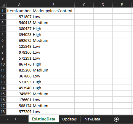
Step 2: create a totally separate Excel file to manage changes
I use a dedicated Excel file to manage the changes I make to production csv files. In the first tab, I copy/paste all the data from the most recent file – in this case, I’ve copy/pasted it out of the 220914 Madeupylose.csv file in the _archive folder so I don’t have to open the live file:
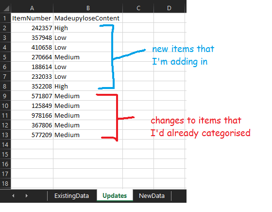
In the next tab, I make my actual changes. I’ve got some items that I’m adding in and some items that I’m recategorising:
I can use this file to add in some checks – for example, have I spelled “High”, “Medium”, and “Low” correctly? Are they all the same format? There are loads of things you could do here, like sticking a filter on to check individual values, making sure that there are no duplicates, and so on.
Once I’m happy with my updates, I now need to add them to the production file somehow. I could potentially just open the file and add them in… but that would involve opening the file, for a start, and maybe disrupting another process. And it’s not just a case of adding them in – I could simply copy/paste the new items, but I’d have to find the already-categorised items and have to change them, which would be quite easy to make a mistake on (and I really don’t want to hit CTRL+F a load of times).
So, this is where I create a third tab called New Data and use a couple of xlookups.
Step 3: xlookups
If you haven’t come across xlookups before, they’re just like vlookups but simpler and better.
Firstly, I’m going to create a new column in the ExistingData tab, and I’ll use this formula:
What this does is take the item number in the existing data tab, look for it in the updates tab, and if it finds it in the updates tab, it’ll return that number. If it doesn’t find it, it gives me an #N/A value:
What this means is that I can distinguish between the items that have already been categorised that I’ve changed and the ones that I haven’t. I know that anything with an #N/A value in the lookup column is an item that I haven’t changed at all. So, I can add a filter to the lookup column, and select only the #N/A values:
I’ll copy/paste columns A and B for these items into the NewData tab. Then, I’ll copy/paste columns A and B for all items in the Updates tab into the NewData tab underneath (and remember to remove the headers!). Now, I’ve got the full information in one place:
What I like about this approach is that it works the same whether you’re updating 20 records or 20,000 records – once you’ve made your updates in the updates tab, the xlookups to get it all transferred over only take seconds, and you can be sure that you’ve definitely got all the things you need in the NewData tab.
Step 4: update the production file
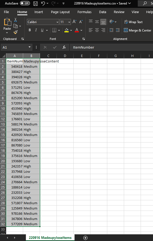
We’re now ready to update the production file. I prefer to take an extra step to create a whole new csv and never actually touch the production file. So, I’m going to take everything in the NewData tab, copy/paste it into a new file, and save that as a csv called “220916 MadeupyloseItems.csv” in the _archive folder:
We’ve got the archived version of the current file – it’s the one from 220914, so there’s a backup in case I’ve messed up the latest update somehow. We’ve also got the archived version of the new file that I want to be the production file. The final step is to move that into production by overwriting the production file. That’s as simple as going back to the 220916 MadeupyloseItems.csv file in Excel, hit Save As, and overwrite the live file:
And there we have it! We’ve updated the live production file without even touching it, we’ve carefully tracked which lines we’re adding in and which lines we’re changing, and we’ve got a full set of backups just in case.
I’ve been working with product classification in SAP recently, and something that comes up a lot is the difference between the merchandise category hierarchy and the article hierarchy. Both can be used for showing hierarchies and reporting, so what’s the difference?
The merchandise category is obligatory – you have to have the merchandise category when setting up SAP. It’s also a pain to change, so you need to think really carefully out what you want the merchandise category to be when you’re starting out. You don’t necessarily have to create a merchandise category hierarchy, but you do have to assign merchandise categories. The article hierarchy isn’t obligatory at all, and it’s more flexible to change.
The purpose of having separate hierarchies is that they represent different aspects of a thing. The merchandise category is about what a thing actually is, while the article hierarchy is about what you do with it.
To illustrate this, let’s take a load of different nuts – peanuts, almonds, walnuts, chestnuts, and so on. Under a merchandise category perspective, you’d want to classify these into fundamental properties of the item – for example, you could use the GS1 standards, which separate them into bricks like Nuts/Seeds – Unprepared/Unprocessed (in shell) and Nuts/Seeds – Prepared/Processed (out of shell). That would mean that nuts like loose chestnuts and walnuts in shells would be in the first category, salted peanuts and flaked almonds would be in the second category. These are fundamental to what the product actually is.
Under an article hierarchy perspective, you’d maybe want to set up a separate way of classifying these nuts depending on what you do with them in your store. While salted peanuts and flaked almonds are both Nuts/Seeds – Prepared/Processed (out of shell), they’re quite different in terms of what people actually buy them for – salted peanuts are more of a snacking thing and you’d probably expect to see them in the same aisle as crisps and Bombay mix, while flaked almonds are more of a baking/cooking thing and you’d probably expect to see them in the same aisle as flour and glacé cherries. And maybe you’d want to reflect that in your internal organisation too, having one team of people responsible for snacks and one team responsible for baking/cooking, and splitting nuts across the two. This isn’t fundamental to what the product actually is, as they’re both nuts, but it’s more about what you do with it.
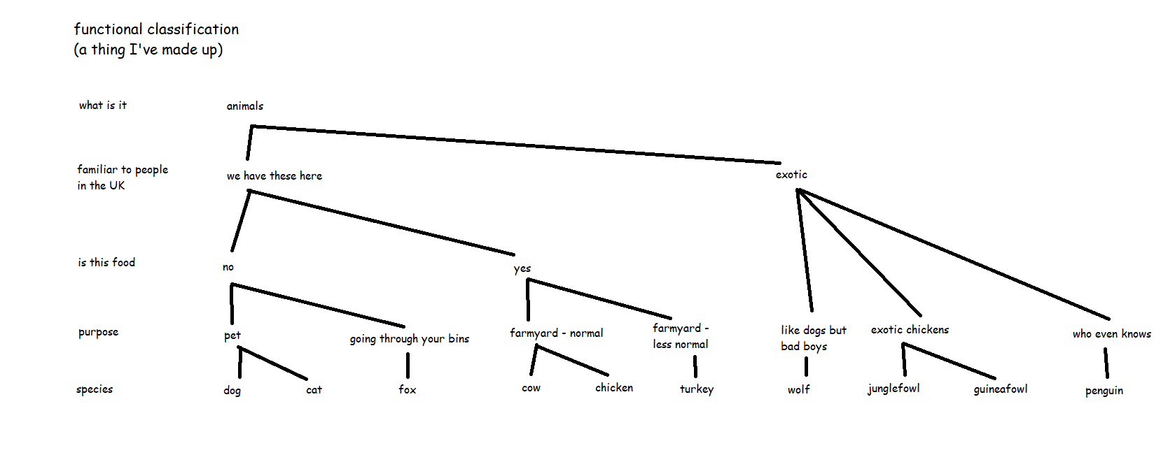
I’ve found that the best analogy for merchandise categories vs. article hierarchy is to step away from shop products and talk about animals.
If merchandise category is about what something fundamentally is, then it’s like the order of species, or taxonomic classification. Dogs and wolves are separate species, but they’re both in the dog family, and if you go up a little higher, that includes foxes in the canidae genus, and if you go up higher again to carnivores, this is where you get to cats as well, and the level above that is all mammals, so that’s where cows come in, and so on. Chickens are birds, which are totally different from mammals at a very high level, so you’ve got to go all the way from species up to the phylum chordata to get to the level where cows and chickens are the same kind of thing. That’s the taxonomic classification of animals, and it’s just how it is. Scientists can provide evidence to move things around a little bit, but it’s pretty much set. This is the merchandise category hierarchy of the animal world.
(wordpress has compressed this a lot – open the full size image in a new tab or use an image reader browser extension like Imagus to see full size)
But now, let’s say you run a pet shop, or a zoo. You know your taxonomic classification perfectly, but you also know that selling dogs and wolves in a pet shop is a terrible idea, because while dogs and wolves are technically very similar, one of them is very much not a pet. Or you’re planning out which animals to keep together in which bits of the zoo, and while cows and chickens are nothing like each other on the taxonomic classification, they’re both farmyard animals (and they won’t eat each other), so it would probably make sense to keep cows and chickens together in the “life on the farm” section of the zoo rather than having cows and lions in the “but they’re both mammals, it’ll all be fine” section of the zoo.
So, this is where you’d create a separate article hierarchy. It’s not about what an animal is, it’s about what you do with that animal, how you organise things, who’s responsible for caring for them, and so on.
This is a lot easier to change and it lets you build different reporting on top of the merchandise categories, but it’s a completely different way of seeing things from the merchandise category hierarchy view of the world. This is why the merchandise category hierarchy and the article hierarchy are different, and why the merchandise category level is obligatory (although putting it into a merchandise category hierarchy is optional), while the article hierarchy is optional.
A little while ago, I wrote a blog on how to dynamically save a file with different file paths based on a folder structure that has a separate folder for each year/month. I’ve since used variations on this trick a few different ways, so instead of writing multiple blogs, I figured I’d condense them into one blog with three use cases.
Example 1: updating folder locations based on dates
I’ve already written about this one, so I’ll only briefly recap it here. What happens when you’ve got a network drive with a folder structure like this? You’d have to update your output tools every time the month changes, right?
Nope. You can use a single formula tool with multiple calculations to generate the file path based on the date that you’re running the workflow, like this:
…and then use that file path in your output tool to automatically update the folder location you’re saving to depending on when you’re running the workflow:
The only caveat here is that it won’t create the folder if it doesn’t already exist – I had this recently when I was up super early on April 1st and got an error because the \2021\Apr folder wasn’t there. Not a huge problem since my workflow only took a couple of minutes to run – I just created the folder myself and then re-ran it – but it could be really annoying if you’ve got a big chunky workflow and it errors out after an hour of runtime for something so trivial.
Example 2: different files for different people
The second example is when you want to create different files for different people/users/customers/whatever.
I work at Asda, and so a lot of our data and reporting is store-specific. The store manager at Asda on Old Kent Road in London really doesn’t care about what’s going on at the Asda on Kirkstall Road in Leeds, and vice versa – they just want to have their own data. But with hundreds of stores across the UK, I don’t want to have a separate workflow for each store. I don’t even want to have one workflow with hundreds of separate output tools for each store.
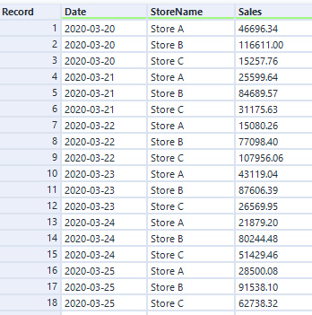
Luckily, I can use the same trick to automatically create a different file for each store by generating a different file name and saving them all within one output tool. Let’s say I’ve got a data set like this:
(in case it’s not obvious, this is data is completely faked and does not show actual Asda sales)
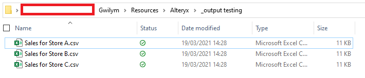
I can use the store name in the StoreName field to create a separate file name, simply by adding it in a file path. In this example, it’ll make a file called “Sales for Store A.csv”, and save it in the folder location specified in the formula tool:
I set up my output tool in exactly the same way as example – change the entire file path, take the name from the field I’ve created called FilePath, and don’t keep that field in the output:
After running that, I get three files:
And when I open the Sales for Store A.csv file in Excel, I can see that it’s only got Store A’s data in it:
Example 3: splitting up a big CSV / SQL statement
My third example is splitting up a big data set into chunks so that other people can use it without specialist data tools.
In my specific case, I’m using Alteryx to pull data from several data sources together, do some stuff with it, and generate the SQL upload syntax for the database admin to load it into the main database. We could technically do this straight from Alteryx, but a) this is an occasional ad-hoc thing rather than something to productionise and schedule, and b) I don’t have write-admin rights to the main database, a responsibility that I’m perfectly happy to avoid.
Anyway, what often happens is that I’ve got a few million lines for the admin to upload. I can generate a text file or a .sql file with all those lines, and the admin can run that with a script… but it would take forever to open if the admin wants to take a look at the contents before just running whatever I’ve sent them into a database. So, I want to split it up into manageable chunks that they can easily open in Excel or a text editor or whatever else. This is also useful when sending people data in general, not just SQL statements, when you know they’re going to be using Excel to look at it.
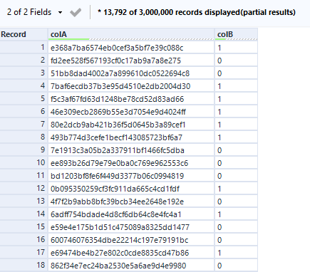
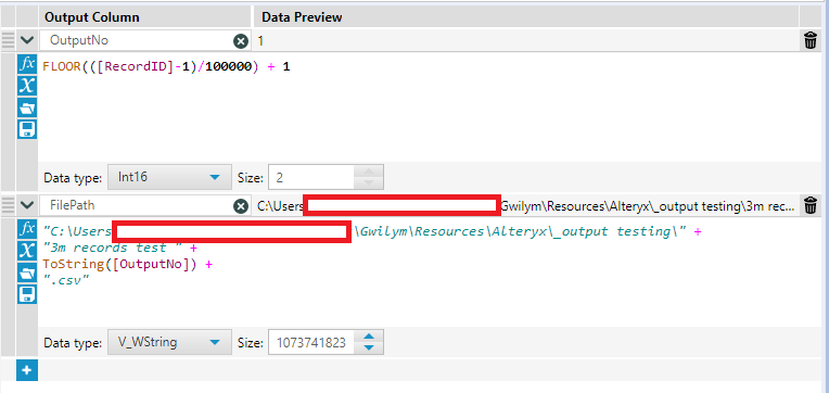
Let’s take some more fake data, this time with 3m rows:
The overall process is to add a record ID, do a nice little floor calc, deselect the record ID, and write it out in files like “data 1.csv”, “data 2.csv”, “data 3.csv”, etc.:
After putting the record ID on, I want to create an output number for each file. The first thing to do is decide how many rows I want in each file. In this example, I’ve gone for 100,000 rows per file. In two steps, I create the output number, then use that to create the file path in the same way we’ve seen in the first two examples:
Here’s the floor calc in text so you can simply copy/paste it:
FLOOR(([RecordID]-1)/100000) + 1
How does it work?
The floor function rounds down a number with decimal places to the whole number preceding the decimal point. If you imagine a number with decimal places as a string, it’s like simply deleting the decimal point and all the numbers after that. A number like 3.77 would become 3, for example.
In this calc, it uses the record ID, and subtracts 1 so that the record ID goes from 0 to 2,999,999. It then divides that record ID by 100,000 (or however many rows you want in your file). For the 100,000 records from 0 through to 99,999, the division returns a number between 0 and 0.99999. When you floor this, you get 0 for those 100,000 records. For the 100,000 from 100,000 through to 199,999, the division returns a number between 1 and 1.99999. When you floor this, you get 1 for those 100,000 records… and so on. After that, I just add 1 again so that my floored numbers start at 1 instead of 0.
(yes, you could just set the RecordID tool to start from 0 instead of 1 and just take the FLOOR(RecordID/100000) + 1… but I always forget about that, so I find it easier to copy across this formula instead)
Then we set up the output in the same way:
…and we’ve got 30 .csv files with 100,000 rows each:
Also, if you need to write out a large amount of data which you also need to split into multiple files to make it work for whatever you’re using it for afterwards, honestly, you probably want to address that first. I’m aware that it’s not a great process I’ve got going on here! But it’s a quick fix for a quick thing that I’ve found really useful when getting something off the ground, and it’s something I’d change if this ever turns into a scheduled process.
This is disgusting. Don’t do it. If you are running a production workflow off a manually maintained Excel file, you have bigger problems than not being able to open an Excel file in Alteryx because somebody else is using it.
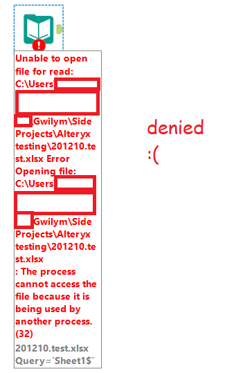
With that out of the way… you know how you can’t open an Excel file in Alteryx if you’ve got that file open? Or worse, if it’s an xlsx on a shared drive, and you don’t even have it open, but somebody else does? Yeah, not fun.
The “solution” is to email everybody to ask them to close the file, or to create a copy and read that in, changing all your inputs to reference the copy, then probably forgetting to delete the copy and now you’re running it off the copy and nobody’s updating that so you’re stuck in a cycle of overwriting the copy whenever you remember, and … this is not really a solution.
The ideal thing to do would be to change your process so that whatever’s in the xlsx is in a database. That’d be nice. But if that’s not an option for you, I’ve created a set of macros that will read an open xlsx in Alteryx.
In the first part of this blog, I’ll show you how to use the macros. In the second, I’ll explain how it works. If you’re not interested in the details, the only thing you need to know is this:
They use run command tools (which means your organisation might be a bit weird about you downloading them, but just show them this blog, nobody who uses comic sans could be an evil man).
Those run commands mimic the process of you going to the file explorer, clicking on a file, hitting copy, hitting paste in the same location, reading the data out of that copy, then deleting that copy. Leave no trace, it’s not just for hiking.
This means that command windows will briefly open up while you’re running the workflow. That’s fine, just don’t click anything or hit any keys while that’s happening or you might accidentally interrupt something (I’ve mashed the keys a bit trying to do this deliberately and the worst I’ve done is stop it copying the file or stop it deleting the file, but that’s still annoying. Anyway, you’ve been warned.).
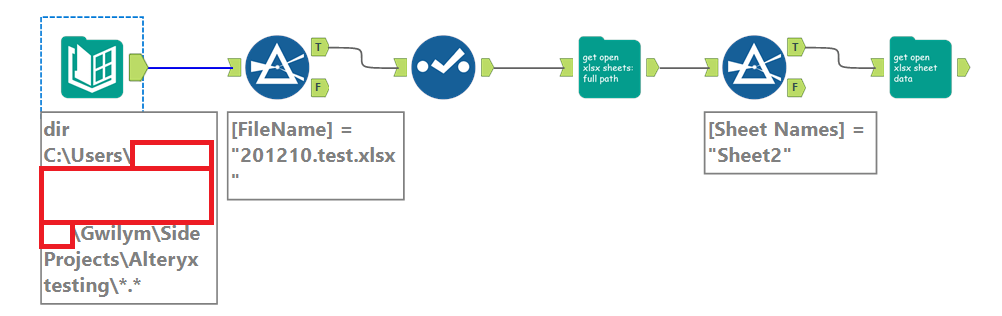
Using these macros is a two-step process. The first step takes the xlsx and reads in the sheet names. There are two options here; you can browse for the xlsx file directly in the macro using option 1b, or you can use a directory tool and feed in the necessary xlsx file using option 1a (this is a few extra steps, but it’s my preferred approach). You can then filter to the sheet(s) you want to open, and feed that into the second step, which takes the sheet(s) and reads in the data.
Example 1
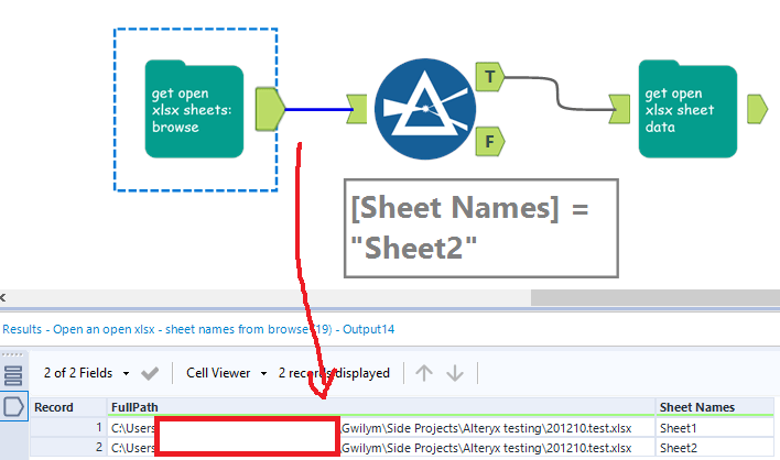
Let’s work through this simple example. I’ve got a file, imaginatively called 201210.test.xlsx, and I can’t read it because somebody else has it open. In these three steps, I can get the file, select the sheet I need, and get the data out of it:
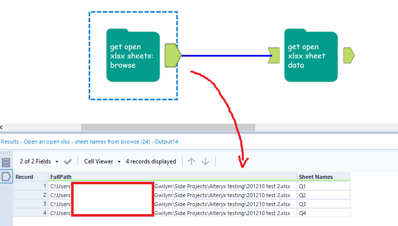
In the first step, I’m using macro 1b: Open an open xlsx – sheet names from browse. The input is incredibly simple – just hit the folder icon and browse for the xlsx you need:
But this one comes with one caveat – for the same reason that you can’t open an xlsx if it’s open, the file browse doesn’t work if the xlsx is open either. You only need to set this macro up once, though – once you’ve selected the file you need, you’re good, and you can run this workflow whenever. You only need to have the file closed when you first bring this macro onto the canvas and select the file through the file browser.
This returns the sheet names:
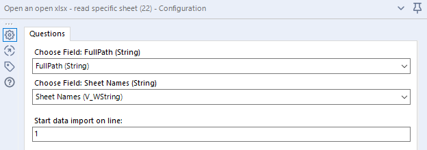
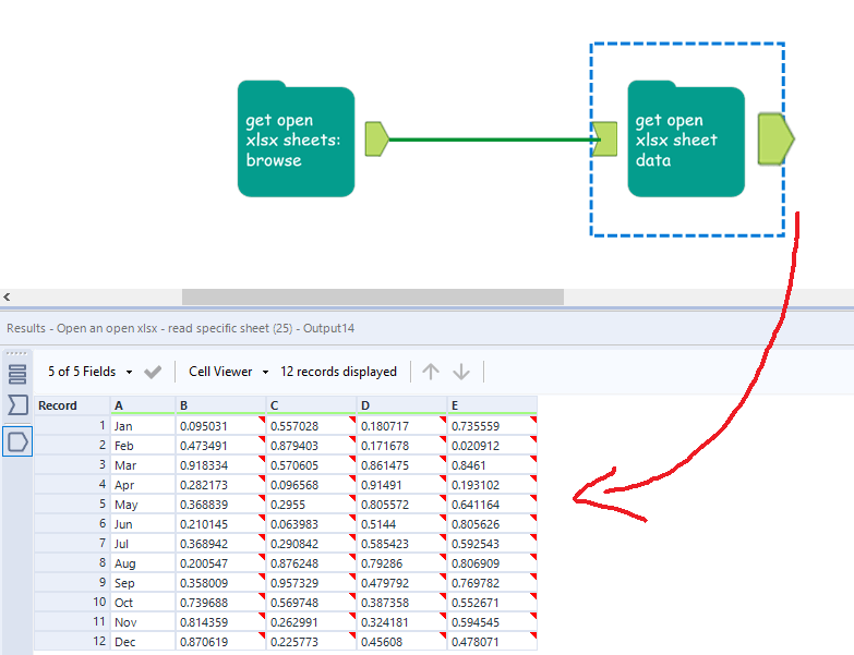
All you need to do next is filter to the sheet name you need. I want to open Sheet2, so I filter to that and feed it into the next macro, which is macro 2: Open an open xlsx – read specific sheet. This takes three input fields – the full path of the xlsx, the sheet you want to open, and the line you want to import from:
[FullPath] and [Sheet Names] are the names of the fields returned by the first macro, so you shouldn’t even need to change anything here, just whack it in.
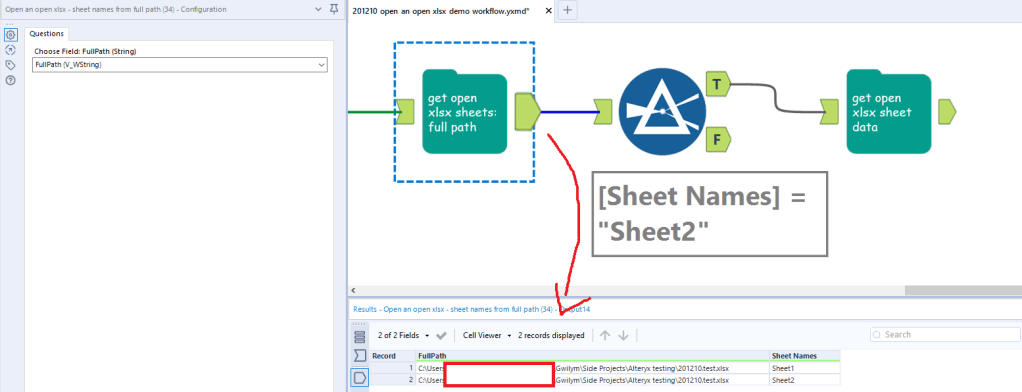
In the first step, I use the directory tool to give me the full paths of all the xlsx files in a particular folder. This is really powerful, because it means I can choose a file in a dynamic fashion – for example, if the manually maintained process has a different xlsx for each month, you can sort by CreationTime from most recent to least recent, then use the select records tool to select the first record. That’ll always feed in the most recently created xlsx into the first macro. In this simple example, I’m just going to filter to the file I want, then deselect the columns I don’t need, which is everything except FullPath:
I can now feed the full path into the macro, like so:
…and the next steps are identical to example 1.
Example 3
If you need to read in multiple sheets, the get open xlsx sheet data macro will do that and union them together, as long as they’re all in the same format. I’ve got another example xlsx, which is unsurprisingly called 201210 test 2.xlsx. I’ve got four sheets, one for each quarter, where the data structure is identical:
The data structure has to be identical, can’t stress that enough
With this, you don’t have to filter to a specific sheet – you can just bung the get open xlsx sheet data macro straight on the output of the first one, like this:
That’s all you have to do! If this is something you’ve been looking for, please download them from the public gallery, test them out, and let me know if there are any bugs. But seriously, please don’t use this as a production process.
How it works
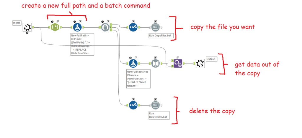
It’s all about the run commands. I’ll walk through macro 1a: open an open xlsx from a full path, but they’re all basically the same. There are four main steps internally:
Creating the file path and the batch commands
Copying the file
Getting data out of the copy
Deleting the copy
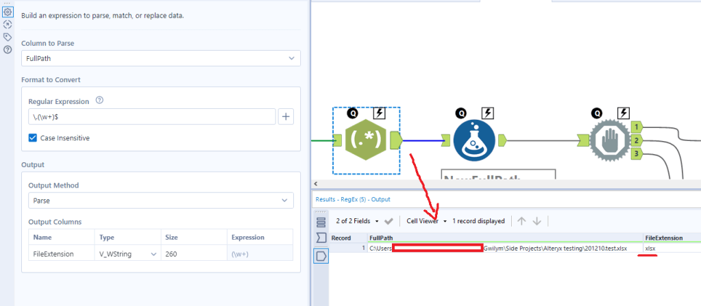
The first regex tool just finds the file extension. I’ll use this later to build the new file path:
The formula tool has three calculations in it; one to create a new full path, one to create the copy command, and one to create the delete command.
The NewFullPath calculation takes my existing full path (i.e. the xlsx that’s open) and adds a timestamp and flag to it. It does this by replacing “.xlsx” with “2021-02-12 17.23.31temptodelete1a.xlsx”. It’s ugly, but it’s a useful way of making pretty sure that you create a unique copy so that you’re not going to just call it “- copy.xlsx” and then delete somebody else’s copy.
The Command calculation uses the xcopy command (many thanks to Ian Baldwin, your friendly neighbourhood run-command-in-Alteryx hero, for helping me figure out why I couldn’t get this working). What this does is create a command to feed into the run command tool that says “take this full path and create a copy of it called [NewFullPath]”.
The DeleteCommand calculation uses the delete command. You feed that into the run command tool, and it simply takes the new full path and tells Windows to delete it.
Now that you’ve got the commands, it’s run command time (and block until done, just to make sure it’s happening in the right order).
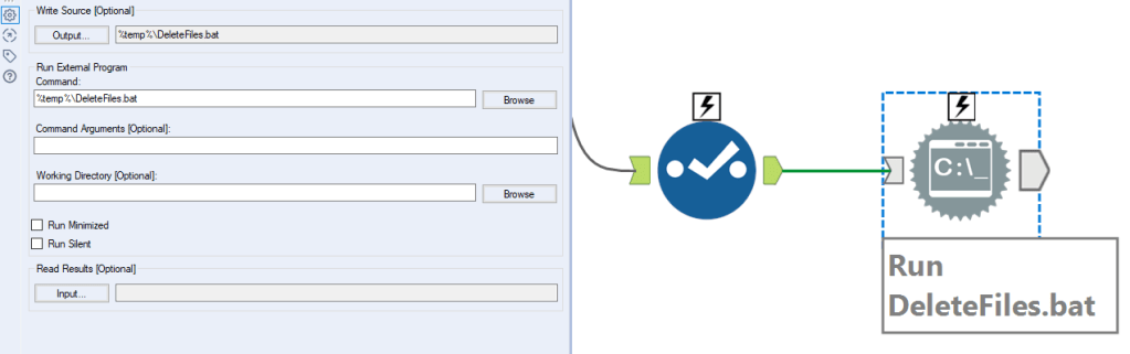
To copy the file: put a select tool down to deselect everything except the command field. Now set up your run command tool like this:
You want to treat the command like a .bat file. You can do this by setting the write source output to be a .bat file that runs in temp – I just called it CopyFiles.bat. To do this, you’ll need to hit output, then type it in in the configuration window that pops up, and keep the other settings as above too. If you’re just curious how this macro works, you don’t need to change anything here, it’ll run just fine (let me know if it doesn’t).
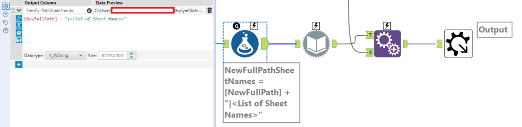
To get the list of sheet names, the first step is to create a new column with the full path, a pipe separator, then “<List of Sheet Names>” to feed into the dynamic input:
From there, you can use the existing xlsx as the data source template, and use NewFullPathSheetNames from the previous formula as the data source list field, and change the entire file path:
That’ll return the sheet names only:
So the last step is an append tool to bring back the original FullPath. That’s all you need as the output of this step to go into the sheet read macro (and the only real difference in that macro is that the formula tool and dynamic input tool is set up to read the data out of the sheets rather than get a list of sheet names).
Finally, to delete the copy, deselect everything except the DeleteCommand field, and set it up in the same way as the copy run command tool earlier:
And that’s about it. I hope this explanation is full enough for you to muck about with run command tools with a little confidence. I really like xcopy functions as a way of mass-shifting things around, it’s a powerful way of doing things. But like actual power tools, it can be dangerous – be careful when deleting things, because, well, that can go extremely badly for you.
And finally, none of this is good. This is like the data equivalent of me having a leaky roof, putting a bucket on the floor, and then coming up with an automatic way of switching out the full bucket for an empty one before it overflows. What I should actually do is fix the roof. If you’re using these macros, I highly recommend changing your underlying data management practices/processes instead!
Here’s a quick Tableau tip I’ve used a fair bit lately. It’s a really simple one but I haven’t seen it blogged about before – apologies if you’ve written about it and I’ve unintentionally ripped you off.
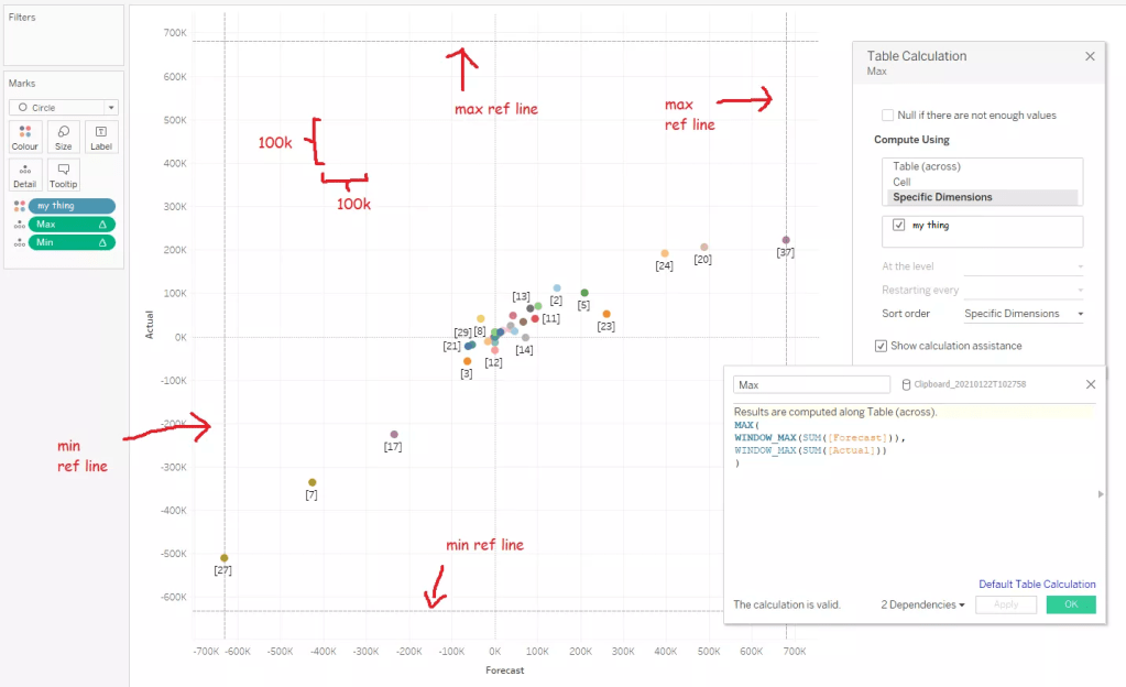
When Tableau creates a scatterplot, it automatically sizes the axes to the extent of the data. That’s often exactly how I want it to look, but sometimes, it’s not. For example, in this situation, I’m comparing a forecast I made with the actuals, and the different axis scaling makes my forecast look better than it is:
I want to get around that – instead of Tableau fitting the two axis scales to the data available, I want to force Tableau to fit the two axis scales to fit each other, giving me an equal scale on both axes. I can do this with two calculations and four reference lines, which is a little more effort than just fixing my axes, but it’s also a lot more robust than fixing my axes, which isn’t dynamic.
The max calc finds the window_max of the measures on each axis, and then finds the max of that. In my case, this is SUM([Forecast]) and SUM([Actual]), which you can switch out for whatever your measure is. Basically, it means “what’s the point with the highest value on either axis?”. The min calc does the same thing but with the min of the two window_mins.
That returns the highest and lowest value across both axes. You can then put those on each axis as four reference lines – take the max of the max calc and the min of the min calc on each axis – and then make the reference lines invisible.
And that’s it! A perfectly square scatterplot with the same scale on both axes. If you’re putting it in a dashboard, make sure to fix the sheet size so that it’s square there too.
I’ve recently started working on a project where the folder structure uses years and months. It looks a bit like this:
This structure makes a lot of sense for that team for this project, but it’s a nightmare for my Alteryx workflows – every time I want to save the output, I need to update the output tool.
…or do I? One of my favourite things to do in Alteryx is update entire file paths using calculations. It’s a really flexible trick that you can apply to a lot of different scenarios. In this case, I know that the folder structure will always be the year, then a subfolder for the month where the month is the first three letters (apart from June, where they write it out in full). I can use a formula tool with some date and string calculations to save this in the correct folder for me automatically. I can do it in just one formula tool and a regular output tool, like this:
Firstly, I’m going to stick a date stamp on the front of my file name in yymmdd format because that’s what I always do with my files. And my handwritten notes. And my runs on Strava. Old habits die hard. I’m doing it with this formula:
…which is a nested way of saying “give me the date right now (2021-02-08), convert it to a string (“2021-02-08”), then only take the 8 characters on the right, thereby trimming off the “20-” from this century because I only started dating stuff like this in maybe 2015-16 and I’m under no illusions that I’ll be alive in 2115 to face my own century bug issue and I’d rather have those two characters back (“21-02-08”), then get rid of the hyphens (“210208”).
The next two calculations in the formula tool give me the year and month name as a string. The year is easy and doesn’t need extra explanation (just make sure you put the data type as a string):
DateTimeYear(DateTimeToday())
The month is a little harder, and uses one of my favourite functions: DateTimeFormat(). Here we go:
IF DateTimeMonth(DateTimeToday()) = 6 THEN "June" ELSE DateTimeFormat(DateTimeToday(), '%b') ENDIF
This basically says “if today is in the sixth month of the year, then give me ‘June’ because for some reason that’s the only month that doesn’t follow the same pattern in this network drive’s naming conventions, otherwise give me the first three letters of the month name where the first letter is a capital”. You can do that with the ‘%b’ DateTimeFormat option – this is not an intuitive label for it and if you’re like me you will read this once, forget it, and just copy over this formula tool from your workflow of useful tricks whenever you need it.
The final step in the formula tool is to collate it all together into one long file path:
You don’t need the DateStamp, Year, or Month fields anymore. I just deselect them with a select tool.
Then, in the output tool, you’ll want to use the options at the bottom of the tool. Take the file/table name from field, and set it to “change entire file path”. Make sure the field where you created the full file path is selected in the bottom option, and you’ll probably want to untick the “keep field in output” option because you almost definitely don’t need it in your data itself:
And that’s about it! I’ve hit run on my workflow, and it’s gone in the right place:
It’s a simple trick and probably doesn’t need an entire blog post, but it’s a trick I find really useful.
The original Slate article introduces this better than I can, because they’re actual journalists and I’m just a data botherer:
On Thursday morning, a federal court released a 2016 deposition given by Ghislaine Maxwell, the 58-year-old British woman charged by the federal government with enticing underage girls to have sex with Jeffrey Epstein. That deposition, which Maxwell has fought to withhold, was given as part of a defamation suit brought by Virginia Roberts Giuffre, who alleges that she was lured to become Epstein’s sex slave. That defamation suit was settled in 2017. Epstein died by suicide in 2019.
In the deposition, Maxwell was pressed to answer questions about the many famous men in Epstein’s orbit, among them Bill Clinton, Alan Dershowitz, and Prince Andrew. In the document that was released on Thursday, those names and others appear under black bars. According to the Miami Herald, which sued for this and other documents to be released, the deposition was released only after “days of wrangling over redactions.”
Slate: “We Cracked the Redactions in the Ghislaine Maxwell Deposition”
It’s some grim shit. I haven’t been following the story that closely, and I don’t particularly want to read all 400-odd pages of testimony.
But this bit caught my eye:
It turns out, though, that those redactions are possible to crack. That’s because the deposition—which you can read in full here—includes a complete alphabetized index of the redacted and unredacted words that appear in the document.
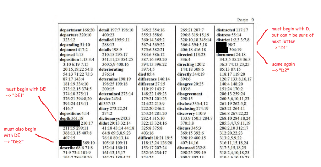
This is … not exactly redacted. It looks pretty redacted in the text itself:
Above: Page 231 of the depositions with black bars redacting some names.
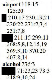
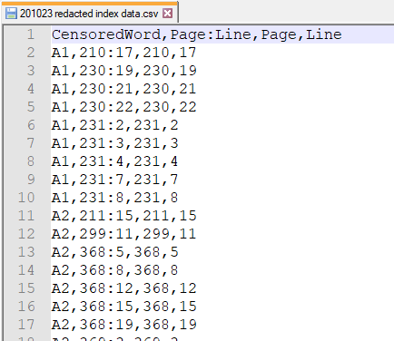
But the index helpfully lists out all the redacted words. With the original word lengths intact. In alphabetical order. You don’t need any sophisticated statistical methods to see that many of the redacted black bars on page 231 concern a short word which begins with the letter A, and is followed by either the letter I or the letter L:
Above: The index of the deposition, helpfully listing out all the redacted words alphabetically anbd referencing them to individual lines on individual pages.
It also doesn’t take much effort to scroll through the rest of the index, and notice that another short word beginning with the letters GO occurs in exactly the same place:
Above: I wish all metadata was this good.
And once you’ve put those two things together, it’s not a huge leap to figure out that this is probably about Al Gore.
When I first read the Slate article on Friday 23rd October 2020, around 8am UK time, Slate had already listed out a few names they’d figured out by manually going through the index and piecing together coöccurring words. And that reminded me of market basket analysis, one of my favourite statistical processes. I love it because you can figure out where things occur together at scale, and I love it because conceptually it’s not even that hard, it’s just fractions.
Market basket analysis is normally used for retail data to look at what people buy together, like burgers and burger buns, and what people don’t tend to buy together, like veggie sausages and bacon. But since it’s basically just looking at what happens together, you can apply it to all sorts of use cases outside supermarkets.
In this case, our shopping basket is the individual page of the deposition, and our items are the redacted words. If two individual redacted words occur together on the same page(s) more than you’d expect by chance, then those two words are probably a first name and a surname. And if we can figure out the first letter(s) of the words from their positions in the index, we’ve got the initials of our redacted people.
For example, let’s take the two words which are probably Al Gore, A1 and GO1. If the redacted word A1 appears on 2% of pages, and if the redacted word GO1 appears on 3% of pages, then if there’s no relationship between the two words, you’d expect A1 and GO1 to appear together on 3% of 2% of pages, i.e. on 0.06% of pages. But if those two words appear together on 1% of pages, that’s ~16x more often than you’d expect by chance, suggesting that there’s a relationship between the words there.
So, I opened up the Maxwell deposition pdf, which you can find here, and spent a happy Friday evening going through scanned pdf pages (which are the worst, even worse than the .xls UK COVID-19 test and trace debacle, please never store your data like this, thank you) and turning it into something usable. Like basically every data project I’ve ever worked on, about 90% of my time was spent getting the data into a form that I could actually use.
oh god why
Working through it…
How data should look.
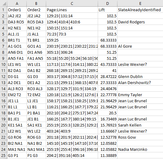
And now we’re ready for some stats. I used Alteryx to look at possible one-to-one association rules between redacted words. Since I don’t know the actual order of the redacted words, there are two possible orders for any two words: Word1 Word2 and Word2 Word1. For example, the name that’s almost definitely Al Gore is represented by the two words “A1” and “GO1” in my data. If there’s a high lift between those two words, that tells me it’s likely to be a name, but I’m not sure if that name is “A1 GO1” or “GO1 A1”.
After running the market basket analysis and sorting by lift, I get these results. Luckily, Slate have already identified a load of names, so I’m reasonably confident that this approach works:
A list of initials and names, in Excel this time to make it more human-readable.
Like I said, I haven’t been following this story that closely, and I’m not close enough to be able to take a guess at the names. But I’m definitely intrigued by the top one – Slate haven’t cracked it as of the time of writing. The numbers suggest that there’s somebody called either Je___ Ja___ or Ja___ Je___ who’s being talked about here:
Je___ Ja___ or Ja___ Je___?
I don’t particularly want to speculate on who’s involved in this. It’s a nasty business and I’d prefer to stay out of it. But there are a few things that this document illustrates perfectly:
It’s not really redacted if you’ve still got the indexing, come on, seriously
Even fairly simple statistical procedures can be really useful
Different fields should look at the statistical approaches used in other fields more often – it really frustrates me that I almost never see any applications of market basket analysis outside retail data
Please never store any data in a pdf if you want people to be able to use that data
A little over a year ago, I sat in a park with some friends on a hot day and scientifically proved that Fosters isn’t actually that bad.
After that, we figured we should probably do the same thing with genuinely good beers. But this throws up all sorts of complications, like, what’s a genuinely good beer, and what about accounting for different tastes and styles, and what if I found out that I only like a beer because the can design is pretty? The stakes were much, much higher this time.
So, we went for the corner shop tinnie equivalent of the indie beer world – the standard IPA. Every brewery has an IPA, and you can tell a lot about a brewery by how well they do the standard style that defines modern craft beer … well, about as standard as the loose collection of totally different things that all get called IPAs can be. We also decided to keep it local, focusing strictly on South London IPAs.
Sadly for me, this meant we didn’t get to objectively rate Beavertown Gamma Ray, the North London American pale ale. I am fascinated by this beer. Gamma Ray circa 2014-16 was like the Barcelona 2009-11 team of London beers. Nothing compared. You’d go to a pub with 20 different taps of interesting beers, have a pint of Gamma Ray, and think, nah, I’m set for the evening, this is all I want. I am also absolutely convinced that since their takeover by partnership with Heineken, Gamma Ray has got worse. I mean, it’s still fine, but it used to be something special, you know? The first thing I’d do if I invented a time machine would be to go to the industrial estate in Tottenham in summer 2015 and order a pint of peak Gamma Ray, and then compare it to the 2020 pint I’d brought back in time with me.
South London IPAs
Anyway, back to South London. On a muggy August evening in a back garden in Dulwich, with the rain clouds hovering around like a wasp at a picnic, we set about drinking and ranking the IPAs of South London, which are, in alphabetical order:
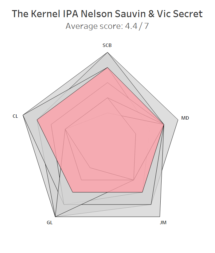
Anspach & Hobday The IPA BBNo 05 Mosaic & Amarillo Brick Peckham IPA Brixton Electric IPA Canopy Brockwell IPA Fourpure Shapeshifter Gipsy Hill Baller The Kernel IPA Nelson Sauvin & Vic Secret
(side note: it’s interesting how most of these beers have orange/red in their labels. I’d have said a well-balanced IPA – clear and crisp at first sip, slightly sweet and full bodied, but then turning bitter and dankly aromatic, so, wait, was that bitter, or sweet, I can’t tell, I’d better have some more – would taste a kind of forest green.)
Methods
A quick methods note in case you feel the need to replicate our research. All beers were bought in the week or so leading up to the experiment—mostly sourced from Hop Burns and Black, otherwise bought straight from the brewery—and were kept in our fridge for 48 hours before drinking while the weekly shop sat on the kitchen table. Immediately before the experiment started, JM and I decanted all beers into two-pint bottles we had left over from takeaways from The Beer Shop in Nunhead, various Clapton Crafts, and Stormbird, and stuck them in a coolbox full of ice. JM and I numbered the bottles 1-8, then CL and SCB recoded them using a random number generator to ensure that nobody knew what they were drinking until we checked the codes after rating everything. Finally, I also pseudorandomised the drinking order so that all beers were spread out evenly over the course of the evening to minimise any possible order effects:
All beers were poured into identical small glasses in ~200ml measures, and rated on a 1-7 Likert scale, where 4 means neutral, 3-2-1 is increasingly negative, and 5-6-7 is increasingly positive.
(I haven’t written a scientific paper in four years, and I still find it really hard not to put everything in the methods section into the passive voice. Sorry about that.)
Results
We then tasted all the beers. It was hard work, but we managed to soldier on through it. With some trepidation, we totted up the scores, drew up a table of beers, and then matched up the codes for the big reveal. From bottom to top, the results are as follows.
8. Brixton Electric IPA
We went to Brixton’s taproom a couple of years ago, and it was … nothing earth-shattering, but pretty nice? We made a mental note to drink more of their beer, but then they got bought out by partnered up with Heineken and we gave them a bit of a miss after that. I was kind of hoping this would come out bottom, so it was satisfying, in a petty, pretentious, I-should-be-better-than-this kind of way, to get objective evidence that Heineken makes independent breweries worse. Can’t argue with this, though.
7. Anspach & Hobday The IPA
This one was a surprise. I’ve had quite a few excellent pints of the Anspach & Hobday IPA at The Pigeon, and even JM’s dad / my father-in-law, who normally writes off anything over 4% as too strong, really enjoyed it (he ordered it by mistake and we just decided not to tell him it was 6%). Maybe it’s just one of those beers that’s noticeably better on tap than in a can. Still, something’s got to score lower, and I’ll still be popping into The Pigeon for a couple of pints in a milk carton to take to the park. A disappointing result for the up-and-coming South Londoners.
6. Canopy Brockwell IPA
There’s an interesting split between me and everybody else here. Canopy are, I reckon, South London’s most underrated brewery. Their Basso DIPA is the best I’ve had all year, and there aren’t many simple cycling pleasures better than going for a long ride on a hot day and ending up at their taproom for a cold pint of Paceline. I like Canopy’s Brockwell IPA, and I liked it here too; the others thought it was “a bit lager-y”. They’re wrong, and Canopy should be sitting further up the table, but the rules are the rules. If I don’t have my scientific integrity, I’m just drinking in a back garden.
4=. Fourpure Shapeshifter
Another sell-out, but Fourpure have always seemed to know exactly what they’re doing, and apparently they still do. Shapeshifter is a solid all-round IPA, and it’s the first beer on this list to receive at least a 4 from all of us. It’s like the plain digestive biscuit of the beer world – nothing to get excited about, but you’d never refuse one, would you?
4=. The Kernel India Pale Ale Nelson Sauvin & Vic Secret
The Kernel are a bit of an enigma. Back in the ancient days of yore, by which I mean 2013, anything on tap by The Kernel stood out (as did the price, but it felt worth it). And yet I never really felt like I knew The Kernel. Maybe because they closed their taproom on the Bermondsey Beer Mile for years, maybe because they tended more towards one-off brews and variations rather than a core range (their one core beer I can name, the Table Beer, splits opinion – the correct half of us love it, the other half really don’t). I’d recommend them, but I’d be hard pressed to say why, or which specific beers, other than “ah, it’s just really good”.
I don’t think they’ve got worse, it’s just that everybody else has got better, and I think that they’re better overall at porters and stouts. Anyway, we all thought this one was a decent effort and wouldn’t complain about it cluttering up the fridge.
3. Gipsy Hill Baller
This was the weakest beer of the lot by ABV (is 5.4% really even an IPA?), and, as such, it was summarily dismissed by MD as not having enough body, but it punches above its weight for the rest of us. Baller is JM’s go-to beer for her work’s Friday afternoon (virtual) beer o’clock, so I thought she’d recognise it instantly. Surprisingly, she didn’t, and she only gave it a 4. Maybe anything tastes good if it’s your first can on a Friday afternoon.
2. Brick Brewery Peckham IPA
In second place is the Brick Brewery Peckham IPA, which was a pleasant surprise. When I’m at Brick, I have a well-worn routine. I’ll start with a pint of the Peckham Pale, which is just a great general purpose, all-weather beer on both cask and keg. I’ll then move onto one of their outstanding one-offs or irregulars, like the Inashi yuzu and plum sour, or their recent Cellared Pils that rivals the Lost & Grounded Keller Pils, or their East or West Coast DIPA, or the Velvet Sea stout, or … point is, I normally ignore this one.
Well, I shouldn’t. The Peckham IPA was the favourite or joint favourite for three of us, and scored pretty highly for the other two too. It was well-balanced, it was quaffable, and it’s at the top of my list for next time I’m at the Brick taproom.
1. Brew By Numbers 05 Mosaic & Amarillo
Just pipping Brick Brewery’s Peckham IPA to the top spot was Brew By Numbers’ 05 Mosaic & Amarillo. It’s tropical, well-balanced, and easy to drink. It’s also delicious. It was the favourite or joint favourite for four of us, and SCB’s tasting notes—“yay!”—sum it up pretty well.
I’m glad BBNo ran out overall winners. It’s where JM and I had our civil partnership early this year (before heading to Brick for the after party), so it’s satisfying to see those two come out top objectively as well as sentimentally.
The ultimate accolade, though, comes from MD. The BBNo IPA was the only beer which pushed him beyond the neutral four-out-of-seven zone into net positive territory. Truly remarkable.
Summary
And there you have it. BBNo and Brick Brewery brew South London’s best standard IPAs, but more research is needed to see if this transfers from garden drinking to park drinking or pub/taproom drinking (when it feels reasonable to do so inside in groups again).
Survival analysis is a way of looking at the time it takes for something to happen. It’s a bit different from the normal predictive approaches; we’re not trying to predict a binary property like in a logistic regression, and we’re not trying to predict a continuous variable like in a linear regression. Instead, we’re looking at whether or not a thing happens, and how long it might take that thing to happen.
One use case is in clinical trials (which is where it started, and why it’s called survival analysis). The outcome is whether or not a disease kills somebody, and the time is the time it takes for it to happen. If a drug works, the outcome will happen less often and/or take longer. Cheery stuff.
In the non-clinical world, it’s used for things like customer churn, where you’re looking at how long it takes for somebody to cancel their subscription, or things like failure rates, where you’re looking at how long it takes for lightbulbs to blow, or for fruit to go bad.
This is a long blog (a really long blog) that’ll cover the principles of survival analysis, how to do it in Alteryx, and how to visualise it in Tableau. Feel free to skip ahead to whichever section(s) you fancy. I could have split it up into several different ones, but one of my bugbears as a blog reader is when everything isn’t in one place and I have to skip from tab to tab, especially if blog part 1 doesn’t link to blog part 2, and so on. So, yeah, it’s a big one, but you’ve got a CTRL key and an F key, so search away for whatever specific bit you need.
Principles of survival analysis
Survival curves, or Kaplan-Meier graphs
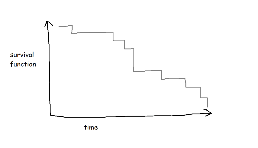
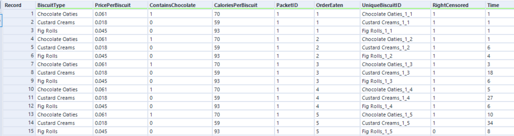
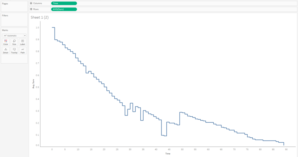
Survival analysis is most often visualised with Kaplan-Meier graphs, or survival curves, which look a bit like this:
The survival function on the y-axis shows the probability that a thing will avoid something happening to it for a certain amount of time. At the start, where time = 0, the probability is 1 because nothing has happened yet; over time, something happens to more and more things, until something has happened to all the things.
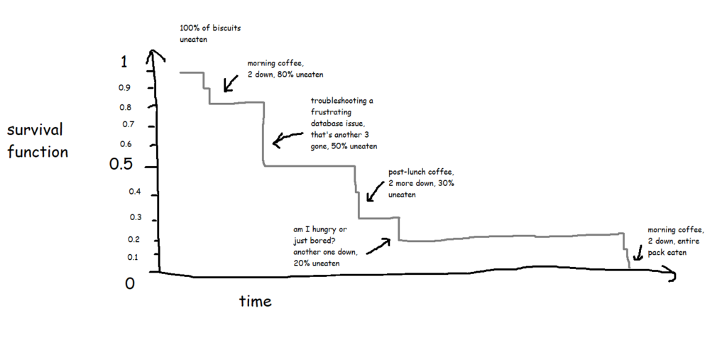
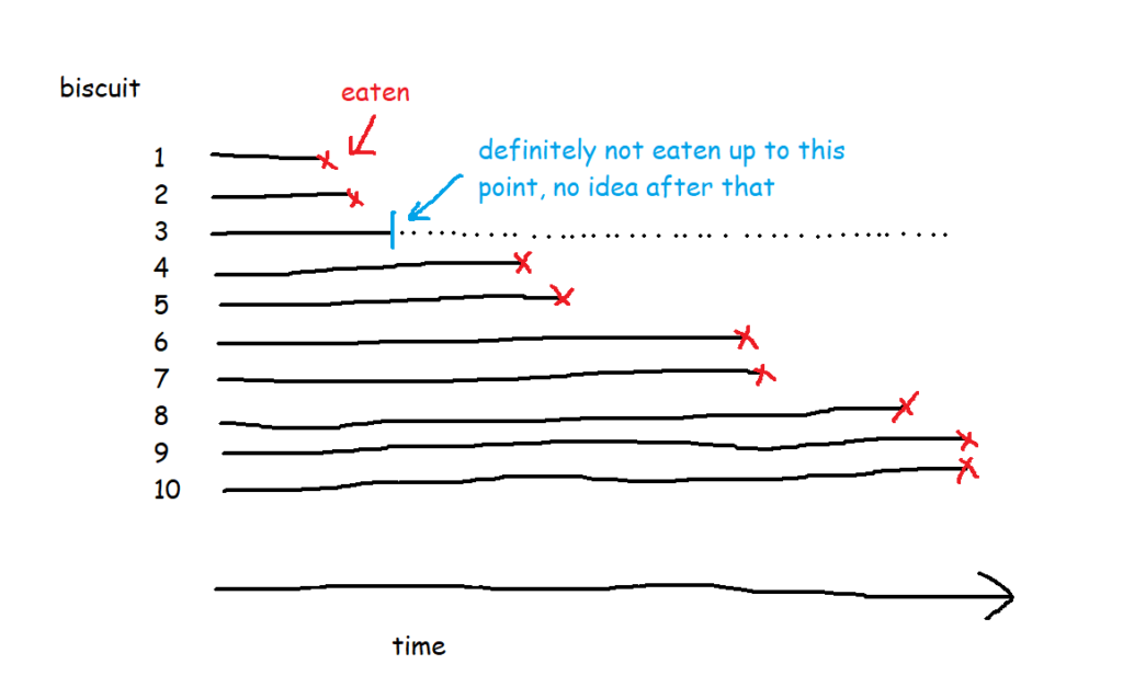
A lot of the examples are fairly morbid, so to illustrate this, I’ll talk about biscuits instead. I’ve just bought a packet of supermarket own-brand chocolate oaties, and they’re not going to last long. I’ve already had three. Okay, five. So, the biscuits are the things, being eaten is the event, and the time it’s taken between me buying the packet and eating the biscuit is the time duration we’re interested in.
Survival functions, or S(t)
In its simplest form, where every biscuit eventually gets eaten, a survival function is equivalent to the percentage of biscuits remaining at any given point:
This is the survival curve for a packet of ten biscuits that I have sole access to. And in cases like this, where there’s a single packet of biscuits where every biscuit gets eaten, the survival function is nice and simple.
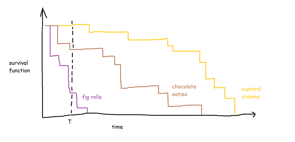
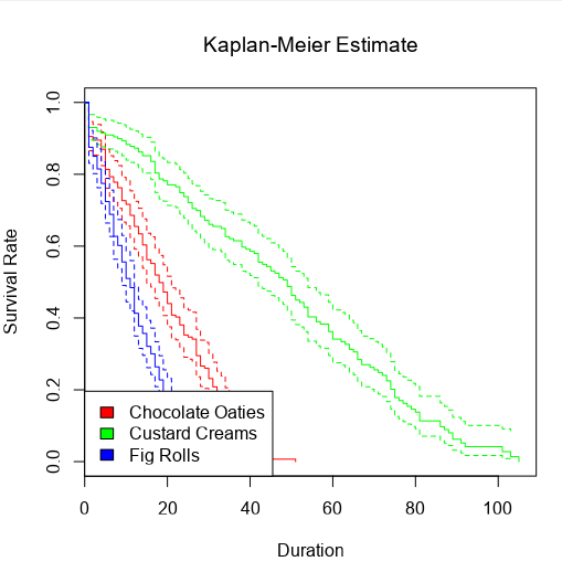
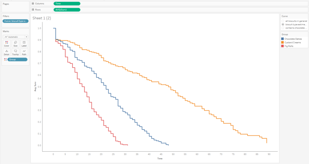
The curve gets more complicated and more interesting when you build up the data over a period of time for multiple packets of multiple biscuits. My biscuit consumption looks a little bit like this:
I’m not a huge fan of custard creams, so I don’t eat them as quickly. I really like chocolate oaties, and I can’t get enough of fig rolls, so I eat those ones much more quickly. This means that the probability that a particular biscuit will remain unmunched by time point T is around 100% for a custard cream, around 70% for a chocolate oatie, and around 30% for a fig roll:
(this assumes I’ve decanted the biscuits into a biscuit tin or something – if I’ve left them in the packet and I’m munching them sequentially, then the probability isn’t consistent for any given biscuit, but let’s leave that aside for now)
A quick detour to talk about censoring
But in most survival analysis situations, the event won’t happen to every thing, or to put it another way, the time that the event happens isn’t known for every thing. For example, I’ve bought the packet of biscuits, and I’ve had two, and then a little while later I come back and there are only seven left when there should be eight. What happened to the missing biscuit? I didn’t eat it, so I can’t count that event as having happened, but I can’t assume that it hasn’t been eaten or never will be eaten either. Instead, I have to acknowledge that I don’t know when (or if) the biscuit got eaten, but I can at least work with the duration that I knew for sure that it remained uneaten.
This concept is called censoring. Biscuit number three is censored, because we don’t know when (or if) it was eaten.
There are a few different types of censoring. Right-censored data, which is the most common kind, is where you do know when something started, but you don’t know when the event happened. This could be because the biscuit has gone missing and you don’t know what’s happened to it, or simply because you’ve finished collecting your data and you’re doing your analysis before you’ve finished all the biscuits. If you’re doing survival analysis on customers of a subscription service, like if you’re looking at how long it takes for somebody with a Spotify account to decide to leave Spotify, anybody who still has a Spotify account is right-censored – you know how long they’ve had the account, but you don’t know when (or if) they’re going to cancel their subscription. The event is unknown or hasn’t happened yet. To put it another way, the actual survival time is longer than (or equal to) the observed survival time.
Left-censored data is the other way round. For left-censored data, the actual survival time is shorter than (or equal to) the observed survival time. In the biscuit situation, this would be where I’m starting my survival analysis data collection after I’ve already started the packet of biscuits. I can work out when I bought the packet by looking at my shopping history, and I know what the date and time is right now. I don’t know exactly when I ate the first biscuit, but I know that it has to before now. So, the observed survival time is the time between buying the packet of biscuits and right now, and the data for the missing biscuits is left-censored because I’ve already eaten them, so their actual survival time was shorter than the observed survival time.
There’s also interval censoring, where we only know that the event happened in a given interval. So, with the biscuits, imagine that I don’t record the exact timestamp of when I eat them. Instead, I just check the packet every hour; if the packet was opened at 9am, and a biscuit has been eaten between 11am and 12 noon, I know that the survival time is somewhere between 120 and 180 minutes, but not the exact length.
I normally find that my data is right-censored or not censored, and rarely need to run survival analysis with left- or interval-censored data.
Back to survival functions
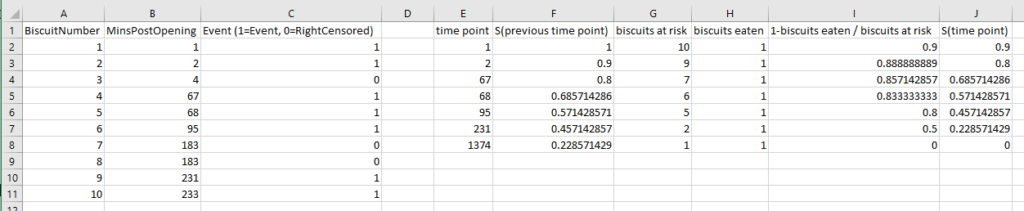
So, let’s have a look at the survival function for this data set of ten packets of biscuits where there are some right-censored biscuits too. It’s no longer as simple as the percentage of biscuits that haven’t been eaten yet.
There are ten biscuits in the packet, and I’ve eaten seven of them. Three of them have gone missing in mysterious circumstances, which I’m going to blame on my partner. All I know about BiscuitNumber 4 is that it was gone by minute 4 after the packet was opened, and all I know about BiscuitNumbers 7 and 8 is that they were also gone when I checked the packet at 183 minutes post-opening. My partner probably at them, but I don’t actually know.
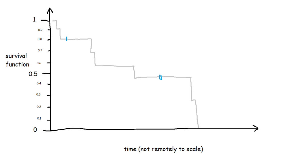
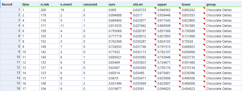
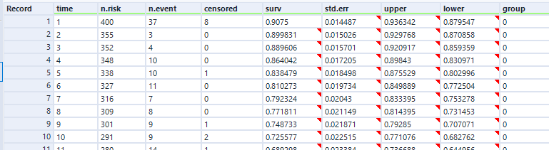
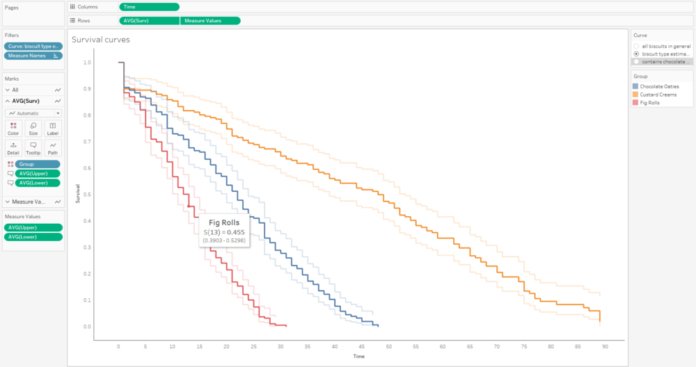
The survival curve for this data looks like this:
The blue lines show where the right-censored biscuits have dropped out; I haven’t eaten them, so I can’t say that the event has happened to them, but they’re not in my data set anymore, and that’s the point at which they left my data set.
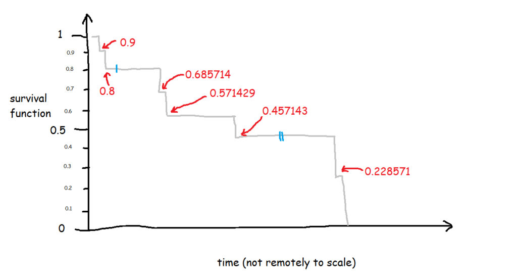
Let’s have a look at the exact numbers on the y-axis:
This is a little less intuitive! The survival function is cumulative, and it’s calculated like this as:
S(t) = S(t-1) * (1 - (# events / # at risk)
which in slightly plainer English is:
[the survival function at the previous point in time] *
(1 - [number of events happening at this time point] /
[number of things at risk at this time point])
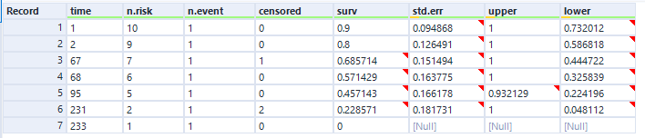
At the first time point, at 1 minute post-opening, I eat the first biscuit. At that point, all 10 biscuits are present and correct, so all 10 biscuits are at risk of being eaten. That makes the survival function at 1 minute post-opening:
1 * (1 - (1/10)
=
1 * 0.9
So, we end up with 0.9 at 1 minute post-opening, or S(1) = 0.9.
At the next time point, at 2 minutes post-opening, I eat the second biscuit. At that point, 1 biscuit has already been eaten (BiscuitNumber 1 at 1 minutes post-opening), so we’ve got 9 biscuits which are still at risk. Moreover, the survival function at the previous time point is 0.9. That makes the survival function at 2 minutes post-opening:
0.9 * (1 - (1/9)
=
0.9 * 0.8888
So, we end up with 0.8 at 2 minutes post-opening, or S(2) = 0.8. So far, so good.
But then it gets a little trickier, because we’ve got a censored biscuit. BiscuitNumber 3 drops out of our data at 4 minutes post-opening. We don’t adjust the survival curve here because the eating event hasn’t happened, but we do make a note of it, and continue onto the next event, which is when I eat my third biscuit at 67 minutes post-opening. At this point, 2 biscuits have already been eaten (BiscuitNumbers 1 and 2), and 1 biscuit has dropped out of the data (BiscuitNumber 3). That means that there are now 7 biscuits which are still at risk. The survival function at the previous time point is 0.8, so the survival function at 67 minutes post-opening is:
0.8 * (1 - (1/7)
=
0.8 * 0.85713
That gives us 0.685714, so S(67) = 0.685714. This is less intuitive now, because it doesn’t map onto an easy interpretation of percentages. You can’t say that 68.57% of biscuits are uneaten – that doesn’t make sense, as there were only 10 biscuits to begin with. Rather, it’s a cumulative, adjusted view; 80% of biscuits were uneaten at the last time point, and then of those 80% that we still know about (i.e. limit the data to biscuits which are either definitely eaten or definitely uneaten), 85.71% of them are still uneaten now. So, you take the 85.71% of the 80%, and you get a survival function of 68.57%, which is the probability that any given biscuit remains unmunched by 67 minutes post-opening, accounting for the fact that we don’t know what’s happened to some biscuits along the way.
I had to work this through step-by-step in an Excel file to fully wrap my head around it, so hopefully this helps if you’re still stuck:
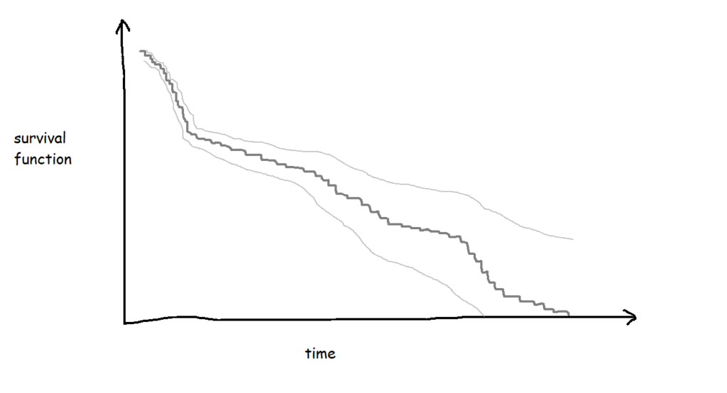
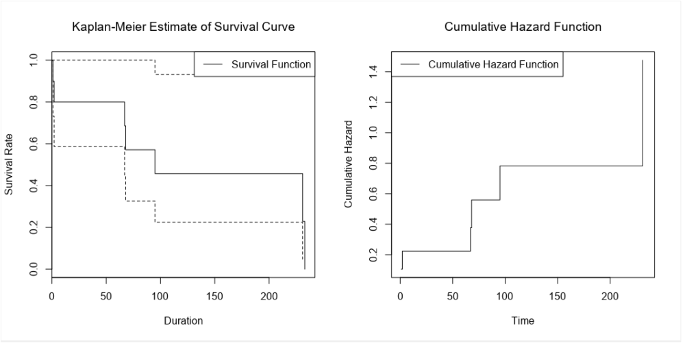
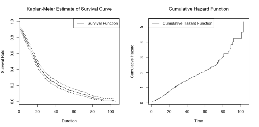
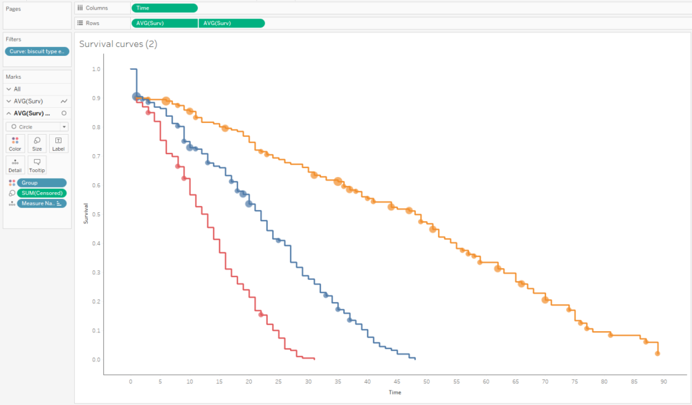
If I collect biscuit data over several packets of biscuits and add them all to my survival analysis model, I’ll get a survival curve with more, smaller steps, like this:
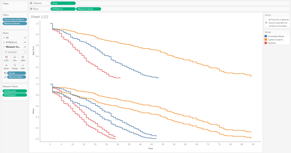
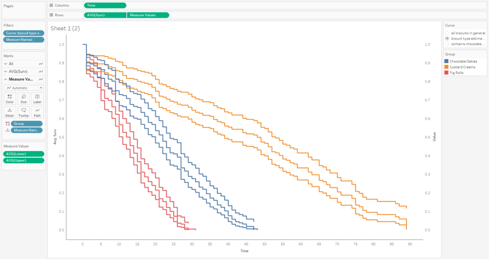
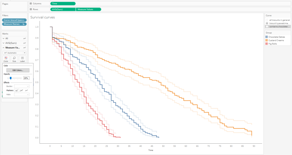
The more biscuits that have gone into my analysis, the more confident I am that the survival curve is an accurate representation of the probability that a biscuit won’t have been eaten by a particular time point. Better still, you can show this by plotting confidence intervals around the survival function too:
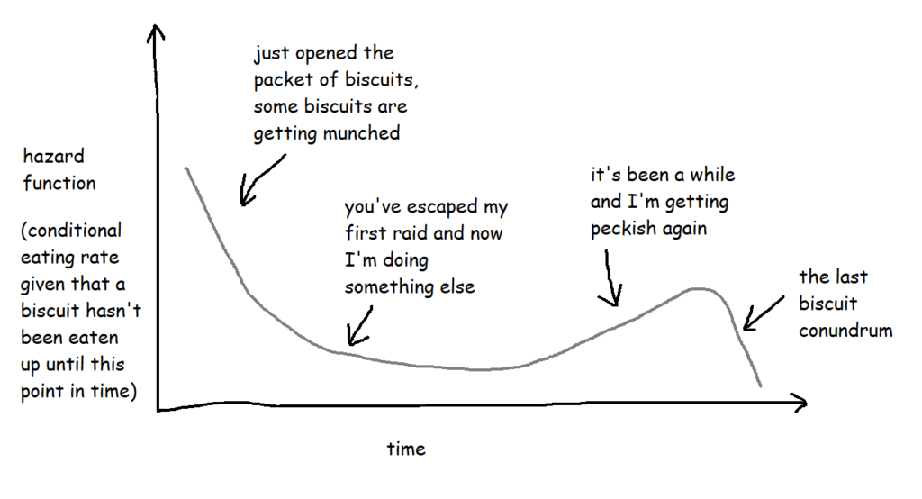
Hazard functions, or h(t)
If the survival function tells you what the probability of something not happening by a particular point in time is, a hazard function tells you the risk that something is going to happen given that you’ve made it this far without it happening.
With the biscuit example, when I open the packet, let’s say any given biscuit has a 70% chance of surviving longer than two hours. But what about if the packet is already open? What’s the risk of a biscuit being eaten if it’s already three hours since I opened the packet and that biscuit hasn’t been eaten yet? That’s the hazard function.
Technically, the hazard function isn’t actually a probability – the way it’s calculated is by taking the probability that a thing has survived up until a certain point but the event will happen by a later point and then dividing it by the interval between the two points, so you get the rate that the event will happen, given that it hasn’t happened up until now. But it also involves limits, and there are a lot of blogs and articles out there describing exactly how it works. For the purposes of this blog, it’s more useful to think of it as a conditional failure rate, and you can use the hazard function to interpret risk a bit like this:
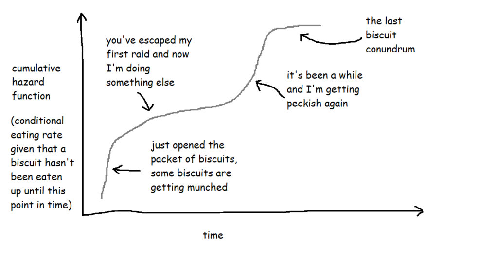
These are often plotted cumulatively:
It’s not exactly an intuitive graph, but it essentially shows the total amount of risk faced over time. You can kind of think of it like “how many times would you expect the event to have happened to this thing by now?”. So, in this case, it’s “if this biscuit has made it this far without being eaten, how does that compare to the rest of them? How many times would you expect this biscuit to have been eaten by now?”.
Cox proportional hazards
Now that we’ve got our survival curves, we can analyse them with a Cox proportional hazards model, and use that model to predict survival relative risk for future things. It’s a bit like a linear regression for looking at the survival time based on various different factors, and it lets you explore the effect of the different factors on the survival time.
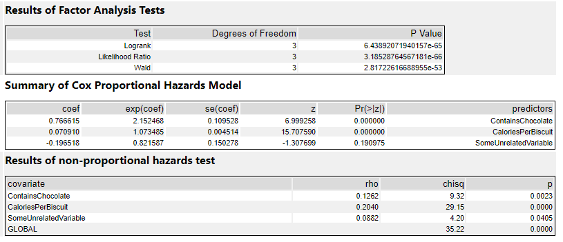
The output of a Cox proportional hazards model should give you the following information for each variable:
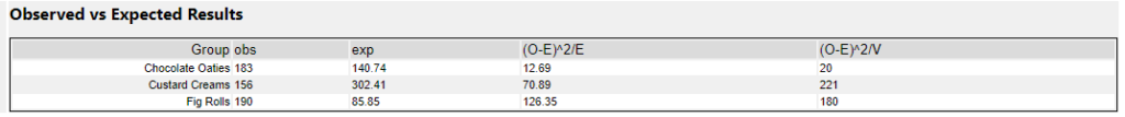
The statistical significance for each variable i.e. does it look like this actually has an effect on the survival time? e.g. biscuits with more calories in them taste better, so I’m more likely to eat them more quickly … but is that true?
The coefficients i.e. is it negative or positive? If it’s positive, then the higher this variable gets, the higher the risk of the event happening gets; if it’s negative, then the lower this variable gets, the higher the risk of the event happening gets. e.g. if it turns out that I do indeed eat biscuits with more calories in them more quickly, then the coefficient for the variable CaloriesPerBiscuit will be positive. But if it turns out that I actually eat less calorific biscuits more quickly because they’re less instantly satisfying, then the coefficient for CaloriesPerBiscuit will be negative.
The hazard ratios i.e. the effect size of the variables. If it’s below 1, it reduces the risk; if it’s above 1, it increases the risk. e.g. a hazard ratio of 1.9 for ContainsChocolate means that having chocolate on, in, or around a biscuit increases the hazard by 90%
At this point, it’s a lot easier to explain things with some actual results, so let’s dive into how to do it in Alteryx, and come back to the interpretations later.
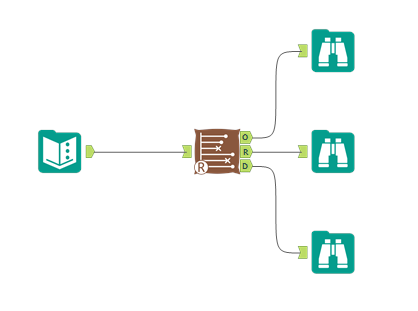
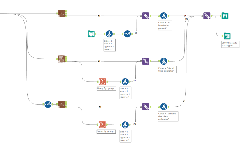
Survival analysis in Alteryx
First of all, you’ll need to download the survival analysis tools from the Alteryx Gallery. The search functionality isn’t great, so here’s the links:
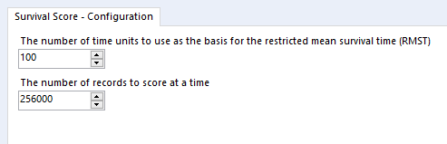
Survival analysis tool Download it here Read the documentation here
Survival score tool Download it here Read the documentation here
I’ve also put up an example workflow on the public gallery, which you can download here
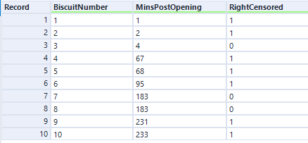
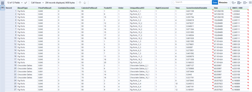
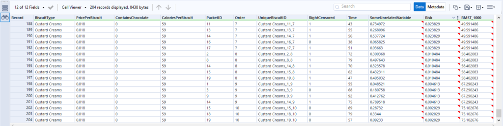
Nice. Now, you need some data! Let’s start out with the simple example I used to illustrate Kaplan-Meier survival curves:
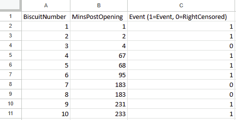
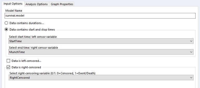
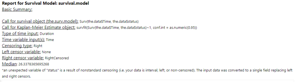
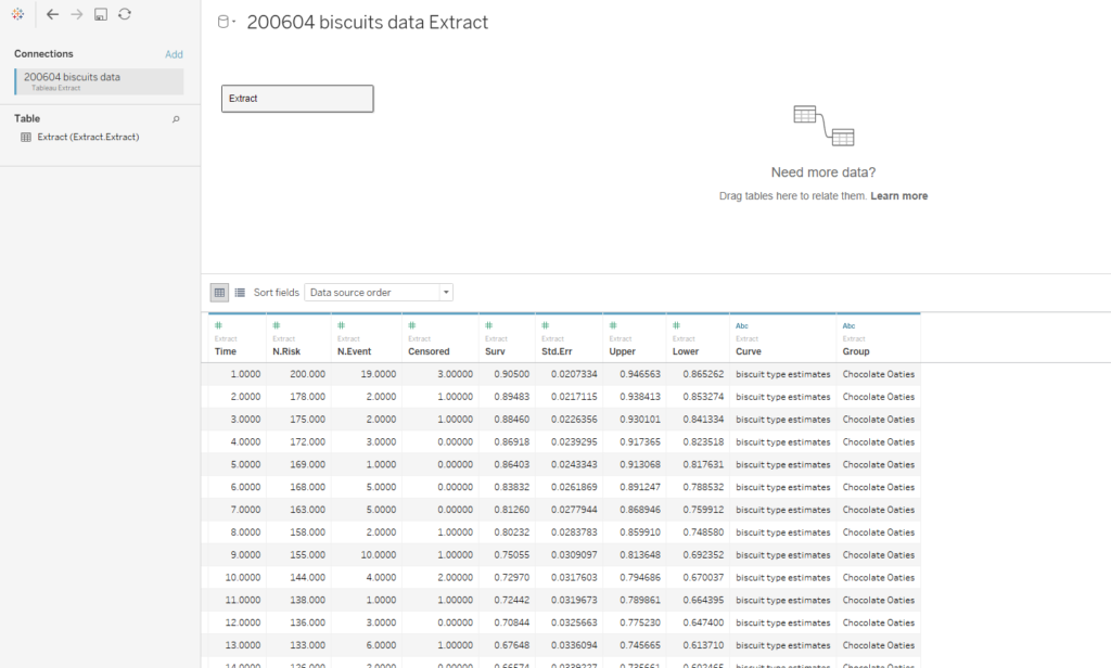
The data needs to have one row per thing, with a field for the duration or survival time, and another field for whether the data is censored or not (the eagle-eyed reader may have spotted something confusing with the RightCensored field – more on that in a moment). Now I can plug it straight into the survival analysis tool:
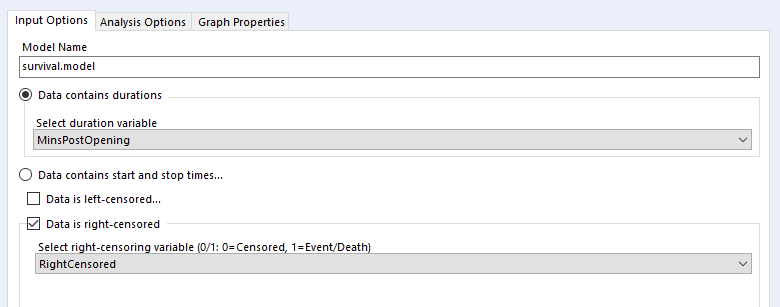
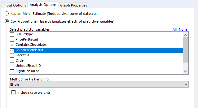
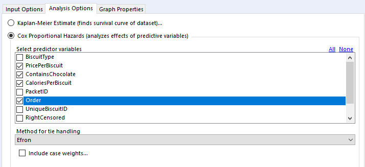
Let’s have a look at how to configure the tool. The input options are the same for both Kaplan-Meier graphs and Cox proportional hazards models:
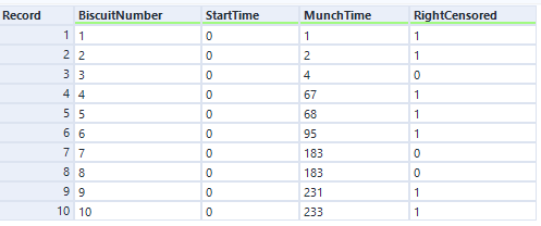
I’ve selected the option “Data contains durations”, as I have a single field for the number of minutes a biscuit lasted before being eaten, rather than one field for the time of packet opening and another field for the time of biscuit eating. I prefer using a single field for durations for two reasons. Firstly, because the tool doesn’t accept date or datetime fields, only numbers, and I find it easier to calculate the date difference than to convert two date fields into integers; secondly, as it allows me to sort out any other processing I need beforehand (e.g. removing time periods when I wasn’t in the flat because there wasn’t any actual risk of the biscuits being eaten at that time). But, if you have start and stop times in a number format and don’t want to do the time difference calculation yourself, you can have your data like this:
…and set up your tool like this:
…and you should get the same results.
Confusingly, the survival analysis tool asks whether data is censored, and asks for a 0/1 field where 1 = “the event happened” (i.e. this data isn’t actually censored) and 0 = “I don’t know what happened” (i.e. this data is censored). I often get this mixed up. But yes, if your data is right-censored, you need to assign that a 0 value, and if your event has actually happened, that’s a 1.
Kaplan-Meier
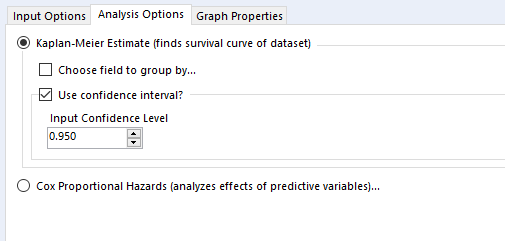
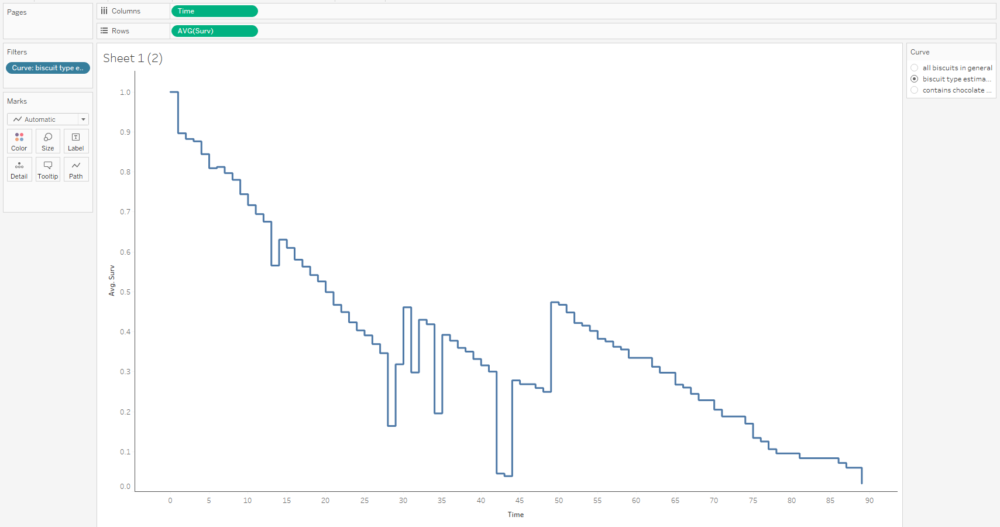
Then there’s the analysis tab. Let’s go over Kaplan-Meier graphs first:
We’re doing the survival curve at the moment, so select the Kaplan-Meier Estimate option. I’d recommend always using the confidence interval – it might make the plots harder to read when you group by a field, but you’ll want that data in the output.
The choose field to group by option is also good to look at, but there’s a strange little catch with this; it won’t work unless the field you’re grouping by is the first field in your data set, so you’ll need to put a select tool on before the survival analysis tool, and make sure that you move your grouping field right to the top.
Now you can run the workflow. There are three outputs: O: Object. You can plug this into a survival score tool, but I don’t really do much with this otherwise R: Report. This is full of interesting information, so stick a browse tool on the end. D: Data. This is brilliantly useful, and I wish more Alteryx predictive tools did this. It’s the stuff that’s shown in the report output, but a data table that you can do stuff with.
Here’s what the report output looks like:
There’s the survival curve, along with some giant confidence intervals because there are so few biscuits in the data set. This is the same one that I was drawing in MS Paint in the first section.
We’ve also got the cumulative hazard function, which I drew earlier too. It’s is the running sum of the hazard functions along the time period. In this particular example, it just looks like the survival curve but rotated a bit, but we’ll see examples where it’s different later.
In the data output, we can see the curve data in a table:
And again, this is the data as profiled in the screenshot from Excel earlier when I was working through the survival function calculations.
Let’s now move to a bigger data set of biscuits. I’ve tracked my consumption of fig rolls, chocolate oaties, and custard creams in a table that looks like this:
(this is all fake data that I’ve generated for this blog, if you haven’t guessed already – but it is “based on a true story”)
The Time field is the duration – I’ve generated it kind of arbitrarily. We can pretend it’s still minutes, although as you’ll see, I end up finishing a pack of fig rolls in about thirty minutes, which is going it some even for me.
When I run the main survival analysis, I get a nice survival curve of my general biscuit consumption:
I can also choose the group by option to create separate survival curves for each biscuit type, and it’ll plot the survival curves of all three alongside each other:
…and then the survival curve and cumulative hazard function of each biscuit type individually:
When grouping by a field, you get this extra table in the report output:
The obs column is a simple count of how many biscuits actually got eaten (i.e. the sum of the RightCensored field I created earlier), but I’m not sure where they’re getting the exp values from. I’m also not sure why I don’t get this table when I’m not grouping by any fields.
Another quirk of the survival analysis tool is that I get this warning message about nonstandard censoring regardless of what I do:
I haven’t figured out why it happens – if you do, give me a shout.
In the data output, we get the survival curve data points for each group, which is really useful. We’ll use this data later and plot it in Tableau:
Cox proportional hazards
Back to the analysis tab, then.
In the “select predictor variables” section, you can select the variables you want to investigate. I generally use binary fields and continuous fields here. You can use categorical fields, but I wouldn’t recommend it, as they get converted to paired binary fields anyway (more on that in a bit).
For tie handling, I just leave it at Efron. The survival R package documentation that the survival analysis tool is built off has a long explanation; the summary version is that if there aren’t many ties in your data (i.e. if there aren’t many things that have the same duration), then it doesn’t really matter which option you use, and Efron is the more accurate one anyway.
Finally, case weights gives you an option to double-count a particular line of data. As far as I can tell, this is functionally equivalent to unioning in every line of data you want to replicate; there’s no difference between running a Cox proportional hazards model on 500 rows where each row has case weight = 2 and running the same model on 1000 rows where it’s the 500 row table unioned to itself. The model returns the same coefficients, but the p-values are different. In any case, it seems like it’s a throwback to when data was reduced as much as possible to keep it light. I can’t see any need to include case weights in your analysis in Alteryx, but again, hit me up if you have a use case where this is necessary.
Here are the results in the results tab:
The factor analysis section is testing whether the model itself is significant. If it’s not (i.e. if the p-value is > 0.05), then the rest of the results are interesting to look at but not really that meaningful. If it is significant, then you can proceed to the rest of the results.
The summary section is the most useful bit. The coef column shows the coefficients. This is where the sign is important – if it’s positive, then there’s a corresponding increase in risk, whereas if it’s negative, then there’s a corresponding decrease in risk. My ContainsChocolate field is positive, so if a biscuit contains chocolate, then there’s an increase in the risk to the biscuit that I’ll eat it. Same goes for CaloriesPerBiscuit, which is also positive. The more calories a biscuit has, the greater the risk that I’ll eat it.
The exp(coef) column shows the exponent of the coefficient, which basically means the effect size of the variable. The exp(coef) for ContainsChocolate is 2.15, which means that having chocolate in the biscuit will more than double the risk that I’ll eat it. The exp(coef) for SomeUnrelatedVariable is 0.82, which suggests that the risk decreases by 18% as SomeUnrelatedVariable rises…
…but as we can see in the Pr(>|z|) column, the p-value for SomeUnrelatedVariable is 0.19, which means it’s not significant (I’d hope not, as I created SomeUnrelatedVariable by just sticking RAND() in a formula tool). So, we can ignore the coef and exp(coef) columns, because they aren’t really meaningful. The ContainsChocolate and CaloriesPerBiscuit fields are significant, so I can use that information to explore my biscuit consumption.
This is where knowing your variables is really important. If I’d coded up my ContainsChocolate variable differently, and set it so that 0 = contains chocolate and 1 = does not contain chocolate, then the model would return -0.766615 in the coef column rather than 0.766615. Likewise, the exp(coef) column would be a little under 0.5 rather than a little over 2. If you mix up which way round your variables go, you’ll draw completely the wrong conclusion from the stats.
It’s possible to use categorical fields in the Cox proportional hazards model too, but all it does is create new variables by comparing everything to the first item in the categorical field in a binary way. So, in this output, I’ve used BiscuitType as a predictor variable, and the tool has converted that into two variables; chocolate oaties vs. custard creams (where chocolate oaties = 0 and custard creams = 1), and chocolate oaties vs. fig rolls (where Chocolate oaties = 0 and custard creams = 1). The interpretation of these results is that there’s a huge difference between custard creams and chocolate oaties in terms of survival. As the new field BiscuitTypeCustardCreams increases (i.e., for custard creams), the risk of being eaten decreases, as shown by the negative coef value of -1.53, and that translates to a risk reduction of 79% as shown by the exp(coef) value of 0.21:
The more things you’ve got in a categorical field, the more of these new variables you’ll get, and it’ll get messy. I prefer to work out any categorical variables of interest beforehand and translate them into more useful groupings myself first, such as in my field ContainsChocolate.
Combining Cox proportional hazards with a survival score tool
Finally, once you’ve got a model that you’re happy with, you can use it with the survival score tool to predict relative risk and survival times for other biscuits.
I highly recommend validating your model predictions on your original data set so that you can compare the output of the survival score tool with the survival times that actually happened:
What I’ve done here is train my Cox proportional hazards model on 66% of the biscuit data, and then used the output of that model in the survival score tool to predict biscuit survival time for the remaining 34%. I’ve also included Order in the model as the order where the biscuit sits in the packet, as that’s obviously going to affect the survival time of the biscuit. Actually, I shouldn’t really be doing the analysis like this at all, because the fact that there’s an order to them shows that the biscuits aren’t independent, but I’m 4000 words into this analogy now. Just pretend that the biscuits are independent and sitting in a tin, and that the order field is some kind of variable that affects how quickly an individual biscuit gets eaten, yeah? Anyway, here’s the configuration pane:
If I look at the output, it’s pretty good:
This first table is sorted by the relative risk factor that the score tool puts out, and it’s showing that the biscuits with the highest risk of being eaten are the fig rolls in the first few positions in the packet, then the chocolate oaties in the first position in the packet. The actual survival duration (just called Time here) is pretty low too. If I scroll down to see the lowest risk, I can see lower relative risk in the Risk field, and higher actual survival times in the Time field:
So, I’m happy that my model is a good one, and I can now put some new biscuit information to predict survival time for a new set of biscuits. Maybe some bourbons, maybe some ginger nuts, maybe even some garibaldis.
Let’s predict survival time and relative risk for a new packet of bourbons:
The score tool has established the relative risk for each biscuit in the packet, and the RMST_1000 output shows the number of minutes it’s expecting each biscuit to survive for:
This isn’t perfectly accurate – we’ve already seen in the data that the first two biscuits of most packets get eaten within a couple of minutes, but the time prediction for biscuit number 1 is 24 mins. More data and more different predictor fields will make that more realistic.
The RMST bit of the RMST field stands for Restricted Mean Survival Time, and it’s set in the survival score tool configuration pane:
It’s a value you can choose to get a relatively realistic estimate of how long something will survive for out of a fixed number of time units. It’s helpful for cases when you’re running your analysis with a lot of right-censored data because the event simply hasn’t happened yet, such as customer churn. Then you can get an estimate of how the survival curve might extend beyond the period you’ve got.
Visualising survival analysis in Tableau
Now that I’ve got my biscuit survival models, I want to visualise them in Tableau, because the default R plots in the browse tool aren’t great.
I want three different survival curves – the general biscuits curve, the curves broken down per BiscuitType, and the curves broke down by ContainsChocolate. So, I’m going to need three separate survival tools to get the data for these survival curves.
It’s also important to do a little bit of data processing to the output of the D anchor. This is how the data looks:
The first line of data is at time = 1, which is the time of the first event. To make the graph in Tableau, we’ll need an extra line at the top where time = 0 and the survival function = 1. This line needs to be repeated for each group that we’ve grouped by in the survival analysis tool.
For the single survival curve of all biscuits, I do this by using a text input tool with a single row and single column, adding four new fields in the formula tool (time = 0, surv = 1, upper = 1, lower = 1), deselecting the dummy field, and unioning it in with the survival analysis data output. Then I add a formula tool for that data to label which survival curve it is:
For the survival curves which are split out by a particular field in the group by option, I split off the data output, use a summarise tool to group by the grouping field so that there’s one row per value in the group field, then add the same fields in a formula tool and union these new rows back in. Again, a formula tool after the union is there to label the data for each survival curve:
Then you can union the lot together, and output to Tableau:
This doesn’t cover getting the hazard function or cumulative hazard function. For that, you need to hack the macro itself and add an output to the R tool inside it to put out the data it uses for the cumulative hazard function plot. That’s a topic for another blog.
Now, let’s open this data in Tableau:
The first step is to plot the average survival function over time. You’ll want your time field to be a continuous measure:
This curve doesn’t make any sense because it seems to jump up and down; that’s because we’ve got several different survival curves in this data, so let’s add a filter to show one at a time:
This graph is filtered to the BiscuitType curve only, but it still jumps around because there are three separate curves for the three biscuit types. That means we need to put the grouping field on detail and/or colour too:
The next step is to add the confidence intervals. I’m going to add them in as measure names/measure values, and then dual axis them with the survival function. In the measure names/measure values step, make sure to put AVG(Lower) and AVG(Upper) together, and put Measure Names on detail with group on colour.
The next step is to put AVG(Surv) and Measure Values on a dual axis, and synchronise it:
That’s quite nice, but I can’t really distinguish the survival function line that easily, and that’s the most important one. So, I’ll whack the opacity down on the confidence intervals too:
A little bit more formatting and tooltip adjustment, and I’ve got a nice set of survival curves that I can interact with, publish, and share for others to explore:
Alternatively, I can plot the number of censored biscuits at each time point as well by plotting AVG(Surv) as circles, and sizing the circles by the number of censored biscuits. The relative lack of censored biscuits for fig rolls in red explains why the confidence intervals are more narrow for fig rolls compared to chocolate oaties and custard creams: