Cricket

Using R to calculate better cricket statistics… or, how to revolutionise the way we slag off Ian Bell.

Have you ever been bothered by the idea of career batting averages, how it doesn’t reflect a player’s form, and how it’s unfair to compare averages of cricketers who’ve played over a hundred tests to cricketers who’ve played maybe thirty since one bad innings will damage the experienced cricketer’s average way less than the relative newcomer?

Well, you’re not alone. I’ve always thought that cricinfo should report a ten-innings rolling average. Occasionally you get a stat like “Cook is averaging 60 or so in the last few matches” or whatever, but there’s no functionality on cricinfo or statsguru to be able to look that up.

Enter R. R is a free open-source statistical programme that I normally use for my ERP research, but it’s also the next best thing after Andy Zaltzman for settling arguments about cricket statistics.

I’ve written some R code which can take any cricketer on cricinfo and spit out a ten-innings rolling average to show fluctuations in form. Plotting it with ggplot2 can show a player’s peaks and troughs as compared to their career average, and can hopefully be used as a much more objective way of saying whether or not somebody’s playing badly.

Alastair Cook has been a lightning rod for criticism in the last couple of years. He scored heavily in his first few matches as England captain, and for a little while it seemed as though captaincy would improve his batting, but then he went into a long slump. He recently broke his century drought, and people are divided over whether he’s finally hitting form again or whether this is a dead cat bounce on an inevitable decline. Some people take his last five Tests and say he’s back; others take his last year or two in Tests and say he’s lost it. What is missing from all the misspelled derision in the comments under any article about Cook is a ten-innings rolling average and how it changes over time.

Cook

Alastair Cook: rolling and cumulative averages

This graph shows Cook’s peaks and troughs in form quite nicely. The big one in the middle where he averaged about 120 over ten innings is a combination of his mammoth 2010-11 Ashes series and the home series against Sri Lanka where he scored three centuries in four innings. His recent slump can be seen in the extended low from his 160th innings and onwards, where his rolling average went down to below 20. Now, though, it’s clear that not only has he regained some form, he’s actually on one of the better runs of his career.

Similarly, it seems like commentators and online commenters alike feel like Gary Ballance should be dropped because he’s on a terrible run of form. Certainly, he’s had a few disappointing innings against the West Indies and New Zealand lately, but is his form that bad?

Gary Ballance: rolling and cumulative averages

Gary Ballance: rolling and cumulative averages

…no, no it isn’t. He’s still averaging 40 in his last ten innings.

If anything, it’s Ian Bell who should be dropped because of bad form:

Bell

Bell’s average has had a few serious drops recently, going down to 20 after a poor Ashes series in Australia (along with pretty much every other England player too), rebounding a bit after a healthy home series against India, and then plummeting back down to 20 after two bad series against West Indies and New Zealand. Unlike Cook, however, Bell never seems to stay in a rut of bad form for very long… but that never stops his detractors from claiming he hasn’t been good since 2011.

The missing bit in the cumulative average line, by the way, is from where Bell averaged a triple Bradman-esque 297 after his first three innings against West Indies and Bangladesh, which were 70, 65*, and 162*.

The forthcoming Ashes series also raises the interesting comparison of Joe Root and Steven Smith, two hugely promising young batsmen both at their first real career high points. Smith in particular is seen as having had an excellent run of form recently and has just become the #1 ranked Test batsman. Most cricket fans online seem to think that there’s no contest between Smith and Root, with Smith being by far and away the better batsman…

Root and Smith

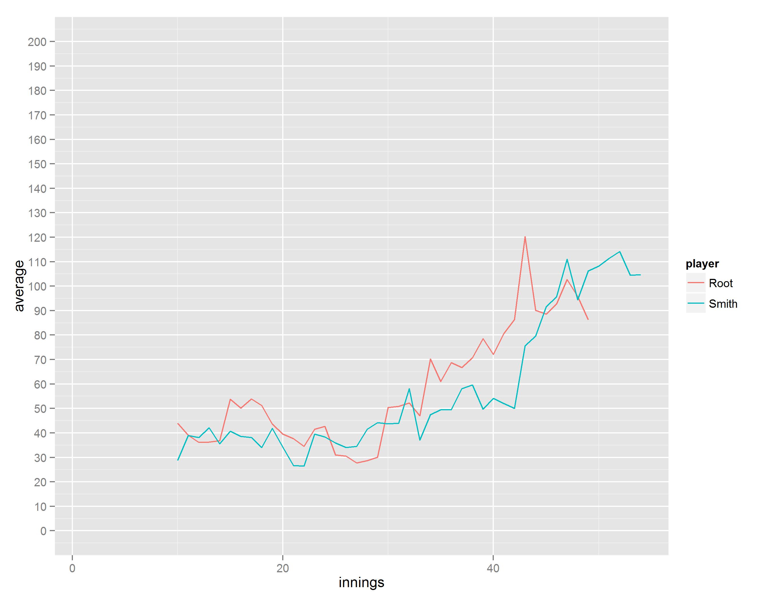
…but it appears that there’s not actually much to choose between them. If anything, Root has had the highest peak out of the two of them, averaging 120 over ten innings against India last summer and the West Indies more recently (this is in fact comparable to Alastair Cook’s peak against Australia in 2010-11, but has attracted far less attention). He’s dropped a little since, but is still averaging a more than acceptable 85. Smith’s current rolling average of 105 is also very impressive, and it’ll be fascinating to see how he gets on in this series.

If you are interested in calculating and plotting these graphs yourself, you can follow the R code as below.

Firstly, if you don’t use them already, install and run the following packages:

install.packages('gtools')
install.packages('plyr')
install.packages('ggplot2')
install.packages('dplyr')
install.packages('XML')
require('gtools')
require('plyr')
require('ggplot2')
require('dplyr')
require('XML')

The next step is to create a dataframe of innings for each player. You can do this by going to any player’s cricinfo profile, and then clicking on “Batting innings list” under the statistics section. Take that URL and paste it in here like so:

# Joe Root innings
url = "http://stats.espncricinfo.com/ci/engine/player/303669.html?class=1;template=results;type=batting;view=innings"
Root.tables = readHTMLTable(url,stringsAsFactors = F)
Root.full = Root.tables$"Innings by innings list"

This creates a fairly messy dataframe, and we have to tidy it up a lot before doing anything useful with it. I rolled all the tidying and calculating code into one big function. Essentially, it sorts out a few formatting issues, then introduces a for loop which loops through a player’s innings list and calculates both the cumulative and ten-innings rolling averages at each individual innings (of course, the first nine innings will not return a ten-innings rolling average), and then puts the dataframe into a melted or long format:

rollingbattingaverage <- function(x) {
 
  x$Test <- x[,14]            # creates new column called Test, which is what column 14 should be called
  x <- x[,c(1:9, 11:13, 15)]  # removes 10th column, which is just blank, and column 14
 
  x$NotOut=grepl("\*",x$Runs) #create an extra not out column so that the Runs column works as a numeric variable
  x$Runs=gsub("\*","",x$Runs)
 
  #Reorder columns for ease of reading
  x <- x[,c(1, 14, 2:13)]
 
  #Convert Runs variable to numeric variables
  x$Runs <- as.numeric(x$Runs)
 
  #This introduces NAs for when Runs = DNB
  x <- x[complete.cases(x),] 
 
  rolling <- data.frame(innings = (1:length(x$Runs)), rollingave = NA, cumulave = NA)
  names(rolling) <- c("innings", "rolling", "cumulative")
 
  i = 1
  z = length(x$Runs)
  for (i in 1:z) {
    j = i+9
    rolling[j,2] = sum(x$Runs[i:j])/sum(x$NotOut[i:j]==FALSE)
    rolling[i,3] = sum(x$Runs[1:i])/sum(x$NotOut[1:i]==FALSE)
  }
 
  #because of the j=i+9 definition and because [i:j] works while [i:i+9] doesn't, 
  #creates 9 extra rows where all are NA
 
  x <- rolling[1:length(x$Runs),] #removes extra NA rows at the end
 
  melt(x, id="innings") 
 
}

Then I have another function which sorts out the column names (since changing the names of a function’s output is kind of tricky) and adds another column with the player’s name in it so that the player dataframes can be compared:

sortoutnames <- function(x) {
  x$player = deparse(substitute(x))
  allx <- list(x)
  x <- as.data.frame(lapply(allx, 'names<-', c("innings","type", "average", "player")))
}

Now we can plot an individual player’s rolling and cumulative averages:

plotplayer <- function(x) {
  myplot <- ggplot(data=x, aes(y=average, x=innings, colour=type))
  myplot+geom_line()+scale_y_continuous(limits=c(0, 200), breaks=seq(0,200,by=10))
}

The next function isn’t really necessary as a function since all it does is rbind two or more dataframes together, but it makes things easier and neater in the long run:

compareplayers <- function(...) {
  rbind(...)
}

And finally, we need to create functions for various types of graphs to be able to compare players:

plotrolling <- function(x){
  myplot <- ggplot(data=x[x$type=="rolling",], aes(x=innings, y=average, colour=player))
  myplot+geom_line()+scale_y_continuous(limits=c(0, 200), breaks=seq(0,200,by=10))
}
 
plotcumulative <- function(x){
  myplot <- ggplot(data=x[x$type=="cumulative",], aes(x=innings, y=average, colour=player))
  myplot+geom_line()+scale_y_continuous(limits=c(0, 200), breaks=seq(0,200,by=10))
}
 
plotboth <- function(x){
  myplot <- ggplot(data=comparisons, aes(x=innings, y=average, colour=player, size=type))
  myplot+geom_line()+scale_size_manual(values=c(0.6,1.3))+scale_y_continuous(limits=c(0, 200), breaks=seq(0,200,by=10))
}
 
plotrollingscatter <- function(x){
  myplot <- ggplot(data=x[x$type=="rolling",], aes(x=innings, y=average, colour=player))
  myplot+geom_point()+scale_y_continuous(limits=c(0, 200), breaks=seq(0,200,by=10))
}

Now that all the functions exist, you can get the information quickly and easily; just find the correct URL for the player(s) you want, paste it in the bit where the URL goes, and then run the functions as follows:

Root <- rollingbattingaverage(Root.full)
Root <- sortoutnames(Root)
plotplayer(Root)
comparisons <- compareplayers(Root, Smith)
plotrolling(comparisons)
plotcumulative(comparisons)
plotboth(comparisons)
Standard
EEG/ERP, Sound-symbolism

Ideophones in Japanese modulate the P2 and late positive complex responses: MS Paint version

I just had my first paper published:

Lockwood, G., & Tuomainen, J. (2015). Ideophones in Japanese modulate the P2 and late positive complex responses. Language Sciences, 933. http://doi.org/10.3389/fpsyg.2015.00933

It’s completely open access, so have a look (and download the PDF, because it looks a lot nicer than the full text).

It’s a fuller, better version of my MSc thesis, which means that I’ve been working on this project on and off since about April 2013. Testing was done in June/July 2013 and November 2013. Early versions of this paper have been presented at an ideophone workshop in Tokyo in December 2013, a synaesthesia conference in Hamburg in February 2014, and a neurobiology of language conference in Amsterdam in August 2014. It was rejected once from one journal in August 2014, and was submitted to this journal in October 2014. It feels great to have it finally published, but also kind of anticlimactic, given that I’m focusing on some different research now.

I feel like the abstract and full article describe what’s going on quite well; this is a generally under-researched area within the (neuro)science of language as it is, so it’s written for the sizeable number of people who aren’t knowledgeable about ideophones in the first place. However, if you can’t explain your research using shoddy MS Paint figures, then you can’t explain it at all, so here goes.

Ideophones are “marked words which depict sensory imagery” (Dingemanse, 2012). In essence, this means that ideophones stick out compared to regular words, ideophones are real words (not just off the cuff onomatopoeia), ideophones try and imitate the thing they mean rather than just describing it, and ideophones mean things to do with sensory experiences. This sounds like onomatopoeia, but it’s a lot more than that. Ideophones have been kind of sidelined within traditional approaches to language because of a strange fluke whereby the original languages of academia (i.e. European languages, and especially French, German, and English) are from one of the very few language families across the world which don’t have ideophones. Since ideophones aren’t really present in the languages of the people who wrote about languages most often, those writers kind of just ignored them. The less well-known linguistic literature on ideophones has been going on for decades, and variously describes ideophones as vivid, quasi-synaesthetic, expressive, and so on.

What this boils down to is that for speakers of languages with ideophones, listening to somebody say a regular word is like this:

listening to a regular word

and listening to somebody say an ideophone is like this:

listening to an ideophone

Why, though?

Ideophones are iconic and/or sound-symbolic. These terms are slightly different but are often used interchangeably and both mean that there’s a link between the sound of something language-y (or the shape/form of something language-y in signed languages) and its meaning. This means that, when you’re listening to a regular word, you’re generally just relying on your existing knowledge of the combinations of sounds in your language to know what the meaning is:

regular word processing

…whereas when a speaker of a language with ideophones listens to an ideophone, they feel a rather more direct connection between what the ideophone sounds like and what the meaning of the ideophone is:

ideophone processing

These links between sound and meaning are known as cross-modal correspondences.

Thing is, it’s one thing for various linguists and speakers of languages with ideophones to identify and describe what’s happening; it’s quite another to see if that has any psycho/neurolinguistic basis. This is where my research comes in.

I took a set of Japanese ideophones (e.g. perapera, which means “fluently” when talking about somebody’s language skills; I certainly wish my Japanese was a lot more perapera) and compared them with regular Japanese words (e.g. ryuuchou-ni, which also means “fluently” when talking about somebody’s language skills, but isn’t an ideophone). My Japanese participants read sentences which were the same apart from swapping the ideophones and the arbitrary words around, like:

花子は ぺらぺらと フランス語を話す
Hanako speaks French fluently (where “fluently” = perapera).

花子は りゅうちょうに フランス語を話す
Hanako speaks French fluently (where “fluently” = ryuuchou-ni).

While they read these sentences, I used EEG (or electroencephalography) to measure their brain activity. This is done by putting a load of electrodes in a swimming cap like this:

electrode set up

After measuring a lot of participants reading a lot of sentences in the two conditions, I averaged them together to see if there was a difference between the two conditions… and indeed there was:

figure 1 from japanese natives paper

The red line shows the brain activity in response to the ideophones, and the blue line shows the brain activity in response to the arbitrary words. The red line is higher than the blue line at two important points; the peak at about 250ms after the word was presented (the P2 component), and the consistent bit for the last 400ms (the late positive complex).

Various other research has found that a higher P2 component is elicited by cross-modally congruent stimuli… i.e. this particular brain response is bigger to two things that match nicely (such as a high pitched sound and a small object). Finding this in response to the Japanese ideophones suggests that the brain recognises that the sounds of the ideophones cross-modally match the meanings of the ideophones much more than the sounds of the arbitrary words match the meanings of the arbitrary words. This may be why ideophones are experienced more vividly than arbitrary words.

higher P2 for ideophones

lower P2 for arbitrary words

As for the late positive complex, it’s hard to say. It could be that the cross-modal matching of sound and meaning in ideophones actually makes it harder for the brain to work out the ideophone’s role in a sentence because it has to do all the cross-modal sensory processing on top of all the grammatical stuff it’s doing in the first place. It’s very much up for discussion.

Standard
EEG/ERP

Putting the graph into electroencephalography

ERPists – click to jump to the main point of this blog, which is about plotting measures of confidence and variance. Or just read on from the start, because there’s a lot of highly proficient MS Paint figures in here.

UPDATE! The paper where this dataset comes from is now published in Collabra. You can read the paper here and download all the raw data and analysis scripts here.

ERP graphs are often subjected to daft plotting practices that make them highly frustrating to look at.

ERPing the derp

Negative voltage is often (but not always) plotted upwards, which is counterintuitive but generally justified with “oh but that’s how we’ve always done it”. Axes are rarely labelled, apart from a small key tucked away somewhere in the corner of the graph which still doesn’t give you precise temporal accuracy (which is kind of the point of using EEG in the first place). And finally, these graphs are often generated using ERP programmes then saved as particular file extensions, which then get cramped up or kind of blurry when resized to fit journals’ image criteria. This means that a typical ERP graph looks something a little like this:

typical erp graph

…and the graph is supposed to be interpreted something a little like this:

erp intuitive 2

…although realistically, reading a typical ERP graph is a bit more like this:

erp context

Some of these problems are to do with standard practices; others, due to lack of expertise in generating graphics; and more still are due to journal requirements, which generally specify that graphics must conform to a size which is too small to allow for proper visual inspection of somebody’s data, and also charge approximately four million dollars for the privilege of having these little graphs in colour because of printing costs despite the fact that nobody really reads actual print journals anymore.

Anyway. Many researchers grumble about these pitfalls, but accept that it comes with the territory.

However, one thing I’ve rarely heard discussed, and even more rarely seen plotted, is the representation of different statistical information in ERP graphs.

ERP graphs show the mean voltage across participants on the y-axis at each time point represented on the x-axis (although because of sampling rates, it generally isn’t a different mean voltage for each millisecond, it’s more often a mean voltage for every two milliseconds). Taking the mean readings across trials and across participants is exactly what ERPs are for – they average out the many, many random or irrelevant fluctuations in the EEG data to generate a relatively consistent measure of a brain response to a particular stimulus.

Decades of research have shown that many of these ERPs are reliably generated, so if you get a group of people to read two sentences – one where the sentence makes perfect sense, like the researcher wrote the blog, and one where the final word is replaced with something that’s kind of weird, like the researcher wrote the bicycle – you can bet that there will be a bigger (i.e. more negative) N400 after the kind of weird final words than the ones that make sense. The N400 is named like that because it’s a negative-going wave that normally peaks at around 400ms.

Well, that is, it’ll look like that when you average across the group. You’ll get a nice clean average ERP showing quite clearly what the effect is (I’ve plotted it with positive-up axes, with time points labelled in 100ms intervals, and with two different colours to show the conditions):

standard N400

But, the strength of the ERP – that it averages out noisy data – is also its major weakness. As Steve Levinson points out in a provocative and entertaining jibe at the cognitive sciences, individual variation is huge, both between different groups across the world and between the thirty or so undergraduates who are doing ERP studies for course credit or beer money. The original sin of the cognitive sciences is to deny the variation and diversity in human cognition in an attempt to find the universal human cognitive capabilities. This means that averaging across participants in ERP studies and plotting that average is quite misleading of what’s actually going on… even if the group average is totally predictable. To test this out, I had a look at the ERP plot of a study that I’m writing up now (and to generate my plots, I use R and the ggplot2 package, both of which are brilliant). When I average across all 29 participants and plot the readings from the electrode right in the middle of the top of the head, it looks like this:

Cz electrode (RG onset timelock + NO GUIDE)

There’s a fairly clear effect of the green condition; there’s a P3 followed by a late positivity. This comes out as hugely statistically significant using ANOVAs (the traditional tool of the ERPist) and cluster-based permutation tests in the FieldTrip toolbox (which is also brilliant).

But. What’s it like for individual participants? Below, I’ve plotted some of the participants where no trials were lost to artefacts, meaning that the ERPs for each participant are clearer since they’ve been averaged over all the experimental trials.

Here’s participant 9:

ppt09 Cz electrode (RG onset timelock + NO GUIDE)

Participant 9 reflects the group average quite well. The green line is much higher than the orange line, peaking at about 300ms, and then the green line is also more positive than the orange line for the last few hundred milliseconds. This is nice.

Here’s participant 13:

ppt13 Cz electrode (RG onset timelock + NO GUIDE)

Participant 13 is not reflective of the group average. There’s no P3 effect, and the late positivity effect is actually reversed between conditions. There might even be a P2 effect in the orange condition. Oh dear. I wonder if this individual variation will get lost in the averaging process?

Here’s participant 15:

ppt15 Cz electrode (RG onset timelock + NO GUIDE)

Participant 15 shows the P3 effect, albeit about 100ms later than participant 9 does, but there isn’t really a late positivity here. Swings and roundabouts, innit.

However, despite this variation, if I average the three of them together, I get a waveform that is relatively close to the group average:

ppt9-13-15 Cz electrode (RG onset timelock + NO GUIDE)

The P3 effect is fairly clear, although the late positivity isn’t… but then again, it’s only from three participants, and EEG studies should generally use at least 20-25 participants. It would also be ideal if participants could do hundreds or thousands of trials so that the ERPs for each participant are much more reliable, but this experiment took an hour and a half as it is; nobody wants to sit in a chair strapped into a swimming cap full of electrodes for a whole day.

So, on the one hand, this shows that ERPs from a tenth of the sample size can actually be quite reflective of the group average ERPs… but on the other hand, this shows that even ERPs averaged over only three participants can still obscure the highly divergent readings of one of them.

Now, if only there were a way of calculating an average, knowing how accurate that average is, and also knowing what the variation in the sample size is like…

…which, finally, brings me onto the main point of this blog:

Why do we only plot the mean across all participants when we could also include measures of confidence and variance?

In behavioural data, it’s relatively common to plot line graphs where the line is the mean across participants, while there’s also a shaded area around the line which typically shows 95% confidence intervals. Graphs with confidence intervals look a bit like this (although normally a bit less like an earthworm with a go-faster stripe on it):

updated ci picture for eeg graphs


This is pretty useful in visualising data. It’s taking a statistical measure of how reliable the measurement is, and plotting it in a way that’s easy to see.

So. Why aren’t ERPs plotted with confidence intervals? The obvious stumbling point is the ridiculous requirements of journals (see above), which would make the shading quite hard to do. But, if we all realised that everything happens on the internet now, where colour printing isn’t a thing, then we could plot and publish ERPs that look like this:

Cz electrode (RG onset timelock + 95pc CIs + NO GUIDE)

It’s nice, isn’t it? It also makes it fairly clear where the main effects are; not only do the lines diverge, the shaded areas do too. This might even go some way towards addressing Steve Levinson’s valid concerns about cognitive science data ignoring individual data… although only within one population. My data was acquired from 18-30 year old Dutch university students, and cannot be generalised to, say, 75 year old illiterate Hindi speakers with any degree of certainty, let alone 95%.

This isn’t really measuring the variance within a sample, though. How can we plot an ERP graph which gives some indication of how participant 13 had a completely different response from participants 9 and 15? Well, we could try plotting it with the shaded areas showing one standard deviation either side of the mean instead. It looks like this:

Cz electrode (RG onset timelock + SDs + NO GUIDE)

…which, let’s face it, is pretty gross. The colours overlap a lot, and it’s just kind of messy. But, it’s still informative; it indicates a fair chunk of the variation within my 29 participants, and it’s still fairly clear where the main effects are.

Is this a valid way of showing ERP data? I quite like it, but I’m not sure if other ERP researchers would find this useful (or indeed sensible). I’m also not sure if I’ve missed something obvious about this which makes it impractical or incorrect. It could well be that the amplitudes at each time point aren’t normally distributed, which would require some more advanced approaches to showing confidence intervals, but it’s something to go on at least.

I’d love to hear people’s opinions in the comments below.

To summarise, then:

– ERP graphs aren’t all that great

– but they could be if we plotted them logically

– and they could be really great if we plotted more than just the sample mean

Standard
Science in general

The only way is ethics

Ethics in scientific research can be very, very frustrating. At MPI, we’re pretty lucky in that we have blanket ethical approval for all studies which use standard methodologies (behavioural, eye-tracking, EEG, and fMRI at the Donders Institute) and non-vulnerable populations (i.e. not children, not the elderly, and not adults with medical or mental disorders). Even then, though, it’s complicated.

For example, I have to include a section in my EEG consent forms which says that if I see any indication of a neurological abnormality in the signal, I will report it to a clinical neurologist. The thing is, EEG doesn’t work like that; you can’t look at the signal, point to it, and say, “yup, this bit’s gone wrong” like you can with an X-ray or a structural fMRI. Interpreting EEG signals depends on whatever the person is doing at the time, and unless they’re doing a specific task for making a specific diagnosis, all you can really tell with EEG is whether somebody is moving, blinking, or currently having an epileptic seizure (or if they have them often).

eeg artifact

As another example, there’s a difficulty in reconciling data protection (which is a good thing) and Open Science (which is also a good thing). The Open Science movement advocates archiving your raw data and participants’ metadata so that other scientists can scrutinise your analysis and replicate – or not – your work. This is easy enough for behavioural data; we just ask participants whether they consent to the anonymised sharing of their raw data. With fMRI data, though, it’s technically possible to reconstruct a participant’s face from the structural scans, which could violate participant anonymity. And with video corpora, this is hugely problematic. The Language and Cognition group at MPI do a lot of work with video corpora for conversation analysis, which involves extra layers of consent from the participants so that the videos can be analysed and shown in conferences. After several hours of recording, they find this one perfect example of a particular gesture or phrase or turn-taking strategy… and then they realise that somebody’s just walked past in the background, and so the video can’t be used because they haven’t given their consent.

Dealing with ethics and consent creates a huge pile of admin work where a common sense strategy would be much quicker and easier… but on balance, this is definitely preferable to an experiment that puts people in any kind of danger. The problem is that outside academia (and similarly-controlled corporate and governmental research), all kinds of ethically questionable experiments are happening.

This is a long, roundabout introduction to an anecdote about how I was recently contacted by a high school student who wanted to know how EEG works with paralysis. I assumed they were asking about a brain-machine interface, such as the one in the 2014 World Cup opening ceremony where a paralysed man wearing an EEG cap was able to control an exoskeleton and kick a football…

Nope. They were actually asking about something they’d seen in an anime. After living in Japan for a year, one of my rules to live by is that the sentence “No, it’s okay, I’ve seen it in an anime” never indicates anything good, and this rule was proven again on this occasion. The anime in question is called Sword Art Online, and I’m not really sure what it’s about other than it features a virtual reality helmet which paralyses the characters from the neck down and overrides their sensory systems, thereby making the virtual reality feel real as well as look real. I wrote back to the student and said that people are doing all kinds of interesting VR research and brain-machine interface research, but that EEG is kind of like a set of scales for weighing things; it can tell you what your weight is, but that doesn’t mean it can change your weight.

The student wrote back to me saying that people are doing research on this in America. These teams are apparently attempting to induce paralysis from the neck down, but are running into problems with their “body stopper”, like vertigo, nausea, paralysis lasting for much longer than when the machine was turned off, and some body functions not working for a while afterwards. I did a bit of googling and found out that the people working on this are amateurs who have taken apart a tazer that they’ve bought from a hardware store, messed about with the power settings, and strapped it to each other’s necks to try to induce temporary paralysis (and the guy in charge of it seems to want to run his own maid café, which pretty much says it all).

It goes without saying that this wouldn’t get ethical approval at MPI or any other university, and that it is, to use the technical term, really fucking dangerous.

It’s a bit more complicated than that, though. It’s easy enough to look at people making their own TMS machines or buying tDCS sets because they think they can zap themselves smart (even though it doesn’t really work like that anyway) and write them off as potential Darwin Award winners… but science is somewhat complicit in this too. The mainstream media coverage of scientific findings is hugely exaggerated; mostly due to the media’s need to sell itself, but also because of the need for academics to overhype their own research. If people are presented with stories about how something about the brain and electricity can make you smarter or make paralysed people walk, and if scientific research isn’t all that open to non-scientists, it’s not really surprising that people are trying it out for themselves.

It boils down to science communication in the end. It’s one thing to talk about how amazing your own research is or how these great findings could mean brilliant things, but that’s actually kind of irresponsible without also talking about the ethics approval boards, the consent forms, the participant safety measures… in short, all the boring but essential things that make scientific research safe. Hence the long, roundabout introduction to this anecdote. You’ll remember the bit about the homemade paralysis machine from a tazer, but I’d rather you remember the bit about all the ethics forms I have to fill in before I can do any kind of experiments myself.

Standard
Science in general

An ode to participants

[klik hier om in Nederlands te lezen]

I’ve been a PhD student at the MPI for 18 months now, and in that time I have tested 147 different participants in 4 different experiments here, and an extra 23 in another experiment in London. That’s about nine and a half times a month, which falls somewhere between the number of times I go to the gym and the number of times I just watch TV eating biscuits (I’ll let you decide which is which).

That’s a lot of people. That’s a lot of times that I’ve been saying “Thanks for doing the experiment” and that’s a lot of times that I’ve forgotten whether it’s de experiment or het experiment. That’s a lot of times I’ve inflicted post-rock on my participant while setting up the electrodes. That’s a lot of times I’ve heard the same stimuli, to the point where I almost feel more familiar with the voice of the woman who recorded the words than the voice of my own girlfriend. That’s a lot of times that I’ve said “press the left button if the word is correct, and press the right button if the word is wrong”, so much so that it’s become burned into my mind and I can’t say it without feeling like I’m singing it. That’s a lot of conversations where I ask things like “So, are you a student here? What do you study? Is my experiment more fun than my office mate’s experiment? [it definitely is]”. That’s a lot of conversations where participants ask things like “are you German? Oh, you’re British, I thought your accent sounded German. How long have you been in Nijmegen? Can you say Scheveningen? [I sort of can, yeah] Is the UK really like Geordie Shore? [it sort of is, yeah]”. I appreciate the Dutch practice, although I hope there won’t be many situations in daily life where I have to tell people “please read and sign the consent form before we go any further” or “don’t worry, this won’t actually electrocute you”.

The really funny thing is the disparity in how each of us sees the experiment. To my participant, it’s a strange, maybe slightly boring, task that takes about an hour. It’s not a bad way to earn a bit of beer money, it’s two drinks at the Cultuur Café on campus, maybe three if they settle for Jupiler instead of something actually nice, and there was that two hour gap between lectures that afternoon anyway. It’s pretty forgettable. A week later, my participant vaguely remembers doing my experiment, but not really what it was about, apart from that it had some Japanese words in it and there was that bit where I turned the electrode impedance check on and that weird swimming cap thing made their head light up like a Christmas tree, and there was something about how blinking made their brainwaves go funny.

To me, though, it’s everything. My career completely depends on the research that I do, and the research that I do completely depends on the kind people who turn up to do these strange, maybe slightly boring tasks, even though it’s 9am and it’s raining outside. I have talked about the results from my experiments all over the place, from a beautiful old room in the KNAW in Amsterdam with oil paintings of 18th century Dutch writers on the walls, to a wooden boat on the river in Tokyo from which my supervisor could see a fireworks display and where I tried to hide the fact that I’d spilled shochu down my shirt.

Without my participants, I would have never seen any of this; without my participants, I wouldn’t be able to do the job that I love (or the job that I think is frustratingly terrible, if you’re asking when I’m cleaning gel out of electrodes with a toothbrush or if there’s a typo in my code that I just can’t find). The department blog hettaligebrein.nl often talks about the research that we do at MPI, and some of it even makes the national news. This can make the scientists involved seem like the most important part… but I hope you appreciate that behind every MPI study is a scientist who is quietly very grateful for the bemused participants who do their experiments. Especially the ones who still turn up at 9am when it’s raining outside.

[this blog was originally written for hettaligebrein.nl, the Dutch-language blog for the Neurobiology of Language department at the MPI for Psycholinguistics]

Standard
Science in general

From codas to coding: how to make the move from linguistics into experimental research.

I was testing a participant the other day when I had a moment. I had electrode gel all over my hands, I was saying something about measuring action potentials, and I just thought, wait, what? How did I end up here?

See, I dropped science at sixteen. I have A-levels in French, Latin, History, and Maths. Even at degree level, I did Japanese and Linguistics, and yet here I am, programming and running my own EEG experiments looking at cross-modal integration in language. Academia is funny like that.

It’s great that you can start specialising at sixteen and still end up doing things that are almost completely unrelated; there’s something reassuring about having the freedom to drift. But, the downside is that you’re always trying to catch up with things that you should have learned much, much earlier. I get asked about how to transition from a languages/linguistics degree towards the experimental side of things quite often; this blog is part answer, part letter to my younger self (who should have learned this stuff, and got a proper haircut, much earlier). If you don’t fancy reading through it all, there are four main points:

  1. Take a two year long Master’s course, so that you have time to develop a) your knowledge, and b) your interests.
  2. Take a more general cognitive neuroscience Master’s course rather than anything that sounds really specific.
  3. Read around about things like how approaches to the neuroscience of language have developed and what sort of questions we should be asking.
  4. Learn statistics. Learn R. Learn programming too, if you can.

…and don’t forget about the cost of it. I can’t speak for many countries, but the Netherlands is much cheaper than the UK, and just as good, if not better.

Okay. Here it is in detail.

I’m a linguistics student, and it’s great! …but that one lecture I had about Broca’s area and Wernicke’s area was really interesting, and I want to do this kind of thing in my Master’s, but I don’t know where to start.

It ultimately depends on what you want to get out of a Master’s. Do you want to go on and do a PhD and research? Or do you want to explore something you find interesting? Because my advice is different depending on whether or not you want to stay in academia.

I’m interested, but I don’t know if a PhD is for me. I’d quite like to have a job where I’m not blogging about my own job at 11pm on a Thursday night…

Fair point. In that case, it’s relatively straightforward – pick something that interests you and meets all your criteria about location, cost, etc, and just make sure you enjoy it! If you know you want to have a non-academic job, then a Master’s is about self-fulfilment / self-development / self-whatever. Transferable skills too, of course, and so a lot of what I’m about to say will also apply, but isn’t quite as crucial.

Then again, staying in school does kind of appeal… you get paid to start work at 1pm, eat nothing but pot noodles, and still get to call yourself Dr. Lockwood afterwards? Sign me up!

That’s not how it is at all (honestly, mum, it isn’t).

Oh. Well, it still sounds good. I find a one year Master’s course and race through it so I can quickly get settled into the life of luxury you’re living as a PhD student, right?

I wouldn’t recommend that, actually. The Master’s course I did was one year long, and at the time I thought that was fine – I’d spent four years doing my undergrad degree, I had itchy feet and I wanted to move on, I liked the idea of quick progress. However, it’s just not possible to learn all the things you need to be prepared for a PhD in one year. It’s too rushed, both in terms of the amount you can learn, and also in terms of the development of your own thinking and interests. If you already have a specific idea of what you want to specialise in, then that’s great; but if you’re generally interested in psycholinguistics / cognitive neuroscience of language, then a year is not enough time. During my Master’s (and presumably in most one-year Master’s courses), I started in late September and had to have a clear idea of what I wanted to write my thesis about by December. This means that you’ve basically got to have worked out exactly what you’re interested in researching within two months of being there, and that’s still while you’re learning the basics of a new field! A lot of people on my course ended up doing a thesis project about something that they were only generally interested in. This isn’t a problem if you don’t want to go on and do a PhD, but it is a problem if you do – if your Master’s thesis is about X, then you will have to base your PhD application on X, which limits your PhD research to things related to X. Luckily, I enjoy my research area, but I do sometimes think I’d be researching something slightly different, or researching the same thing but in a slightly different way, if I’d had more time.

But I found this Master’s course which really interests me and the title is something like MSc cognitive neuroscience of language and communication with an experimental focus on acquisition and development and and and… surely it only takes a year to do something so specific?

It probably does… but I would also recommend taking a more general Master’s (e.g. cognitive neuroscience or logic, like you suggest), rather than one that focuses on one particular thing. You’re doing a linguistics BA, so I can guarantee you that you know more about the theoretical structure of language than most computational or psycholinguistics / neuroscience of language researchers do. Neuroscience of language generally works at a far more general level of linguistic analysis than you’re used to. Instead, you’ll find that you need a lot more general neuroscience information, so you should rely on your BA having provided you with enough strictly linguistic information; do a Master’s in general cognitive neuroscience in order to get as much knowledge about the brain as you possibly can. Then, you can go back to a more language-focused PhD, but with a much better set of skills and a much wider knowledge than I did.

You keep talking about developing your “set of skills” and it sounds horribly corporate. What are you on about?

The first one is doing as much reading about the neuroscience of language as you can. That’s a big field, and I don’t know what your main interests are – let me know, and I can send you some more specific things. A good place to start is Poeppel and Embick (2005) “Defining the Relation between Linguistics and Neuroscience.”, which is a book chapter about what the field is and what it should be doing when looking at the brain and language. Another good one is Hagoort (2014) “Nodes and networks in the neural architecture for language: Broca’s area and beyond”, which is a summary of how the traditional view of language in the brain is defunct and outlines the recent developments (the traditional view is probably what you learned in that one lecture on language and the brain, where Broca’s area and Wernicke’s area play separate roles for syntax and semantics).

That’s just reading! I can do that already.

Sorry, I don’t mean to be patronising, but sometimes it’s useful to have a place to start.

The next thing is to start reading about statistics. If you do any kind of experimental linguistics, you will spend far more time working with numbers than with phonemes or words or sentences. Understanding the methods of analysis is as important, if not more important, than understanding the concepts you’re researching. It’s difficult to recommend something for this, as nothing works the same for everybody – just read as many things as you can, and see what works for you. I find that for any given concept, I could read three different explanations and not understand a thing, another person’s explanation and kind of get it, and one magic way of phrasing things which makes it completely clear what’s going on. For me, that phrasing magician is Daniel Lakens, who writes an interesting and readable blog on statistics as applied to psychology (but which is easily transferable to language research). Just read through it; it’s surprising how much you’ll pick up from blogs rather than textbooks. The main thing to remember is that statistics is complicated, but it isn’t inherently difficult.

Well, reading about statistics is one thing, but how do I actually do statistics?

There are a ton of statistics programmes out there (as well as MS Excel, which I often forget about). The best thing I’ve found for mucking about with data is R… and it’s also completely free to download. R involves a steep learning curve, but it’s also almost instantly rewarding – it’s clear what you’re doing, and it’s easy to see how you can apply it to whatever you’re interested in.

Like with statistics, learning data manipulation and statistical programming can be impossible from one person and easy from another depending on how you find their instruction style. I recommend an excellent set of free courses hosted by Johns Hopkins University about data science. The first two courses on there are a great introduction to data analysis and to R, and you can take it at your own pace. Also, if you have twitter, you should follow Hadley Wickham, the guru of all things R. He writes packages which make grappling with R code much easier (such as dplyr, for which there’s a great tutorial video here), and frequently tweets useful links and resources. I’ve figured out all kinds of things in my scripts just from procrastinating on twitter. When it’s not just an echo chamber for outrage and hatred, social media can actually be pretty great.

Oh, and finally, if you’re not already using referencing software, start now. Again, there are loads out there, but I recommend Zotero. It’s free, it’s really simple to use once you’ve installed it, and it’s brilliantly intuitive.

That sounds like a lot of work! I’m in my final year of my undergrad, and I’ve got these three essays, and…

You will never have as much spare time as you do right now. In my final year, I worked three jobs (as a proofreader, a translator, and best of all, a dog food seller), took an evening course in Russian, played the piano in a musical, did some stand-up comedy gigs… and still had the time to binge watch all ten series of Friends in about six weeks. I don’t have anywhere near that much spare time to waste anymore; it’s hard enough to find the time to improve my statistics and my R skills, and that’s part of my job. I wish I’d put that time a few years ago into working on some useful skills rather than watching improbably affluent fictional twentysomethings drink coffee.

You mean, watching Friends hasn’t prepared you for PhD life?

Only for the amount of coffee that’s required.

Standard
Science in general

Ghost literature is haunting science

Scientists properly referencing things is great[citation needed], but sometimes proper referencing leads to improper science.

With the apparent need for scientists to produce more papers, it is increasingly common to see three or four separate short papers on the same subject – the same experiment, even – rather than one big paper which rounds them all up. This isn’t necessarily a bad thing. Reading a long paper with several experiments which are variations on a theme can take all morning, and sometimes you’re just looking for one specific bit of information anyway. Papers written like this (or articlettes, as I think of them) generally cite their sister articlettes to avoid repeating things every time. It often looks something like this:

Methods

The methods are the same as in Me et al. (20XX), but this time the stimuli were presented visually instead of auditorily. See Me et al. (20XX) for a detailed description.

This isn’t too much of a problem. It cuts down on the length of the articlette by removing material which has already been written and published. If you want to see the detailed methods, it tells you exactly where to find them (and if you’re not interested in the detailed methods, then maybe you should read papers more thoroughly). The author also benefits by sneakily increasing their citations by citing themself.

The problem is when the articlettes read something like this:

Methods

We did blah blah blah with stimuli that were designed based on Me et al. (submitted).

…or even worse,

Methods

We did blah blah blah with stimuli that were designed based on Me et al. (in prep).

In this case, the author is citing their own work which has been submitted to (but not yet accepted and published by) a journal, or isn’t even ready to be submitted. Either way, it’s impossible for the enthusiastic reader to follow up and have a look at their experimental manipulations more closely, because the sister articlette is unavailable (I think of this sort of thing as ghost literature). This is really frustrating – it’s very difficult to know what to think of an articlette’s conclusion when all kinds of things could depend on the manipulations. It could be just as the author describes; but there could also be various things in the experimental set-up which could easily determine the results, possibly more so than the main manipulation which the author thinks is responsible, and it’s just not possible to have a look. Moreover, the articlette which has been published will always look like that – somebody could be reading it years later, and not know where to find the sister articlette with all the interesting information in it, even if it has since been published.

There are mitigating factors, of course. Given the appeal of articlettes to both reader and author, the author can’t necessarily be blamed for putting something in one articlette and then citing it in another. It’s easily possible that the two articlettes were submitted for review at exactly the same time, and that the second one was reviewed and published more quickly than the first one. This would lead to the second one, which depends on the first, citing a paper which is not yet available. It’s unfortunate, but understandable, considering the casserole of nonsense that is the scientific journal system. A rather more cynical interpretation would be that the author knows that their work wouldn’t pass peer-review if submitted completely, and therefore cites ghost literature to obscure the deficiencies of the articlette in question.

I’m surprised that there aren’t measures or rules against these things. Some, but not that many, journals have an editorial policy which states that papers citing as yet unavailable manuscripts will be rejected (and hey, journals will find all kinds of excuses to reject papers). It shouldn’t be too hard to fix. Either the journals prevent the citation of ghost literature, or the authors go full Open Science and publish their stimuli on open repositories online somewhere.

As it stands, ghost literature is haunting science, making it hard to evaluate a paper for what it is. Thing is, I don’t know who to call.

Standard
EEG/ERP

Papers of the Year: 2014

I’m not really one for new year’s resolutions, but they are a useful crutch for getting things done sometimes. And so, 2015 will herald the dawn of a brand new academic blog, packed full of information and insights from the business end of sound-symbolism and synaesthesia research, along with a sprinkling of observations and anecdotes about life in early academia in general.

December, though, is a great time to start. What better way to begin a new blog than tapping into the buzzfeed zeitgeist and have a listicle with gifs?  Without further ado, I hereby present the moderately prestigious, barely anticipated, inaugural annual Papers of the Year awards listicle. In no particular order, here are the five most interesting and/or important papers I’ve read this year.

1. Behme (2014). “A ‘Galilean’ Science of Language.” Journal of Linguistics 50, no. 03: 671–704. doi:10.1017/S0022226714000061.

(.pdf here)

mjpopcorn

Far more august minds than mine have spilled lot of virtual ink over Behme’s book review … well, I say book review, but it’s more like a brief section on Chomsky’s book The Science of Language which is then used as a launchpad to critically assess Chomsky’s entire scholarship. From the strictly academic side of things, I’d say that the majority of the criticism is justified, although I’m not sure I agree with Behme’s rather absolutist stance that ignoring or discarding any single piece of evidence that conflicts with your theory is absolutely reprehensible and invalidates your entire research programme. To do so on a massive scale is of course problematic, but I think there is a little more leeway in linguistics than Behme makes out. This is also a really interesting paper because of the reactions it inspires. We had a journal club session in the Neurobiology of Language department at MPI about this paper, and it was fascinating to see people’s opinions about the tone and style. Some (myself included) believe that reviews like this are perfectly fine if the author accepts that they have to stand behind their rather direct points of view; others feel that the tone was aggressive and that there’s no place in science for this kind of attack. Either way, it’s beautifully written and addresses some hugely important and uncomfortable truths about the science of language and The Science of Language.

2. Revill, Namy, DeFife, and Nygaard (2014). “Cross-Linguistic Sound Symbolism and Crossmodal Correspondence: Evidence from fMRI and DTI.” Brain and Language 128, no. 1: 18–24. doi:10.1016/j.bandl.2013.11.002.

(no free .pdf available)

excited duck

I’ve been reading and re-reading this paper quite a lot this year. It’s an fMRI study on sound-symbolism which finds increased activation for sound-symbolic words in the left superior parietal cortex, which the authors take to mean the engagement of cross-modal sensory integration networks. That is to say, it seems that monolingual native English speakers are able to integrate sound and sensory meaning when the sound of the word naturally fits the meaning. My experiments use a similar approach with EEG, so it was very exciting to read a paper which independently expressed the same kind of ideas using a different imaging technique. Sadly, the wider behavioural experiment which they used to test the stimuli hasn’t been published yet – I’m interested to see the variation in the words they used, as some words were from languages without much sound-symbolism (Dutch, for example), while other words were from languages with lots of ideophones (e.g. Yoruba). I’m looking forward to reading about that in more detail.

3. Skipper (2014). “Echoes of the Spoken Past: How Auditory Cortex Hears Context during Speech Perception.” Philosophical Transactions of the Royal Society B: Biological Sciences 369, no. 1651: 20130297. doi:10.1098/rstb.2013.0297.

(open access paper available here)

husky hearing questioning

This paper addresses context beyond language and asks why neuroimaging meta-analyses show that the auditory cortex is less active (and sometimes deactivated) when people listen to meaningful speech compared to less meaningful sounds. Skipper’s model suggests that the auditory cortex doesn’t “listen” to speech, but instead matches the input to predictions made from context; the closer the prediction matches the input, the less error checking there is, and consequently the less activation of the auditory cortex there is. The role of the auditory cortex, therefore, is to confirm or deny internal predictions about the identity of sounds. When predictions originating from PVF-SP (posterior ventral frontal regions for speech perception) regions are accurate, no error signal is generated in the auditory cortex and so less processing is required. More accurate predictions could be generated from verbal and non-verbal context (indeed, Skipper argues that verbal and non-verbal is a false distinction), resulting in less error signal, and therefore less metabolic expenditure (suggesting a metabolic conservation basis for the existence of the predictive model).

It’s interesting, and definitely plausible, but I think he goes too far. He throws the baby out with the bathwater when arguing against the necessity of traditional linguistic units; just because context (rather than specifically phonemes, syllables, etc.) seems to be the basis for predictions and error checking, that doesn’t mean that well-attested traditional linguistic units aren’t important or aren’t there. Indeed, if they’re not important, why are they there, and why are they so consistently distinctive?

Linguistic reservations aside, this is one of the most interesting ideas I’ve read this year.

4. Perniss and Vigliocco (2014). “The Bridge of Iconicity: From a World of Experience to the Experience of Language.” Philosophical Transactions of the Royal Society B: Biological Sciences 369, no. 1651: 20130300. doi:10.1098/rstb.2013.0300.

(open access paper available here)

Another paper from the special edition of Phil.Trans.Royal Society B on language as a multimodal phenomenon. I like how the three functions of iconicity are made clear here: displacement, referentiality, and embodiment. I also like how an attempt is made at categorising and more precisely defining iconicity, as pinning it down precisely has been quite tricky and different researchers use different terms in different ways. Their definition of iconicity has undergone a (welcome) narrowing compared to their definition in Perniss et al. (2010); they now equate it directly to sound-symbolism (which I’m not sure I fully agree with), and define it as “putatively universal as well as language-specific mappings between given sounds and properties of referents”. This version of iconicity does not include systematicity, or any “non-arbitrary mappings achieved simply through regularity or systematicity of mappings between phonology and meaning”. I’m neutral on this. Certainly, statistical sound-symbolism is different from sensory sound-symbolism, but where do we draw the line between conventionalised language-specific sound-symbolism and statistical sound-symbolism? How is it possible to differentiate them, given that language-specific sound-symbolism will also be statistically overrepresented with certain concepts? Moreover, what are phonaesthemes now? Can you distinguish between statistical phonaesthemes and sensory phonaesthemes which are also very common? This paper goes further than most in terms of categorising and defining the casserole of concepts related to iconicity and it defines the state and purpose of iconicity very well.

5. Shin and Kim (2014). “Both ‘나’ and ‘な’ Are Yellow: Cross-Linguistic Investigation in Search of the Determinants of Synesthetic Color.” Neuropsychologia. doi:10.1016/j.neuropsychologia.2014.09.032.

(no free .pdf available)

adventure time nice fist bump

This is a study of four trilingual Korean-Japanese-English speakers who also have grapheme-colour synaesthesia (which wins the award of “most niche participant group of 2014” for me). They found that all four of them had broadly similar colours for the same characters across languages, and that the effect was more strongly driven by sound rather than the visual features of the characters. This means that grapheme-colour synaesthesia seems to be driven by the sounds of the graphemes more than their shapes. This is rather an exciting find, because it hints that a previously non-linguistic phenomenon may well be rooted in language, and this may have interesting implications for the processing of cross-modal correspondences in language in non-synaesthetes too.

Standard