
A while back, I blogged about creating better ERP graphs. The data I used to generate those graphs has now been published, and all the data and analysis scripts from that paper are available to download here.
One of the things I find most fun about research is playing about with plotting graphs. There are so many different ways to visualise ERP data that it’s hard to pick one. I played around with a few different styles for my Collabra paper, and settled for plotting the two conditions with 95% confidence intervals. I was also tempted to plot the individual ERPs, as shown in the second plot, but felt the CIs were cleaner and more useful.
However, I also liked Guillaume’s approach of plotting the grand average difference wave and the difference waves for individual participants. I’ve done it with and without 95% CIs in plots 3 and 4. The difference in those two is that the green/orange distinction shows significance; the 320-784ms window was significant, the rest of the epoch wasn’t.
")
 (lighter)")


But I’d love to see how these can be improved! All my graphs and all the code needed are below. You can download eegdata.txt from my OSF page, but be careful not to click on the file name itself, otherwise your browser will probably freeze:

After that, load it into R, and have at it. The only extra packages I use to make the graphs in this blog are ggplot2, ggthemes, tidyr, and dplyr.
If you think you can do better, email me your graphs and code to gwilym(dot)lockwood(at)mpi(dot)nl. I’ll post another blog in a few weeks with my favourite contributions… and I’ll buy the winner a beer 🙂

eegdata$condition <- gsub("real", "Real", eegdata$condition)
eegdata$condition <- gsub("opposite", "Opposite", eegdata$condition)

# create dataframe by measuring across participants

dfsmallarea <- filter(eegdata, smallarea == "parietal")
dfsmallarea <- aggregate(measurement ~ smallarea*time*condition, dfsmallarea,mean)

# work it out for all trials

parietaldf <- filter(eegdata, smallarea == "parietal")
parietaldf <- aggregate(measurement ~ time*participant*condition*electrode, parietaldf,mean)

std <- function(x)sd(x)/sqrt(length(x))
# i.e. std is a function to give you the standard error of the mean
# this is the standard deviation of a sample divided by the square root of the sample size

SD <- rep(NA,length(dfsmallarea$time))       # creates empty vector for standard deviation at each time point, which will be huge
SE <- rep(NA,length(dfsmallarea$time))       # creates empty vector for standard error at each time point
CIupper <- rep(NA,length(dfsmallarea$time))  # creates empty vector for upper 95% confidence limit at each time point
CIlower <- rep(NA,length(dfsmallarea$time))  # creates empty vector for lower 95% confidence limit at each time point

for (i in 1:length(dfsmallarea$time)){
  something <- subset(parietaldf,time==dfsmallarea$time[i] & condition==dfsmallarea$condition[i], select=measurement)
  SD[i] = sd(something$measurement)
  SE[i] = std(something$measurement)
  CIupper[i] = dfsmallarea$measurement[i] + (SE[i] * 1.96)
  CIlower[i] = dfsmallarea$measurement[i] - (SE[i] * 1.96)

}

dfsmallarea$CIL <- CIlower
dfsmallarea$CIU <- CIupper

# Now let's plot things, starting with all trials

colours <- c("#D55E00", "#009E73")  # colourblind friendly - red/orange for opposite, green for real

dfsmallarea$time <- as.integer(as.character(dfsmallarea$time))plot <- ggplot(dfsmallarea, aes(x=time, y=measurement, color=condition)) +
  geom_line(size=1, alpha = 1)+
  scale_linetype_manual(values=c(1,1) )+  #, guide=FALSE)+
  scale_y_continuous(limits=c(-7, 7), breaks=seq(-7,7,by=1))+
  scale_x_continuous(limits=c(-200,1000),breaks=seq(-200,1000,by=100),labels=c("-200", "-100","0","100","200","300","400","500","600","700","800","900","1000"))+
  ggtitle("Parietal electrodes - all trials")+
  ylab("Amplitude (µV)")+
  xlab("Time (ms)")+
  theme_bw() +
  geom_vline(xintercept=0) +
  geom_hline(yintercept=0)plot+ theme(plot.title=  element_text( face="bold"), axis.text = element_text(size=8)) +
  geom_smooth(aes(ymin = CIL, ymax = CIU, fill=condition), stat="identity", alpha = 0.3) + #95% CIs
  scale_fill_manual(values=colours)+ #, guide=FALSE) +
  scale_colour_manual(values=colours) #, guide=FALSE)
Created by Pretty R at inside-R.org
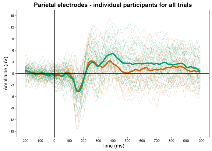
temp <- filter(eegdata, smallarea == "parietal")
temp <- select(temp, smallarea,time, measurement, condition, participant)
temp <- aggregate(measurement ~ smallarea*time*condition*participant, temp,mean)
temp2 <- aggregate(measurement ~ smallarea*time*condition, temp,mean)
temp2$participant <- "Grand Average"
temp2$GA <- "Grand Average"
temp$GA <- "individuals"
temp2 <- select(temp2, smallarea,time, measurement, condition, participant, GA)
temp3 <- rbind(temp, temp2)
temp3$conbypar = paste(temp3$condition, temp3$participant, sep="")

temp3$time <- as.integer(as.character(temp3$time))plot <- ggplot(temp3, aes(x=time, y=measurement,group=conbypar)) +
  geom_line(size=0.3, alpha=0.3, aes(colour=condition))+
  geom_line(data = subset(temp3, GA == "Grand Average"), size=1.5, alpha=1, aes(colour=condition)) +
  scale_colour_manual(values=colours, guide=FALSE)+
  scale_y_continuous(limits=c(-15, 15), breaks=seq(-15,15,by=3))+
  scale_x_continuous(limits=c(-200,1000),breaks=seq(-200,1000,by=100),labels=c("-200", "-100","0","100","200","300","400","500","600","700","800","900","1000"))+
  ggtitle("Parietal electrodes - individual participants for all trials")+
  ylab("Amplitude (µV)")+
  xlab("Time (ms)")+
  theme_few() +
  geom_vline(xintercept=0) +
  geom_hline(yintercept=0)plot+   theme(plot.title=  element_text( face="bold"),
              axis.text = element_text(size=8))
Created by Pretty R at inside-R.org

temp <- filter(eegdata, smallarea == "parietal")
temp <- select(temp, smallarea,time, measurement, condition, participant)
temp <- aggregate(measurement ~ smallarea*time*condition*participant, temp,mean)
temp2 <- aggregate(measurement ~ smallarea*time*condition, temp,mean)
temp2$participant <- "Grand Average"
temp2$GA <- "Grand Average"
temp$GA <- "individuals"
temp2 <- select(temp2, smallarea,time, measurement, condition, participant, GA)
temp3 <- rbind(temp, temp2)
temp3$conbypar = paste(temp3$condition, temp3$participant, sep="")


temp4 <- spread(temp2, condition, measurement) # unmelt to create diffwave calculation
temp5 <- spread(temp, condition, measurement)

temp4$diffwave <- temp4$real - temp4$opposite
temp5$diffwave <- temp5$real - temp5$opposite

temp6 <- rbind(temp4, temp5)
temp6$conbypar = paste(temp6$condition, temp6$participant, sep="")

temp6$sig <- ifelse(temp6$time %in% c(320:784), "yes", "no")

temp6$time <- as.integer(as.character(temp6$time))
sigcolours <- c("#D55E00", "#D55E00", "#009E73")plot <- ggplot(temp6, aes(x=time, y=diffwave,group=conbypar)) +
  geom_line(size=0.3, alpha=0.3)+
  geom_line(data = subset(temp6, GA == "Grand Average"), size=2, alpha=1, aes(colour=sig)) +
  scale_colour_manual(values=sigcolours, guide=FALSE)+
  scale_y_continuous(limits=c(-16, 16), breaks=seq(-16,16,by=2))+
  scale_x_continuous(limits=c(-200,1000),breaks=seq(-200,1000,by=100),labels=c("-200", "-100","0","100","200","300","400","500","600","700","800","900","1000"))+
  ggtitle("Parietal electrodes - difference wave and individual difference waves")+
  ylab("Amplitude (µV)")+
  xlab("Time (ms)")+
  theme_few() +
  geom_vline(xintercept=0) +
  geom_hline(yintercept=0)plot+   theme(plot.title=  element_text( face="bold"),
              axis.text = element_text(size=8))
Created by Pretty R at inside-R.org

for (i in 1:length(temp6$time)){
  something <- subset(temp6,time==temp6$time[i], select=diffwave)
  SD[i] = sd(something$diffwave)
  SE[i] = std(something$diffwave)
  SDupper[i] = temp6$diffwave[i] + SD[i]
  SDlower[i] = temp6$diffwave[i] - SD[i]
  SEupper[i] = temp6$diffwave[i] + SE[i]
  SElower[i] = temp6$diffwave[i] - SE[i]
  CIupper[i] = temp6$diffwave[i] + (SE[i] * 1.96)
  CIlower[i] = temp6$diffwave[i] - (SE[i] * 1.96)

}

temp6$CIL <- CIlower
temp6$CIU <- CIupper

temp6$sig <- ifelse(temp6$time %in% c(320:784), "yes",ifelse(temp6$time %in% c(-200:318), "no1",
                           "no2"))

temp6$time <- as.integer(as.character(temp6$time))
sigcolours <- c("#D55E00", "#D55E00", "#009E73")plot <- ggplot(temp6, aes(x=time, y=diffwave,group=conbypar)) +
  geom_line(size=0.3, alpha=0.3)+
  geom_line(data = subset(temp6, GA == "Grand Average"), size=2, alpha=1, aes(colour=sig)) +
  scale_colour_manual(values=sigcolours, guide=FALSE)+
  scale_y_continuous(limits=c(-16, 16), breaks=seq(-16,16,by=2))+
  scale_x_continuous(limits=c(-200,1000),breaks=seq(-200,1000,by=100),labels=c("-200", "-100","0","100","200","300","400","500","600","700","800","900","1000"))+
  ggtitle("Parietal electrodes - difference wave and individual difference waves")+
  ylab("Amplitude (µV)")+
  xlab("Time (ms)")+
  theme_few() +
  geom_vline(xintercept=0) +
  geom_hline(yintercept=0)plot+   theme(plot.title=  element_text( face="bold"),
              axis.text = element_text(size=8))plot+ theme(plot.title=  element_text( face="bold"), axis.text = element_text(size=8)) +
  geom_smooth(data = subset(temp6, GA == "Grand Average"), linetype=0, aes(ymin = CIL, ymax = CIU,group=sig, fill=sig), stat="identity", alpha = 0.5) + #95% CIs
  scale_fill_manual(values=sigcolours, guide=FALSE)

Pingback: Data Visualization – the Why and How – CogTales