I’m not proud to admit it. I was recently in a pub and pulled out my phone to calculate the area of a set of pizzas we were ordering. There were two sizes of pizza on the menu – 12″ and 18″, for £12 and £18 each – and my group were going to order five 12″ pizzas.
I couldn’t let that slide.
“Nah, let’s get three 18″ pizzas instead”, I said. “More pizza, less money.”
Intuitively, it feels wrong. Yes, an 18″ pizza is bigger, but surely five 12″ pizzas are more than only three 18″ pizzas? This is when I worked out the total area of the pizzas and their price per square inch, and for the record, buying three 18″ pizzas at £18 gets you 763 sq inch of pizza for £54, whereas buying five 12″ pizzas at £12 gets you 566 sq inch of pizza for £60. We bought the big ones.
This got me thinking about how to visualise this in Tableau, and I created the following handy dashboard for settling your pub pizza problems (click here for desktop version, or here for mobile version):

This was a fun one to build, not least because there’s basically no underlying data. I knew I wanted the inputs for the calculations to depend entirely on parameters, so all I needed was the names of the two pizzas. This is the spreadsheet I created:

Simple.
The next thing was to create three parameters per pizza; diameter, price, and quantity. The values entered here can be passed to the data with a case statement, e.g.:

…or directly within a formula:

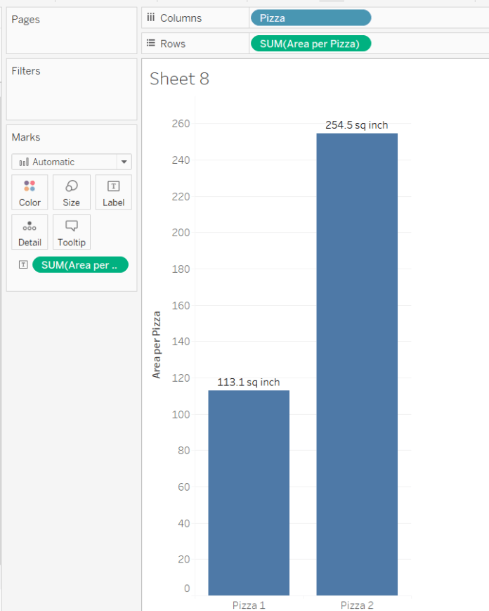
Things were starting to get complicated, so I built out a table to make sure the numbers were working properly:

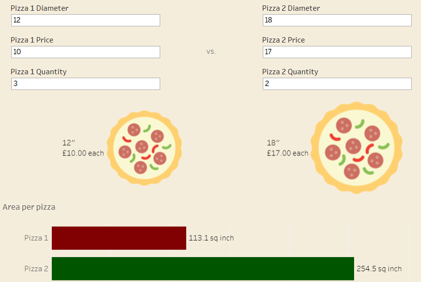
From here on out, it was relatively straightforward. It’s really hard to accurately judge area when looking at circles and squares (which is one of the reasons I hate packed bubbles and tree maps), so I started out by visualising the pizzas as actual circles vs. bar graphs.
This makes the two pizzas look relatively similar in size:

…whereas this shows that one of them is more than double the other:
One useful little trick I found was to create a calculated field to place the two pizza icons in specific places:
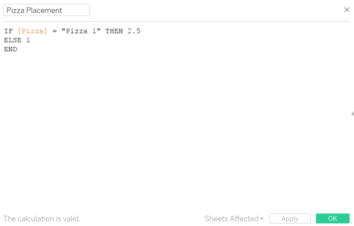
This spaced them out nicely rather than piling them on top of each other or putting them side by side and too close together:

The most fiddly bit was creating the text summary. I dragged a lot of calculated string fields onto the label shelf, and configured it like this:
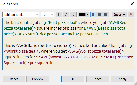
And an example of some of the fields going into making a sentence which automatically updates is the best pizza deal field here:

I really enjoyed playing around with this viz. People who use Tableau often talk about liberating your data, but this was a nice exercise in what’s possible with basically no data at all!