

I’ve had an issue this week which has taken a couple of hours to figure out. Sometimes, the command buttons showed up on the tooltips, but sometimes they didn’t. The short answer is that you have to make sure that the detail card is identical across measures, even if it seems redundant.
Here’s how it works. My client wanted a dashboard which shows a time series of points and a distribution of a certain measure, which is controlled by a parameter to select an individual measure. I’ve mocked this up in Superstore with sales per country. In the time series sheet, I want every single value to show, so I’ve put Country Sales on as a dimension rather than an aggregated measure (but it would also work if you had a Row ID dimension and put that on detail).


I also added a highlight action so that clicking a bar in the distribution would highlight all the points in the time series in that range, and vice versa. To do this, add Country Sales (bin) to detail on the time series sheet, and add a highlight action as follows:


…and there we go, the dashboard highlights nicely:

“Great!”, said my client. “But, hey, can we have it so we can compare two measures on a dual axis?”
Of course. I added a second calculated field for a second country, created a second distribution sheet, and added the Country 2 Sales (bin) to the Country 2 Sales detail to make sure the highlighting action worked.


“Hold up a sec”, said my client. “I can’t keep only or exclude certain values anymore. Could you sort that out?”
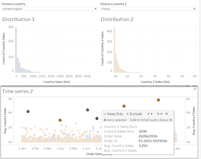
Odd one. The functionality was working fine on the single axis dashboard…

…but, on the dual axis dashboard, no dice. WTF? Where’s The Functionality?

After a couple of hours of fiddling around, my colleague Beth and I figured it out.
Firstly, the measures in the view have to be aggregated for the command button tools to show up. It seems that Tableau can cope with excluding/keeping only selected values for a single axis dimension, but can’t handle two dual axis dimensions. So, make them into aggregated measures (which will aggregate data points together) and then separate them out by putting Order ID (or better still, a Row ID measure) on dimension.
Secondly, remember how I put Country Sales (bin) on the Country Sales detail and Country 2 Sales (bin) on the Country 2 Sales detail? It turns out that dual axis measures have to have identical marks cards if you want things like keep only/exclude to apply to them. So, drag Country Sales (bin) and Country 2 Sales (bin) onto detail for All. This feels a bit redundant, because Country Sales (bin) is null for Country 2 Sales data points (and vice versa), but it has to be done.

Now you’ll have the command buttons back in the tooltips:

Wow, superb weblog format! How lengthy have you been running a blog for? you make running a blog look easy. The overall look of your website is excellent, let alone the content!
LikeLike
I am now not positive the place you’re getting your information, but good topic. I needs to spend a while finding out much more or working out more. Thank you for great information I was on the lookout for this information for my mission.
LikeLike