

Are you tired of histograms? Do you look at the count distribution of your actual data points and find yourself thinking, yeah, that’s cool and all, but I wish there was a more abstract way of showing this? Then you’ll probably like violin plots. That’s these things here:
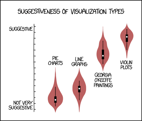
Despite their somewhat sexual connotations, violin plots can be really useful for comparing distributions of data. To be honest, if it mattered that much to me, I’d probably go for a boxplot with overlaid, mostly transparent data points… but hey, people still use these, Tableau doesn’t support them natively, and I haven’t found a full tutorial anywhere (apologies if I’ve missed one – let me know!), so here’s how to make them.
To follow along, you can download the Tableau workbook I used from my Tableau Public page here.
It’s all based around Kernel density estimation. This is maths for “take my data, smooth it out a bit, and make it so I can generalise it to data I haven’t got yet”. You can read more about that here, and I’m going to use the same set of six values used in the Wikipedia example.
Here’s what you’ll need, and here’s one I made earlier:
-
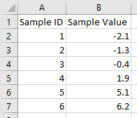
- Your data. One column with one row per observation, one column with one row per observation ID. Something a little like this:
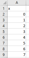
- A handy data scaffold. I’ve used a hundred points, going from zero to 99; if your data has a lot of variance, you might want to whack that up to a thousand, although that’ll make things proper slow. Either way, keep it simple; it should look like this:
- Your data. One column with one row per observation, one column with one row per observation ID. Something a little like this:
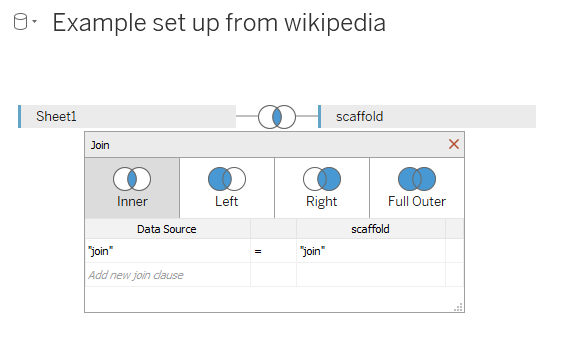
Okay, nice. Stick these into Tableau, and join them with a custom join calculation so that every row in the data joins to every row in the scaffold (i.e. six rows balloons out to 600 rows here; this is why using a 1000 row scaffold isn’t pretty, performance-wise). I normally just type in “join” on both sides:
Also, remember that with a scaffolded dataset, simply summing your values will just multiply the value you actually want by a hundred. Watch out for that.
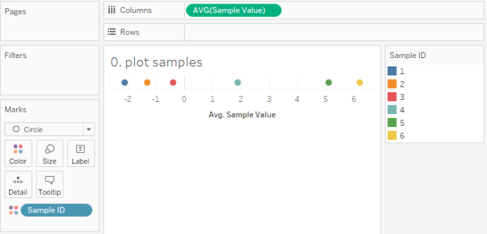
Okay, we’ve got our data; let’s plot the sample values we want to create a violin plot of.
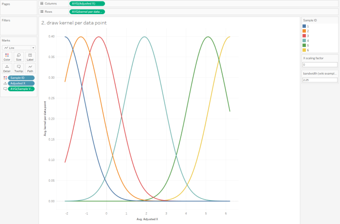
What we need to do is draw a kernel around each data point, like this (but better):
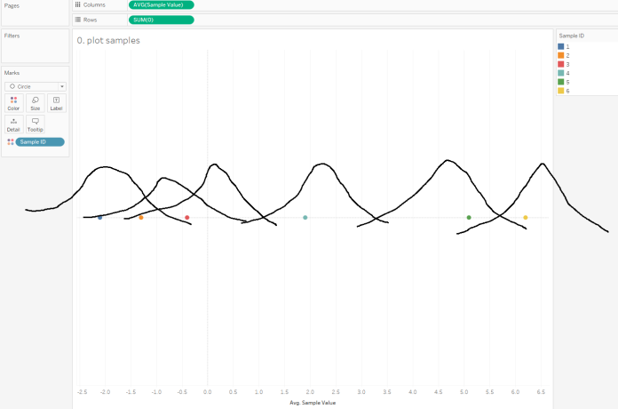
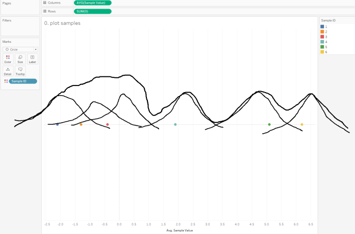
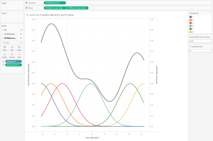
…and add up the y-axis values of those kernels to create the overall kernel density, like this (but a lot better):
This is why we need the data scaffold; you can’t draw a kernel with one point, so we need a hundred points for each point.
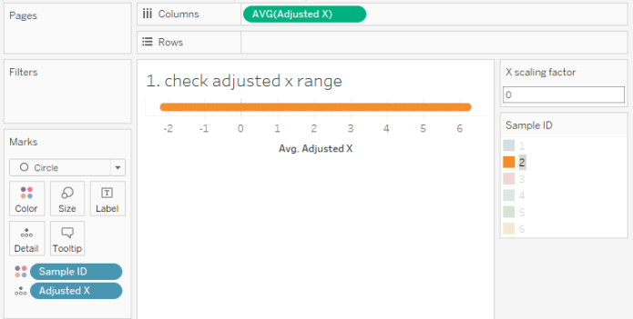
The first thing to do is to create an adjusted x-axis. We want the hundred points for each data point to range from the lowest to the highest value. You can do that like this (ignore the bandwidth part for now):
IF [X] = 0 THEN {MIN([Sample Value])} - [X scaling factor]

ELSEIF [X] = 99 THEN {MAX([Sample Value])} + [X scaling factor]

ELSE

({MIN([Sample Value])} - [X scaling factor]) +

(

ABS(

({MAX([Sample Value])}+[X scaling factor]) - ({MIN([Sample Value])}-[X scaling factor])

)

* ([X]/99)

)

END
Alternatively, you can see that there’s no point making the scaffolded points for the values go all the way across the range, so you could fix it on the Sample ID instead. But I found that this had a knock-on effect down the line that I didn’t like, so let’s leave this for now. If you can make it work, I’d love to hear from you.
We’ve now got a set of Adjusted X data points across the range of the data for each data point:
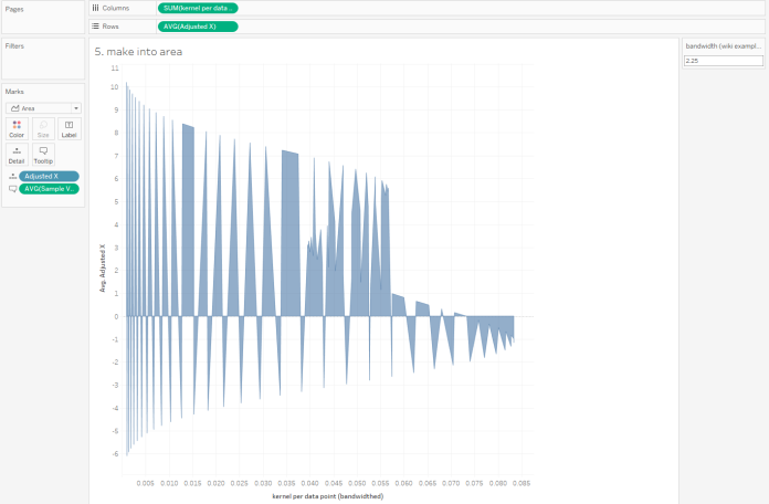
The next step is to stick something on the y-axis so that each point goes up the required amount to draw a kernel around each data point. It’ll end up looking like this:
…and the calculation required to do that is this:
1/({COUNTD([Sample ID])}*[bandwidth (wiki example)])

*

(1/(SQRT(2*PI()))) * EXP(-0.5 * (

([Adjusted X] - [Sample Value])^2)/[bandwidth (wiki example)])
This is done as a normal kernel using the standard normal density function, because that’ll probably do the job well enough for most situations. I’m not going to go into the different types of kernel functions, but you can read about them here, and if a different kernel function tickles your fancy, you can rewrite the (1/(SQRT(2*PI()))) * EXP(-0.5 * ( part of the equation with something else.
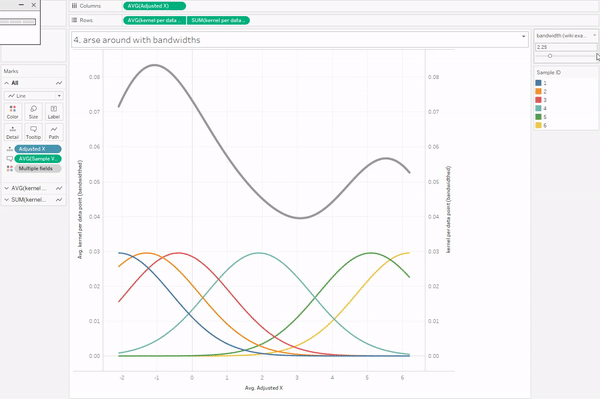
I’m also not going to go into bandwidths, because it’s complicated. There are various proper methods for choosing your bandwidth, but if you play about with it, you’ll see that setting the bandwidth too low doesn’t smooth out the curve enough, and setting the bandwidth too high smooths out the curve too much.
Anyway. To create the kernel density estimation for the data points, we need to sum up the individual kernels. This is the easy part in Tableau; CTRL+drag the same kernel calculation field to rows again, take Sample ID off colour/detail, sum it up, and put it on a synchronised dual axis. Voilà.
This grey curve is half a violin plot on its side. But before we go into how to rotate and fill it, let’s go back to the scaling factor. I’ve kept it at 0 the whole way through, so that the x-axis runs from the smallest data point to the highest data point. That’s fine if you’re showing your actual data, but the whole point of kernel density estimates is to show a probability function… or in other words, “okay this is the data I’ve got, but what if there’s going to be more data like this, where’s it going to go?”. There may well be other values higher than your highest point or lower than your lowest point. So, I created a parameter to mess about with how far the x-axis goes, simply by adding a constant to the highest value and subtracting that same constant from the lowest value. You can adjust it as you see fit; I think setting it to 4 captures this data nicely:
Right. That’s the maths behind a violin plot. Now to actually make one.
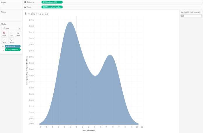
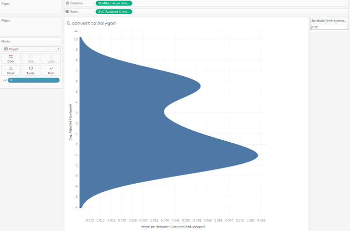
All we need to do is fill it and rotate it. The filling is easy; just convert it from line to area:
…but the rotation messes this right up.
So, we need to redraw it as a polygon. And to do that, we need to redo some of the calculations. Sorry about that.
Firstly, make this change to the Adjusted X calculation:
IF [X] = 0 THEN ({MIN([Sample Value])} - [X scaling factor])

ELSEIF [X] = 1 THEN ({MIN([Sample Value])} - [X scaling factor])

ELSEIF [X] = 99 THEN ({MAX([Sample Value])} + [X scaling factor])

ELSE

({MIN([Sample Value])} - [X scaling factor]) +

(

ABS(

({MAX([Sample Value])}+[X scaling factor]) - ({MIN([Sample Value])}-[X scaling factor])

)

* (([X]-1)/97)

)

END
And now make this change to your kernel calculation:
IF [X] = 0 THEN 0

ELSEIF [X] = 99 THEN 0

ELSE

1/({COUNTD([Sample ID])}*[bandwidth (wiki example)])

*

(1/(SQRT(2*PI()))) * EXP(-0.5  * (

([Adjusted X (polygon)] - [Sample Value])^2)/[bandwidth (wiki example)])

END
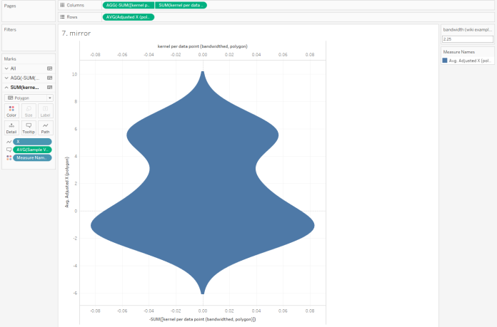
That should do the trick. If you’re using a bigger scaffold, remember to update the 99 to 999 and the 97 to 997! Now you can plot your polygon like this:
And if you repeat the kernel calculation, whack a minus on the front of it, and dual axis it, you can make a nice violin:
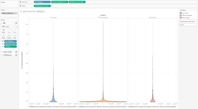
These violins take a lot of formatting to make, and it’s an absolute faff to compare two separate distributions. And the LODs for finding the max and min values in the data will require you to add in a FIXED for any dimension you want in the view. They’ll also screw up filters, unless you put them in context. It is possible, though; here’s an unformatted set of violins for Sales in each Category in California using Tableau’s Superstore dataset. With some a fair bit of tidying, this could look pretty good:
Again, it’s not an ideal way of showing the distributions, and hopefully Tableau introduce violin plots in the same way as boxplots in a later version. But for now, this is how you’d do it if you really wanted one.

Pingback: Understanding and making violin plot in Tableau - The Data School