

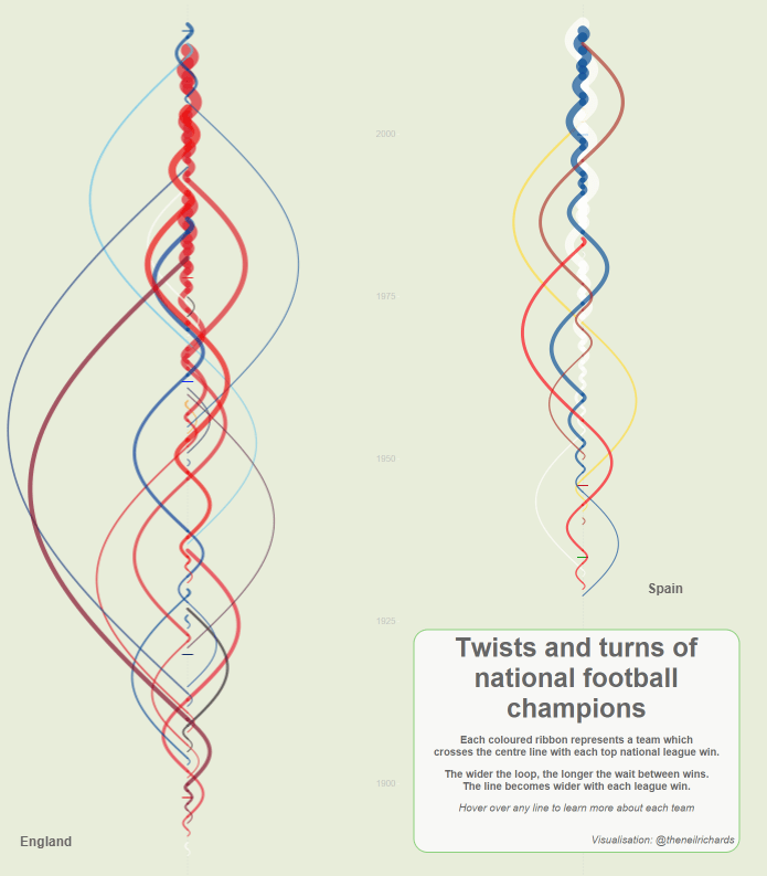
Browsing what other people have done on Tableau Public is a great source of both challenge and inspiration. Recently, I’ve been really taken with Neil Richards’ visualisation of football league winners over time, with a beautiful sine wave showing how long it’s been since each team last won the league. I’ve no idea what to call these plots, but they’re fantastic (click image to see Neil’s original on Tableau Public).
I’ve wanted to take these apart and see how they work for a while, and finally got round to it the other day. It turns out that Neil did a lot of the angle calculations outside Tableau, which is fair enough… so I set myself the challenge of doing it all with table calculations. I got there eventually, but it was a good workout.
[to skip the explanation and just download the workbook I’ve made, click here]
This blog is a walk-through of how to do it. Instead of football data, I’ve used official pope names; I was on a wikipedia spiral and noticed that seven of the eleven popes between 1775 and 1958 were called Pius, taking the Pius count from VI to XII. Naturally this reminded me of Barcelona’s recent league dominance, winning six of the last nine La Liga championships, so it seemed obvious to see if the chart for pope names would be similarly tightly woven.
So. This is all the input data you’ll need: a list of all popes, in order, with a record ID and a number showing how many of that name there’s been so far:

Come to think of it, if you’re good with INDEX() calcs, you might not even need the PopeNameNo column… but I’m not, so I do.
You’ll also need a simple scaffold sheet with 100 points, going from 0 to 99. If you’re trying to visualise something with more data points than the 267 popes I’ve got, you might want to whack up the scaffold to 999 instead.

[I’m including the elected-but-not-consecrated Stephen II in this list, because even though he’s not an official pope, all the subsequent Stephens had an increased number until relatively recently, and then it got confusing. So he’s in here.]
Read the two files into Tableau, and create a calculated join with “x” in the join field for the popes data, so that there are 100 points for each pope. Now we’re ready to do some vizzical jiggery-popery!
Although Neil’s vizzes had time on a y-axis going vertically, I’ve spent way too long looking at time series graphs for that to feel intuitive, so I’m reverting to the vanilla “time on x-axis going left” approach. Let’s stick Pope ID on the x-axis as a continuous dimension:

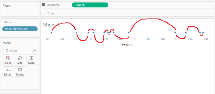
Great, we’ve got a line made up of lots of circles. This doesn’t make it easy to see what’s going on, so let’s filter to a single pope name – Leo will do for now:

Here’s all the Leos, in order. It was a fairly popular (pope-ular?) pope name in the later part of the first millenium, but then it fell out of favour for a while, with almost 500 years between Leo IX in 1054 and Leo X in 1513.
We want to connect these dots with a line, but if we set the mark type to line, it’ll just be a straight line. Rather, we want a curved line, like this:
This is why we’ve got the scaffold table. We can’t just connect two points with a curvy line – or at least, I can’t. Instead, we need to put a load of dots between the two main points, and connect them up. That means figuring out the x and y axis values to put those dots in the right place to connect the two main points with a nice sine wave.
To do that, we’ll need to create a new x-axis measure instead of simply Pope ID, where the distance (in units of popes) is divided by up so that the scaffold points are evenly distributed along the x-axis. But first, that means calculating the distance between popes in units of popes. We can do that with a lookup() calculation:
LOOKUP(ATTR([Pope ID]), 1)

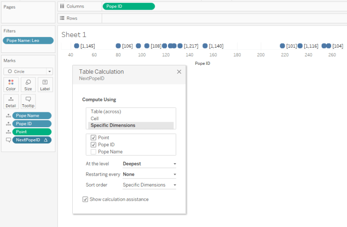
This is working nicely – I’ve stuck it on the tooltip, and hovering over Leo IX, who’s pope number 153 in my list, tells me that the next Leo is pope number 218.
This’ll work fine for this filtered view, but to get it to do this properly, you’ll need to put the Point field from the scaffold table on detail, and edit the table calculation to compute using Point and Pope ID:
At the moment, all those points are on top of each other on the Pope ID value. This isn’t what we want – we want to spread them out evenly between the Pope ID values. To do that, we’ll need this calculation here. It’s a bit long, and there’s MIN() functions everywhere because of all the table calculations, but hey:
Logically, what it’s doing is this:
- There are 100 scaffolding points, going from 0 to 99.
- If it’s the first one, i.e. 0, give it the same value as Pope ID. For the Leo IX to Leo X example, this is 153.
- If it’s the last one, give it the same value as the next Pope ID with the same name. For the Leo IX to Leo X example, this is 218.
- If it’s any of the rest, calculate the difference between the two Pope ID values (i.e. 218 – 153, which is 65 pope units), and then divide that by the maximum point value, which is 99 (if you made your scaffold points 1-100 instead, you’ll have to set this to maximum point value -1, not 100). This is because there’s 99 spaces to fill between all the scaffold points. Then multiply that fraction by the number of the point, and add it to the Pope ID value.
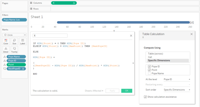
You can also copy and paste it directly from here if that makes it easier:
IF MIN([Point]) = 0 THEN MIN([Pope ID])

ELSEIF MIN([Point]) = MIN([MaxPoint]) THEN [NextPopeID]

ELSE

MIN([Pope ID]) +

(

([NextPopeID] - MIN([Pope ID])) / MIN([MaxPoint]) * MIN([Point])

)

END
Grand. Set the new x-axis value to calculate using Pope ID and Point, restarting every Pope ID, and that’s the x-axis sorted. But these points are still basically just calculating a straight line, whereas what we actually need to do is push them up the y-axis by a different amount, kind of like this:

Let’s also add a direction calculation, so that the wave between the first and second goes upwards, the wave between the second and third goes downwards, and so on. We can do that by working out whether it’s an odd or even number, and setting the direction accordingly:
IF INT([Pope Name No] % 2) = 0 THEN -1 ELSE 1 END
Now let’s work on our y-axis calculation. It’s got three parts:
- Working out a nice sinusoidal curve
- Multiplying that value by how long it’s been between popes, so that the longer it is between popes, the higher the curve goes
- Multiplying that by the distance calculation so that it goes above or below the x-axis accordingly
The first phase of a sine wave goes from 0 on the y-axis, up to a peak of 1, and then back down to 0 between the x-axis values of 0 and π, like so:
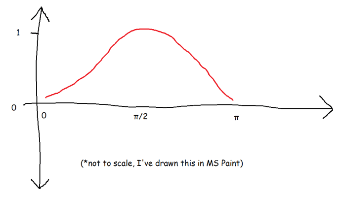
In our case, we don’t want a wave between 0 pope units and 3.141… pope units; rather, we want to define the beginning and end of this phase of a sine wave to be between one pope and the next pope of the same name. So, for Leo IX to Leo X, we want 153 to be our 0 and 218 to be our π. That means taking the scaffold point, dividing it by the maximum point of 99 to get the % of the distance that that point is along the 0-to-π scale, and then multiply it by π.
That’ll give us the first phase of a sine wave of the same height (of 1) between the popes, regardless of how long it’s been between them. We want the peak to be higher the longer it’s been between popes, so we multiply it by the distance. Then we can multiply by our positive/negative direction calc. Here’s the code:
MIN(SIN([Point]/[MaxPoint] * PI()))

*

([NextPopeID] - MIN([Pope ID]))

*

MIN([Direction])
So, stick the y-axis calc on rows, set the table calculation to calculate using Pope and Pope ID, and voila! We have a nice set of sine waves between our Leos.

(this plot reminds me of doing Fourier transformations for EEG analysis; technically, we haven’t created this complex wave by layering up different sine waves on top of each other, but we can kind of decompose it into sets of individual sine waves as we go along)
The hard work is done now, so let’s bring the rest of our popes back in:
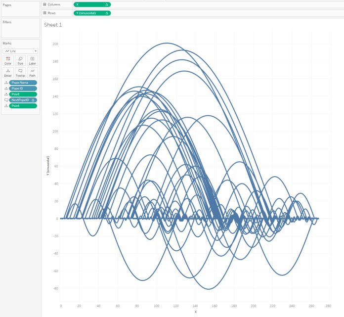
Delightful. The rest of it is all about making it pretty, which I can leave to your personal tastes. But the real question is: what happens with Pius, the Barcelona of second millenium popes? Can we clearly see the era of Pius dominance?
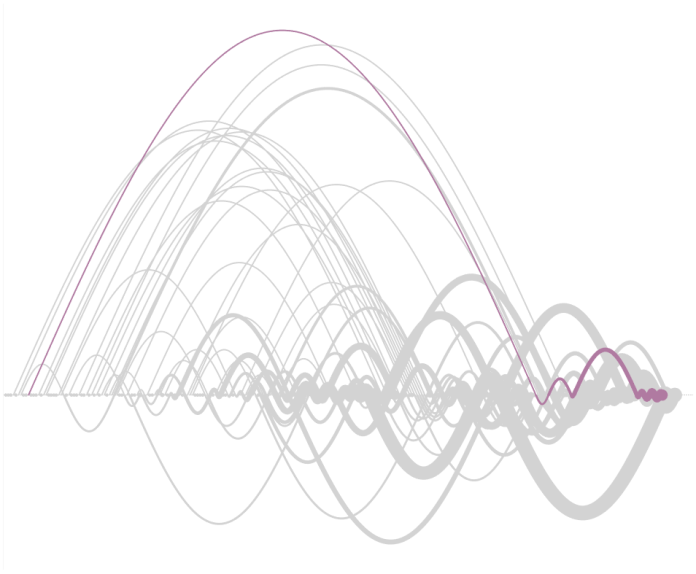
…yes, we can.
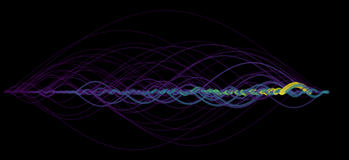
These graphs can be applied to basically anything that goes in a sequential order and may or may not have repeated values; this graph here is every word from my old band’s EP in order. I like how you can see where the choruses are, because the lines get more tightly woven as the words in the chorus are repeated more often.
I hope this blog makes it clear how to make these graphs! I still don’t know what to call them, but in my head they’re unimaginatively down as sine wave time series. Thanks again to Neil for creating them first, and for making his workbooks downloadable and play-around-withable!
