
I haven’t always been a fan of connected scatterplots, but I’m gradually coming round to them. First it was with centre of gravity maps; now it’s as a replacement for (some) area charts and bars.
I came across a chart a lot like this at work this week:

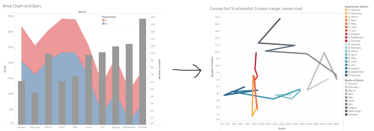
I’ve mocked it up using some fake data, but it’s pretty much showing how two departments (or groups, or types of things, or categories) do in terms of profit (or another measure) over the year, and how many orders (or another measure again) there were in each month across both groups.
I’m not a fan of the area chart plus bars over the top approach. Firstly, the bars obscure what’s going on with the area chart underneath them, and secondly, area charts can be misleading as it’s hard to parse each thing separately.
Let’s show the same information with a connected scatterplot:
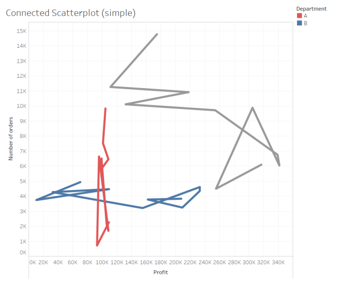
Here, the red and blue lines show the two departments, and the grey line shows the aggregated number of orders and profit. Instantly, the difference between the two departments is a lot clearer; department A has had a lot of variation in number of orders but profit has stayed pretty consistent, while department B has had a lot of variation in profit but the number of orders has stayed consistent.
The lines are joined up by month… but as it is, it’s impossible to tell where the year begins and ends, which makes the whole thing pretty pointless. Let’s show time with size:

The lines get thicker as the month gets more recent, and now it’s easy to see the trends over the year. The variation in orders in department A is all over the place, but the variation in profit in department B is a bit more consistent; profit has gone down over the year. We can also see the aggregate profit and order trends much more clearly on the grey line, with orders going up but profit going down.
The downside of using line size to show time trends is that the thinner parts are hard to see and the thicker parts can be hard to parse. Let’s try it with colour instead:

I personally prefer this approach to using line size, but it’s also a bit of a faff. Tableau doesn’t like it if you try to do a three-way colour split by dimension (i.e. red, blue, and grey) and then change the shade of the colour by a measure, so you have to convert the month to discrete and make sure to order everything correctly. It’s not too taxing though, so it’s worth it if the data doesn’t change all the time.
Finally, you can go the whole hog and do some double encoding with both colour and size on the line to show time:
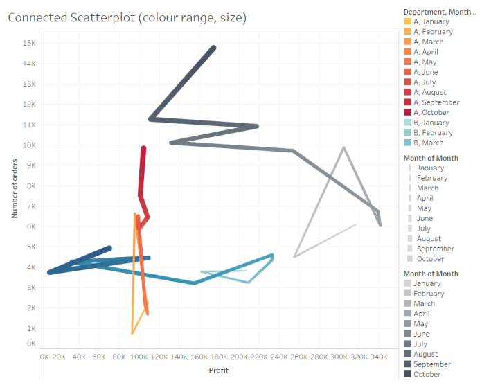
This is eye-catching, but possibly to the point where it’s more distracting than informative.
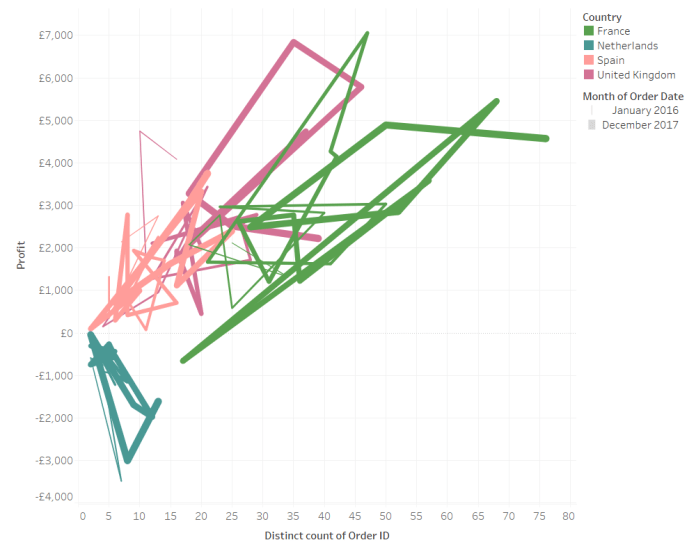
I like the connected scatterplots in this example, although there are many situations where the lines will overlap in a way that won’t tell you much. It certainly won’t work well with lots of different departments; here’s the mess you get if you look at all countries in EU Superstore for all months of all years:

Even when filtering to four countries and two years of data, it’s not the clearest way of showing things:
In summary, then, give a connected scatterplot a go. It may well not work, but sometimes it’ll result in something a lot clearer and more informative than a combined area/bar chart.
