

Andy Kriebel wrote a great tutorial on how to make small multiples charts in Tableau here. It works pretty much all the time… but you’ll also find that if you simply copy and paste the calculations, it might not work with your data.
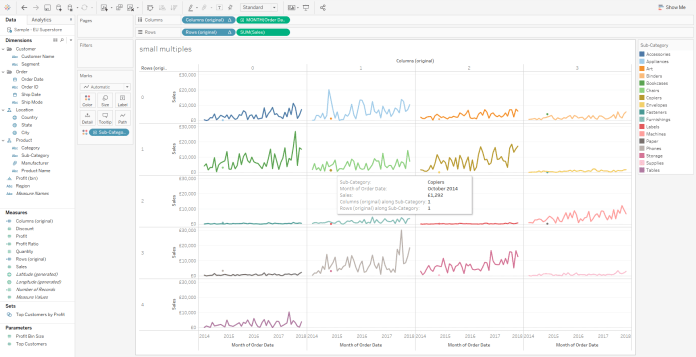
For example, have a look at Superstore here. I’m plotting sum of Sales for each continuous month per product subcategory. The rows and columns calculations split up the view nicely into a line for each subcategory, which is good:

But look closely, and you’ll see some weird stuff going on; there’s a brown-ish dot for subcategory = Copiers and month = October 2014 in the Chairs section (second row, second from left):
What’s going on there?
It turns out that the rows and columns calculations can’t handle nulls in the underlying dataset. I haven’t dived into this fully, but I’m guessing this is because the index calculation works depending on what’s in the view, rather than being fixed on all the subcategories and months regardless of whether there’s data or not.
In this case, what happens is that the October 2014 missing data for one one category – Accessories – shunts everything else up one; the Appliances value turns up in the Accessories small multiple, the Art value turns up in the Appliances small multiple, and so on. The same thing would happen in March 2014 if there was another subcategory after Tables too.
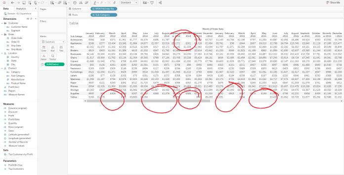
You’ll see that if you switch to calculating using quarters instead of months, this problem disappears completely.
Andy’s calculations are great because they’re really flexible, and they’ll work fine without much further adjustment most of the time. But if you get issues with null data like this, you can try this alternative instead.
With these calculations, I’m going to hardcode the small multiples by whatever thing you’re splitting up the view by. That means that you’d have to create separate fields for every dimension you’d ever want to do it by, which is extra work, but it does take care of the nulls issue.
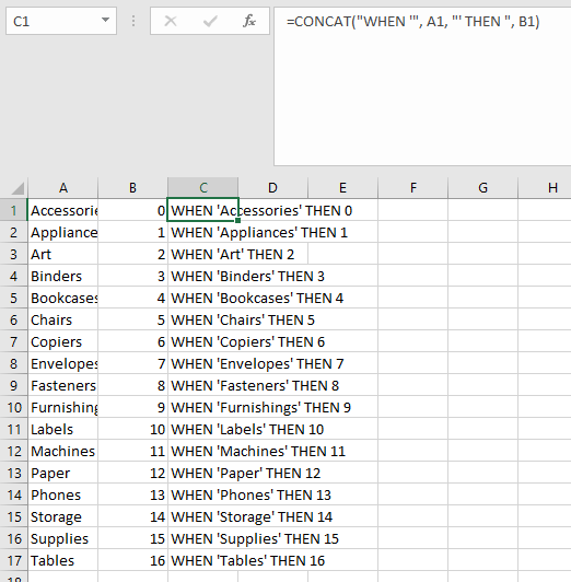
First, create a calculation called Number (or Subcategory ID, or Steve, or whatever suits you). This is a case statement which assigns a number from 0 to N-1 for a particular dimension.
CASE [Sub-Category]

WHEN 'Accessories' THEN 0

WHEN 'Appliances' THEN 1

WHEN 'Art' THEN 2

WHEN 'Binders' THEN 3

WHEN 'Bookcases' THEN 4

WHEN 'Chairs' THEN 5

WHEN 'Copiers' THEN 6

WHEN 'Envelopes' THEN 7

WHEN 'Fasteners' THEN 8

WHEN 'Furnishings' THEN 9

WHEN 'Labels' THEN 10

WHEN 'Machines' THEN 11

WHEN 'Paper' THEN 12

WHEN 'Phones' THEN 13

WHEN 'Storage' THEN 14

WHEN 'Supplies' THEN 15

WHEN 'Tables' THEN 16

END
Typing all that out is quite a faff, so I generate that text with a concat function in Excel like this:
Now create a calc called Columns with the modulo function like this:
[Number] % 4
And then create a calc called Rows by dividing and rounding like this:
INT ([Number] / 4)
It’s crucial that you use the same constant each time! I’ve used 4 because that’ll give me 4 columns across the top, meaning that the 17 subcategories in superstore will be split over four rows of four columns and a fifth row with one column, exactly like Andy’s small multiples do. If you want to do it another way, you could use 3 instead. That would give you five rows of three columns and a sixth row of two columns. There’s a lot of playing around with the configuration, but it’s also more flexible in terms of the configuration you want to plot.
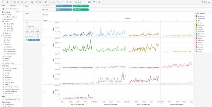
Now that you’ve got these row and column calcs, you can drag them into the view like this, and generate small multiples which work even with null data:
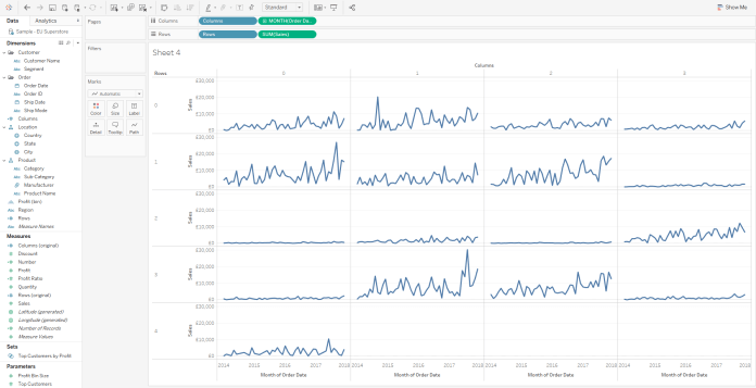
Just to make sure, let’s colour code it by subcategory too. No differently coloured dots in the wrong places anymore!
Another advantage of this approach is that you can colour the graphs by another field. You can do that with Andy’s calcs too, but you have to be careful about how the table calcs work and what they’re using to compute the calculations. Because my calcs don’t have index() in them, there’s no table calc issues to worry about. Just drag and drop.


Pingback: Creating a Small Multiples Chart of Energy Usage – datavis.blog
Pingback: Soccer Shot Map Small Multiples – CJ Mayes