

I haven’t written a blog in far too long. My bad. So, to get back into the swing of things, here’s something I’ve been playing with this week: centre of gravity plots.
It started with an accident. I had some EU member data, and I was simply trying to make a filled map based on the year each country joined, just to see if it was worth plotting. You know, something like this:
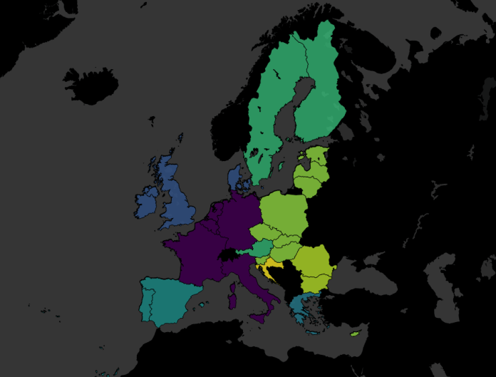
Except that I’d been having a clumsy day (the kind of day where I spilled coffee on my desk, twice), and accidentally missed the filled map option and clicked line instead:

Now, I normally don’t like connected scatterplots, but realised that I could change a couple of things to this accident to make quite a nice connected scatterplot on a map, joining up the central latitude and longitude of each country, so I thought I’d follow through with it and see what happened.
(by the way, the colour palette I use is the Viridis Palette, which I absolutely love. You can find the text to copy/paste into your Tableau preferences file here)
Firstly, I changed my “year joined” field from a discrete dimension into a continuous measure so that I could make it a continuous line with AVG(Year joined):
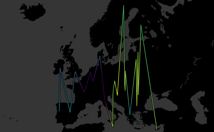
This connects all the countries by their central latitude and longitude as generated by Tableau, but it joins them up in order from left to right on the map. So, I then added AVG(Year joined) to the path shelf as well, which means that each country is joined in chronological order, or in alphabetical order when there’s a tie (as with Belgium, France, Germany, Italy, Luxembourg, and the Netherlands, who formed the EU in 1958):

I was pretty happy with this; it shows the EU’s expansion eastwards over time far, far better than the filled map did.
I got talking to Mark and Neil online, who introduced me to the idea of “centre of gravity” plots, which show the average latitude and longitude of something and how it changes with respect to something else (usually time). In this case, a centre of gravity plot of the EU would show the average central point of Belgium, France, Germany, Italy, Luxembourg, and the Netherlands in 1958, then the average central point of Belgium, France, Germany, Italy, Luxembourg, the Netherlands, Denmark, Ireland, and the UK in 1973… and so on. I figured it should be easy enough, I’d just take Country off detail, replace it with Year joined, and average the latitudes and longitudes together.
Sadly, it doesn’t work that way. The Latitude (generated) and Longitude (generated) fields that Tableau automatically generates when it detects a geographic field like country can’t be aggregated, and can’t be used if the geographic field they’re based on isn’t in the view. That meant I couldn’t average the latitudes and longitudes over multiple countries without creating lots of different groups.
But, there’s a simple way around this! You can create a text table of the latlongs, copy/paste them into Excel or whatever, then read that in as another data source. Firstly, drag your geographic field into the view, and put the latitude on text, like so:
Then copy and paste it all (I just click on there randomly, hit ctrl+A, ctrl+C, switch to Excel, ctrl-V). Now do the same for the longitude. Save the document, and read it in as a separate data source in Tableau. Now you can blend the data on Country, or whatever your geographic field is, and you’ve got actual latlongs that you can use like proper measures.
And so I did. I recreated the line chart with the new fields, but took Country off detail, and made AVG(Latitude) and AVG(Longitude) into moving average table calculations which take the current value and an arbitrarily high number of previous values (I put in 100, just because). This looked pretty good:

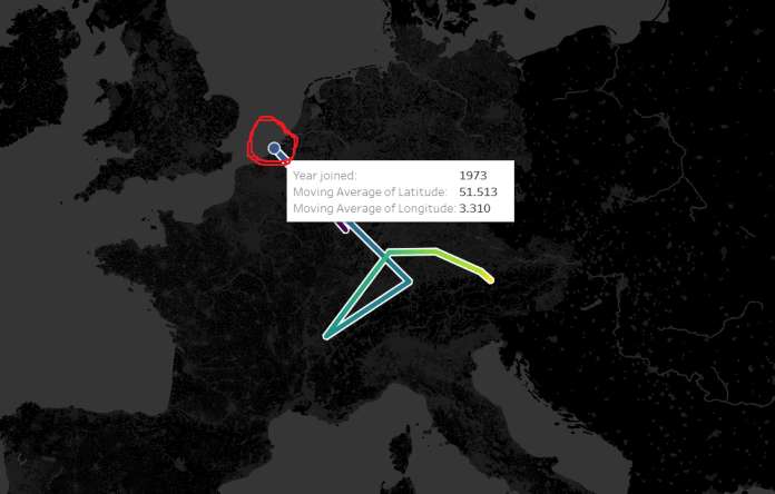
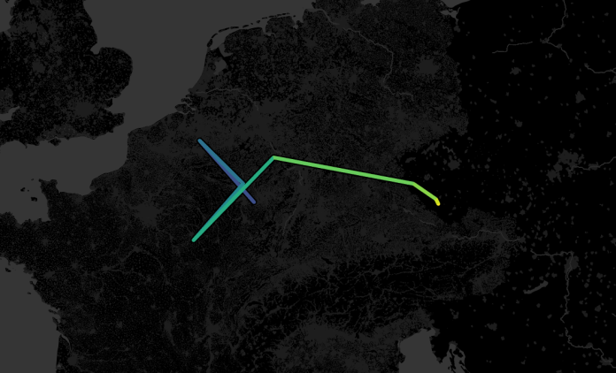
…but then I realised that it wasn’t accurate data. Look at the point for 1973, after the UK, Ireland, and Denmark joined. Doesn’t that seem a little far north?
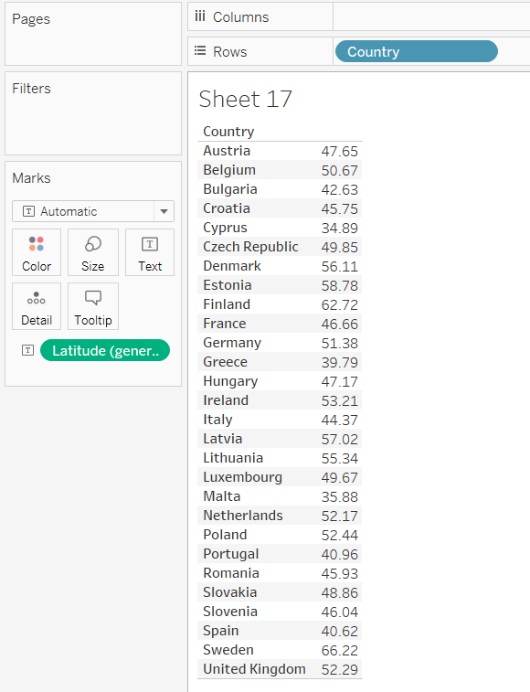
To investigate it fully, I duplicated the sheet as a crosstab, because sometimes, tables are the best way to go. What I found is that I’ve got a bit of Simpson’s Paradox going on; the calculation is taking averages of averages:

Not so great. If we add Country to the view after the Year joined pill, you can see what it should be:

But the problem is, how do we put Country on detail but then get the moving average to ignore it? I tried various LODs, but couldn’t get it to work exactly – if you have a solution, I would love to hear it! My default approach is to try to restructure the data in Alteryx – because that generally solves everything – but I feel like I’m becoming too reliant on restructuring the data rather than working with what Tableau can do.
Anyway, I ended up restructuring the data by generating a row for each country and year that the country has been a member of the EU. That means I can create a data table like this:

…which removes the need for a moving average calculation entirely, because the entire data is moving with the year instead. Just take country off detail / out of the view, and you get the right averages:

Much more accurate:
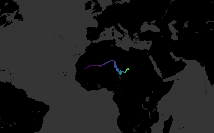
This is a better way of structuring the data for this particular instance, because the dataset is tiny; 28 countries, 60-ish years, 913 rows in my Excel file. It’s not going to be a good, sustainable solution for a centre of gravity plot over a much bigger dataset though. I did the same thing for the UN – 193 countries, 70-ish years – and ended up with 10,045 rows in my Excel file. It’s easy to see how this could explode with much more data.
It does look interesting, though; I’d never have guessed that the UN’s centre of gravity hadn’t really left the Sahara since its inception:
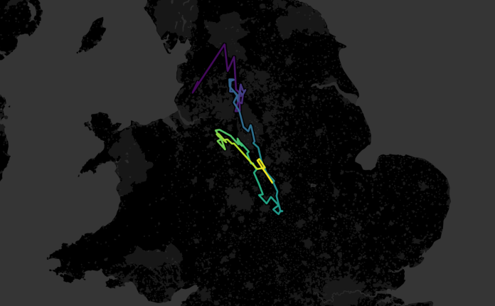
Finally, since I was on a roll, I plotted the centre of gravity for the English football champions since the first ever professional season in 1888-89. Conceptually, this was slightly different; unlike the EU and the UN, the champion isn’t a group of teams constantly joining over the years (although it is possible to plot that too). Rather, I wanted to create a rolling average of the centre of gravity over the last N years. If you set it to five years, it’s a bit messy, moving around the country quite a lot:

But if you set it to 20 years, the line tells a nice story. You can see how English football started out with the original northern teams being the most powerful, then it moves south after the Second World War, then it moves north-west during the Liverpool/Manchester era of domination, and finally it’s moving south again more recently:
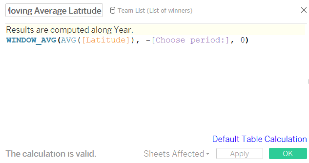
Many thanks to Ian, who showed me how to parameterise this. Firstly, put your hard-coded (i.e. not Tableau generated!) latitude or longitude field in the view, and create a moving average over the last ten years. Or two, or thirteen, or ninety-eight, it doesn’t really matter. Next, drag the moving average latitude/longitude pill from the rows/columns into the measures pane in order to store it. This creates a calculated field. Meanwhile, create a parameter to let you select a number. This will change the period to calculate the moving average over. Open up the new calculated fields, and replace the number ten/two/thirteen/ninety-eight with your newly-created parameter, remembering to leave the minus sign in front of it:
This will let you parameterise your moving average centre of gravity.
It was a lot of fun to play around with these maps this week. I’ve packaged them all up in a Tableau Public workbook here; I hope you find it as interesting as I did!
(title inspiration: Touché Amoré – Gravity, Metaphorically)

Pingback: How to give your area and bar charts a makeover with connected scatterplots | Vizzee Rascal