Beer, data visualisation

South London IPAs, objectively ranked for science

Introduction

A little over a year ago, I sat in a park with some friends on a hot day and scientifically proved that Fosters isn’t actually that bad.

After that, we figured we should probably do the same thing with genuinely good beers. But this throws up all sorts of complications, like, what’s a genuinely good beer, and what about accounting for different tastes and styles, and what if I found out that I only like a beer because the can design is pretty? The stakes were much, much higher this time.

So, we went for the corner shop tinnie equivalent of the indie beer world – the standard IPA. Every brewery has an IPA, and you can tell a lot about a brewery by how well they do the standard style that defines modern craft beer … well, about as standard as the loose collection of totally different things that all get called IPAs can be. We also decided to keep it local, focusing strictly on South London IPAs.

Sadly for me, this meant we didn’t get to objectively rate Beavertown Gamma Ray, the North London American pale ale. I am fascinated by this beer. Gamma Ray circa 2014-16 was like the Barcelona 2009-11 team of London beers. Nothing compared. You’d go to a pub with 20 different taps of interesting beers, have a pint of Gamma Ray, and think, nah, I’m set for the evening, this is all I want. I am also absolutely convinced that since their takeover by partnership with Heineken, Gamma Ray has got worse. I mean, it’s still fine, but it used to be something special, you know? The first thing I’d do if I invented a time machine would be to go to the industrial estate in Tottenham in summer 2015 and order a pint of peak Gamma Ray, and then compare it to the 2020 pint I’d brought back in time with me.

South London IPAs

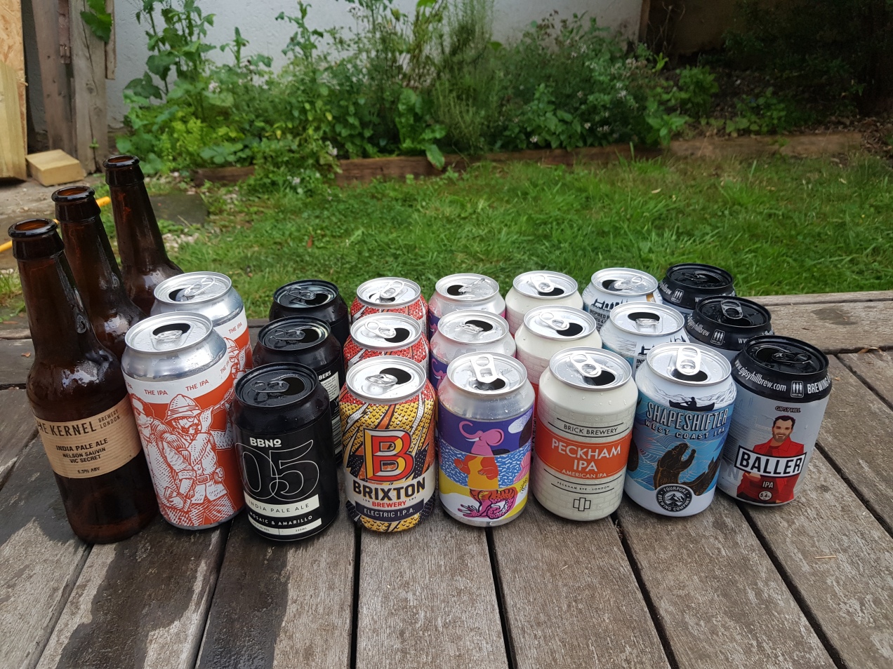
Anyway, back to South London. On a muggy August evening in a back garden in Dulwich, with the rain clouds hovering around like a wasp at a picnic, we set about drinking and ranking the IPAs of South London, which are, in alphabetical order:

Anspach & Hobday The IPA
BBNo 05 Mosaic & Amarillo
Brick Peckham IPA
Brixton Electric IPA
Canopy Brockwell IPA
Fourpure Shapeshifter
Gipsy Hill Baller
The Kernel IPA Nelson Sauvin & Vic Secret

(side note: it’s interesting how most of these beers have orange/red in their labels. I’d have said a well-balanced IPA – clear and crisp at first sip, slightly sweet and full bodied, but then turning bitter and dankly aromatic, so, wait, was that bitter, or sweet, I can’t tell, I’d better have some more – would taste a kind of forest green.)

Methods

A quick methods note in case you feel the need to replicate our research. All beers were bought in the week or so leading up to the experimentmostly sourced from Hop Burns and Black, otherwise bought straight from the breweryand were kept in our fridge for 48 hours before drinking while the weekly shop sat on the kitchen table. Immediately before the experiment started, JM and I decanted all beers into two-pint bottles we had left over from takeaways from The Beer Shop in Nunhead, various Clapton Crafts, and Stormbird, and stuck them in a coolbox full of ice. JM and I numbered the bottles 1-8, then CL and SCB recoded them using a random number generator to ensure that nobody knew what they were drinking until we checked the codes after rating everything. Finally, I also pseudorandomised the drinking order so that all beers were spread out evenly over the course of the evening to minimise any possible order effects:

All beers were poured into identical small glasses in ~200ml measures, and rated on a 1-7 Likert scale, where 4 means neutral, 3-2-1 is increasingly negative, and 5-6-7 is increasingly positive.

(I haven’t written a scientific paper in four years, and I still find it really hard not to put everything in the methods section into the passive voice. Sorry about that.)

Results

We then tasted all the beers. It was hard work, but we managed to soldier on through it. With some trepidation, we totted up the scores, drew up a table of beers, and then matched up the codes for the big reveal. From bottom to top, the results are as follows.

8. Brixton Electric IPA

We went to Brixton’s taproom a couple of years ago, and it was … nothing earth-shattering, but pretty nice? We made a mental note to drink more of their beer, but then they got bought out by partnered up with Heineken and we gave them a bit of a miss after that. I was kind of hoping this would come out bottom, so it was satisfying, in a petty, pretentious, I-should-be-better-than-this kind of way, to get objective evidence that Heineken makes independent breweries worse. Can’t argue with this, though.

7. Anspach & Hobday The IPA

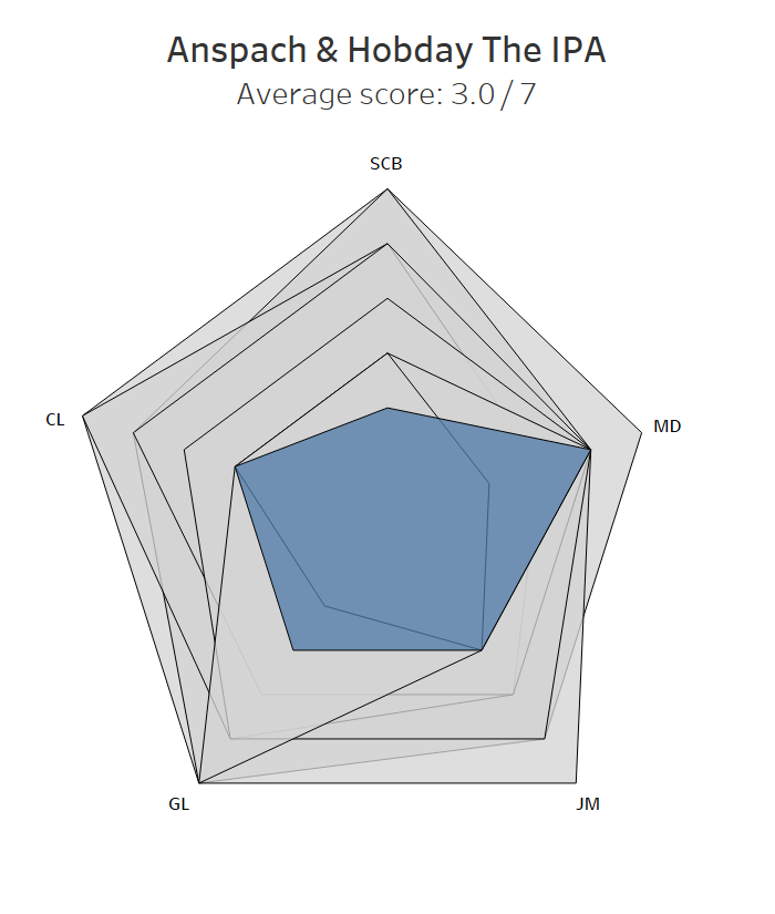
This one was a surprise. I’ve had quite a few excellent pints of the Anspach & Hobday IPA at The Pigeon, and even JM’s dad / my father-in-law, who normally writes off anything over 4% as too strong, really enjoyed it (he ordered it by mistake and we just decided not to tell him it was 6%). Maybe it’s just one of those beers that’s noticeably better on tap than in a can. Still, something’s got to score lower, and I’ll still be popping into The Pigeon for a couple of pints in a milk carton to take to the park. A disappointing result for the up-and-coming South Londoners.

6. Canopy Brockwell IPA

There’s an interesting split between me and everybody else here. Canopy are, I reckon, South London’s most underrated brewery. Their Basso DIPA is the best I’ve had all year, and there aren’t many simple cycling pleasures better than going for a long ride on a hot day and ending up at their taproom for a cold pint of Paceline. I like Canopy’s Brockwell IPA, and I liked it here too; the others thought it was “a bit lager-y”. They’re wrong, and Canopy should be sitting further up the table, but the rules are the rules. If I don’t have my scientific integrity, I’m just drinking in a back garden.

4=. Fourpure Shapeshifter

Another sell-out, but Fourpure have always seemed to know exactly what they’re doing, and apparently they still do. Shapeshifter is a solid all-round IPA, and it’s the first beer on this list to receive at least a 4 from all of us. It’s like the plain digestive biscuit of the beer world – nothing to get excited about, but you’d never refuse one, would you?

4=. The Kernel India Pale Ale Nelson Sauvin & Vic Secret

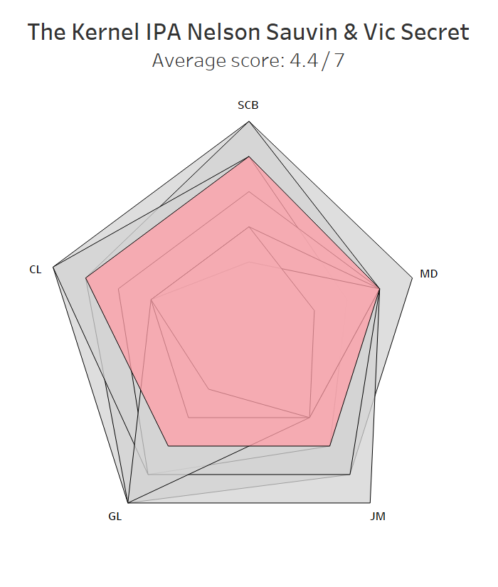
The Kernel are a bit of an enigma. Back in the ancient days of yore, by which I mean 2013, anything on tap by The Kernel stood out (as did the price, but it felt worth it). And yet I never really felt like I knew The Kernel. Maybe because they closed their taproom on the Bermondsey Beer Mile for years, maybe because they tended more towards one-off brews and variations rather than a core range (their one core beer I can name, the Table Beer, splits opinion – the correct half of us love it, the other half really don’t). I’d recommend them, but I’d be hard pressed to say why, or which specific beers, other than “ah, it’s just really good”.

I don’t think they’ve got worse, it’s just that everybody else has got better, and I think that they’re better overall at porters and stouts. Anyway, we all thought this one was a decent effort and wouldn’t complain about it cluttering up the fridge.

3. Gipsy Hill Baller

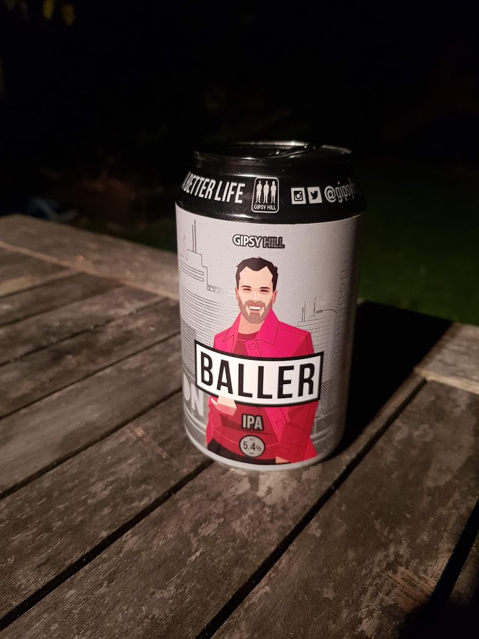
This was the weakest beer of the lot by ABV (is 5.4% really even an IPA?), and, as such, it was summarily dismissed by MD as not having enough body, but it punches above its weight for the rest of us. Baller is JM’s go-to beer for her work’s Friday afternoon (virtual) beer o’clock, so I thought she’d recognise it instantly. Surprisingly, she didn’t, and she only gave it a 4. Maybe anything tastes good if it’s your first can on a Friday afternoon.

2. Brick Brewery Peckham IPA

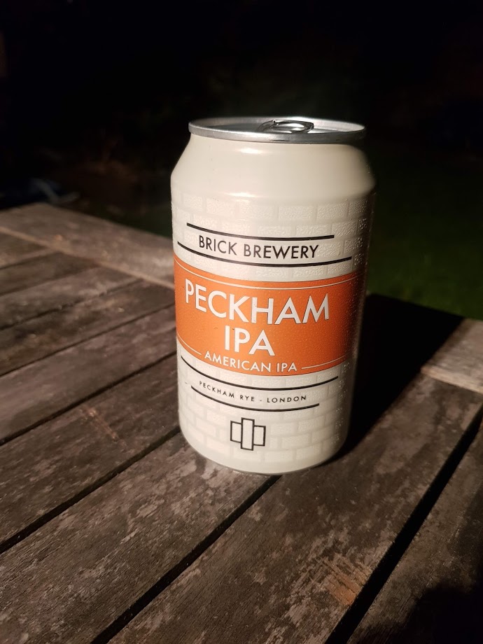
In second place is the Brick Brewery Peckham IPA, which was a pleasant surprise. When I’m at Brick, I have a well-worn routine. I’ll start with a pint of the Peckham Pale, which is just a great general purpose, all-weather beer on both cask and keg. I’ll then move onto one of their outstanding one-offs or irregulars, like the Inashi yuzu and plum sour, or their recent Cellared Pils that rivals the Lost & Grounded Keller Pils, or their East or West Coast DIPA, or the Velvet Sea stout, or … point is, I normally ignore this one.

Well, I shouldn’t. The Peckham IPA was the favourite or joint favourite for three of us, and scored pretty highly for the other two too. It was well-balanced, it was quaffable, and it’s at the top of my list for next time I’m at the Brick taproom.

1. Brew By Numbers 05 Mosaic & Amarillo

Just pipping Brick Brewery’s Peckham IPA to the top spot was Brew By Numbers’ 05 Mosaic & Amarillo. It’s tropical, well-balanced, and easy to drink. It’s also delicious. It was the favourite or joint favourite for four of us, and SCB’s tasting notes“yay!”sum it up pretty well.

I’m glad BBNo ran out overall winners. It’s where JM and I had our civil partnership early this year (before heading to Brick for the after party), so it’s satisfying to see those two come out top objectively as well as sentimentally.

The ultimate accolade, though, comes from MD. The BBNo IPA was the only beer which pushed him beyond the neutral four-out-of-seven zone into net positive territory. Truly remarkable.

Summary

And there you have it. BBNo and Brick Brewery brew South London’s best standard IPAs, but more research is needed to see if this transfers from garden drinking to park drinking or pub/taproom drinking (when it feels reasonable to do so inside in groups again).

Standard
data visualisation, Tableau

Calculating dynamic Z scores in Tableau

What are Z scores? How can you calculate them in Tableau? And once you’ve done that, what can you use them for? This blog will cover all of that, using some fake data from a factory that produces things. We’ll have a look at how the things differ from each other across various different manufacturing dimensions, and use that to see what to do with the thing we’re currently building. It’s all in a Tableau Public workbook here.

Firstly, what’s a Z score, and why would we want to use one?

A Z score is a way of looking at how much more, or less, something is from average in a relative way that accounts for the spread of data. For example, let’s start with height. I’m 6’3″ (or 190cm), and I live in England, where, according to wikipedia at the time of writing, the average male height is 5’9″ (or 175cm). That makes me taller than average.

However, averages don’t tell you anything about the spread of data, which means that taking the simple difference in height doesn’t tell you anything about how tall I am relative to everybody else. If every man in England (apart from me) was somewhere between 5’8″ and 5’10”, I’d be an absolute giant, relatively speaking. But as it is, I’m never the tallest guy in the room, so while I’m taller than average, I only feel averagely tall.

This relative difference from average can be expressed in a Z score, which is essentially saying, “how many standard deviations above or below average is this value?”. A Z score is calculated like this:

Value - Average Value
/
Standard Deviation of Values

So, my height as a Z score compared to men in England would be:

6'3" - 5'9"
/
Standard Deviation of Heights (which I don't know)

In the hypothetical example where every other man is between 5’8″ and 5’10”, the spread of heights is small, which means that the standard deviation of heights would be really low, which means that my Z score would be really high. But in the real world, the spread of heights is much greater, so the standard deviation of heights is bigger, which means that my Z score is lower.

It also means you can normalise comparisons over different metrics with different scales. Let’s say I’m an Olympic heptathlete. I’m doing seven different events, and the units they’re measured in are different – some are in metres, like the high jump and the shot put, and some are in seconds, like the hurdles and the sprints. The scale of those units is different too – I’ll be able to throw the shot put many times further than I can jump. That makes comparing my performance across my different events difficult! But Z scores let you compare. If my shot put Z score is +2.1 compared to other athletes while my hurdles score is -0.3 compared to other athletes, I know that I need to work on my hurdles more than my shot put.

OK, so Z scores are a way of normalising data to do comparisons. How do I do it in Tableau?

Sets are fantastic for this. Here’s a quick explanation of why before we move onto how to set it all up.

I like using sets to decide which things I’m focusing on (the “I want to know how normal this thing is” group) and which things are in my reference group (the “I want to take this lot as the basis for all my comparisons” group).

A lot of the time, you’ll want all things to be in both groups. For example, if I’m a professional athlete, I want to compare myself to my peer group, and I’ll want to see how my closest rivals compare to the same peer group too. So, I’d stick all the top athletes in my sport in the main group (so I can see their Z scores) and in the reference group (so that I’m comparing everybody to each other).

Actually, I’m very much not a professional athlete… but when I’m out cycling, I might still want to compare myself to the Tour de France pros to see just how out of my league they are. In that case, I’d want all the professional cyclists in the reference group, and I’d want to put myself in the main group, but what I don’t want to do is put myself in the reference group – my slow trundling up Anerley Hill would only bring the reference group’s average performance down and widen the reference group’s standard deviation, and I’d mistakenly make myself look closer to the pros than I actually am.

That’s why I like using sets and set actions in Tableau. Now for the actual Tableau work!

First of all, let’s talk data structure. I’ve got a long and thin data source; a field for the [Dimension Name], a field for the [Thing], and a field for the [Dimension Value]:

OK. The next step is to set up the sets. I want to create two sets based on my [Thing] field – one for the main analysis set, one for the reference set. You can do this by right-clicking on [Thing] and selecting Create Set.

Now that I’ve got two sets, I can start creating my Z score calculations. The formula for a Z score is:

Value of the thing you want a Z score for - Average value in the reference group
/
Standard Deviation of values in the reference group

You could do all this in one calculation, but I like breaking mine down into individual parts.

[Reference Set Avg]
{FIXED [Dimension Name]: AVG(IF [Reference Set] THEN [Dimension Value] END)}

[Reference Set StDev]
IF {FIXED [Dimension Name]: COUNTD(IF [Reference Set] THEN [Dimension Value] END)} =1 THEN 0 ELSE
{FIXED [Dimension Name]: STDEV(IF [Reference Set] THEN [Dimension Value] END)}
END

Now I can use those two calcs in my Z score calc:

[Z Score]
(AVG([Dimension Value]) - AVG([Reference Set Avg]))
/
AVG([Reference Set Stdev])

That’s all it takes to calculate Z scores! Here’s a scatterplot of my dimension A1. The actual dimension value and the Z score are perfectly correlated, but now we’ve got a normalised value on the y-axis:

And that normalised value is nice and useful, because now we can compare two dimensions with very different scales, like A1 and B:

I often plot Z scores on diverging bar charts. A chart like this will show me how a thing compares to other things across multiple dimensions, and a thing’s idiosyncrasies will stick out:

Similarly, if I want to see what the outliers are across a whole data set, I can create a concatenated [Thing-Dimension] field, plot the absolute Z score, colour by the actual Z score, and sort. This instantly shows me where the biggest outliers in my data are:

Eagle-eyed readers may have noticed that I haven’t calculated a separate field for the analysis set, and I’m just using AVG([Dimension Value]) in the numerator. That’ll calculate the Z score for any [Thing] in the view regardless of whether it’s in the analysis set or not, so those readers may be wondering why we need the analysis set at all. Never fear, we’ll use this set in some more advanced calculations that are coming up.

Making Z scores interactive

With a few extra steps, you can create two sheets to use as set member choosers (I think that drop-down set controllers are coming in 2020.2 or 2020.3, which is exciting! But for now, I’m in 2020.1, and this is the workaround we need to update set membership).

I set up my reference set chooser sheet like this:

…and then the dashboard action like this:

Repeat for the analysis set, and you can build a dashboard a bit like this (click the image to see the interactive version on Tableau Public):

I’m using this to select an individual dimension, and then looking at how 010X compares to 001X through 009X. I’m plotting the actual value on the x-axis, because that’s what I’ll have to adjust in the factory if I decide to make any changes, and I’ve included the Z score in the tooltip.

The nice thing about using sets and set actions is that we can update these Z scores by changing the reference set. Maybe we’ll find out that one of our things, say, 004X, was actually faulty and shouldn’t be included in our set of “normal” things that we’re using as a reference. Do we need to re-run our entire data pipeline? Nope, just deselect it from our reference group selector.

Next steps: comparing Z scores

That’s nice and everything, but let’s take it a bit further. I know that 002X, 003X, and 007X were particularly good things, and ideally, all the things I manufacture in future will be like those three. So, I’ve created a new set called [High performance set], and I want to compare my WIP thing 010X to the high performance set based on the same reference set I selected earlier.

That means I’ve got a lot of comparisons going on:

I also want to group my dimensions into themes. For example, A1 through A8 are technically separate dimensions, but they represent the same kind of thing taken at different points – maybe it’s the thickness of a circular plate at eight different points around the circumference of the plate, or maybe it’s the weight of eight different ball bearings in the same part of the thing, or something like that. So, since they’re all related, I want to see how 010X compares to the high performance set across the A dimensions as a group of dimensions. In my workbook, I’ve simply grouped them by regex-ing out any numbers from the dimension name.

I’ve created a dashboard like this (click for interactive version):

What am I doing here? In the bar chart at the top, I can see how the Z scores for 010X compares to the Z scores for the high performance set for each group of dimensions. I’m finding the Z score for each dimension within a dimension group, and comparing the average Z score for each dimension group for the analysis and high performance sets.

What I’m seeing here is that, on average, the C dimensions in 010X are higher than the high performance set. If I click the C bar, it’ll filter the “compare selection” chart:

This stacked bar chart shows me the Z scores for all C dimensions for the things in the analysis and high performance sets. This is telling me that the high performance things tended to have C dimensions lower than normal across the reference group, and that while 010X also has some C dimensions on the lower side of normal, it’s not as low as the high performance group. So, maybe my manufacturing specifications for the C dimensions are actually a bit high, and I should tune them lower if I want more high performance things.

Building the “compare selection” chart is relatively straightforward – put the [Z score] field on columns, and stack your rows with the Group and Thing dimensions, as well as the IN/OUT value of the analysis set so that it’s sorted nicely:

I’ve also created a calculation that returns a T/F value based on set membership and I’m using it to filter the view. It’s simply:

[Analysis or High Perf set]
[Analysis Set] OR [High performance set]

…and I’ve set the filter to TRUE.

The tricky bit is getting the values for the diverging bar chart. I like using the compare selection sheet as a way of checking the calculations. What we want to work out is the average Z score across all things and dimensions for the analysis set, and the average Z score across all things and dimensions for the high performance set. Then we want to take the analysis set average and subtract the high performance set average to see the difference.

In other words, we want this:

…minus this:

…which should give me 0.857944.

The first thing we need to do is to create a new field: [Thing-Dimension]. It’s just a concatenated field of [Thing] and [Dimension Name], like this:

[Thing-Dimension]
[Thing] + "-" + [Dimension Name]

To be able to plot the average Z scores and difference in a simple bar chart for each dimension group, we can’t have the thing or dimension in the view, which means we need an LOD which includes those fields:

[Z score (LOD include Thing-Dimension)]
(
{INCLUDE [Thing-Dimension]: AVG([Dimension Value])}
- {INCLUDE [Thing-Dimension]: AVG([Reference Set Avg])}
)
/
{INCLUDE [Thing-Dimension]:AVG([Reference Set Stdev])}

Now we can use that field to work out the difference between our sets:

[Z score difference]
AVG(IF [Analysis Set] THEN [Z score (LOD include Thing-Dimension)] END)
- AVG (IF [High performance set] THEN [Z score (LOD include Thing-Dimension)] END

Finally, we can create our bar chart! And it’s nice and simple:

Let’s just check the calc works. Is it 0.857944, as I worked out manually earlier on? Yup, it’s showing up as 0.858 in my tooltip. Lovely:

Now that I’ve compared Z scores across groups of dimensions to get an idea of the general way that my things compare to each other, I can dive back into the actual data to look at what those differences are and potentially fix my manufacturing variance.

Here’s my final dashboard (again, click for the interactive version). I’ve plotted the Z scores for all dimensions for 010X, and I can click any of those Z scores to update the scatterplot and marginal histogram of actual values below. I know that the C dimensions are a bit different for 010X in comparison to the high performance set, so let’s have a look at those:

I can look at that scatterplot and instantly see which of the C dimensions are driving that difference between 010X and the high performance set:

It’s dimensions C2 and C4.

Let’s start with C2. 010X has a high Z score of 2.25, and we can see in the scatterplot that this is a higher value than normal. As it is, that should be raising flags in the factory – that’s a high C2 value, both absolutely and relatively, so we should probably turn it down a bit to be more in line with the others at around 30. As an aside, it’s interesting to see that the high performance set all have low C2 values, so maybe we should turn it down lower than 30 to be closer to the high performance set:

Now, let’s have a look at C4. No issues there, right? 010X has a C4 value which is slightly higher than the average for the reference group, but the Z score is only 0.198, which indicates that it’s pretty much bang on normal. However, we can see that even though it’s normal for the reference group, it’s quite a lot higher than the high performance group. So, again, maybe we’re manufacturing C4 to a specification that says “aim for a C4 value between 30 and 34”, whereas we should consider amending those limits to between 26 and 30 based on how the lowest C4 values have all been the high performance things:

This is just a few of many different ways you can use Z scores and Tableau to look at manufacturing data. There are all kinds of interesting use cases out there – hopefully this explainer helps you build some of your own.

Standard
data visualisation, Tableau

Donut charts and dynamic reference banding

Donut charts aren’t everybody’s cup of tea, but I quite like them for showing a percentage against a total which has to be 100%. Things like the percentage of tickets answered within an hour, or an industrial test pass rate as a percentage, or an on time percentage.

The problem is that percentages often come with targets. If you’re measuring a rate, you’re probably measuring it to check that you’re on target. For example, if you’ve got 19.8% of tickets being answered within an hour, you’ve probably also got a target of 15% or 20% or something, and you’d probably want to show that on your donut chart for context, like this:

In Tableau, you can’t do that, not without creating some pretty filthy trigonometric calculations. But I’ve recently found a workaround which I rather like, which I’ll explain in this blog. You can download the supporting workbook from Tableau Public here.

I’ve used Superstore, which isn’t too ideal for percentages and targets, but hey, it’s something everybody uses. Let’s say you’re the head of sales for California. You know you’re a big market, and you want to keep it that way – you want 15% of all of Superstore’s sales to be in California.

You can create donut charts showing this percentage easily by creating two fields. One called [California Sales], which is:
IF [State] = “California” THEN [Sales] END

The other would be [Rest of US Sales], which is:
SUM([Sales]) – SUM([California Sales])

And you’d put it on a donut chart with those two fields as the two measure values, then put measure names on colour, and split it out by category to get something like this:

Sadly, we can’t put a reference line at the 15% mark to show the target. Not easily, at least. But what we can do is to play around with the colours. If the percentage is above the target, we could show the percentage up to the target in yellow, and then the overperformance in green, like so:

And if we adjust the target higher, we could show the percentage up to the actual percentage in yellow, and then the underperformance in red, like so:

This is a little complicated. It requires a few extra calculations; [California Sales Percentage], [Target Distance], [California Sales Base], [Rest of Sales], [California Sales Over], and [California Sales Under]. Let’s go through the logic one by one.

[California Sales Percentage]
In this calculation, you take the existing [California Sales] field that you’ve made, and found out what that is as a percentage of all sales. It’s simply:
SUM([California Sales]) / SUM([Sales])

[Target Distance]
This is how far from the target the California Sales Percentage is. I’ve used [Target] as a parameter to make it adjustable, but you could also hardcode it. It’s simply the California Sales Percentage minus the target; so, if you’ve got an actual % of 21%, and your target is 15%, then the Target Distance will be 6%. It’s simply:
[California Sales Percentage] – [Target]

[California Sales Base]
This calculation will be what’s in yellow in the donut. If your California Sales Percentage is above the target, then you’ll want it to be yellow up to the target, and then green above that, so this base field will simply be the target. If your California Sales Percentage is below the target, then you’ll want it to be yellow up to the actual sales percentage, and then red for the space between the percentage and the target. So, you can calculate it like this:
IF [Target Distance] > 0 THEN ([Target] * SUM([Sales]))
ELSE SUM([California Sales]) END

[Rest of Sales]
This is the bit in grey. If your California Sales Percentage is above the target, then you’ll want it to be grey from the actual sales up to 100%. If your California Sales Percentage is below the target, then you’ll want it to be grey from the target value up to 100%. That can be calculated like this:
IF [Target Distance] < 0 THEN
SUM([Sales]) – ([Target] * SUM([Sales]))
ELSEIF [Target Distance] > 0 THEN
SUM([Sales]) – SUM([California Sales])
END

[California Sales Over]
This is the bit in green. If your California Sales Percentage is above the target, then you’ll want it to be green between the target and the actual sales percentage. If it’s below target, you don’t want it to show up at all, so set it to zero like this:
IF [Target Distance] > 0 THEN
SUM([California Sales]) – ([Target] * SUM([Sales]))
ELSE 0 END

[California Sales Under]
Finally, this is the bit in red. If your California Sales Percentage is below the target, then you’ll want it to be red between the actual sales percentage and the target. If it’s above target, you don’t want it to show up at all, so set it to zero like this:
IF [Target Distance] < 0 THEN
([Target] * SUM([Sales]))-SUM([California Sales])
ELSE 0 END

Okay! Now we’re ready to build our donuts. This is the easy bit.

Build out your donuts like normal, like this:

Now, instead of the current two measure values, we’ll want all four of the colour ones:

For this one, I’ve set the target to 20% so that there are examples of categories that are above and below target, all in one view.

And that’s it! It’s not quite a reference line, but it’s a nice way of showing a percentage performance against a target within a donut chart. As a reminder, you can download my workbook here:
https://public.tableau.com/profile/gwilym#!/vizhome/Dynamicreferencebandingondonutcharts/Donutchart-dynamicreferencebanding

Standard
data visualisation, football

Simulating football leagues: the “magical” 40-point mark.

Every time a new Premier League season starts, somebody, probably a manager for a newly-promoted side, says they’ll only relax once they’ve hit the magical 40-point mark. Claudio Ranieri famously kept banging on about aiming for 40 points and Premier League safety throughout the season when Leicester won it.

The problem with the magical 40-point truism is that it’s not really true. There are a fair few examples out there of how you’re probably safe in the Premier League with 36 or 37 points, as well as the reminder that you can still get relegated with 42 points (West Ham in 2003, which will never not be funny to this Charlton fan).

But the problem with the debunking articles is that they’re also not that accurate. They show maybe 20 seasons of data, showing the number of points the teams in 17th (safe) and 18th (relegated) got. And the frustrating and beautiful thing about football is that it’s full of variance.

Here’s an example league table I’ve generated:
(click any graph to follow through to the interactive version)

equal simulation league table 1

The thing is, all of these teams are the exact same strength. In this incredibly basic simulation of a twenty-team football league, for each of the 380 games there was an equal chance of it being a win, loss, or draw. So, Inter Random finished bottom with 33 points, and Random Albion won it with 63 points, but those two teams were perfectly equal throughout the season. It just so happened that it wasn’t Inter Random’s season.

Here’s another table:

equal simulation league table 2

This is also from the same set of simulations. Inter Random did pretty well this time, finishing 6th with 55 points, while last year’s champions Random Albion finished 19th with 37 points and got relegated. Why are they so bad this season? What happened to them? Nothing happened. Just a different roll of the die.

Let’s do this 10,000 times and look at the breakdown of points won by teams finishing in each position.

equal simulation 10k position x points.PNG

That’s a lot of variance! All of these teams are equal, and every single game had a 33.3% chance of the home team winning it, 33.3% chance of a draw, and 33.3% of the away team winning it. You’d think that this would balance out over the course of a season, but it doesn’t. A team can win the league with as many as 85 points (Random Athletic in simulation number 4349), a team can win the league with only 55 points (also Random Athletic, in simulation number 9384), a team can finish bottom with as many as 45 points (Real Random x2, Sporting Random, Random Argyle), and a team can finish bottom with only 18 points (Dynamo Random, Random United).

And if this is the amount of variance you can get between seasons when everything is equal, what happens when it’s not? Did West Ham get a particularly unlucky roll of the die when they finished 18th with 42 points, and that 36 points is going to see you to safety most of the time? Or is it that the last twenty or so seasons have been at the low end of the variance, and that in any given season, 36 points is still probably going to get you relegated? And is there even a points total where you’re definitely absolutely guaranteed not to get relegated?

On that last point, it’s technically possible to get relegated with 63 points. If two teams are completely useless and lose every single game, and the other 18 teams win every home game and lose every away game apart from the two games away to the bottom two, that means that 18 teams finish on 63 points (57 points from winning all home games, 6 points from winning two away games). One team could finish 18th on goal difference. So, really, 64 points is the real magic safety number.

But this would never realistically happen. So, I’ve also run 10,000 simulations of leagues based on real data. I took every single game from the last four years (2014/15 to 2018/19) of the big five leagues (England, Spain, France, Italy, Germany). Assuming that a team’s actual points total is a relatively good measure of a team’s actual strength – which it isn’t, as shown above, but it’s about as close as I can get – I drew random samples of 20 values for each simulation. Since Italy and Germany only have 18 teams in their top flights, I used each team’s average points per game (PPG) as their underlying team strength. This generated 10,000 realistic leagues of 20 teams of different strengths. I then grouped them into strength tiles of 0.3 points per game – the teams in the weakest tile were between 0.3 and 0.6 PPG, the teams in the strongest tile were between 2.4 and 2.7 PPG. I then compared the frequency of teams in each strength tile scoring a certain number of goals against teams in each strength tile, and sampled from those distributions for each of the 3,800,000 games in the simulations. I experimented with making the tiles smaller, but that meant that there were too few examples of games between teams of particular tiles. I also added a home vs. away boost factor.

This ended up coming out pretty realistic. For example, here’s the average number of goals that teams in each strength tile score and concede:

avg goals for and against per tile.PNG

So, what are the points distributions per position in a more realistic simulation?

accurate simulation 10k position x points.PNG

This looks pleasingly similar to the distributions in my graph of Premier League points by position. Most simulation results cluster around the middle of each band (the black line denotes the average). But at the extreme end, you can win the league with 112 points if you’re already a strong team and you outperform / get lucky, like Sporting Random did here:

highest winning total.png

…and you can also win the league with as little as 64 points if you outperform / get lucky and if the rest of the league underperform / get unlucky, like Real Random did here:

lowest winning total.png

At the bottom of the table, you can get relegated in 18th with 46 points, which is what happened to Random United, a solid midtable team who had a pretty average season… except that everybody else at the bottom of the table completely outperformed expectations / got incredibly lucky:

highest relegated total.png

This chart shows the overlap between the relegation positions and safety. There are some interesting data points at the extreme ends, but the main point is that there are a lot of simulations where a team got 33 points or fewer but finished 17th, and there are several simulations where a team got 38 points or more but still finished 18th:

relegation points.PNG

To put it another way, 93% of teams getting 40 points didn’t get relegated:

cumulative percent curves

You can explore the full interaction between points and position in this graph, where you can set a threshold. Here, this shows how often a team finishes in a particular position when getting at least 40 points – so in 5.85% of simulations, you can get 40+ points, but still finish 18th:

% of teams per position

And to work out what your safety threshold is, this graph shows how many teams end up safe or relegated based on their points total. 35 is the turning point; 50.27% of teams getting 35 points end up safe:

% of relegations per points

As a final view, here’s a breakdown of the variance in positions by each team strength tile. It shows how you can be an incredibly strong team and expect to get 2.4 to 2.7 points per game, and you’ll win the league 63% of the time, but also miss out on the top four entirely a little under 1% of the time:

strength tiles and positions

Forty points isn’t a magic number – you’re safe around 93% of the time if you get 40 points, but it’s not guaranteed.

Standard
Alteryx, data visualisation, Tableau

Eurovision Song Contest: a market basket analysis of voting patterns and international relations.

I’ve been doing a lot of market basket analysis at The Information Lab lately. Market basket analysis is a way of looking for things that people buy at the same time (or that people never buy at the same time) in order to spot trends in people’s behaviour. For example, it’s probably obvious that if somebody buys cereal, they’ll probably also buy milk. Or that if somebody buys tofu, they’re not going to be buying sausages. This is a really nice example of how it all works.

Thing is, after a while, using bread and butter or cereal and milk or sausages and tofu as an example gets kinda dry. And talking about Lego shovels and milligram-level accurate scales is sometimes a little unprofessional, even if it is a perfect example of consumer behaviour.

So, I’ve been analysing the Eurovision Song Contest. The jury votes lend themselves pretty well to market basket analysis, because they’re pretty similar to transactions: each country’s jury (or customer) votes for (or buys) ten countries (or items) at a time (in a basket), and the fact that these countries (or items) are a subset of all possible countries (or items) to vote for (or buy) means that you can make the same selection vs. non-selection distinction. And we all know that some countries always vote for some other countries, regardless of how good the song is, which is part of what makes it fun.

I took the historic Eurovision data collected by Stephan Okhuijsen of Datagraver. Then, using Alteryx, I filtered it to all contests from 1993 onwards, because European countries have been relatively consistent since then. I also filtered it to the final only, and to the jury votes only.

I set the minimum support for a rule to 0.01, which is kind of high for a regular market basket analysis using tens of thousands of SKUs in a supermarket, but works fine for such a closed set of possible choices of countries. I also set the minimum confidence to 0.05. That gave me almost 33,000 association rules, of which about 1,600 were one-to-one country mappings.

The full results are in an interactive dashboard here.

dash

In the matrix at the bottom, you can see who consistently votes for who, and it’s pretty predictable. Cyprus and Greece, for example, almost always give each other the most possible points. There’s a big love in between Moldova and Romania, and between Turkey and Azerbaijan. The Nordics are a bit too cool to give each other full marks every time, but it’s still a bit of a Scandi circle jerk. Andorra love Spain, although it doesn’t seem like that’s reciprocated. Azerbaijan have never voted for Armenia, funnily enough. And Austria have given Australia full marks twice, which I like to believe is because they were hoping to exploit a poor fuzzy matching process in the background scoring:

2 austria australia

But market basket analysis shows how countries behave as a group, where we can see how some associations are Europe-wide, and some are just confined to the two countries. For example, some of the Scandi trends are reflected in votes across Europe; if a country, any country, votes for Denmark, they’re also likely to vote for Norway:

1 denmark to norway

And surprise, surprise, countries that vote for Ukraine will also vote for Russia:

1 ukraine to russia

But the Greece/Cyprus love in is special just for them; in fact, if anything, there’s a slightly negative association between them, meaning that if a country votes for Cyprus, they’re slightly less likely to vote for Greece as well:

1 cyprus to greece

Likewise with Turkey and Azerbaijan. Just because they give each other full points all the time, other European countries don’t link the two together in their voting behaviour at all:

1 turkey to azerbaijan

Meanwhile, even though Azerbaijan will never give points to Armenia, and Armenia have only ever given one point to Azerbaijan, other European countries are far more optimistic. Maybe they hope that voting for both Armenia and Azerbaijan at Eurovision can resolve the Nagorno-Karabakh dispute. Or maybe they just don’t know anything about the Caucasus region and think they’re the same place, I don’t know.

1 azerbaijan to armenia

This is quite nice to illustrate, because the market basket analysis allows you to make the distinction; while there are some obvious associations between countries, like how Greece and Cyprus always vote for each other, it shows that those associations aren’t necessarily transferred to other countries’ voting behaviour.

Click through to the interactive version here to explore in more detail. I’m going to be using this in my teaching examples more often.

Standard
data visualisation, Tableau

Language. Sex. Violins. Other?: how to create Violin Plots in Tableau.

Are you tired of histograms? Do you look at the count distribution of your actual data points and find yourself thinking, yeah, that’s cool and all, but I wish there was a more abstract way of showing this? Then you’ll probably like violin plots. That’s these things here:

Despite their somewhat sexual connotations, violin plots can be really useful for comparing distributions of data. To be honest, if it mattered that much to me, I’d probably go for a boxplot with overlaid, mostly transparent data points… but hey, people still use these, Tableau doesn’t support them natively, and I haven’t found a full tutorial anywhere (apologies if I’ve missed one – let me know!), so here’s how to make them.

To follow along, you can download the Tableau workbook I used from my Tableau Public page here.

It’s all based around Kernel density estimation. This is maths for “take my data, smooth it out a bit, and make it so I can generalise it to data I haven’t got yet”. You can read more about that here, and I’m going to use the same set of six values used in the Wikipedia example.

Here’s what you’ll need, and here’s one I made earlier:

    1. Your data. One column with one row per observation, one column with one row per observation ID. Something a little like this:
      1. data
    2. A handy data scaffold. I’ve used a hundred points, going from zero to 99; if your data has a lot of variance, you might want to whack that up to a thousand, although that’ll make things proper slow. Either way, keep it simple; it should look like this:
      2. scaffold

Okay, nice. Stick these into Tableau, and join them with a custom join calculation so that every row in the data joins to every row in the scaffold (i.e. six rows balloons out to 600 rows here; this is why using a 1000 row scaffold isn’t pretty, performance-wise). I normally just type in “join” on both sides:

join

Also, remember that with a scaffolded dataset, simply summing your values will just multiply the value you actually want by a hundred. Watch out for that.

Okay, we’ve got our data; let’s plot the sample values we want to create a violin plot of.

plot samples.png

What we need to do is draw a kernel around each data point, like this (but better):

plot samples 2

…and add up the y-axis values of those kernels to create the overall kernel density, like this (but a lot better):

plot samples 3

This is why we need the data scaffold; you can’t draw a kernel with one point, so we need a hundred points for each point.

The first thing to do is to create an adjusted x-axis. We want the hundred points for each data point to range from the lowest to the highest value. You can do that like this (ignore the bandwidth part for now):

IF [X] = 0 THEN {MIN([Sample Value])} - [X scaling factor]
ELSEIF [X] = 99 THEN {MAX([Sample Value])} + [X scaling factor]
ELSE
({MIN([Sample Value])} - [X scaling factor]) +
(
ABS(
({MAX([Sample Value])}+[X scaling factor]) - ({MIN([Sample Value])}-[X scaling factor])
)
* ([X]/99)
)
END

Alternatively, you can see that there’s no point making the scaffolded points for the values go all the way across the range, so you could fix it on the Sample ID instead. But I found that this had a knock-on effect down the line that I didn’t like, so let’s leave this for now. If you can make it work, I’d love to hear from you.

We’ve now got a set of Adjusted X data points across the range of the data for each data point:

adjusted x range

The next step is to stick something on the y-axis so that each point goes up the required amount to draw a kernel around each data point. It’ll end up looking like this:

kernel per data point

…and the calculation required to do that is this:

1/({COUNTD([Sample ID])}*[bandwidth (wiki example)])
*
(1/(SQRT(2*PI()))) * EXP(-0.5 * (
([Adjusted X] - [Sample Value])^2)/[bandwidth (wiki example)])

This is done as a normal kernel using the standard normal density function, because that’ll probably do the job well enough for most situations. I’m not going to go into the different types of kernel functions, but you can read about them here, and if a different kernel function tickles your fancy, you can rewrite the (1/(SQRT(2*PI()))) * EXP(-0.5 * ( part of the equation with something else.

I’m also not going to go into bandwidths, because it’s complicated. There are various proper methods for choosing your bandwidth, but if you play about with it, you’ll see that setting the bandwidth too low doesn’t smooth out the curve enough, and setting the bandwidth too high smooths out the curve too much.

ezgif-4-6d764c7c16.gif

Anyway. To create the kernel density estimation for the data points, we need to sum up the individual kernels. This is the easy part in Tableau; CTRL+drag the same kernel calculation field to rows again, take Sample ID off colour/detail, sum it up, and put it on a synchronised dual axis. Voilà.

density estimate.png

This grey curve is half a violin plot on its side. But before we go into how to rotate and fill it, let’s go back to the scaling factor. I’ve kept it at 0 the whole way through, so that the x-axis runs from the smallest data point to the highest data point. That’s fine if you’re showing your actual data, but the whole point of kernel density estimates is to show a probability function… or in other words, “okay this is the data I’ve got, but what if there’s going to be more data like this, where’s it going to go?”. There may well be other values higher than your highest point or lower than your lowest point. So, I created a parameter to mess about with how far the x-axis goes, simply by adding a constant to the highest value and subtracting that same constant from the lowest value. You can adjust it as you see fit; I think setting it to 4 captures this data nicely:

density estimate

Right. That’s the maths behind a violin plot. Now to actually make one.

All we need to do is fill it and rotate it. The filling is easy; just convert it from line to area:

area 1

…but the rotation messes this right up.

area 2

So, we need to redraw it as a polygon. And to do that, we need to redo some of the calculations. Sorry about that.

Firstly, make this change to the Adjusted X calculation:

IF [X] = 0 THEN ({MIN([Sample Value])} - [X scaling factor])
ELSEIF [X] = 1 THEN ({MIN([Sample Value])} - [X scaling factor])
ELSEIF [X] = 99 THEN ({MAX([Sample Value])} + [X scaling factor])
ELSE
({MIN([Sample Value])} - [X scaling factor]) +
(
ABS(
({MAX([Sample Value])}+[X scaling factor]) - ({MIN([Sample Value])}-[X scaling factor])
)
* (([X]-1)/97)
)
END

And now make this change to your kernel calculation:

IF [X] = 0 THEN 0
ELSEIF [X] = 99 THEN 0
ELSE
1/({COUNTD([Sample ID])}*[bandwidth (wiki example)])
*
(1/(SQRT(2*PI()))) * EXP(-0.5 * (
([Adjusted X (polygon)] - [Sample Value])^2)/[bandwidth (wiki example)])
END

That should do the trick. If you’re using a bigger scaffold, remember to update the 99 to 999 and the 97 to 997! Now you can plot your polygon like this:

polygon

And if you repeat the kernel calculation, whack a minus on the front of it, and dual axis it, you can make a nice violin:

violin

These violins take a lot of formatting to make, and it’s an absolute faff to compare two separate distributions. And the LODs for finding the max and min values in the data will require you to add in a FIXED for any dimension you want in the view. They’ll also screw up filters, unless you put them in context. It is possible, though; here’s an unformatted set of violins for Sales in each Category in California using Tableau’s Superstore dataset. With some a fair bit of tidying, this could look pretty good:

violins superstore

Again, it’s not an ideal way of showing the distributions, and hopefully Tableau introduce violin plots in the same way as boxplots in a later version. But for now, this is how you’d do it if you really wanted one.

Standard
data visualisation, Tableau

We chase the waves: how to make a sinusoidal time series in Tableau.

Browsing what other people have done on Tableau Public is a great source of both challenge and inspiration. Recently, I’ve been really taken with Neil Richards’ visualisation of football league winners over time, with a beautiful sine wave showing how long it’s been since each team last won the league. I’ve no idea what to call these plots, but they’re fantastic (click image to see Neil’s original on Tableau Public).

0 Neil's thing

I’ve wanted to take these apart and see how they work for a while, and finally got round to it the other day. It turns out that Neil did a lot of the angle calculations outside Tableau, which is fair enough… so I set myself the challenge of doing it all with table calculations. I got there eventually, but it was a good workout.

[to skip the explanation and just download the workbook I’ve made, click here]

This blog is a walk-through of how to do it. Instead of football data, I’ve used official pope names; I was on a wikipedia spiral and noticed that seven of the eleven popes between 1775 and 1958 were called Pius, taking the Pius count from VI to XII. Naturally this reminded me of Barcelona’s recent league dominance, winning six of the last nine La Liga championships, so it seemed obvious to see if the chart for pope names would be similarly tightly woven.

So. This is all the input data you’ll need: a list of all popes, in order, with a record ID and a number showing how many of that name there’s been so far:

1 popes data

Come to think of it, if you’re good with INDEX() calcs, you might not even need the PopeNameNo column… but I’m not, so I do.

You’ll also need a simple scaffold sheet with 100 points, going from 0 to 99. If you’re trying to visualise something with more data points than the 267 popes I’ve got, you might want to whack up the scaffold to 999 instead.

2 scaffold data

[I’m including the elected-but-not-consecrated Stephen II in this list, because even though he’s not an official pope, all the subsequent Stephens had an increased number until relatively recently, and then it got confusing. So he’s in here.]

Read the two files into Tableau, and create a calculated join with “x” in the join field for the popes data, so that there are 100 points for each pope. Now we’re ready to do some vizzical jiggery-popery!

Although Neil’s vizzes had time on a y-axis going vertically, I’ve spent way too long looking at time series graphs for that to feel intuitive, so I’m reverting to the vanilla “time on x-axis going left” approach.  Let’s stick Pope ID on the x-axis as a continuous dimension:

3 original x axis

Great, we’ve got a line made up of lots of circles. This doesn’t make it easy to see what’s going on, so let’s filter to a single pope name – Leo will do for now:

4 filter to leo

Here’s all the Leos, in order. It was a fairly popular (pope-ular?) pope name in the later part of the first millenium, but then it fell out of favour for a while, with almost 500 years between Leo IX in 1054 and Leo X in 1513.

We want to connect these dots with a line, but if we set the mark type to line, it’ll just be a straight line. Rather, we want a curved line, like this:

5 leo annotated

This is why we’ve got the scaffold table. We can’t just connect two points with a curvy line – or at least, I can’t. Instead, we need to put a load of dots between the two main points, and connect them up. That means figuring out the x and y axis values to put those dots in the right place to connect the two main points with a nice sine wave.

To do that, we’ll need to create a new x-axis measure instead of simply Pope ID, where the distance (in units of popes) is divided by up so that the scaffold points are evenly distributed along the x-axis. But first, that means calculating the distance between popes in units of popes. We can do that with a lookup() calculation:

LOOKUP(ATTR([Pope ID]), 1)

6 next pope id calc

This is working nicely – I’ve stuck it on the tooltip, and hovering over Leo IX, who’s pope number 153 in my list, tells me that the next Leo is pope number 218.

This’ll work fine for this filtered view, but to get it to do this properly, you’ll need to put the Point field from the scaffold table on detail, and edit the table calculation to compute using Point and Pope ID:

7 point, pope id calc

At the moment, all those points are on top of each other on the Pope ID value. This isn’t what we want – we want to spread them out evenly between the Pope ID values. To do that, we’ll need this calculation here. It’s a bit long, and there’s MIN() functions everywhere because of all the table calculations, but hey:

8 x calc

Logically, what it’s doing is this:

  1. There are 100 scaffolding points, going from 0 to 99.
  2. If it’s the first one, i.e. 0, give it the same value as Pope ID. For the Leo IX to Leo X example, this is 153.
  3. If it’s the last one, give it the same value as the next Pope ID with the same name. For the Leo IX to Leo X example, this is 218.
  4. If it’s any of the rest, calculate the difference between the two Pope ID values (i.e. 218 – 153, which is 65 pope units), and then divide that by the maximum point value, which is 99 (if you made your scaffold points 1-100 instead, you’ll have to set this to maximum point value -1, not 100). This is because there’s 99 spaces to fill between all the scaffold points. Then multiply that fraction by the number of the point, and add it to the Pope ID value.

You can also copy and paste it directly from here if that makes it easier:

IF MIN([Point]) = 0 THEN MIN([Pope ID])
ELSEIF MIN([Point]) = MIN([MaxPoint]) THEN [NextPopeID]
ELSE
MIN([Pope ID]) +
(
([NextPopeID] - MIN([Pope ID])) / MIN([MaxPoint]) * MIN([Point])
)
END

Grand. Set the new x-axis value to calculate using Pope ID and Point, restarting every Pope ID, and that’s the x-axis sorted. But these points are still basically just calculating a straight line, whereas what we actually need to do is push them up the y-axis by a different amount, kind of like this:

9 x calc why

Let’s also add a direction calculation, so that the wave between the first and second goes upwards, the wave between the second and third goes downwards, and so on. We can do that by working out whether it’s an odd or even number, and setting the direction accordingly:

IF INT([Pope Name No] % 2) = 0 THEN -1 ELSE 1 END

Now let’s work on our y-axis calculation. It’s got three parts:

  1. Working out a nice sinusoidal curve
  2. Multiplying that value by how long it’s been between popes, so that the longer it is between popes, the higher the curve goes
  3. Multiplying that by the distance calculation so that it goes above or below the x-axis accordingly

The first phase of a sine wave goes from 0 on the y-axis, up to a peak of 1, and then back down to 0 between the x-axis values of 0 and π, like so:

10 sine wave explanation

In our case, we don’t want a wave between 0 pope units and 3.141… pope units; rather, we want to define the beginning and end of this phase of a sine wave to be between one pope and the next pope of the same name. So, for Leo IX to Leo X, we want 153 to be our 0 and 218 to be our π. That means taking the scaffold point, dividing it by the maximum point of 99 to get the % of the distance that that point is along the 0-to-π scale, and then multiply it by π.

That’ll give us the first phase of a sine wave of the same height (of 1) between the popes, regardless of how long it’s been between them. We want the peak to be higher the longer it’s been between popes, so we multiply it by the distance. Then we can multiply by our positive/negative direction calc. Here’s the code:

MIN(SIN([Point]/[MaxPoint] * PI()))
*
([NextPopeID] - MIN([Pope ID]))
*
MIN([Direction])

So, stick the y-axis calc on rows, set the table calculation to calculate using Pope and Pope ID, and voila! We have a nice set of sine waves between our Leos.

10 y calc

(this plot reminds me of doing Fourier transformations for EEG analysis; technically, we haven’t created this complex wave by layering up different sine waves on top of each other, but we can kind of decompose it into sets of individual sine waves as we go along)

The hard work is done now, so let’s bring the rest of our popes back in:

11 no filter all popes

Delightful. The rest of it is all about making it pretty, which I can leave to your personal tastes. But the real question is: what happens with Pius, the Barcelona of second millenium popes? Can we clearly see the era of Pius dominance?

11 pius

…yes, we can.

These graphs can be applied to basically anything that goes in a sequential order and may or may not have repeated values; this graph here is every word from my old band’s EP in order. I like how you can see where the choruses are, because the lines get more tightly woven as the words in the chorus are repeated more often.

12 sinusoidal pangolins.png

I hope this blog makes it clear how to make these graphs! I still don’t know what to call them, but in my head they’re unimaginatively down as sine wave time series. Thanks again to Neil for creating them first, and for making his workbooks downloadable and play-around-withable!

Standard
Alteryx, data visualisation, Tableau

The Gaslight Analysis: when sentiment analysis doesn’t quite work.

I love sentiment analysis. It’s a great way of getting fascinating insights from a glut of text data. You can take a load of Yelp reviews, figure out how people feel about a place, and cross-validate it with the star rating. You can take the works of Jane Austen and plot narrative arcs. You can look at the texting styles of you and your girlfriend. If you’ve got a dataset with clear sentences in standard textbook English, you can find out all sorts of things.

But, here’s the thing with language; it’s gloriously, infuriatingly messy.

That makes it really hard to do really good sentiment analysis – certainly with the free, widely-available tools. Most of those assign certain emotional values to specific words; for example, in the NRC dataset often used with the R package Tidytext, the word “alive” has associations of ANTICIPATION, JOY, POSITIVE, and TRUST, while the word “afraid” has associations of FEAR and NEGATIVE.

This approach works great for sentences like this:

“I bought these shoes last week, and they’re amazing. They feel great, and they make me feel great. Good value too! 10/10, very happy about this.”

…but it doesn’t work for sentences like this:

“I don’t feel good about this. I don’t feel good about this at all. I’d love to get out of this situation right now.”

The second sentence is pretty obviously negative, but it works by negating words. The word “good” isn’t actually good, because it’s being negated by “don’t” a couple of words earlier. And “love” isn’t a positive emotion here, as it’s expressing the desire to get out of the situation, meaning that what’s going on is not a positive thing.

It’s possible to address this with sentiment analysis, but it’s complicated. You’d have to account for every possible way of negating/reversing a word, and there’s a lot of those. You’d have to account for every possible way that a word that’s positive in isolation could actually be referring to a negative overall situation, and that’s a huge task. This is why good sentiment analysis costs a fortune. It’s really complicated.

Luckily, people tend not to speak indirectly all the time, and in aggregate, the twisting, sentiment-negating sentences are cancelled out by the number of straightforward sentences where word-level sentiment analysis does work. But the caveat is that just because you’re using sentiment analysis, that doesn’t mean you’re using it well, and you should really cross-validate it with some other measures.

I’m exploring this with lyrics from Brian Fallon’s bands – The Gaslight Anthem, The Horrible Crowes, and his solo project. I’m looking at Fallon’s lyrics because:

  1. Song lyrics are enough of a deviation from standard English to pose problems for standard sentiment analysis;
  2. At the same time, song lyrics are some of the most obviously emotional usages of language we have;
  3. Fallon writes lyrics in a pretty clear style, often in full sentences, without too many obscure metaphors or references;
  4. I really like his music.

I’ve used the Tidytext package in R for doing sentiment analysis before. This time, I’m using the same NRC sentiment dataset, but trying it out in Alteryx instead. I’ve also visualised it in Tableau, and you can click any of these images to go to an interactive link where you can play around with it yourself.

So, first things first; let’s have a look at sentiment in each song:

1

Looks pretty good so far. Here’s lookin’ at you, kid is a wistful, regretful song; definitely on the negative side, quite a bit of sadness, very little joy. Click the graph to explore other Brian Fallon songs, if you know them.

There’s a lot of different sentiment measures available, so let’s simplify it to looking at positive and negative. Here’s lookin’ at you, kid has 13 negative words, and 4 positive words. If we take difference (9) and divide it by the biggest value (13), we get a ratio of positive to negative words:

Positive – Negative
————————————
MAX(Positive, Negative)

This accounts for the difference between positive and negative words, as well as the number. For example, if one song has 10 positive words and 5 negative words, and another song has 6 positive words and 1 negative word, the difference is the same, but the second song is more positive overall, because it has far more times the number of positive words than negative words.

If we calculate this +/- balance for each song, we can order them as follows:

2

There’s a nice mix of positive and negative songs, and if you know the songs, some of them definitely feel right; Here’s lookin’ at you, kid is negative, so is Get hurt, while 45 is an upbeat, positive song. But there’s definitely some weird ones in there. We did it when we were young is a sad, regretful song, but it’s up there in the top half of positive songs. That doesn’t seem right.

So let’s cross-validate this. Spotify’s Echo Nest data has a measure called Valence, which is a measure of how positive the mood of a song is. You can get all kinds of interesting measures for your Spotify playlist here. When we plot the Spotify Valence (branching off to the left for values under 50), we get this instead:

3.png

Spotify has Here’s lookin’ at you, kid as one of the most negative songs, along with Cherry blossoms, which seems about right to me, but has We did it when we were young as a pretty neutral song, which still doesn’t feel right. Have a look at the difference with Blue jeans and white t-shirts, as well – it’s one of the most negative songs according to Spotify, but one of the most positive according to sentiment analysis. I’d put it somewhere in the middle, maybe a bit more positive than neutral.

Since I keep using my own perspective as a fan and a human, I figured I’d better cross-validate both of these stats with what fans think. I set up a simple survey where to get Brian Fallon fans to rate each song for positivity on a scale of 1 to 7, where 1 meant really negative, 4 meant neutral, and 7 meant really positive. I stressed in the introduction, several times, that it’s not a rating of how much you like each song, or how positive each song makes you personally feel (like, I really like Fallon’s sad songs because they make me feel nice… but they’re still objectively sad), but about the emotion in the song itself. Around 15-20 fans answered for each song, so I averaged their ratings together to get a human-generated emotion rating per song. It’s not the most scientific approach, but it’s good enough for the purposes of this blog.

Here’s what we get, centred around an average of 4 for neutral songs:

4

This time, Blue jeans and white t-shirts comes in as I see it – fairly positive, but not hugely so. We did it when we were young is down there in the negative range, along with Get hurt and Here’s lookin’ at you, kid.

It’s fascinating to see how the three measures agree and disagree for each song. If we rank each song along each measure (with 1 being most positive and 85 being most negative), we can see how the rank difference varies. There are five possible combinations:

  1. All measures disagree with each other
  2. All measures agree with each other
  3. Spotify valence and fan rating agree, but sentiment analysis disagrees
  4. Sentiment analysis and fan rating agree, but Spotify valence disagrees
  5. Sentiment analysis and Spotify valence agree, but fan rating disagrees

…and there’s at least one example of each:

5.15.25.35.45.5

We can see which songs are most consistently rated across all three measures by looking at the difference between each song’s highest and lowest positivity rank:

6

Blood loss is the most consistently rated, with a rank difference of only four places, while The backseat has a massive rank difference of 81 – fans put it as the second most positive song in Brian Fallon’s catalogue, while sentiment analysis rates it as 83rd, ahead of only I believe Jesus brought us together and I witnessed a crime. Spotify puts it at 24th.

Another way of showing this variation is by creating scatterplots of each measure against each other, with each dot representing a song:

7

I’ve run simple correlations on each plot – not exactly statistically kosher, but this is all just exploratory. There is no correlation between valence and sentiment analysis, and more tellingly, no correlation between sentiment analysis and fan ratings. There is a correlation between valence and fan ratings, but it’s not particularly strong.

The overall point, then, is to be careful with sentiment analysis. It’s not that it doesn’t work – it can often work really well, and be a really useful line of investigating data. But relying on sentiment analysis alone, without checking whether it matches measures that should reflect the same kind of thing, might give you some false insights. You don’t want to have Great expectations, or you might Get hurt.

Standard
Alteryx, data visualisation, football, Tableau

The growing gap between the Premiership’s Top Six and the rest.

This is my first football data blog for a while, and I feel all nostalgic! It’s nice to dive into some league table data again, and even nicer now that I have Alteryx; I was able to format my data about 10x quicker than I was in when I first started doing this in R. Then again, I’ve probably also spent 5x more time using Alteryx than R in the last year or so. Anyway.

I’ve been hearing a lot more analysis of the Top 6 in the Premiership recently. I first noticed it in the last couple of seasons, when I saw a few journalists/people on Twitter writing about a “Big Six Mini-League”. Liverpool often seemed to do quite well at this, and Arsenal often seemed to do quite badly at this. Neither team won the actual league.

I’ve started looking at how the Top 6 sides in the Premiership perform each year (using data from this fantastically well-maintained repository), and there’s quite a few interesting stories in here. The first main point is that the big clubs are accelerating away from the rest of the league. The second main point is that any big six mini-league doesn’t really matter, as you can win the Premiership with an underwhelming record against your main rivals if you trash everybody else. I mean, that shouldn’t be much of a surprise – if you’re a Top 6 team, only 30 points are on offer from matches against your rivals, but you can potentially take 84 points from the 28 matches against the rest of the league.

For all these analyses, I’m taking Top 6 literally – meaning the teams that finish that season in the top six positions. Nothing to do with net spend, illustrious history, shirt sales in Indonesia, or anything like that. I then look at the average points-per-game changes by team, position, season, and Top 6/Bottom 14 status. I also filtered out the first three seasons of the Premiership to keep it slightly easier for comparison, since there were 22 teams in the league until 1995-96.

When plotting the average points-per-game per season between the two groups, a clear trend emerges; the Top 6 are better and better at beating the rest of the league:

1

However, this trend appears to be asymmetrical. When looking at the overall average points-per-game for all games across the season, teams that finish in the Top 6 are getting better, but there’s only a negligible decline for the rest of the league. This suggests the bigger, better teams are pulling away from the rest of the league:

2

This effect is most striking when plotting the difference in overall average points-per-game between the two groups:

3

Teams finishing in the Top 6 scored around 0.6 points-per-game more than the rest of the league in the early nineties, but that’s now up to over 1 point-per-game in the latest couple of seasons. That half-a-point difference translates to a 19-point difference across a whole 38-game season.

We can plot each team in each season of the Premiership (since 1995-96, when the league was first reduced to 20 teams) and look at how well they did against the top teams and the rest of the league. In this graph, the straight line represents equal performance vs the Top 6 and Bottom 14:

4

A couple of things stand out:

1. Only a handful of teams have ever done better vs. the Top 6 than the rest of the league. This seems to have no effect on final position.

2. It’s possible to win the league with a poor record against the Top 6 by consistently beating everybody else. Manchester United won the league in 00-01 and 08-09 with only 1.3 PPG vs the Top 6.

3. Manchester City this year are ridiculous.

I find it interesting to compare Liverpool and Arsenal over the years. One narrative I sometimes hear is that Liverpool tend to raise their game for big matches, but are too inconsistent the rest of the time, whereas Arsenal struggle against big sides but do well enough in the rest of the league to consistently finish well. This chart seems to bear that analysis out; Liverpool’s cluster of dots are higher on the chart, but further to the left:

6

…while Arsenal’s cluster is slightly lower but further to the right… and most importantly, more colourful:

5

And if you want to explore other teams and seasons, there’s an interactive version of all these graphs here.

Standard
data visualisation, Tableau

Why won’t my Tableau small multiples chart work?

Andy Kriebel wrote a great tutorial on how to make small multiples charts in Tableau here. It works pretty much all the time… but you’ll also find that if you simply copy and paste the calculations, it might not work with your data.

For example, have a look at Superstore here. I’m plotting sum of Sales for each continuous month per product subcategory. The rows and columns calculations split up the view nicely into a line for each subcategory, which is good:

small multiples not working

But look closely, and you’ll see some weird stuff going on; there’s a brown-ish dot for subcategory = Copiers and month = October 2014 in the Chairs section (second row, second from left):

small multiples not working - highlight point

What’s going on there?

It turns out that the rows and columns calculations can’t handle nulls in the underlying dataset. I haven’t dived into this fully, but I’m guessing this is because the index calculation works depending on what’s in the view, rather than being fixed on all the subcategories and months regardless of whether there’s data or not.

In this case, what happens is that the October 2014 missing data for one one category – Accessories – shunts everything else up one; the Appliances value turns up in the Accessories small multiple, the Art value turns up in the Appliances small multiple, and so on. The same thing would happen in March 2014 if there was another subcategory after Tables too.

table with nulls

You’ll see that if you switch to calculating using quarters instead of months, this problem disappears completely.

Andy’s calculations are great because they’re really flexible, and they’ll work fine without much further adjustment most of the time. But if you get issues with null data like this, you can try this alternative instead.

With these calculations, I’m going to hardcode the small multiples by whatever thing you’re splitting up the view by. That means that you’d have to create separate fields for every dimension you’d ever want to do it by, which is extra work, but it does take care of the nulls issue.

First, create a calculation called Number (or Subcategory ID, or Steve, or whatever suits you). This is a case statement which assigns a number from 0 to N-1 for a particular dimension.

CASE [Sub-Category]
WHEN 'Accessories' THEN 0
WHEN 'Appliances' THEN 1
WHEN 'Art' THEN 2
WHEN 'Binders' THEN 3
WHEN 'Bookcases' THEN 4
WHEN 'Chairs' THEN 5
WHEN 'Copiers' THEN 6
WHEN 'Envelopes' THEN 7
WHEN 'Fasteners' THEN 8
WHEN 'Furnishings' THEN 9
WHEN 'Labels' THEN 10
WHEN 'Machines' THEN 11
WHEN 'Paper' THEN 12
WHEN 'Phones' THEN 13
WHEN 'Storage' THEN 14
WHEN 'Supplies' THEN 15
WHEN 'Tables' THEN 16
END

Typing all that out is quite a faff, so I generate that text with a concat function in Excel like this:

excel help for calc

Now create a calc called Columns with the modulo function like this:

[Number] % 4

And then create a calc called Rows by dividing and rounding like this:

INT ([Number] / 4)

It’s crucial that you use the same constant each time! I’ve used 4 because that’ll give me 4 columns across the top, meaning that the 17 subcategories in superstore will be split over four rows of four columns and a fifth row with one column, exactly like Andy’s small multiples do. If you want to do it another way, you could use 3 instead. That would give you five rows of three columns and a sixth row of two columns. There’s a lot of playing around with the configuration, but it’s also more flexible in terms of the configuration you want to plot.

Now that you’ve got these row and column calcs, you can drag them into the view like this, and generate small multiples which work even with null data:

small multiples fixed (simple)

Just to make sure, let’s colour code it by subcategory too. No differently coloured dots in the wrong places anymore!

small multiples fixed plus colour

Another advantage of this approach is that you can colour the graphs by another field. You can do that with Andy’s calcs too, but you have to be careful about how the table calcs work and what they’re using to compute the calculations. Because my calcs don’t have index() in them, there’s no table calc issues to worry about. Just drag and drop.

small multiples fixed plus region colour

Standard