Survival analysis is a way of looking at the time it takes for something to happen. It’s a bit different from the normal predictive approaches; we’re not trying to predict a binary property like in a logistic regression, and we’re not trying to predict a continuous variable like in a linear regression. Instead, we’re looking at whether or not a thing happens, and how long it might take that thing to happen.
One use case is in clinical trials (which is where it started, and why it’s called survival analysis). The outcome is whether or not a disease kills somebody, and the time is the time it takes for it to happen. If a drug works, the outcome will happen less often and/or take longer. Cheery stuff.
In the non-clinical world, it’s used for things like customer churn, where you’re looking at how long it takes for somebody to cancel their subscription, or things like failure rates, where you’re looking at how long it takes for lightbulbs to blow, or for fruit to go bad.
This is a long blog (a really long blog) that’ll cover the principles of survival analysis, how to do it in Alteryx, and how to visualise it in Tableau. Feel free to skip ahead to whichever section(s) you fancy. I could have split it up into several different ones, but one of my bugbears as a blog reader is when everything isn’t in one place and I have to skip from tab to tab, especially if blog part 1 doesn’t link to blog part 2, and so on. So, yeah, it’s a big one, but you’ve got a CTRL key and an F key, so search away for whatever specific bit you need.
Principles of survival analysis
Survival curves, or Kaplan-Meier graphs
Survival analysis is most often visualised with Kaplan-Meier graphs, or survival curves, which look a bit like this:
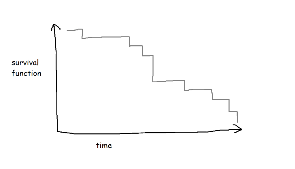
The survival function on the y-axis shows the probability that a thing will avoid something happening to it for a certain amount of time. At the start, where time = 0, the probability is 1 because nothing has happened yet; over time, something happens to more and more things, until something has happened to all the things.
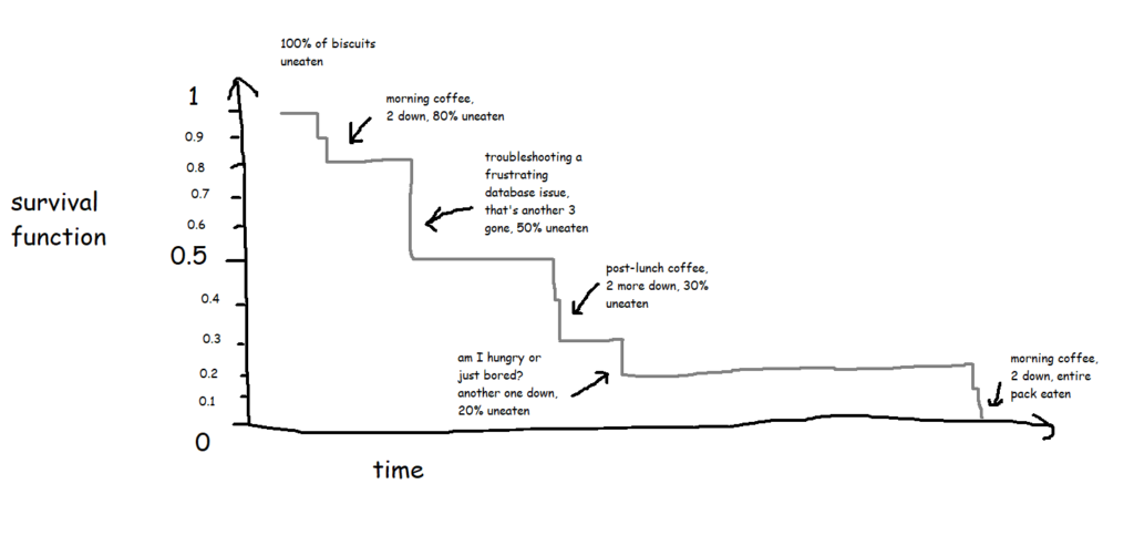
A lot of the examples are fairly morbid, so to illustrate this, I’ll talk about biscuits instead. I’ve just bought a packet of supermarket own-brand chocolate oaties, and they’re not going to last long. I’ve already had three. Okay, five. So, the biscuits are the things, being eaten is the event, and the time it’s taken between me buying the packet and eating the biscuit is the time duration we’re interested in.
Survival functions, or S(t)
In its simplest form, where every biscuit eventually gets eaten, a survival function is equivalent to the percentage of biscuits remaining at any given point:
This is the survival curve for a packet of ten biscuits that I have sole access to. And in cases like this, where there’s a single packet of biscuits where every biscuit gets eaten, the survival function is nice and simple.
The curve gets more complicated and more interesting when you build up the data over a period of time for multiple packets of multiple biscuits. My biscuit consumption looks a little bit like this:

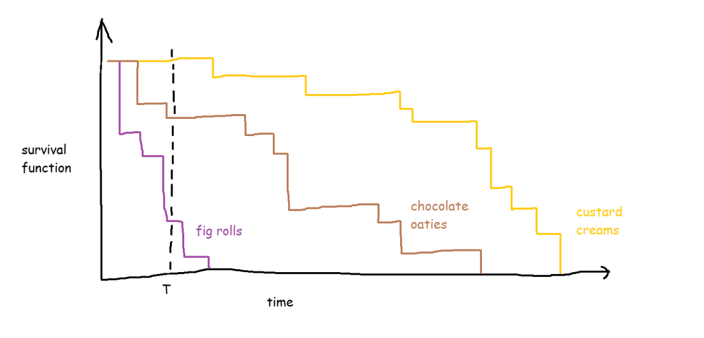
I’m not a huge fan of custard creams, so I don’t eat them as quickly. I really like chocolate oaties, and I can’t get enough of fig rolls, so I eat those ones much more quickly. This means that the probability that a particular biscuit will remain unmunched by time point T is around 100% for a custard cream, around 70% for a chocolate oatie, and around 30% for a fig roll:
(this assumes I’ve decanted the biscuits into a biscuit tin or something – if I’ve left them in the packet and I’m munching them sequentially, then the probability isn’t consistent for any given biscuit, but let’s leave that aside for now)
A quick detour to talk about censoring
But in most survival analysis situations, the event won’t happen to every thing, or to put it another way, the time that the event happens isn’t known for every thing. For example, I’ve bought the packet of biscuits, and I’ve had two, and then a little while later I come back and there are only seven left when there should be eight. What happened to the missing biscuit? I didn’t eat it, so I can’t count that event as having happened, but I can’t assume that it hasn’t been eaten or never will be eaten either. Instead, I have to acknowledge that I don’t know when (or if) the biscuit got eaten, but I can at least work with the duration that I knew for sure that it remained uneaten.
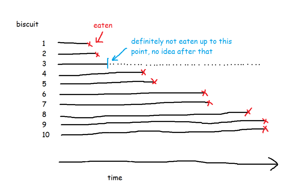
This concept is called censoring. Biscuit number three is censored, because we don’t know when (or if) it was eaten.
There are a few different types of censoring. Right-censored data, which is the most common kind, is where you do know when something started, but you don’t know when the event happened. This could be because the biscuit has gone missing and you don’t know what’s happened to it, or simply because you’ve finished collecting your data and you’re doing your analysis before you’ve finished all the biscuits. If you’re doing survival analysis on customers of a subscription service, like if you’re looking at how long it takes for somebody with a Spotify account to decide to leave Spotify, anybody who still has a Spotify account is right-censored – you know how long they’ve had the account, but you don’t know when (or if) they’re going to cancel their subscription. The event is unknown or hasn’t happened yet. To put it another way, the actual survival time is longer than (or equal to) the observed survival time.
Left-censored data is the other way round. For left-censored data, the actual survival time is shorter than (or equal to) the observed survival time. In the biscuit situation, this would be where I’m starting my survival analysis data collection after I’ve already started the packet of biscuits. I can work out when I bought the packet by looking at my shopping history, and I know what the date and time is right now. I don’t know exactly when I ate the first biscuit, but I know that it has to before now. So, the observed survival time is the time between buying the packet of biscuits and right now, and the data for the missing biscuits is left-censored because I’ve already eaten them, so their actual survival time was shorter than the observed survival time.
There’s also interval censoring, where we only know that the event happened in a given interval. So, with the biscuits, imagine that I don’t record the exact timestamp of when I eat them. Instead, I just check the packet every hour; if the packet was opened at 9am, and a biscuit has been eaten between 11am and 12 noon, I know that the survival time is somewhere between 120 and 180 minutes, but not the exact length.
I normally find that my data is right-censored or not censored, and rarely need to run survival analysis with left- or interval-censored data.
Back to survival functions
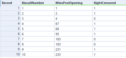
So, let’s have a look at the survival function for this data set of ten packets of biscuits where there are some right-censored biscuits too. It’s no longer as simple as the percentage of biscuits that haven’t been eaten yet.
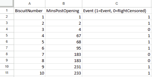
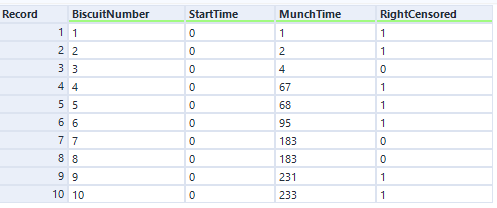
There are ten biscuits in the packet, and I’ve eaten seven of them. Three of them have gone missing in mysterious circumstances, which I’m going to blame on my partner. All I know about BiscuitNumber 4 is that it was gone by minute 4 after the packet was opened, and all I know about BiscuitNumbers 7 and 8 is that they were also gone when I checked the packet at 183 minutes post-opening. My partner probably at them, but I don’t actually know.
The survival curve for this data looks like this:
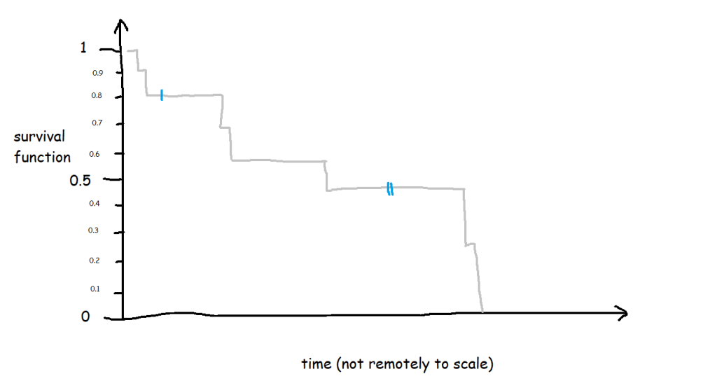
The blue lines show where the right-censored biscuits have dropped out; I haven’t eaten them, so I can’t say that the event has happened to them, but they’re not in my data set anymore, and that’s the point at which they left my data set.
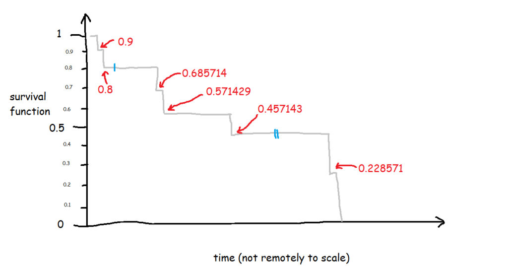
Let’s have a look at the exact numbers on the y-axis:
This is a little less intuitive! The survival function is cumulative, and it’s calculated like this as:
S(t) = S(t-1) * (1 - (# events / # at risk)
which in slightly plainer English is:
[the survival function at the previous point in time] *
(1 - [number of events happening at this time point] /
[number of things at risk at this time point])
At the first time point, at 1 minute post-opening, I eat the first biscuit. At that point, all 10 biscuits are present and correct, so all 10 biscuits are at risk of being eaten. That makes the survival function at 1 minute post-opening:
1 * (1 - (1/10)
=
1 * 0.9
So, we end up with 0.9 at 1 minute post-opening, or S(1) = 0.9.
At the next time point, at 2 minutes post-opening, I eat the second biscuit. At that point, 1 biscuit has already been eaten (BiscuitNumber 1 at 1 minutes post-opening), so we’ve got 9 biscuits which are still at risk. Moreover, the survival function at the previous time point is 0.9. That makes the survival function at 2 minutes post-opening:
0.9 * (1 - (1/9)
=
0.9 * 0.8888
So, we end up with 0.8 at 2 minutes post-opening, or S(2) = 0.8. So far, so good.
But then it gets a little trickier, because we’ve got a censored biscuit. BiscuitNumber 3 drops out of our data at 4 minutes post-opening. We don’t adjust the survival curve here because the eating event hasn’t happened, but we do make a note of it, and continue onto the next event, which is when I eat my third biscuit at 67 minutes post-opening. At this point, 2 biscuits have already been eaten (BiscuitNumbers 1 and 2), and 1 biscuit has dropped out of the data (BiscuitNumber 3). That means that there are now 7 biscuits which are still at risk. The survival function at the previous time point is 0.8, so the survival function at 67 minutes post-opening is:
0.8 * (1 - (1/7)
=
0.8 * 0.85713
That gives us 0.685714, so S(67) = 0.685714. This is less intuitive now, because it doesn’t map onto an easy interpretation of percentages. You can’t say that 68.57% of biscuits are uneaten – that doesn’t make sense, as there were only 10 biscuits to begin with. Rather, it’s a cumulative, adjusted view; 80% of biscuits were uneaten at the last time point, and then of those 80% that we still know about (i.e. limit the data to biscuits which are either definitely eaten or definitely uneaten), 85.71% of them are still uneaten now. So, you take the 85.71% of the 80%, and you get a survival function of 68.57%, which is the probability that any given biscuit remains unmunched by 67 minutes post-opening, accounting for the fact that we don’t know what’s happened to some biscuits along the way.
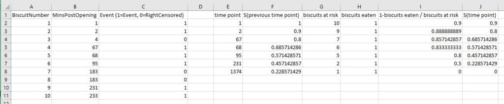
I had to work this through step-by-step in an Excel file to fully wrap my head around it, so hopefully this helps if you’re still stuck:
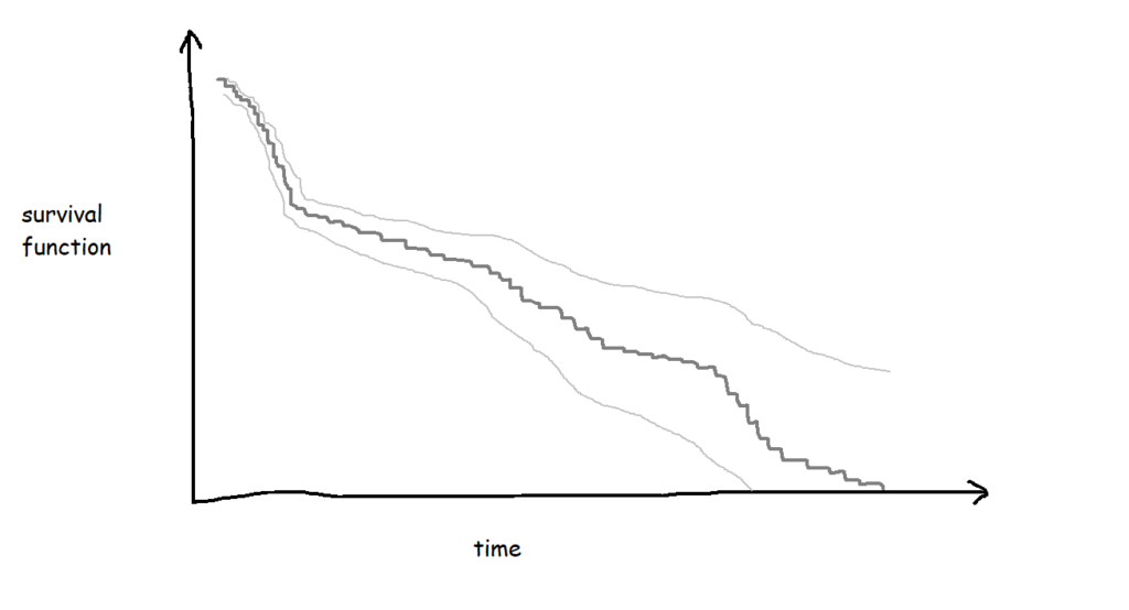
If I collect biscuit data over several packets of biscuits and add them all to my survival analysis model, I’ll get a survival curve with more, smaller steps, like this:

The more biscuits that have gone into my analysis, the more confident I am that the survival curve is an accurate representation of the probability that a biscuit won’t have been eaten by a particular time point. Better still, you can show this by plotting confidence intervals around the survival function too:
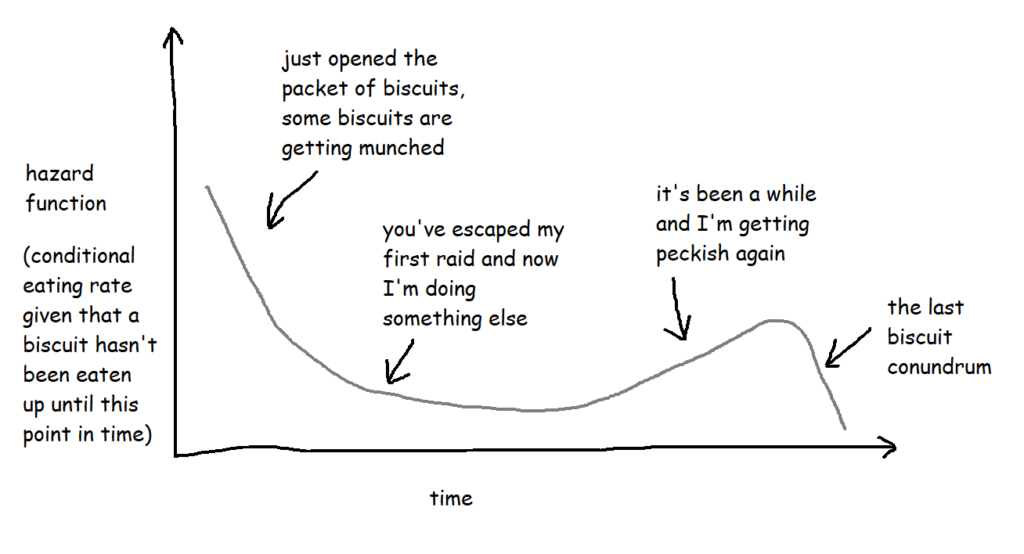
Hazard functions, or h(t)
If the survival function tells you what the probability of something not happening by a particular point in time is, a hazard function tells you the risk that something is going to happen given that you’ve made it this far without it happening.
With the biscuit example, when I open the packet, let’s say any given biscuit has a 70% chance of surviving longer than two hours. But what about if the packet is already open? What’s the risk of a biscuit being eaten if it’s already three hours since I opened the packet and that biscuit hasn’t been eaten yet? That’s the hazard function.
Technically, the hazard function isn’t actually a probability – the way it’s calculated is by taking the probability that a thing has survived up until a certain point but the event will happen by a later point and then dividing it by the interval between the two points, so you get the rate that the event will happen, given that it hasn’t happened up until now. But it also involves limits, and there are a lot of blogs and articles out there describing exactly how it works. For the purposes of this blog, it’s more useful to think of it as a conditional failure rate, and you can use the hazard function to interpret risk a bit like this:
These are often plotted cumulatively:
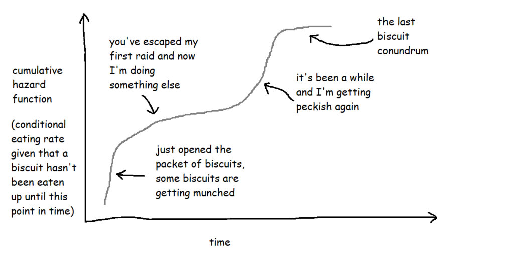
It’s not exactly an intuitive graph, but it essentially shows the total amount of risk faced over time. You can kind of think of it like “how many times would you expect the event to have happened to this thing by now?”. So, in this case, it’s “if this biscuit has made it this far without being eaten, how does that compare to the rest of them? How many times would you expect this biscuit to have been eaten by now?”.
Cox proportional hazards
Now that we’ve got our survival curves, we can analyse them with a Cox proportional hazards model, and use that model to predict survival relative risk for future things. It’s a bit like a linear regression for looking at the survival time based on various different factors, and it lets you explore the effect of the different factors on the survival time.
The output of a Cox proportional hazards model should give you the following information for each variable:
- The statistical significance for each variable
i.e. does it look like this actually has an effect on the survival time?
e.g. biscuits with more calories in them taste better, so I’m more likely to eat them more quickly … but is that true? - The coefficients
i.e. is it negative or positive? If it’s positive, then the higher this variable gets, the higher the risk of the event happening gets; if it’s negative, then the lower this variable gets, the higher the risk of the event happening gets.
e.g. if it turns out that I do indeed eat biscuits with more calories in them more quickly, then the coefficient for the variable CaloriesPerBiscuit will be positive. But if it turns out that I actually eat less calorific biscuits more quickly because they’re less instantly satisfying, then the coefficient for CaloriesPerBiscuit will be negative. - The hazard ratios
i.e. the effect size of the variables. If it’s below 1, it reduces the risk; if it’s above 1, it increases the risk.
e.g. a hazard ratio of 1.9 for ContainsChocolate means that having chocolate on, in, or around a biscuit increases the hazard by 90%
At this point, it’s a lot easier to explain things with some actual results, so let’s dive into how to do it in Alteryx, and come back to the interpretations later.
Survival analysis in Alteryx
First of all, you’ll need to download the survival analysis tools from the Alteryx Gallery. The search functionality isn’t great, so here’s the links:
Survival analysis tool
Download it here
Read the documentation here
Survival score tool
Download it here
Read the documentation here
I’ve also put up an example workflow on the public gallery, which you can download here
Nice. Now, you need some data! Let’s start out with the simple example I used to illustrate Kaplan-Meier survival curves:
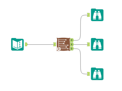
The data needs to have one row per thing, with a field for the duration or survival time, and another field for whether the data is censored or not (the eagle-eyed reader may have spotted something confusing with the RightCensored field – more on that in a moment). Now I can plug it straight into the survival analysis tool:
Let’s have a look at how to configure the tool. The input options are the same for both Kaplan-Meier graphs and Cox proportional hazards models:
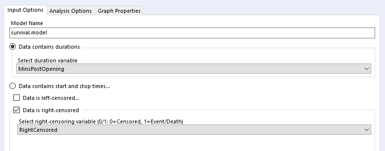
I’ve selected the option “Data contains durations”, as I have a single field for the number of minutes a biscuit lasted before being eaten, rather than one field for the time of packet opening and another field for the time of biscuit eating. I prefer using a single field for durations for two reasons. Firstly, because the tool doesn’t accept date or datetime fields, only numbers, and I find it easier to calculate the date difference than to convert two date fields into integers; secondly, as it allows me to sort out any other processing I need beforehand (e.g. removing time periods when I wasn’t in the flat because there wasn’t any actual risk of the biscuits being eaten at that time). But, if you have start and stop times in a number format and don’t want to do the time difference calculation yourself, you can have your data like this:
…and set up your tool like this:
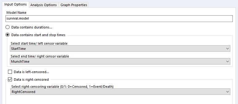
…and you should get the same results.
Confusingly, the survival analysis tool asks whether data is censored, and asks for a 0/1 field where 1 = “the event happened” (i.e. this data isn’t actually censored) and 0 = “I don’t know what happened” (i.e. this data is censored). I often get this mixed up. But yes, if your data is right-censored, you need to assign that a 0 value, and if your event has actually happened, that’s a 1.
Kaplan-Meier
Then there’s the analysis tab. Let’s go over Kaplan-Meier graphs first:
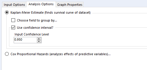
We’re doing the survival curve at the moment, so select the Kaplan-Meier Estimate option. I’d recommend always using the confidence interval – it might make the plots harder to read when you group by a field, but you’ll want that data in the output.
The choose field to group by option is also good to look at, but there’s a strange little catch with this; it won’t work unless the field you’re grouping by is the first field in your data set, so you’ll need to put a select tool on before the survival analysis tool, and make sure that you move your grouping field right to the top.
Now you can run the workflow. There are three outputs:
O: Object. You can plug this into a survival score tool, but I don’t really do much with this otherwise
R: Report. This is full of interesting information, so stick a browse tool on the end.
D: Data. This is brilliantly useful, and I wish more Alteryx predictive tools did this. It’s the stuff that’s shown in the report output, but a data table that you can do stuff with.
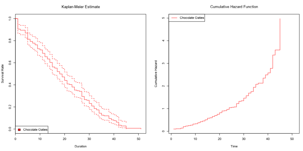
Here’s what the report output looks like:
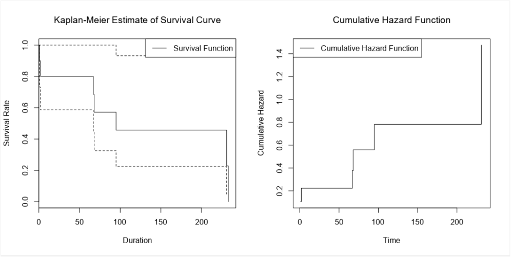
There’s the survival curve, along with some giant confidence intervals because there are so few biscuits in the data set. This is the same one that I was drawing in MS Paint in the first section.
We’ve also got the cumulative hazard function, which I drew earlier too. It’s is the running sum of the hazard functions along the time period. In this particular example, it just looks like the survival curve but rotated a bit, but we’ll see examples where it’s different later.
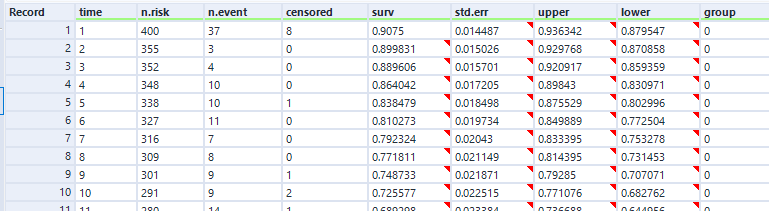
In the data output, we can see the curve data in a table:
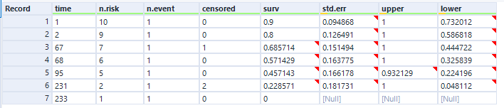
And again, this is the data as profiled in the screenshot from Excel earlier when I was working through the survival function calculations.
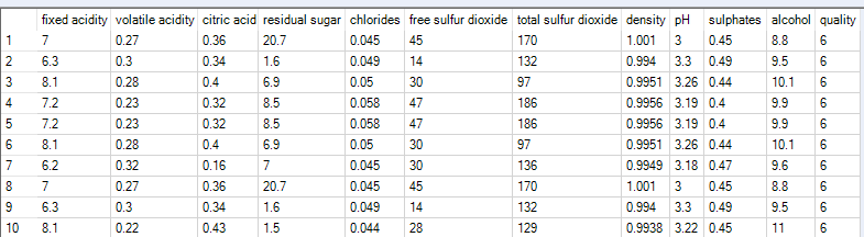
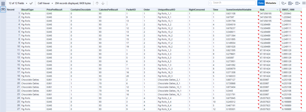
Let’s now move to a bigger data set of biscuits. I’ve tracked my consumption of fig rolls, chocolate oaties, and custard creams in a table that looks like this:
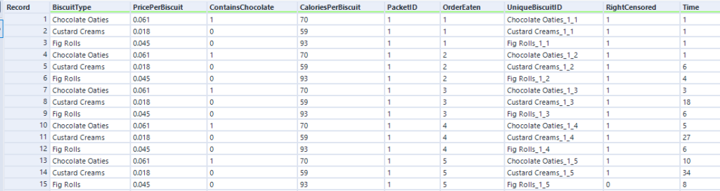
(this is all fake data that I’ve generated for this blog, if you haven’t guessed already – but it is “based on a true story”)
The Time field is the duration – I’ve generated it kind of arbitrarily. We can pretend it’s still minutes, although as you’ll see, I end up finishing a pack of fig rolls in about thirty minutes, which is going it some even for me.
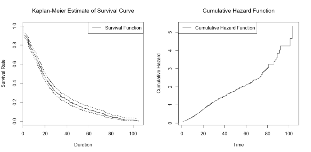
When I run the main survival analysis, I get a nice survival curve of my general biscuit consumption:
I can also choose the group by option to create separate survival curves for each biscuit type, and it’ll plot the survival curves of all three alongside each other:
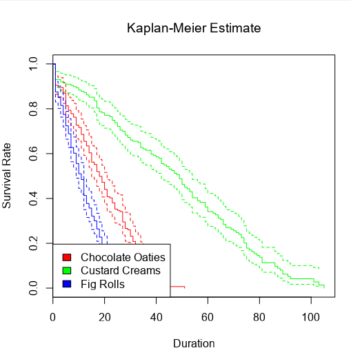
…and then the survival curve and cumulative hazard function of each biscuit type individually:
When grouping by a field, you get this extra table in the report output:
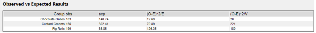
The obs column is a simple count of how many biscuits actually got eaten (i.e. the sum of the RightCensored field I created earlier), but I’m not sure where they’re getting the exp values from. I’m also not sure why I don’t get this table when I’m not grouping by any fields.
Another quirk of the survival analysis tool is that I get this warning message about nonstandard censoring regardless of what I do:
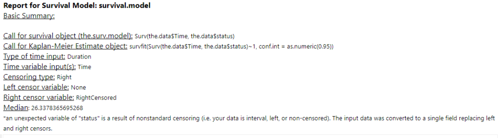
I haven’t figured out why it happens – if you do, give me a shout.
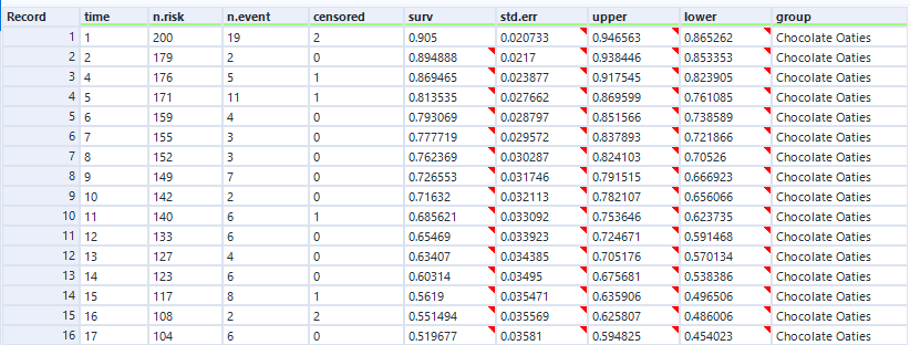
In the data output, we get the survival curve data points for each group, which is really useful. We’ll use this data later and plot it in Tableau:
Cox proportional hazards
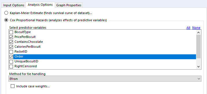
Back to the analysis tab, then.
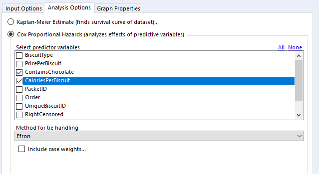
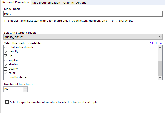
In the “select predictor variables” section, you can select the variables you want to investigate. I generally use binary fields and continuous fields here. You can use categorical fields, but I wouldn’t recommend it, as they get converted to paired binary fields anyway (more on that in a bit).
For tie handling, I just leave it at Efron. The survival R package documentation that the survival analysis tool is built off has a long explanation; the summary version is that if there aren’t many ties in your data (i.e. if there aren’t many things that have the same duration), then it doesn’t really matter which option you use, and Efron is the more accurate one anyway.
Finally, case weights gives you an option to double-count a particular line of data. As far as I can tell, this is functionally equivalent to unioning in every line of data you want to replicate; there’s no difference between running a Cox proportional hazards model on 500 rows where each row has case weight = 2 and running the same model on 1000 rows where it’s the 500 row table unioned to itself. The model returns the same coefficients, but the p-values are different. In any case, it seems like it’s a throwback to when data was reduced as much as possible to keep it light. I can’t see any need to include case weights in your analysis in Alteryx, but again, hit me up if you have a use case where this is necessary.
Here are the results in the results tab:
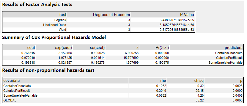
The factor analysis section is testing whether the model itself is significant. If it’s not (i.e. if the p-value is > 0.05), then the rest of the results are interesting to look at but not really that meaningful. If it is significant, then you can proceed to the rest of the results.
The summary section is the most useful bit. The coef column shows the coefficients. This is where the sign is important – if it’s positive, then there’s a corresponding increase in risk, whereas if it’s negative, then there’s a corresponding decrease in risk. My ContainsChocolate field is positive, so if a biscuit contains chocolate, then there’s an increase in the risk to the biscuit that I’ll eat it. Same goes for CaloriesPerBiscuit, which is also positive. The more calories a biscuit has, the greater the risk that I’ll eat it.
The exp(coef) column shows the exponent of the coefficient, which basically means the effect size of the variable. The exp(coef) for ContainsChocolate is 2.15, which means that having chocolate in the biscuit will more than double the risk that I’ll eat it. The exp(coef) for SomeUnrelatedVariable is 0.82, which suggests that the risk decreases by 18% as SomeUnrelatedVariable rises…
…but as we can see in the Pr(>|z|) column, the p-value for SomeUnrelatedVariable is 0.19, which means it’s not significant (I’d hope not, as I created SomeUnrelatedVariable by just sticking RAND() in a formula tool). So, we can ignore the coef and exp(coef) columns, because they aren’t really meaningful. The ContainsChocolate and CaloriesPerBiscuit fields are significant, so I can use that information to explore my biscuit consumption.
This is where knowing your variables is really important. If I’d coded up my ContainsChocolate variable differently, and set it so that 0 = contains chocolate and 1 = does not contain chocolate, then the model would return -0.766615 in the coef column rather than 0.766615. Likewise, the exp(coef) column would be a little under 0.5 rather than a little over 2. If you mix up which way round your variables go, you’ll draw completely the wrong conclusion from the stats.
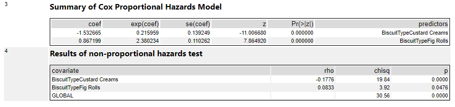
It’s possible to use categorical fields in the Cox proportional hazards model too, but all it does is create new variables by comparing everything to the first item in the categorical field in a binary way. So, in this output, I’ve used BiscuitType as a predictor variable, and the tool has converted that into two variables; chocolate oaties vs. custard creams (where chocolate oaties = 0 and custard creams = 1), and chocolate oaties vs. fig rolls (where Chocolate oaties = 0 and custard creams = 1). The interpretation of these results is that there’s a huge difference between custard creams and chocolate oaties in terms of survival. As the new field BiscuitTypeCustardCreams increases (i.e., for custard creams), the risk of being eaten decreases, as shown by the negative coef value of -1.53, and that translates to a risk reduction of 79% as shown by the exp(coef) value of 0.21:
The more things you’ve got in a categorical field, the more of these new variables you’ll get, and it’ll get messy. I prefer to work out any categorical variables of interest beforehand and translate them into more useful groupings myself first, such as in my field ContainsChocolate.
Combining Cox proportional hazards with a survival score tool
Finally, once you’ve got a model that you’re happy with, you can use it with the survival score tool to predict relative risk and survival times for other biscuits.
I highly recommend validating your model predictions on your original data set so that you can compare the output of the survival score tool with the survival times that actually happened:
What I’ve done here is train my Cox proportional hazards model on 66% of the biscuit data, and then used the output of that model in the survival score tool to predict biscuit survival time for the remaining 34%. I’ve also included Order in the model as the order where the biscuit sits in the packet, as that’s obviously going to affect the survival time of the biscuit. Actually, I shouldn’t really be doing the analysis like this at all, because the fact that there’s an order to them shows that the biscuits aren’t independent, but I’m 4000 words into this analogy now. Just pretend that the biscuits are independent and sitting in a tin, and that the order field is some kind of variable that affects how quickly an individual biscuit gets eaten, yeah? Anyway, here’s the configuration pane:
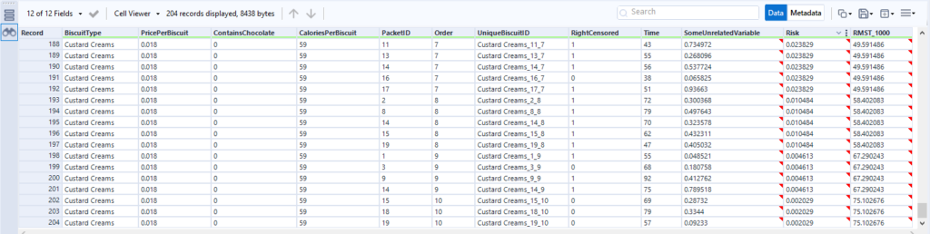
If I look at the output, it’s pretty good:
This first table is sorted by the relative risk factor that the score tool puts out, and it’s showing that the biscuits with the highest risk of being eaten are the fig rolls in the first few positions in the packet, then the chocolate oaties in the first position in the packet. The actual survival duration (just called Time here) is pretty low too. If I scroll down to see the lowest risk, I can see lower relative risk in the Risk field, and higher actual survival times in the Time field:
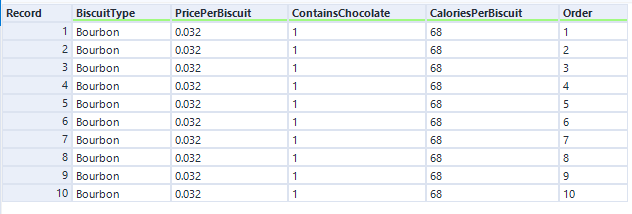
So, I’m happy that my model is a good one, and I can now put some new biscuit information to predict survival time for a new set of biscuits. Maybe some bourbons, maybe some ginger nuts, maybe even some garibaldis.
Let’s predict survival time and relative risk for a new packet of bourbons:
The score tool has established the relative risk for each biscuit in the packet, and the RMST_1000 output shows the number of minutes it’s expecting each biscuit to survive for:
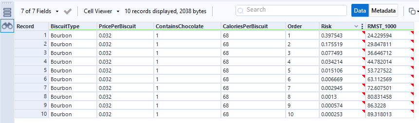
This isn’t perfectly accurate – we’ve already seen in the data that the first two biscuits of most packets get eaten within a couple of minutes, but the time prediction for biscuit number 1 is 24 mins. More data and more different predictor fields will make that more realistic.
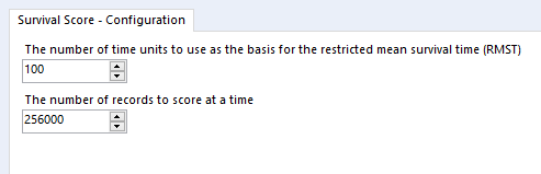
The RMST bit of the RMST field stands for Restricted Mean Survival Time, and it’s set in the survival score tool configuration pane:
It’s a value you can choose to get a relatively realistic estimate of how long something will survive for out of a fixed number of time units. It’s helpful for cases when you’re running your analysis with a lot of right-censored data because the event simply hasn’t happened yet, such as customer churn. Then you can get an estimate of how the survival curve might extend beyond the period you’ve got.
Visualising survival analysis in Tableau
Now that I’ve got my biscuit survival models, I want to visualise them in Tableau, because the default R plots in the browse tool aren’t great.
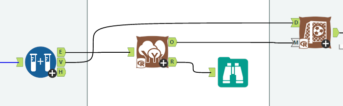
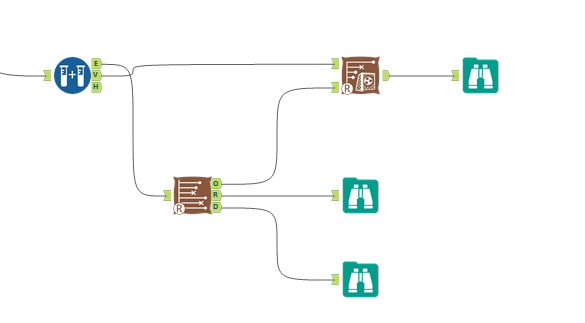
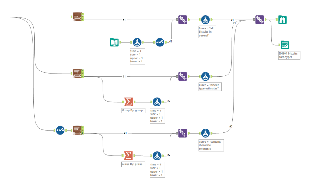
I want three different survival curves – the general biscuits curve, the curves broken down per BiscuitType, and the curves broke down by ContainsChocolate. So, I’m going to need three separate survival tools to get the data for these survival curves.
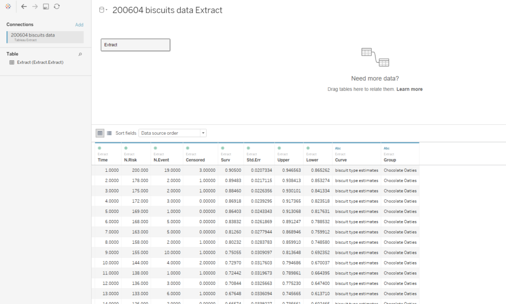
It’s also important to do a little bit of data processing to the output of the D anchor. This is how the data looks:
The first line of data is at time = 1, which is the time of the first event. To make the graph in Tableau, we’ll need an extra line at the top where time = 0 and the survival function = 1. This line needs to be repeated for each group that we’ve grouped by in the survival analysis tool.
For the single survival curve of all biscuits, I do this by using a text input tool with a single row and single column, adding four new fields in the formula tool (time = 0, surv = 1, upper = 1, lower = 1), deselecting the dummy field, and unioning it in with the survival analysis data output. Then I add a formula tool for that data to label which survival curve it is:
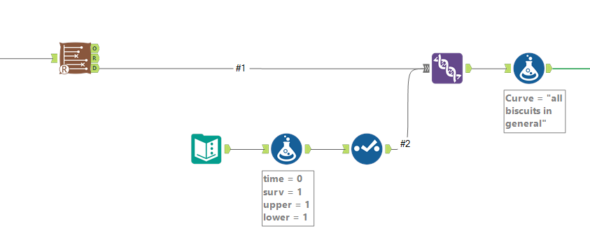
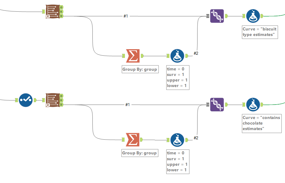
For the survival curves which are split out by a particular field in the group by option, I split off the data output, use a summarise tool to group by the grouping field so that there’s one row per value in the group field, then add the same fields in a formula tool and union these new rows back in. Again, a formula tool after the union is there to label the data for each survival curve:
Then you can union the lot together, and output to Tableau:
This doesn’t cover getting the hazard function or cumulative hazard function. For that, you need to hack the macro itself and add an output to the R tool inside it to put out the data it uses for the cumulative hazard function plot. That’s a topic for another blog.
Now, let’s open this data in Tableau:
The first step is to plot the average survival function over time. You’ll want your time field to be a continuous measure:
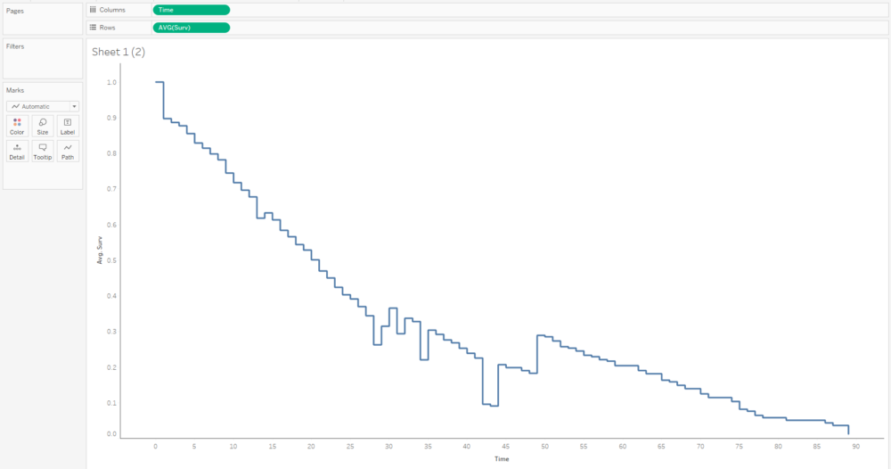
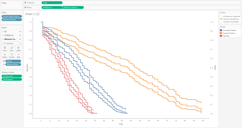
This curve doesn’t make any sense because it seems to jump up and down; that’s because we’ve got several different survival curves in this data, so let’s add a filter to show one at a time:
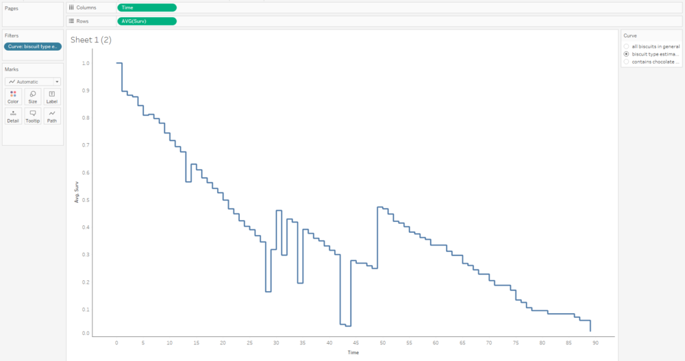
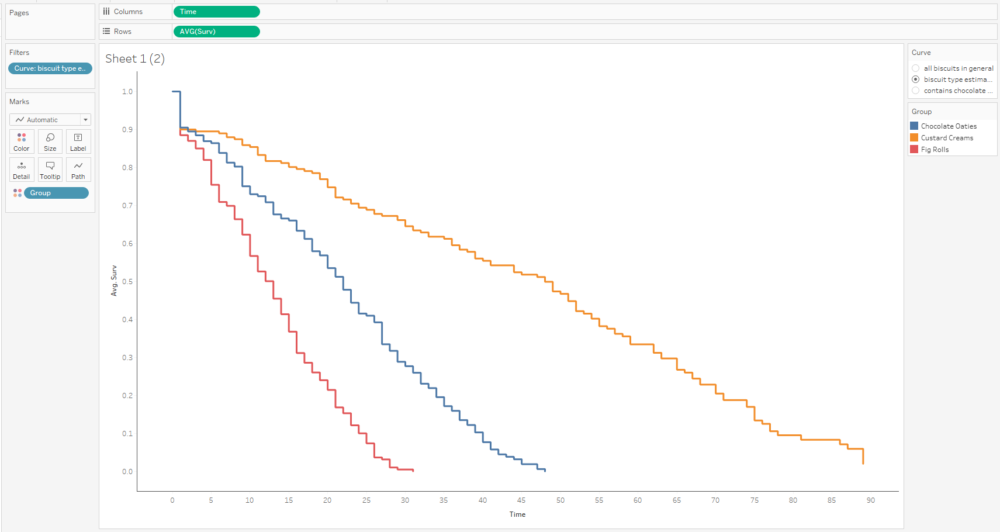
This graph is filtered to the BiscuitType curve only, but it still jumps around because there are three separate curves for the three biscuit types. That means we need to put the grouping field on detail and/or colour too:
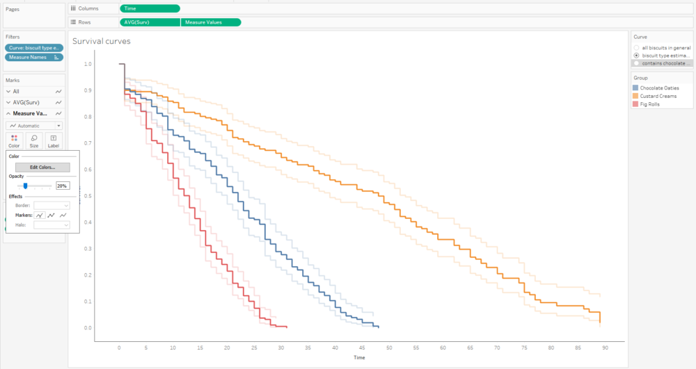
The next step is to add the confidence intervals. I’m going to add them in as measure names/measure values, and then dual axis them with the survival function. In the measure names/measure values step, make sure to put AVG(Lower) and AVG(Upper) together, and put Measure Names on detail with group on colour.
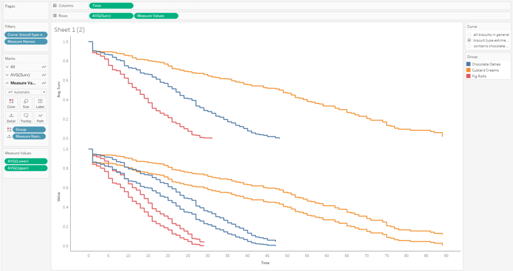
The next step is to put AVG(Surv) and Measure Values on a dual axis, and synchronise it:
That’s quite nice, but I can’t really distinguish the survival function line that easily, and that’s the most important one. So, I’ll whack the opacity down on the confidence intervals too:
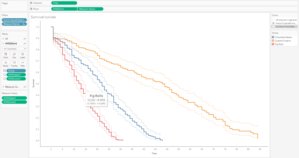
A little bit more formatting and tooltip adjustment, and I’ve got a nice set of survival curves that I can interact with, publish, and share for others to explore:
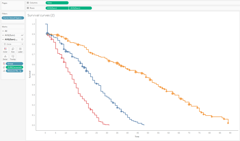
Alternatively, I can plot the number of censored biscuits at each time point as well by plotting AVG(Surv) as circles, and sizing the circles by the number of censored biscuits. The relative lack of censored biscuits for fig rolls in red explains why the confidence intervals are more narrow for fig rolls compared to chocolate oaties and custard creams:
I’ve wrapped it all up into a workbook you can find and download here:
https://public.tableau.com/profile/gwilym#!/vizhome/BiscuitSurvivalAnalysis/BiscuitSurvivalAnalysis
That was a looong blog. Congratulations / commiserations if you’ve read all the way down in one go. Hopefully you got something out of it!