A little while ago, I wrote a blog on how to dynamically save a file with different file paths based on a folder structure that has a separate folder for each year/month. I’ve since used variations on this trick a few different ways, so instead of writing multiple blogs, I figured I’d condense them into one blog with three use cases.
Example 1: updating folder locations based on dates
I’ve already written about this one, so I’ll only briefly recap it here. What happens when you’ve got a network drive with a folder structure like this? You’d have to update your output tools every time the month changes, right?
Nope. You can use a single formula tool with multiple calculations to generate the file path based on the date that you’re running the workflow, like this:
…and then use that file path in your output tool to automatically update the folder location you’re saving to depending on when you’re running the workflow:
The only caveat here is that it won’t create the folder if it doesn’t already exist – I had this recently when I was up super early on April 1st and got an error because the \2021\Apr folder wasn’t there. Not a huge problem since my workflow only took a couple of minutes to run – I just created the folder myself and then re-ran it – but it could be really annoying if you’ve got a big chunky workflow and it errors out after an hour of runtime for something so trivial.
Example 2: different files for different people
The second example is when you want to create different files for different people/users/customers/whatever.
I work at Asda, and so a lot of our data and reporting is store-specific. The store manager at Asda on Old Kent Road in London really doesn’t care about what’s going on at the Asda on Kirkstall Road in Leeds, and vice versa – they just want to have their own data. But with hundreds of stores across the UK, I don’t want to have a separate workflow for each store. I don’t even want to have one workflow with hundreds of separate output tools for each store.
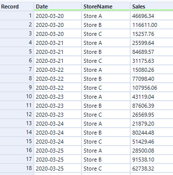
Luckily, I can use the same trick to automatically create a different file for each store by generating a different file name and saving them all within one output tool. Let’s say I’ve got a data set like this:
(in case it’s not obvious, this is data is completely faked and does not show actual Asda sales)
I can use the store name in the StoreName field to create a separate file name, simply by adding it in a file path. In this example, it’ll make a file called “Sales for Store A.csv”, and save it in the folder location specified in the formula tool:
I set up my output tool in exactly the same way as example – change the entire file path, take the name from the field I’ve created called FilePath, and don’t keep that field in the output:
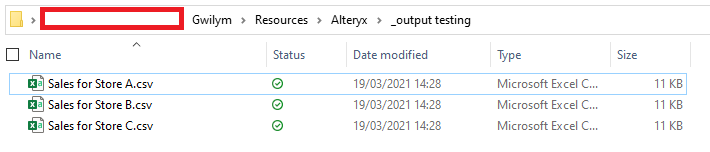
After running that, I get three files:
And when I open the Sales for Store A.csv file in Excel, I can see that it’s only got Store A’s data in it:
Example 3: splitting up a big CSV / SQL statement
My third example is splitting up a big data set into chunks so that other people can use it without specialist data tools.
In my specific case, I’m using Alteryx to pull data from several data sources together, do some stuff with it, and generate the SQL upload syntax for the database admin to load it into the main database. We could technically do this straight from Alteryx, but a) this is an occasional ad-hoc thing rather than something to productionise and schedule, and b) I don’t have write-admin rights to the main database, a responsibility that I’m perfectly happy to avoid.
Anyway, what often happens is that I’ve got a few million lines for the admin to upload. I can generate a text file or a .sql file with all those lines, and the admin can run that with a script… but it would take forever to open if the admin wants to take a look at the contents before just running whatever I’ve sent them into a database. So, I want to split it up into manageable chunks that they can easily open in Excel or a text editor or whatever else. This is also useful when sending people data in general, not just SQL statements, when you know they’re going to be using Excel to look at it.
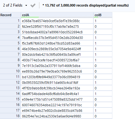
Let’s take some more fake data, this time with 3m rows:
The overall process is to add a record ID, do a nice little floor calc, deselect the record ID, and write it out in files like “data 1.csv”, “data 2.csv”, “data 3.csv”, etc.:
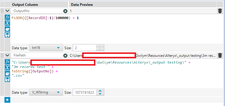
After putting the record ID on, I want to create an output number for each file. The first thing to do is decide how many rows I want in each file. In this example, I’ve gone for 100,000 rows per file. In two steps, I create the output number, then use that to create the file path in the same way we’ve seen in the first two examples:
Here’s the floor calc in text so you can simply copy/paste it:
FLOOR(([RecordID]-1)/100000) + 1
How does it work?
The floor function rounds down a number with decimal places to the whole number preceding the decimal point. If you imagine a number with decimal places as a string, it’s like simply deleting the decimal point and all the numbers after that. A number like 3.77 would become 3, for example.
In this calc, it uses the record ID, and subtracts 1 so that the record ID goes from 0 to 2,999,999. It then divides that record ID by 100,000 (or however many rows you want in your file). For the 100,000 records from 0 through to 99,999, the division returns a number between 0 and 0.99999. When you floor this, you get 0 for those 100,000 records. For the 100,000 from 100,000 through to 199,999, the division returns a number between 1 and 1.99999. When you floor this, you get 1 for those 100,000 records… and so on. After that, I just add 1 again so that my floored numbers start at 1 instead of 0.
(yes, you could just set the RecordID tool to start from 0 instead of 1 and just take the FLOOR(RecordID/100000) + 1… but I always forget about that, so I find it easier to copy across this formula instead)
Then we set up the output in the same way:
…and we’ve got 30 .csv files with 100,000 rows each:
Also, if you need to write out a large amount of data which you also need to split into multiple files to make it work for whatever you’re using it for afterwards, honestly, you probably want to address that first. I’m aware that it’s not a great process I’ve got going on here! But it’s a quick fix for a quick thing that I’ve found really useful when getting something off the ground, and it’s something I’d change if this ever turns into a scheduled process.
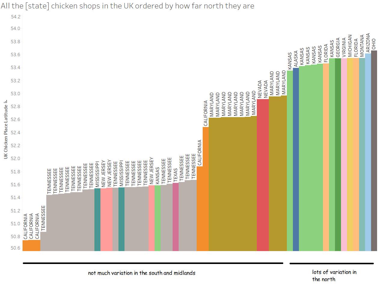
I’ve recently started working on a project where the folder structure uses years and months. It looks a bit like this:
This structure makes a lot of sense for that team for this project, but it’s a nightmare for my Alteryx workflows – every time I want to save the output, I need to update the output tool.
…or do I? One of my favourite things to do in Alteryx is update entire file paths using calculations. It’s a really flexible trick that you can apply to a lot of different scenarios. In this case, I know that the folder structure will always be the year, then a subfolder for the month where the month is the first three letters (apart from June, where they write it out in full). I can use a formula tool with some date and string calculations to save this in the correct folder for me automatically. I can do it in just one formula tool and a regular output tool, like this:
Firstly, I’m going to stick a date stamp on the front of my file name in yymmdd format because that’s what I always do with my files. And my handwritten notes. And my runs on Strava. Old habits die hard. I’m doing it with this formula:
…which is a nested way of saying “give me the date right now (2021-02-08), convert it to a string (“2021-02-08”), then only take the 8 characters on the right, thereby trimming off the “20-” from this century because I only started dating stuff like this in maybe 2015-16 and I’m under no illusions that I’ll be alive in 2115 to face my own century bug issue and I’d rather have those two characters back (“21-02-08”), then get rid of the hyphens (“210208”).
The next two calculations in the formula tool give me the year and month name as a string. The year is easy and doesn’t need extra explanation (just make sure you put the data type as a string):
DateTimeYear(DateTimeToday())
The month is a little harder, and uses one of my favourite functions: DateTimeFormat(). Here we go:
IF DateTimeMonth(DateTimeToday()) = 6 THEN "June" ELSE DateTimeFormat(DateTimeToday(), '%b') ENDIF
This basically says “if today is in the sixth month of the year, then give me ‘June’ because for some reason that’s the only month that doesn’t follow the same pattern in this network drive’s naming conventions, otherwise give me the first three letters of the month name where the first letter is a capital”. You can do that with the ‘%b’ DateTimeFormat option – this is not an intuitive label for it and if you’re like me you will read this once, forget it, and just copy over this formula tool from your workflow of useful tricks whenever you need it.
The final step in the formula tool is to collate it all together into one long file path:
You don’t need the DateStamp, Year, or Month fields anymore. I just deselect them with a select tool.
Then, in the output tool, you’ll want to use the options at the bottom of the tool. Take the file/table name from field, and set it to “change entire file path”. Make sure the field where you created the full file path is selected in the bottom option, and you’ll probably want to untick the “keep field in output” option because you almost definitely don’t need it in your data itself:
And that’s about it! I’ve hit run on my workflow, and it’s gone in the right place:
It’s a simple trick and probably doesn’t need an entire blog post, but it’s a trick I find really useful.
Survival analysis is a way of looking at the time it takes for something to happen. It’s a bit different from the normal predictive approaches; we’re not trying to predict a binary property like in a logistic regression, and we’re not trying to predict a continuous variable like in a linear regression. Instead, we’re looking at whether or not a thing happens, and how long it might take that thing to happen.
One use case is in clinical trials (which is where it started, and why it’s called survival analysis). The outcome is whether or not a disease kills somebody, and the time is the time it takes for it to happen. If a drug works, the outcome will happen less often and/or take longer. Cheery stuff.
In the non-clinical world, it’s used for things like customer churn, where you’re looking at how long it takes for somebody to cancel their subscription, or things like failure rates, where you’re looking at how long it takes for lightbulbs to blow, or for fruit to go bad.
This is a long blog (a really long blog) that’ll cover the principles of survival analysis, how to do it in Alteryx, and how to visualise it in Tableau. Feel free to skip ahead to whichever section(s) you fancy. I could have split it up into several different ones, but one of my bugbears as a blog reader is when everything isn’t in one place and I have to skip from tab to tab, especially if blog part 1 doesn’t link to blog part 2, and so on. So, yeah, it’s a big one, but you’ve got a CTRL key and an F key, so search away for whatever specific bit you need.
Principles of survival analysis
Survival curves, or Kaplan-Meier graphs
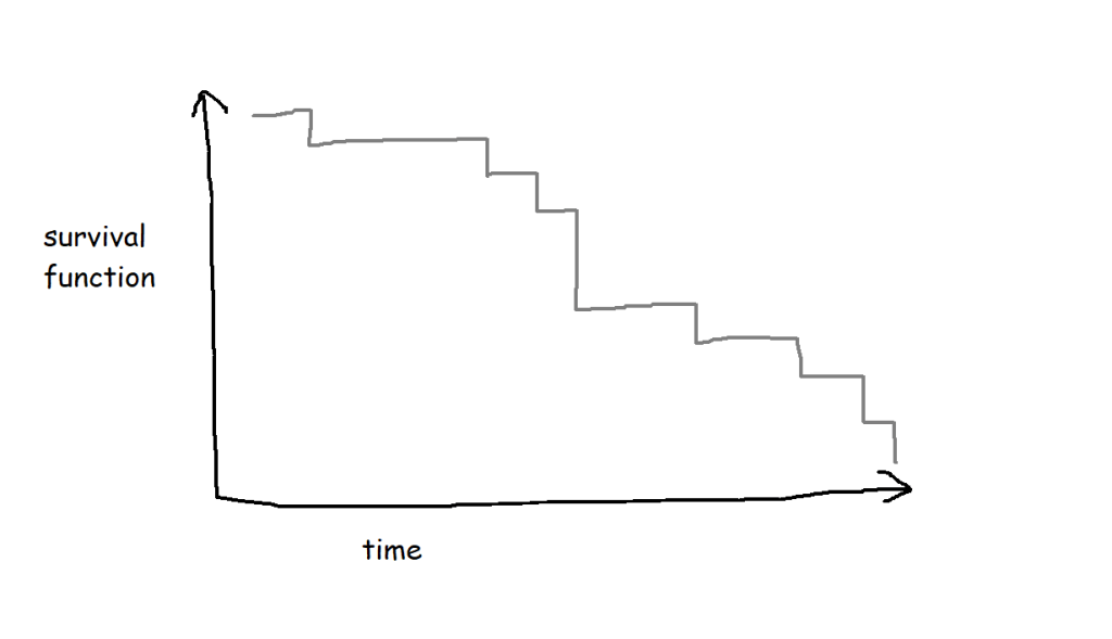
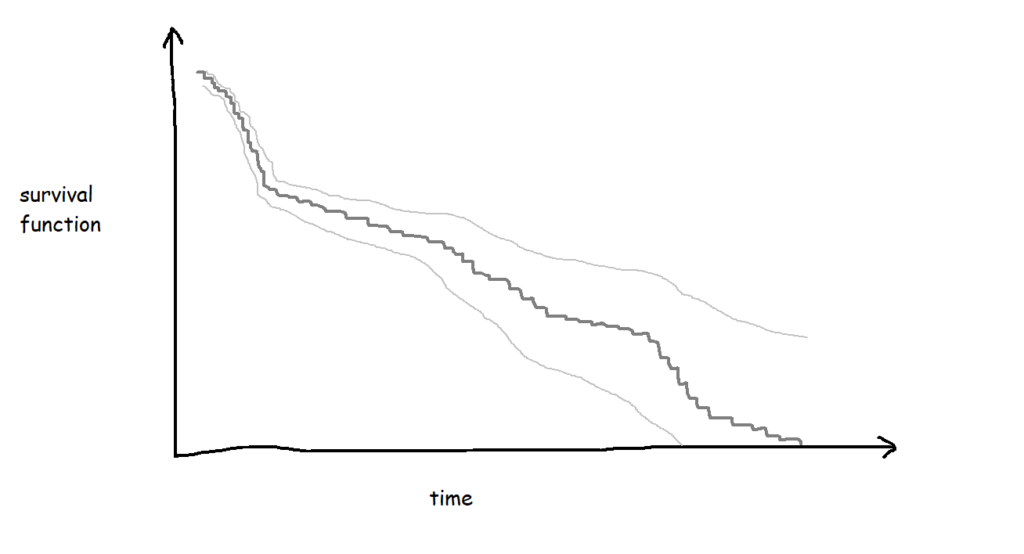
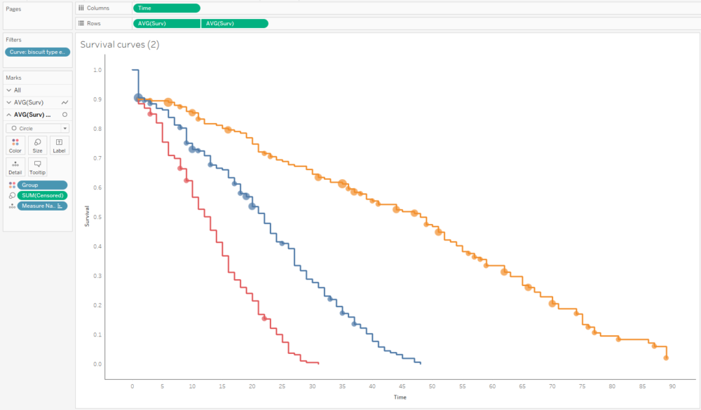
Survival analysis is most often visualised with Kaplan-Meier graphs, or survival curves, which look a bit like this:
The survival function on the y-axis shows the probability that a thing will avoid something happening to it for a certain amount of time. At the start, where time = 0, the probability is 1 because nothing has happened yet; over time, something happens to more and more things, until something has happened to all the things.
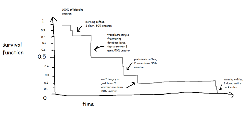
A lot of the examples are fairly morbid, so to illustrate this, I’ll talk about biscuits instead. I’ve just bought a packet of supermarket own-brand chocolate oaties, and they’re not going to last long. I’ve already had three. Okay, five. So, the biscuits are the things, being eaten is the event, and the time it’s taken between me buying the packet and eating the biscuit is the time duration we’re interested in.
Survival functions, or S(t)
In its simplest form, where every biscuit eventually gets eaten, a survival function is equivalent to the percentage of biscuits remaining at any given point:
This is the survival curve for a packet of ten biscuits that I have sole access to. And in cases like this, where there’s a single packet of biscuits where every biscuit gets eaten, the survival function is nice and simple.
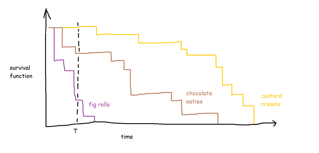
The curve gets more complicated and more interesting when you build up the data over a period of time for multiple packets of multiple biscuits. My biscuit consumption looks a little bit like this:
I’m not a huge fan of custard creams, so I don’t eat them as quickly. I really like chocolate oaties, and I can’t get enough of fig rolls, so I eat those ones much more quickly. This means that the probability that a particular biscuit will remain unmunched by time point T is around 100% for a custard cream, around 70% for a chocolate oatie, and around 30% for a fig roll:
(this assumes I’ve decanted the biscuits into a biscuit tin or something – if I’ve left them in the packet and I’m munching them sequentially, then the probability isn’t consistent for any given biscuit, but let’s leave that aside for now)
A quick detour to talk about censoring
But in most survival analysis situations, the event won’t happen to every thing, or to put it another way, the time that the event happens isn’t known for every thing. For example, I’ve bought the packet of biscuits, and I’ve had two, and then a little while later I come back and there are only seven left when there should be eight. What happened to the missing biscuit? I didn’t eat it, so I can’t count that event as having happened, but I can’t assume that it hasn’t been eaten or never will be eaten either. Instead, I have to acknowledge that I don’t know when (or if) the biscuit got eaten, but I can at least work with the duration that I knew for sure that it remained uneaten.
This concept is called censoring. Biscuit number three is censored, because we don’t know when (or if) it was eaten.
There are a few different types of censoring. Right-censored data, which is the most common kind, is where you do know when something started, but you don’t know when the event happened. This could be because the biscuit has gone missing and you don’t know what’s happened to it, or simply because you’ve finished collecting your data and you’re doing your analysis before you’ve finished all the biscuits. If you’re doing survival analysis on customers of a subscription service, like if you’re looking at how long it takes for somebody with a Spotify account to decide to leave Spotify, anybody who still has a Spotify account is right-censored – you know how long they’ve had the account, but you don’t know when (or if) they’re going to cancel their subscription. The event is unknown or hasn’t happened yet. To put it another way, the actual survival time is longer than (or equal to) the observed survival time.
Left-censored data is the other way round. For left-censored data, the actual survival time is shorter than (or equal to) the observed survival time. In the biscuit situation, this would be where I’m starting my survival analysis data collection after I’ve already started the packet of biscuits. I can work out when I bought the packet by looking at my shopping history, and I know what the date and time is right now. I don’t know exactly when I ate the first biscuit, but I know that it has to before now. So, the observed survival time is the time between buying the packet of biscuits and right now, and the data for the missing biscuits is left-censored because I’ve already eaten them, so their actual survival time was shorter than the observed survival time.
There’s also interval censoring, where we only know that the event happened in a given interval. So, with the biscuits, imagine that I don’t record the exact timestamp of when I eat them. Instead, I just check the packet every hour; if the packet was opened at 9am, and a biscuit has been eaten between 11am and 12 noon, I know that the survival time is somewhere between 120 and 180 minutes, but not the exact length.
I normally find that my data is right-censored or not censored, and rarely need to run survival analysis with left- or interval-censored data.
Back to survival functions
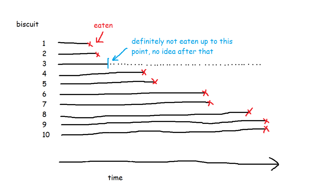
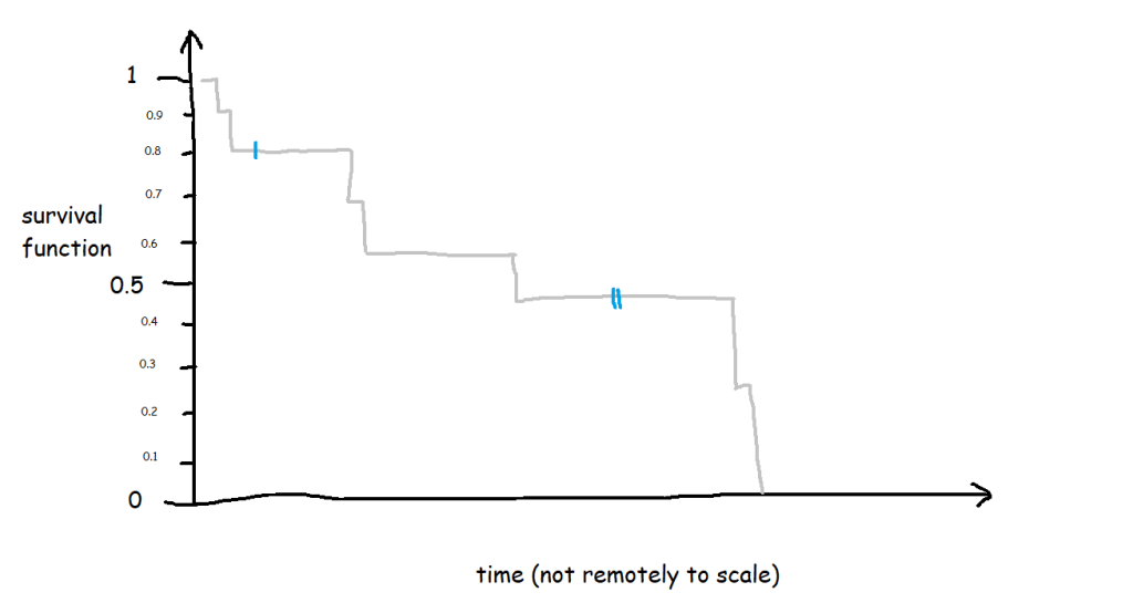
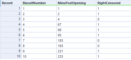
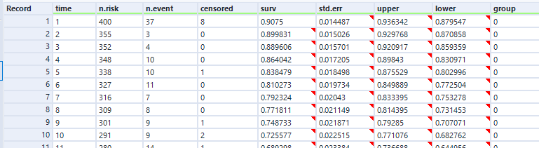
So, let’s have a look at the survival function for this data set of ten packets of biscuits where there are some right-censored biscuits too. It’s no longer as simple as the percentage of biscuits that haven’t been eaten yet.
There are ten biscuits in the packet, and I’ve eaten seven of them. Three of them have gone missing in mysterious circumstances, which I’m going to blame on my partner. All I know about BiscuitNumber 4 is that it was gone by minute 4 after the packet was opened, and all I know about BiscuitNumbers 7 and 8 is that they were also gone when I checked the packet at 183 minutes post-opening. My partner probably at them, but I don’t actually know.
The survival curve for this data looks like this:
The blue lines show where the right-censored biscuits have dropped out; I haven’t eaten them, so I can’t say that the event has happened to them, but they’re not in my data set anymore, and that’s the point at which they left my data set.
Let’s have a look at the exact numbers on the y-axis:
This is a little less intuitive! The survival function is cumulative, and it’s calculated like this as:
S(t) = S(t-1) * (1 - (# events / # at risk)
which in slightly plainer English is:
[the survival function at the previous point in time] *
(1 - [number of events happening at this time point] /
[number of things at risk at this time point])
At the first time point, at 1 minute post-opening, I eat the first biscuit. At that point, all 10 biscuits are present and correct, so all 10 biscuits are at risk of being eaten. That makes the survival function at 1 minute post-opening:
1 * (1 - (1/10)
=
1 * 0.9
So, we end up with 0.9 at 1 minute post-opening, or S(1) = 0.9.
At the next time point, at 2 minutes post-opening, I eat the second biscuit. At that point, 1 biscuit has already been eaten (BiscuitNumber 1 at 1 minutes post-opening), so we’ve got 9 biscuits which are still at risk. Moreover, the survival function at the previous time point is 0.9. That makes the survival function at 2 minutes post-opening:
0.9 * (1 - (1/9)
=
0.9 * 0.8888
So, we end up with 0.8 at 2 minutes post-opening, or S(2) = 0.8. So far, so good.
But then it gets a little trickier, because we’ve got a censored biscuit. BiscuitNumber 3 drops out of our data at 4 minutes post-opening. We don’t adjust the survival curve here because the eating event hasn’t happened, but we do make a note of it, and continue onto the next event, which is when I eat my third biscuit at 67 minutes post-opening. At this point, 2 biscuits have already been eaten (BiscuitNumbers 1 and 2), and 1 biscuit has dropped out of the data (BiscuitNumber 3). That means that there are now 7 biscuits which are still at risk. The survival function at the previous time point is 0.8, so the survival function at 67 minutes post-opening is:
0.8 * (1 - (1/7)
=
0.8 * 0.85713
That gives us 0.685714, so S(67) = 0.685714. This is less intuitive now, because it doesn’t map onto an easy interpretation of percentages. You can’t say that 68.57% of biscuits are uneaten – that doesn’t make sense, as there were only 10 biscuits to begin with. Rather, it’s a cumulative, adjusted view; 80% of biscuits were uneaten at the last time point, and then of those 80% that we still know about (i.e. limit the data to biscuits which are either definitely eaten or definitely uneaten), 85.71% of them are still uneaten now. So, you take the 85.71% of the 80%, and you get a survival function of 68.57%, which is the probability that any given biscuit remains unmunched by 67 minutes post-opening, accounting for the fact that we don’t know what’s happened to some biscuits along the way.
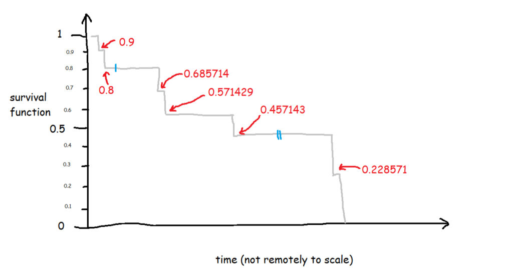
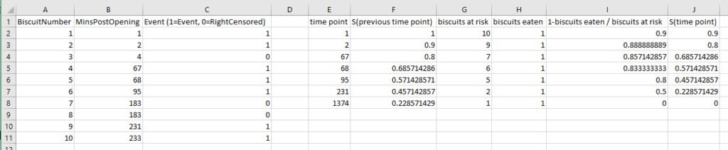
I had to work this through step-by-step in an Excel file to fully wrap my head around it, so hopefully this helps if you’re still stuck:
If I collect biscuit data over several packets of biscuits and add them all to my survival analysis model, I’ll get a survival curve with more, smaller steps, like this:
The more biscuits that have gone into my analysis, the more confident I am that the survival curve is an accurate representation of the probability that a biscuit won’t have been eaten by a particular time point. Better still, you can show this by plotting confidence intervals around the survival function too:
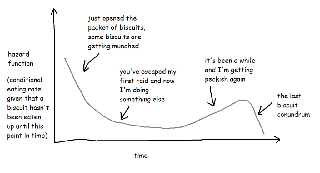
Hazard functions, or h(t)
If the survival function tells you what the probability of something not happening by a particular point in time is, a hazard function tells you the risk that something is going to happen given that you’ve made it this far without it happening.
With the biscuit example, when I open the packet, let’s say any given biscuit has a 70% chance of surviving longer than two hours. But what about if the packet is already open? What’s the risk of a biscuit being eaten if it’s already three hours since I opened the packet and that biscuit hasn’t been eaten yet? That’s the hazard function.
Technically, the hazard function isn’t actually a probability – the way it’s calculated is by taking the probability that a thing has survived up until a certain point but the event will happen by a later point and then dividing it by the interval between the two points, so you get the rate that the event will happen, given that it hasn’t happened up until now. But it also involves limits, and there are a lot of blogs and articles out there describing exactly how it works. For the purposes of this blog, it’s more useful to think of it as a conditional failure rate, and you can use the hazard function to interpret risk a bit like this:
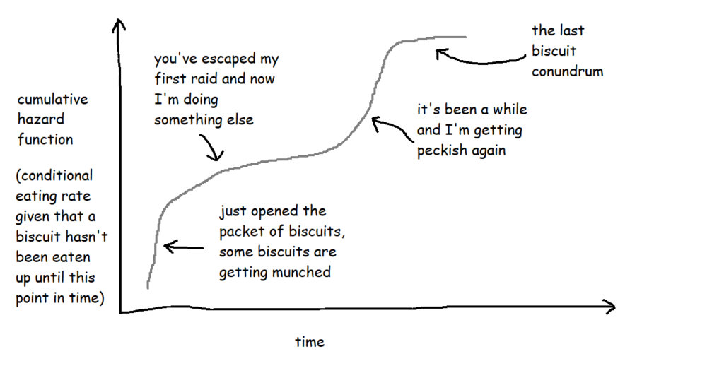
These are often plotted cumulatively:
It’s not exactly an intuitive graph, but it essentially shows the total amount of risk faced over time. You can kind of think of it like “how many times would you expect the event to have happened to this thing by now?”. So, in this case, it’s “if this biscuit has made it this far without being eaten, how does that compare to the rest of them? How many times would you expect this biscuit to have been eaten by now?”.
Cox proportional hazards
Now that we’ve got our survival curves, we can analyse them with a Cox proportional hazards model, and use that model to predict survival relative risk for future things. It’s a bit like a linear regression for looking at the survival time based on various different factors, and it lets you explore the effect of the different factors on the survival time.
The output of a Cox proportional hazards model should give you the following information for each variable:
The statistical significance for each variable i.e. does it look like this actually has an effect on the survival time? e.g. biscuits with more calories in them taste better, so I’m more likely to eat them more quickly … but is that true?
The coefficients i.e. is it negative or positive? If it’s positive, then the higher this variable gets, the higher the risk of the event happening gets; if it’s negative, then the lower this variable gets, the higher the risk of the event happening gets. e.g. if it turns out that I do indeed eat biscuits with more calories in them more quickly, then the coefficient for the variable CaloriesPerBiscuit will be positive. But if it turns out that I actually eat less calorific biscuits more quickly because they’re less instantly satisfying, then the coefficient for CaloriesPerBiscuit will be negative.
The hazard ratios i.e. the effect size of the variables. If it’s below 1, it reduces the risk; if it’s above 1, it increases the risk. e.g. a hazard ratio of 1.9 for ContainsChocolate means that having chocolate on, in, or around a biscuit increases the hazard by 90%
At this point, it’s a lot easier to explain things with some actual results, so let’s dive into how to do it in Alteryx, and come back to the interpretations later.
Survival analysis in Alteryx
First of all, you’ll need to download the survival analysis tools from the Alteryx Gallery. The search functionality isn’t great, so here’s the links:
Survival analysis tool Download it here Read the documentation here
Survival score tool Download it here Read the documentation here
I’ve also put up an example workflow on the public gallery, which you can download here
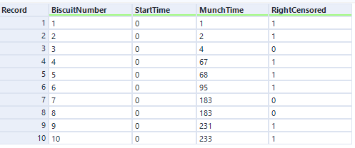
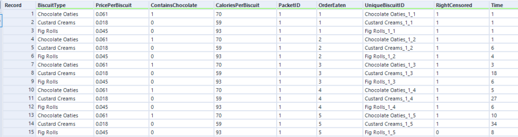
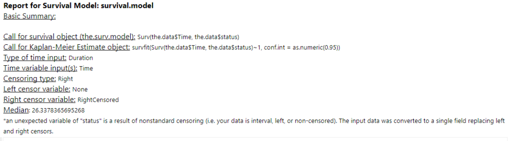
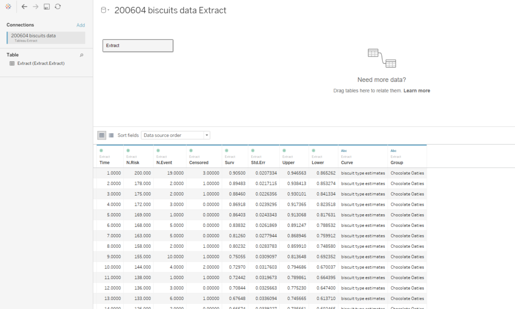
Nice. Now, you need some data! Let’s start out with the simple example I used to illustrate Kaplan-Meier survival curves:
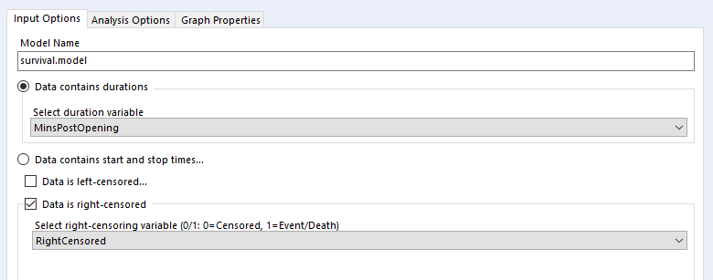
The data needs to have one row per thing, with a field for the duration or survival time, and another field for whether the data is censored or not (the eagle-eyed reader may have spotted something confusing with the RightCensored field – more on that in a moment). Now I can plug it straight into the survival analysis tool:
Let’s have a look at how to configure the tool. The input options are the same for both Kaplan-Meier graphs and Cox proportional hazards models:
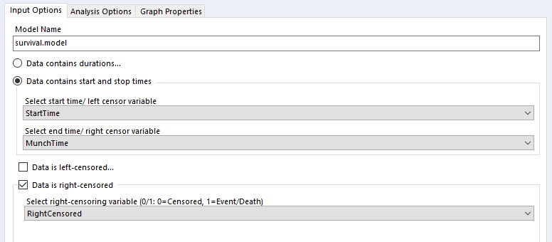
I’ve selected the option “Data contains durations”, as I have a single field for the number of minutes a biscuit lasted before being eaten, rather than one field for the time of packet opening and another field for the time of biscuit eating. I prefer using a single field for durations for two reasons. Firstly, because the tool doesn’t accept date or datetime fields, only numbers, and I find it easier to calculate the date difference than to convert two date fields into integers; secondly, as it allows me to sort out any other processing I need beforehand (e.g. removing time periods when I wasn’t in the flat because there wasn’t any actual risk of the biscuits being eaten at that time). But, if you have start and stop times in a number format and don’t want to do the time difference calculation yourself, you can have your data like this:
…and set up your tool like this:
…and you should get the same results.
Confusingly, the survival analysis tool asks whether data is censored, and asks for a 0/1 field where 1 = “the event happened” (i.e. this data isn’t actually censored) and 0 = “I don’t know what happened” (i.e. this data is censored). I often get this mixed up. But yes, if your data is right-censored, you need to assign that a 0 value, and if your event has actually happened, that’s a 1.
Kaplan-Meier
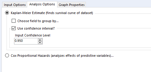
Then there’s the analysis tab. Let’s go over Kaplan-Meier graphs first:
We’re doing the survival curve at the moment, so select the Kaplan-Meier Estimate option. I’d recommend always using the confidence interval – it might make the plots harder to read when you group by a field, but you’ll want that data in the output.
The choose field to group by option is also good to look at, but there’s a strange little catch with this; it won’t work unless the field you’re grouping by is the first field in your data set, so you’ll need to put a select tool on before the survival analysis tool, and make sure that you move your grouping field right to the top.
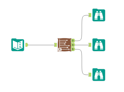
Now you can run the workflow. There are three outputs: O: Object. You can plug this into a survival score tool, but I don’t really do much with this otherwise R: Report. This is full of interesting information, so stick a browse tool on the end. D: Data. This is brilliantly useful, and I wish more Alteryx predictive tools did this. It’s the stuff that’s shown in the report output, but a data table that you can do stuff with.
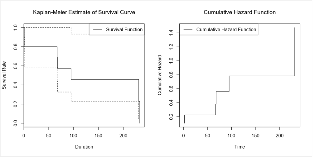
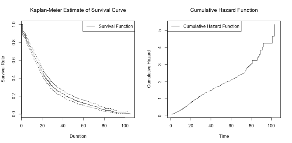
Here’s what the report output looks like:
There’s the survival curve, along with some giant confidence intervals because there are so few biscuits in the data set. This is the same one that I was drawing in MS Paint in the first section.
We’ve also got the cumulative hazard function, which I drew earlier too. It’s is the running sum of the hazard functions along the time period. In this particular example, it just looks like the survival curve but rotated a bit, but we’ll see examples where it’s different later.
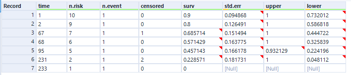
In the data output, we can see the curve data in a table:
And again, this is the data as profiled in the screenshot from Excel earlier when I was working through the survival function calculations.
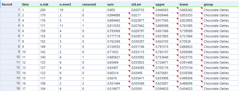
Let’s now move to a bigger data set of biscuits. I’ve tracked my consumption of fig rolls, chocolate oaties, and custard creams in a table that looks like this:
(this is all fake data that I’ve generated for this blog, if you haven’t guessed already – but it is “based on a true story”)
The Time field is the duration – I’ve generated it kind of arbitrarily. We can pretend it’s still minutes, although as you’ll see, I end up finishing a pack of fig rolls in about thirty minutes, which is going it some even for me.
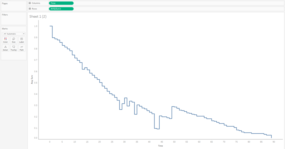
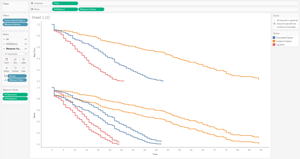
When I run the main survival analysis, I get a nice survival curve of my general biscuit consumption:
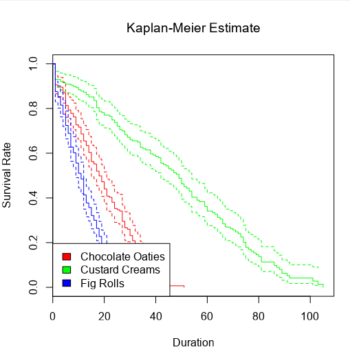
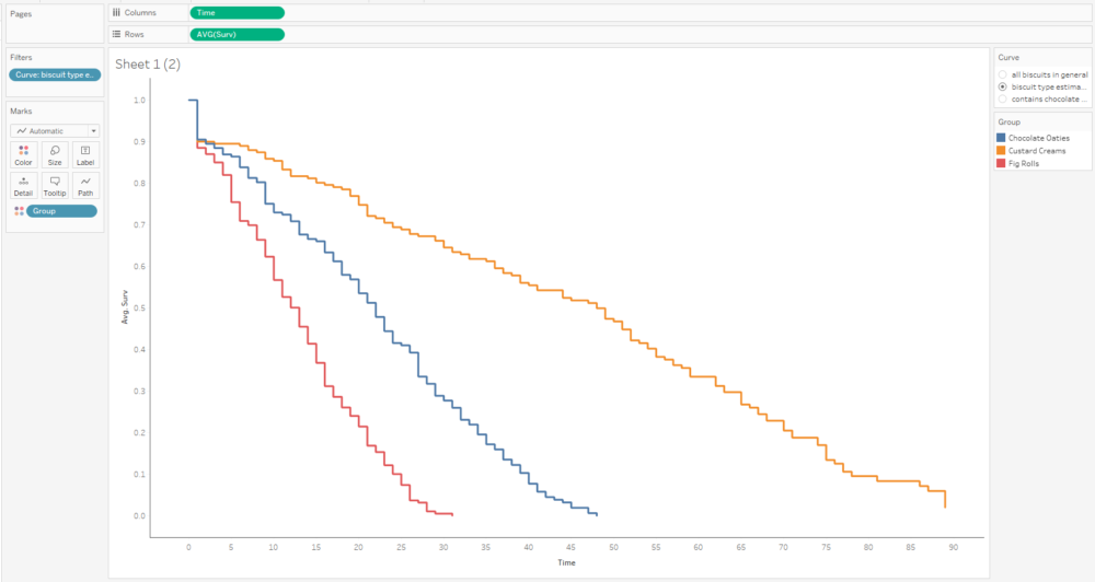
I can also choose the group by option to create separate survival curves for each biscuit type, and it’ll plot the survival curves of all three alongside each other:
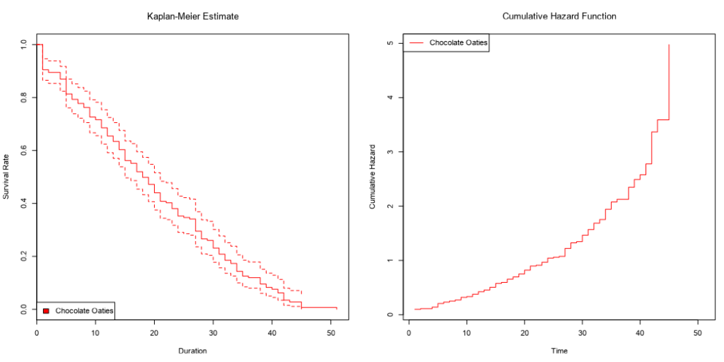
…and then the survival curve and cumulative hazard function of each biscuit type individually:
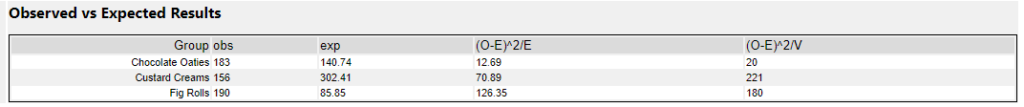
When grouping by a field, you get this extra table in the report output:
The obs column is a simple count of how many biscuits actually got eaten (i.e. the sum of the RightCensored field I created earlier), but I’m not sure where they’re getting the exp values from. I’m also not sure why I don’t get this table when I’m not grouping by any fields.
Another quirk of the survival analysis tool is that I get this warning message about nonstandard censoring regardless of what I do:
I haven’t figured out why it happens – if you do, give me a shout.
In the data output, we get the survival curve data points for each group, which is really useful. We’ll use this data later and plot it in Tableau:
Cox proportional hazards
Back to the analysis tab, then.
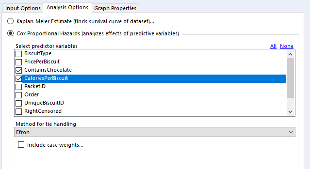
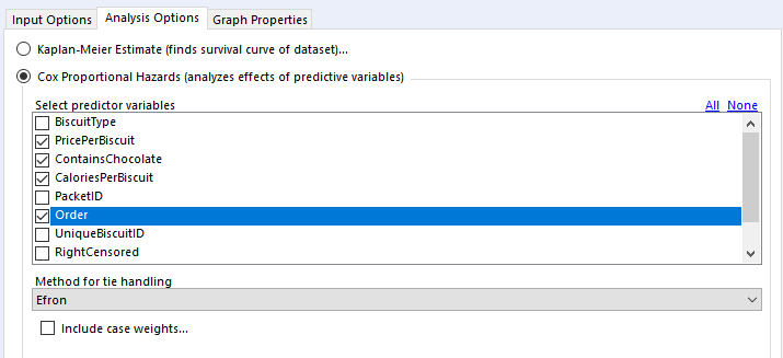
In the “select predictor variables” section, you can select the variables you want to investigate. I generally use binary fields and continuous fields here. You can use categorical fields, but I wouldn’t recommend it, as they get converted to paired binary fields anyway (more on that in a bit).
For tie handling, I just leave it at Efron. The survival R package documentation that the survival analysis tool is built off has a long explanation; the summary version is that if there aren’t many ties in your data (i.e. if there aren’t many things that have the same duration), then it doesn’t really matter which option you use, and Efron is the more accurate one anyway.
Finally, case weights gives you an option to double-count a particular line of data. As far as I can tell, this is functionally equivalent to unioning in every line of data you want to replicate; there’s no difference between running a Cox proportional hazards model on 500 rows where each row has case weight = 2 and running the same model on 1000 rows where it’s the 500 row table unioned to itself. The model returns the same coefficients, but the p-values are different. In any case, it seems like it’s a throwback to when data was reduced as much as possible to keep it light. I can’t see any need to include case weights in your analysis in Alteryx, but again, hit me up if you have a use case where this is necessary.
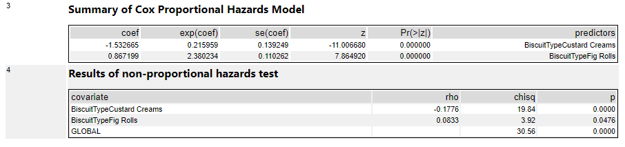
Here are the results in the results tab:
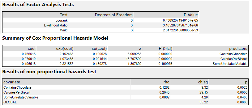
The factor analysis section is testing whether the model itself is significant. If it’s not (i.e. if the p-value is > 0.05), then the rest of the results are interesting to look at but not really that meaningful. If it is significant, then you can proceed to the rest of the results.
The summary section is the most useful bit. The coef column shows the coefficients. This is where the sign is important – if it’s positive, then there’s a corresponding increase in risk, whereas if it’s negative, then there’s a corresponding decrease in risk. My ContainsChocolate field is positive, so if a biscuit contains chocolate, then there’s an increase in the risk to the biscuit that I’ll eat it. Same goes for CaloriesPerBiscuit, which is also positive. The more calories a biscuit has, the greater the risk that I’ll eat it.
The exp(coef) column shows the exponent of the coefficient, which basically means the effect size of the variable. The exp(coef) for ContainsChocolate is 2.15, which means that having chocolate in the biscuit will more than double the risk that I’ll eat it. The exp(coef) for SomeUnrelatedVariable is 0.82, which suggests that the risk decreases by 18% as SomeUnrelatedVariable rises…
…but as we can see in the Pr(>|z|) column, the p-value for SomeUnrelatedVariable is 0.19, which means it’s not significant (I’d hope not, as I created SomeUnrelatedVariable by just sticking RAND() in a formula tool). So, we can ignore the coef and exp(coef) columns, because they aren’t really meaningful. The ContainsChocolate and CaloriesPerBiscuit fields are significant, so I can use that information to explore my biscuit consumption.
This is where knowing your variables is really important. If I’d coded up my ContainsChocolate variable differently, and set it so that 0 = contains chocolate and 1 = does not contain chocolate, then the model would return -0.766615 in the coef column rather than 0.766615. Likewise, the exp(coef) column would be a little under 0.5 rather than a little over 2. If you mix up which way round your variables go, you’ll draw completely the wrong conclusion from the stats.
It’s possible to use categorical fields in the Cox proportional hazards model too, but all it does is create new variables by comparing everything to the first item in the categorical field in a binary way. So, in this output, I’ve used BiscuitType as a predictor variable, and the tool has converted that into two variables; chocolate oaties vs. custard creams (where chocolate oaties = 0 and custard creams = 1), and chocolate oaties vs. fig rolls (where Chocolate oaties = 0 and custard creams = 1). The interpretation of these results is that there’s a huge difference between custard creams and chocolate oaties in terms of survival. As the new field BiscuitTypeCustardCreams increases (i.e., for custard creams), the risk of being eaten decreases, as shown by the negative coef value of -1.53, and that translates to a risk reduction of 79% as shown by the exp(coef) value of 0.21:
The more things you’ve got in a categorical field, the more of these new variables you’ll get, and it’ll get messy. I prefer to work out any categorical variables of interest beforehand and translate them into more useful groupings myself first, such as in my field ContainsChocolate.
Combining Cox proportional hazards with a survival score tool
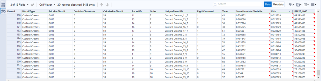
Finally, once you’ve got a model that you’re happy with, you can use it with the survival score tool to predict relative risk and survival times for other biscuits.
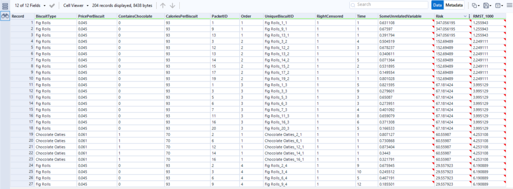
I highly recommend validating your model predictions on your original data set so that you can compare the output of the survival score tool with the survival times that actually happened:
What I’ve done here is train my Cox proportional hazards model on 66% of the biscuit data, and then used the output of that model in the survival score tool to predict biscuit survival time for the remaining 34%. I’ve also included Order in the model as the order where the biscuit sits in the packet, as that’s obviously going to affect the survival time of the biscuit. Actually, I shouldn’t really be doing the analysis like this at all, because the fact that there’s an order to them shows that the biscuits aren’t independent, but I’m 4000 words into this analogy now. Just pretend that the biscuits are independent and sitting in a tin, and that the order field is some kind of variable that affects how quickly an individual biscuit gets eaten, yeah? Anyway, here’s the configuration pane:
If I look at the output, it’s pretty good:
This first table is sorted by the relative risk factor that the score tool puts out, and it’s showing that the biscuits with the highest risk of being eaten are the fig rolls in the first few positions in the packet, then the chocolate oaties in the first position in the packet. The actual survival duration (just called Time here) is pretty low too. If I scroll down to see the lowest risk, I can see lower relative risk in the Risk field, and higher actual survival times in the Time field:
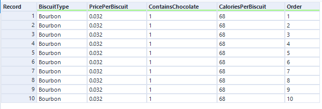
So, I’m happy that my model is a good one, and I can now put some new biscuit information to predict survival time for a new set of biscuits. Maybe some bourbons, maybe some ginger nuts, maybe even some garibaldis.
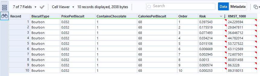
Let’s predict survival time and relative risk for a new packet of bourbons:
The score tool has established the relative risk for each biscuit in the packet, and the RMST_1000 output shows the number of minutes it’s expecting each biscuit to survive for:
This isn’t perfectly accurate – we’ve already seen in the data that the first two biscuits of most packets get eaten within a couple of minutes, but the time prediction for biscuit number 1 is 24 mins. More data and more different predictor fields will make that more realistic.
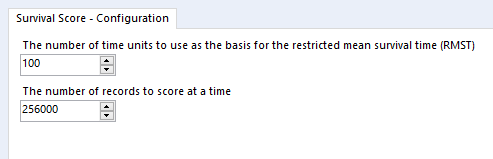
The RMST bit of the RMST field stands for Restricted Mean Survival Time, and it’s set in the survival score tool configuration pane:
It’s a value you can choose to get a relatively realistic estimate of how long something will survive for out of a fixed number of time units. It’s helpful for cases when you’re running your analysis with a lot of right-censored data because the event simply hasn’t happened yet, such as customer churn. Then you can get an estimate of how the survival curve might extend beyond the period you’ve got.
Visualising survival analysis in Tableau
Now that I’ve got my biscuit survival models, I want to visualise them in Tableau, because the default R plots in the browse tool aren’t great.
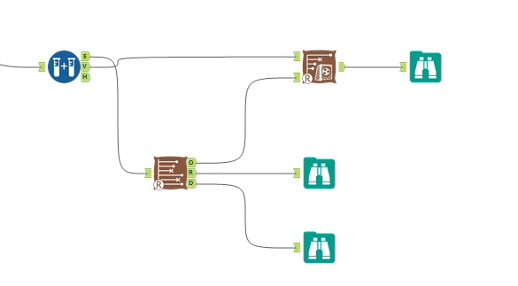
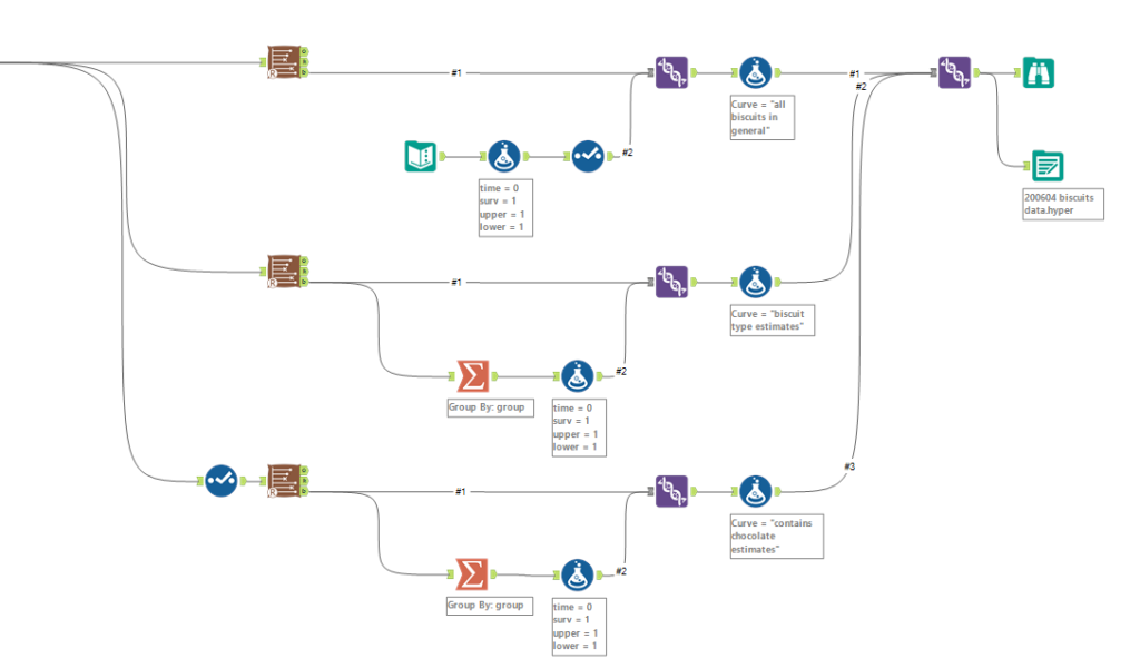
I want three different survival curves – the general biscuits curve, the curves broken down per BiscuitType, and the curves broke down by ContainsChocolate. So, I’m going to need three separate survival tools to get the data for these survival curves.
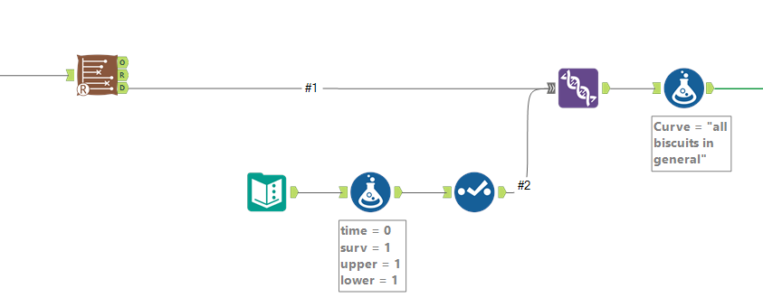
It’s also important to do a little bit of data processing to the output of the D anchor. This is how the data looks:
The first line of data is at time = 1, which is the time of the first event. To make the graph in Tableau, we’ll need an extra line at the top where time = 0 and the survival function = 1. This line needs to be repeated for each group that we’ve grouped by in the survival analysis tool.
For the single survival curve of all biscuits, I do this by using a text input tool with a single row and single column, adding four new fields in the formula tool (time = 0, surv = 1, upper = 1, lower = 1), deselecting the dummy field, and unioning it in with the survival analysis data output. Then I add a formula tool for that data to label which survival curve it is:
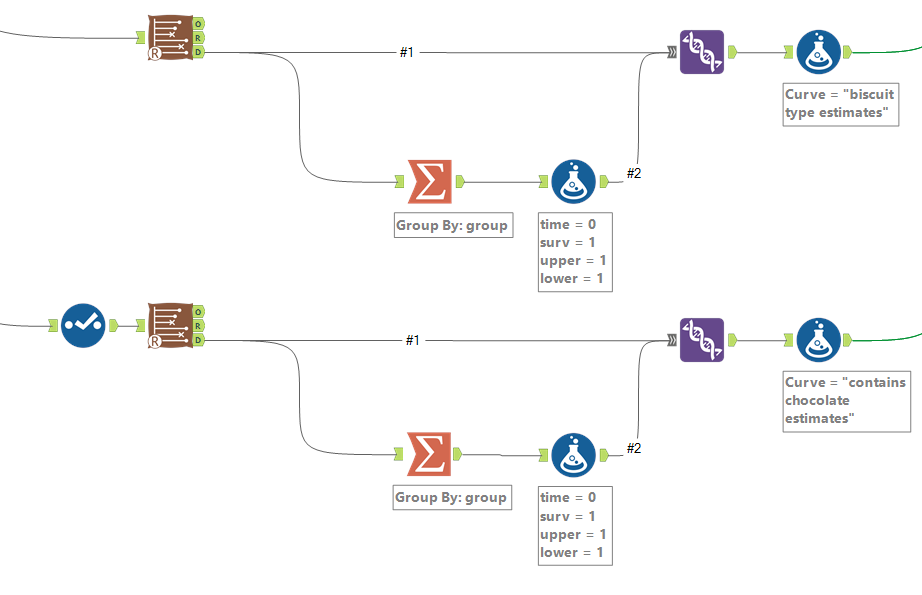
For the survival curves which are split out by a particular field in the group by option, I split off the data output, use a summarise tool to group by the grouping field so that there’s one row per value in the group field, then add the same fields in a formula tool and union these new rows back in. Again, a formula tool after the union is there to label the data for each survival curve:
Then you can union the lot together, and output to Tableau:
This doesn’t cover getting the hazard function or cumulative hazard function. For that, you need to hack the macro itself and add an output to the R tool inside it to put out the data it uses for the cumulative hazard function plot. That’s a topic for another blog.
Now, let’s open this data in Tableau:
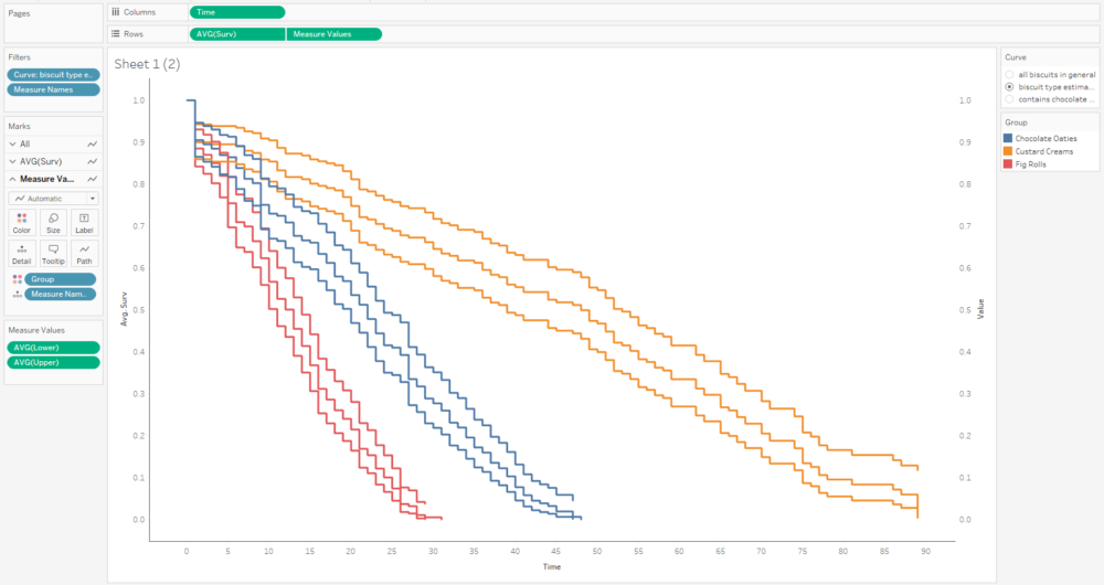
The first step is to plot the average survival function over time. You’ll want your time field to be a continuous measure:
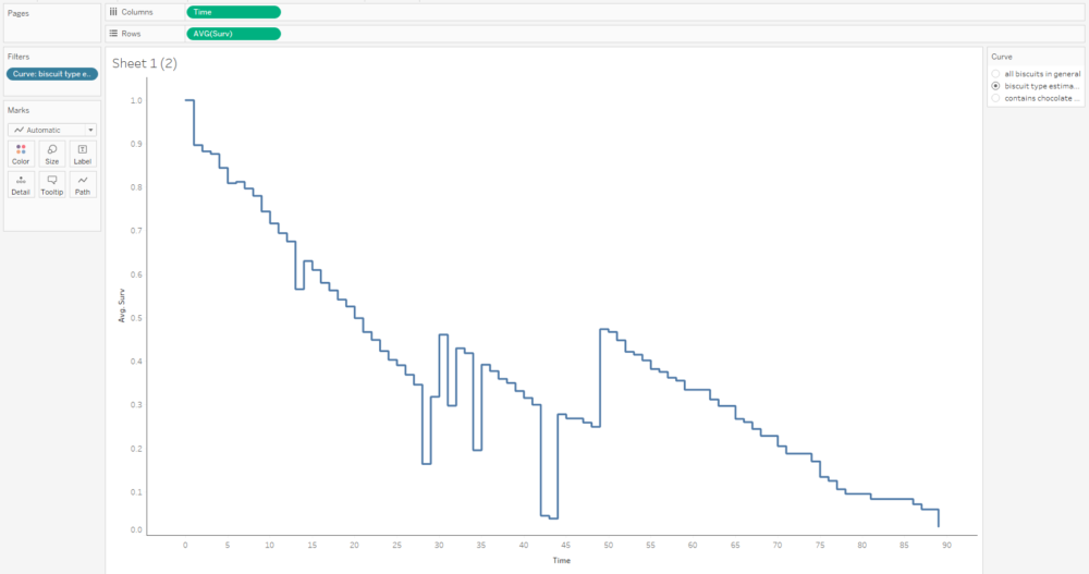
This curve doesn’t make any sense because it seems to jump up and down; that’s because we’ve got several different survival curves in this data, so let’s add a filter to show one at a time:
This graph is filtered to the BiscuitType curve only, but it still jumps around because there are three separate curves for the three biscuit types. That means we need to put the grouping field on detail and/or colour too:
The next step is to add the confidence intervals. I’m going to add them in as measure names/measure values, and then dual axis them with the survival function. In the measure names/measure values step, make sure to put AVG(Lower) and AVG(Upper) together, and put Measure Names on detail with group on colour.
The next step is to put AVG(Surv) and Measure Values on a dual axis, and synchronise it:
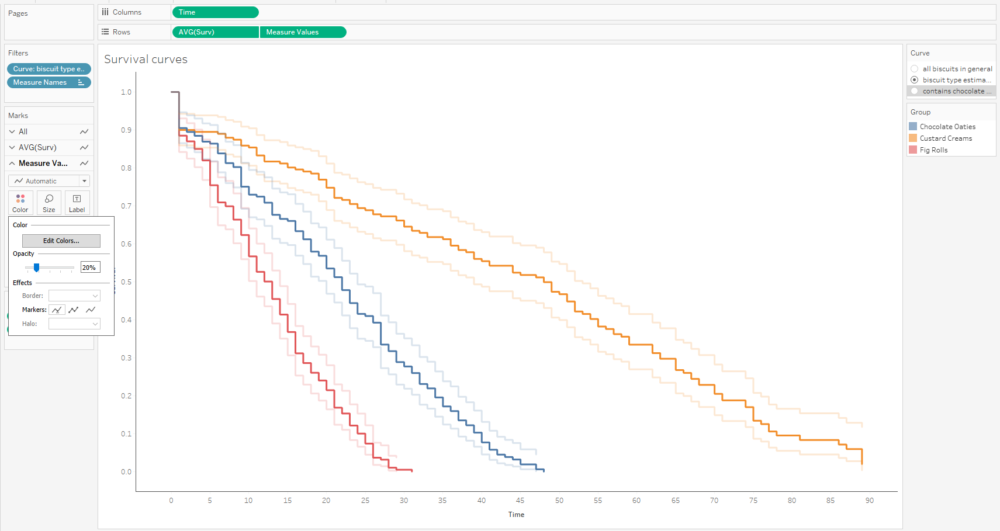
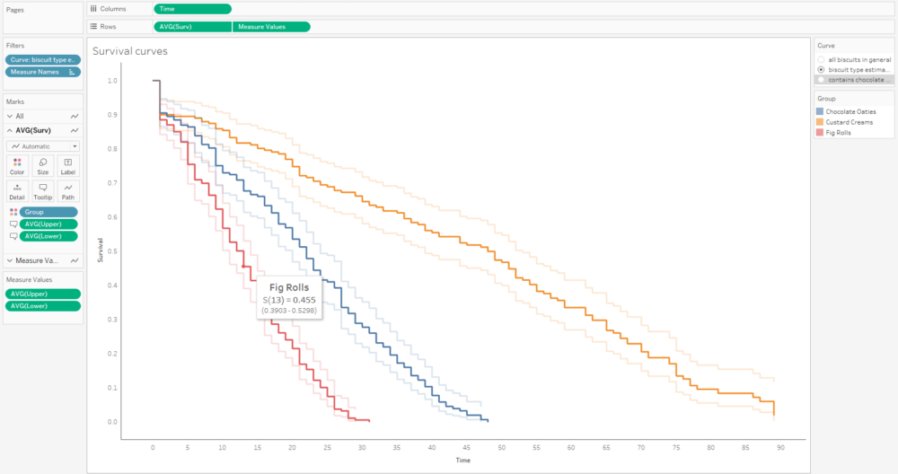
That’s quite nice, but I can’t really distinguish the survival function line that easily, and that’s the most important one. So, I’ll whack the opacity down on the confidence intervals too:
A little bit more formatting and tooltip adjustment, and I’ve got a nice set of survival curves that I can interact with, publish, and share for others to explore:
Alternatively, I can plot the number of censored biscuits at each time point as well by plotting AVG(Surv) as circles, and sizing the circles by the number of censored biscuits. The relative lack of censored biscuits for fig rolls in red explains why the confidence intervals are more narrow for fig rolls compared to chocolate oaties and custard creams:
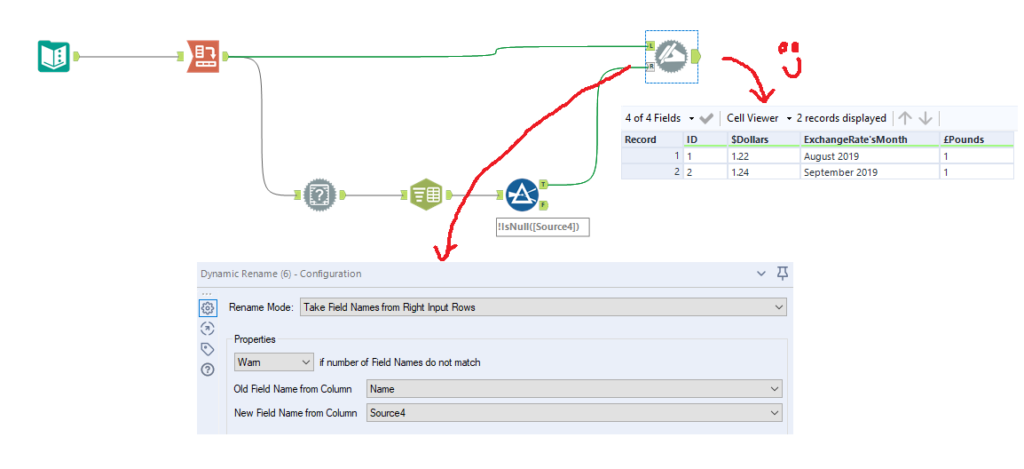
Have you ever used a CrossTab tool in Alteryx, then noticed that the new column headers are messed up?
Irritating, isn’t it? Basically, anything in a string that isn’t a letter or a number will be converted to an underscore when it becomes a new column after a CrossTab tool.
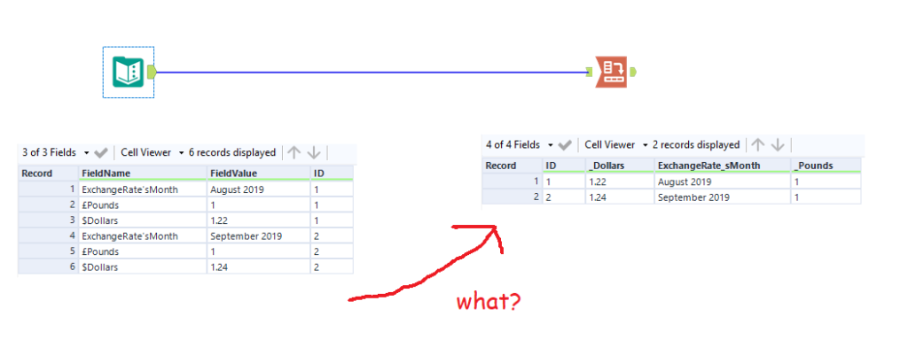
There are a few solutions out there in blogs and on the community, but I haven’t seen one which uses the Field Info tool, a handy trick that my colleague Ian Baldwin pointed out the other day. The Field Info tool is probably the most robust solution, because it doesn’t require any manual corrections that you would have to update when new string values come into your data. It requires no configuration, and in most cases it provides the original string in the Source data:
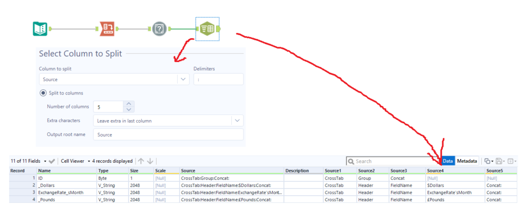
You can then use a Text to Columns tool to parse out the original string from the Source field by splitting to columns on a colon delimiter:
Then filter out rows where Source4 is null, as these don’t need to be renamed. After that, you can put in a Dynamic Rename tool, set it to take field names from right input rows, and make sure to set the old field name to Name and new field name to Source4. That’ll rename it properly for you without needing to do anything else!
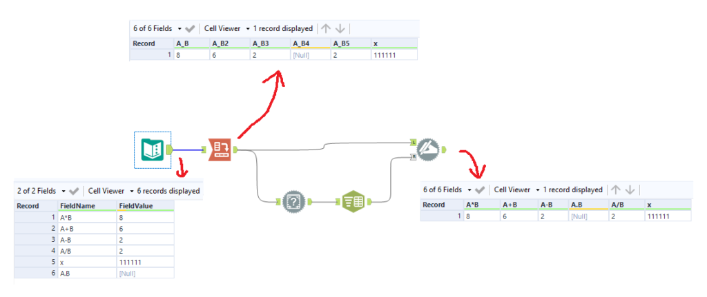
What’s even better is that this method works for strings which are only disambiguated by punctuation. For example, if you have the values A+B and A-B, a CrossTab will turn the + and the – into underscores, and then add a 2 at the end of the second field, giving you A_B and A_B2. This can be particularly difficult to fix with some of the other methods where you can’t always be sure which one will be the first and which one will get a number afterwards:
Now, there is one caveat: this doesn’t work when the aggregation method is set to First or Last. I’m not sure why, but the metadata doesn’t record those aggregations from a CrossTab, so that means that the Field Info tool doesn’t pick up the original string:
But luckily, we can use the same trick, we just have to add an extra CrossTab. In the new CrossTab, you can use Sum or Concat as the aggregation method, and you can put anything you like in the values for new column section, just as long as the new column headers is set to the same field as the CrossTab tool where you’re using First or Last. Then, you can take the field information from the secondary CrossTab and use the same trick to rename the fields from the main CrossTab:
Ideally, Alteryx would make the First or Last aggregations available in the metadata too, but until that gets updated, this little workaround will sort you out. The only downside of this is if your workflow is already really slow due to having loads of data, so a double CrossTab would add to the runtime.
This post is a complete overview of what market basket analysis is, and how to use the MB Rules and MB Inspect tools to do market basket analysis in Alteryx. If you don’t use Alteryx, don’t worry – the theory side of things may well still be useful for you!
THEORY
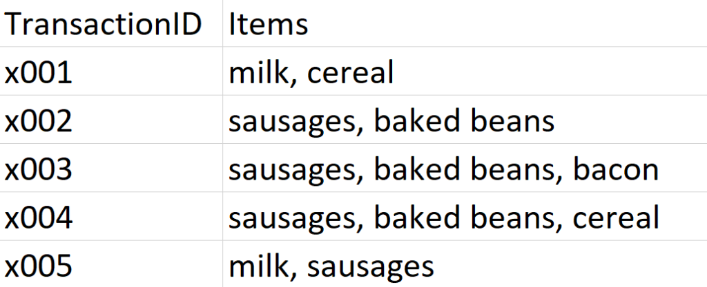
It’s Saturday morning in Gwilym’s Breakfast Goods Co., and people are slowly rolling in to buy their weekend breakfast ingredients (we don’t sell much else). The first five people through the door make the following purchases:
I’m looking at my dataset here, and I can instantly see a couple of insights. Firstly, that’s a lot of rich beef sausages we’re selling. And secondly, people seem to buy sausages and baked beans together.
This is, in essence, market basket analysis – looking at your transactions to see what people buy a lot of, what people don’t buy a lot of, and what different things people buy together. There are four main concepts in market basket analysis – association rules, support, confidence, and lift.
Association rules
An association rule is the name for a relationship between items or combinations of items across all transactions, and it’s often written like this:
sausages → baked beans
This means “if people buy sausages, they also buy baked beans”, and we can see that this association rule figures pretty prominently in this dataset. But an association rule is just the name for the relationship, not a statement about the strength of it. For example, milk → sausages is also an association rule, even though there’s only one transaction where that happens.
Support
This is just the proportion of transactions that contain a thing. Support can be for individual items (like sausages) or a combination of items (like sausages and baked beans). In our example dataset, the support for sausages is 0.8, because sausages are in four transactions out of a total of five.
Confidence
While support refers to items in the transaction list, confidence depends on association rules. For an association rule, confidence is the number of transactions that contain a thing that already contain the other thing. It’s calculated like this:
[support for both items in association rule] / [support for item on left hand side of rule]
So, if we use the rule sausages → baked beans , the confidence is 0.75. This is because it’s calculated like this:
[support for sausages and baked beans, which is 3 out of 5, or 0.6] / [support for sausages, which is 4 out of 5, or 0.8]
If we take the alternative association rule for the same two items, which is baked beans → sausages, then the confidence is 1, because the support for beans and sausages is 0.6, and the support for beans alone is also 0.6.
Lift
Finally, lift is how likely two or more things are to be bought together compared to being bought independently. It’s calculated like this:
[support for both items] / [support for one item] * [support for the other item]
Unlike confidence, where the value will change depending on which way round the rule between two items is, the direction of a rule makes no difference to the lift value.
Again, if we use the rule sausages → baked beans , the lift is 1.25. This is because it’s calculated like this:
[support for sausages and beans, which is 0.6] / [support for sausages, which is 0.8] * [support for beans, which is 0.6]
That gives us 0.6 / (0.8 * 0.6), which is 0.6 / 0.48, which is 1.25
A rough guide to lift is that if it’s above 1, then it means that the two items are bought more frequently as a pair than they are bought individually, while if it’s below 1, then it means that the two items are bought more frequently individually than as a pair.
ALTERYX EXAMPLES
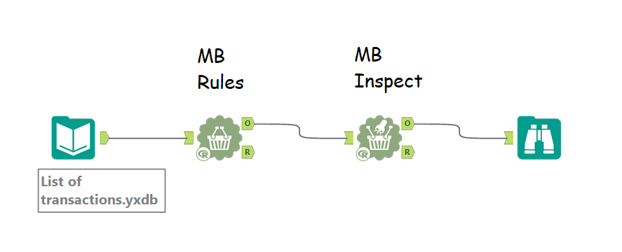
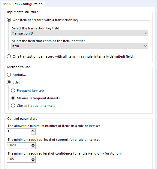
That’s pretty much it for the theory so far, so let’s create a simple analysis in Alteryx. You’ll need two tools – MB Rules and MB Inspect.
MB Rules does all the work, and it’s where you set your support and confidence thresholds. However, it only outputs an R object, which Alteryx can’t read as a standard data frame… so you need MB Inspect, which is basically a glorified filter tool, to turn that into Alteryx data.
You can set it up a little like this:
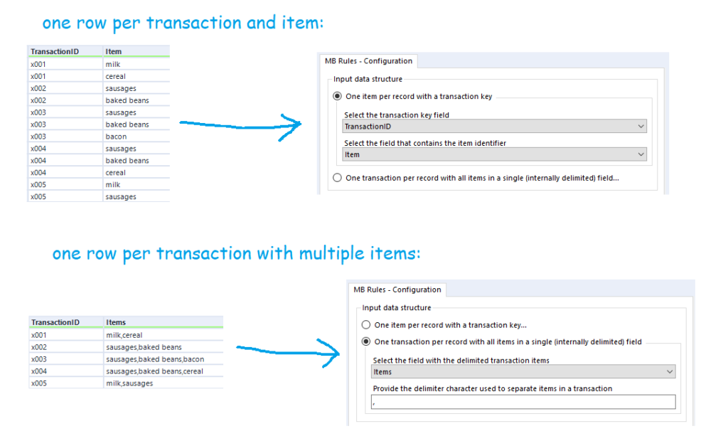
You’ll also want to sort out your data beforehand. There are two possible ways you can structure your data for the MB Rules tool to work. You can either have a row for every single item of every single transaction, or you can have a row for every transaction, with each item separated by the same character. The MB Rules tool can handle both structures, and you’d set it up as follows:
Apriori Association Rules
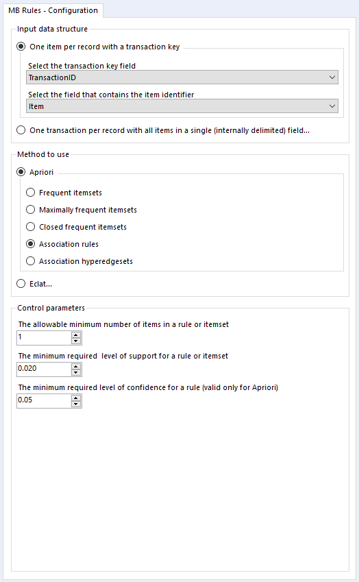
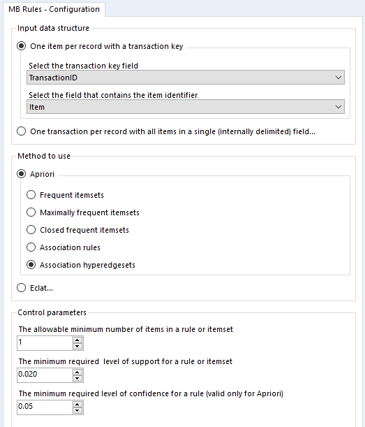
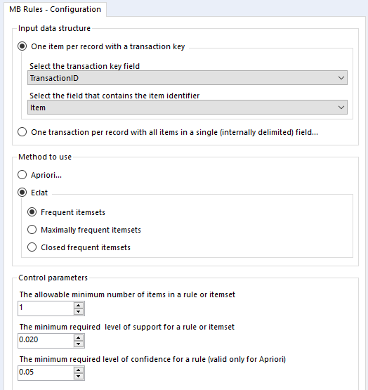
In the MB Rules tool, let’s set it up to give us the association rules, with their support, confidence, and lift. You can do that by selecting Apriori and Association rules under method to use:
Here, I’ve left the control parameters to their defaults – 0.02 support for an item or set of items or association rule, and 0.05 for the confidence of an association rule. With the support filter, note that this will apply to both items and association rules. For example, in the five transaction dataset, the support for milk is 0.4 and the support for cereal is 0.4. If I set my minimum support to 0.4, then the empty LHS rules for milk and cereal will come through (more on that in a moment), but the association rule for milk → cereal will not be returned, because the support for that association rule is only 0.2, because both milk and cereal only occur together in one transaction out of five.
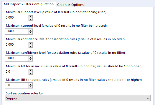
Onto the MB Inspect tool, and I normally leave it like this – zeroes for everything, because I’ve set most of my filters that I care about in the MB Rules tool.
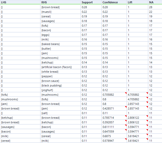
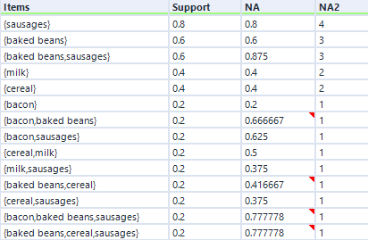
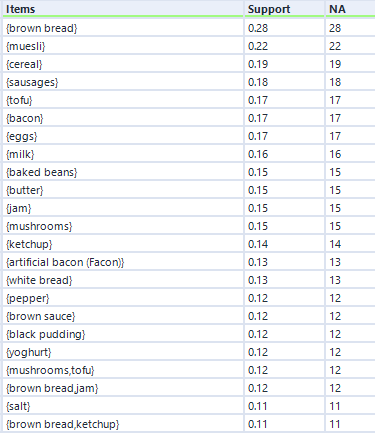
That’s pretty much it, so I’ll now press run. For this data, I’ve expanded my dataset from the first five transactions to a hundred transactions. Here are the association rules in my dataset:
Remember I mentioned empty rules earlier? The top handful of rows where the LHS column is “{}” is what I mean. What this shows is the association rule, if you can really call it that, for items individually, totally independent of other items. This just shows the support for an individual item, and because it’s independent of other items, the confidence is the same, and the lift is always 1.
Do you see the NA column on the far right? This is another useful output, although it’s not labelled very well. This stands for Number of Associations (I think) – in any case, it’s a count of how many transactions this item or set of items occurs in. So, brown bread turns up in 28 transactions out of 100 (hence the 0.28 support for brown bread), and cereal and milk turn up in 11 transactions out of 100 (hence the 0.11 support for cereal → milk).
You can also see how lift is independent of the association rule direction, but confidence isn’t. For example, take the two association rules between tofu and mushrooms. The first one, tofu → mushrooms, has a confidence of 0.705882, which means that mushrooms turn up in 70% of transactions that have tofu in them. The second one, mushrooms → tofu, has a confidence of 0.8, which means that tofu turns up in 80% of transactions that have mushrooms in them. Or in other words, 80% of people who buy mushrooms also have tofu, and 70% of people who buy tofu also buy mushrooms. Either way, there’s a big lift of 4.7, which means that tofu and mushrooms occur together about 4.7 times more often than you’d expect if 15 people threw mushrooms into their trolley at random and 17 people threw tofu into their trolley at random.
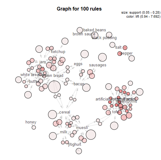
That’s basically it for a simple market basket analysis. The MB Inspect tool does also generate some graphics, which I don’t normally use that much, although I do like the network graph it makes:
That’s the main way of doing market basket analysis in Alteryx, and it’s what I do most of the time. But there are several other options, so let’s explore what they do as well.
Apriori Association hyperedgesets
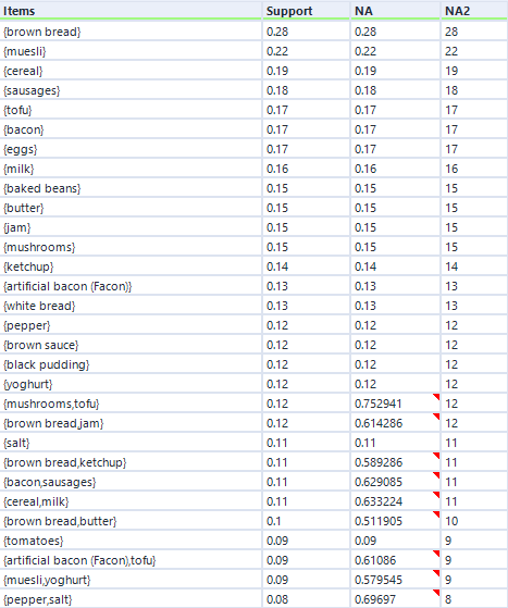
In the same Apriori section, there’s an option to look at Association hyperedgesets:
What this does is basically to average across both sides of an association rule. It gives you the same support, the same number of associations, and the average confidence for both sides.
You can see that in the output below.
To explain, let’s take the mushrooms/tofu relationship again. This time, it doesn’t list an association rule – all you can see is the two items together in one set, ordered alphabetically, like {mushrooms, tofu}.
You can see that the support here (0.12) is the same as the support for both association rules (0.12). However, look at the confidence. And when I say “confidence”, I mean the field called NA.
(Rather unhelpfully, the output of the hyperedgesets option has the column NA and the column NA2. The column NA2 should actually be called NA, as it shows the number of associations, and the column NA should actually be called confidence.)
Anyway, let’s look at the confidence (column NA). The figure 0.752941 is the average of the confidence for mushrooms → tofu (0.8) and the confidence for tofu → mushrooms (0.705882).
The minimum confidence setting here applies only to the average confidence, not the individual rules. So for example, if I had set the minimum confidence in the MB Rules tool to 0.73, I would still get the hyperedgeset {mushrooms, tofu} because the average confidence is above 0.73, even though the confidence of the association rule tofu → mushrooms is below 0.73.
If I go back to the earlier five-transaction dataset, the hyperedgeset average confidence for sausages and baked beans is 0.875. This is the average of the confidence for sausages given baked beans (which is 1) and the confidence for baked beans given sausages (which is 0.75). I think that you can interpret this to mean that if you buy one if the items in that set, there’s an 87.5% chance you’ll buy one of the other items in that set (or to put it another way, 87.5% of items in this set occurred in combination in a transaction with the other items in this set), but don’t quote me on that!
In any case, here’s the hyperedgeset results for the five-transaction dataset:
THEORY – PART TWO
Thought we were done with theory? Surprise! Here’s a nice little bonus bit, because to cover the other options, we’ll need to talk about sets and supersets.
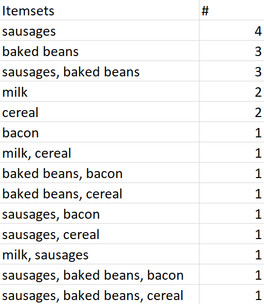
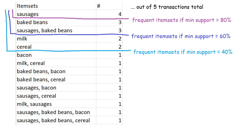
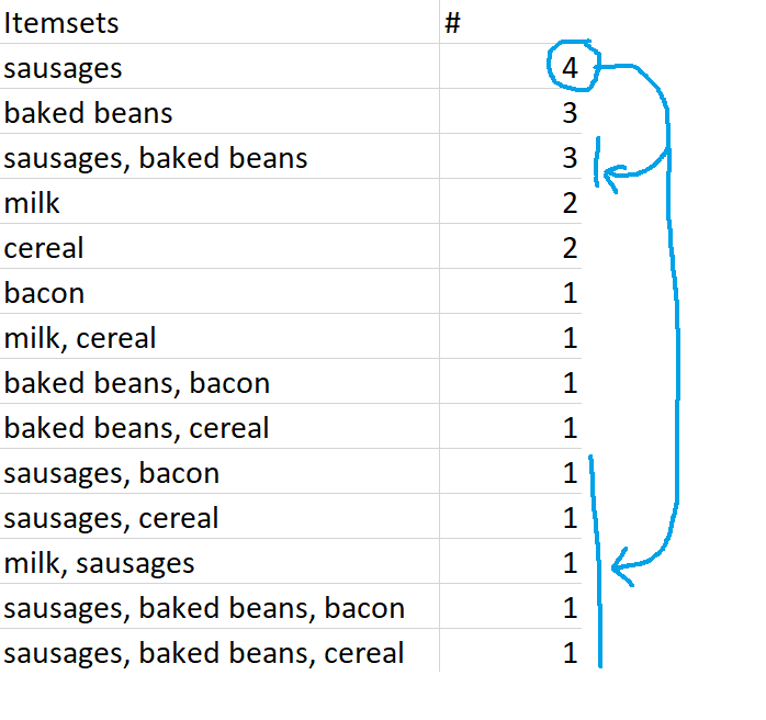
Let’s go back to the five-transaction dataset. Here is a list of every single item and combination of items that occur, along with the number of times they occur. At the top, you can see that sausages are bought in four transactions – this doesn’t mean that there were four transactions where people only bought sausages, this just means that there were four transactions (of a potentially unlimited size) which contained sausages. At the bottom, you can see that there was one transaction which contained sausages, baked beans, and bacon.
All of these are sets. The set {sausages} is a set made up of a single item – sausages. {sausages, baked beans} is a set made up of two items. And so on. Because they’re sets, they get curly brackets around them, like {}, when we’re specifically talking about the items as a set rather than a group of items.
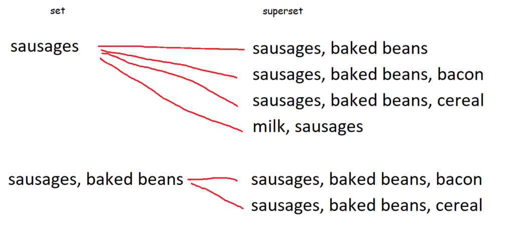
A superset is a set that contains another set. For example, the set {sausages, baked beans} is a superset of the set {sausages}, because the superset fully contains the set. Similarly, the set {sausages, baked beans, bacon} is a superset of the sets {sausages} and {sausages, baked beans}, because the superset fully contains those sets.
This diagram shows every single superset of {sausages} and {sausages, baked beans}:
This is relevant for the next set of options because we’ll need to talk about supersets to be able to define frequent itemsets, closed frequent itemsets, and maximally frequent itemsets.
Frequent itemsets
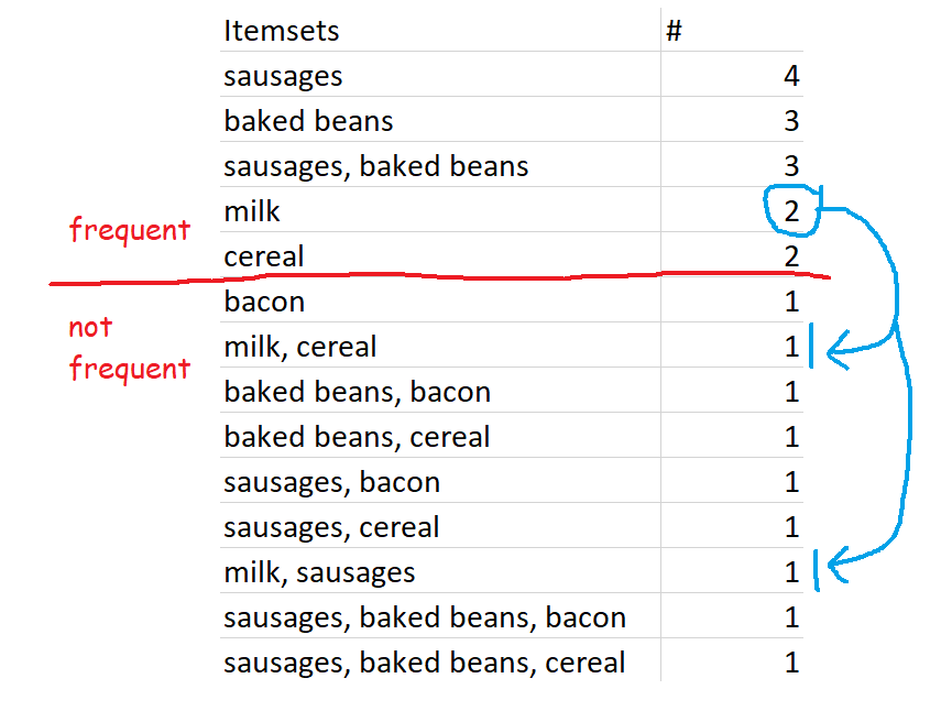
This one is nice and straightforward – it’s simply sets of items which occur above your defined level of support. So, for example, if you set 60% as your minimum level of support, then the definition of frequent itemsets is all sets of items which occur in 60% or more of transactions. In our case, that’s {sausages}, {baked beans}, and {sausages, baked beans}.
In our five-transaction example, here are some possible frequent itemsets:
Setting the frequency yourself might make it feel like a bit of a circular analysis – “I want to know what’s frequent, so here’s my definition of frequent” – but it’s pretty useful all the same, because every organisation’s data is different. What counts as frequent in a specialist shop might be way higher than a giant supermarket, so this allows you to tailor your analysis differently.
Closed frequent itemsets
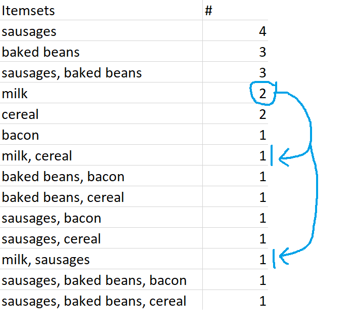
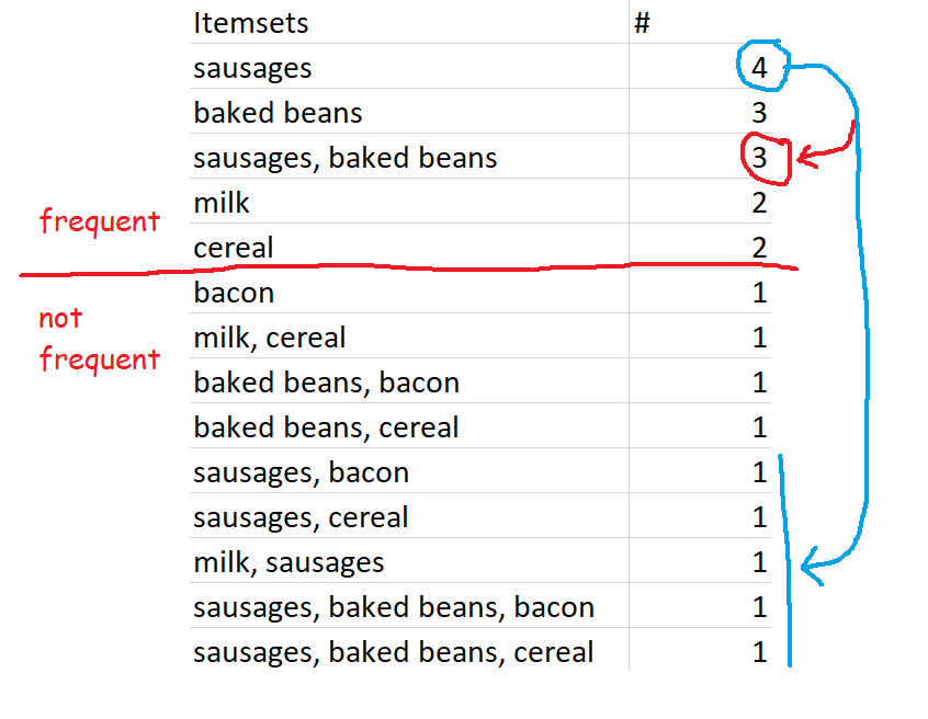
Closed frequent itemsets are sets which are frequent and also occur more frequently than their supersets. For example, let’s define frequent as having a minimum support of 0.4 or 40%, which in this dataset works out to occurring in 2 or more transactions. Sausages are in four transactions, so the set {sausages} is a frequent itemset. This is also more frequent than any of the supersets of {sausages}, like {sausages, baked beans} or {sausages, bacon}, so {sausages} is a closed frequent itemset.
Similarly, {milk} is a closed frequent itemset because it occurs twice – that’s frequent according to our 40% definition, and that’s more frequent than its supersets, {milk, cereal} and {milk, sausages}.
However, if we increased the minimum support to 0.6, or 60%, then {milk} would no longer be a closed frequent itemset – even though it still fulfils the closed set requirements by being more frequent than its superset, it’s no longer frequent by our definition.
Maximally frequent itemsets
Finally, maximally frequent itemsets are frequent itemsets which are more frequent than their supersets, and which do not have any frequent supersets. To put it another way, maximally frequent itemsets are closed frequent itemsets which have no frequent supersets.
{milk} is a closed frequent itemset, and it’s also a maximally frequent itemset. This is because {milk} is frequent, {milk} is more frequent than its supersets {milk, cereal} and {milk, sausages}, and its supersets {milk, cereal} and {milk, sausages} are not frequent sets.
However, while {sausages} is both a frequent itemset and a closed frequent itemset, {sausages} is not a maximally frequent itemset. This is because one of {sausages}’s supersets, {sausages, baked beans}, is also a frequent itemset.
…but again, this is because of our preset definition of frequent. If we changed the minimum support for frequent itemsets to 70% rather than 60%, then the set {sausages, baked beans} would no longer be frequent, so {sausages} would be a maximally frequent itemset.
ALTERYX EXAMPLES
Now that we’ve seen the theory, it’s really quick to run these analyses in Alteryx.
You may have noticed that there are two different ways of running a frequent itemsets analysis – one under the apriori method, and one under the eclat method. The only difference is the search algorithm used. The two methods return exactly the same results (well, almost – the order of items with the same NA and Support is slightly different, but that doesn’t actually matter, and the results don’t join up perfectly, but that’s because of joining on a double, so they do join up perfectly if you convert the NA columns to Int16 or something). From what I can tell/from what I’ve googled, the difference in the search algorithms is that apriori scans through the data multiple times, which makes eclat slightly faster for larger datasets. In my dataset of 100 transactions, it made absolutely no difference to the speed.
So, we can set up the eclat frequent itemsets analysis up like this:
…and here’s what the output looks like:
Eagle-eyed readers may have noticed that the output of the eclat frequent itemsets analysis is the same as the apriori hyperedgesets analysis, but without the average confidence column. And it is, but it does run a little quicker.
Onto closed frequent itemsets – if we set up the tool like this:
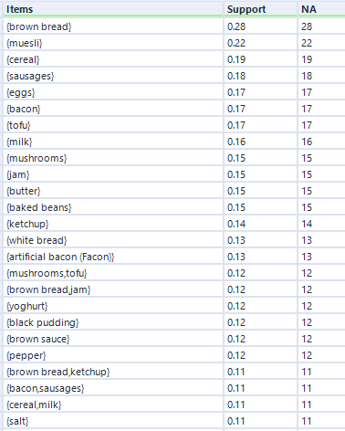
…we get results like this:
At first, this looks identical to the output of the frequent itemsets analysis, but that’s only because I’m screenshotting the first few rows. There are less than half the number of itemsets returned by the closed frequent itemsets option.
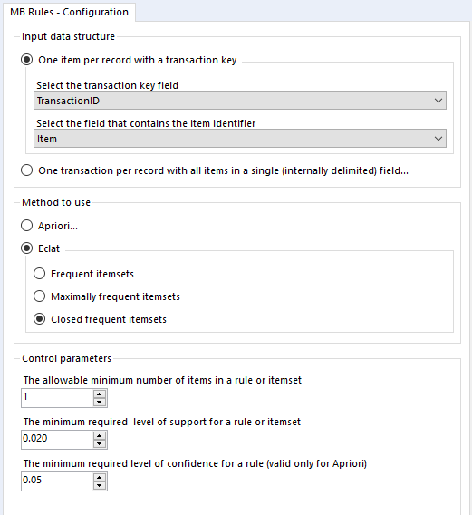
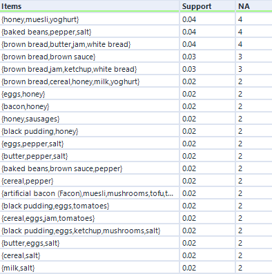
Finally, let’s look at maximal closed frequent itemsets. Again, we’ll set it up like this:
…and again, here’s the output:
This output structure is identical to the other two, but the results are more noticeably different. The honey/muesli/yoghurt combo is the most frequent maximally frequent itemset.
Application
I’ve written about applying market basket analysis to your data before, and this has turned into a really long blog post, so I won’t cover it in full here. But, as a shop keeper, I’d use the results of this analysis in Gwilym’s Breakfast Goods Co. to explore what to put on sale together, what not to put on sale together, and so on. For example, mushrooms and tofu are the combination with the highest lift, so if I’d accidentally overstocked on tofu and needed to sell it off quickly, I’d put it on special offer with mushrooms and put it in the vegetable (or fungus-pretending-to-be-a-vegetable) aisle. But if I’d done my supply chain planning well, I could use the strong association between mushrooms and tofu to get people to buy other things. For example, people who buy tofu also buy artificial bacon (Facon), so I could use people’s tendency to buy tofu and mushrooms together by putting them in the same aisle but sandwiching artificial bacon (Facon) between the two. This would mean that people looking for the tried and trusted mushroom/tofu combination are going to be looking at artificial bacon (Facon) at the same time, and hopefully they’ll pick it up and try it out.
I’ve been doing a lot of market basket analysis at The Information Lab lately. Market basket analysis is a way of looking for things that people buy at the same time (or that people never buy at the same time) in order to spot trends in people’s behaviour. For example, it’s probably obvious that if somebody buys cereal, they’ll probably also buy milk. Or that if somebody buys tofu, they’re not going to be buying sausages. This is a really nice example of how it all works.
Thing is, after a while, using bread and butter or cereal and milk or sausages and tofu as an example gets kinda dry. And talking about Lego shovels and milligram-level accurate scales is sometimes a little unprofessional, even if it is a perfect example of consumer behaviour.
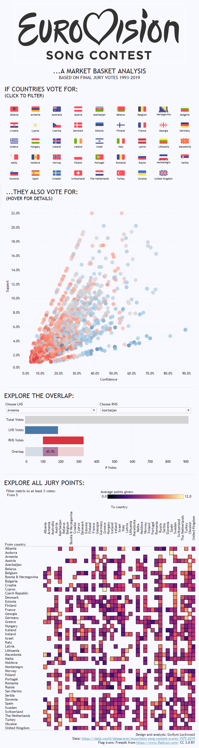
So, I’ve been analysing the Eurovision Song Contest. The jury votes lend themselves pretty well to market basket analysis, because they’re pretty similar to transactions: each country’s jury (or customer) votes for (or buys) ten countries (or items) at a time (in a basket), and the fact that these countries (or items) are a subset of all possible countries (or items) to vote for (or buy) means that you can make the same selection vs. non-selection distinction. And we all know that some countries always vote for some other countries, regardless of how good the song is, which is part of what makes it fun.
I took the historic Eurovision data collected by Stephan Okhuijsen of Datagraver. Then, using Alteryx, I filtered it to all contests from 1993 onwards, because European countries have been relatively consistent since then. I also filtered it to the final only, and to the jury votes only.
I set the minimum support for a rule to 0.01, which is kind of high for a regular market basket analysis using tens of thousands of SKUs in a supermarket, but works fine for such a closed set of possible choices of countries. I also set the minimum confidence to 0.05. That gave me almost 33,000 association rules, of which about 1,600 were one-to-one country mappings.
The full results are in an interactive dashboard here.
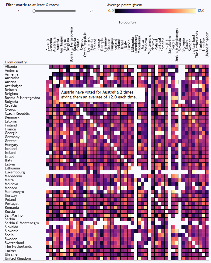
In the matrix at the bottom, you can see who consistently votes for who, and it’s pretty predictable. Cyprus and Greece, for example, almost always give each other the most possible points. There’s a big love in between Moldova and Romania, and between Turkey and Azerbaijan. The Nordics are a bit too cool to give each other full marks every time, but it’s still a bit of a Scandi circle jerk. Andorra love Spain, although it doesn’t seem like that’s reciprocated. Azerbaijan have never voted for Armenia, funnily enough. And Austria have given Australia full marks twice, which I like to believe is because they were hoping to exploit a poor fuzzy matching process in the background scoring:
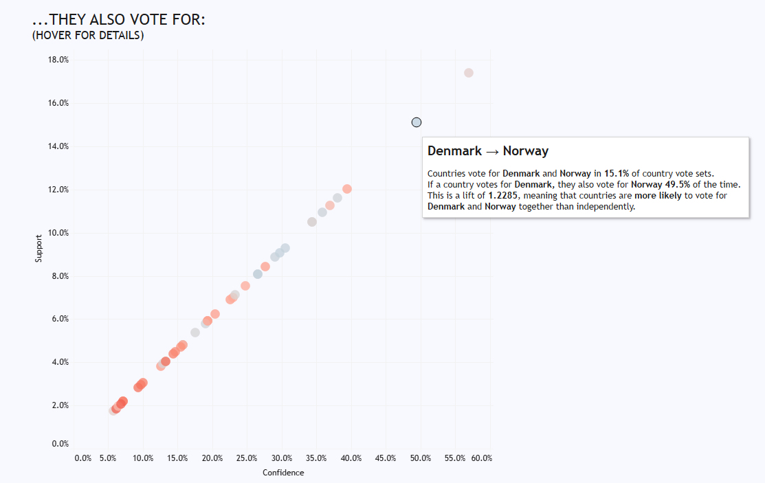
But market basket analysis shows how countries behave as a group, where we can see how some associations are Europe-wide, and some are just confined to the two countries. For example, some of the Scandi trends are reflected in votes across Europe; if a country, any country, votes for Denmark, they’re also likely to vote for Norway:
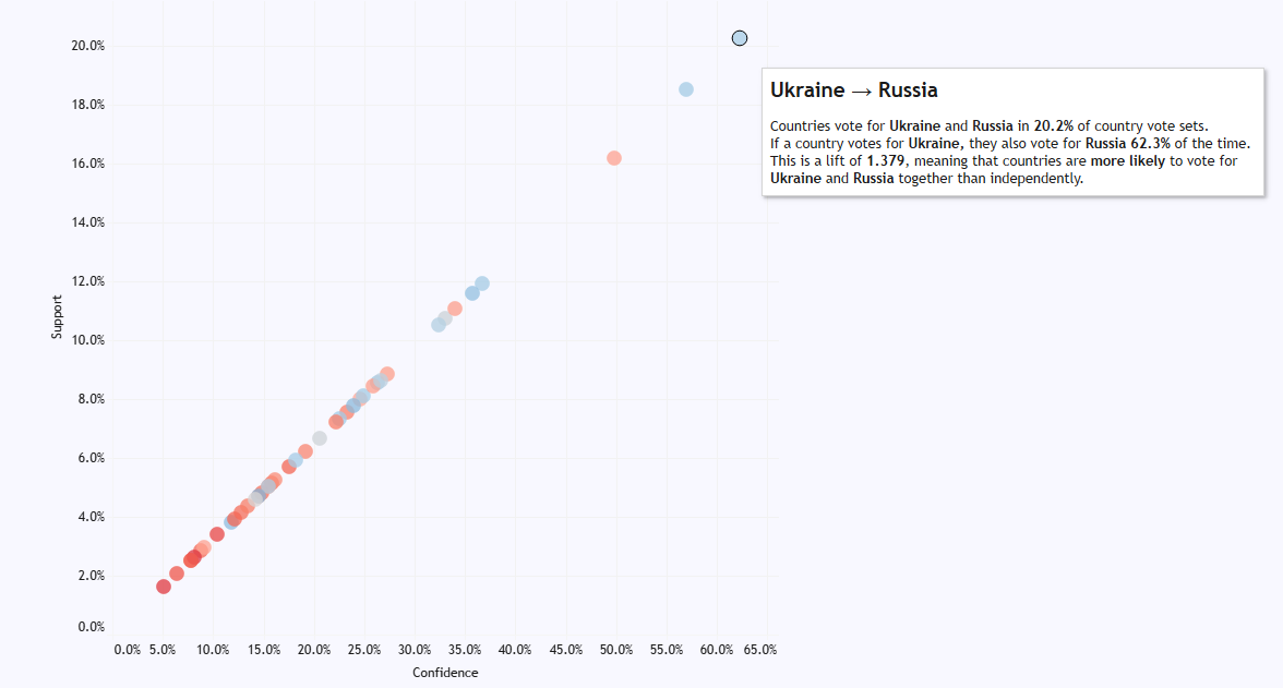
And surprise, surprise, countries that vote for Ukraine will also vote for Russia:
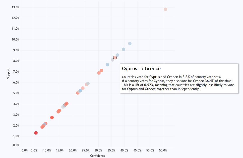
But the Greece/Cyprus love in is special just for them; in fact, if anything, there’s a slightly negative association between them, meaning that if a country votes for Cyprus, they’re slightly less likely to vote for Greece as well:
Likewise with Turkey and Azerbaijan. Just because they give each other full points all the time, other European countries don’t link the two together in their voting behaviour at all:
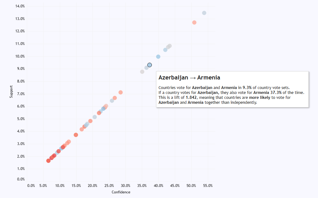
Meanwhile, even though Azerbaijan will never give points to Armenia, and Armenia have only ever given one point to Azerbaijan, other European countries are far more optimistic. Maybe they hope that voting for both Armenia and Azerbaijan at Eurovision can resolve the Nagorno-Karabakh dispute. Or maybe they just don’t know anything about the Caucasus region and think they’re the same place, I don’t know.
This is quite nice to illustrate, because the market basket analysis allows you to make the distinction; while there are some obvious associations between countries, like how Greece and Cyprus always vote for each other, it shows that those associations aren’t necessarily transferred to other countries’ voting behaviour.
Click through to the interactive version here to explore in more detail. I’m going to be using this in my teaching examples more often.
[update: this macro has been updated to fix a small discrepancy in the “most recent X” filters. If you downloaded it before 2019-03-01, please download the new version]
It’s 2019. Hooray. The change of a year is one of my least favourite things, professionally speaking, because January 2nd is when you find out how much stuff breaks because somebody (possibly you) has hard coded a date somewhere in all your pipelines. Suddenly, all your dashboards are blank because somebody’s put filter Year=2018 on, or all the YoY calculations are off because it’s looking at [2018]/[2017] instead of [CurrentYear]/[PreviousYear].
Sure enough, I spent a few days in January tracing through several Alteryx workflows and looking for rogue date filters. Pretty much all of them could be fixed by changing 2018 to DatePartYear(DateTimeNow()). But it was a long and frustrating process to identify all the filters which needed to remain static (e.g. filter out everything before 2018 because older data is in a different format and needs to be treated differently) vs. filters which needed to be dynamic (e.g. filter to the current year’s data to show YTD values), and then replacing the filter code in the custom filter section.
Most date filters I found were pretty similar, and fit into one of a handful of categories:
1. Filter to this period (e.g. if it’s 2019 right now, give me all of 2019)
2. Filter to this period-to-date (e.g. if it’s 2019 right now, give me all of 2019 up to today)
3. Filter to most recent full / completed period (e.g. if it’s 2019 right now, give me all of 2018)
4. Filter to the previous / next 12 months
5. Filter to the past / the future
…so to save myself some work in January 2020, I’ve built an Alteryx macro which handles all these examples. You can get it here! Click on the image, or copy the full link below:
Just hit download and stick it in your standard macro path. It’s automatically set up to appear in your preparation tools.
And here’s how it looks in your workflow:
It works much like a regular filter tool, with T and F outputs based on a filter condition. But instead of coding up a calculation like “DatePartYear([MyDateField]) = DatePartYear(DateTimeNow()) AND [MyDateField] <= DateTimeNow()” for a Year-to-Date filter, you can simply tick the Year-to-Date option (and see a description of what that particular filter option will do). I built this with scheduled workflows in mind so that you can spend less time copy/pasting chunks of date filter code, and less time trawling through custom filter code when the year changes and the workflows break.
One caveat: this macro works at the day level, rather than the specific time level – so if it’s 7pm on March 19th when you run the workflow and select Year-to-Date, the filter will include future values from later in the evening on March 19th, not just the ones up to 7pm.
The way it works is by selecting the relevant part of a looooong IF statement, which has all possible filter options from the input tools. If you’re interested, this is the full set of IF statement formulae:
IF [FilterOptionSelected] = ‘Current Week’ THEN
DateTimeTrim([IncomingDate], “day”) >= DateTimeAdd(
DateTimeTrim([DateValueUsed], “day”),
(IF ToNumber(DateTimeFormat(DateTimeTrim([DateValueUsed], “day”),”%w”)) = 0 THEN
ToNumber(DateTimeFormat(DateTimeTrim([DateValueUsed], “day”),”%w”))-7
ELSE 0-ToNumber(DateTimeFormat(DateTimeTrim([DateValueUsed], “day”),”%w”)) ENDIF),
“day”)
AND
DateTimeTrim([IncomingDate], “day”) <= DateTimeAdd(
DateTimeTrim([DateValueUsed], “day”),
(IF ToNumber(DateTimeFormat(DateTimeTrim([DateValueUsed], “day”),”%w”)) = 0 THEN 0 ELSE
7-ToNumber(DateTimeFormat(DateTimeTrim([DateValueUsed], “day”),”%w”)) ENDIF) ,
“day”)
ELSEIF [FilterOptionSelected] = ‘Current Month’ THEN
DateTimeMonth(DateTimeTrim([IncomingDate], “day”)) = DateTimeMonth(DateTimeTrim([DateValueUsed], “day”))
AND
DateTimeYear(DateTimeTrim([IncomingDate], “day”)) = DateTimeYear(DateTimeTrim([DateValueUsed], “day”))
ELSEIF [FilterOptionSelected] = ‘Current Quarter’ THEN
(IF DateTimeMonth(DateTimeTrim([DateValueUsed], “day”)) <= 3 THEN
DateTimeMonth(DateTimeTrim([IncomingDate], “day”)) <= 3
ELSEIF DateTimeMonth(DateTimeTrim([DateValueUsed], “day”)) <= 6 THEN
DateTimeMonth(DateTimeTrim([IncomingDate], “day”))> 3 AND DateTimeMonth(DateTimeTrim([IncomingDate], “day”)) <= 6
ELSEIF DateTimeMonth(DateTimeTrim([DateValueUsed], “day”)) <= 9 THEN
DateTimeMonth(DateTimeTrim([IncomingDate], “day”))> 6 AND DateTimeMonth(DateTimeTrim([IncomingDate], “day”)) <= 9
ELSE DateTimeMonth(DateTimeTrim([IncomingDate], “day”))> 9 AND DateTimeMonth(DateTimeTrim([IncomingDate], “day”)) <= 12 ENDIF
)
AND
DateTimeYear(DateTimeTrim([IncomingDate], “day”)) = DateTimeYear(DateTimeTrim([DateValueUsed], “day”))
ELSEIF [FilterOptionSelected] = ‘Month-to-date’ THEN
DateTimeMonth(DateTimeTrim([IncomingDate], “day”)) = DateTimeMonth(DateTimeTrim([DateValueUsed], “day”))
AND
DateTimeYear(DateTimeTrim([IncomingDate], “day”)) = DateTimeYear(DateTimeTrim([DateValueUsed], “day”))
AND
DateTimeTrim([IncomingDate], “day”) <= DateTimeTrim([DateValueUsed], “day”)
ELSEIF [FilterOptionSelected] = ‘Quarter-to-date’ THEN
(IF DateTimeMonth(DateTimeTrim([DateValueUsed], “day”)) <= 3 THEN
DateTimeMonth(DateTimeTrim([IncomingDate], “day”)) <= 3
ELSEIF DateTimeMonth(DateTimeTrim([DateValueUsed], “day”)) <= 6 THEN
DateTimeMonth(DateTimeTrim([IncomingDate], “day”))> 3 AND DateTimeMonth(DateTimeTrim([IncomingDate], “day”)) <= 6
ELSEIF DateTimeMonth(DateTimeTrim([DateValueUsed], “day”)) <= 9 THEN
DateTimeMonth(DateTimeTrim([IncomingDate], “day”))> 6 AND DateTimeMonth(DateTimeTrim([IncomingDate], “day”)) <= 9
ELSE DateTimeMonth(DateTimeTrim([IncomingDate], “day”))> 9 AND DateTimeMonth(DateTimeTrim([IncomingDate], “day”)) <= 12 ENDIF
)
AND
DateTimeYear(DateTimeTrim([IncomingDate], “day”)) = DateTimeYear(DateTimeTrim([DateValueUsed], “day”))
AND
DateTimeTrim([IncomingDate], “day”) <= DateTimeTrim([DateValueUsed], “day”)
ELSEIF [FilterOptionSelected] = ‘Year-to-date’ THEN
DateTimeYear(DateTimeTrim([IncomingDate], “day”)) = DateTimeYear(DateTimeTrim([DateValueUsed], “day”))
AND
DateTimeTrim([IncomingDate], “day”) <= DateTimeTrim([DateValueUsed], “day”)
ELSEIF [FilterOptionSelected] = ‘Most recent complete month’ THEN
DateTimeMonth(DateTimeTrim([IncomingDate], “day”)) = (IF DateTimeMonth(DateTimeTrim([DateValueUsed], “day”)) = 1 THEN 12 ELSE DateTimeMonth(DateTimeTrim([DateValueUsed], “day”))-1 ENDIF)
AND
DateTimeYear(DateTimeTrim([IncomingDate], “day”)) =
(IF DateTimeMonth(DateTimeTrim([DateValueUsed], “day”)) = 1 THEN DateTimeYear(DateTimeTrim([DateValueUsed], “day”))-1 ELSE DateTimeYear(DateTimeTrim([DateValueUsed], “day”)) ENDIF)
ELSEIF [FilterOptionSelected] = ‘Most recent complete quarter’ THEN
IF DateTimeMonth(DateTimeTrim([DateValueUsed], “day”)) <= 3
THEN DateTimeMonth(DateTimeTrim([IncomingDate], “day”))> 9 AND DateTimeMonth(DateTimeTrim([IncomingDate], “day”)) <= 12 AND DateTimeYear(DateTimeTrim([IncomingDate], “day”)) = DateTimeYear(DateTimeTrim([DateValueUsed], “day”))-1
ELSEIF DateTimeMonth(DateTimeTrim([DateValueUsed], “day”)) <= 6
THEN DateTimeMonth(DateTimeTrim([IncomingDate], “day”)) <= 3 AND DateTimeYear(DateTimeTrim([IncomingDate], “day”)) = DateTimeYear(DateTimeTrim([DateValueUsed], “day”))
ELSEIF DateTimeMonth(DateTimeTrim([DateValueUsed], “day”)) <= 9
THEN DateTimeMonth(DateTimeTrim([IncomingDate], “day”))> 3 AND DateTimeMonth(DateTimeTrim([IncomingDate], “day”)) <= 6 AND DateTimeYear(DateTimeTrim([IncomingDate], “day”)) = DateTimeYear(DateTimeTrim([DateValueUsed], “day”))
ELSEIF DateTimeMonth(DateTimeTrim([DateValueUsed], “day”)) <= 12 AND DateTimeMonth(DateTimeTrim([DateValueUsed], “day”)) = DateTimeMonth(DateTimeAdd(DateTimeTrim([DateValueUsed], “day”), 1, “day”))
THEN DateTimeMonth(DateTimeTrim([IncomingDate], “day”))> 9 AND DateTimeMonth(DateTimeTrim([IncomingDate], “day”)) <= 9 AND DateTimeYear(DateTimeTrim([IncomingDate], “day”)) = DateTimeYear(DateTimeTrim([DateValueUsed], “day”))
ELSE !ISNULL(DateTimeTrim([IncomingDate], “day”)) OR ISNULL(DateTimeTrim([IncomingDate], “day”)) ENDIF
//returns all date as a clue the filter doesn’t work
ELSEIF [FilterOptionSelected] = ‘Last 12 months up to and including today’ THEN
DateTimeTrim([IncomingDate], “day”) > DateTimeAdd(DateTimeTrim([DateValueUsed], “day”), -1, “year”)
AND
DateTimeTrim([IncomingDate], “day”) <= DateTimeTrim([DateValueUsed], “day”)
ELSEIF [FilterOptionSelected] = ‘Next 12 months from today’ THEN
DateTimeTrim([IncomingDate], “day”) >= DateTimeTrim([DateValueUsed], “day”)
AND
DateTimeTrim([IncomingDate], “day”) < DateTimeAdd(DateTimeTrim([DateValueUsed], “day”), 1, “year”)
ELSEIF [FilterOptionSelected] = ‘Everything before today (including today)’ THEN
DateTimeTrim([IncomingDate], “day”) <= DateTimeTrim([DateValueUsed], “day”)
ELSEIF [FilterOptionSelected] = ‘Everything before today (not including today)’ THEN
DateTimeTrim([IncomingDate], “day”) < DateTimeTrim([DateValueUsed], “day”)
ELSEIF [FilterOptionSelected] = ‘Everything after today (including today)’ THEN
DateTimeTrim([IncomingDate], “day”) >= DateTimeTrim([DateValueUsed], “day”)
ELSEIF [FilterOptionSelected] = ‘Everything after today (not including today)’ THEN
DateTimeTrim([IncomingDate], “day”) > DateTimeTrim([DateValueUsed], “day”)
ELSEIF [FilterOptionSelected] = ‘All days of the same date across years’ THEN
DateTimeMonth(DateTimeTrim([IncomingDate], “day”)) = DateTimeMonth(DateTimeTrim([DateValueUsed], “day”))
AND
DateTimeDay(DateTimeTrim([IncomingDate], “day”)) = DateTimeDay(DateTimeTrim([DateValueUsed], “day”))
ELSEIF [FilterOptionSelected] = ‘All days of the same weekday’ THEN
DateTimeFormat(DateTimeTrim([IncomingDate], “day”),”%w”) = DateTimeFormat(DateTimeTrim([DateValueUsed], “day”),”%w”)
ELSE
!ISNULL(DateTimeTrim([IncomingDate], “day”)) OR ISNULL(DateTimeTrim([IncomingDate], “day”)) ENDIF
//returns all dates in range without filtering anything just in case
But, here’s the thing with language; it’s gloriously, infuriatingly messy.
That makes it really hard to do really good sentiment analysis – certainly with the free, widely-available tools. Most of those assign certain emotional values to specific words; for example, in the NRC dataset often used with the R package Tidytext, the word “alive” has associations of ANTICIPATION, JOY, POSITIVE, and TRUST, while the word “afraid” has associations of FEAR and NEGATIVE.
This approach works great for sentences like this:
“I bought these shoes last week, and they’re amazing. They feel great, and they make me feel great. Good value too! 10/10, very happy about this.”
…but it doesn’t work for sentences like this:
“I don’t feel good about this. I don’t feel good about this at all. I’d love to get out of this situation right now.”
The second sentence is pretty obviously negative, but it works by negating words. The word “good” isn’t actually good, because it’s being negated by “don’t” a couple of words earlier. And “love” isn’t a positive emotion here, as it’s expressing the desire to get out of the situation, meaning that what’s going on is not a positive thing.
It’s possible to address this with sentiment analysis, but it’s complicated. You’d have to account for every possible way of negating/reversing a word, and there’s a lot of those. You’d have to account for every possible way that a word that’s positive in isolation could actually be referring to a negative overall situation, and that’s a huge task. This is why good sentiment analysis costs a fortune. It’s really complicated.
Luckily, people tend not to speak indirectly all the time, and in aggregate, the twisting, sentiment-negating sentences are cancelled out by the number of straightforward sentences where word-level sentiment analysis does work. But the caveat is that just because you’re using sentiment analysis, that doesn’t mean you’re using it well, and you should really cross-validate it with some other measures.
I’m exploring this with lyrics from Brian Fallon’s bands – The Gaslight Anthem, The Horrible Crowes, and his solo project. I’m looking at Fallon’s lyrics because:
Song lyrics are enough of a deviation from standard English to pose problems for standard sentiment analysis;
At the same time, song lyrics are some of the most obviously emotional usages of language we have;
Fallon writes lyrics in a pretty clear style, often in full sentences, without too many obscure metaphors or references;
I really like his music.
I’ve used the Tidytext package in R for doing sentiment analysis before. This time, I’m using the same NRC sentiment dataset, but trying it out in Alteryx instead. I’ve also visualised it in Tableau, and you can click any of these images to go to an interactive link where you can play around with it yourself.
So, first things first; let’s have a look at sentiment in each song:
Looks pretty good so far. Here’s lookin’ at you, kid is a wistful, regretful song; definitely on the negative side, quite a bit of sadness, very little joy. Click the graph to explore other Brian Fallon songs, if you know them.
There’s a lot of different sentiment measures available, so let’s simplify it to looking at positive and negative. Here’s lookin’ at you, kid has 13 negative words, and 4 positive words. If we take difference (9) and divide it by the biggest value (13), we get a ratio of positive to negative words:
This accounts for the difference between positive and negative words, as well as the number. For example, if one song has 10 positive words and 5 negative words, and another song has 6 positive words and 1 negative word, the difference is the same, but the second song is more positive overall, because it has far more times the number of positive words than negative words.
If we calculate this +/- balance for each song, we can order them as follows:
There’s a nice mix of positive and negative songs, and if you know the songs, some of them definitely feel right; Here’s lookin’ at you, kid is negative, so is Get hurt, while 45 is an upbeat, positive song. But there’s definitely some weird ones in there. We did it when we were young is a sad, regretful song, but it’s up there in the top half of positive songs. That doesn’t seem right.
So let’s cross-validate this. Spotify’s Echo Nest data has a measure called Valence, which is a measure of how positive the mood of a song is. You can get all kinds of interesting measures for your Spotify playlist here. When we plot the Spotify Valence (branching off to the left for values under 50), we get this instead:
Spotify has Here’s lookin’ at you, kid as one of the most negative songs, along with Cherry blossoms, which seems about right to me, but has We did it when we were young as a pretty neutral song, which still doesn’t feel right. Have a look at the difference with Blue jeans and white t-shirts, as well – it’s one of the most negative songs according to Spotify, but one of the most positive according to sentiment analysis. I’d put it somewhere in the middle, maybe a bit more positive than neutral.
Since I keep using my own perspective as a fan and a human, I figured I’d better cross-validate both of these stats with what fans think. I set up a simple survey where to get Brian Fallon fans to rate each song for positivity on a scale of 1 to 7, where 1 meant really negative, 4 meant neutral, and 7 meant really positive. I stressed in the introduction, several times, that it’s not a rating of how much you like each song, or how positive each song makes you personally feel (like, I really like Fallon’s sad songs because they make me feel nice… but they’re still objectively sad), but about the emotion in the song itself. Around 15-20 fans answered for each song, so I averaged their ratings together to get a human-generated emotion rating per song. It’s not the most scientific approach, but it’s good enough for the purposes of this blog.
Here’s what we get, centred around an average of 4 for neutral songs:
This time, Blue jeans and white t-shirts comes in as I see it – fairly positive, but not hugely so. We did it when we were young is down there in the negative range, along with Get hurt and Here’s lookin’ at you, kid.
It’s fascinating to see how the three measures agree and disagree for each song. If we rank each song along each measure (with 1 being most positive and 85 being most negative), we can see how the rank difference varies. There are five possible combinations:
All measures disagree with each other
All measures agree with each other
Spotify valence and fan rating agree, but sentiment analysis disagrees
Sentiment analysis and fan rating agree, but Spotify valence disagrees
Sentiment analysis and Spotify valence agree, but fan rating disagrees
…and there’s at least one example of each:
We can see which songs are most consistently rated across all three measures by looking at the difference between each song’s highest and lowest positivity rank:
Blood loss is the most consistently rated, with a rank difference of only four places, while The backseat has a massive rank difference of 81 – fans put it as the second most positive song in Brian Fallon’s catalogue, while sentiment analysis rates it as 83rd, ahead of only I believe Jesus brought us together and I witnessed a crime. Spotify puts it at 24th.
Another way of showing this variation is by creating scatterplots of each measure against each other, with each dot representing a song:
I’ve run simple correlations on each plot – not exactly statistically kosher, but this is all just exploratory. There is no correlation between valence and sentiment analysis, and more tellingly, no correlation between sentiment analysis and fan ratings. There is a correlation between valence and fan ratings, but it’s not particularly strong.
The overall point, then, is to be careful with sentiment analysis. It’s not that it doesn’t work – it can often work really well, and be a really useful line of investigating data. But relying on sentiment analysis alone, without checking whether it matches measures that should reflect the same kind of thing, might give you some false insights. You don’t want to have Great expectations, or you might Get hurt.
This is my first football data blog for a while, and I feel all nostalgic! It’s nice to dive into some league table data again, and even nicer now that I have Alteryx; I was able to format my data about 10x quicker than I was in when I first started doing this in R. Then again, I’ve probably also spent 5x more time using Alteryx than R in the last year or so. Anyway.
I’ve been hearing a lot more analysis of the Top 6 in the Premiership recently. I first noticed it in the last couple of seasons, when I saw a few journalists/people on Twitter writing about a “Big Six Mini-League”. Liverpool often seemed to do quite well at this, and Arsenal often seemed to do quite badly at this. Neither team won the actual league.
I’ve started looking at how the Top 6 sides in the Premiership perform each year (using data from this fantastically well-maintained repository), and there’s quite a few interesting stories in here. The first main point is that the big clubs are accelerating away from the rest of the league. The second main point is that any big six mini-league doesn’t really matter, as you can win the Premiership with an underwhelming record against your main rivals if you trash everybody else. I mean, that shouldn’t be much of a surprise – if you’re a Top 6 team, only 30 points are on offer from matches against your rivals, but you can potentially take 84 points from the 28 matches against the rest of the league.
For all these analyses, I’m taking Top 6 literally – meaning the teams that finish that season in the top six positions. Nothing to do with net spend, illustrious history, shirt sales in Indonesia, or anything like that. I then look at the average points-per-game changes by team, position, season, and Top 6/Bottom 14 status. I also filtered out the first three seasons of the Premiership to keep it slightly easier for comparison, since there were 22 teams in the league until 1995-96.
When plotting the average points-per-game per season between the two groups, a clear trend emerges; the Top 6 are better and better at beating the rest of the league:
However, this trend appears to be asymmetrical. When looking at the overall average points-per-game for all games across the season, teams that finish in the Top 6 are getting better, but there’s only a negligible decline for the rest of the league. This suggests the bigger, better teams are pulling away from the rest of the league:
This effect is most striking when plotting the difference in overall average points-per-game between the two groups:
Teams finishing in the Top 6 scored around 0.6 points-per-game more than the rest of the league in the early nineties, but that’s now up to over 1 point-per-game in the latest couple of seasons. That half-a-point difference translates to a 19-point difference across a whole 38-game season.
We can plot each team in each season of the Premiership (since 1995-96, when the league was first reduced to 20 teams) and look at how well they did against the top teams and the rest of the league. In this graph, the straight line represents equal performance vs the Top 6 and Bottom 14:
A couple of things stand out:
1. Only a handful of teams have ever done better vs. the Top 6 than the rest of the league. This seems to have no effect on final position.
2. It’s possible to win the league with a poor record against the Top 6 by consistently beating everybody else. Manchester United won the league in 00-01 and 08-09 with only 1.3 PPG vs the Top 6.
3. Manchester City this year are ridiculous.
I find it interesting to compare Liverpool and Arsenal over the years. One narrative I sometimes hear is that Liverpool tend to raise their game for big matches, but are too inconsistent the rest of the time, whereas Arsenal struggle against big sides but do well enough in the rest of the league to consistently finish well. This chart seems to bear that analysis out; Liverpool’s cluster of dots are higher on the chart, but further to the left:
…while Arsenal’s cluster is slightly lower but further to the right… and most importantly, more colourful:
And if you want to explore other teams and seasons, there’s an interactive version of all these graphs here.
I went a little bit viral a couple of weeks ago when I tweeted about chicken shops in the UK which are named after American states which aren’t Kentucky. If I’d thought about it, I’d have written this blog up first, created a Tableau Public viz, and had all kinds of other shit ready to plug once I started getting some serious #numbers… but I didn’t. So, to make up for that, this blog will go through that thread in more detail and answer a few questions I received along the way.
It all started when I walked past Tennessee Fried Chicken in Camberwell, pretty close to where I live. It’s clearly a knock-off KFC, and I wanted to know how many other chicken shops had the same name format: [American state] Fried Chicken.
The first thing to do is to get a list of all the restaurants in the UK. I spent a while wondering how to get this data, but then I remembered that my colleague Luke Stoughton once built a Tableau Public dashboard about food hygiene ratings in the UK. All UK chicken shops – hopefully! – are inspected by the Food Standards Agency. So, Luke kindly showed me his Alteryx workflow for scraping the data from the FSA API, and I adjusted it to look for chicken shops.
My first line of inquiry is pretty stringent: how many chicken shops in the UK are called “X Fried Chicken” where X is an American state which isn’t Kentucky?
Turns out it’s 34. “Tennessee Fried Chicken” – including variants such as Tenessee and Tennesse – is the most popular with 13 chicken shops. The next highest is Kansas with six, which I’m assuming is so the owners can refer to their shops as KFC, although maybe the owner/s just really like tornadoes, wheat, and/or the Wizard of Oz. Then there’s four Californias, a couple of Floridas, and one each of Arizona, Georgia, Michigan, Mississippi, Montana, Ohio, Texas, and Virginia.
[tangent: I’m aware that a lot of these states aren’t exactly famed for their fried chicken, but as a Brit, all I have to go on for most of them are my stereotypes from American media. But hey, maybe it’s still accurate, and Ohio Fried Chicken tastes of opiates and post-industrial decline, Arizona Fried Chicken comes pre-pulped for the senior clientele who can’t chew so well these days, and Florida Fried Chicken is actually just alligator. Michigan Fried Chicken is, I dunno, fried in car oil rather than vegetable oil, and Alaska Fried Chicken is their sneaky way of dealing with the bald eagle problem up there? I’m running out of crude state stereotypes now, I’m afraid. Out of all these states, I’ve only actually been to California.]
There’s also a “DC Fried Chicken”, which is close but not quite close enough for me, and a “South Harrow Tennessee Fried Chicken”, which I’m not counting because either.
Here is where these American State Fried Chicken shops are in the UK:
Interestingly, this isn’t a case of a map simply showing population distributions. The shops cluster around the London and Manchester regions, but with almost none in any other major urban centre.
Let’s have a look at the clusters separately. Here’s the chicken shops around the Manchester area:
None of them are in the proper centre of Manchester itself, but they’re in the towns around. One town in particular stands out: Oldham. Let’s have a look at the centre of Oldham:
Oldham, you’re fantastic. There are six separate “X Fried Chicken” shops in Oldham, and four of them – Georgia, Michigan, Montana, and Virginia – are the only ones by that name in the whole country.
For comparison, here’s the London area:
This is where all the Tennessees are, as well as the one Texas and Mississippi.
It looks like there’s a lot more variety in the north of England compared to the south, and sure enough, a split emerges:
Chicken shops in the south of England (and that one Tennessee place in Wales) tend to name their shops after states in the geographical south of the USA, while chicken shops in the north of England name their shops after any states they like.
This is where my initial Twitter thread ended, and I woke up the next day to a lot of comments like “Y IS THEIR NO MARYLAND THEIR IS MARYLAND CHICKEN IN LEICESTER”. Well, yeah, but it’s not Maryland Fried Chicken, is it?
So I re-ran the data to look at chicken shops with an American state in the name. This is the point at which it’s hard to tell if there’s any data drop out; the FSA data categorises places to inspect as restaurants, takeaways, etc., but not as specifically as chicken shops. All I’ve got to go on is the name, so I’ve taken all shops with an American state and the word “chicken” in the name. This would exclude (sadly fictional) places like “South Dakota Spicy Wings” and “The Organic Vermont Quail Emporium”, but it’d also include a lot of false positives; for example, you’d think that taking all takeaway places with “wings” in the name would be safe, but when I manually checked a few on Google Street View (because I’m dedicated to my research), about half of them are Chinese and refer to the owner’s surname, not the delicacy available.
This brings in a few more states – Marlyand, New Jersey, and Nevada:
Let’s have another look at the UK’s south vs north split. We’ve got a bit of midlands representation now, with the Maryland Chickens in Leicester and Nottingham, the Nevada Chickens in Nottingham and Derby, and a California Chicken & Pizza near Dudley. The latitude naming split between the south/midlands and the north isn’t quite as obvious anymore:
…but, there is still a noticeable difference. This graph shows each chicken shop with an American state and the word “chicken” in the name, ordered by latitude going south to north:
In the south and the midlands, there’s the occasional chicken shop that’s going individual – there’s the Texas Fried Chicken in Edmonton, the two Mississippi places in London which don’t seem to be related (Mississippi Chicken & Pizza in Dagenham, Mississippi Fried Chicken in Islington), the Kansas Chicken & Ribs place in Hornsey is almost definitely a different chain from the six Kansas Fried Chicken shops in and around Manchester, and the California Fried Chicken in Luton is probably independent of the California Fried Chickens on the south coast – but most of them are Tennessee or Maryland chains in the same area. In all, the south and midlands have 17 chicken shops named after 8 American states (excluding Kentucky), or a State-to-Chicken-Shop ratio of 0.47.
In the north, however, there’s a proliferation of independent chicken shops – 15 shops named after 9 different states (excluding Kentucky), or a State-to-Chicken-Shop ratio of 0.6. There’s the chain of six Kansas Fried Chicken places and two Florida Fried Chicken places in Manchester and Oldham, but the rest are completely separate. Good job, The North.
The broader question is: why does the UK do this? There’s obviously the copycat nature of it; chicken shops want to seem plausible, and sounding like a KFC (and looking like one too, since they’re almost always designed in red/white/blue colours) links it in people’s minds. I think there’s more to it, though. Having a really American-sounding word in the name is probably a bit like how Japanese companies scatter English words everywhere to sound international and dynamic (even if they make no sense), or how Americans often perceive British names and accents as fancier and more authoritative (even if to British ears it’s somebody from Birmingham called Jenkins). We’re doing the same, but… for fried chicken.
Finally, since this data is all from the Food Standards Agency’s hygiene ratings, it’d be a shame not to look at the actual hygiene ratings:
It looks like independently-named chicken shops named after American states in the north are more hygienic. The chains in the south and midlands – Tennessee, Maryland, California, and especially New Jersey – don’t have great hygiene ratings, and the independent shops do pretty badly too. In contrast, the chicken shops in the north score highly for cleanliness. In fact, a quick linear regression of hygiene onto latitude gives me an R2 of 0.74 and a p-value of < 0.0001. Speculations as to why this is on a postcard, please.
Update, November 2018: I’ve finally got round to refreshing the data and putting up an interactive, searchable map. Sadly, it looks like Ohio Fried Chicken has shut down, but there’s another Arizona Fried Chicken now, so… (s)wings and roundabouts. Have a look for (probable) chicken shops in your area here.
Preëmpting your questions/comments:
“I live in […] and my local shop […] isn’t mentioned!”
Maybe you’re talking about a Dallas Chicken place. That’s not a state. Nor is Dixy Chicken, it just sounds a bit American. If it’s definitely a state, then does it have chicken in the name? If not, I won’t have picked it up. I also haven’t picked up shops which have, say, “Vermont Fried Chicken” written on the shop sign if it’s registered in the database as “VFC”. Same with if the state is misspelled, either by the shop or by the data collectors. If it’s all still fine, perhaps the shop is so new that it hasn’t had an inspection… or perhaps the shop is operating illegally and isn’t registered for a hygiene inspection.
“Did you know about Mr. Chicken, the guy who designs the signs?”
I didn’t, but I do now! He’s brilliant.
“How did you do all this?”
I use Alteryx for data scraping/preparation and Tableau for data visualisation.
“I have an idea for something / I want to talk to you about something, can I get in touch?”
Please do! My Twitter handle is @GwilymLockwood, or you can email me on gwilym.lockwood@theinformationlab.co.uk
“Your analysis is amazing, probably the best thing I’ve ever seen with my eyes. Where can I explore more of your stuff?”
Thanks, that’s so kind! There’s a lot of my infographic work on my Tableau Public site here.