Quite a while ago, I wrote what I thought was a highly-specific blog for a niche use-case – dynamically rounding your Tableau numbers to millions, thousands, billions, or whatever made sense. That ended up being one of my most-viewed blogs.
So today, I’m writing a follow-up. How do you round the number of decimals to a number that actually makes sense?
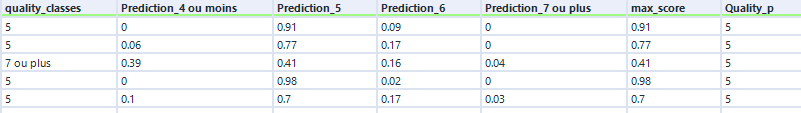
Take this input data:
If you plot this in Tableau, it’s normally enough to set the default format to Number (standard). That gives us this:
But if you don’t like the scientific formatting for Thing 2 and 7 in Type b, you’ll have to set the number of decimal places to the right number. But that’ll give you this:
Ew.
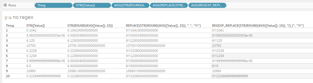
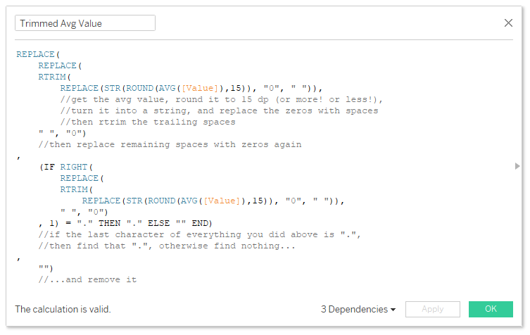
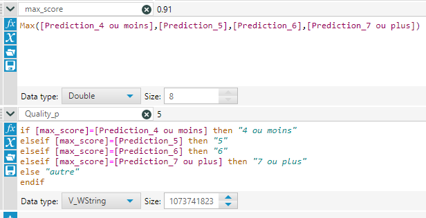
You can get around this with strings. I don’t use this too often, but it comes in handy now and again. Here’s the formula that you can copy/paste and use in your own workbooks:
REPLACE(
     REPLACE(
     RTRIM(
         REPLACE(STR(ROUND(AVG([Value]),15)), "0", " ")),
         //get the avg value, round it to 15 dp (or more! or less!),
         //turn it into a string, and replace the zeros with spaces
         //then rtrim the trailing spaces
     " ", "0")
     //then replace remaining spaces with zeros again
 ,
     (IF RIGHT(
         REPLACE(
         RTRIM(
             REPLACE(STR(ROUND(AVG([Value]),15)), "0", " ")),
         " ", "0")
     , 1) = "." THEN "." ELSE "" END)
     //if the last character of everything you did above is ".",
     //then find that ".", otherwise find nothing…
 ,
     "")
     //…and remove it
Working from inside out, the calculation does this:
Take the AVG() of your field. You’ll want to change this to whichever aggregation makes most sense for your use case. e.g. 6.105
Rounds that aggregation to 15 decimal places. This is almost definitely going to be enough, but hey, you might need to up it to 20 or so. I have never needed to do this. e.g. 6.105000000000000
Turns that into a string. e.g. “6.105000000000000”
Replaces the zeros in the string to spaces. e.g. “6.1 5 ”
Uses RTRIM() to remove all trailing spaces on the right of the string. e.g. “6.1 5”
Replaces any remaining spaces with zeros again. e.g. “6.105”
If the last character of the string is a decimal point, then there are no decimals needed, so it removes that decimal point by replacing it with nothing; otherwise, it leaves it where it is. e.g. “6.105”
And there you go – the number is formatted as a string to the exact number of decimals you’ve got in your Excel file.
Interestingly, there are some differences between the way REPLACE() and REGEX_REPLACE() work. It seems that REPLACE() will wait for the aggregation, rounding, and conversion to string before doing anything, whereas REGEX_REPLACE() will give you the same issues you get as if you just turn a number straight into a string without rounding first.
What are Z scores? How can you calculate them in Tableau? And once you’ve done that, what can you use them for? This blog will cover all of that, using some fake data from a factory that produces things. We’ll have a look at how the things differ from each other across various different manufacturing dimensions, and use that to see what to do with the thing we’re currently building. It’s all in a Tableau Public workbook here.
Firstly, what’s a Z score, and why would we want to use one?
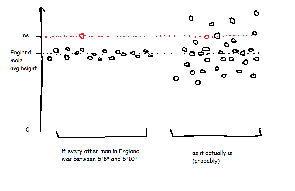
A Z score is a way of looking at how much more, or less, something is from average in a relative way that accounts for the spread of data. For example, let’s start with height. I’m 6’3″ (or 190cm), and I live in England, where, according to wikipedia at the time of writing, the average male height is 5’9″ (or 175cm). That makes me taller than average.
However, averages don’t tell you anything about the spread of data, which means that taking the simple difference in height doesn’t tell you anything about how tall I am relative to everybody else. If every man in England (apart from me) was somewhere between 5’8″ and 5’10”, I’d be an absolute giant, relatively speaking. But as it is, I’m never the tallest guy in the room, so while I’m taller than average, I only feel averagely tall.
This relative difference from average can be expressed in a Z score, which is essentially saying, “how many standard deviations above or below average is this value?”. A Z score is calculated like this:
Value - Average Value
/
Standard Deviation of Values
So, my height as a Z score compared to men in England would be:
6'3" - 5'9"
/
Standard Deviation of Heights (which I don't know)
In the hypothetical example where every other man is between 5’8″ and 5’10”, the spread of heights is small, which means that the standard deviation of heights would be really low, which means that my Z score would be really high. But in the real world, the spread of heights is much greater, so the standard deviation of heights is bigger, which means that my Z score is lower.
It also means you can normalise comparisons over different metrics with different scales. Let’s say I’m an Olympic heptathlete. I’m doing seven different events, and the units they’re measured in are different – some are in metres, like the high jump and the shot put, and some are in seconds, like the hurdles and the sprints. The scale of those units is different too – I’ll be able to throw the shot put many times further than I can jump. That makes comparing my performance across my different events difficult! But Z scores let you compare. If my shot put Z score is +2.1 compared to other athletes while my hurdles score is -0.3 compared to other athletes, I know that I need to work on my hurdles more than my shot put.
OK, so Z scores are a way of normalising data to do comparisons. How do I do it in Tableau?
Sets are fantastic for this. Here’s a quick explanation of why before we move onto how to set it all up.
I like using sets to decide which things I’m focusing on (the “I want to know how normal this thing is” group) and which things are in my reference group (the “I want to take this lot as the basis for all my comparisons” group).
A lot of the time, you’ll want all things to be in both groups. For example, if I’m a professional athlete, I want to compare myself to my peer group, and I’ll want to see how my closest rivals compare to the same peer group too. So, I’d stick all the top athletes in my sport in the main group (so I can see their Z scores) and in the reference group (so that I’m comparing everybody to each other).
Actually, I’m very much not a professional athlete… but when I’m out cycling, I might still want to compare myself to the Tour de France pros to see just how out of my league they are. In that case, I’d want all the professional cyclists in the reference group, and I’d want to put myself in the main group, but what I don’t want to do is put myself in the reference group – my slow trundling up Anerley Hill would only bring the reference group’s average performance down and widen the reference group’s standard deviation, and I’d mistakenly make myself look closer to the pros than I actually am.
That’s why I like using sets and set actions in Tableau. Now for the actual Tableau work!
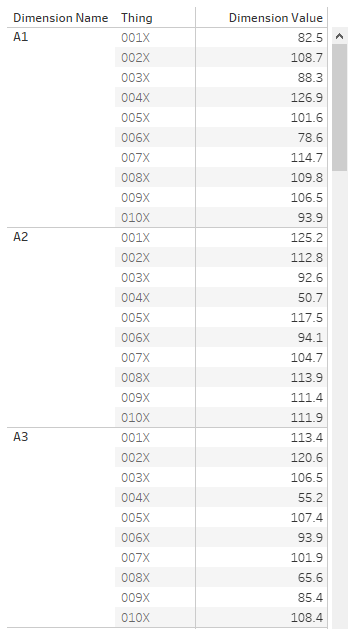
First of all, let’s talk data structure. I’ve got a long and thin data source; a field for the [Dimension Name], a field for the [Thing], and a field for the [Dimension Value]:
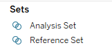
OK. The next step is to set up the sets. I want to create two sets based on my [Thing] field – one for the main analysis set, one for the reference set. You can do this by right-clicking on [Thing] and selecting Create Set.
Now that I’ve got two sets, I can start creating my Z score calculations. The formula for a Z score is:
Value of the thing you want a Z score for - Average value in the reference group
/
Standard Deviation of values in the reference group
You could do all this in one calculation, but I like breaking mine down into individual parts.
[Reference Set Avg] {FIXED [Dimension Name]: AVG(IF [Reference Set] THEN [Dimension Value] END)}
[Reference Set StDev] IF {FIXED [Dimension Name]: COUNTD(IF [Reference Set] THEN [Dimension Value] END)} =1 THEN 0 ELSE {FIXED [Dimension Name]: STDEV(IF [Reference Set] THEN [Dimension Value] END)} END
Now I can use those two calcs in my Z score calc:
[Z Score] (AVG([Dimension Value]) - AVG([Reference Set Avg])) / AVG([Reference Set Stdev])
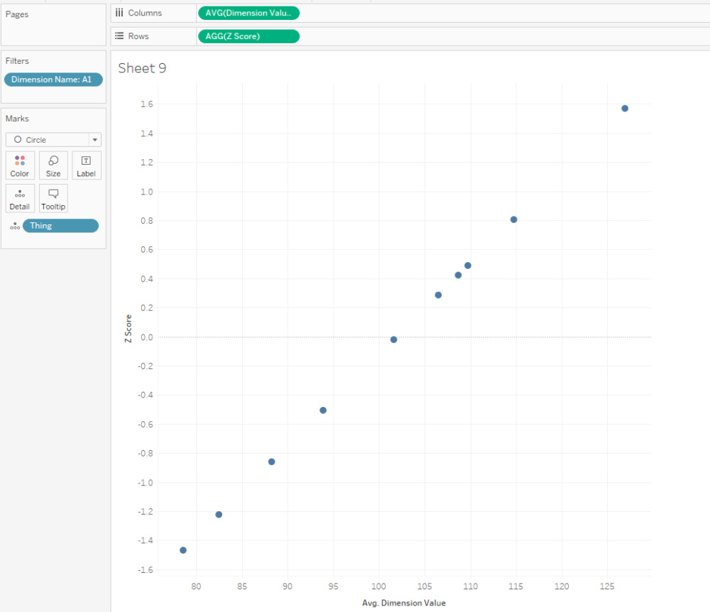
That’s all it takes to calculate Z scores! Here’s a scatterplot of my dimension A1. The actual dimension value and the Z score are perfectly correlated, but now we’ve got a normalised value on the y-axis:
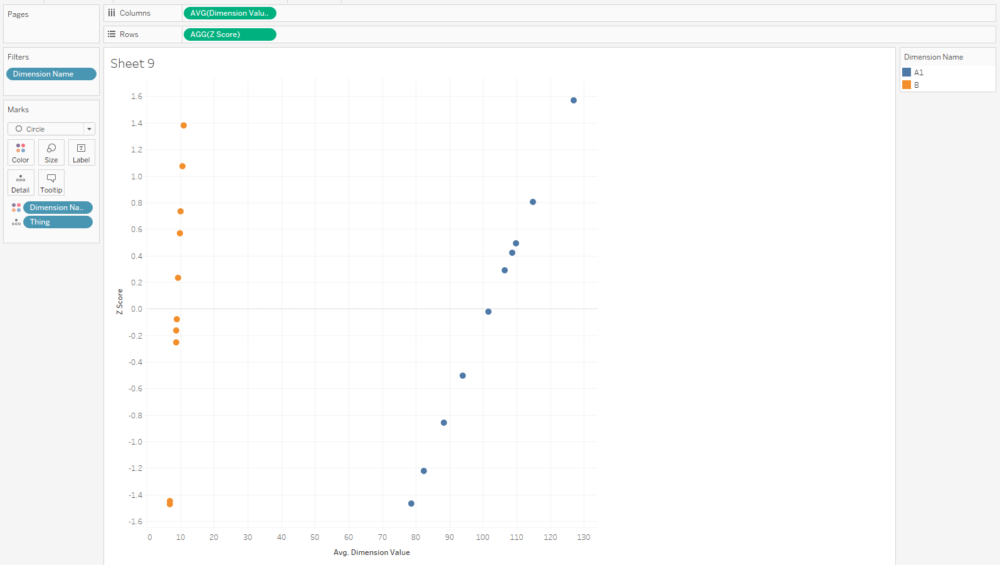
And that normalised value is nice and useful, because now we can compare two dimensions with very different scales, like A1 and B:
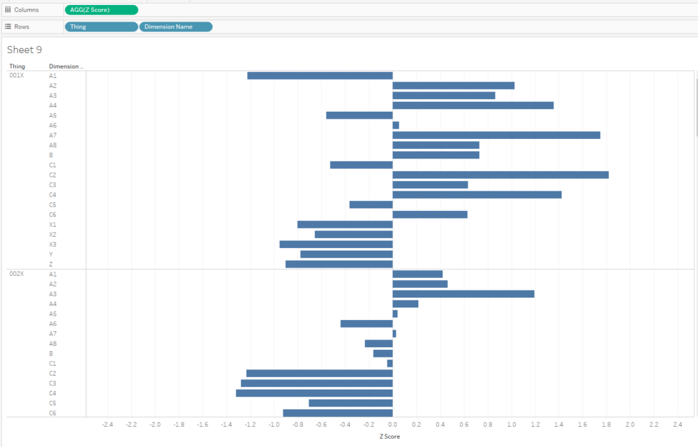
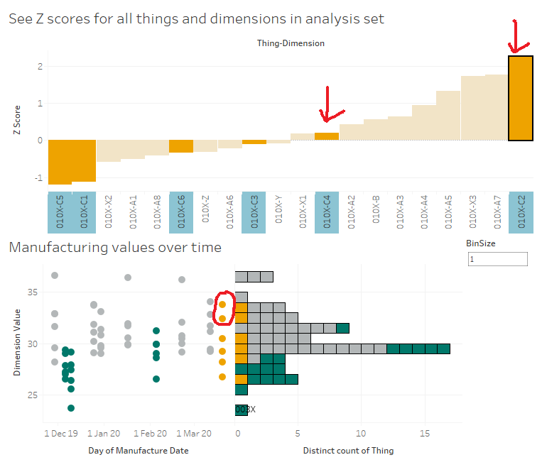
I often plot Z scores on diverging bar charts. A chart like this will show me how a thing compares to other things across multiple dimensions, and a thing’s idiosyncrasies will stick out:
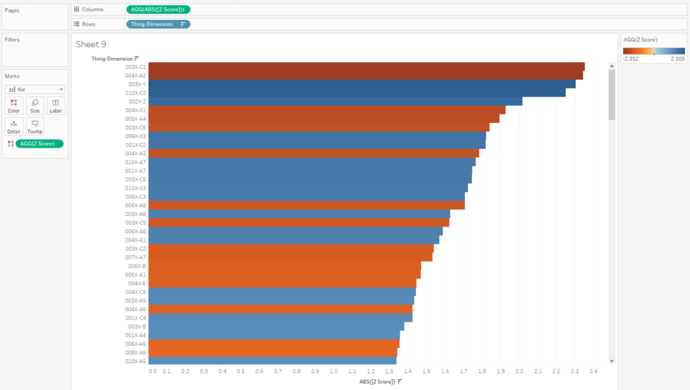
Similarly, if I want to see what the outliers are across a whole data set, I can create a concatenated [Thing-Dimension] field, plot the absolute Z score, colour by the actual Z score, and sort. This instantly shows me where the biggest outliers in my data are:
Eagle-eyed readers may have noticed that I haven’t calculated a separate field for the analysis set, and I’m just using AVG([Dimension Value]) in the numerator. That’ll calculate the Z score for any [Thing] in the view regardless of whether it’s in the analysis set or not, so those readers may be wondering why we need the analysis set at all. Never fear, we’ll use this set in some more advanced calculations that are coming up.
Making Z scores interactive
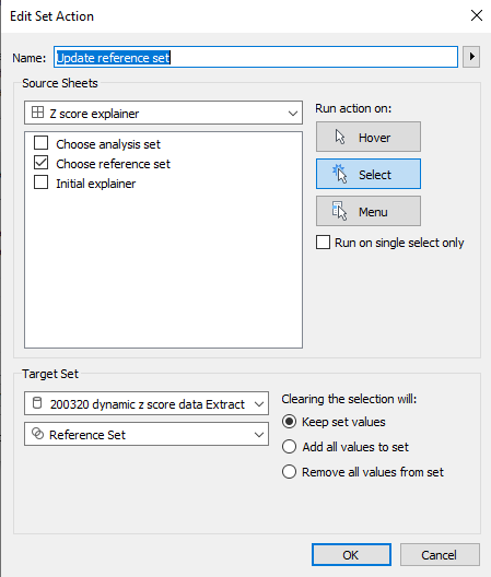
With a few extra steps, you can create two sheets to use as set member choosers (I think that drop-down set controllers are coming in 2020.2 or 2020.3, which is exciting! But for now, I’m in 2020.1, and this is the workaround we need to update set membership).
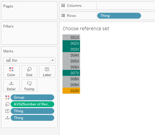
I set up my reference set chooser sheet like this:
…and then the dashboard action like this:
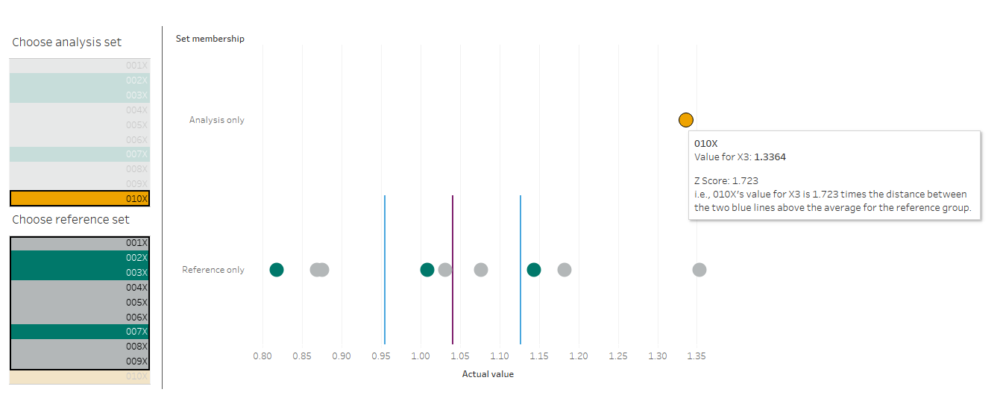
Repeat for the analysis set, and you can build a dashboard a bit like this (click the image to see the interactive version on Tableau Public):
I’m using this to select an individual dimension, and then looking at how 010X compares to 001X through 009X. I’m plotting the actual value on the x-axis, because that’s what I’ll have to adjust in the factory if I decide to make any changes, and I’ve included the Z score in the tooltip.
The nice thing about using sets and set actions is that we can update these Z scores by changing the reference set. Maybe we’ll find out that one of our things, say, 004X, was actually faulty and shouldn’t be included in our set of “normal” things that we’re using as a reference. Do we need to re-run our entire data pipeline? Nope, just deselect it from our reference group selector.
Next steps: comparing Z scores
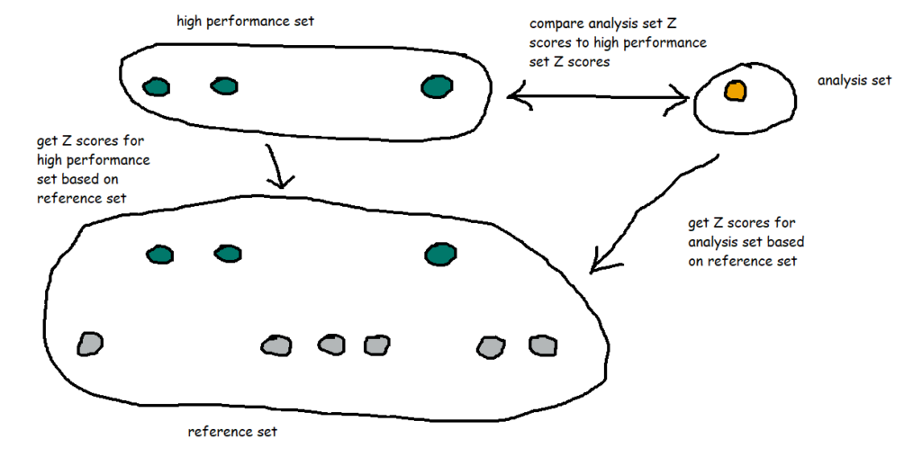
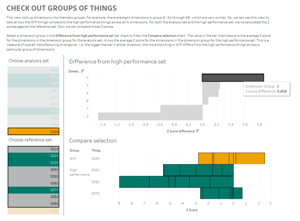
That’s nice and everything, but let’s take it a bit further. I know that 002X, 003X, and 007X were particularly good things, and ideally, all the things I manufacture in future will be like those three. So, I’ve created a new set called [High performance set], and I want to compare my WIP thing 010X to the high performance set based on the same reference set I selected earlier.
That means I’ve got a lot of comparisons going on:
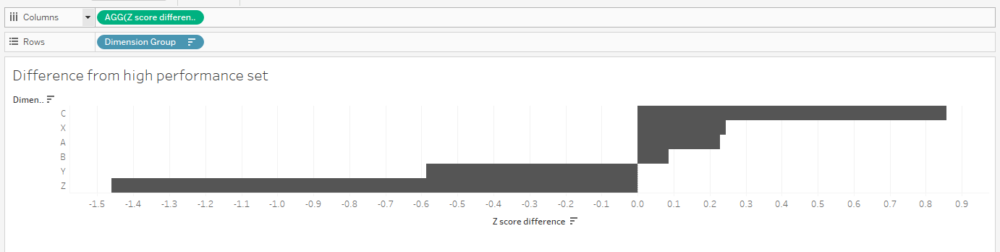
I also want to group my dimensions into themes. For example, A1 through A8 are technically separate dimensions, but they represent the same kind of thing taken at different points – maybe it’s the thickness of a circular plate at eight different points around the circumference of the plate, or maybe it’s the weight of eight different ball bearings in the same part of the thing, or something like that. So, since they’re all related, I want to see how 010X compares to the high performance set across the A dimensions as a group of dimensions. In my workbook, I’ve simply grouped them by regex-ing out any numbers from the dimension name.
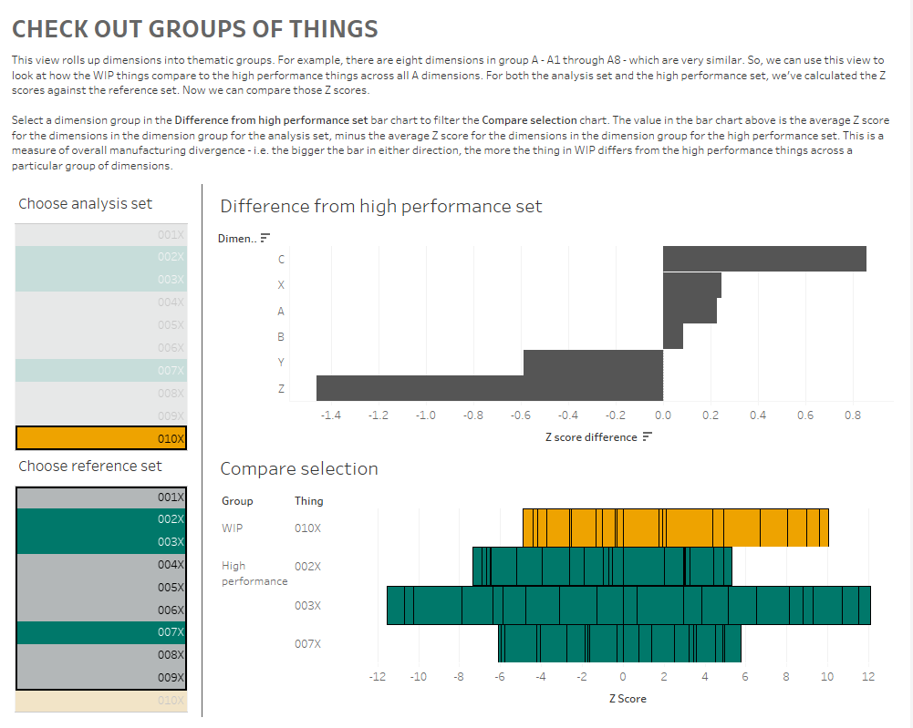
I’ve created a dashboard like this (click for interactive version):
What am I doing here? In the bar chart at the top, I can see how the Z scores for 010X compares to the Z scores for the high performance set for each group of dimensions. I’m finding the Z score for each dimension within a dimension group, and comparing the average Z score for each dimension group for the analysis and high performance sets.
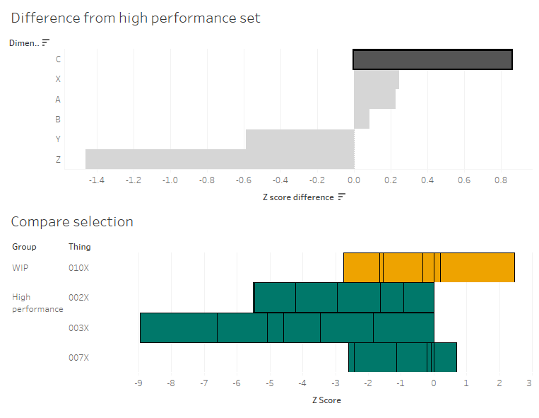
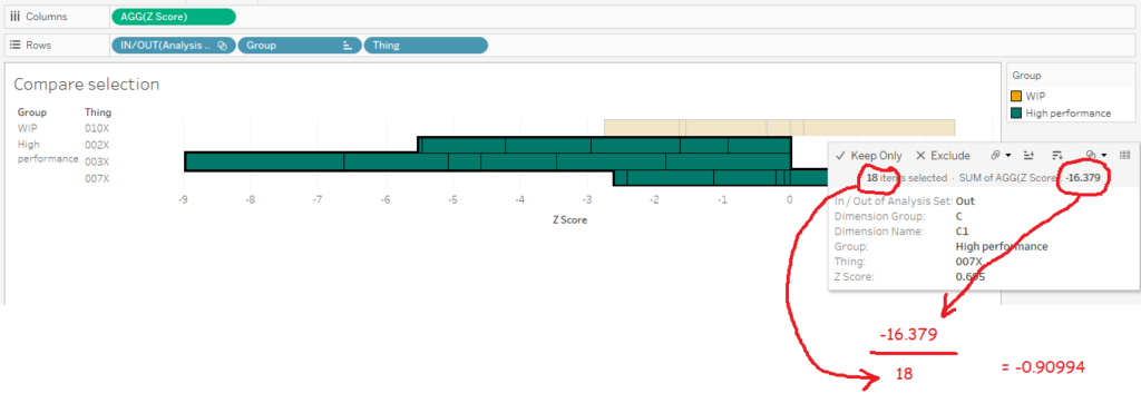
What I’m seeing here is that, on average, the C dimensions in 010X are higher than the high performance set. If I click the C bar, it’ll filter the “compare selection” chart:
This stacked bar chart shows me the Z scores for all C dimensions for the things in the analysis and high performance sets. This is telling me that the high performance things tended to have C dimensions lower than normal across the reference group, and that while 010X also has some C dimensions on the lower side of normal, it’s not as low as the high performance group. So, maybe my manufacturing specifications for the C dimensions are actually a bit high, and I should tune them lower if I want more high performance things.
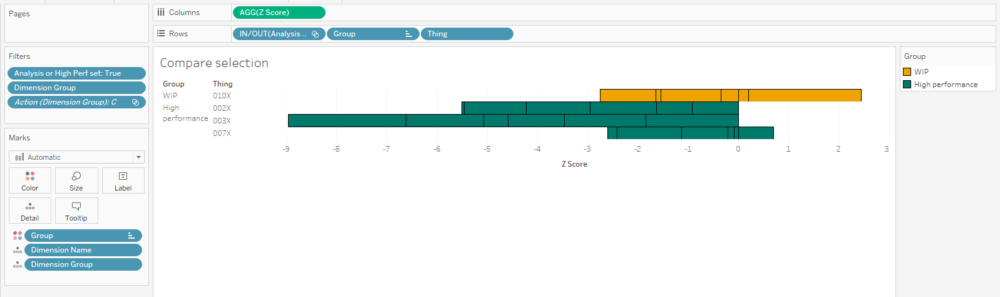
Building the “compare selection” chart is relatively straightforward – put the [Z score] field on columns, and stack your rows with the Group and Thing dimensions, as well as the IN/OUT value of the analysis set so that it’s sorted nicely:
I’ve also created a calculation that returns a T/F value based on set membership and I’m using it to filter the view. It’s simply:
[Analysis or High Perf set] [Analysis Set] OR [High performance set]
…and I’ve set the filter to TRUE.
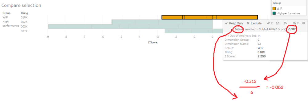
The tricky bit is getting the values for the diverging bar chart. I like using the compare selection sheet as a way of checking the calculations. What we want to work out is the average Z score across all things and dimensions for the analysis set, and the average Z score across all things and dimensions for the high performance set. Then we want to take the analysis set average and subtract the high performance set average to see the difference.
In other words, we want this:
…minus this:
…which should give me 0.857944.
The first thing we need to do is to create a new field: [Thing-Dimension]. It’s just a concatenated field of [Thing] and [Dimension Name], like this:
To be able to plot the average Z scores and difference in a simple bar chart for each dimension group, we can’t have the thing or dimension in the view, which means we need an LOD which includes those fields:
[Z score (LOD include Thing-Dimension)] ( {INCLUDE [Thing-Dimension]: AVG([Dimension Value])} - {INCLUDE [Thing-Dimension]: AVG([Reference Set Avg])} ) / {INCLUDE [Thing-Dimension]:AVG([Reference Set Stdev])}
Now we can use that field to work out the difference between our sets:
[Z score difference] AVG(IF [Analysis Set] THEN [Z score (LOD include Thing-Dimension)] END) - AVG (IF [High performance set] THEN [Z score (LOD include Thing-Dimension)] END
Finally, we can create our bar chart! And it’s nice and simple:
Let’s just check the calc works. Is it 0.857944, as I worked out manually earlier on? Yup, it’s showing up as 0.858 in my tooltip. Lovely:
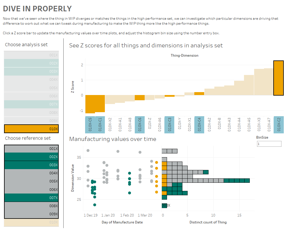
Now that I’ve compared Z scores across groups of dimensions to get an idea of the general way that my things compare to each other, I can dive back into the actual data to look at what those differences are and potentially fix my manufacturing variance.
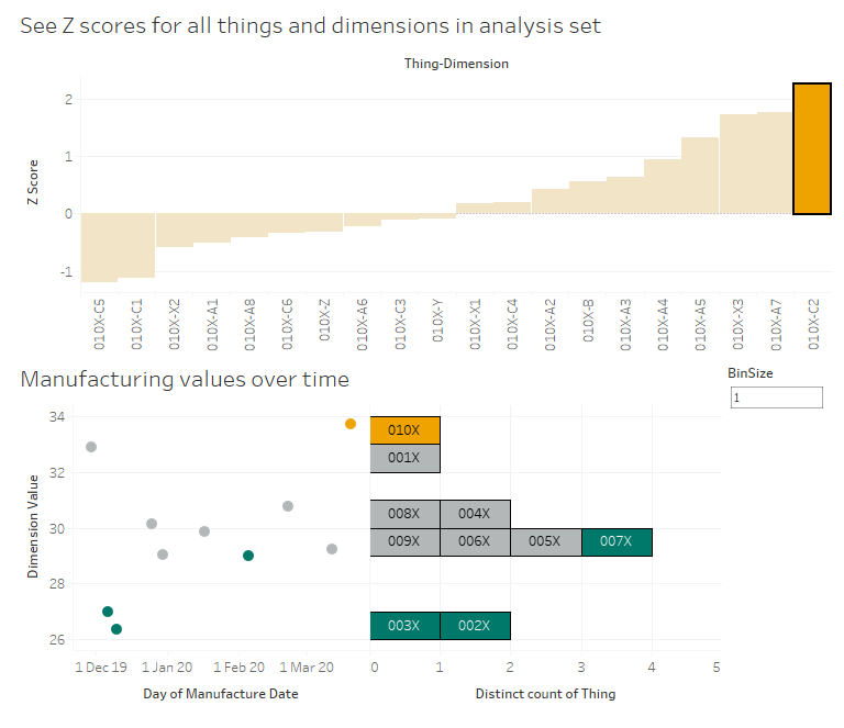
Here’s my final dashboard (again, click for the interactive version). I’ve plotted the Z scores for all dimensions for 010X, and I can click any of those Z scores to update the scatterplot and marginal histogram of actual values below. I know that the C dimensions are a bit different for 010X in comparison to the high performance set, so let’s have a look at those:
I can look at that scatterplot and instantly see which of the C dimensions are driving that difference between 010X and the high performance set:
It’s dimensions C2 and C4.
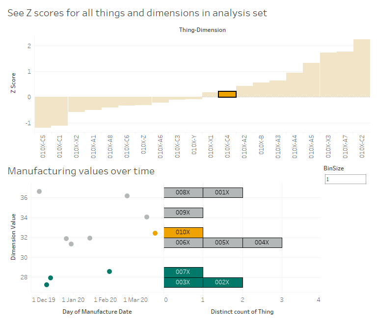
Let’s start with C2. 010X has a high Z score of 2.25, and we can see in the scatterplot that this is a higher value than normal. As it is, that should be raising flags in the factory – that’s a high C2 value, both absolutely and relatively, so we should probably turn it down a bit to be more in line with the others at around 30. As an aside, it’s interesting to see that the high performance set all have low C2 values, so maybe we should turn it down lower than 30 to be closer to the high performance set:
Now, let’s have a look at C4. No issues there, right? 010X has a C4 value which is slightly higher than the average for the reference group, but the Z score is only 0.198, which indicates that it’s pretty much bang on normal. However, we can see that even though it’s normal for the reference group, it’s quite a lot higher than the high performance group. So, again, maybe we’re manufacturing C4 to a specification that says “aim for a C4 value between 30 and 34”, whereas we should consider amending those limits to between 26 and 30 based on how the lowest C4 values have all been the high performance things:
This is just a few of many different ways you can use Z scores and Tableau to look at manufacturing data. There are all kinds of interesting use cases out there – hopefully this explainer helps you build some of your own.
This isn’t my favourite use of Tableau by any stretch of the imagination, but it’s something that comes up now and again when doing Tableau consulting:
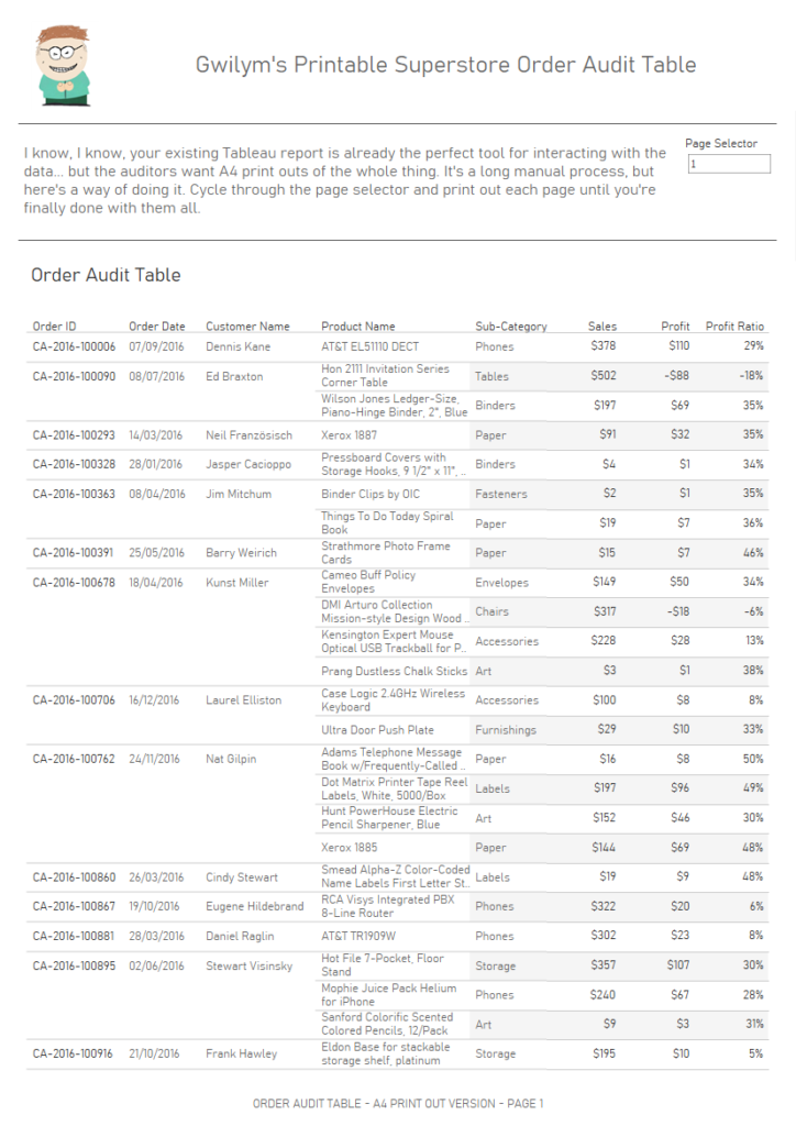
“I’ve got a massive table, which is fine to scroll through online, but I can’t print it. How can I print out this table over multiple pages while keeping all the dashboard formatting and the column headers?”.
My solution to this uses a parameter and a running total calculation using the [Number of Records] field. You can download my workbook from Tableau Public here, and then follow the instructions below.
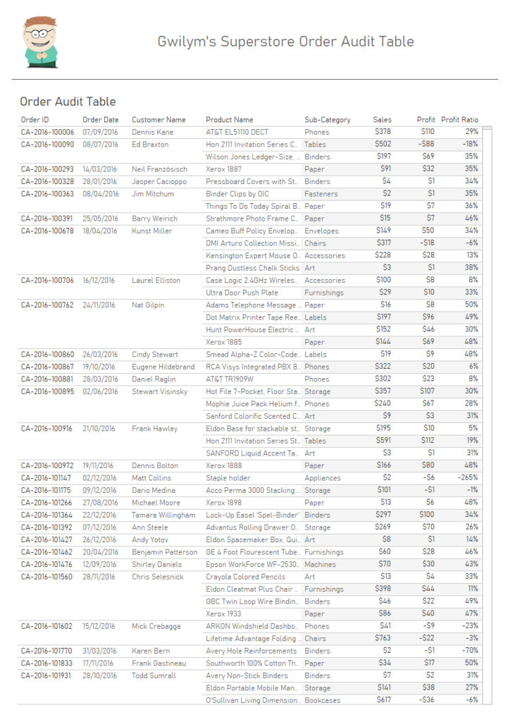
First of all, let’s create a big old table, something a little like this:
It’s got almost 10,000 rows in it. That’s fine when you’ve got an interactive scroll bar and you’re working with it online, but not so much if you need to create static print outs.
So, the next step is to find a way of making it into pages. What I want to do is put the table on a dashboard, like this:
…and instead of having a scroll bar, I want to fit the data to however many rows fit on the dashboard, and then repeat that dashboard as many times as necessary.
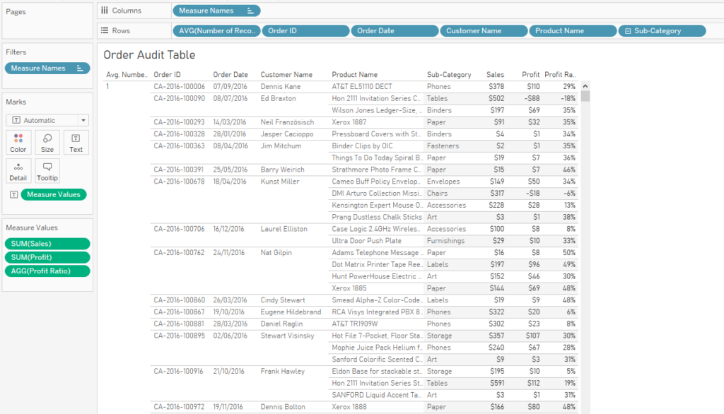
Let’s bring in the AVG([Number of Records]), and switch it to discrete so it functions like a row number where the row number is 1 for each row:
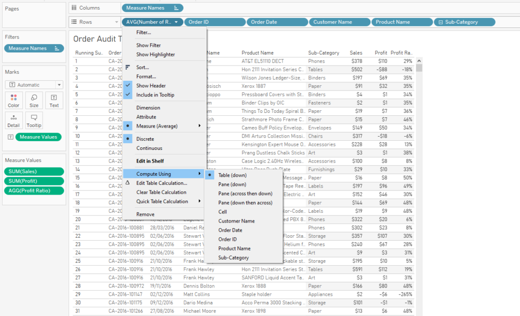
Now let’s add a running total table calculation to it, computing along Table (down). This gives us a dynamic Row ID:
The next step is to create a parameter to select the page number. You’ll need to make it an integer with any allowable value.
Now, we can divide the table into pages. I’ve decided that I’d like to show 25 rows on each page, mostly because that’s an easy number to work with in my head – I know that there’ll be 4 pages for each 100 rows in the data.
We can use the following logic to determine where my 25 row pages start and end:
((RUNNING_SUM(AVG([Number of Records]))-1) / 25) + 1
This is a few more brackets than are technically necessary, but I find that it clarifies the purpose of the calculation. It takes the dynamic Row ID we’ve created, and subtracts 1 from it, so that it goes like 0, 1, 2, 3… instead of 1, 2, 3, 4… and so on. Then, it divides that number by 25, which is the number of rows I want in each table page. Finally, it adds 1 to the whole thing.
This tells us where each page will be:
Why does it subtract 1 and then add 1 again? The first -1 is in order to make sure that all pages have the same number of rows on them. If the Row ID begins on 1, then the first page will always have one row fewer on it, as it’ll take rows 1-24, then the second page will take rows 25-49. Subtracting 1 means that the first page will take rows 0-24, then the second page will take rows 25-49. Then, after dividing the Row IDs by 25, the first page will have a number between 0 and 1. Talking about the first page as page 0 and the second page as page 1 always gets confusing, so I’ve added 1 back on to make it more intuitive.
Now that we’ve got that logic understood, we can create a Page Filter calculated field:
((RUNNING_SUM(AVG([Number of Records]))-1) / 25) + 1 >= [Page Selector] AND ((RUNNING_SUM(AVG([Number of Records]))-1) / 25) + 1 < [Page Selector] + 1
This filters the table to whichever page you’ve selected in the page selection parameter. So, if you’ve selected page 4, it’ll give you all values where the Row ID divided by the number of rows you want per page is >= 4 and < 5. This corresponds to rows 76-100.
Now that the filter is set up correctly, we can get rid of the first two columns in this table entirely and leave it to work in the background. You can put the new version of your table into a dashboard along with the page selector parameter. Tableau also lets you set the dashboard size to common printer paper sizes, so I’ve set this to A4 portrait:
Now, if you need to print out the entire table in a consistent format, you can cycle through all the pages and print them individually. This will obviously take a lot of time for big tables, and it won’t be a pleasant experience, but it does at least make it possible for you!
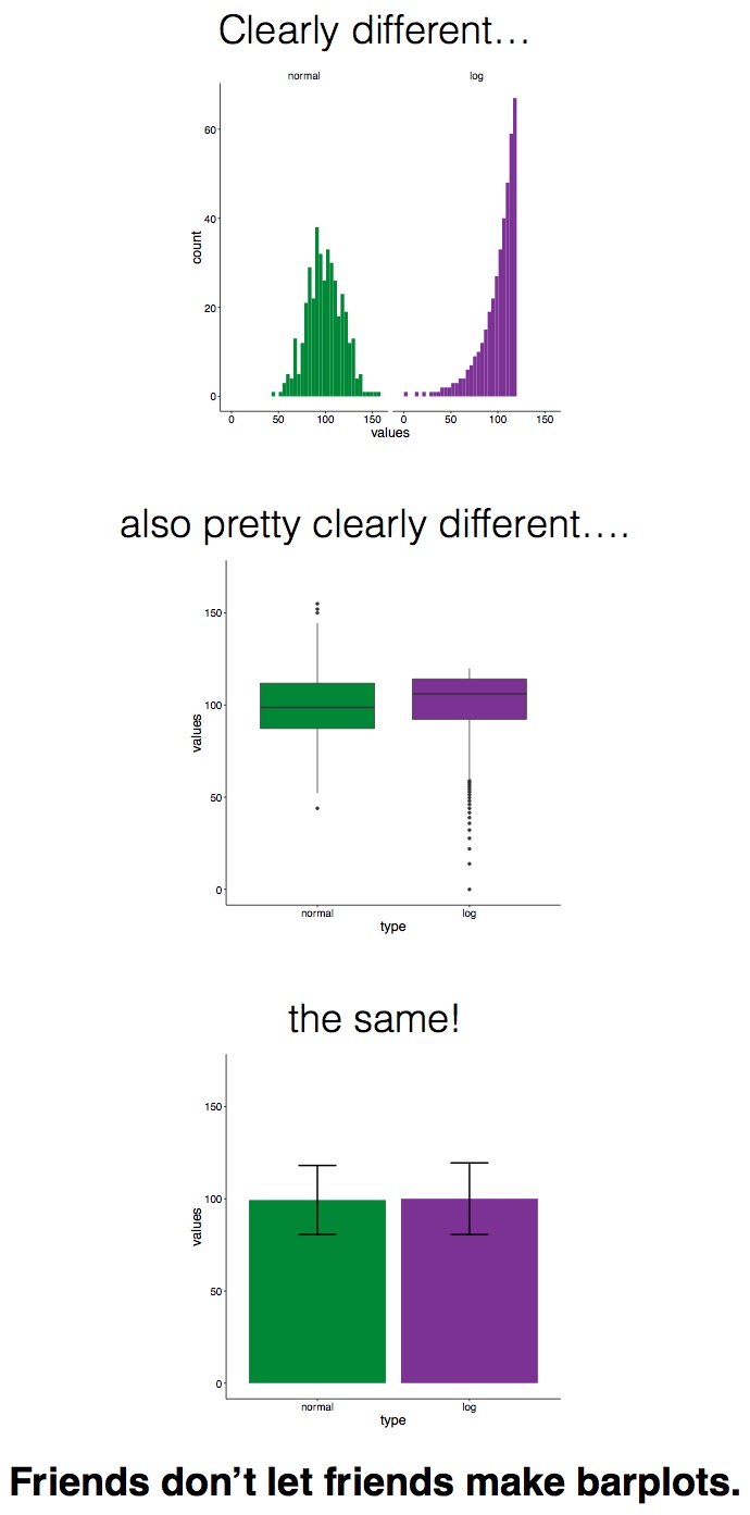
Sometimes when you plot values on a graph, you want to show not only the aggregated value, but also the variance or uncertainty around it. Now, before I get into this blog properly, I want to say that I don’t actually recommend plotting bar graphs with error bars or confidence intervals, as it can be misleading. The Bar Bar Plots campaign has far more information on it, but ultimately it’s more honest, and really straightforward, to show the actual data points in Tableau, so why wouldn’t you just do that?
Friends don’t let friends make barplots – solid advice from Page Piccinini.
But in the event that you do need to show simple bars and an indication of uncertainty, you’ve got two main options:
Standard errors
Confidence intervals
Introduction to the data
I’m going to use some data I collected during an experiment I ran in 2015. In this experiment, Dutch people learned some Japanese ideophones (vividly descriptive words). But there was a catch – half the words they learned were with the real meanings (e.g. fuwafuwa, which means “fluffy”, and they learned that it meant “pluizig”), and half the words they learned were with the opposite meanings (e.g. debudebu, which means “fat”, but they learned that it meant “dun”, or “thin”). Then they did a quick test to see if they remembered the word associations correctly. You can read more about that here, if you like.
All the following graphs in this blog have been created in this workbook on Tableau Public. Please feel free to download and explore how it’s all made!
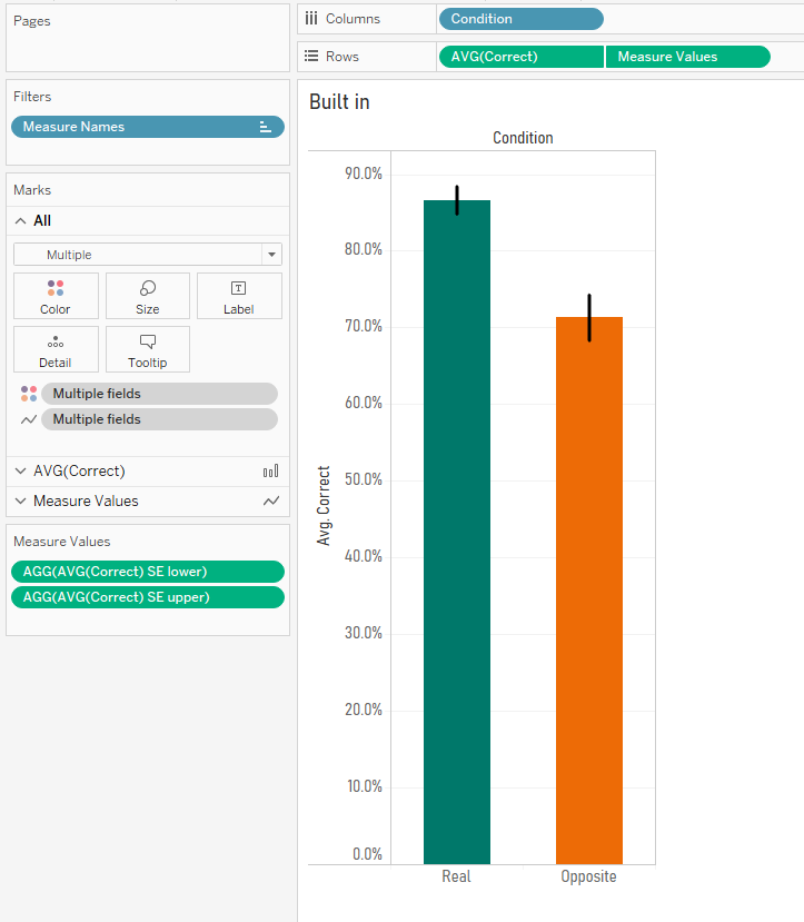
Here’s a simple bar graph of the results. For the words they learned with their real meanings, people answered correctly in the test round 86.7% of the time. But when tested on the words they learned with their opposite meanings, people answered correctly only 71.3% of the time.
But this hides the variation in the data. Sure, the average in each condition (and the difference between them) is what I care about, but with simple bar graphs, it’s easy to forget that lots of individual people are below and above the average in each condition. You can see that variation here:
Also, these are averages taken from a sample. I can’t go to a conference and say, “hey everybody, I’ve done the research and Dutch undergrads get 86.7% correct in the real condition and only 71.3% in the opposite condition”… well, I could, but it would be misleading. I can’t guarantee that these results are definitely in line with what the entire population of Dutch undergrads would get if I somehow managed to test all of them, so I need to make some kind of statement about the uncertainty of that result. I can do this with standard errors or confidence intervals.
Standard errors
Let’s start with standard errors. The standard error of the mean is essentially a way of saying how uncertain you are about the mean based on the size of your sample by estimating the standard deviation of the whole population. The wikipedia article on standard errors is pretty good.
The first step is to create a field for the standard error. This is the standard deviation of the scores per condition, divided by the square root of the number of participants:
STDEV([Correct]) / SQRT(COUNTD([Participant]))
You’ll notice I’ve also got fields for the sample standard deviation and the not sample standard deviation. This is from when I was playing around with different calculations for the standard deviation of the sample vs. the standard deviation of the population. I’m not going to go into it in this blog, but here’s a really nice explainer here, and you can download the workbook to investigate further. In summary, it looks like Tableau’s native STDEV() function uses the formula for the corrected sample standard deviation by default, rather than the population standard deviation. This is pretty nice, it feels like a safer assumption to make. Cheers, Tableau.
Now that we’ve got the standard error, we can create new fields for our upper and lower standard error limits like this:
AVG([Correct]) – [SE] and AVG([Correct]) + [SE]
So, now we can create some nice standard error bars. This uses a combination of measure names/values and dual axes, so it’s a little bit complicated. Firstly, create your simple bars for the correct % per condition:
Now, drag the lower standard error field onto rows to create a separate graph. Drag the upper standard error field onto the same axis of that new graph to set up a measure names/measure values situation:
Now, switch the measure values mark type to line, and drag measure values from columns and drop it on the path card:
All you have to do now is create a dual axis graph, synchronise the axes, and remove condition from colour on the standard error lines:
Great! We’ve now got bar graphs with standard error bars. I mean, I still don’t recommend doing this, but it’s a common request.
Confidence intervals
Now, let’s have a look at confidence intervals. They are a range around your sample mean which tell you that, if you repeated the same study over and over, X% (usually 95%) of confidence intervals from future studies will contain the true population mean. They’re hard to explain (there’s a good blog here), but easy to see.
In Tableau, confidence intervals are really straightforward. You can plot your data points, go to the analytics pane, and bring in an “average with 95% CI” reference line, which creates a reference band around the average:
Nice. This is exactly how I’d like to visualise my experimental data! You can see the average per condition, the confidence intervals, and the underlying participant data.
Quick disclaimer: because I’m looking at percentages here, this is a proportion rather than a hard and fast value, so I shouldn’t actually be using confidence intervals at all… but if we pretend that the 86.7% value is actually an average 0.867 value of something like my participants taking 0.867 seconds taken to respond, or young children being 0.867 metres tall at a certain age, or 0.867 kg lost for each week under a new diet plan, then it’s okay. I’m just going to keep going with my percentages, but please bear this in mind.
However, if your journal insists on old school bar graphs, Tableau’s built in average with 95% CI reference band won’t work. Well, technically it will, it’s just that it’ll show you this:
Because we’ve had to take Participant off detail in order to show an aggregation across participants, the reference band doesn’t know how to compute it, and it assumes that there’s just one data point.
One way around this would to built a dual axis graph. Keep the bars with just condition on colour, and create another axis. Add participant to detail, and set the mark type to circle. Make the circles as small as possible and completely transparent, hit dual axis, synchronise axes, and voila. Now you can have an average with 95% CI reference band again.
The downside is that this is pretty ugly. The reference line/band is way outside the edges of the bars, and it just doesn’t have that standard look that you’re used to. What we actually want is something like our standard error lines from earlier, but with confidence intervals.
The good news is that we can do it! But we’ll have to move away from Tableau’s built in confidence intervals, and create our own calculation, just like we did with standard errors.
The first step is to use the standard error field we made earlier to calculate the confidence intervals. When you look up how to calculate confidence intervals, you’ll probably find something saying that 95% confidence intervals are calculated by taking the mean, and adding/subtracting 1.96 multiplied by the standard error. This 1.96 figure is from the Z distribution, which tells you that 95% of normally distributed data is within 1.96 standard deviations of the mean. And because this is a sample of a population, we multiply that 1.96 by the standard error to get our confidence intervals. Here’s another great blog which breaks it all down.
So, we can create separate fields for our upper and lower confidence interval limits like this:
Once we’ve done that, we can build our graphs. This is the same technique as the standard error bars earlier. Create the measure names/values and dual axis graph with measure names on the line path, and you’ll get the same kind of graph, but now showing confidence intervals instead of standard errors:
Excellent! We’ve now got our 95% confidence intervals… or do we?
Confidence intervals, pt.2 – what’s going on?
Some of the more statistically minded of you may have been yelling at the screen when I used the 1.96 value from the Z distribution to calculate my confidence intervals. You see, confidence intervals shouldn’t always simply use the Z distribution, even though that’s the standard formula you’ll find when looking up the definition of confidence intervals. Rather, when you’ve got a small sample, which is generally defined as under 30, you should use the T distribution because the size of the sample may skew the normality of the sample. Again, there’s a lot of good information here.
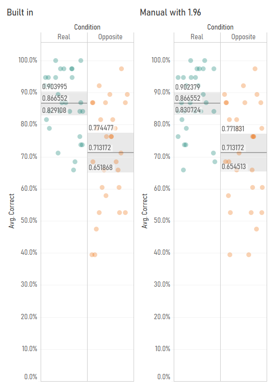
I started investigating this when I noticed that Tableau’s average with 95% confidence interval calculations were different from my manually calculated ones. Have a look at this comparison – you’ll notice that the confidence interval values are slightly different:
I started playing around with the Z/T value in the confidence interval calculation by making it parameter-driven, and I found that Tableau’s confidence interval calculation seemed to use a number like 2.048 rather than 1.96:
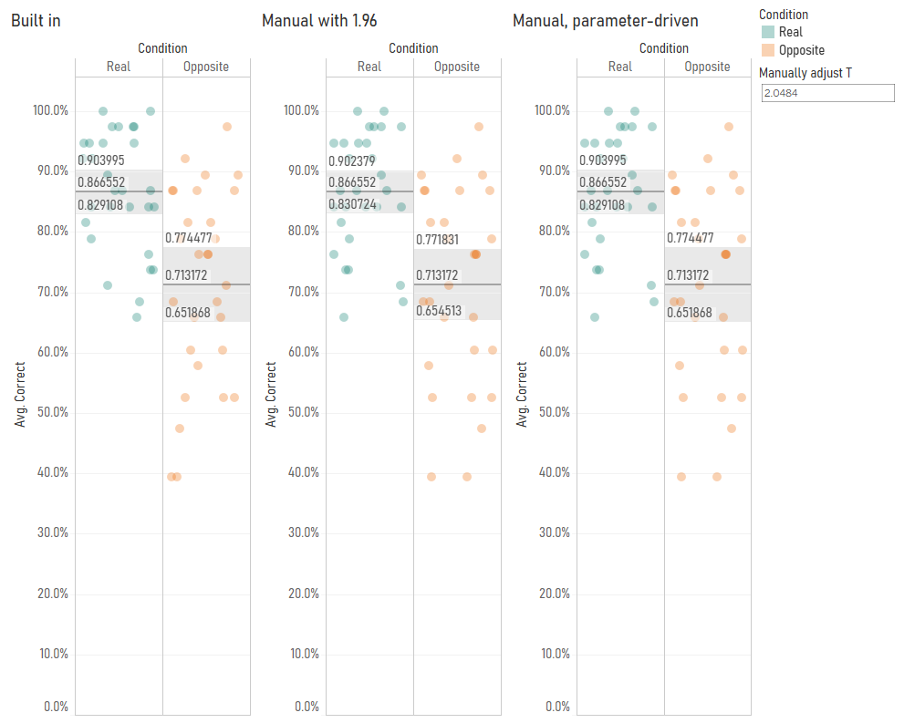
This is because Tableau’s confidence interval calculation is using the T distribution rather than the Z distribution. You can find the appropriate T values to use based on your degrees of freedom (which is your sample size minus one) in Appendix B.2 of this very useful pdf (there’s also a table set to 4dp instead of 3dp here). In my case, I’ve got 29 participants, so the degrees of freedom is 28, and the lookup table shows that the relevant T value for a 95% confidence interval is 2.048, so I can put that in my confidence interval calculations. It also looks like Tableau’s confidence intervals are calculated on a more precise number than 2.048, which suggests that the back end is calculating it directly from the T distribution rather than using the fairly common approach of looking it up in a table where everything is rounded to three decimal places. That’s pretty nice too.
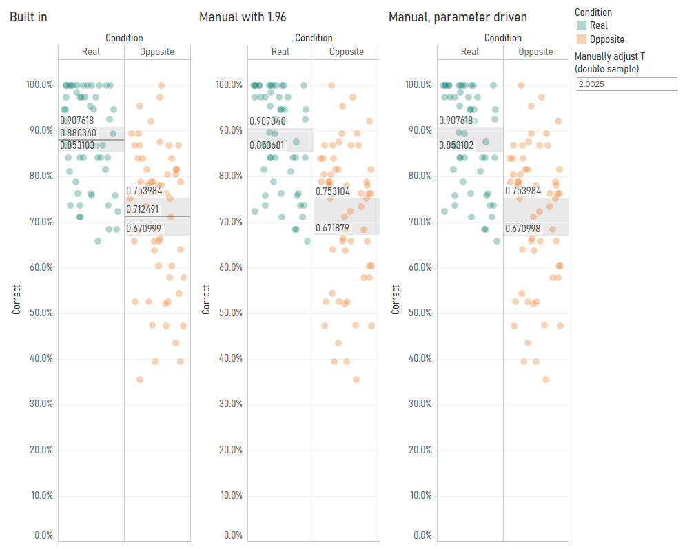
My next step was to check whether Tableau switches between the T and Z distributions based on sample size. So, I duplicated my data and fudged the [correct] field by a random number to create a sample of 58 participants. With 58 participants, it’s fine to use the Z distribution to calculate 95% confidence intervals. But even then, it looks like Tableau is using the T distribution – when I set my parameter to 2.0025 using the slightly-more-precise values in the T table here, you can see that the confidence intervals using T values, not Z values, match Tableau’s calculations:
This is pretty good as well, I think. As your sample size increases, the T distribution starts to match the Z distribution more and more closely anyway. Notice how, with 29 participants, the T value was 2.0484, and with 58 participants, it was 2.0025. This is getting closer and closer to 1.96. At 200 participants, the T value would be 1.9719. Overstating the confidence intervals by using the T distribution is safer default behaviour than accidentally understating them by using the Z distribution.
So, to conclude, I’ve found out the following about confidence intervals in Tableau:
They’re based on standard errors which use the corrected sample standard deviation (and Tableau’s STDEV() function returns the corrected sample standard deviation as well).
They’re based on the T distribution regardless of your sample size.
Have you ever used a CrossTab tool in Alteryx, then noticed that the new column headers are messed up?
Irritating, isn’t it? Basically, anything in a string that isn’t a letter or a number will be converted to an underscore when it becomes a new column after a CrossTab tool.
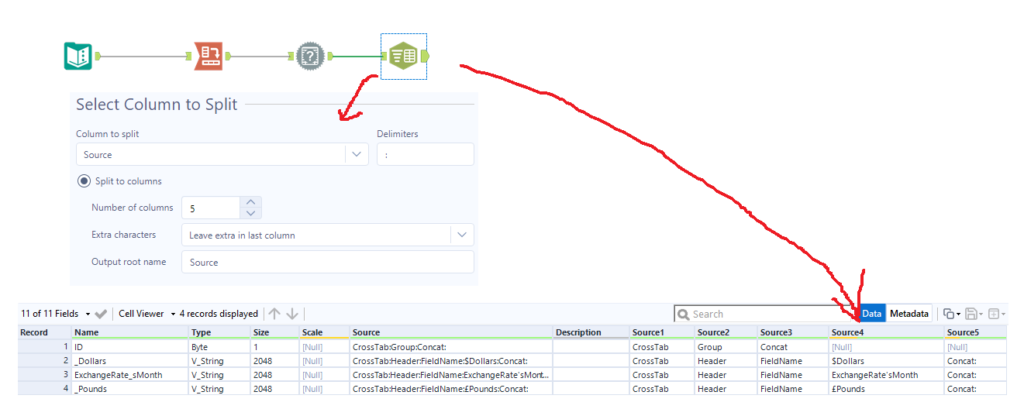
There are a few solutions out there in blogs and on the community, but I haven’t seen one which uses the Field Info tool, a handy trick that my colleague Ian Baldwin pointed out the other day. The Field Info tool is probably the most robust solution, because it doesn’t require any manual corrections that you would have to update when new string values come into your data. It requires no configuration, and in most cases it provides the original string in the Source data:
You can then use a Text to Columns tool to parse out the original string from the Source field by splitting to columns on a colon delimiter:
Then filter out rows where Source4 is null, as these don’t need to be renamed. After that, you can put in a Dynamic Rename tool, set it to take field names from right input rows, and make sure to set the old field name to Name and new field name to Source4. That’ll rename it properly for you without needing to do anything else!
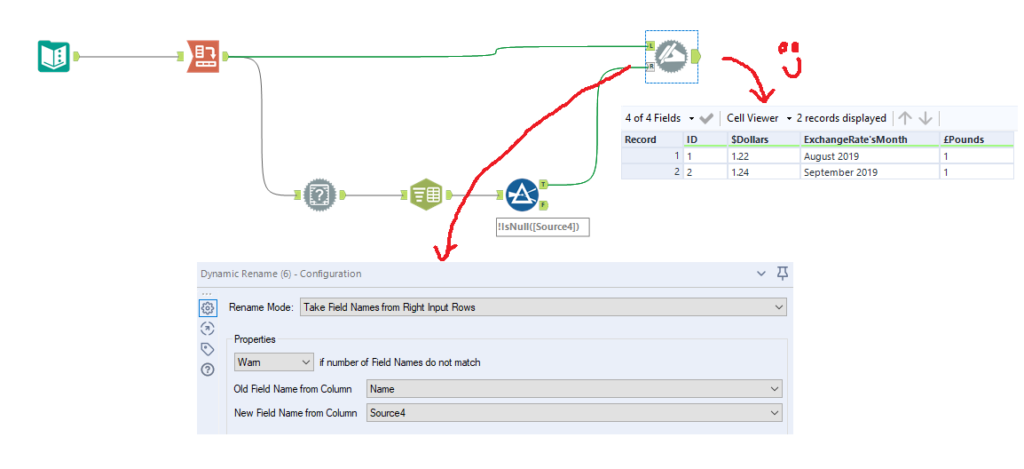
What’s even better is that this method works for strings which are only disambiguated by punctuation. For example, if you have the values A+B and A-B, a CrossTab will turn the + and the – into underscores, and then add a 2 at the end of the second field, giving you A_B and A_B2. This can be particularly difficult to fix with some of the other methods where you can’t always be sure which one will be the first and which one will get a number afterwards:
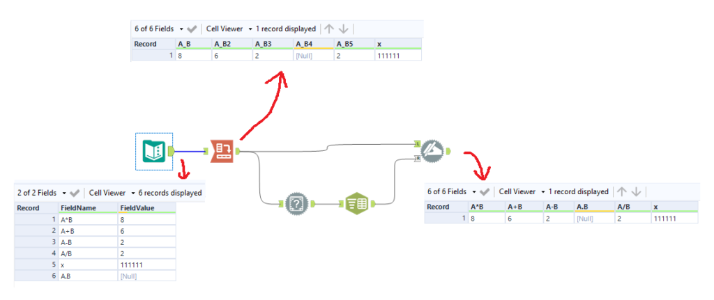
Now, there is one caveat: this doesn’t work when the aggregation method is set to First or Last. I’m not sure why, but the metadata doesn’t record those aggregations from a CrossTab, so that means that the Field Info tool doesn’t pick up the original string:
But luckily, we can use the same trick, we just have to add an extra CrossTab. In the new CrossTab, you can use Sum or Concat as the aggregation method, and you can put anything you like in the values for new column section, just as long as the new column headers is set to the same field as the CrossTab tool where you’re using First or Last. Then, you can take the field information from the secondary CrossTab and use the same trick to rename the fields from the main CrossTab:
Ideally, Alteryx would make the First or Last aggregations available in the metadata too, but until that gets updated, this little workaround will sort you out. The only downside of this is if your workflow is already really slow due to having loads of data, so a double CrossTab would add to the runtime.
This post is a complete overview of what market basket analysis is, and how to use the MB Rules and MB Inspect tools to do market basket analysis in Alteryx. If you don’t use Alteryx, don’t worry – the theory side of things may well still be useful for you!
THEORY
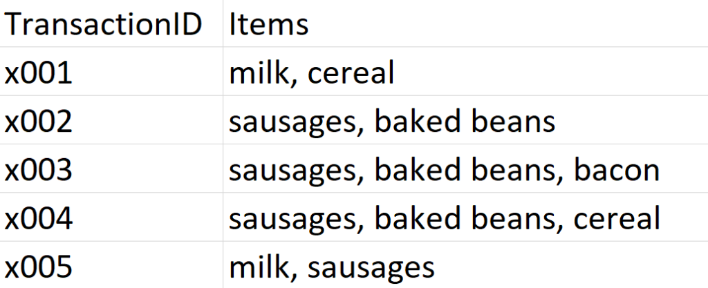
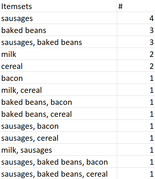
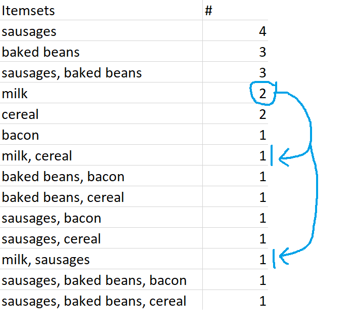
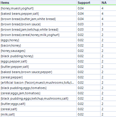
It’s Saturday morning in Gwilym’s Breakfast Goods Co., and people are slowly rolling in to buy their weekend breakfast ingredients (we don’t sell much else). The first five people through the door make the following purchases:
I’m looking at my dataset here, and I can instantly see a couple of insights. Firstly, that’s a lot of rich beef sausages we’re selling. And secondly, people seem to buy sausages and baked beans together.
This is, in essence, market basket analysis – looking at your transactions to see what people buy a lot of, what people don’t buy a lot of, and what different things people buy together. There are four main concepts in market basket analysis – association rules, support, confidence, and lift.
Association rules
An association rule is the name for a relationship between items or combinations of items across all transactions, and it’s often written like this:
sausages → baked beans
This means “if people buy sausages, they also buy baked beans”, and we can see that this association rule figures pretty prominently in this dataset. But an association rule is just the name for the relationship, not a statement about the strength of it. For example, milk → sausages is also an association rule, even though there’s only one transaction where that happens.
Support
This is just the proportion of transactions that contain a thing. Support can be for individual items (like sausages) or a combination of items (like sausages and baked beans). In our example dataset, the support for sausages is 0.8, because sausages are in four transactions out of a total of five.
Confidence
While support refers to items in the transaction list, confidence depends on association rules. For an association rule, confidence is the number of transactions that contain a thing that already contain the other thing. It’s calculated like this:
[support for both items in association rule] / [support for item on left hand side of rule]
So, if we use the rule sausages → baked beans , the confidence is 0.75. This is because it’s calculated like this:
[support for sausages and baked beans, which is 3 out of 5, or 0.6] / [support for sausages, which is 4 out of 5, or 0.8]
If we take the alternative association rule for the same two items, which is baked beans → sausages, then the confidence is 1, because the support for beans and sausages is 0.6, and the support for beans alone is also 0.6.
Lift
Finally, lift is how likely two or more things are to be bought together compared to being bought independently. It’s calculated like this:
[support for both items] / [support for one item] * [support for the other item]
Unlike confidence, where the value will change depending on which way round the rule between two items is, the direction of a rule makes no difference to the lift value.
Again, if we use the rule sausages → baked beans , the lift is 1.25. This is because it’s calculated like this:
[support for sausages and beans, which is 0.6] / [support for sausages, which is 0.8] * [support for beans, which is 0.6]
That gives us 0.6 / (0.8 * 0.6), which is 0.6 / 0.48, which is 1.25
A rough guide to lift is that if it’s above 1, then it means that the two items are bought more frequently as a pair than they are bought individually, while if it’s below 1, then it means that the two items are bought more frequently individually than as a pair.
ALTERYX EXAMPLES
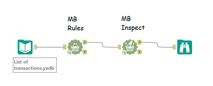
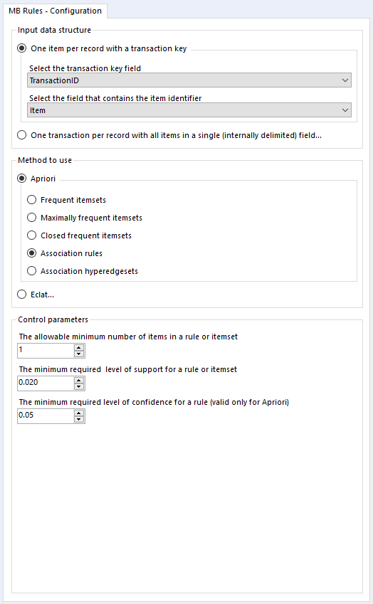
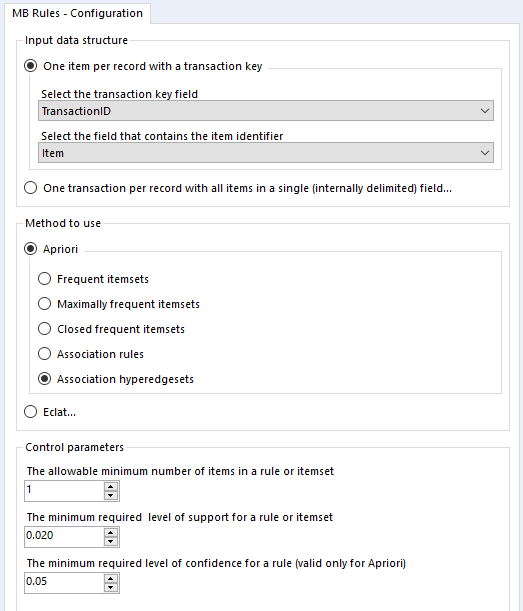
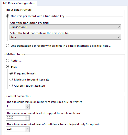
That’s pretty much it for the theory so far, so let’s create a simple analysis in Alteryx. You’ll need two tools – MB Rules and MB Inspect.
MB Rules does all the work, and it’s where you set your support and confidence thresholds. However, it only outputs an R object, which Alteryx can’t read as a standard data frame… so you need MB Inspect, which is basically a glorified filter tool, to turn that into Alteryx data.
You can set it up a little like this:
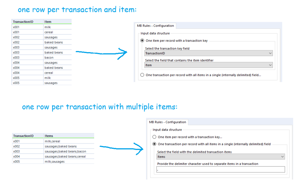
You’ll also want to sort out your data beforehand. There are two possible ways you can structure your data for the MB Rules tool to work. You can either have a row for every single item of every single transaction, or you can have a row for every transaction, with each item separated by the same character. The MB Rules tool can handle both structures, and you’d set it up as follows:
Apriori Association Rules
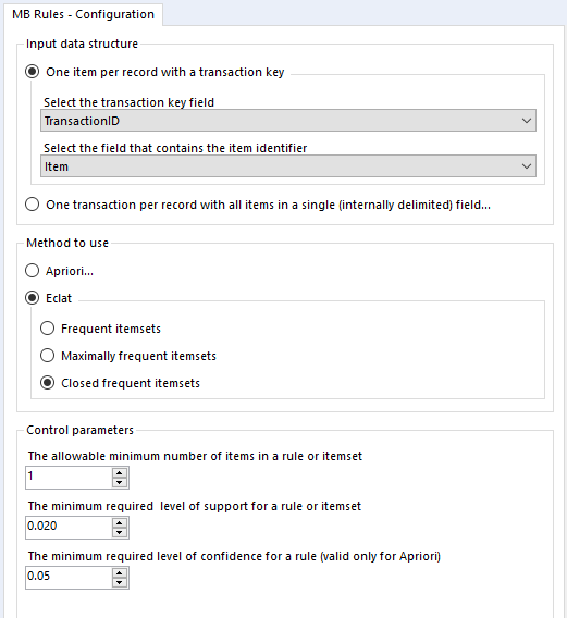
In the MB Rules tool, let’s set it up to give us the association rules, with their support, confidence, and lift. You can do that by selecting Apriori and Association rules under method to use:
Here, I’ve left the control parameters to their defaults – 0.02 support for an item or set of items or association rule, and 0.05 for the confidence of an association rule. With the support filter, note that this will apply to both items and association rules. For example, in the five transaction dataset, the support for milk is 0.4 and the support for cereal is 0.4. If I set my minimum support to 0.4, then the empty LHS rules for milk and cereal will come through (more on that in a moment), but the association rule for milk → cereal will not be returned, because the support for that association rule is only 0.2, because both milk and cereal only occur together in one transaction out of five.
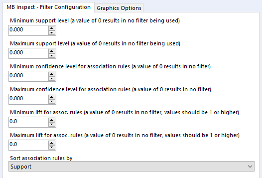
Onto the MB Inspect tool, and I normally leave it like this – zeroes for everything, because I’ve set most of my filters that I care about in the MB Rules tool.
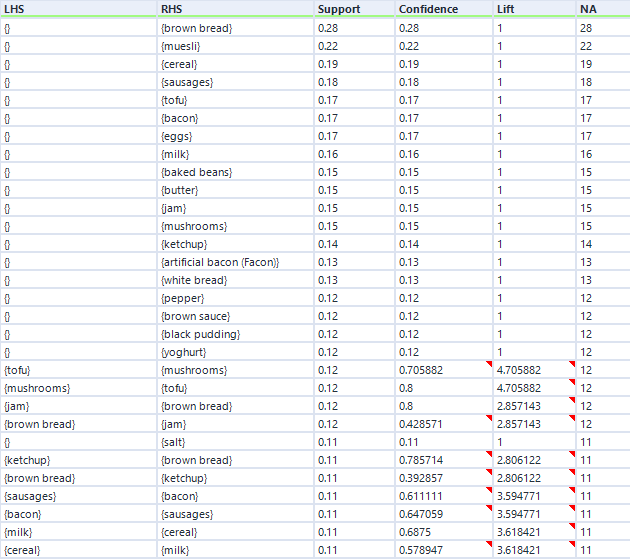
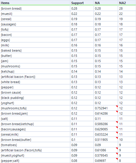
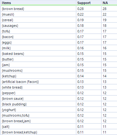
That’s pretty much it, so I’ll now press run. For this data, I’ve expanded my dataset from the first five transactions to a hundred transactions. Here are the association rules in my dataset:
Remember I mentioned empty rules earlier? The top handful of rows where the LHS column is “{}” is what I mean. What this shows is the association rule, if you can really call it that, for items individually, totally independent of other items. This just shows the support for an individual item, and because it’s independent of other items, the confidence is the same, and the lift is always 1.
Do you see the NA column on the far right? This is another useful output, although it’s not labelled very well. This stands for Number of Associations (I think) – in any case, it’s a count of how many transactions this item or set of items occurs in. So, brown bread turns up in 28 transactions out of 100 (hence the 0.28 support for brown bread), and cereal and milk turn up in 11 transactions out of 100 (hence the 0.11 support for cereal → milk).
You can also see how lift is independent of the association rule direction, but confidence isn’t. For example, take the two association rules between tofu and mushrooms. The first one, tofu → mushrooms, has a confidence of 0.705882, which means that mushrooms turn up in 70% of transactions that have tofu in them. The second one, mushrooms → tofu, has a confidence of 0.8, which means that tofu turns up in 80% of transactions that have mushrooms in them. Or in other words, 80% of people who buy mushrooms also have tofu, and 70% of people who buy tofu also buy mushrooms. Either way, there’s a big lift of 4.7, which means that tofu and mushrooms occur together about 4.7 times more often than you’d expect if 15 people threw mushrooms into their trolley at random and 17 people threw tofu into their trolley at random.
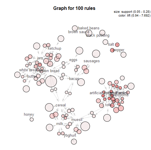
That’s basically it for a simple market basket analysis. The MB Inspect tool does also generate some graphics, which I don’t normally use that much, although I do like the network graph it makes:
That’s the main way of doing market basket analysis in Alteryx, and it’s what I do most of the time. But there are several other options, so let’s explore what they do as well.
Apriori Association hyperedgesets
In the same Apriori section, there’s an option to look at Association hyperedgesets:
What this does is basically to average across both sides of an association rule. It gives you the same support, the same number of associations, and the average confidence for both sides.
You can see that in the output below.
To explain, let’s take the mushrooms/tofu relationship again. This time, it doesn’t list an association rule – all you can see is the two items together in one set, ordered alphabetically, like {mushrooms, tofu}.
You can see that the support here (0.12) is the same as the support for both association rules (0.12). However, look at the confidence. And when I say “confidence”, I mean the field called NA.
(Rather unhelpfully, the output of the hyperedgesets option has the column NA and the column NA2. The column NA2 should actually be called NA, as it shows the number of associations, and the column NA should actually be called confidence.)
Anyway, let’s look at the confidence (column NA). The figure 0.752941 is the average of the confidence for mushrooms → tofu (0.8) and the confidence for tofu → mushrooms (0.705882).
The minimum confidence setting here applies only to the average confidence, not the individual rules. So for example, if I had set the minimum confidence in the MB Rules tool to 0.73, I would still get the hyperedgeset {mushrooms, tofu} because the average confidence is above 0.73, even though the confidence of the association rule tofu → mushrooms is below 0.73.
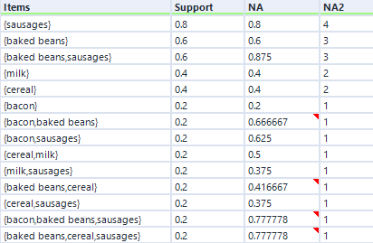
If I go back to the earlier five-transaction dataset, the hyperedgeset average confidence for sausages and baked beans is 0.875. This is the average of the confidence for sausages given baked beans (which is 1) and the confidence for baked beans given sausages (which is 0.75). I think that you can interpret this to mean that if you buy one if the items in that set, there’s an 87.5% chance you’ll buy one of the other items in that set (or to put it another way, 87.5% of items in this set occurred in combination in a transaction with the other items in this set), but don’t quote me on that!
In any case, here’s the hyperedgeset results for the five-transaction dataset:
THEORY – PART TWO
Thought we were done with theory? Surprise! Here’s a nice little bonus bit, because to cover the other options, we’ll need to talk about sets and supersets.
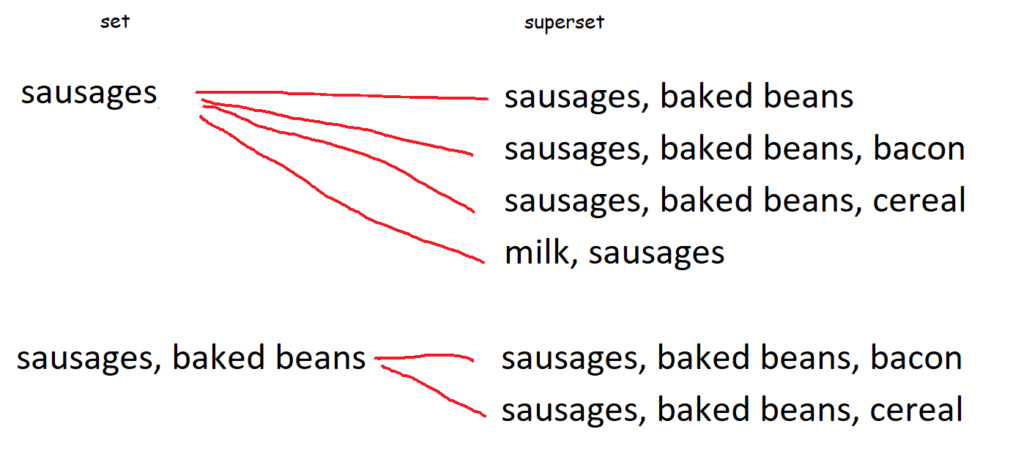
Let’s go back to the five-transaction dataset. Here is a list of every single item and combination of items that occur, along with the number of times they occur. At the top, you can see that sausages are bought in four transactions – this doesn’t mean that there were four transactions where people only bought sausages, this just means that there were four transactions (of a potentially unlimited size) which contained sausages. At the bottom, you can see that there was one transaction which contained sausages, baked beans, and bacon.
All of these are sets. The set {sausages} is a set made up of a single item – sausages. {sausages, baked beans} is a set made up of two items. And so on. Because they’re sets, they get curly brackets around them, like {}, when we’re specifically talking about the items as a set rather than a group of items.
A superset is a set that contains another set. For example, the set {sausages, baked beans} is a superset of the set {sausages}, because the superset fully contains the set. Similarly, the set {sausages, baked beans, bacon} is a superset of the sets {sausages} and {sausages, baked beans}, because the superset fully contains those sets.
This diagram shows every single superset of {sausages} and {sausages, baked beans}:
This is relevant for the next set of options because we’ll need to talk about supersets to be able to define frequent itemsets, closed frequent itemsets, and maximally frequent itemsets.
Frequent itemsets
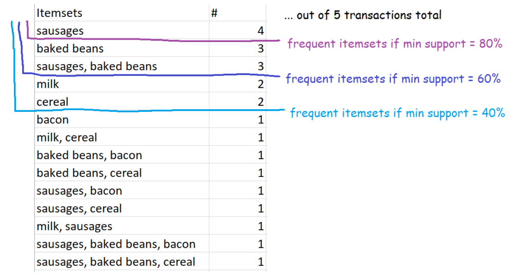
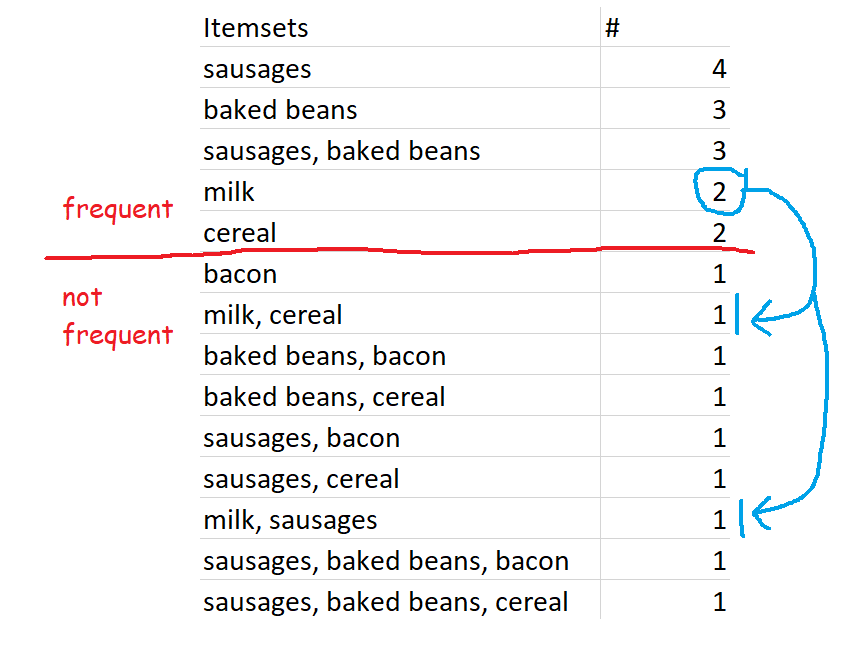
This one is nice and straightforward – it’s simply sets of items which occur above your defined level of support. So, for example, if you set 60% as your minimum level of support, then the definition of frequent itemsets is all sets of items which occur in 60% or more of transactions. In our case, that’s {sausages}, {baked beans}, and {sausages, baked beans}.
In our five-transaction example, here are some possible frequent itemsets:
Setting the frequency yourself might make it feel like a bit of a circular analysis – “I want to know what’s frequent, so here’s my definition of frequent” – but it’s pretty useful all the same, because every organisation’s data is different. What counts as frequent in a specialist shop might be way higher than a giant supermarket, so this allows you to tailor your analysis differently.
Closed frequent itemsets
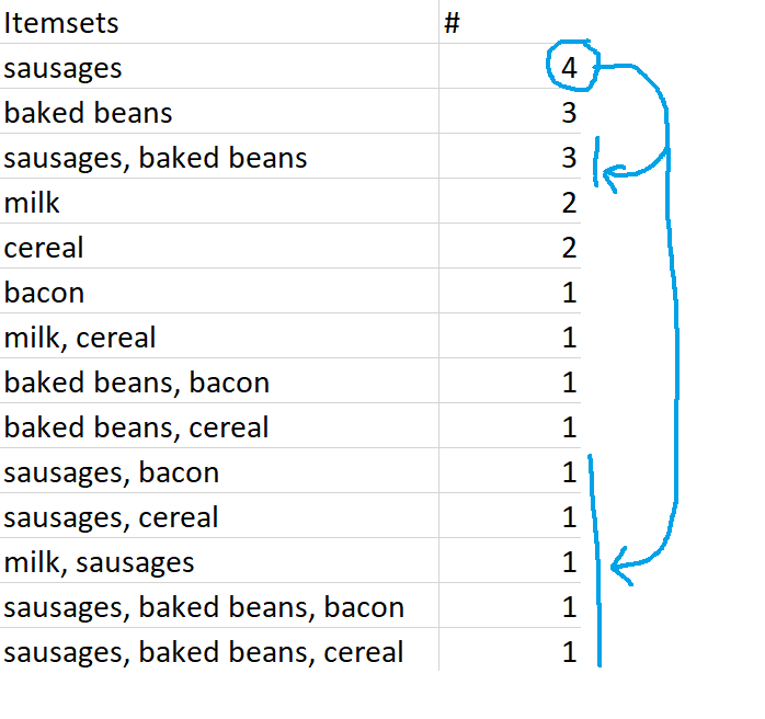
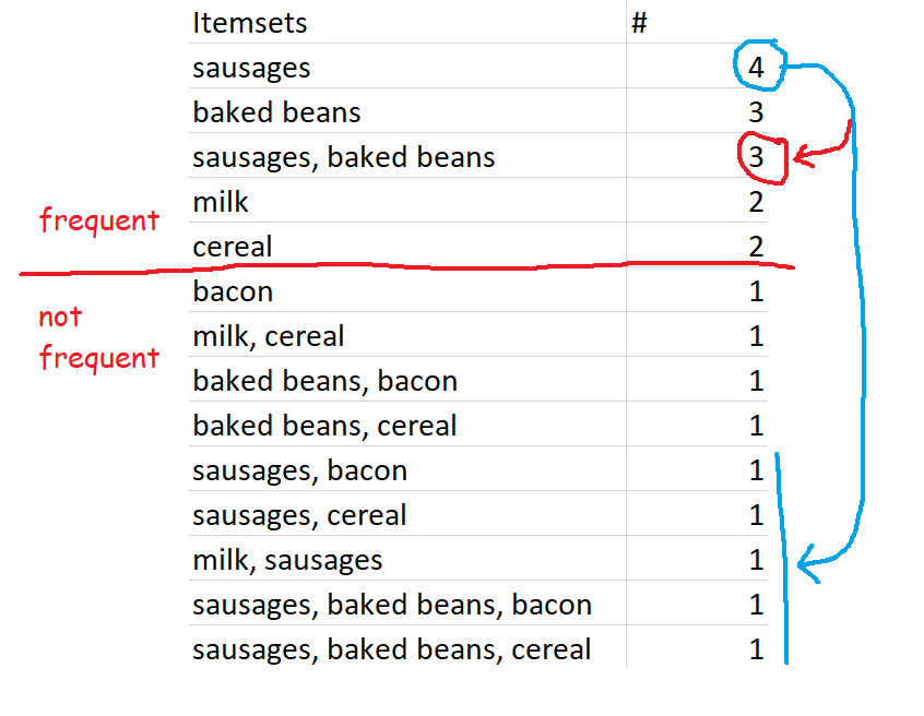
Closed frequent itemsets are sets which are frequent and also occur more frequently than their supersets. For example, let’s define frequent as having a minimum support of 0.4 or 40%, which in this dataset works out to occurring in 2 or more transactions. Sausages are in four transactions, so the set {sausages} is a frequent itemset. This is also more frequent than any of the supersets of {sausages}, like {sausages, baked beans} or {sausages, bacon}, so {sausages} is a closed frequent itemset.
Similarly, {milk} is a closed frequent itemset because it occurs twice – that’s frequent according to our 40% definition, and that’s more frequent than its supersets, {milk, cereal} and {milk, sausages}.
However, if we increased the minimum support to 0.6, or 60%, then {milk} would no longer be a closed frequent itemset – even though it still fulfils the closed set requirements by being more frequent than its superset, it’s no longer frequent by our definition.
Maximally frequent itemsets
Finally, maximally frequent itemsets are frequent itemsets which are more frequent than their supersets, and which do not have any frequent supersets. To put it another way, maximally frequent itemsets are closed frequent itemsets which have no frequent supersets.
{milk} is a closed frequent itemset, and it’s also a maximally frequent itemset. This is because {milk} is frequent, {milk} is more frequent than its supersets {milk, cereal} and {milk, sausages}, and its supersets {milk, cereal} and {milk, sausages} are not frequent sets.
However, while {sausages} is both a frequent itemset and a closed frequent itemset, {sausages} is not a maximally frequent itemset. This is because one of {sausages}’s supersets, {sausages, baked beans}, is also a frequent itemset.
…but again, this is because of our preset definition of frequent. If we changed the minimum support for frequent itemsets to 70% rather than 60%, then the set {sausages, baked beans} would no longer be frequent, so {sausages} would be a maximally frequent itemset.
ALTERYX EXAMPLES
Now that we’ve seen the theory, it’s really quick to run these analyses in Alteryx.
You may have noticed that there are two different ways of running a frequent itemsets analysis – one under the apriori method, and one under the eclat method. The only difference is the search algorithm used. The two methods return exactly the same results (well, almost – the order of items with the same NA and Support is slightly different, but that doesn’t actually matter, and the results don’t join up perfectly, but that’s because of joining on a double, so they do join up perfectly if you convert the NA columns to Int16 or something). From what I can tell/from what I’ve googled, the difference in the search algorithms is that apriori scans through the data multiple times, which makes eclat slightly faster for larger datasets. In my dataset of 100 transactions, it made absolutely no difference to the speed.
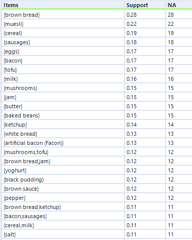
So, we can set up the eclat frequent itemsets analysis up like this:
…and here’s what the output looks like:
Eagle-eyed readers may have noticed that the output of the eclat frequent itemsets analysis is the same as the apriori hyperedgesets analysis, but without the average confidence column. And it is, but it does run a little quicker.
Onto closed frequent itemsets – if we set up the tool like this:
…we get results like this:
At first, this looks identical to the output of the frequent itemsets analysis, but that’s only because I’m screenshotting the first few rows. There are less than half the number of itemsets returned by the closed frequent itemsets option.
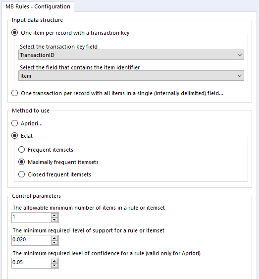
Finally, let’s look at maximal closed frequent itemsets. Again, we’ll set it up like this:
…and again, here’s the output:
This output structure is identical to the other two, but the results are more noticeably different. The honey/muesli/yoghurt combo is the most frequent maximally frequent itemset.
Application
I’ve written about applying market basket analysis to your data before, and this has turned into a really long blog post, so I won’t cover it in full here. But, as a shop keeper, I’d use the results of this analysis in Gwilym’s Breakfast Goods Co. to explore what to put on sale together, what not to put on sale together, and so on. For example, mushrooms and tofu are the combination with the highest lift, so if I’d accidentally overstocked on tofu and needed to sell it off quickly, I’d put it on special offer with mushrooms and put it in the vegetable (or fungus-pretending-to-be-a-vegetable) aisle. But if I’d done my supply chain planning well, I could use the strong association between mushrooms and tofu to get people to buy other things. For example, people who buy tofu also buy artificial bacon (Facon), so I could use people’s tendency to buy tofu and mushrooms together by putting them in the same aisle but sandwiching artificial bacon (Facon) between the two. This would mean that people looking for the tried and trusted mushroom/tofu combination are going to be looking at artificial bacon (Facon) at the same time, and hopefully they’ll pick it up and try it out.
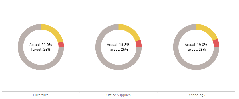
Donut charts aren’t everybody’s cup of tea, but I quite like them for showing a percentage against a total which has to be 100%. Things like the percentage of tickets answered within an hour, or an industrial test pass rate as a percentage, or an on time percentage.
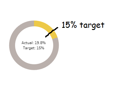
The problem is that percentages often come with targets. If you’re measuring a rate, you’re probably measuring it to check that you’re on target. For example, if you’ve got 19.8% of tickets being answered within an hour, you’ve probably also got a target of 15% or 20% or something, and you’d probably want to show that on your donut chart for context, like this:
In Tableau, you can’t do that, not without creating some pretty filthy trigonometric calculations. But I’ve recently found a workaround which I rather like, which I’ll explain in this blog. You can download the supporting workbook from Tableau Public here.
I’ve used Superstore, which isn’t too ideal for percentages and targets, but hey, it’s something everybody uses. Let’s say you’re the head of sales for California. You know you’re a big market, and you want to keep it that way – you want 15% of all of Superstore’s sales to be in California.
You can create donut charts showing this percentage easily by creating two fields. One called [California Sales], which is:
IF [State] = “California” THEN [Sales] END
The other would be [Rest of US Sales], which is:
SUM([Sales]) – SUM([California Sales])
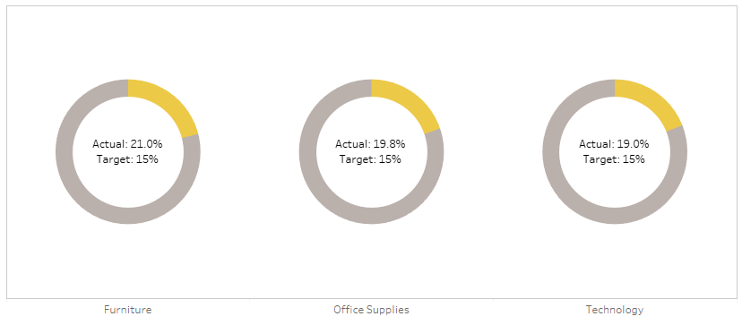
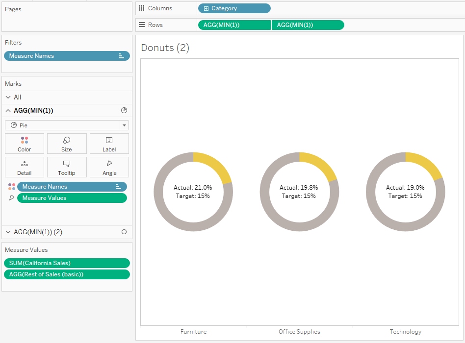
And you’d put it on a donut chart with those two fields as the two measure values, then put measure names on colour, and split it out by category to get something like this:
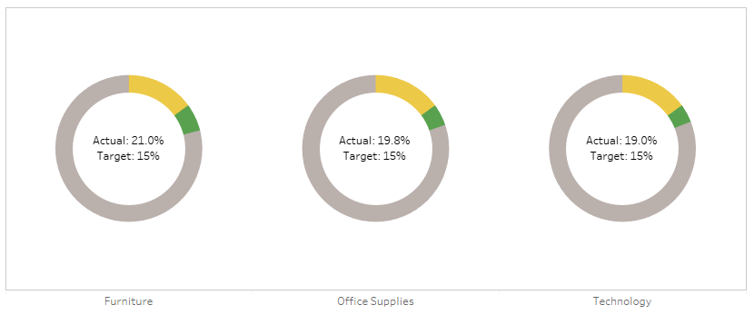
Sadly, we can’t put a reference line at the 15% mark to show the target. Not easily, at least. But what we can do is to play around with the colours. If the percentage is above the target, we could show the percentage up to the target in yellow, and then the overperformance in green, like so:
And if we adjust the target higher, we could show the percentage up to the actual percentage in yellow, and then the underperformance in red, like so:
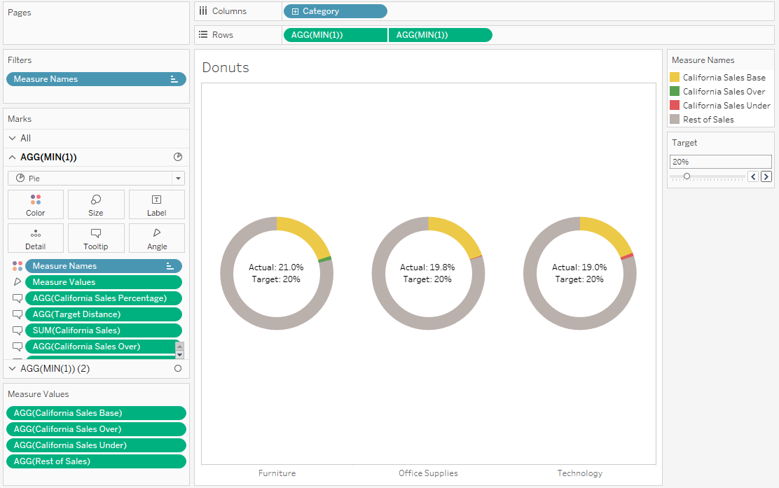
This is a little complicated. It requires a few extra calculations; [California Sales Percentage], [Target Distance], [California Sales Base], [Rest of Sales], [California Sales Over], and [California Sales Under]. Let’s go through the logic one by one.
[California Sales Percentage]
In this calculation, you take the existing [California Sales] field that you’ve made, and found out what that is as a percentage of all sales. It’s simply:
SUM([California Sales]) / SUM([Sales])
[Target Distance]
This is how far from the target the California Sales Percentage is. I’ve used [Target] as a parameter to make it adjustable, but you could also hardcode it. It’s simply the California Sales Percentage minus the target; so, if you’ve got an actual % of 21%, and your target is 15%, then the Target Distance will be 6%. It’s simply:
[California Sales Percentage] – [Target]
[California Sales Base]
This calculation will be what’s in yellow in the donut. If your California Sales Percentage is above the target, then you’ll want it to be yellow up to the target, and then green above that, so this base field will simply be the target. If your California Sales Percentage is below the target, then you’ll want it to be yellow up to the actual sales percentage, and then red for the space between the percentage and the target. So, you can calculate it like this:
IF [Target Distance] > 0 THEN ([Target] * SUM([Sales]))
ELSE SUM([California Sales]) END
[Rest of Sales]
This is the bit in grey. If your California Sales Percentage is above the target, then you’ll want it to be grey from the actual sales up to 100%. If your California Sales Percentage is below the target, then you’ll want it to be grey from the target value up to 100%. That can be calculated like this:
IF [Target Distance] < 0 THEN
SUM([Sales]) – ([Target] * SUM([Sales]))
ELSEIF [Target Distance] > 0 THEN
SUM([Sales]) – SUM([California Sales])
END
[California Sales Over]
This is the bit in green. If your California Sales Percentage is above the target, then you’ll want it to be green between the target and the actual sales percentage. If it’s below target, you don’t want it to show up at all, so set it to zero like this:
IF [Target Distance] > 0 THEN
SUM([California Sales]) – ([Target] * SUM([Sales]))
ELSE 0 END
[California Sales Under]
Finally, this is the bit in red. If your California Sales Percentage is below the target, then you’ll want it to be red between the actual sales percentage and the target. If it’s above target, you don’t want it to show up at all, so set it to zero like this:
IF [Target Distance] < 0 THEN
([Target] * SUM([Sales]))-SUM([California Sales])
ELSE 0 END
Okay! Now we’re ready to build our donuts. This is the easy bit.
Build out your donuts like normal, like this:
Now, instead of the current two measure values, we’ll want all four of the colour ones:
For this one, I’ve set the target to 20% so that there are examples of categories that are above and below target, all in one view.
Every time a new Premier League season starts, somebody, probably a manager for a newly-promoted side, says they’ll only relax once they’ve hit the magical 40-point mark. Claudio Ranieri famously kept banging on about aiming for 40 points and Premier League safety throughout the season when Leicester won it.
The problem with the magical 40-point truism is that it’s not really true. There are a fairfewexamples out there of how you’re probably safe in the Premier League with 36 or 37 points, as well as the reminder that you can still get relegated with 42 points (West Ham in 2003, which will never not be funny to this Charlton fan).
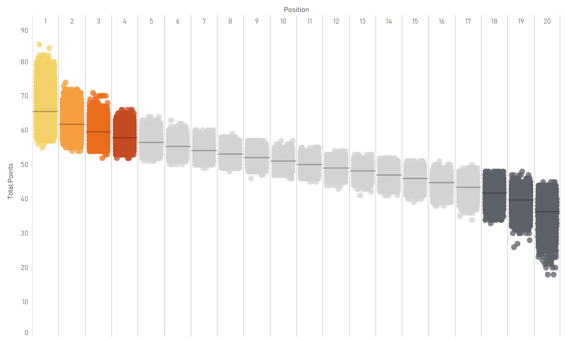
But the problem with the debunking articles is that they’re also not that accurate. They show maybe 20 seasons of data, showing the number of points the teams in 17th (safe) and 18th (relegated) got. And the frustrating and beautiful thing about football is that it’s full of variance.
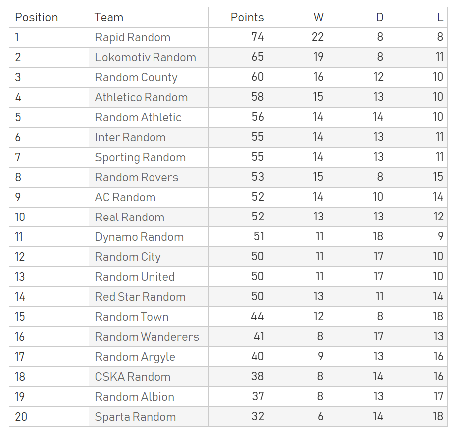
Here’s an example league table I’ve generated:
(click any graph to follow through to the interactive version)
The thing is, all of these teams are the exact same strength. In this incredibly basic simulation of a twenty-team football league, for each of the 380 games there was an equal chance of it being a win, loss, or draw. So, Inter Random finished bottom with 33 points, and Random Albion won it with 63 points, but those two teams were perfectly equal throughout the season. It just so happened that it wasn’t Inter Random’s season.
Here’s another table:
This is also from the same set of simulations. Inter Random did pretty well this time, finishing 6th with 55 points, while last year’s champions Random Albion finished 19th with 37 points and got relegated. Why are they so bad this season? What happened to them? Nothing happened. Just a different roll of the die.
Let’s do this 10,000 times and look at the breakdown of points won by teams finishing in each position.
That’s a lot of variance! All of these teams are equal, and every single game had a 33.3% chance of the home team winning it, 33.3% chance of a draw, and 33.3% of the away team winning it. You’d think that this would balance out over the course of a season, but it doesn’t. A team can win the league with as many as 85 points (Random Athletic in simulation number 4349), a team can win the league with only 55 points (also Random Athletic, in simulation number 9384), a team can finish bottom with as many as 45 points (Real Random x2, Sporting Random, Random Argyle), and a team can finish bottom with only 18 points (Dynamo Random, Random United).
And if this is the amount of variance you can get between seasons when everything is equal, what happens when it’s not? Did West Ham get a particularly unlucky roll of the die when they finished 18th with 42 points, and that 36 points is going to see you to safety most of the time? Or is it that the last twenty or so seasons have been at the low end of the variance, and that in any given season, 36 points is still probably going to get you relegated? And is there even a points total where you’re definitely absolutely guaranteed not to get relegated?
On that last point, it’s technically possible to get relegated with 63 points. If two teams are completely useless and lose every single game, and the other 18 teams win every home game and lose every away game apart from the two games away to the bottom two, that means that 18 teams finish on 63 points (57 points from winning all home games, 6 points from winning two away games). One team could finish 18th on goal difference. So, really, 64 points is the real magic safety number.
But this would never realistically happen. So, I’ve also run 10,000 simulations of leagues based on real data. I took every single game from the last four years (2014/15 to 2018/19) of the big five leagues (England, Spain, France, Italy, Germany). Assuming that a team’s actual points total is a relatively good measure of a team’s actual strength – which it isn’t, as shown above, but it’s about as close as I can get – I drew random samples of 20 values for each simulation. Since Italy and Germany only have 18 teams in their top flights, I used each team’s average points per game (PPG) as their underlying team strength. This generated 10,000 realistic leagues of 20 teams of different strengths. I then grouped them into strength tiles of 0.3 points per game – the teams in the weakest tile were between 0.3 and 0.6 PPG, the teams in the strongest tile were between 2.4 and 2.7 PPG. I then compared the frequency of teams in each strength tile scoring a certain number of goals against teams in each strength tile, and sampled from those distributions for each of the 3,800,000 games in the simulations. I experimented with making the tiles smaller, but that meant that there were too few examples of games between teams of particular tiles. I also added a home vs. away boost factor.
This ended up coming out pretty realistic. For example, here’s the average number of goals that teams in each strength tile score and concede:
So, what are the points distributions per position in a more realistic simulation?
This looks pleasingly similar to the distributions in my graph of Premier League points by position. Most simulation results cluster around the middle of each band (the black line denotes the average). But at the extreme end, you can win the league with 112 points if you’re already a strong team and you outperform / get lucky, like Sporting Random did here:
…and you can also win the league with as little as 64 points if you outperform / get lucky and if the rest of the league underperform / get unlucky, like Real Random did here:
At the bottom of the table, you can get relegated in 18th with 46 points, which is what happened to Random United, a solid midtable team who had a pretty average season… except that everybody else at the bottom of the table completely outperformed expectations / got incredibly lucky:
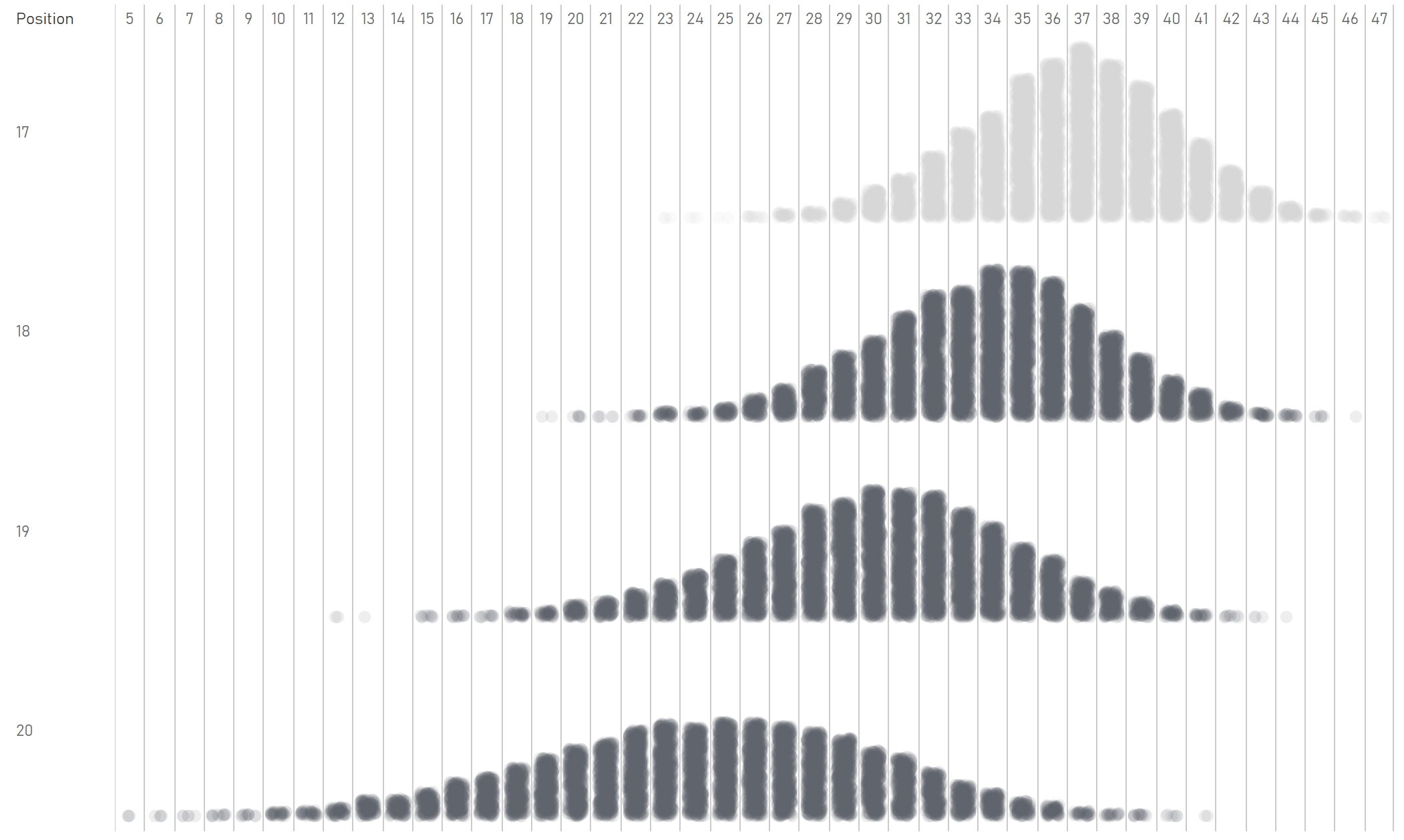
This chart shows the overlap between the relegation positions and safety. There are some interesting data points at the extreme ends, but the main point is that there are a lot of simulations where a team got 33 points or fewer but finished 17th, and there are several simulations where a team got 38 points or more but still finished 18th:
To put it another way, 93% of teams getting 40 points didn’t get relegated:
You can explore the full interaction between points and position in this graph, where you can set a threshold. Here, this shows how often a team finishes in a particular position when getting at least 40 points – so in 5.85% of simulations, you can get 40+ points, but still finish 18th:
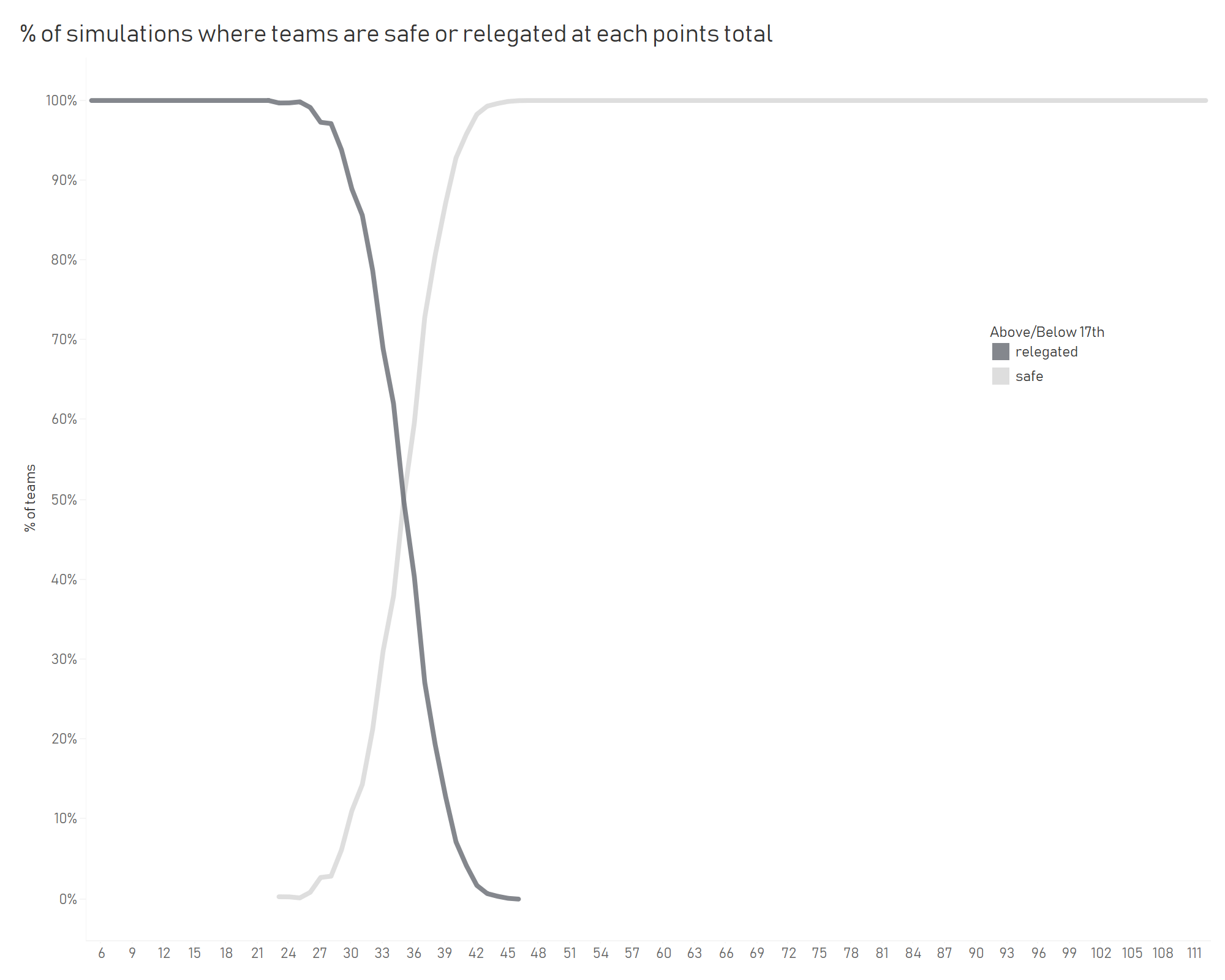
And to work out what your safety threshold is, this graph shows how many teams end up safe or relegated based on their points total. 35 is the turning point; 50.27% of teams getting 35 points end up safe:
As a final view, here’s a breakdown of the variance in positions by each team strength tile. It shows how you can be an incredibly strong team and expect to get 2.4 to 2.7 points per game, and you’ll win the league 63% of the time, but also miss out on the top four entirely a little under 1% of the time:
Forty points isn’t a magic number – you’re safe around 93% of the time if you get 40 points, but it’s not guaranteed.
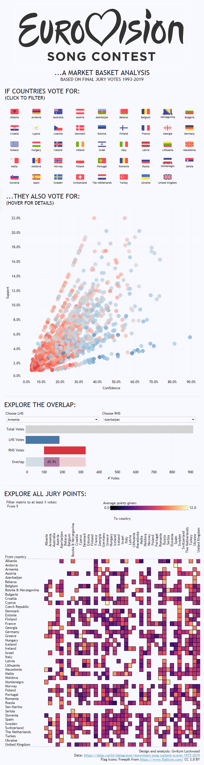
I’ve been doing a lot of market basket analysis at The Information Lab lately. Market basket analysis is a way of looking for things that people buy at the same time (or that people never buy at the same time) in order to spot trends in people’s behaviour. For example, it’s probably obvious that if somebody buys cereal, they’ll probably also buy milk. Or that if somebody buys tofu, they’re not going to be buying sausages. This is a really nice example of how it all works.
Thing is, after a while, using bread and butter or cereal and milk or sausages and tofu as an example gets kinda dry. And talking about Lego shovels and milligram-level accurate scales is sometimes a little unprofessional, even if it is a perfect example of consumer behaviour.
So, I’ve been analysing the Eurovision Song Contest. The jury votes lend themselves pretty well to market basket analysis, because they’re pretty similar to transactions: each country’s jury (or customer) votes for (or buys) ten countries (or items) at a time (in a basket), and the fact that these countries (or items) are a subset of all possible countries (or items) to vote for (or buy) means that you can make the same selection vs. non-selection distinction. And we all know that some countries always vote for some other countries, regardless of how good the song is, which is part of what makes it fun.
I took the historic Eurovision data collected by Stephan Okhuijsen of Datagraver. Then, using Alteryx, I filtered it to all contests from 1993 onwards, because European countries have been relatively consistent since then. I also filtered it to the final only, and to the jury votes only.
I set the minimum support for a rule to 0.01, which is kind of high for a regular market basket analysis using tens of thousands of SKUs in a supermarket, but works fine for such a closed set of possible choices of countries. I also set the minimum confidence to 0.05. That gave me almost 33,000 association rules, of which about 1,600 were one-to-one country mappings.
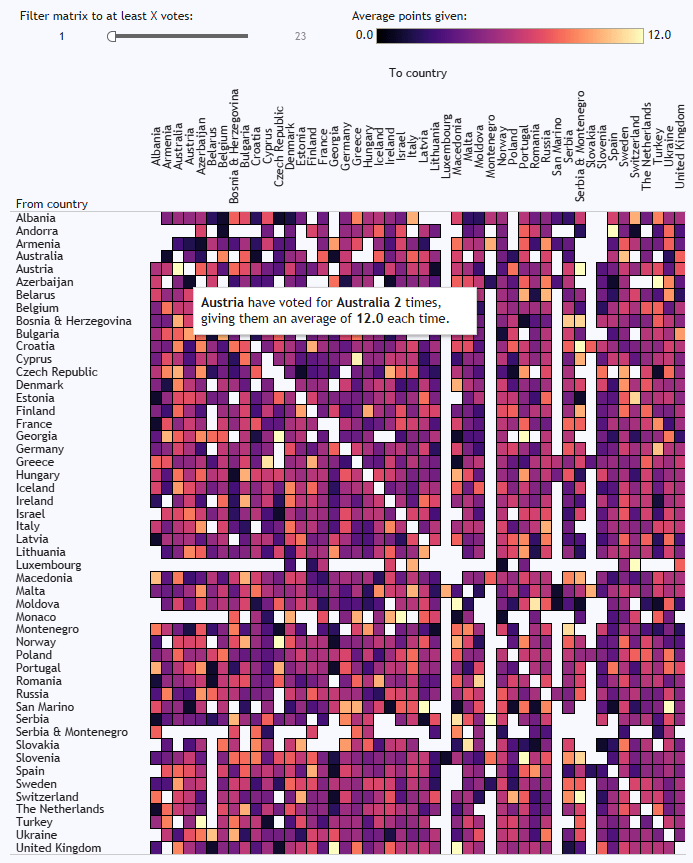
The full results are in an interactive dashboard here.
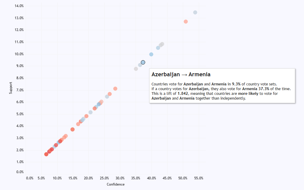
In the matrix at the bottom, you can see who consistently votes for who, and it’s pretty predictable. Cyprus and Greece, for example, almost always give each other the most possible points. There’s a big love in between Moldova and Romania, and between Turkey and Azerbaijan. The Nordics are a bit too cool to give each other full marks every time, but it’s still a bit of a Scandi circle jerk. Andorra love Spain, although it doesn’t seem like that’s reciprocated. Azerbaijan have never voted for Armenia, funnily enough. And Austria have given Australia full marks twice, which I like to believe is because they were hoping to exploit a poor fuzzy matching process in the background scoring:
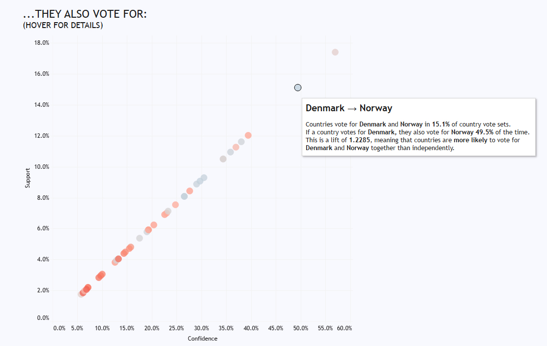
But market basket analysis shows how countries behave as a group, where we can see how some associations are Europe-wide, and some are just confined to the two countries. For example, some of the Scandi trends are reflected in votes across Europe; if a country, any country, votes for Denmark, they’re also likely to vote for Norway:
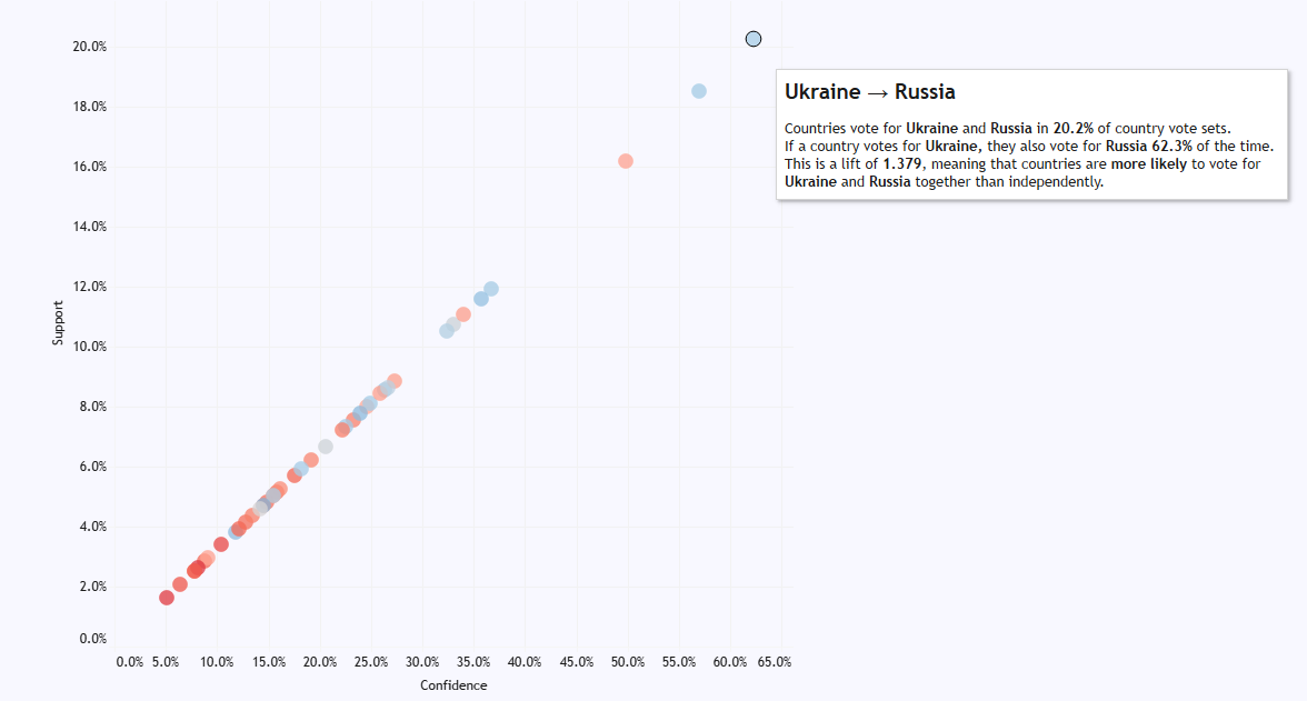
And surprise, surprise, countries that vote for Ukraine will also vote for Russia:
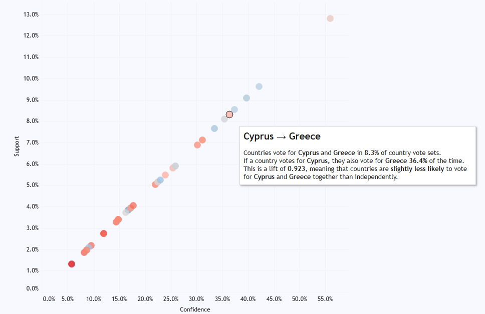
But the Greece/Cyprus love in is special just for them; in fact, if anything, there’s a slightly negative association between them, meaning that if a country votes for Cyprus, they’re slightly less likely to vote for Greece as well:
Likewise with Turkey and Azerbaijan. Just because they give each other full points all the time, other European countries don’t link the two together in their voting behaviour at all:
Meanwhile, even though Azerbaijan will never give points to Armenia, and Armenia have only ever given one point to Azerbaijan, other European countries are far more optimistic. Maybe they hope that voting for both Armenia and Azerbaijan at Eurovision can resolve the Nagorno-Karabakh dispute. Or maybe they just don’t know anything about the Caucasus region and think they’re the same place, I don’t know.
This is quite nice to illustrate, because the market basket analysis allows you to make the distinction; while there are some obvious associations between countries, like how Greece and Cyprus always vote for each other, it shows that those associations aren’t necessarily transferred to other countries’ voting behaviour.
Click through to the interactive version here to explore in more detail. I’m going to be using this in my teaching examples more often.
[update: this macro has been updated to fix a small discrepancy in the “most recent X” filters. If you downloaded it before 2019-03-01, please download the new version]
It’s 2019. Hooray. The change of a year is one of my least favourite things, professionally speaking, because January 2nd is when you find out how much stuff breaks because somebody (possibly you) has hard coded a date somewhere in all your pipelines. Suddenly, all your dashboards are blank because somebody’s put filter Year=2018 on, or all the YoY calculations are off because it’s looking at [2018]/[2017] instead of [CurrentYear]/[PreviousYear].
Sure enough, I spent a few days in January tracing through several Alteryx workflows and looking for rogue date filters. Pretty much all of them could be fixed by changing 2018 to DatePartYear(DateTimeNow()). But it was a long and frustrating process to identify all the filters which needed to remain static (e.g. filter out everything before 2018 because older data is in a different format and needs to be treated differently) vs. filters which needed to be dynamic (e.g. filter to the current year’s data to show YTD values), and then replacing the filter code in the custom filter section.
Most date filters I found were pretty similar, and fit into one of a handful of categories:
1. Filter to this period (e.g. if it’s 2019 right now, give me all of 2019)
2. Filter to this period-to-date (e.g. if it’s 2019 right now, give me all of 2019 up to today)
3. Filter to most recent full / completed period (e.g. if it’s 2019 right now, give me all of 2018)
4. Filter to the previous / next 12 months
5. Filter to the past / the future
…so to save myself some work in January 2020, I’ve built an Alteryx macro which handles all these examples. You can get it here! Click on the image, or copy the full link below:
Just hit download and stick it in your standard macro path. It’s automatically set up to appear in your preparation tools.
And here’s how it looks in your workflow:
It works much like a regular filter tool, with T and F outputs based on a filter condition. But instead of coding up a calculation like “DatePartYear([MyDateField]) = DatePartYear(DateTimeNow()) AND [MyDateField] <= DateTimeNow()” for a Year-to-Date filter, you can simply tick the Year-to-Date option (and see a description of what that particular filter option will do). I built this with scheduled workflows in mind so that you can spend less time copy/pasting chunks of date filter code, and less time trawling through custom filter code when the year changes and the workflows break.
One caveat: this macro works at the day level, rather than the specific time level – so if it’s 7pm on March 19th when you run the workflow and select Year-to-Date, the filter will include future values from later in the evening on March 19th, not just the ones up to 7pm.
The way it works is by selecting the relevant part of a looooong IF statement, which has all possible filter options from the input tools. If you’re interested, this is the full set of IF statement formulae:
IF [FilterOptionSelected] = ‘Current Week’ THEN
DateTimeTrim([IncomingDate], “day”) >= DateTimeAdd(
DateTimeTrim([DateValueUsed], “day”),
(IF ToNumber(DateTimeFormat(DateTimeTrim([DateValueUsed], “day”),”%w”)) = 0 THEN
ToNumber(DateTimeFormat(DateTimeTrim([DateValueUsed], “day”),”%w”))-7
ELSE 0-ToNumber(DateTimeFormat(DateTimeTrim([DateValueUsed], “day”),”%w”)) ENDIF),
“day”)
AND
DateTimeTrim([IncomingDate], “day”) <= DateTimeAdd(
DateTimeTrim([DateValueUsed], “day”),
(IF ToNumber(DateTimeFormat(DateTimeTrim([DateValueUsed], “day”),”%w”)) = 0 THEN 0 ELSE
7-ToNumber(DateTimeFormat(DateTimeTrim([DateValueUsed], “day”),”%w”)) ENDIF) ,
“day”)
ELSEIF [FilterOptionSelected] = ‘Current Month’ THEN
DateTimeMonth(DateTimeTrim([IncomingDate], “day”)) = DateTimeMonth(DateTimeTrim([DateValueUsed], “day”))
AND
DateTimeYear(DateTimeTrim([IncomingDate], “day”)) = DateTimeYear(DateTimeTrim([DateValueUsed], “day”))
ELSEIF [FilterOptionSelected] = ‘Current Quarter’ THEN
(IF DateTimeMonth(DateTimeTrim([DateValueUsed], “day”)) <= 3 THEN
DateTimeMonth(DateTimeTrim([IncomingDate], “day”)) <= 3
ELSEIF DateTimeMonth(DateTimeTrim([DateValueUsed], “day”)) <= 6 THEN
DateTimeMonth(DateTimeTrim([IncomingDate], “day”))> 3 AND DateTimeMonth(DateTimeTrim([IncomingDate], “day”)) <= 6
ELSEIF DateTimeMonth(DateTimeTrim([DateValueUsed], “day”)) <= 9 THEN
DateTimeMonth(DateTimeTrim([IncomingDate], “day”))> 6 AND DateTimeMonth(DateTimeTrim([IncomingDate], “day”)) <= 9
ELSE DateTimeMonth(DateTimeTrim([IncomingDate], “day”))> 9 AND DateTimeMonth(DateTimeTrim([IncomingDate], “day”)) <= 12 ENDIF
)
AND
DateTimeYear(DateTimeTrim([IncomingDate], “day”)) = DateTimeYear(DateTimeTrim([DateValueUsed], “day”))
ELSEIF [FilterOptionSelected] = ‘Month-to-date’ THEN
DateTimeMonth(DateTimeTrim([IncomingDate], “day”)) = DateTimeMonth(DateTimeTrim([DateValueUsed], “day”))
AND
DateTimeYear(DateTimeTrim([IncomingDate], “day”)) = DateTimeYear(DateTimeTrim([DateValueUsed], “day”))
AND
DateTimeTrim([IncomingDate], “day”) <= DateTimeTrim([DateValueUsed], “day”)
ELSEIF [FilterOptionSelected] = ‘Quarter-to-date’ THEN
(IF DateTimeMonth(DateTimeTrim([DateValueUsed], “day”)) <= 3 THEN
DateTimeMonth(DateTimeTrim([IncomingDate], “day”)) <= 3
ELSEIF DateTimeMonth(DateTimeTrim([DateValueUsed], “day”)) <= 6 THEN
DateTimeMonth(DateTimeTrim([IncomingDate], “day”))> 3 AND DateTimeMonth(DateTimeTrim([IncomingDate], “day”)) <= 6
ELSEIF DateTimeMonth(DateTimeTrim([DateValueUsed], “day”)) <= 9 THEN
DateTimeMonth(DateTimeTrim([IncomingDate], “day”))> 6 AND DateTimeMonth(DateTimeTrim([IncomingDate], “day”)) <= 9
ELSE DateTimeMonth(DateTimeTrim([IncomingDate], “day”))> 9 AND DateTimeMonth(DateTimeTrim([IncomingDate], “day”)) <= 12 ENDIF
)
AND
DateTimeYear(DateTimeTrim([IncomingDate], “day”)) = DateTimeYear(DateTimeTrim([DateValueUsed], “day”))
AND
DateTimeTrim([IncomingDate], “day”) <= DateTimeTrim([DateValueUsed], “day”)
ELSEIF [FilterOptionSelected] = ‘Year-to-date’ THEN
DateTimeYear(DateTimeTrim([IncomingDate], “day”)) = DateTimeYear(DateTimeTrim([DateValueUsed], “day”))
AND
DateTimeTrim([IncomingDate], “day”) <= DateTimeTrim([DateValueUsed], “day”)
ELSEIF [FilterOptionSelected] = ‘Most recent complete month’ THEN
DateTimeMonth(DateTimeTrim([IncomingDate], “day”)) = (IF DateTimeMonth(DateTimeTrim([DateValueUsed], “day”)) = 1 THEN 12 ELSE DateTimeMonth(DateTimeTrim([DateValueUsed], “day”))-1 ENDIF)
AND
DateTimeYear(DateTimeTrim([IncomingDate], “day”)) =
(IF DateTimeMonth(DateTimeTrim([DateValueUsed], “day”)) = 1 THEN DateTimeYear(DateTimeTrim([DateValueUsed], “day”))-1 ELSE DateTimeYear(DateTimeTrim([DateValueUsed], “day”)) ENDIF)
ELSEIF [FilterOptionSelected] = ‘Most recent complete quarter’ THEN
IF DateTimeMonth(DateTimeTrim([DateValueUsed], “day”)) <= 3
THEN DateTimeMonth(DateTimeTrim([IncomingDate], “day”))> 9 AND DateTimeMonth(DateTimeTrim([IncomingDate], “day”)) <= 12 AND DateTimeYear(DateTimeTrim([IncomingDate], “day”)) = DateTimeYear(DateTimeTrim([DateValueUsed], “day”))-1
ELSEIF DateTimeMonth(DateTimeTrim([DateValueUsed], “day”)) <= 6
THEN DateTimeMonth(DateTimeTrim([IncomingDate], “day”)) <= 3 AND DateTimeYear(DateTimeTrim([IncomingDate], “day”)) = DateTimeYear(DateTimeTrim([DateValueUsed], “day”))
ELSEIF DateTimeMonth(DateTimeTrim([DateValueUsed], “day”)) <= 9
THEN DateTimeMonth(DateTimeTrim([IncomingDate], “day”))> 3 AND DateTimeMonth(DateTimeTrim([IncomingDate], “day”)) <= 6 AND DateTimeYear(DateTimeTrim([IncomingDate], “day”)) = DateTimeYear(DateTimeTrim([DateValueUsed], “day”))
ELSEIF DateTimeMonth(DateTimeTrim([DateValueUsed], “day”)) <= 12 AND DateTimeMonth(DateTimeTrim([DateValueUsed], “day”)) = DateTimeMonth(DateTimeAdd(DateTimeTrim([DateValueUsed], “day”), 1, “day”))
THEN DateTimeMonth(DateTimeTrim([IncomingDate], “day”))> 9 AND DateTimeMonth(DateTimeTrim([IncomingDate], “day”)) <= 9 AND DateTimeYear(DateTimeTrim([IncomingDate], “day”)) = DateTimeYear(DateTimeTrim([DateValueUsed], “day”))
ELSE !ISNULL(DateTimeTrim([IncomingDate], “day”)) OR ISNULL(DateTimeTrim([IncomingDate], “day”)) ENDIF
//returns all date as a clue the filter doesn’t work
ELSEIF [FilterOptionSelected] = ‘Last 12 months up to and including today’ THEN
DateTimeTrim([IncomingDate], “day”) > DateTimeAdd(DateTimeTrim([DateValueUsed], “day”), -1, “year”)
AND
DateTimeTrim([IncomingDate], “day”) <= DateTimeTrim([DateValueUsed], “day”)
ELSEIF [FilterOptionSelected] = ‘Next 12 months from today’ THEN
DateTimeTrim([IncomingDate], “day”) >= DateTimeTrim([DateValueUsed], “day”)
AND
DateTimeTrim([IncomingDate], “day”) < DateTimeAdd(DateTimeTrim([DateValueUsed], “day”), 1, “year”)
ELSEIF [FilterOptionSelected] = ‘Everything before today (including today)’ THEN
DateTimeTrim([IncomingDate], “day”) <= DateTimeTrim([DateValueUsed], “day”)
ELSEIF [FilterOptionSelected] = ‘Everything before today (not including today)’ THEN
DateTimeTrim([IncomingDate], “day”) < DateTimeTrim([DateValueUsed], “day”)
ELSEIF [FilterOptionSelected] = ‘Everything after today (including today)’ THEN
DateTimeTrim([IncomingDate], “day”) >= DateTimeTrim([DateValueUsed], “day”)
ELSEIF [FilterOptionSelected] = ‘Everything after today (not including today)’ THEN
DateTimeTrim([IncomingDate], “day”) > DateTimeTrim([DateValueUsed], “day”)
ELSEIF [FilterOptionSelected] = ‘All days of the same date across years’ THEN
DateTimeMonth(DateTimeTrim([IncomingDate], “day”)) = DateTimeMonth(DateTimeTrim([DateValueUsed], “day”))
AND
DateTimeDay(DateTimeTrim([IncomingDate], “day”)) = DateTimeDay(DateTimeTrim([DateValueUsed], “day”))
ELSEIF [FilterOptionSelected] = ‘All days of the same weekday’ THEN
DateTimeFormat(DateTimeTrim([IncomingDate], “day”),”%w”) = DateTimeFormat(DateTimeTrim([DateValueUsed], “day”),”%w”)
ELSE
!ISNULL(DateTimeTrim([IncomingDate], “day”)) OR ISNULL(DateTimeTrim([IncomingDate], “day”)) ENDIF
//returns all dates in range without filtering anything just in case