A little while ago, I wrote a blog on how to dynamically save a file with different file paths based on a folder structure that has a separate folder for each year/month. I’ve since used variations on this trick a few different ways, so instead of writing multiple blogs, I figured I’d condense them into one blog with three use cases.
Example 1: updating folder locations based on dates
I’ve already written about this one, so I’ll only briefly recap it here. What happens when you’ve got a network drive with a folder structure like this? You’d have to update your output tools every time the month changes, right?
Nope. You can use a single formula tool with multiple calculations to generate the file path based on the date that you’re running the workflow, like this:
…and then use that file path in your output tool to automatically update the folder location you’re saving to depending on when you’re running the workflow:
The only caveat here is that it won’t create the folder if it doesn’t already exist – I had this recently when I was up super early on April 1st and got an error because the \2021\Apr folder wasn’t there. Not a huge problem since my workflow only took a couple of minutes to run – I just created the folder myself and then re-ran it – but it could be really annoying if you’ve got a big chunky workflow and it errors out after an hour of runtime for something so trivial.
Example 2: different files for different people
The second example is when you want to create different files for different people/users/customers/whatever.
I work at Asda, and so a lot of our data and reporting is store-specific. The store manager at Asda on Old Kent Road in London really doesn’t care about what’s going on at the Asda on Kirkstall Road in Leeds, and vice versa – they just want to have their own data. But with hundreds of stores across the UK, I don’t want to have a separate workflow for each store. I don’t even want to have one workflow with hundreds of separate output tools for each store.
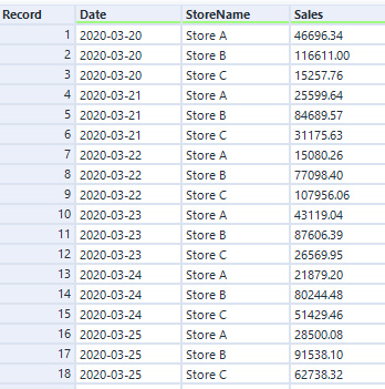
Luckily, I can use the same trick to automatically create a different file for each store by generating a different file name and saving them all within one output tool. Let’s say I’ve got a data set like this:
(in case it’s not obvious, this is data is completely faked and does not show actual Asda sales)
I can use the store name in the StoreName field to create a separate file name, simply by adding it in a file path. In this example, it’ll make a file called “Sales for Store A.csv”, and save it in the folder location specified in the formula tool:
I set up my output tool in exactly the same way as example – change the entire file path, take the name from the field I’ve created called FilePath, and don’t keep that field in the output:
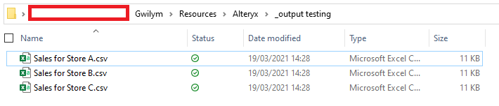
After running that, I get three files:
And when I open the Sales for Store A.csv file in Excel, I can see that it’s only got Store A’s data in it:
Example 3: splitting up a big CSV / SQL statement
My third example is splitting up a big data set into chunks so that other people can use it without specialist data tools.
In my specific case, I’m using Alteryx to pull data from several data sources together, do some stuff with it, and generate the SQL upload syntax for the database admin to load it into the main database. We could technically do this straight from Alteryx, but a) this is an occasional ad-hoc thing rather than something to productionise and schedule, and b) I don’t have write-admin rights to the main database, a responsibility that I’m perfectly happy to avoid.
Anyway, what often happens is that I’ve got a few million lines for the admin to upload. I can generate a text file or a .sql file with all those lines, and the admin can run that with a script… but it would take forever to open if the admin wants to take a look at the contents before just running whatever I’ve sent them into a database. So, I want to split it up into manageable chunks that they can easily open in Excel or a text editor or whatever else. This is also useful when sending people data in general, not just SQL statements, when you know they’re going to be using Excel to look at it.
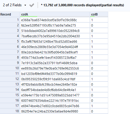
Let’s take some more fake data, this time with 3m rows:
The overall process is to add a record ID, do a nice little floor calc, deselect the record ID, and write it out in files like “data 1.csv”, “data 2.csv”, “data 3.csv”, etc.:
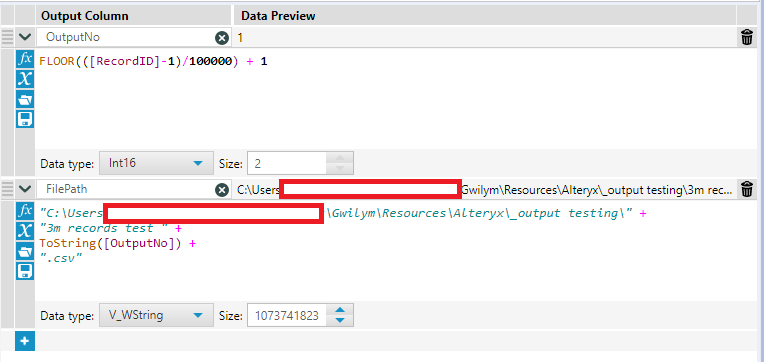
After putting the record ID on, I want to create an output number for each file. The first thing to do is decide how many rows I want in each file. In this example, I’ve gone for 100,000 rows per file. In two steps, I create the output number, then use that to create the file path in the same way we’ve seen in the first two examples:
Here’s the floor calc in text so you can simply copy/paste it:
FLOOR(([RecordID]-1)/100000) + 1
How does it work?
The floor function rounds down a number with decimal places to the whole number preceding the decimal point. If you imagine a number with decimal places as a string, it’s like simply deleting the decimal point and all the numbers after that. A number like 3.77 would become 3, for example.
In this calc, it uses the record ID, and subtracts 1 so that the record ID goes from 0 to 2,999,999. It then divides that record ID by 100,000 (or however many rows you want in your file). For the 100,000 records from 0 through to 99,999, the division returns a number between 0 and 0.99999. When you floor this, you get 0 for those 100,000 records. For the 100,000 from 100,000 through to 199,999, the division returns a number between 1 and 1.99999. When you floor this, you get 1 for those 100,000 records… and so on. After that, I just add 1 again so that my floored numbers start at 1 instead of 0.
(yes, you could just set the RecordID tool to start from 0 instead of 1 and just take the FLOOR(RecordID/100000) + 1… but I always forget about that, so I find it easier to copy across this formula instead)
Then we set up the output in the same way:
…and we’ve got 30 .csv files with 100,000 rows each:
Also, if you need to write out a large amount of data which you also need to split into multiple files to make it work for whatever you’re using it for afterwards, honestly, you probably want to address that first. I’m aware that it’s not a great process I’ve got going on here! But it’s a quick fix for a quick thing that I’ve found really useful when getting something off the ground, and it’s something I’d change if this ever turns into a scheduled process.
This is disgusting. Don’t do it. If you are running a production workflow off a manually maintained Excel file, you have bigger problems than not being able to open an Excel file in Alteryx because somebody else is using it.
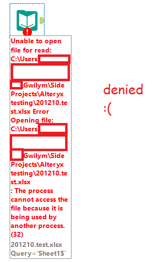
With that out of the way… you know how you can’t open an Excel file in Alteryx if you’ve got that file open? Or worse, if it’s an xlsx on a shared drive, and you don’t even have it open, but somebody else does? Yeah, not fun.
The “solution” is to email everybody to ask them to close the file, or to create a copy and read that in, changing all your inputs to reference the copy, then probably forgetting to delete the copy and now you’re running it off the copy and nobody’s updating that so you’re stuck in a cycle of overwriting the copy whenever you remember, and … this is not really a solution.
The ideal thing to do would be to change your process so that whatever’s in the xlsx is in a database. That’d be nice. But if that’s not an option for you, I’ve created a set of macros that will read an open xlsx in Alteryx.
In the first part of this blog, I’ll show you how to use the macros. In the second, I’ll explain how it works. If you’re not interested in the details, the only thing you need to know is this:
They use run command tools (which means your organisation might be a bit weird about you downloading them, but just show them this blog, nobody who uses comic sans could be an evil man).
Those run commands mimic the process of you going to the file explorer, clicking on a file, hitting copy, hitting paste in the same location, reading the data out of that copy, then deleting that copy. Leave no trace, it’s not just for hiking.
This means that command windows will briefly open up while you’re running the workflow. That’s fine, just don’t click anything or hit any keys while that’s happening or you might accidentally interrupt something (I’ve mashed the keys a bit trying to do this deliberately and the worst I’ve done is stop it copying the file or stop it deleting the file, but that’s still annoying. Anyway, you’ve been warned.).
Using these macros is a two-step process. The first step takes the xlsx and reads in the sheet names. There are two options here; you can browse for the xlsx file directly in the macro using option 1b, or you can use a directory tool and feed in the necessary xlsx file using option 1a (this is a few extra steps, but it’s my preferred approach). You can then filter to the sheet(s) you want to open, and feed that into the second step, which takes the sheet(s) and reads in the data.
Example 1
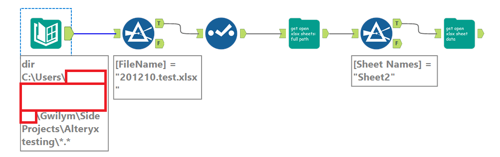
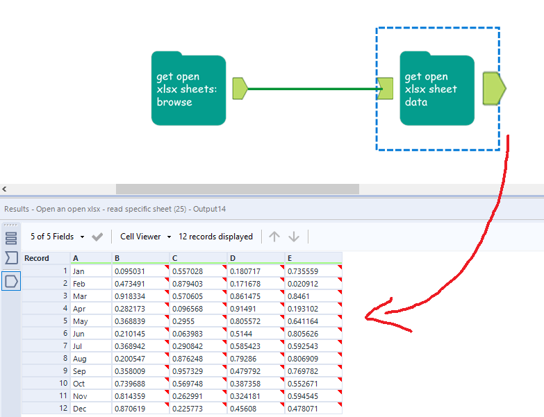
Let’s work through this simple example. I’ve got a file, imaginatively called 201210.test.xlsx, and I can’t read it because somebody else has it open. In these three steps, I can get the file, select the sheet I need, and get the data out of it:
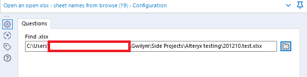
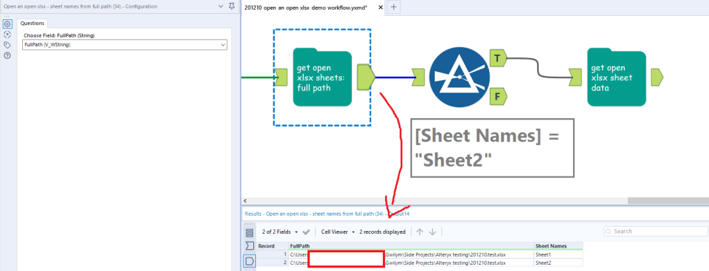
In the first step, I’m using macro 1b: Open an open xlsx – sheet names from browse. The input is incredibly simple – just hit the folder icon and browse for the xlsx you need:
But this one comes with one caveat – for the same reason that you can’t open an xlsx if it’s open, the file browse doesn’t work if the xlsx is open either. You only need to set this macro up once, though – once you’ve selected the file you need, you’re good, and you can run this workflow whenever. You only need to have the file closed when you first bring this macro onto the canvas and select the file through the file browser.
This returns the sheet names:
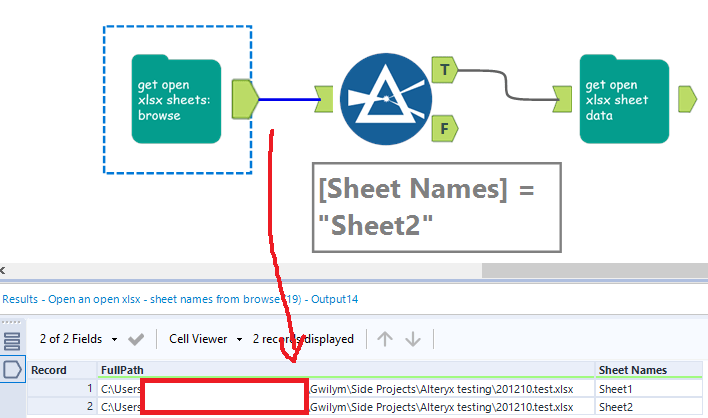
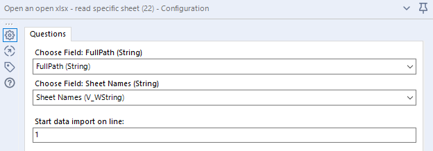
All you need to do next is filter to the sheet name you need. I want to open Sheet2, so I filter to that and feed it into the next macro, which is macro 2: Open an open xlsx – read specific sheet. This takes three input fields – the full path of the xlsx, the sheet you want to open, and the line you want to import from:
[FullPath] and [Sheet Names] are the names of the fields returned by the first macro, so you shouldn’t even need to change anything here, just whack it in.
In the first step, I use the directory tool to give me the full paths of all the xlsx files in a particular folder. This is really powerful, because it means I can choose a file in a dynamic fashion – for example, if the manually maintained process has a different xlsx for each month, you can sort by CreationTime from most recent to least recent, then use the select records tool to select the first record. That’ll always feed in the most recently created xlsx into the first macro. In this simple example, I’m just going to filter to the file I want, then deselect the columns I don’t need, which is everything except FullPath:
I can now feed the full path into the macro, like so:
…and the next steps are identical to example 1.
Example 3
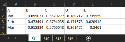
If you need to read in multiple sheets, the get open xlsx sheet data macro will do that and union them together, as long as they’re all in the same format. I’ve got another example xlsx, which is unsurprisingly called 201210 test 2.xlsx. I’ve got four sheets, one for each quarter, where the data structure is identical:
The data structure has to be identical, can’t stress that enough
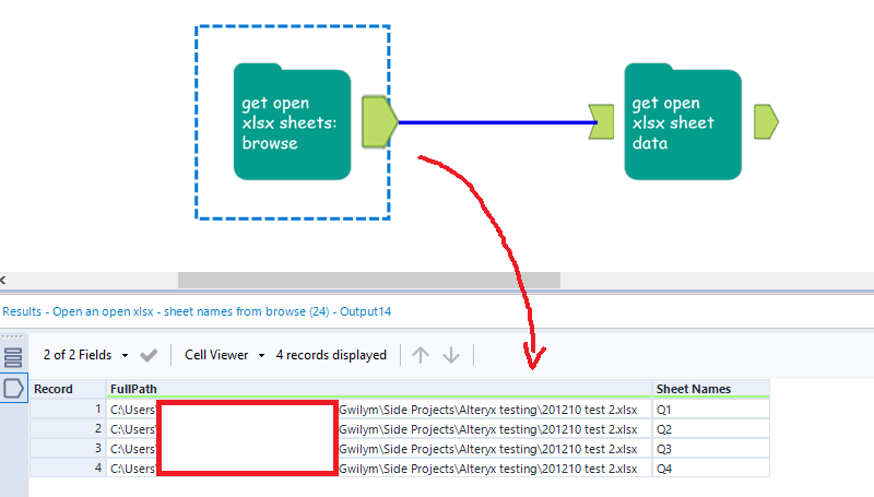
With this, you don’t have to filter to a specific sheet – you can just bung the get open xlsx sheet data macro straight on the output of the first one, like this:
That’s all you have to do! If this is something you’ve been looking for, please download them from the public gallery, test them out, and let me know if there are any bugs. But seriously, please don’t use this as a production process.
How it works
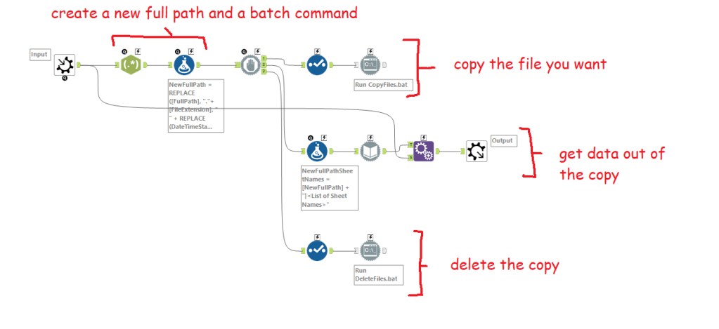
It’s all about the run commands. I’ll walk through macro 1a: open an open xlsx from a full path, but they’re all basically the same. There are four main steps internally:
Creating the file path and the batch commands
Copying the file
Getting data out of the copy
Deleting the copy
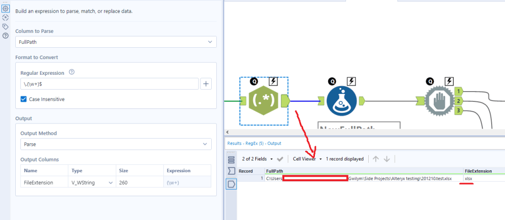
The first regex tool just finds the file extension. I’ll use this later to build the new file path:
The formula tool has three calculations in it; one to create a new full path, one to create the copy command, and one to create the delete command.
The NewFullPath calculation takes my existing full path (i.e. the xlsx that’s open) and adds a timestamp and flag to it. It does this by replacing “.xlsx” with “2021-02-12 17.23.31temptodelete1a.xlsx”. It’s ugly, but it’s a useful way of making pretty sure that you create a unique copy so that you’re not going to just call it “- copy.xlsx” and then delete somebody else’s copy.
The Command calculation uses the xcopy command (many thanks to Ian Baldwin, your friendly neighbourhood run-command-in-Alteryx hero, for helping me figure out why I couldn’t get this working). What this does is create a command to feed into the run command tool that says “take this full path and create a copy of it called [NewFullPath]”.
The DeleteCommand calculation uses the delete command. You feed that into the run command tool, and it simply takes the new full path and tells Windows to delete it.
Now that you’ve got the commands, it’s run command time (and block until done, just to make sure it’s happening in the right order).
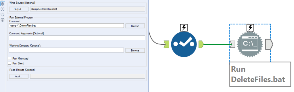
To copy the file: put a select tool down to deselect everything except the command field. Now set up your run command tool like this:
You want to treat the command like a .bat file. You can do this by setting the write source output to be a .bat file that runs in temp – I just called it CopyFiles.bat. To do this, you’ll need to hit output, then type it in in the configuration window that pops up, and keep the other settings as above too. If you’re just curious how this macro works, you don’t need to change anything here, it’ll run just fine (let me know if it doesn’t).
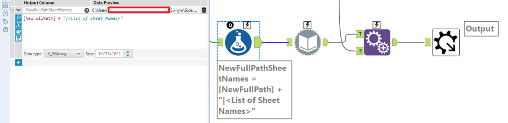
To get the list of sheet names, the first step is to create a new column with the full path, a pipe separator, then “<List of Sheet Names>” to feed into the dynamic input:
From there, you can use the existing xlsx as the data source template, and use NewFullPathSheetNames from the previous formula as the data source list field, and change the entire file path:
That’ll return the sheet names only:
So the last step is an append tool to bring back the original FullPath. That’s all you need as the output of this step to go into the sheet read macro (and the only real difference in that macro is that the formula tool and dynamic input tool is set up to read the data out of the sheets rather than get a list of sheet names).
Finally, to delete the copy, deselect everything except the DeleteCommand field, and set it up in the same way as the copy run command tool earlier:
And that’s about it. I hope this explanation is full enough for you to muck about with run command tools with a little confidence. I really like xcopy functions as a way of mass-shifting things around, it’s a powerful way of doing things. But like actual power tools, it can be dangerous – be careful when deleting things, because, well, that can go extremely badly for you.
And finally, none of this is good. This is like the data equivalent of me having a leaky roof, putting a bucket on the floor, and then coming up with an automatic way of switching out the full bucket for an empty one before it overflows. What I should actually do is fix the roof. If you’re using these macros, I highly recommend changing your underlying data management practices/processes instead!
I’ve recently started working on a project where the folder structure uses years and months. It looks a bit like this:
This structure makes a lot of sense for that team for this project, but it’s a nightmare for my Alteryx workflows – every time I want to save the output, I need to update the output tool.
…or do I? One of my favourite things to do in Alteryx is update entire file paths using calculations. It’s a really flexible trick that you can apply to a lot of different scenarios. In this case, I know that the folder structure will always be the year, then a subfolder for the month where the month is the first three letters (apart from June, where they write it out in full). I can use a formula tool with some date and string calculations to save this in the correct folder for me automatically. I can do it in just one formula tool and a regular output tool, like this:
Firstly, I’m going to stick a date stamp on the front of my file name in yymmdd format because that’s what I always do with my files. And my handwritten notes. And my runs on Strava. Old habits die hard. I’m doing it with this formula:
…which is a nested way of saying “give me the date right now (2021-02-08), convert it to a string (“2021-02-08”), then only take the 8 characters on the right, thereby trimming off the “20-” from this century because I only started dating stuff like this in maybe 2015-16 and I’m under no illusions that I’ll be alive in 2115 to face my own century bug issue and I’d rather have those two characters back (“21-02-08”), then get rid of the hyphens (“210208”).
The next two calculations in the formula tool give me the year and month name as a string. The year is easy and doesn’t need extra explanation (just make sure you put the data type as a string):
DateTimeYear(DateTimeToday())
The month is a little harder, and uses one of my favourite functions: DateTimeFormat(). Here we go:
IF DateTimeMonth(DateTimeToday()) = 6 THEN "June" ELSE DateTimeFormat(DateTimeToday(), '%b') ENDIF
This basically says “if today is in the sixth month of the year, then give me ‘June’ because for some reason that’s the only month that doesn’t follow the same pattern in this network drive’s naming conventions, otherwise give me the first three letters of the month name where the first letter is a capital”. You can do that with the ‘%b’ DateTimeFormat option – this is not an intuitive label for it and if you’re like me you will read this once, forget it, and just copy over this formula tool from your workflow of useful tricks whenever you need it.
The final step in the formula tool is to collate it all together into one long file path:
You don’t need the DateStamp, Year, or Month fields anymore. I just deselect them with a select tool.
Then, in the output tool, you’ll want to use the options at the bottom of the tool. Take the file/table name from field, and set it to “change entire file path”. Make sure the field where you created the full file path is selected in the bottom option, and you’ll probably want to untick the “keep field in output” option because you almost definitely don’t need it in your data itself:
And that’s about it! I’ve hit run on my workflow, and it’s gone in the right place:
It’s a simple trick and probably doesn’t need an entire blog post, but it’s a trick I find really useful.
This post is a complete overview of what market basket analysis is, and how to use the MB Rules and MB Inspect tools to do market basket analysis in Alteryx. If you don’t use Alteryx, don’t worry – the theory side of things may well still be useful for you!
THEORY
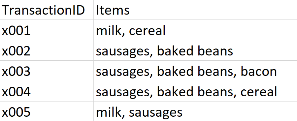
It’s Saturday morning in Gwilym’s Breakfast Goods Co., and people are slowly rolling in to buy their weekend breakfast ingredients (we don’t sell much else). The first five people through the door make the following purchases:
I’m looking at my dataset here, and I can instantly see a couple of insights. Firstly, that’s a lot of rich beef sausages we’re selling. And secondly, people seem to buy sausages and baked beans together.
This is, in essence, market basket analysis – looking at your transactions to see what people buy a lot of, what people don’t buy a lot of, and what different things people buy together. There are four main concepts in market basket analysis – association rules, support, confidence, and lift.
Association rules
An association rule is the name for a relationship between items or combinations of items across all transactions, and it’s often written like this:
sausages → baked beans
This means “if people buy sausages, they also buy baked beans”, and we can see that this association rule figures pretty prominently in this dataset. But an association rule is just the name for the relationship, not a statement about the strength of it. For example, milk → sausages is also an association rule, even though there’s only one transaction where that happens.
Support
This is just the proportion of transactions that contain a thing. Support can be for individual items (like sausages) or a combination of items (like sausages and baked beans). In our example dataset, the support for sausages is 0.8, because sausages are in four transactions out of a total of five.
Confidence
While support refers to items in the transaction list, confidence depends on association rules. For an association rule, confidence is the number of transactions that contain a thing that already contain the other thing. It’s calculated like this:
[support for both items in association rule] / [support for item on left hand side of rule]
So, if we use the rule sausages → baked beans , the confidence is 0.75. This is because it’s calculated like this:
[support for sausages and baked beans, which is 3 out of 5, or 0.6] / [support for sausages, which is 4 out of 5, or 0.8]
If we take the alternative association rule for the same two items, which is baked beans → sausages, then the confidence is 1, because the support for beans and sausages is 0.6, and the support for beans alone is also 0.6.
Lift
Finally, lift is how likely two or more things are to be bought together compared to being bought independently. It’s calculated like this:
[support for both items] / [support for one item] * [support for the other item]
Unlike confidence, where the value will change depending on which way round the rule between two items is, the direction of a rule makes no difference to the lift value.
Again, if we use the rule sausages → baked beans , the lift is 1.25. This is because it’s calculated like this:
[support for sausages and beans, which is 0.6] / [support for sausages, which is 0.8] * [support for beans, which is 0.6]
That gives us 0.6 / (0.8 * 0.6), which is 0.6 / 0.48, which is 1.25
A rough guide to lift is that if it’s above 1, then it means that the two items are bought more frequently as a pair than they are bought individually, while if it’s below 1, then it means that the two items are bought more frequently individually than as a pair.
ALTERYX EXAMPLES
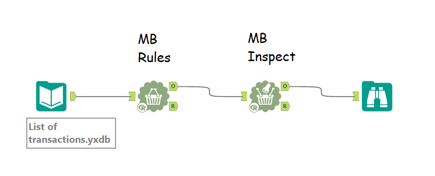
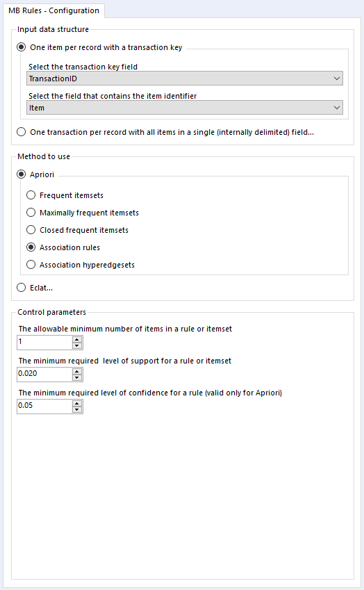
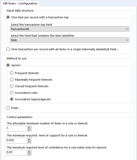
That’s pretty much it for the theory so far, so let’s create a simple analysis in Alteryx. You’ll need two tools – MB Rules and MB Inspect.
MB Rules does all the work, and it’s where you set your support and confidence thresholds. However, it only outputs an R object, which Alteryx can’t read as a standard data frame… so you need MB Inspect, which is basically a glorified filter tool, to turn that into Alteryx data.
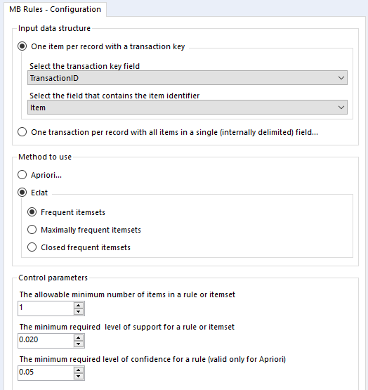
You can set it up a little like this:
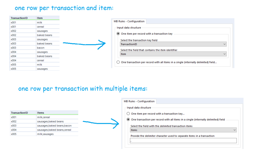
You’ll also want to sort out your data beforehand. There are two possible ways you can structure your data for the MB Rules tool to work. You can either have a row for every single item of every single transaction, or you can have a row for every transaction, with each item separated by the same character. The MB Rules tool can handle both structures, and you’d set it up as follows:
Apriori Association Rules
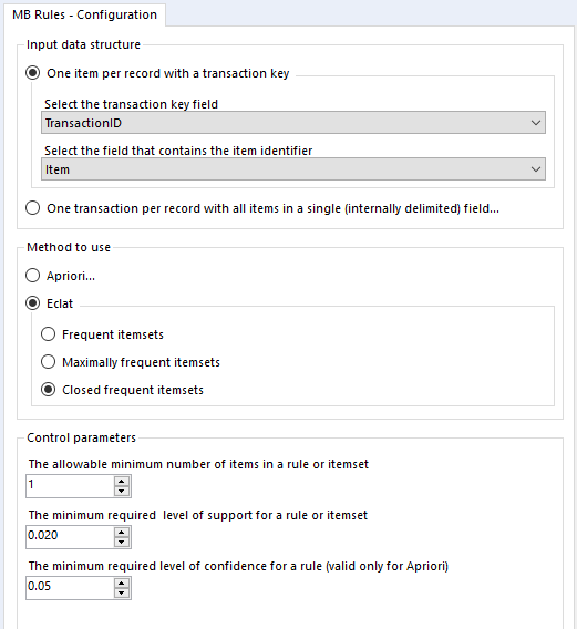
In the MB Rules tool, let’s set it up to give us the association rules, with their support, confidence, and lift. You can do that by selecting Apriori and Association rules under method to use:
Here, I’ve left the control parameters to their defaults – 0.02 support for an item or set of items or association rule, and 0.05 for the confidence of an association rule. With the support filter, note that this will apply to both items and association rules. For example, in the five transaction dataset, the support for milk is 0.4 and the support for cereal is 0.4. If I set my minimum support to 0.4, then the empty LHS rules for milk and cereal will come through (more on that in a moment), but the association rule for milk → cereal will not be returned, because the support for that association rule is only 0.2, because both milk and cereal only occur together in one transaction out of five.
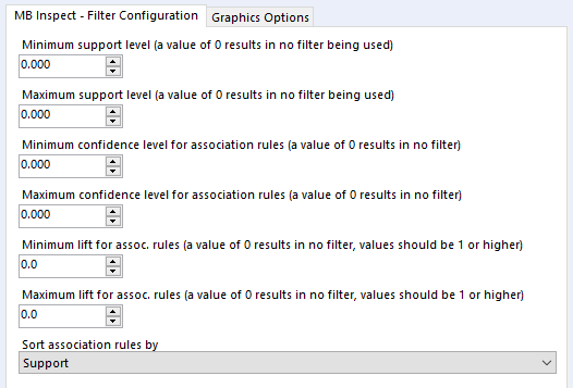
Onto the MB Inspect tool, and I normally leave it like this – zeroes for everything, because I’ve set most of my filters that I care about in the MB Rules tool.
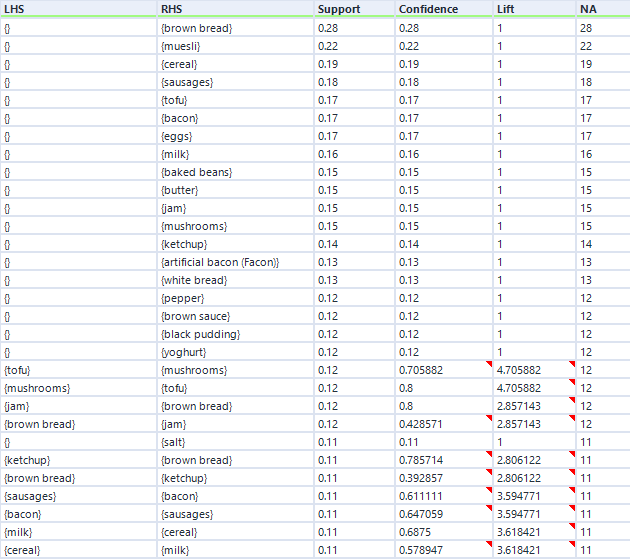
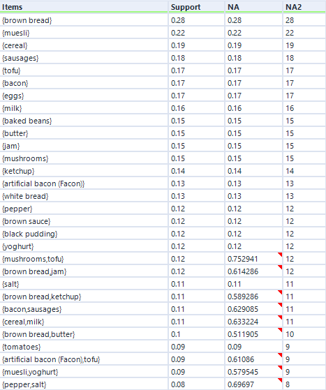
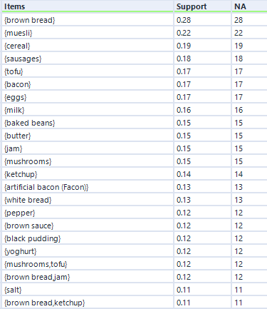
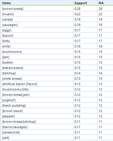
That’s pretty much it, so I’ll now press run. For this data, I’ve expanded my dataset from the first five transactions to a hundred transactions. Here are the association rules in my dataset:
Remember I mentioned empty rules earlier? The top handful of rows where the LHS column is “{}” is what I mean. What this shows is the association rule, if you can really call it that, for items individually, totally independent of other items. This just shows the support for an individual item, and because it’s independent of other items, the confidence is the same, and the lift is always 1.
Do you see the NA column on the far right? This is another useful output, although it’s not labelled very well. This stands for Number of Associations (I think) – in any case, it’s a count of how many transactions this item or set of items occurs in. So, brown bread turns up in 28 transactions out of 100 (hence the 0.28 support for brown bread), and cereal and milk turn up in 11 transactions out of 100 (hence the 0.11 support for cereal → milk).
You can also see how lift is independent of the association rule direction, but confidence isn’t. For example, take the two association rules between tofu and mushrooms. The first one, tofu → mushrooms, has a confidence of 0.705882, which means that mushrooms turn up in 70% of transactions that have tofu in them. The second one, mushrooms → tofu, has a confidence of 0.8, which means that tofu turns up in 80% of transactions that have mushrooms in them. Or in other words, 80% of people who buy mushrooms also have tofu, and 70% of people who buy tofu also buy mushrooms. Either way, there’s a big lift of 4.7, which means that tofu and mushrooms occur together about 4.7 times more often than you’d expect if 15 people threw mushrooms into their trolley at random and 17 people threw tofu into their trolley at random.
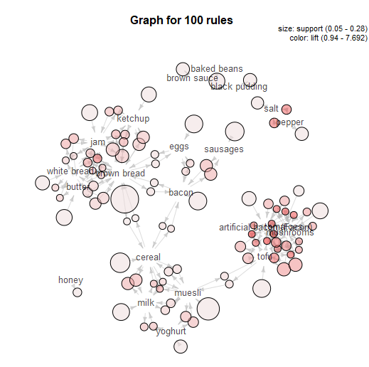
That’s basically it for a simple market basket analysis. The MB Inspect tool does also generate some graphics, which I don’t normally use that much, although I do like the network graph it makes:
That’s the main way of doing market basket analysis in Alteryx, and it’s what I do most of the time. But there are several other options, so let’s explore what they do as well.
Apriori Association hyperedgesets
In the same Apriori section, there’s an option to look at Association hyperedgesets:
What this does is basically to average across both sides of an association rule. It gives you the same support, the same number of associations, and the average confidence for both sides.
You can see that in the output below.
To explain, let’s take the mushrooms/tofu relationship again. This time, it doesn’t list an association rule – all you can see is the two items together in one set, ordered alphabetically, like {mushrooms, tofu}.
You can see that the support here (0.12) is the same as the support for both association rules (0.12). However, look at the confidence. And when I say “confidence”, I mean the field called NA.
(Rather unhelpfully, the output of the hyperedgesets option has the column NA and the column NA2. The column NA2 should actually be called NA, as it shows the number of associations, and the column NA should actually be called confidence.)
Anyway, let’s look at the confidence (column NA). The figure 0.752941 is the average of the confidence for mushrooms → tofu (0.8) and the confidence for tofu → mushrooms (0.705882).
The minimum confidence setting here applies only to the average confidence, not the individual rules. So for example, if I had set the minimum confidence in the MB Rules tool to 0.73, I would still get the hyperedgeset {mushrooms, tofu} because the average confidence is above 0.73, even though the confidence of the association rule tofu → mushrooms is below 0.73.
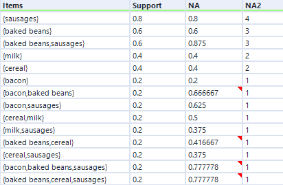
If I go back to the earlier five-transaction dataset, the hyperedgeset average confidence for sausages and baked beans is 0.875. This is the average of the confidence for sausages given baked beans (which is 1) and the confidence for baked beans given sausages (which is 0.75). I think that you can interpret this to mean that if you buy one if the items in that set, there’s an 87.5% chance you’ll buy one of the other items in that set (or to put it another way, 87.5% of items in this set occurred in combination in a transaction with the other items in this set), but don’t quote me on that!
In any case, here’s the hyperedgeset results for the five-transaction dataset:
THEORY – PART TWO
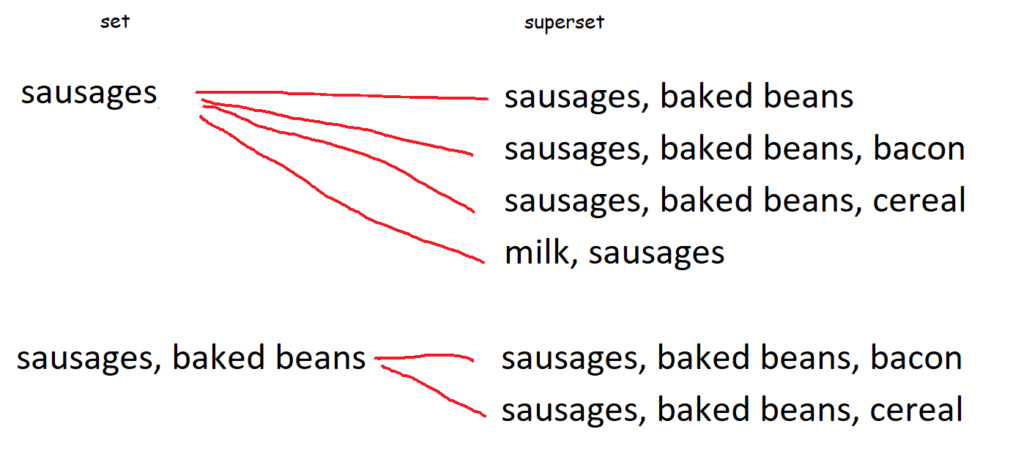
Thought we were done with theory? Surprise! Here’s a nice little bonus bit, because to cover the other options, we’ll need to talk about sets and supersets.
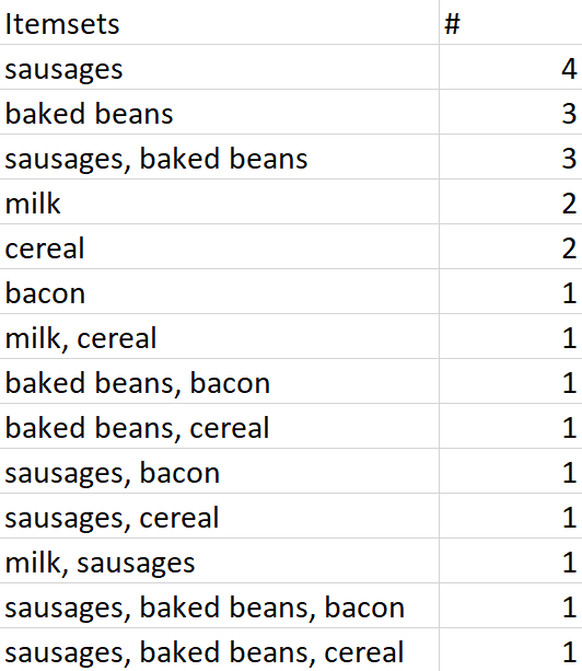
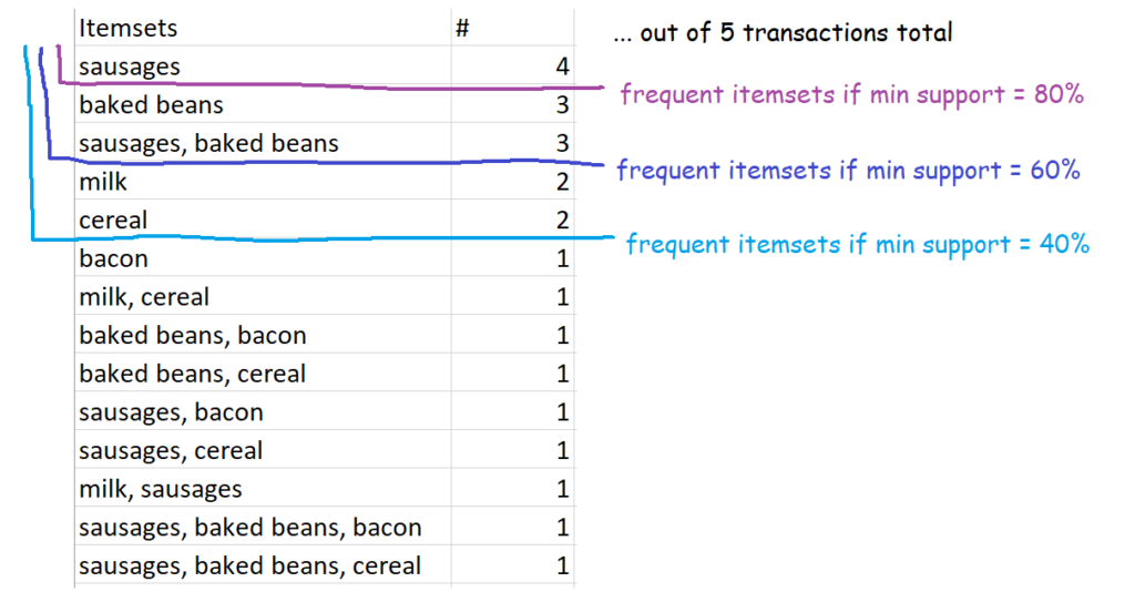
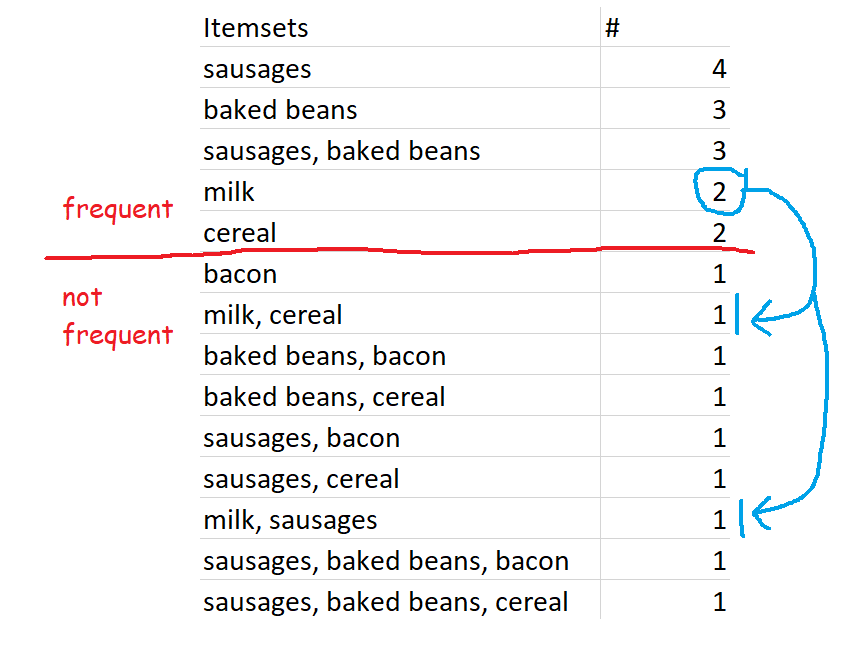
Let’s go back to the five-transaction dataset. Here is a list of every single item and combination of items that occur, along with the number of times they occur. At the top, you can see that sausages are bought in four transactions – this doesn’t mean that there were four transactions where people only bought sausages, this just means that there were four transactions (of a potentially unlimited size) which contained sausages. At the bottom, you can see that there was one transaction which contained sausages, baked beans, and bacon.
All of these are sets. The set {sausages} is a set made up of a single item – sausages. {sausages, baked beans} is a set made up of two items. And so on. Because they’re sets, they get curly brackets around them, like {}, when we’re specifically talking about the items as a set rather than a group of items.
A superset is a set that contains another set. For example, the set {sausages, baked beans} is a superset of the set {sausages}, because the superset fully contains the set. Similarly, the set {sausages, baked beans, bacon} is a superset of the sets {sausages} and {sausages, baked beans}, because the superset fully contains those sets.
This diagram shows every single superset of {sausages} and {sausages, baked beans}:
This is relevant for the next set of options because we’ll need to talk about supersets to be able to define frequent itemsets, closed frequent itemsets, and maximally frequent itemsets.
Frequent itemsets
This one is nice and straightforward – it’s simply sets of items which occur above your defined level of support. So, for example, if you set 60% as your minimum level of support, then the definition of frequent itemsets is all sets of items which occur in 60% or more of transactions. In our case, that’s {sausages}, {baked beans}, and {sausages, baked beans}.
In our five-transaction example, here are some possible frequent itemsets:
Setting the frequency yourself might make it feel like a bit of a circular analysis – “I want to know what’s frequent, so here’s my definition of frequent” – but it’s pretty useful all the same, because every organisation’s data is different. What counts as frequent in a specialist shop might be way higher than a giant supermarket, so this allows you to tailor your analysis differently.
Closed frequent itemsets
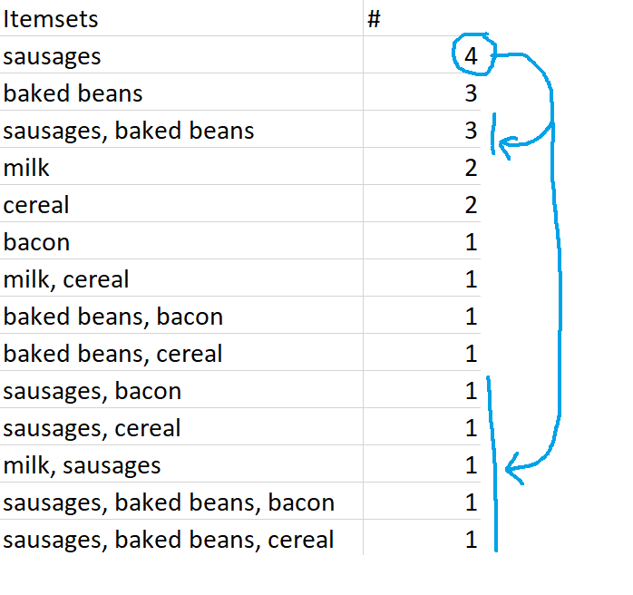
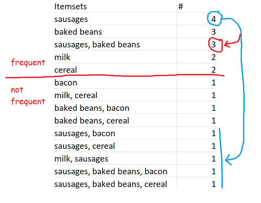
Closed frequent itemsets are sets which are frequent and also occur more frequently than their supersets. For example, let’s define frequent as having a minimum support of 0.4 or 40%, which in this dataset works out to occurring in 2 or more transactions. Sausages are in four transactions, so the set {sausages} is a frequent itemset. This is also more frequent than any of the supersets of {sausages}, like {sausages, baked beans} or {sausages, bacon}, so {sausages} is a closed frequent itemset.
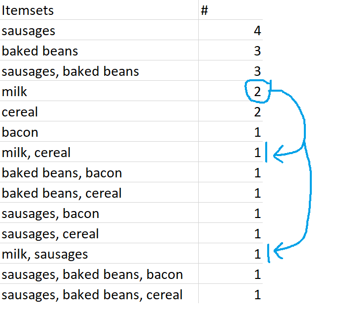
Similarly, {milk} is a closed frequent itemset because it occurs twice – that’s frequent according to our 40% definition, and that’s more frequent than its supersets, {milk, cereal} and {milk, sausages}.
However, if we increased the minimum support to 0.6, or 60%, then {milk} would no longer be a closed frequent itemset – even though it still fulfils the closed set requirements by being more frequent than its superset, it’s no longer frequent by our definition.
Maximally frequent itemsets
Finally, maximally frequent itemsets are frequent itemsets which are more frequent than their supersets, and which do not have any frequent supersets. To put it another way, maximally frequent itemsets are closed frequent itemsets which have no frequent supersets.
{milk} is a closed frequent itemset, and it’s also a maximally frequent itemset. This is because {milk} is frequent, {milk} is more frequent than its supersets {milk, cereal} and {milk, sausages}, and its supersets {milk, cereal} and {milk, sausages} are not frequent sets.
However, while {sausages} is both a frequent itemset and a closed frequent itemset, {sausages} is not a maximally frequent itemset. This is because one of {sausages}’s supersets, {sausages, baked beans}, is also a frequent itemset.
…but again, this is because of our preset definition of frequent. If we changed the minimum support for frequent itemsets to 70% rather than 60%, then the set {sausages, baked beans} would no longer be frequent, so {sausages} would be a maximally frequent itemset.
ALTERYX EXAMPLES
Now that we’ve seen the theory, it’s really quick to run these analyses in Alteryx.
You may have noticed that there are two different ways of running a frequent itemsets analysis – one under the apriori method, and one under the eclat method. The only difference is the search algorithm used. The two methods return exactly the same results (well, almost – the order of items with the same NA and Support is slightly different, but that doesn’t actually matter, and the results don’t join up perfectly, but that’s because of joining on a double, so they do join up perfectly if you convert the NA columns to Int16 or something). From what I can tell/from what I’ve googled, the difference in the search algorithms is that apriori scans through the data multiple times, which makes eclat slightly faster for larger datasets. In my dataset of 100 transactions, it made absolutely no difference to the speed.
So, we can set up the eclat frequent itemsets analysis up like this:
…and here’s what the output looks like:
Eagle-eyed readers may have noticed that the output of the eclat frequent itemsets analysis is the same as the apriori hyperedgesets analysis, but without the average confidence column. And it is, but it does run a little quicker.
Onto closed frequent itemsets – if we set up the tool like this:
…we get results like this:
At first, this looks identical to the output of the frequent itemsets analysis, but that’s only because I’m screenshotting the first few rows. There are less than half the number of itemsets returned by the closed frequent itemsets option.
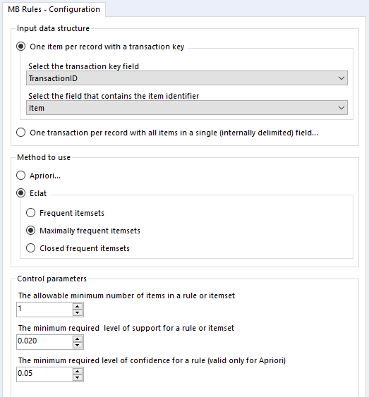
Finally, let’s look at maximal closed frequent itemsets. Again, we’ll set it up like this:
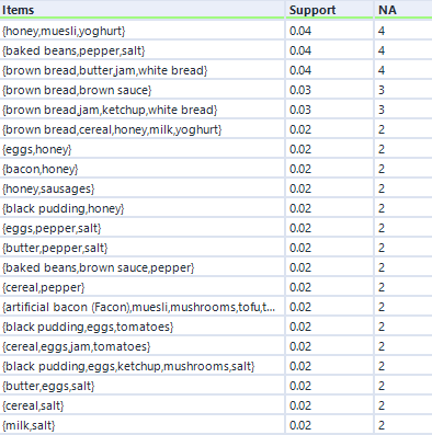
…and again, here’s the output:
This output structure is identical to the other two, but the results are more noticeably different. The honey/muesli/yoghurt combo is the most frequent maximally frequent itemset.
Application
I’ve written about applying market basket analysis to your data before, and this has turned into a really long blog post, so I won’t cover it in full here. But, as a shop keeper, I’d use the results of this analysis in Gwilym’s Breakfast Goods Co. to explore what to put on sale together, what not to put on sale together, and so on. For example, mushrooms and tofu are the combination with the highest lift, so if I’d accidentally overstocked on tofu and needed to sell it off quickly, I’d put it on special offer with mushrooms and put it in the vegetable (or fungus-pretending-to-be-a-vegetable) aisle. But if I’d done my supply chain planning well, I could use the strong association between mushrooms and tofu to get people to buy other things. For example, people who buy tofu also buy artificial bacon (Facon), so I could use people’s tendency to buy tofu and mushrooms together by putting them in the same aisle but sandwiching artificial bacon (Facon) between the two. This would mean that people looking for the tried and trusted mushroom/tofu combination are going to be looking at artificial bacon (Facon) at the same time, and hopefully they’ll pick it up and try it out.
[update: this macro has been updated to fix a small discrepancy in the “most recent X” filters. If you downloaded it before 2019-03-01, please download the new version]
It’s 2019. Hooray. The change of a year is one of my least favourite things, professionally speaking, because January 2nd is when you find out how much stuff breaks because somebody (possibly you) has hard coded a date somewhere in all your pipelines. Suddenly, all your dashboards are blank because somebody’s put filter Year=2018 on, or all the YoY calculations are off because it’s looking at [2018]/[2017] instead of [CurrentYear]/[PreviousYear].
Sure enough, I spent a few days in January tracing through several Alteryx workflows and looking for rogue date filters. Pretty much all of them could be fixed by changing 2018 to DatePartYear(DateTimeNow()). But it was a long and frustrating process to identify all the filters which needed to remain static (e.g. filter out everything before 2018 because older data is in a different format and needs to be treated differently) vs. filters which needed to be dynamic (e.g. filter to the current year’s data to show YTD values), and then replacing the filter code in the custom filter section.
Most date filters I found were pretty similar, and fit into one of a handful of categories:
1. Filter to this period (e.g. if it’s 2019 right now, give me all of 2019)
2. Filter to this period-to-date (e.g. if it’s 2019 right now, give me all of 2019 up to today)
3. Filter to most recent full / completed period (e.g. if it’s 2019 right now, give me all of 2018)
4. Filter to the previous / next 12 months
5. Filter to the past / the future
…so to save myself some work in January 2020, I’ve built an Alteryx macro which handles all these examples. You can get it here! Click on the image, or copy the full link below:
Just hit download and stick it in your standard macro path. It’s automatically set up to appear in your preparation tools.
And here’s how it looks in your workflow:
It works much like a regular filter tool, with T and F outputs based on a filter condition. But instead of coding up a calculation like “DatePartYear([MyDateField]) = DatePartYear(DateTimeNow()) AND [MyDateField] <= DateTimeNow()” for a Year-to-Date filter, you can simply tick the Year-to-Date option (and see a description of what that particular filter option will do). I built this with scheduled workflows in mind so that you can spend less time copy/pasting chunks of date filter code, and less time trawling through custom filter code when the year changes and the workflows break.
One caveat: this macro works at the day level, rather than the specific time level – so if it’s 7pm on March 19th when you run the workflow and select Year-to-Date, the filter will include future values from later in the evening on March 19th, not just the ones up to 7pm.
The way it works is by selecting the relevant part of a looooong IF statement, which has all possible filter options from the input tools. If you’re interested, this is the full set of IF statement formulae:
IF [FilterOptionSelected] = ‘Current Week’ THEN
DateTimeTrim([IncomingDate], “day”) >= DateTimeAdd(
DateTimeTrim([DateValueUsed], “day”),
(IF ToNumber(DateTimeFormat(DateTimeTrim([DateValueUsed], “day”),”%w”)) = 0 THEN
ToNumber(DateTimeFormat(DateTimeTrim([DateValueUsed], “day”),”%w”))-7
ELSE 0-ToNumber(DateTimeFormat(DateTimeTrim([DateValueUsed], “day”),”%w”)) ENDIF),
“day”)
AND
DateTimeTrim([IncomingDate], “day”) <= DateTimeAdd(
DateTimeTrim([DateValueUsed], “day”),
(IF ToNumber(DateTimeFormat(DateTimeTrim([DateValueUsed], “day”),”%w”)) = 0 THEN 0 ELSE
7-ToNumber(DateTimeFormat(DateTimeTrim([DateValueUsed], “day”),”%w”)) ENDIF) ,
“day”)
ELSEIF [FilterOptionSelected] = ‘Current Month’ THEN
DateTimeMonth(DateTimeTrim([IncomingDate], “day”)) = DateTimeMonth(DateTimeTrim([DateValueUsed], “day”))
AND
DateTimeYear(DateTimeTrim([IncomingDate], “day”)) = DateTimeYear(DateTimeTrim([DateValueUsed], “day”))
ELSEIF [FilterOptionSelected] = ‘Current Quarter’ THEN
(IF DateTimeMonth(DateTimeTrim([DateValueUsed], “day”)) <= 3 THEN
DateTimeMonth(DateTimeTrim([IncomingDate], “day”)) <= 3
ELSEIF DateTimeMonth(DateTimeTrim([DateValueUsed], “day”)) <= 6 THEN
DateTimeMonth(DateTimeTrim([IncomingDate], “day”))> 3 AND DateTimeMonth(DateTimeTrim([IncomingDate], “day”)) <= 6
ELSEIF DateTimeMonth(DateTimeTrim([DateValueUsed], “day”)) <= 9 THEN
DateTimeMonth(DateTimeTrim([IncomingDate], “day”))> 6 AND DateTimeMonth(DateTimeTrim([IncomingDate], “day”)) <= 9
ELSE DateTimeMonth(DateTimeTrim([IncomingDate], “day”))> 9 AND DateTimeMonth(DateTimeTrim([IncomingDate], “day”)) <= 12 ENDIF
)
AND
DateTimeYear(DateTimeTrim([IncomingDate], “day”)) = DateTimeYear(DateTimeTrim([DateValueUsed], “day”))
ELSEIF [FilterOptionSelected] = ‘Month-to-date’ THEN
DateTimeMonth(DateTimeTrim([IncomingDate], “day”)) = DateTimeMonth(DateTimeTrim([DateValueUsed], “day”))
AND
DateTimeYear(DateTimeTrim([IncomingDate], “day”)) = DateTimeYear(DateTimeTrim([DateValueUsed], “day”))
AND
DateTimeTrim([IncomingDate], “day”) <= DateTimeTrim([DateValueUsed], “day”)
ELSEIF [FilterOptionSelected] = ‘Quarter-to-date’ THEN
(IF DateTimeMonth(DateTimeTrim([DateValueUsed], “day”)) <= 3 THEN
DateTimeMonth(DateTimeTrim([IncomingDate], “day”)) <= 3
ELSEIF DateTimeMonth(DateTimeTrim([DateValueUsed], “day”)) <= 6 THEN
DateTimeMonth(DateTimeTrim([IncomingDate], “day”))> 3 AND DateTimeMonth(DateTimeTrim([IncomingDate], “day”)) <= 6
ELSEIF DateTimeMonth(DateTimeTrim([DateValueUsed], “day”)) <= 9 THEN
DateTimeMonth(DateTimeTrim([IncomingDate], “day”))> 6 AND DateTimeMonth(DateTimeTrim([IncomingDate], “day”)) <= 9
ELSE DateTimeMonth(DateTimeTrim([IncomingDate], “day”))> 9 AND DateTimeMonth(DateTimeTrim([IncomingDate], “day”)) <= 12 ENDIF
)
AND
DateTimeYear(DateTimeTrim([IncomingDate], “day”)) = DateTimeYear(DateTimeTrim([DateValueUsed], “day”))
AND
DateTimeTrim([IncomingDate], “day”) <= DateTimeTrim([DateValueUsed], “day”)
ELSEIF [FilterOptionSelected] = ‘Year-to-date’ THEN
DateTimeYear(DateTimeTrim([IncomingDate], “day”)) = DateTimeYear(DateTimeTrim([DateValueUsed], “day”))
AND
DateTimeTrim([IncomingDate], “day”) <= DateTimeTrim([DateValueUsed], “day”)
ELSEIF [FilterOptionSelected] = ‘Most recent complete month’ THEN
DateTimeMonth(DateTimeTrim([IncomingDate], “day”)) = (IF DateTimeMonth(DateTimeTrim([DateValueUsed], “day”)) = 1 THEN 12 ELSE DateTimeMonth(DateTimeTrim([DateValueUsed], “day”))-1 ENDIF)
AND
DateTimeYear(DateTimeTrim([IncomingDate], “day”)) =
(IF DateTimeMonth(DateTimeTrim([DateValueUsed], “day”)) = 1 THEN DateTimeYear(DateTimeTrim([DateValueUsed], “day”))-1 ELSE DateTimeYear(DateTimeTrim([DateValueUsed], “day”)) ENDIF)
ELSEIF [FilterOptionSelected] = ‘Most recent complete quarter’ THEN
IF DateTimeMonth(DateTimeTrim([DateValueUsed], “day”)) <= 3
THEN DateTimeMonth(DateTimeTrim([IncomingDate], “day”))> 9 AND DateTimeMonth(DateTimeTrim([IncomingDate], “day”)) <= 12 AND DateTimeYear(DateTimeTrim([IncomingDate], “day”)) = DateTimeYear(DateTimeTrim([DateValueUsed], “day”))-1
ELSEIF DateTimeMonth(DateTimeTrim([DateValueUsed], “day”)) <= 6
THEN DateTimeMonth(DateTimeTrim([IncomingDate], “day”)) <= 3 AND DateTimeYear(DateTimeTrim([IncomingDate], “day”)) = DateTimeYear(DateTimeTrim([DateValueUsed], “day”))
ELSEIF DateTimeMonth(DateTimeTrim([DateValueUsed], “day”)) <= 9
THEN DateTimeMonth(DateTimeTrim([IncomingDate], “day”))> 3 AND DateTimeMonth(DateTimeTrim([IncomingDate], “day”)) <= 6 AND DateTimeYear(DateTimeTrim([IncomingDate], “day”)) = DateTimeYear(DateTimeTrim([DateValueUsed], “day”))
ELSEIF DateTimeMonth(DateTimeTrim([DateValueUsed], “day”)) <= 12 AND DateTimeMonth(DateTimeTrim([DateValueUsed], “day”)) = DateTimeMonth(DateTimeAdd(DateTimeTrim([DateValueUsed], “day”), 1, “day”))
THEN DateTimeMonth(DateTimeTrim([IncomingDate], “day”))> 9 AND DateTimeMonth(DateTimeTrim([IncomingDate], “day”)) <= 9 AND DateTimeYear(DateTimeTrim([IncomingDate], “day”)) = DateTimeYear(DateTimeTrim([DateValueUsed], “day”))
ELSE !ISNULL(DateTimeTrim([IncomingDate], “day”)) OR ISNULL(DateTimeTrim([IncomingDate], “day”)) ENDIF
//returns all date as a clue the filter doesn’t work
ELSEIF [FilterOptionSelected] = ‘Last 12 months up to and including today’ THEN
DateTimeTrim([IncomingDate], “day”) > DateTimeAdd(DateTimeTrim([DateValueUsed], “day”), -1, “year”)
AND
DateTimeTrim([IncomingDate], “day”) <= DateTimeTrim([DateValueUsed], “day”)
ELSEIF [FilterOptionSelected] = ‘Next 12 months from today’ THEN
DateTimeTrim([IncomingDate], “day”) >= DateTimeTrim([DateValueUsed], “day”)
AND
DateTimeTrim([IncomingDate], “day”) < DateTimeAdd(DateTimeTrim([DateValueUsed], “day”), 1, “year”)
ELSEIF [FilterOptionSelected] = ‘Everything before today (including today)’ THEN
DateTimeTrim([IncomingDate], “day”) <= DateTimeTrim([DateValueUsed], “day”)
ELSEIF [FilterOptionSelected] = ‘Everything before today (not including today)’ THEN
DateTimeTrim([IncomingDate], “day”) < DateTimeTrim([DateValueUsed], “day”)
ELSEIF [FilterOptionSelected] = ‘Everything after today (including today)’ THEN
DateTimeTrim([IncomingDate], “day”) >= DateTimeTrim([DateValueUsed], “day”)
ELSEIF [FilterOptionSelected] = ‘Everything after today (not including today)’ THEN
DateTimeTrim([IncomingDate], “day”) > DateTimeTrim([DateValueUsed], “day”)
ELSEIF [FilterOptionSelected] = ‘All days of the same date across years’ THEN
DateTimeMonth(DateTimeTrim([IncomingDate], “day”)) = DateTimeMonth(DateTimeTrim([DateValueUsed], “day”))
AND
DateTimeDay(DateTimeTrim([IncomingDate], “day”)) = DateTimeDay(DateTimeTrim([DateValueUsed], “day”))
ELSEIF [FilterOptionSelected] = ‘All days of the same weekday’ THEN
DateTimeFormat(DateTimeTrim([IncomingDate], “day”),”%w”) = DateTimeFormat(DateTimeTrim([DateValueUsed], “day”),”%w”)
ELSE
!ISNULL(DateTimeTrim([IncomingDate], “day”)) OR ISNULL(DateTimeTrim([IncomingDate], “day”)) ENDIF
//returns all dates in range without filtering anything just in case
I haven’t written a blog in far too long. My bad. So, to get back into the swing of things, here’s something I’ve been playing with this week: centre of gravity plots.
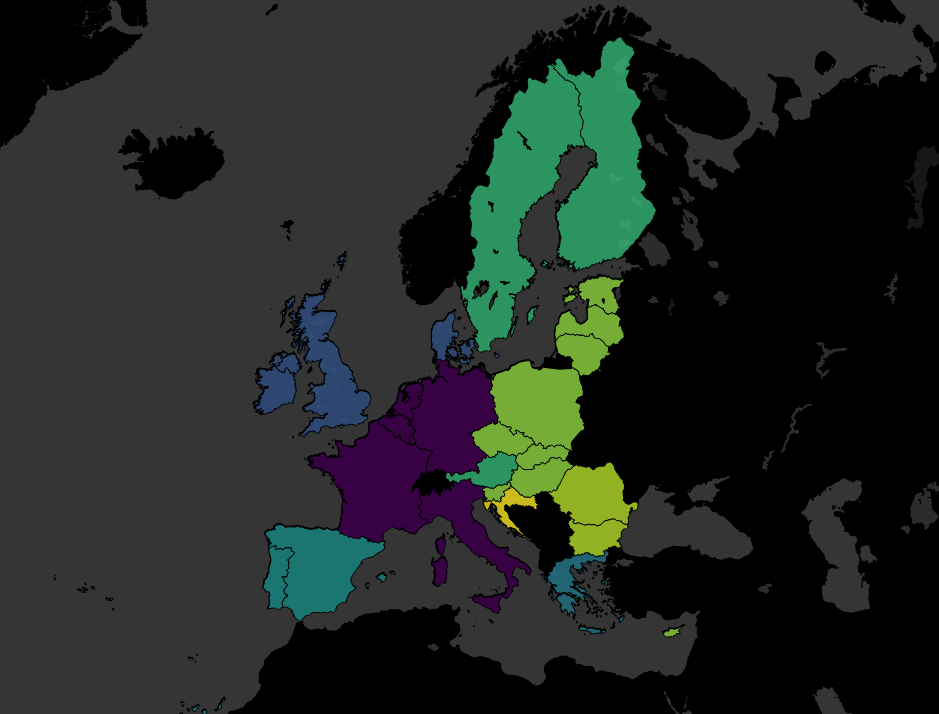
It started with an accident. I had some EU member data, and I was simply trying to make a filled map based on the year each country joined, just to see if it was worth plotting. You know, something like this:
Except that I’d been having a clumsy day (the kind of day where I spilled coffee on my desk, twice), and accidentally missed the filled map option and clicked line instead:
Now, I normally don’t like connected scatterplots, but realised that I could change a couple of things to this accident to make quite a nice connected scatterplot on a map, joining up the central latitude and longitude of each country, so I thought I’d follow through with it and see what happened.
(by the way, the colour palette I use is the Viridis Palette, which I absolutely love. You can find the text to copy/paste into your Tableau preferences file here)
Firstly, I changed my “year joined” field from a discrete dimension into a continuous measure so that I could make it a continuous line with AVG(Year joined):
This connects all the countries by their central latitude and longitude as generated by Tableau, but it joins them up in order from left to right on the map. So, I then added AVG(Year joined) to the path shelf as well, which means that each country is joined in chronological order, or in alphabetical order when there’s a tie (as with Belgium, France, Germany, Italy, Luxembourg, and the Netherlands, who formed the EU in 1958):
I was pretty happy with this; it shows the EU’s expansion eastwards over time far, far better than the filled map did.
I got talking to Mark and Neil online, who introduced me to the idea of “centre of gravity” plots, which show the average latitude and longitude of something and how it changes with respect to something else (usually time). In this case, a centre of gravity plot of the EU would show the average central point of Belgium, France, Germany, Italy, Luxembourg, and the Netherlands in 1958, then the average central point of Belgium, France, Germany, Italy, Luxembourg, the Netherlands, Denmark, Ireland, and the UK in 1973… and so on. I figured it should be easy enough, I’d just take Country off detail, replace it with Year joined, and average the latitudes and longitudes together.
Sadly, it doesn’t work that way. The Latitude (generated) and Longitude (generated) fields that Tableau automatically generates when it detects a geographic field like country can’t be aggregated, and can’t be used if the geographic field they’re based on isn’t in the view. That meant I couldn’t average the latitudes and longitudes over multiple countries without creating lots of different groups.
But, there’s a simple way around this! You can create a text table of the latlongs, copy/paste them into Excel or whatever, then read that in as another data source. Firstly, drag your geographic field into the view, and put the latitude on text, like so:
Then copy and paste it all (I just click on there randomly, hit ctrl+A, ctrl+C, switch to Excel, ctrl-V). Now do the same for the longitude. Save the document, and read it in as a separate data source in Tableau. Now you can blend the data on Country, or whatever your geographic field is, and you’ve got actual latlongs that you can use like proper measures.
And so I did. I recreated the line chart with the new fields, but took Country off detail, and made AVG(Latitude) and AVG(Longitude) into moving average table calculations which take the current value and an arbitrarily high number of previous values (I put in 100, just because). This looked pretty good:
…but then I realised that it wasn’t accurate data. Look at the point for 1973, after the UK, Ireland, and Denmark joined. Doesn’t that seem a little far north?
To investigate it fully, I duplicated the sheet as a crosstab, because sometimes, tables are the best way to go. What I found is that I’ve got a bit of Simpson’s Paradox going on; the calculation is taking averages of averages:
Not so great. If we add Country to the view after the Year joined pill, you can see what it should be:
But the problem is, how do we put Country on detail but then get the moving average to ignore it? I tried various LODs, but couldn’t get it to work exactly – if you have a solution, I would love to hear it! My default approach is to try to restructure the data in Alteryx – because that generally solves everything – but I feel like I’m becoming too reliant on restructuring the data rather than working with what Tableau can do.
Anyway, I ended up restructuring the data by generating a row for each country and year that the country has been a member of the EU. That means I can create a data table like this:
…which removes the need for a moving average calculation entirely, because the entire data is moving with the year instead. Just take country off detail / out of the view, and you get the right averages:
Much more accurate:
This is a better way of structuring the data for this particular instance, because the dataset is tiny; 28 countries, 60-ish years, 913 rows in my Excel file. It’s not going to be a good, sustainable solution for a centre of gravity plot over a much bigger dataset though. I did the same thing for the UN – 193 countries, 70-ish years – and ended up with 10,045 rows in my Excel file. It’s easy to see how this could explode with much more data.
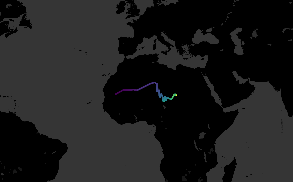
It does look interesting, though; I’d never have guessed that the UN’s centre of gravity hadn’t really left the Sahara since its inception:
Finally, since I was on a roll, I plotted the centre of gravity for the English football champions since the first ever professional season in 1888-89. Conceptually, this was slightly different; unlike the EU and the UN, the champion isn’t a group of teams constantly joining over the years (although it is possible to plot that too). Rather, I wanted to create a rolling average of the centre of gravity over the last N years. If you set it to five years, it’s a bit messy, moving around the country quite a lot:
But if you set it to 20 years, the line tells a nice story. You can see how English football started out with the original northern teams being the most powerful, then it moves south after the Second World War, then it moves north-west during the Liverpool/Manchester era of domination, and finally it’s moving south again more recently:
Many thanks to Ian, who showed me how to parameterise this. Firstly, put your hard-coded (i.e. not Tableau generated!) latitude or longitude field in the view, and create a moving average over the last ten years. Or two, or thirteen, or ninety-eight, it doesn’t really matter. Next, drag the moving average latitude/longitude pill from the rows/columns into the measures pane in order to store it. This creates a calculated field. Meanwhile, create a parameter to let you select a number. This will change the period to calculate the moving average over. Open up the new calculated fields, and replace the number ten/two/thirteen/ninety-eight with your newly-created parameter, remembering to leave the minus sign in front of it:
This will let you parameterise your moving average centre of gravity.
It was a lot of fun to play around with these maps this week. I’ve packaged them all up in a Tableau Public workbook here; I hope you find it as interesting as I did!
I was using my Mahalanobis Distance calculation recently on some of my Spotify listening data, and I ran into difficulty. When I calculated the MD value of one song compared to the benchmark group, it gave me a value of 3.12. Nice. But, when I calculated the MD values of several songs at once compared to the same benchmark group, I got a value of 0.67 for that same song that was 3.12 when calculated individually. The same thing happened for lots of other songs; I got one value when calculating it individually, and another when calculating a whole bunch of them together.
This was weird, and after several hours of diagnosing what was going on, I finally found it. There’s an inconsistency with the Crosstab tool that I’d never noticed before, and this had a critical knock-on effect.
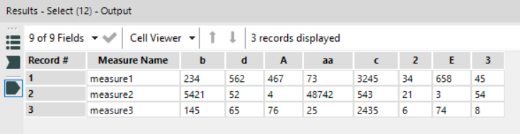
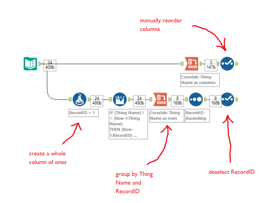
I’ll walk through it step by step with some random data. Here’s the content in a text input tool; note the variety of capitals, lower case, and numbers:
For the MD calculation, what I need is two tables; one where there’s a column for each Thing Name, like this:
And one where there’s a row for each Thing Name, like this:
It should be simple to generate this, but it isn’t because the Crosstab tool orders the Thing Name alphabetically.
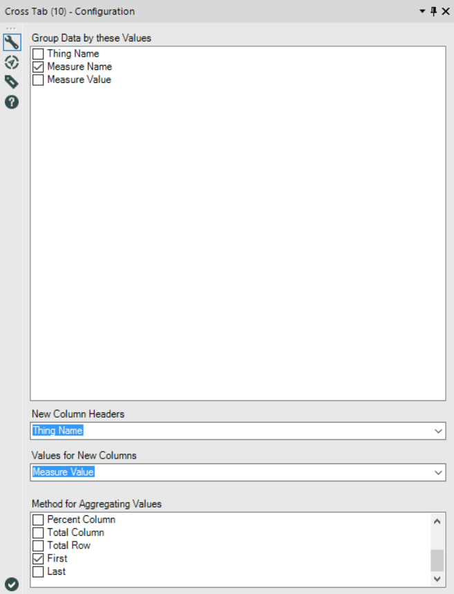
First, let’s see what happens when generating the table with Thing Name as columns. Set the Crosstab tool up like this (for the aggregation, you can choose First, Average, Sum, it doesn’t make a difference with this dataset):
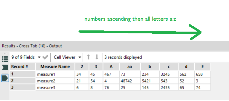
Run the workflow, and this is the output. Note how the output has reordered the Thing Name alphabetically:
It’s put the Thing Names beginning with numbers first, put those in ascending order, then taken all the Thing Names beginning with letters, and put those in alphabetical order a through z.
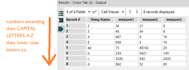
Right. Let’s now look at what happens when generating a table with one row per Thing Name. Set up the Crosstab tool like this (again, aggregation method doesn’t matter):
And here’s the output:
This time, it’s put the Thing Name in the rows in alphabetical order slightly differently. First come the Thing Names beginning with numbers in ascending numerical order as before… but then it’s treating Thing Names beginning with CAPITAL LETTERS and Thing Names beginning lower case letters separately. It runs through the capital-first Thing Names A through Z, and then and only then does it run through the lower case-first Thing Names a-z.
Considering that the MD calculation involves matrix multiplication where it’s assumed that the order of items in the rows and columns is identical, this creates a massive problem down the line!
There are two solutions. One is to CAPITALISE EVERYTHING before even starting, which will probably work in most cases… but if your Thing Names are identical except for case (e.g. if XXX, xXx, and xxX are different variables), it will collapse them together a bit like it does for punctuation. This is not ideal.
The other solution is to use record IDs and manual reordering to ensure that the rows and columns stay in the same order, like this (which is how I generated the first two tables in this blog):
This was an incredibly simple thing that was messing up my calculations, but it took me hours to find. If you’re running into issues – and even if you don’t think you are – check the order of things in your tables!
If you follow football, you often hear about arduous away trips to the other side of the country. This seems to imply that the further an away trip is, the more difficult it is for the away team.
However, is that actually true? Do away teams really do worse when they’ve travelled a long way to get there, or is there no difference?
The football league season has just finished, so I’ve taken each match result from the Championship, League One, and League Two in the 2016-17 season. After some searching, I got the coordinates of each football league team’s stadium, and used the spatial tools in Alteryx to calculate the distance between each stadium. I then joined that to a dataset of the match results, and you can download and play with that dataset here. I stuck that into Tableau, and you can explore the interactive version here.
First, let’s have a look at how many points away teams win on average when travelling different distances. I’ve broken the distance travelled into bins of 25 miles as the crow flies from the away team’s stadium to the home team’s stadium, then found the average number of points an away team wins when travelling distances in that bin (I excluded the games where the away team travelled over 300 miles as there were only two match ups in that bin – Plymouth vs Hartlepool and Plymouth vs Carlisle).
It turns out that it actually seems easier for away teams when they travel further away:
Teams travelling under 25 miles win just under a point on average, while teams travelling over 200 miles win between 1.3 and 1.6 points on average.
This is surprising, but there could be several reasons contributing to this:
Local rivalries. It’s possible that away teams do worse in derby matches than in other matches; this is something to investigate further.
Team bonding. It’s possible that travelling a longer distance together is a shared experience that can help with team bonding.
Southern economic dominance. England is relatively centralised, economically speaking; most of the wealth is in the south. Teams in the South travel further than average to away games, so perhaps the distance advantage actually shows a southern economic advantage; teams in richer areas can buy better players.
Centralisation vs. sparser regions. England is relatively centralised, geographically speaking; most of the population lives in the bits in the middle, and teams in the Midlands travel the least distance on average. Perhaps teams in more centralised areas (e.g. Walsall, Coventry) have more competition for resources like new talent and crowd attendance, while teams in less centralised areas (e.g Exeter, Newcastle) might have less competition for those resources.
I also used Tableau’s clustering algorithm to separate out teams and their away performances based on distance travelled, and it resulted in four basic away performance phenotypes (which you can explore properly and search for your own team here):
Since I had the stadium details, I had a look at whether the stadium capacity made a difference. This isn’t a sophisticated analysis – better teams tend to be more financially successful and therefore invest in bigger stadiums, so it’s probably just a proxy for how good the home team is overall, rather than capturing how a large home crowd could intimidate an away team.
Finally, this heat map combines the two previous graphs and shows that away teams tend to do better when they travel further to a smaller ground. This potentially shows the centralisation issue discussed earlier; the lack of data in the bottom right corner of the graph shows that there are very few big stadiums in parts of the country like the far North West, North East, and South West, where away teams have to travel a long way to get to.
So, it looks like the further an away team travels, the better they tend to do… although that could reflect more complicated economic and geographic factors.
UPDATE: this blog was written for macro inputs, but I’ve now written about a more general, and better, way of sorting them out. If you’re trying to sort out your underscores in your field names, give this blog a go!
I was building an Alteryx app for a client this week, and spent an hour or two tripping up over a really straightforward issue. My workflow worked just fine for a small subset of the data that I was testing it on… but when I fed in the rest of the data, I got this error message:
This isn’t helpful. My data is perfectly clean, thank you very much. I’m not having that. The workflow was working fine for a subset of the data, so there’s no reason it should have tripped up just because more data was added. Or so I thought… but it turns out that Alteryx’s Crosstab tool has a problem with special characters.
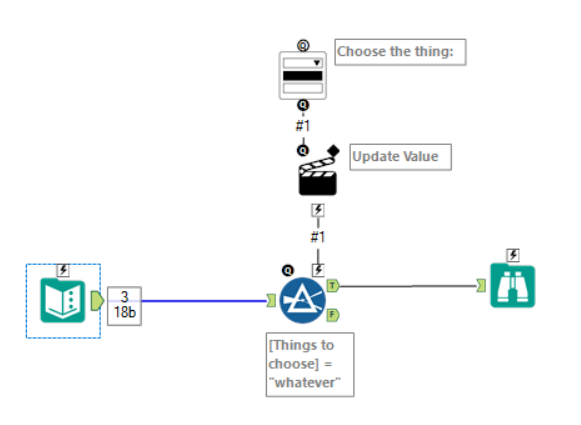
Let’s start from the beginning. I’m building an app with a drop down menu which lets you filter the data to a single value. That looks a little bit like this:
You can manually type in the possibilities in the drop down tool, but if there’s a lot of them (which there generally are), it’s a bit of an arse ache, and it’s not dynamic either in case the data changes in future… so the best option is to populate the drop down menu with the field names of a connected tool:
Irritatingly, there isn’t an option in the drop down tool configuration to take distinct values from the rows of a particular field of a connected tool. This means that you have to take the field where the interesting stuff is and crosstab it, so that all the values become a column heading.
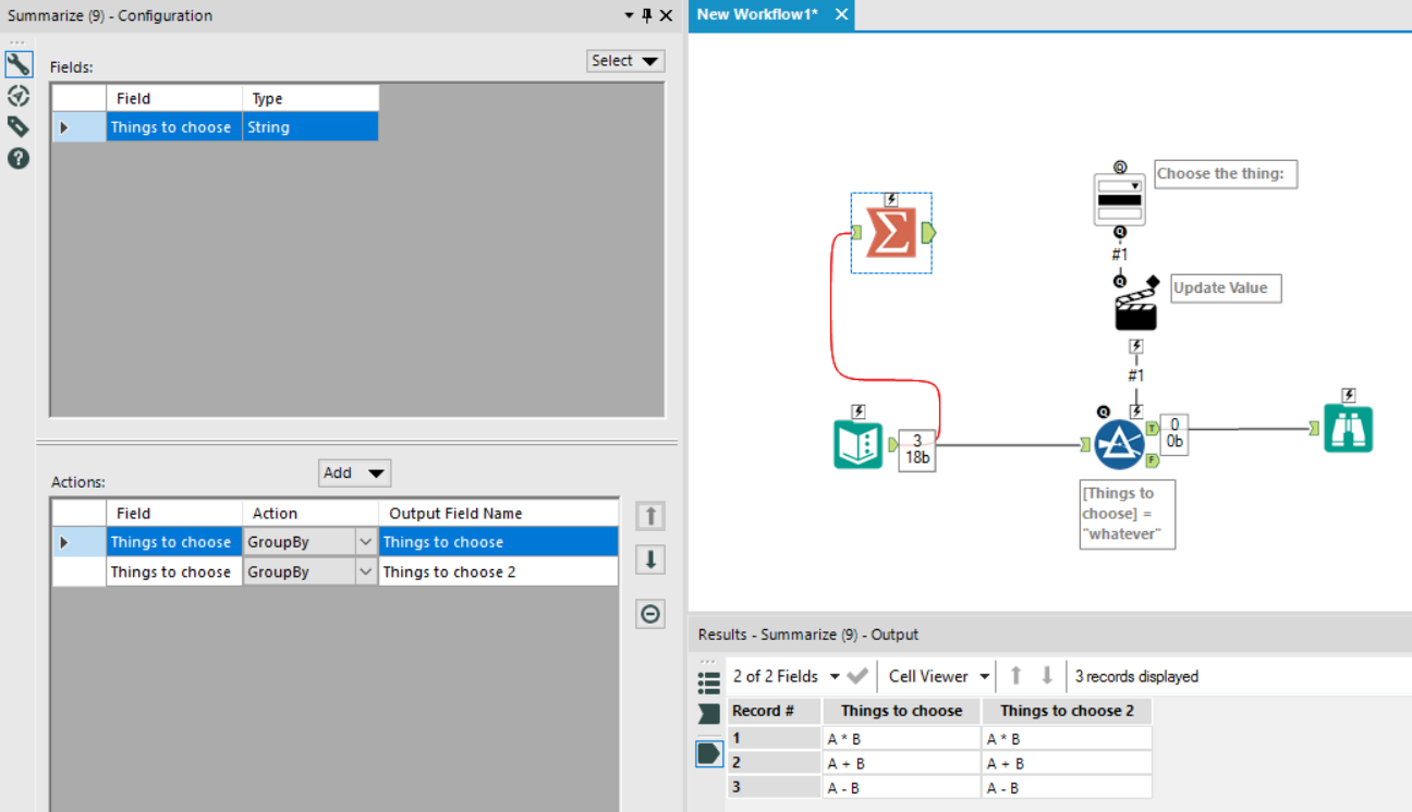
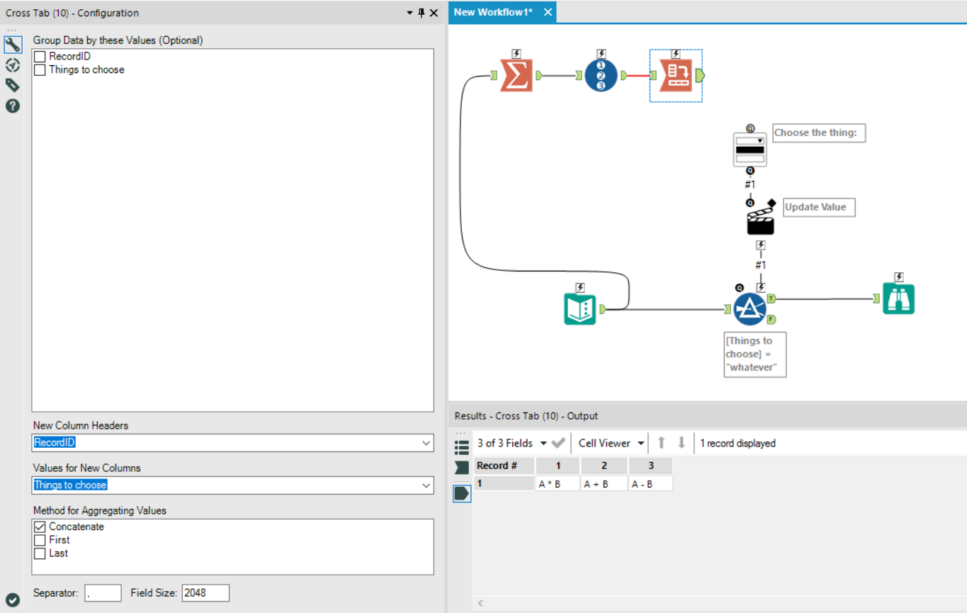
This is pretty straightforward. First, I used a summarize tool and grouped the data by the field which has the values which you want to be in the drop down tool. Then, because you can’t crosstab a single field, I simply grouped by the same field again. That gave me this output:
…and I just crosstabbed it so that I’d get A * B, A + B, and A – B as the field names, and also A * B, A + B, and A – B as the first row of data.
But no:
The warning message is more informative than the error message here. What’s going on with the multiple fields named “A___B”?
It turns out that the crosstab tool automatically changes special characters, like *, +, and -, to underscores in field names. In my subset of data at work, I wasn’t working with any values with special characters in them; but when I brought the rest of the data in, there were values that were textually different, like A * B and A + B, which became the same thing when replacing the special characters with underscores. I’m not sure why it does this; my guess is that it’s something to do with making field names compatible with programmes like SQL and R, which are more restrictive in the characters they allow in field names.
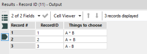
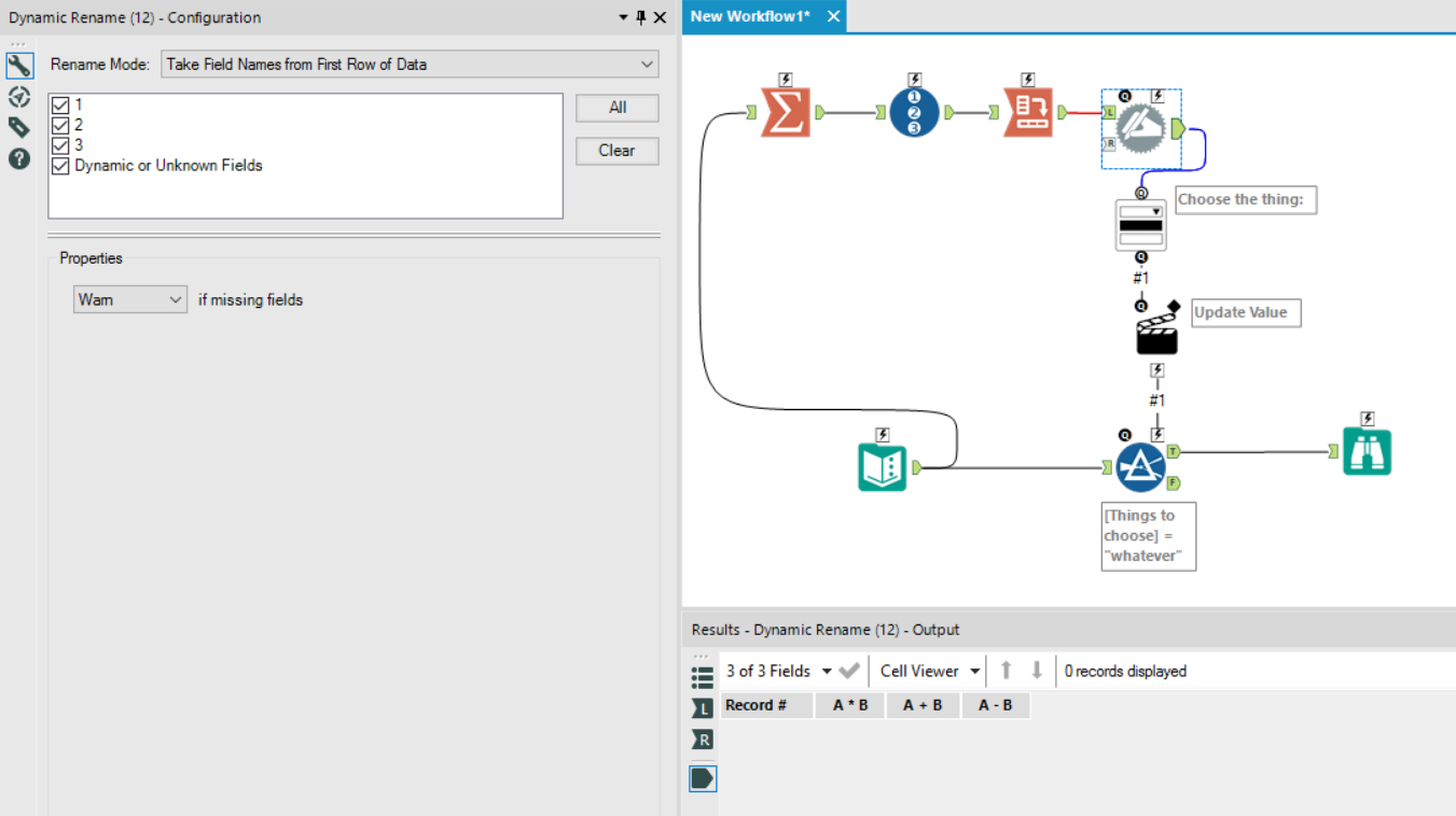
I wasted quite a bit of time trying to work out what was going on here, but luckily, there’s a simple solution. Instead of grouping by the field in the summarize tool twice, just group by that field once. Then, add a Record ID tool in, so that you get something like this:
Now, you can crosstab successfully. Put the Record ID field as the new column headers, and the thing you’re actually interested in as the values:
The next step is to use a dynamic rename tool to take the column names from the first row of data. Unlike the crosstab tool, the dynamic rename tool doesn’t change special characters when assigning new column names:
…and there you go. Now you have an app where the populated drop down menu works with special characters!