I went a little bit viral a couple of weeks ago when I tweeted about chicken shops in the UK which are named after American states which aren’t Kentucky. If I’d thought about it, I’d have written this blog up first, created a Tableau Public viz, and had all kinds of other shit ready to plug once I started getting some serious #numbers… but I didn’t. So, to make up for that, this blog will go through that thread in more detail and answer a few questions I received along the way.
It all started when I walked past Tennessee Fried Chicken in Camberwell, pretty close to where I live. It’s clearly a knock-off KFC, and I wanted to know how many other chicken shops had the same name format: [American state] Fried Chicken.
The first thing to do is to get a list of all the restaurants in the UK. I spent a while wondering how to get this data, but then I remembered that my colleague Luke Stoughton once built a Tableau Public dashboard about food hygiene ratings in the UK. All UK chicken shops – hopefully! – are inspected by the Food Standards Agency. So, Luke kindly showed me his Alteryx workflow for scraping the data from the FSA API, and I adjusted it to look for chicken shops.
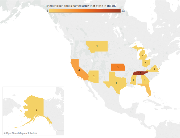
My first line of inquiry is pretty stringent: how many chicken shops in the UK are called “X Fried Chicken” where X is an American state which isn’t Kentucky?
Turns out it’s 34. “Tennessee Fried Chicken” – including variants such as Tenessee and Tennesse – is the most popular with 13 chicken shops. The next highest is Kansas with six, which I’m assuming is so the owners can refer to their shops as KFC, although maybe the owner/s just really like tornadoes, wheat, and/or the Wizard of Oz. Then there’s four Californias, a couple of Floridas, and one each of Arizona, Georgia, Michigan, Mississippi, Montana, Ohio, Texas, and Virginia.
[tangent: I’m aware that a lot of these states aren’t exactly famed for their fried chicken, but as a Brit, all I have to go on for most of them are my stereotypes from American media. But hey, maybe it’s still accurate, and Ohio Fried Chicken tastes of opiates and post-industrial decline, Arizona Fried Chicken comes pre-pulped for the senior clientele who can’t chew so well these days, and Florida Fried Chicken is actually just alligator. Michigan Fried Chicken is, I dunno, fried in car oil rather than vegetable oil, and Alaska Fried Chicken is their sneaky way of dealing with the bald eagle problem up there? I’m running out of crude state stereotypes now, I’m afraid. Out of all these states, I’ve only actually been to California.]
There’s also a “DC Fried Chicken”, which is close but not quite close enough for me, and a “South Harrow Tennessee Fried Chicken”, which I’m not counting because either.
Here is where these American State Fried Chicken shops are in the UK:

Interestingly, this isn’t a case of a map simply showing population distributions. The shops cluster around the London and Manchester regions, but with almost none in any other major urban centre.
Let’s have a look at the clusters separately. Here’s the chicken shops around the Manchester area:
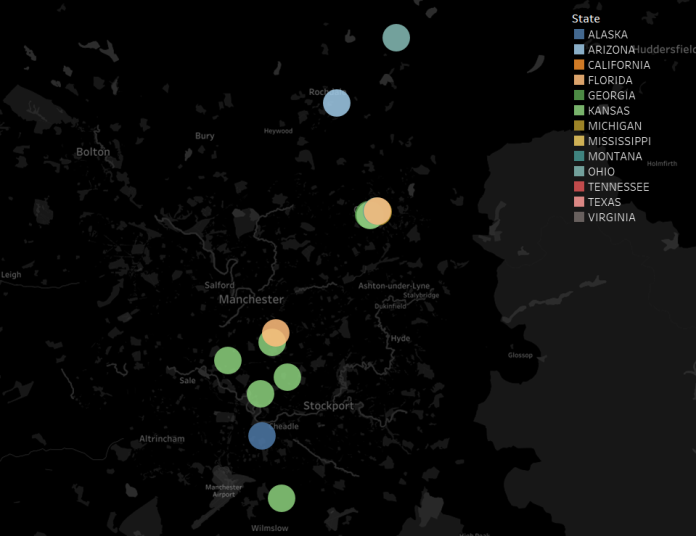
None of them are in the proper centre of Manchester itself, but they’re in the towns around. One town in particular stands out: Oldham. Let’s have a look at the centre of Oldham:
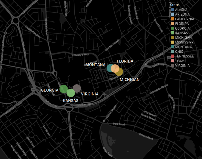
Oldham, you’re fantastic. There are six separate “X Fried Chicken” shops in Oldham, and four of them – Georgia, Michigan, Montana, and Virginia – are the only ones by that name in the whole country.
For comparison, here’s the London area:

This is where all the Tennessees are, as well as the one Texas and Mississippi.
It looks like there’s a lot more variety in the north of England compared to the south, and sure enough, a split emerges:

[chicken icon from https://www.flaticon.com/packs/animals-33%5D
Chicken shops in the south of England (and that one Tennessee place in Wales) tend to name their shops after states in the geographical south of the USA, while chicken shops in the north of England name their shops after any states they like.
This is where my initial Twitter thread ended, and I woke up the next day to a lot of comments like “Y IS THEIR NO MARYLAND THEIR IS MARYLAND CHICKEN IN LEICESTER”. Well, yeah, but it’s not Maryland Fried Chicken, is it?
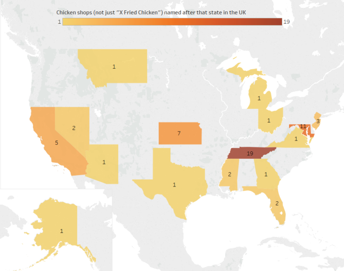
So I re-ran the data to look at chicken shops with an American state in the name. This is the point at which it’s hard to tell if there’s any data drop out; the FSA data categorises places to inspect as restaurants, takeaways, etc., but not as specifically as chicken shops. All I’ve got to go on is the name, so I’ve taken all shops with an American state and the word “chicken” in the name. This would exclude (sadly fictional) places like “South Dakota Spicy Wings” and “The Organic Vermont Quail Emporium”, but it’d also include a lot of false positives; for example, you’d think that taking all takeaway places with “wings” in the name would be safe, but when I manually checked a few on Google Street View (because I’m dedicated to my research), about half of them are Chinese and refer to the owner’s surname, not the delicacy available.
This brings in a few more states – Marlyand, New Jersey, and Nevada:
Let’s have another look at the UK’s south vs north split. We’ve got a bit of midlands representation now, with the Maryland Chickens in Leicester and Nottingham, the Nevada Chickens in Nottingham and Derby, and a California Chicken & Pizza near Dudley. The latitude naming split between the south/midlands and the north isn’t quite as obvious anymore:
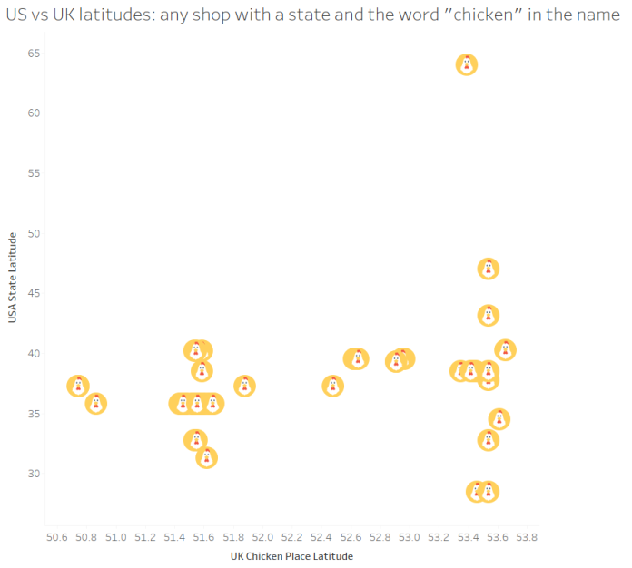
…but, there is still a noticeable difference. This graph shows each chicken shop with an American state and the word “chicken” in the name, ordered by latitude going south to north:

In the south and the midlands, there’s the occasional chicken shop that’s going individual – there’s the Texas Fried Chicken in Edmonton, the two Mississippi places in London which don’t seem to be related (Mississippi Chicken & Pizza in Dagenham, Mississippi Fried Chicken in Islington), the Kansas Chicken & Ribs place in Hornsey is almost definitely a different chain from the six Kansas Fried Chicken shops in and around Manchester, and the California Fried Chicken in Luton is probably independent of the California Fried Chickens on the south coast – but most of them are Tennessee or Maryland chains in the same area. In all, the south and midlands have 17 chicken shops named after 8 American states (excluding Kentucky), or a State-to-Chicken-Shop ratio of 0.47.
In the north, however, there’s a proliferation of independent chicken shops – 15 shops named after 9 different states (excluding Kentucky), or a State-to-Chicken-Shop ratio of 0.6. There’s the chain of six Kansas Fried Chicken places and two Florida Fried Chicken places in Manchester and Oldham, but the rest are completely separate. Good job, The North.
The broader question is: why does the UK do this? There’s obviously the copycat nature of it; chicken shops want to seem plausible, and sounding like a KFC (and looking like one too, since they’re almost always designed in red/white/blue colours) links it in people’s minds. I think there’s more to it, though. Having a really American-sounding word in the name is probably a bit like how Japanese companies scatter English words everywhere to sound international and dynamic (even if they make no sense), or how Americans often perceive British names and accents as fancier and more authoritative (even if to British ears it’s somebody from Birmingham called Jenkins). We’re doing the same, but… for fried chicken.
Finally, since this data is all from the Food Standards Agency’s hygiene ratings, it’d be a shame not to look at the actual hygiene ratings:
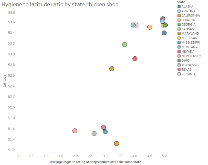
It looks like independently-named chicken shops named after American states in the north are more hygienic. The chains in the south and midlands – Tennessee, Maryland, California, and especially New Jersey – don’t have great hygiene ratings, and the independent shops do pretty badly too. In contrast, the chicken shops in the north score highly for cleanliness. In fact, a quick linear regression of hygiene onto latitude gives me an R2 of 0.74 and a p-value of < 0.0001. Speculations as to why this is on a postcard, please.
Update, November 2018: I’ve finally got round to refreshing the data and putting up an interactive, searchable map. Sadly, it looks like Ohio Fried Chicken has shut down, but there’s another Arizona Fried Chicken now, so… (s)wings and roundabouts. Have a look for (probable) chicken shops in your area here.
Preëmpting your questions/comments:
“I live in […] and my local shop […] isn’t mentioned!”
Maybe you’re talking about a Dallas Chicken place. That’s not a state. Nor is Dixy Chicken, it just sounds a bit American. If it’s definitely a state, then does it have chicken in the name? If not, I won’t have picked it up. I also haven’t picked up shops which have, say, “Vermont Fried Chicken” written on the shop sign if it’s registered in the database as “VFC”. Same with if the state is misspelled, either by the shop or by the data collectors. If it’s all still fine, perhaps the shop is so new that it hasn’t had an inspection… or perhaps the shop is operating illegally and isn’t registered for a hygiene inspection.
“Did you know about Mr. Chicken, the guy who designs the signs?”
I didn’t, but I do now! He’s brilliant.
“How did you do all this?”
I use Alteryx for data scraping/preparation and Tableau for data visualisation.
“I have an idea for something / I want to talk to you about something, can I get in touch?”
Please do! My Twitter handle is @GwilymLockwood, or you can email me on gwilym.lockwood@theinformationlab.co.uk
“Your analysis is amazing, probably the best thing I’ve ever seen with my eyes. Where can I explore more of your stuff?”
Thanks, that’s so kind! There’s a lot of my infographic work on my Tableau Public site here.