Alteryx, data visualisation, football, Tableau

The growing gap between the Premiership’s Top Six and the rest.

This is my first football data blog for a while, and I feel all nostalgic! It’s nice to dive into some league table data again, and even nicer now that I have Alteryx; I was able to format my data about 10x quicker than I was in when I first started doing this in R. Then again, I’ve probably also spent 5x more time using Alteryx than R in the last year or so. Anyway.

I’ve been hearing a lot more analysis of the Top 6 in the Premiership recently. I first noticed it in the last couple of seasons, when I saw a few journalists/people on Twitter writing about a “Big Six Mini-League”. Liverpool often seemed to do quite well at this, and Arsenal often seemed to do quite badly at this. Neither team won the actual league.

I’ve started looking at how the Top 6 sides in the Premiership perform each year (using data from this fantastically well-maintained repository), and there’s quite a few interesting stories in here. The first main point is that the big clubs are accelerating away from the rest of the league. The second main point is that any big six mini-league doesn’t really matter, as you can win the Premiership with an underwhelming record against your main rivals if you trash everybody else. I mean, that shouldn’t be much of a surprise – if you’re a Top 6 team, only 30 points are on offer from matches against your rivals, but you can potentially take 84 points from the 28 matches against the rest of the league.

For all these analyses, I’m taking Top 6 literally – meaning the teams that finish that season in the top six positions. Nothing to do with net spend, illustrious history, shirt sales in Indonesia, or anything like that. I then look at the average points-per-game changes by team, position, season, and Top 6/Bottom 14 status. I also filtered out the first three seasons of the Premiership to keep it slightly easier for comparison, since there were 22 teams in the league until 1995-96.

When plotting the average points-per-game per season between the two groups, a clear trend emerges; the Top 6 are better and better at beating the rest of the league:

1

However, this trend appears to be asymmetrical. When looking at the overall average points-per-game for all games across the season, teams that finish in the Top 6 are getting better, but there’s only a negligible decline for the rest of the league. This suggests the bigger, better teams are pulling away from the rest of the league:

2

This effect is most striking when plotting the difference in overall average points-per-game between the two groups:

3

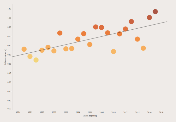
Teams finishing in the Top 6 scored around 0.6 points-per-game more than the rest of the league in the early nineties, but that’s now up to over 1 point-per-game in the latest couple of seasons. That half-a-point difference translates to a 19-point difference across a whole 38-game season.

We can plot each team in each season of the Premiership (since 1995-96, when the league was first reduced to 20 teams) and look at how well they did against the top teams and the rest of the league. In this graph, the straight line represents equal performance vs the Top 6 and Bottom 14:

4

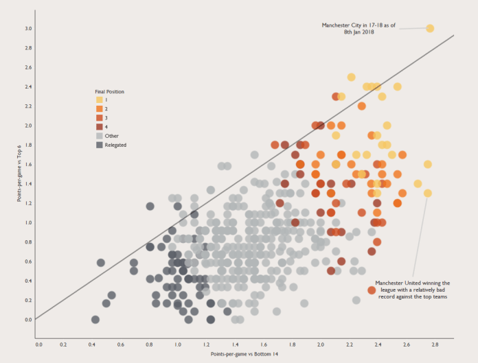
A couple of things stand out:

1. Only a handful of teams have ever done better vs. the Top 6 than the rest of the league. This seems to have no effect on final position.

2. It’s possible to win the league with a poor record against the Top 6 by consistently beating everybody else. Manchester United won the league in 00-01 and 08-09 with only 1.3 PPG vs the Top 6.

3. Manchester City this year are ridiculous.

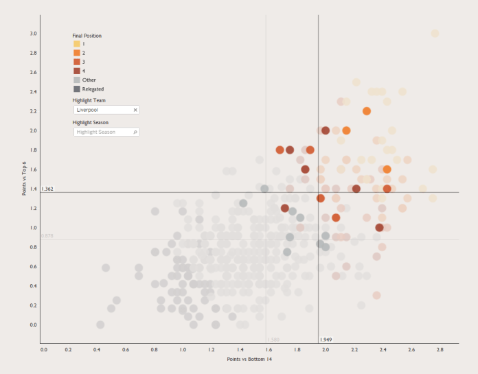
I find it interesting to compare Liverpool and Arsenal over the years. One narrative I sometimes hear is that Liverpool tend to raise their game for big matches, but are too inconsistent the rest of the time, whereas Arsenal struggle against big sides but do well enough in the rest of the league to consistently finish well. This chart seems to bear that analysis out; Liverpool’s cluster of dots are higher on the chart, but further to the left:

6

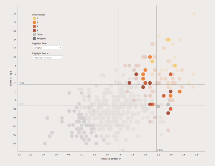
…while Arsenal’s cluster is slightly lower but further to the right… and most importantly, more colourful:

5

And if you want to explore other teams and seasons, there’s an interactive version of all these graphs here.

Standard
Alteryx, football, Maps, Tableau

Centre of Gravity, Metaphorically: Plotting time-based changes on maps

I haven’t written a blog in far too long. My bad. So, to get back into the swing of things, here’s something I’ve been playing with this week: centre of gravity plots.

It started with an accident. I had some EU member data, and I was simply trying to make a filled map based on the year each country joined, just to see if it was worth plotting. You know, something like this:

1 eu filled.png

Except that I’d been having a clumsy day (the kind of day where I spilled coffee on my desk, twice), and accidentally missed the filled map option and clicked line instead:

2 broken line.png

Now, I normally don’t like connected scatterplots, but realised that I could change a couple of things to this accident to make quite a nice connected scatterplot on a map, joining up the central latitude and longitude of each country, so I thought I’d follow through with it and see what happened.

(by the way, the colour palette I use is the Viridis Palette, which I absolutely love. You can find the text to copy/paste into your Tableau preferences file here)

Firstly, I changed my “year joined” field from a discrete dimension into a continuous measure so that I could make it a continuous line with AVG(Year joined):

3 connected line left right.png

This connects all the countries by their central latitude and longitude as generated by Tableau, but it joins them up in order from left to right on the map. So, I then added AVG(Year joined) to the path shelf as well, which means that each country is joined in chronological order, or in alphabetical order when there’s a tie (as with Belgium, France, Germany, Italy, Luxembourg, and the Netherlands, who formed the EU in 1958):

4 connected line year.png

I was pretty happy with this; it shows the EU’s expansion eastwards over time far, far better than the filled map did.

I got talking to Mark and Neil online, who introduced me to the idea of “centre of gravity” plots, which show the average latitude and longitude of something and how it changes with respect to something else (usually time). In this case, a centre of gravity plot of the EU would show the average central point of Belgium, France, Germany, Italy, Luxembourg, and the Netherlands in 1958, then the average central point of Belgium, France, Germany, Italy, Luxembourg, the Netherlands, Denmark, Ireland, and the UK in 1973… and so on. I figured it should be easy enough, I’d just take Country off detail, replace it with Year joined, and average the latitudes and longitudes together.

Sadly, it doesn’t work that way. The Latitude (generated) and Longitude (generated) fields that Tableau automatically generates when it detects a geographic field like country can’t be aggregated, and can’t be used if the geographic field they’re based on isn’t in the view. That meant I couldn’t average the latitudes and longitudes over multiple countries without creating lots of different groups.

But, there’s a simple way around this! You can create a text table of the latlongs, copy/paste them into Excel or whatever, then read that in as another data source. Firstly, drag your geographic field into the view, and put the latitude on text, like so:

5 create table.png

Then copy and paste it all (I just click on there randomly, hit ctrl+A, ctrl+C, switch to Excel, ctrl-V). Now do the same for the longitude. Save the document, and read it in as a separate data source in Tableau. Now you can blend the data on Country, or whatever your geographic field is, and you’ve got actual latlongs that you can use like proper measures.

And so I did. I recreated the line chart with the new fields, but took Country off detail, and made AVG(Latitude) and AVG(Longitude) into moving average table calculations which take the current value and an arbitrarily high number of previous values (I put in 100, just because). This looked pretty good:

6 cog flawed averages.png

…but then I realised that it wasn’t accurate data. Look at the point for 1973, after the UK, Ireland, and Denmark joined. Doesn’t that seem a little far north?

7 cog flawed illustrated

To investigate it fully, I duplicated the sheet as a crosstab, because sometimes, tables are the best way to go. What I found is that I’ve got a bit of Simpson’s Paradox going on; the calculation is taking averages of averages:

8 cog flawed explained.png

Not so great. If we add Country to the view after the Year joined pill, you can see what it should be:

9 what it should be doing.png

But the problem is, how do we put Country on detail but then get the moving average to ignore it? I tried various LODs, but couldn’t get it to work exactly – if you have a solution, I would love to hear it! My default approach is to try to restructure the data in Alteryx – because that generally solves everything – but I feel like I’m becoming too reliant on restructuring the data rather than working with what Tableau can do.

Anyway, I ended up restructuring the data by generating a row for each country and year that the country has been a member of the EU. That means I can create a data table like this:

10 restructured table

…which removes the need for a moving average calculation entirely, because the entire data is moving with the year instead. Just take country off detail / out of the view, and you get the right averages:

11 restructured table 2

Much more accurate:

12 EU cog.png

This is a better way of structuring the data for this particular instance, because the dataset is tiny; 28 countries, 60-ish years, 913 rows in my Excel file. It’s not going to be a good, sustainable solution for a centre of gravity plot over a much bigger dataset though. I did the same thing for the UN – 193 countries, 70-ish years – and ended up with 10,045 rows in my Excel file. It’s easy to see how this could explode with much more data.

It does look interesting, though; I’d never have guessed that the UN’s centre of gravity hadn’t really left the Sahara since its inception:

12 UN cog

Finally, since I was on a roll, I plotted the centre of gravity for the English football champions since the first ever professional season in 1888-89. Conceptually, this was slightly different; unlike the EU and the UN, the champion isn’t a group of teams constantly joining over the years (although it is possible to plot that too). Rather, I wanted to create a rolling average of the centre of gravity over the last N years. If you set it to five years, it’s a bit messy, moving around the country quite a lot:

13 english football 5 years.png

But if you set it to 20 years, the line tells a nice story. You can see how English football started out with the original northern teams being the most powerful, then it moves south after the Second World War, then it moves north-west during the Liverpool/Manchester era of domination, and finally it’s moving south again more recently:

14 english football 20 years.png

Many thanks to Ian, who showed me how to parameterise this. Firstly, put your hard-coded (i.e. not Tableau generated!) latitude or longitude field in the view, and create a moving average over the last ten years. Or two, or thirteen, or ninety-eight, it doesn’t really matter. Next, drag the moving average latitude/longitude pill from the rows/columns into the measures pane in order to store it. This creates a calculated field. Meanwhile, create a parameter to let you select a number. This will change the period to calculate the moving average over. Open up the new calculated fields, and replace the number ten/two/thirteen/ninety-eight with your newly-created parameter, remembering to leave the minus sign in front of it:

15 calc mov avg param

This will let you parameterise your moving average centre of gravity.

It was a lot of fun to play around with these maps this week. I’ve packaged them all up in a Tableau Public workbook here; I hope you find it as interesting as I did!

(title inspiration: Touché Amoré – Gravity, Metaphorically)

Standard