Tableau

Time is money, money is power, power is pizza, and pizza is knowledge.

I’m not proud to admit it. I was recently in a pub and pulled out my phone to calculate the area of a set of pizzas we were ordering. There were two sizes of pizza on the menu – 12″ and 18″, for £12 and £18 each – and my group were going to order five 12″ pizzas.

I couldn’t let that slide.

“Nah, let’s get three 18″ pizzas instead”, I said. “More pizza, less money.”

Intuitively, it feels wrong. Yes, an 18″ pizza is bigger, but surely five 12″ pizzas are more than only three 18″ pizzas? This is when I worked out the total area of the pizzas and their price per square inch, and for the record, buying three 18″ pizzas at £18 gets you 763 sq inch of pizza for £54, whereas buying five 12″ pizzas at £12 gets you 566 sq inch of pizza for £60. We bought the big ones.

This got me thinking about how to visualise this in Tableau, and I created the following handy dashboard for settling your pub pizza problems (click here for desktop version, or here for mobile version):

mobile pizza dash.png

This was a fun one to build, not least because there’s basically no underlying data. I knew I wanted the inputs for the calculations to depend entirely on parameters, so all I needed was the names of the two pizzas. This is the spreadsheet I created:

1

Simple.

The next thing was to create three parameters per pizza; diameter, price, and quantity. The values entered here can be passed to the data with a case statement, e.g.:

2

…or directly within a formula:

3

Things were starting to get complicated, so I built out a table to make sure the numbers were working properly:

4.png

From here on out, it was relatively straightforward. It’s really hard to accurately judge area when looking at circles and squares (which is one of the reasons I hate packed bubbles and tree maps), so I started out by visualising the pizzas as actual circles vs. bar graphs.

This makes the two pizzas look relatively similar in size:

5.png

…whereas this shows that one of them is more than double the other:

6

One useful little trick I found was to create a calculated field to place the two pizza icons in specific places:

9.png

This spaced them out nicely rather than piling them on top of each other or putting them side by side and too close together:

10.png

The most fiddly bit was creating the text summary. I dragged a lot of calculated string fields onto the label shelf, and configured it like this:

8

And an example of some of the fields going into making a sentence which automatically updates is the best pizza deal field here:

7

I really enjoyed playing around with this viz. People who use Tableau often talk about liberating your data, but this was a nice exercise in what’s possible with basically no data at all!

April pizza

Standard
Tableau

Paint your target: how to create a bullseye graph in Tableau

Ever thought of tracking whether something’s hitting the target by showing an actual target? I was looking through some old radial blogs recently, and realised you could use a scatterplot on x-y coördinates to show accuracy on a bullseye target.

(to cut straight to the viz on Tableau Public, go here; to find out how to create it, keep reading!)

For example, you could set up an image of a target a bit like this as a background image:

1

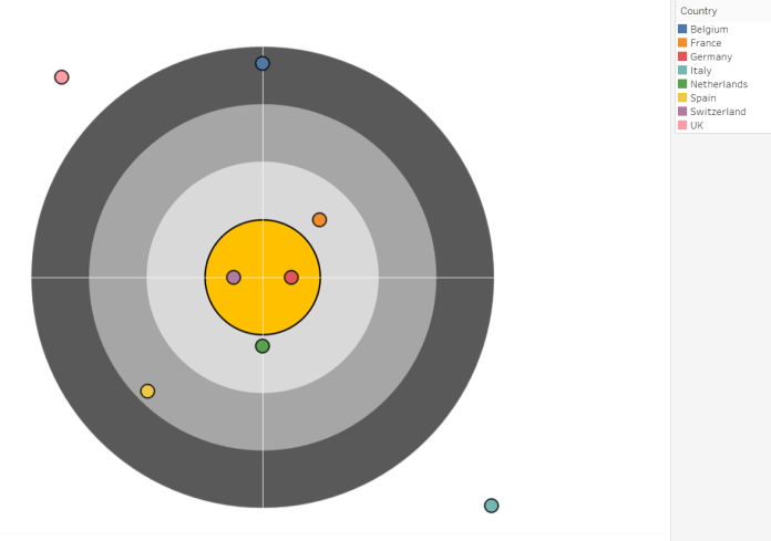
…and plot simple x-y points in Tableau over the top to show how close people/departments/countries are to meeting their target:

10

I used MS Publisher to design these concentric circles in the background image because when you select them all and save as an image, it doesn’t save the blank space as white, so you can use it with any colour worksheet or dashboard. Feel free to download this target image here (and if you use it, give me a shout! I’d love to see what kind of cool things you’re using it for).

Sadly, Superstore doesn’t have target data on it, so I’ve mocked up a quick dataset of sales and target sales per country as follows:

2

The next thing to do is calculate the “accuracy” on the bullseye; the nearer the sales figure is to the target, the closer to the middle of the bullseye it should be. However, once you’ve met or exceeded your target, you don’t want the points to keep moving. Countries with sales at 101% of the target and at 300% of the target should both still be in the middle.

The exact middle of the target is going to be at coördinates (0,0), which means that we actually want to create a field which takes some kind of inverse of the accuracy, where the greater the accuracy, the smaller the number in that field.

3

So, let’s create the following calculated fields. I’ve adapted them a bit from this blog on radial bar charts so that you can put the X field on columns and the Y field on rows, which is more intuitive.

Accuracy:

IF [Sales] > [Target] THEN 1.05
ELSE [Sales] / [Target]
END

Radial Field:

1.1 - [Accuracy]

Why have I set the Accuracy equaliser bit to 1.05 instead of 1? And why have I set the Radial Field calculation to 1.1 instead of 1?

Well, it’s a bit fiddly, but it’s about plotting. I want everything where Sales is 100% of Target or more to be in the gold bullseye, so I want that to fill a certain amount of space. If I set the Accuracy equaliser bit to 1 and the Radial Field calculation part to 1, then it plots everything that’s at 100% or more at (0,0) and includes everything that’s 90% or more in the gold bullseye. I want to space out the 100% or more points so that they’re not on top of each other, and I want only the 100% or more points to be included in the gold bullseye. Setting the Radial Field calculation part to 1.1 makes it so that the edge of the gold bullseye denotes 100%. That means that the 100% or more points will be plotted on the edge of the bullseye. So, the 1.05 part in the Accuracy calculation moves those points further inside the bullseye, but not into the exact middle where they’ll be on top of each other.

While I’m at it, there’s a limitation to the Accuracy calculation. Have you spotted how it’s [Sales] > [Target] rather than SUM([Sales]) > SUM([Target])? This is because the angle calculation needs to aggregate the Radial Field further, and will break if the Accuracy or Radial Field calculations are already aggregated. This means that you’ll probably need to do some data processing to make sure that it’s just one row per thing in the dataset.

The next fields to calculate are:

Radial Angle:

(INDEX() -1 ) *
(1/WINDOW_COUNT(COUNT([Radial Field])))
* 2 * PI()

X:

MAX([Radial Field]) * SIN([Radial Angle])

Y:

MAX([Radial Field]) * COS([Radial Angle])

Now you can drag X onto columns, Y onto rows, and put Country on detail:

4

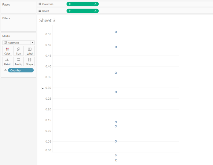
This looks pretty rubbish, but that’s because the INDEX() function in the Radial Angle calculation is a table calc, and Tableau needs to know how to compute it. Edit the X and Y fields to compute using Country instead:

5

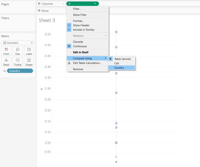
…and now you’ll get some points spaced out properly:

6

The calculations mean you can plot the points in a radial way; it’ll go through whatever field you’ve put on detail, and plot the points the right distance away from the centre, starting at 12 o’clock and looping round clockwise. With Country, it’s done alphabetically, so Belgium is on the X axis zero line. If you want to order the points differently, you can add a numeric field to the detail shelf, and change the table calculation to compute using that numeric field (but make sure to keep Country there!).

The next thing to do is to put the target in as a background image. Confusingly, this is under the Map options. Once you’ve found it, you have to specify exactly where the background image is going to sit on the x-y grid of coördinates. With this target, there are four concentric circles, denoting 70%, 80%, 90%, and 100%+. Because I set the Radial Field to be 1.1 – [Accuracy], there’s a distance of 0.1 in a circle around point (0,0) and the edge of the bullseye denoting 100%. That means that the bullseye section is going to run from -0.1 to 0.1 on both axes. Counting backwards, there are three other circles which are the same thickness; the light grey one denoting 90% will run from -0.2 to 0.2 on both axes, the mid grey one denoting 80% will run from -0.3 to 0.3 on both axes, and the dark grey one denoting 70% will run from -0.4 to 0.4 on both axes. As the edge of the dark grey circle is the edge of the background image, this is where you need to tell Tableau to position the background image:

7

Click OK, and there we are! A nice target, with the different points on it:

8

You can change the formatting to remove the zero lines if you like:

9

…but I actually kinda like them on this graph. I’ve also put Country on the colour shelf, and made the borders around the circles black.

10

I haven’t seen this approach before, so I’m not really sure what to call it. I’ve plumped for a bullseye graph, but maybe it already exists under another name. Let me know if somebody else has covered this, and definitely let me know if you find this useful! You can download the Tableau workbook I used to make this example here (it’s 10.2, by the way, but the same approach should work for older versions).

Standard
Alteryx, football, Tableau

The relationship between away team performance and distance travelled in the English football league

If you follow football, you often hear about arduous away trips to the other side of the country. This seems to imply that the further an away trip is, the more difficult it is for the away team.

However, is that actually true? Do away teams really do worse when they’ve travelled a long way to get there, or is there no difference?

The football league season has just finished, so I’ve taken each match result from the Championship, League One, and League Two in the 2016-17 season. After some searching, I got the coordinates of each football league team’s stadium, and used the spatial tools in Alteryx to calculate the distance between each stadium. I then joined that to a dataset of the match results, and you can download and play with that dataset here. I stuck that into Tableau, and you can explore the interactive version here.

First, let’s have a look at how many points away teams win on average when travelling different distances. I’ve broken the distance travelled into bins of 25 miles as the crow flies from the away team’s stadium to the home team’s stadium, then found the average number of points an away team wins when travelling distances in that bin (I excluded the games where the away team travelled over 300 miles as there were only two match ups in that bin – Plymouth vs Hartlepool and Plymouth vs Carlisle).

It turns out that it actually seems easier for away teams when they travel further away:

Teams travelling under 25 miles win just under a point on average, while teams travelling over 200 miles win between 1.3 and 1.6 points on average.

This is surprising, but there could be several reasons contributing to this:

  1. Local rivalries. It’s possible that away teams do worse in derby matches than in other matches; this is something to investigate further.
  2. Team bonding. It’s possible that travelling a longer distance together is a shared experience that can help with team bonding.
  3. Southern economic dominance. England is relatively centralised, economically speaking; most of the wealth is in the south. Teams in the South travel further than average to away games, so perhaps the distance advantage actually shows a southern economic advantage; teams in richer areas can buy better players.
  4. Centralisation vs. sparser regions. England is relatively centralised, geographically speaking; most of the population lives in the bits in the middle, and teams in the Midlands travel the least distance on average. Perhaps teams in more centralised areas (e.g. Walsall, Coventry) have more competition for resources like new talent and crowd attendance, while teams in less centralised areas (e.g Exeter, Newcastle) might have less competition for those resources.

I also used Tableau’s clustering algorithm to separate out teams and their away performances based on distance travelled, and it resulted in four basic away performance phenotypes (which you can explore properly and search for your own team here):

Since I had the stadium details, I had a look at whether the stadium capacity made a difference. This isn’t a sophisticated analysis – better teams tend to be more financially successful and therefore invest in bigger stadiums, so it’s probably just a proxy for how good the home team is overall, rather than capturing how a large home crowd could intimidate an away team.

Finally, this heat map combines the two previous graphs and shows that away teams tend to do better when they travel further to a smaller ground. This potentially shows the centralisation issue discussed earlier; the lack of data in the bottom right corner of the graph shows that there are very few big stadiums in parts of the country like the far North West, North East, and South West, where away teams have to travel a long way to get to.

So, it looks like the further an away team travels, the better they tend to do… although that could reflect more complicated economic and geographic factors.

Standard
Tableau

The Colour Revolt: using rank calculations to get around Tableau’s colour defaults

Tableau’s colour palettes are generally pretty good, pretty flexible, and pretty… well, pretty. But sometimes you want to colour-code a dimension with more values than the number of colours in the palette, and this is when Tableau has a bit of a problem.

This blog is about how Tableau assigns colours, how that messes some things up, and how to get around that.

I’m working with the Global Indicators dataset in Tableau 10.2 here. Let’s say I want to plot each country’s CO2 emissions each year. Without using colours at all, we get this:

1

Not exactly ideal, so I’ll put the Country dimension on the colour shelf. But before I do, I’m just going to take the CO2 Emissions measure off the view so that we can see how Tableau assigns colours to values in a dimension:

2

Tableau takes all values in the dimension in order, and loops through the colour palette (in this case the 20-shaded automatic palette), assigning the colours in order and restarting every 20 values.

As there are about 200 countries but only 20 colours, ten or so countries will be represented by the same colour. This might not be a problem, depending on what we’re plotting, but then again, it might. Let’s put the CO2 Emissions measure back into the view:

3

Yeah, it’s a problem. It just so happens that China and the USA are a multiple of 20 apart in the dimension list, so they’ve been assigned the same brown colour. This is a problem.

Even more irritatingly, Tableau assigns the colour palette to all possible values in the dimension before you filter them. So, if I change the filter so that it only has China and the USA…

4

…they’re still the same colour.

How can we assign colours to only the countries selected by the filter in the view, rather than all countries?

One solution (thanks Anna for the tip!) is to create a calculated Rank() field, which will only look at the countries in the view. I’ll stick with a default rank of the countries themselves for now, which will do it alphabetically, but you can also do it by how they do on a particular measure.

5

Make this new calculated field discrete, and drag it onto the colour shelf. You’ll also need to separate out the countries by putting Country on detail (which was previously done automatically when Country was on colour).

6

This has changed the colours… but they’re still the same. This is because Rank() is a table calculation, and we need to change its default settings. Instead of compute using Table (across), compute using Country:

7

This now ranks the countries alphabetically (in reverse order, but it doesn’t really matter for this purpose) and assigns a different colour to each of them:

8

Now we have nicely distinguishable colours for dimensions with loads of values when we actually only want to plot a handful!

The colour marks card is a bit annoying, though; it only shows the rank number next to the colour, not the country name. You can get around this by creating a new sheet, applying the country filter to that sheet too, and just putting Country in rows:

9

You can now use this second sheet as a colour legend in a dashboard.

Of course, you might suggest that a simpler solution to the colour problem is to forget about colours altogether and just use labels on the lines. And you’d be totally correct! But maybe you’ve got a more complicated plot where you’ve got several different values for the same country or something. Like a scatterplot of two measures with a circle for each year:

10

Labels would look pretty hideous on this, especially if the circles overlapped a lot. But the Rank() colour workaround still applies.

Standard
Tableau

If data is a supermarket, Tableau is a self-checkout machine

I’ve been helping to introduce Tableau to people who are used to getting their data by putting their query through IT and then plotting it in Excel when they get the extract hours or days later. It can be hard to convince people to use it; some say the current system works okay already, others say they don’t want to learn something new which might be difficult, others say they’ve tried it but it doesn’t work perfectly. While working on this, we came across a great analogy for Tableau, what it’s for, and why we’re getting people to help themselves by using it. It’s long and a bit convoluted, but it fits most businesses pretty well:

Remember a few years ago when self-checkout machines turned up at the supermarkets? You’d stand in line for the regular checkout, looking at the new machines, but you didn’t use them because you didn’t know how, and nobody else was sure either. And even when people did start to use them, there were teething problems; every so often there’d be an item it didn’t recognise, or an item too light for the bagging area to detect, so the process would break and it felt like the whole thing was worse than the old checkouts.

But the more you used them, the more errors happened, and the better the self-checkouts got by learning from those errors. Now, they work really smoothly, much faster than going through the old checkouts. And remember, just because things seemed to work in the old checkouts, that doesn’t mean that they did. I often bought a bag of apples but got charged too much because the cashier thought it was a more expensive variety, like I’d buy Braeburns but get charged for Pink Ladies. That’s an error in the process, but you wouldn’t know if you didn’t check your receipt with an expert eye anyway. And how often does something go wrong and the cashier calls over somebody else? It was never a smooth process to begin with, you’re just used to its flaws.

That’s the difference between opening a ticket with IT and going through their queue, and getting the data you need yourself. We’re the people who hover round the self-checkouts, ready to help if there’s an issue. It’s a bit daunting at first, but just try it out; scan your stuff, see how it works, and we’ll be there as soon as you’ve got an unexpected item.

This analogy has been really useful for helping contextualise Tableau as a way of working that speeds up their day, rather than an additional tool to learn that slows down their day.

If you’ve got any similar analogies, I’d love to hear them!

Standard