

I made a clock in Tableau this week, and you can find it on Tableau Public here.

It always shows the current time for the UK, but it shouldn’t be hard to parameterise to update to whatever time zone you’re in.
Essentially, all it is is two points on a scatterplot, connected by lines to the coördinates (0,0), and superimposed on a background image. I made the background image in Powerpoint, based on the clock in the Time episode of Don’t Hug Me I’m Scared.
I’ve written before about using radial calculations to plot distance from the centre and change the lengths while keeping the angles constant. This time, we’re going to change up the trigonometry a bit, and calculate the angle while keeping how far the line goes constant.
Firstly, though, we need some data to work with. All you need to get a DateTime is a single cell in a single column… but for plotting purposes, we’re going to need the following dataset:
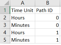
That’s all we’ll need! Read that into Tableau, and the rest can be done with calculated fields.
Firstly, we need to find out what the time is. Tableau has the NOW() function, which is really useful. It returns the exact time, down to the second, of the time on your computer (assuming that you’re working in Tableau Desktop with an Excel sheet you’ve created just for this). But when it’s published on Tableau Server, it returns the time of the Tableau Server Data Engine, which seems to be eight hours behind UK time (as of 19th September 2017, when I’m writing this; I’ve no idea how daylight saving changes will affect it).
So, let’s create our Right Now field, and add eight hours to it with the DATEADD() function so that it’ll give us the UK time when published:
Right Now:
DATEADD('hour', 8, NOW())
The next step is to take Right Now and parse out the time parts that we want to plot. Let’s just go with hours and minutes; plotting seconds is possible, but it’ll look like it’s not working if the dashboard isn’t updating every half second or so. So, let’s create an Hours field and a Minutes field as follows:
Hours:
DATEPART('hour', [Right Now])
Minutes:
DATEPART('minute', [Right Now])
This will give the current hour and the current minute as a number. There’s an extra step we need to take, though… the hour hand on a clock doesn’t point at the exact hour number for the whole of the hour, it moves around depending on the minutes that have passed. If it’s half past ten, the hour hand doesn’t point at ten exactly, it points about halfway between the ten and the eleven.

So, let’s create another field called Exact Hour for the exact point between hour marks to plot:
Exact Hour:
[Hours] + ([Minutes] / 60)
This works by giving us the hour (e.g. 6 for 6pm), and then adding the amount of the hour that we’ve got through. For example, if it’s 6.15pm, the number of minutes is 15, and we’re quarter of the way through the hour. 15/60 = 0.25, so the point where the hour hand will point to is 6.25, i.e. quarter of the way from 6 to 7.
After that, we need to create a single field to plot. This is why the underlying data has the Time Unit field, with separate rows for each hand.
Time for plotting:
IF [Time Unit] = "Hours" THEN

[Exact Hour]

ELSE

[Minutes]

END
Now that we have our field to plot, we’re ready to do some trigonometry!
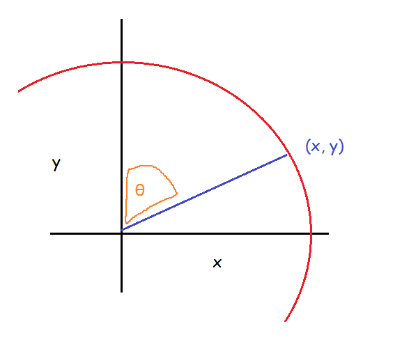
We know that we want the clock hands to begin at (0,0) on the scatterplot; what we need to work out is where the clock hands need to end. To be able to plot the X and Y coördinates of where the hands end, we first need to know the angle of the line from (0,0). In simple terms, the scatterplot works like this:

Finding the angle is fairly simple. There are 360° in a circle, and rather conveniently, a clock face is just a big old circle, starting with 0° from the centre at the 12 o’clock position. There are 12 hour points that go round the clock face, so if we want to find out the hour hand’s angle, we divide the hour value by 12 to find out how far around 360° it is, then multiply that fraction by 360. For minutes, the same thing holds, but there are 60 points instead of 12.
Angle:
IF [Time Unit] = "Hours" THEN

([Time for plotting] / 12 ) * 360

ELSE

([Time for plotting] / 60 ) * 360

END
“But wait!”, I hear you shout at the screen. Dividing the hour by 12 might work for the morning, but what about when it’s the afternoon, when Tableau’s DATEPART() function will return the number 18 for 6pm, as it works on a 24 hour format?
You’re completely right, I haven’t accounted for that. But I don’t really need to. If it’s 6pm, the hour is 18. 18/12 is 1.5, and multiplying that fraction by 360 gives us 540°. Sure, 540 is bigger than the 360° that are in a circle… but the wonderful thing about circles is that they’re, well, circular. Plotting 540° on this clock face will look identical to plotting 180°. If it bothers you that they’re not technically the same, feel free to add an IF clause to identify the afternoon and then subtract 12 hours from the Exact Hour field.
Now that we’ve got the right angles, we can calculate where the coördinates go. This is a bit more tricky.
The first thing to bear in mind is that I’ve changed the trigonometric functions to reflect how Tableau will actually plot the angles, rather than using the standard ones in maths textbooks.
Maths textbooks will tell you that to find the coördinates (X,Y) on a circle, given the angle θ and a radius of 1 from the centre point (0,0), the equations are Y = Sin θ and X = Cos θ. I’m not going to go into why or how here, but please just trust me on this one and take it at face value. Y = Sin θ and X = Cos θ.
Those maths textbooks will also give you a diagram like this:

But this isn’t what we have; we have this angle instead:
…so using the exact same calculations won’t quite work for us here, because they calculate it relative to a different axis. But, we can still use the earlier diagram to help us work it out; we just need to rotate it and flip it a bit until we have what we need:

This looks like the angle we’re trying to work out, right?
This means that our X axis is the Y axis in the canonical diagram, and our Y axis is the X axis in the canonical diagram. Let’s just rename the two axes so X goes along the bottom and Y goes up and down again:
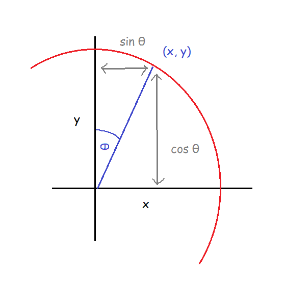
Now, for us, X = Sin θ and Y = Cos θ. Nice.
That’s all well and good, but there’s another step before it’ll actually work in Tableau. We’ve calculated our angle in degrees (because that’s what everybody learns at school first, and that’s still what’s the most intuitive thing for me). Thing is, Tableau uses radians with trigonometric functions. When we use radians, 360° is equivalent to 2π… which means that 1° is equivalent to π/180. So, we can still use our angle field, we just have to multiply it by π/180 (radians is another thing that you’ll just have to take my word on for now, I’m afraid; just remember that π = 3.14159… and so on, and π also = 180°).
Finally, we want our clock hands to be different lengths. To do this, you can take the equations and multiply them by a constant. Through trial and error, I found that I liked it best when the minute hand was 1.6x the length of the hour hand, so I multiplied the equations by 1.6 when it was for minutes and by 1 when it was for hours, just to keep it consistent.
The fields are:
X:
IF [Path ID] = 1 THEN

IF [Time Unit] = "Minutes" THEN

1.6 * SIN([Angle]* PI() / 180)

ELSE

1 * SIN([Angle]* PI() / 180)

END

ELSE 0

END
Y:
IF [Path ID] = 1 THEN

IF [Time Unit] = "Minutes" THEN

1.6 * COS([Angle]* PI() / 180)

ELSE

1 * COS([Angle]* PI() / 180)

END

ELSE 0

END
If you’re wondering why Path ID matters, it’s about connecting the lines to the dots. What we need is to have the lines start at (0,0) and end at (X,Y), but we still need to tell Tableau that the starting point is (0,0) where Path ID = 0.
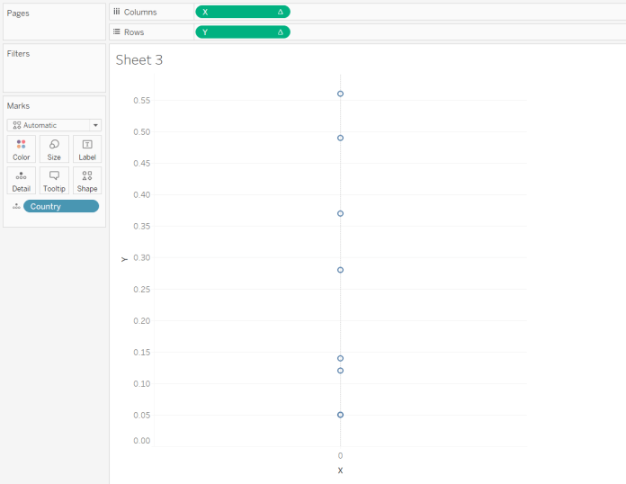
That’s a lot of trigonometry, but we’re finally done! All you need to do now is to drag SUM(X) to columns and SUM(Y) to rows, and put Time Unit on detail. This will give you two circles. Drag SUM(Y) to rows again, and change it to line. Put Path ID on the Path shelf. Then dual axis the two SUM(Y) fields, and synchronise axes.
This probably doesn’t quite look right yet, because you have to make sure that you fix both the X and Y axes to be between the same range; I’ve fixed both of mine to go from -2 to +2, which has worked out nicely.

That’s it for making the clock! But there’s even more fun to be had in the final step, which is playing around with background images. I found a lot of beautiful handless clock faces online, but most of them have copyright restrictions, so I’m not going to use those. Instead, I went for an homage to Don’t Hug Me I’m Scared, a youtube series with probably my favourite animated clock character of all time. At some point, I might try it out with my own face and see how horrific that looks.
I hope this helps! It was really fun to build and write about. Please leave me a comment if you have any questions, and I’ll do my best to answer.
(title inspiration: Time is a Machine – Listener)


