Uncategorized

How clock changes work in the UK and what it means for your data processes

Twice a year, clock changes in the UK cause mild chaos. The extent of this chaos depends on your computer settings, your remote desktop/server settings, and how exactly you’ve set stuff up to figure out what the time is.

We normally describe it by saying that the clocks go forward at the end of March, and the clocks go back at the end of October. I don’t find this particularly intuitive; it doesn’t actually address what we’re doing or why, it just describes what you need to do with your watch.

I think it’s easier to think of it not as the clocks changing, but as the whole country shifting time zones, because that’s what we’re actually doing.

What’s the time?

Firstly, though… what’s the time?

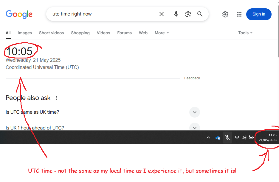
As I write this, sitting in the office in Leeds, the UK, it’s about 11am on 21st May 2025. Thing is, yes, that’s the time, but it’s just my local definition of the time. To help with understanding time zones, we need to know The Time.

This is UTC, or Coordinated Universal Time. UTC isn’t just the time. UTC is The Time, and it’s the same wherever you are. Try googling it:

We could simply sack off the concept of time zones and run everything off UTC. The world of data would be a lot easier if we did and it’d save me a load of hassle at work.

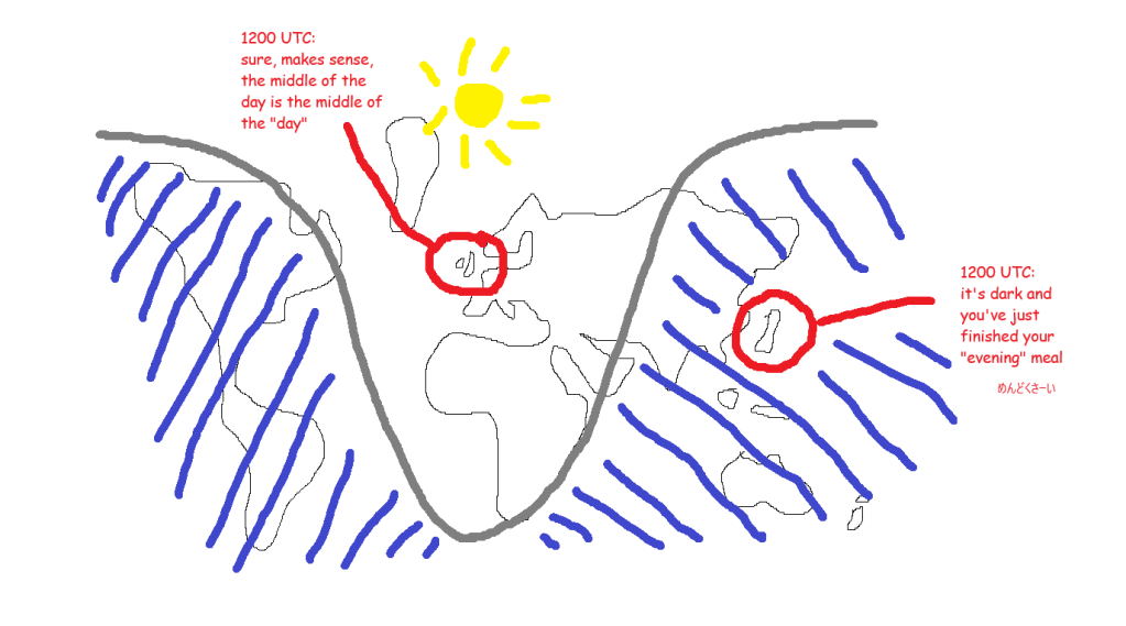
But, this is a rubbish idea. Culturally, we’re used to the time being something meaningful about when it’s light and when it’s dark. The whole point of “AM” is that it means “before the middle of the day where the sun as at its highest point” and “PM” means “after that”.

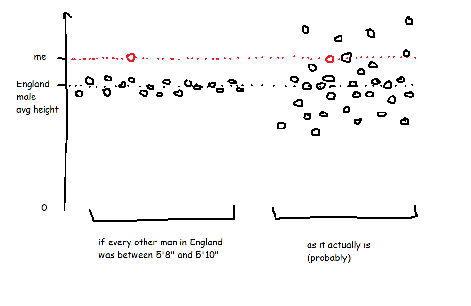
If we ran everything off UTC, then “midday” in the UK would be grand, but “midday” in Japan would be a few hours after the sun has set. Also, “midnight”, when the date changes, would be around when people are starting work or school. You’d get on the school bus on Tuesday at 2315, get to school, and start Maths at “midnight” on Wednesday. Not a great way to run things. This very much not-to-scale diagram shows what that’s like during the northern hemisphere summer:

What are time zones?

So, each country (or each region of big wide countries) chooses what they want the time to be in that country, based on what makes sense for daylight in that country. Luckily, everybody around the world is pretty much in agreement that you generally want “midday” i.e. 1200 to be around the time that the sun is at its highest point and you want the date to change from Tuesday to Wednesday overnight.

You do this by setting the time where you are relative to The Time, i.e. relative to UTC.

It’s easier to explain time zones using places far away from the UK because it’s more obvious why you’d do it. If Japan used UTC time for everything, then, as I’m writing right now, 11am UTC time on 21st May 2025, the time in Japan would be 11am on 21st May 2025 but everything would be dark because the sun has already gone down.

In Japan’s case, they’ve looked at the clocks and the daylight and thought “we want the time here to be 9 hours ahead of the UTC time, so the time in Japan is UTC+9, which means that when it’s midday UTC, it’s 9pm here, which makes much more sense than just using UTC time like in Gwilym’s diagram above”. This time zone is called Japan Standard Time, or JST.

South Korea have done the same thing (Korea Standard Time, KST), as have North Korea (Pyongyang Time, PYT), Palau (Palau Time, PWT), Timor-Leste (Timor-Leste Time, TLT), most of the Sakha Republic in Russia (Yakutsk Time, YAKT), and some of Indonesia (Eastern Indonesia Time, WIT). These are all individual time zones defined by being UTC+9, and you can kind of think of them as all living in one super time zone UTC+9. At least, I do.

In the UK, UTC already aligns almost exactly with what we want. Midday UTC is pretty much at the sun’s highest point. Midnight is pretty much at the midpoint between when the sun goes down and when it comes back up again. So, we could just use UTC as the time by creating a time zone where the time is UTC+0.

However, there is no single UK time zone. We switch between UTC+0, which we call Greenwich Mean Time or GMT, and UTC+1, which we call British Summer Time, or BST. Because of this, sometimes people think that UTC and GMT are the same thing. They’re not; they give you the same end result, but GMT is a time zone based on UTC+0.

What happens when the clocks change?

In the UK, we change the clocks at the end of March, when the clocks go forward, and end of October, when the clocks go back.

We talk about the clocks “going forward” because of the act of how you adjust a clock. At 1am on a Saturday night/Sunday morning in late March, we skip an hour, and move straight from it being 1am to it being 2am. Then in October, we reverse it; the clocks go back because we get to 2am, and then move the clock back to being 1am again, essentially repeating an hour.

I find that it’s a lot easier to think of it as moving time zone rather than just changing the clocks. In the winter (late October through late March), we’re on GMT, i.e. UTC+0. This means that the time in the UK is the same time as The Time, UTC.

Then, in late March, we switch time zones to BST, i.e. suddenly the time in the UK is UTC+1 instead of UTC+0. It’s the same experience as going to France and changing your watch; you’ve changed time zone, but without physically travelling.

In late October, we switch back to GMT, i.e. UTC+0. It’s the same experience as coming back from France and changing your watch back.

The implications for daylight in the UK is that the we’re shifting the when sunrise and sunset happen. Well, sort of – sunrise and sunset still happen at the same time, based on UTC, it’s more that we’re shifting when our experience of it happens.

In late March, switching to UTC+1 means that the sun rises an hour later and also sets an hour later. So, we get more light in the evenings for longer, but less light first thing in the morning. It also means that the sun’s highest point is at about 1pm rather than literally midday.

In late October, switching back to UTC+0 means that the sun rises an hour earlier and also sets an hour later. So, we get more light earlier in the mornings, but it gets darker earlier in the evenings. It also means that the sun’s highest point is at about 12 noon.

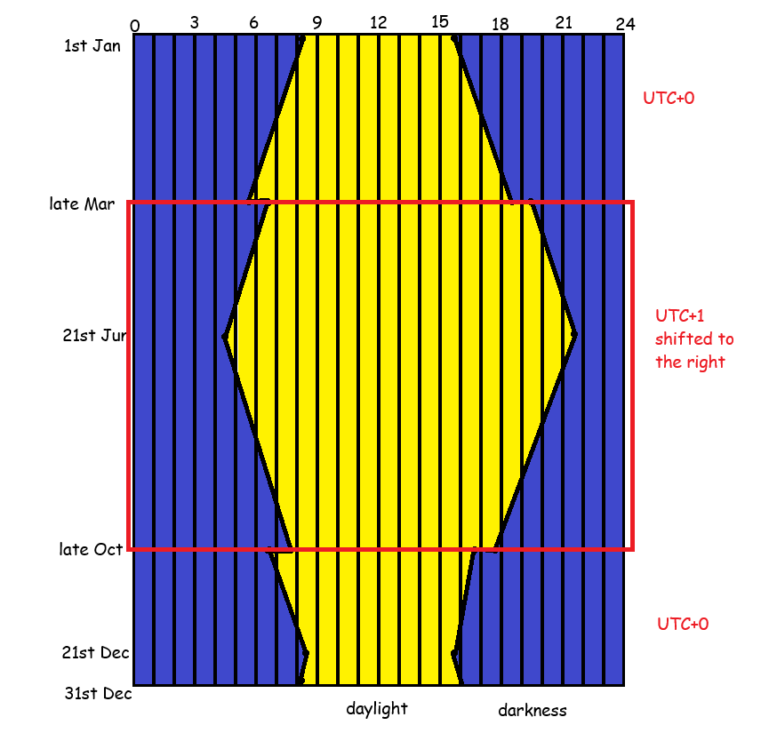
It’s probably easiest to show this using some actual clock times throughout the year. Where I live, in Leeds, what this means is (using 2025 dates):

  • Mar 29th, the last day in GMT: sunrise is 0546, sunset is 1836
  • Mar 30th, the first day in BST: sunrise is 0643, sunset is 1938
    • I notice this on my cycling club rides on Wednesday evenings, which start at 6.30pm. Suddenly we go from meeting up in the twilight and having bike lights on constantly to having a bit more light and being able to see the sun set in the Dales.
  • June 21st, longest day: sunrise is 0435, sunset is 2141
  • Oct 25th, last day in BST: sunrise is 0753, sunset is 1746
  • Oct 26th, first day in GMT: sunrise is 0654, sunset is 1644
    • I notice this shift at work. I’ve gone from arriving at the office in the dark to arriving in the office in the light again, at least for another couple of weeks.
  • Dec 21st, shortest day: sunrise is 0822, sunset is 1546

If we stuck with GMT the whole year round, then on June 21st, we’d have sunrise at 0335 and sunset at 2041. Personally, I’d find this pretty annoying because I love the UK’s long summer evenings. It’s really nice to sit in a beer garden in daylight at 9.30pm, or to go for a long bike ride after work without needing bike lights, whereas I get up at about 6am so the difference between a 0335 sunrise and a 0435 sunrise makes no difference to me.

If we stuck with BST the whole year round, then on Dec 21st, we’d have sunrise at 0922 and sunset at 1646. These late, late mornings can be pretty depressing, and some arguments go that it’s important for traffic safety to have more daylight in the morning. I’m less convinced; in December, based on a 8.30am to 5pm working day, you’ll either be driving to work in the dark or driving home in the dark anyway. Personally, I’d stick to BST the whole year round and simply rebrand it “British Standard Time” instead of British Summer Time, which funnily enough is exactly what we did from 1968 to 1971. This UK parliamentary document is a nice long read about it.

What does this mean for data?

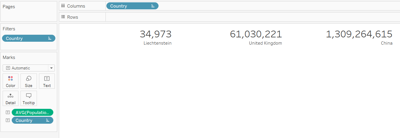
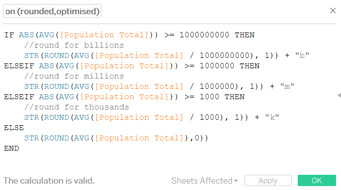
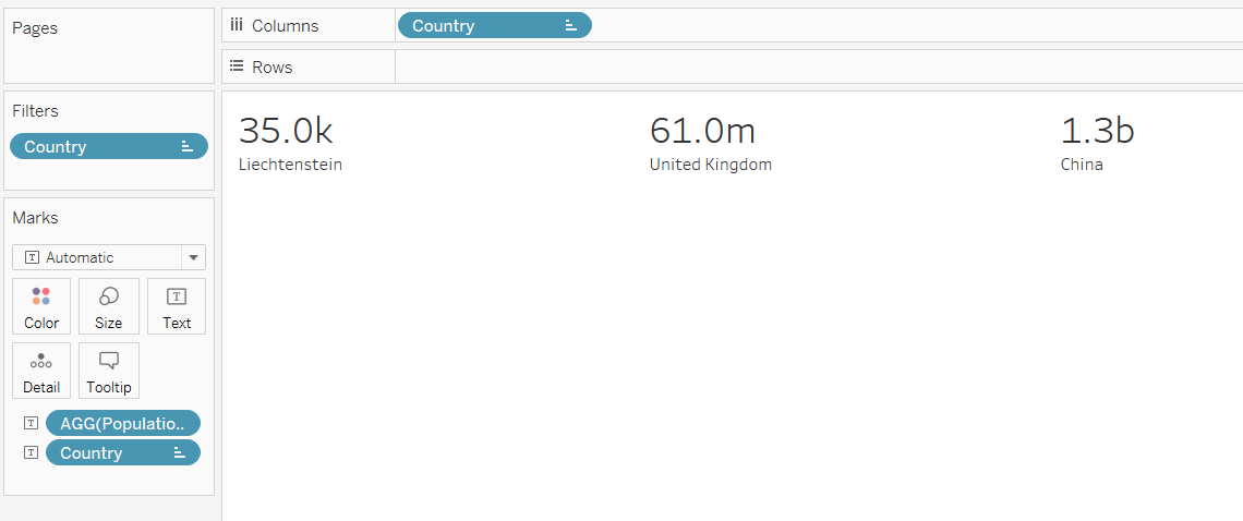
Right, 1600 words in, time to finally get to the point. For anybody working in data, it’s really important to know what time your processes run, and what definition of time you’re using for it.

People (i.e. your non-data colleagues) will expect things to happen at the same time based on their experience of time. Let’s say you automate a data model refresh at 8.30am and automate an email subscription to this report called “the daily 9am report” which gets sent out at 9am. The people receiving this report will expect it to be available at 9am *as they experience 9am*, regardless of whether we’re on UTC+0 or UTC+1.

The problem is, a lot of default data settings are set to UTC time. For example, maybe your Power BI / Tableau / SQL server is fixed to UTC time (or maybe it’s defaulted to the time in California if it’s some kind of service you’re buying from a tech company). That means:

  • If you first set up the daily 9am report subscription for 9am during late March to late October when we’re on UTC+1, then it’s happening at 8am UTC time. So, in late October when we switch to UTC+0, that subscription will still get sent out at 8am UTC time, but to your report recipients, it’ll happen at 8am as we experience it. This also means that, if the reason you’ve scheduled the data refresh for 8.30am and the report subscription for 9am in the first place is that the source data is only available at 8am (regardless of what time zone we’re in), then the report will get sent out at 8am with no data in it. Or in other words, the report will be an hour early, but it’ll be useless because it’s got nothing in it.
  • If you first set up the daily 9am report subscription for 9am during late October to late March when we’re on UTC+0, then it’s happening at 9am UTC time. So, in late March when we switch to UTC+1, the daily 9am report subscription will land in people’s inboxes at 10am as we experience it, i.e. it’s getting sent out an hour later than expected, which people won’t be happy about.

Luckily, a lot of services let you specify time zones in your refresh schedules or processes, and adapt to local time settings. Or you can set your server time to reflect local time settings rather than UTC, which means that the server running the jobs will automatically keep the right definition of what 9am means.

But, whenever you’re doing anything that involves automating something at a particular time, watch out for UTC. If something’s being done based on UTC, then it’ll cause problems next March or October. Especially if, for example, you’ve automated something or set a date field definition based on getdate()/now() just after midnight, or taken a date and converted it to a datetime which will set that datetime to midnight, and then suddenly after the clocks change, that’s now 11pm on the day before!

You also want to make sure you understand the difference between your local time and your server time. For example, my laptop auto-updates between GMT and BST, so I never have to worry about it. But some of the servers we use run on UTC only. So, there’s sometimes a mismatch between my local laptop time and my server time, meaning that when I automate something, it might not do what I think it’s doing. Just because a query with getdate() or now() works fine on my laptop, that doesn’t mean it’ll return the same result when I schedule it on a server.

Finally, this has just focused on the UK and when we change our clocks – some countries also do this, other countries don’t, and of the other counties that also do this, they might not do it at the same time! So if you’re working internationally, it’s all compounded.

Standard
Uncategorized

How to update a production file in Excel very carefully

First things first – keeping and updating important data in an Excel file is not a good idea. There’s a massive risk of human error, which is why there’s a whole industry of information management tools that do a much better job at it.

But sometimes it’s inevitable, and you’ll end up with a situation where a file called CrucialInformation.csv or something like that is feeding into all kinds of different systems, meaning that it’s now a production file that other things depend on. And maybe you’re the person who’s been given the responsibility of keeping it updated. The data person at your job has said “this file is really important, make sure you don’t accidentally put wrong information in or delete anything out of it because then everything will break, okay, have fun, bye!”, and left you to it.

So, how do you responsibly manage a production csv file without breaking things and while minimising mistakes?

In this example, let’s say we work for a shop that sells food items, and the government has introduced new restrictions around items with the ingredient madeupylose in them. Items with high levels of madeupylose can only be sold to over 18s from behind the counter with the cigarettes, items with medium levels of madeupylose can be sold to over 18s from the normal shelves, and items with low levels of madeupylose can be sold to anybody as normal. This isn’t one of the main ingredients that we track in the proper systems yet, so while the data team are working on getting this set up in the databases, we need to manually track which items have madeupylose in them as a short-term solution.

(just to be explicit, this is a completely made-up ingredient in a completely made-up example! but I do use this approach for making targeted updates to large files)

We’ve got a production file called MadeupyloseItems.csv which stores the data, and it looks like this:

Let’s go through how to make controlled updates to this file and not break everything.

Step 1: don’t even touch it, just make copies

First of all, the safest thing to do is to pretty much never touch the production file. Firstly, because having a file open will lock it, so any background process that’s trying to access the data inside it won’t be able to. Secondly, because creating copies means we can have an archive and muck about with things safe in the knowledge that we won’t mess it up.

Wherever the production file is saved, I generally create a folder called “_archive”:

I do all the actual work on files saved in here, and almost never touch the file itself. Let’s have a look at what’s already in there:

There are two archived, datestamped files in there already – the csv from 12th September 2022, and a copy of the live production file with the datestamp from when it was last saved. It’s important to keep them there just in case I make a mistake and need to restore an old version.

There’s also the Madeupylose updater file, which I use to make my updates.

Step 2: create a totally separate Excel file to manage changes

I use a dedicated Excel file to manage the changes I make to production csv files. In the first tab, I copy/paste all the data from the most recent file – in this case, I’ve copy/pasted it out of the 220914 Madeupylose.csv file in the _archive folder so I don’t have to open the live file:

In the next tab, I make my actual changes. I’ve got some items that I’m adding in and some items that I’m recategorising:

I can use this file to add in some checks – for example, have I spelled “High”, “Medium”, and “Low” correctly? Are they all the same format? There are loads of things you could do here, like sticking a filter on to check individual values, making sure that there are no duplicates, and so on.

Once I’m happy with my updates, I now need to add them to the production file somehow. I could potentially just open the file and add them in… but that would involve opening the file, for a start, and maybe disrupting another process. And it’s not just a case of adding them in – I could simply copy/paste the new items, but I’d have to find the already-categorised items and have to change them, which would be quite easy to make a mistake on (and I really don’t want to hit CTRL+F a load of times).

So, this is where I create a third tab called New Data and use a couple of xlookups.

Step 3: xlookups

If you haven’t come across xlookups before, they’re just like vlookups but simpler and better.

Firstly, I’m going to create a new column in the ExistingData tab, and I’ll use this formula:

=XLOOKUP(ExistingData!A2, Updates!A:A, Updates!A:A)

What this does is take the item number in the existing data tab, look for it in the updates tab, and if it finds it in the updates tab, it’ll return that number. If it doesn’t find it, it gives me an #N/A value:

What this means is that I can distinguish between the items that have already been categorised that I’ve changed and the ones that I haven’t. I know that anything with an #N/A value in the lookup column is an item that I haven’t changed at all. So, I can add a filter to the lookup column, and select only the #N/A values:

I’ll copy/paste columns A and B for these items into the NewData tab. Then, I’ll copy/paste columns A and B for all items in the Updates tab into the NewData tab underneath (and remember to remove the headers!). Now, I’ve got the full information in one place:

What I like about this approach is that it works the same whether you’re updating 20 records or 20,000 records – once you’ve made your updates in the updates tab, the xlookups to get it all transferred over only take seconds, and you can be sure that you’ve definitely got all the things you need in the NewData tab.

Step 4: update the production file

We’re now ready to update the production file. I prefer to take an extra step to create a whole new csv and never actually touch the production file. So, I’m going to take everything in the NewData tab, copy/paste it into a new file, and save that as a csv called “220916 MadeupyloseItems.csv” in the _archive folder:

We’ve got the archived version of the current file – it’s the one from 220914, so there’s a backup in case I’ve messed up the latest update somehow. We’ve also got the archived version of the new file that I want to be the production file. The final step is to move that into production by overwriting the production file. That’s as simple as going back to the 220916 MadeupyloseItems.csv file in Excel, hit Save As, and overwrite the live file:

And there we have it! We’ve updated the live production file without even touching it, we’ve carefully tracked which lines we’re adding in and which lines we’re changing, and we’ve got a full set of backups just in case.

Standard
Uncategorized

SAP: what’s the difference between the merchandise category hierarchy and the article hierarchy?

I’ve been working with product classification in SAP recently, and something that comes up a lot is the difference between the merchandise category hierarchy and the article hierarchy. Both can be used for showing hierarchies and reporting, so what’s the difference?

The merchandise category is obligatory – you have to have the merchandise category when setting up SAP. It’s also a pain to change, so you need to think really carefully out what you want the merchandise category to be when you’re starting out. You don’t necessarily have to create a merchandise category hierarchy, but you do have to assign merchandise categories. The article hierarchy isn’t obligatory at all, and it’s more flexible to change.

The purpose of having separate hierarchies is that they represent different aspects of a thing. The merchandise category is about what a thing actually is, while the article hierarchy is about what you do with it.

To illustrate this, let’s take a load of different nuts – peanuts, almonds, walnuts, chestnuts, and so on. Under a merchandise category perspective, you’d want to classify these into fundamental properties of the item – for example, you could use the GS1 standards, which separate them into bricks like Nuts/Seeds – Unprepared/Unprocessed (in shell) and Nuts/Seeds – Prepared/Processed (out of shell). That would mean that nuts like loose chestnuts and walnuts in shells would be in the first category, salted peanuts and flaked almonds would be in the second category. These are fundamental to what the product actually is.

Under an article hierarchy perspective, you’d maybe want to set up a separate way of classifying these nuts depending on what you do with them in your store. While salted peanuts and flaked almonds are both Nuts/Seeds – Prepared/Processed (out of shell), they’re quite different in terms of what people actually buy them for – salted peanuts are more of a snacking thing and you’d probably expect to see them in the same aisle as crisps and Bombay mix, while flaked almonds are more of a baking/cooking thing and you’d probably expect to see them in the same aisle as flour and glacé cherries. And maybe you’d want to reflect that in your internal organisation too, having one team of people responsible for snacks and one team responsible for baking/cooking, and splitting nuts across the two. This isn’t fundamental to what the product actually is, as they’re both nuts, but it’s more about what you do with it.

I’ve found that the best analogy for merchandise categories vs. article hierarchy is to step away from shop products and talk about animals.

If merchandise category is about what something fundamentally is, then it’s like the order of species, or taxonomic classification. Dogs and wolves are separate species, but they’re both in the dog family, and if you go up a little higher, that includes foxes in the canidae genus, and if you go up higher again to carnivores, this is where you get to cats as well, and the level above that is all mammals, so that’s where cows come in, and so on. Chickens are birds, which are totally different from mammals at a very high level, so you’ve got to go all the way from species up to the phylum chordata to get to the level where cows and chickens are the same kind of thing. That’s the taxonomic classification of animals, and it’s just how it is. Scientists can provide evidence to move things around a little bit, but it’s pretty much set. This is the merchandise category hierarchy of the animal world.

(wordpress has compressed this a lot – open the full size image in a new tab or use an image reader browser extension like Imagus to see full size)

But now, let’s say you run a pet shop, or a zoo. You know your taxonomic classification perfectly, but you also know that selling dogs and wolves in a pet shop is a terrible idea, because while dogs and wolves are technically very similar, one of them is very much not a pet. Or you’re planning out which animals to keep together in which bits of the zoo, and while cows and chickens are nothing like each other on the taxonomic classification, they’re both farmyard animals (and they won’t eat each other), so it would probably make sense to keep cows and chickens together in the “life on the farm” section of the zoo rather than having cows and lions in the “but they’re both mammals, it’ll all be fine” section of the zoo.

So, this is where you’d create a separate article hierarchy. It’s not about what an animal is, it’s about what you do with that animal, how you organise things, who’s responsible for caring for them, and so on.

This is a lot easier to change and it lets you build different reporting on top of the merchandise categories, but it’s a completely different way of seeing things from the merchandise category hierarchy view of the world. This is why the merchandise category hierarchy and the article hierarchy are different, and why the merchandise category level is obligatory (although putting it into a merchandise category hierarchy is optional), while the article hierarchy is optional.

Standard
Uncategorized

Hacking redacted documents with statistics: the Ghislaine Maxwell deposition

The original Slate article introduces this better than I can, because they’re actual journalists and I’m just a data botherer:

On Thursday morning, a federal court released a 2016 deposition given by Ghislaine Maxwell, the 58-year-old British woman charged by the federal government with enticing underage girls to have sex with Jeffrey Epstein. That deposition, which Maxwell has fought to withhold, was given as part of a defamation suit brought by Virginia Roberts Giuffre, who alleges that she was lured to become Epstein’s sex slave. That defamation suit was settled in 2017. Epstein died by suicide in 2019.

In the deposition, Maxwell was pressed to answer questions about the many famous men in Epstein’s orbit, among them Bill Clinton, Alan Dershowitz, and Prince Andrew. In the document that was released on Thursday, those names and others appear under black bars. According to the Miami Herald, which sued for this and other documents to be released, the deposition was released only after “days of wrangling over redactions.”

Slate: “We Cracked the Redactions in the Ghislaine Maxwell Deposition”

It’s some grim shit. I haven’t been following the story that closely, and I don’t particularly want to read all 400-odd pages of testimony.

But this bit caught my eye:

It turns out, though, that those redactions are possible to crack. That’s because the deposition—which you can read in full here—includes a complete alphabetized index of the redacted and unredacted words that appear in the document.

This is … not exactly redacted. It looks pretty redacted in the text itself:

Above: Page 231 of the depositions with black bars redacting some names.

But the index helpfully lists out all the redacted words. With the original word lengths intact. In alphabetical order. You don’t need any sophisticated statistical methods to see that many of the redacted black bars on page 231 concern a short word which begins with the letter A, and is followed by either the letter I or the letter L:

Above: The index of the deposition, helpfully listing out all the redacted words alphabetically anbd referencing them to individual lines on individual pages.

It also doesn’t take much effort to scroll through the rest of the index, and notice that another short word beginning with the letters GO occurs in exactly the same place:

Above: I wish all metadata was this good.

And once you’ve put those two things together, it’s not a huge leap to figure out that this is probably about Al Gore.

When I first read the Slate article on Friday 23rd October 2020, around 8am UK time, Slate had already listed out a few names they’d figured out by manually going through the index and piecing together coöccurring words. And that reminded me of market basket analysis, one of my favourite statistical processes. I love it because you can figure out where things occur together at scale, and I love it because conceptually it’s not even that hard, it’s just fractions.

Market basket analysis is normally used for retail data to look at what people buy together, like burgers and burger buns, and what people don’t tend to buy together, like veggie sausages and bacon. But since it’s basically just looking at what happens together, you can apply it to all sorts of use cases outside supermarkets.

In this case, our shopping basket is the individual page of the deposition, and our items are the redacted words. If two individual redacted words occur together on the same page(s) more than you’d expect by chance, then those two words are probably a first name and a surname. And if we can figure out the first letter(s) of the words from their positions in the index, we’ve got the initials of our redacted people.

For example, let’s take the two words which are probably Al Gore, A1 and GO1. If the redacted word A1 appears on 2% of pages, and if the redacted word GO1 appears on 3% of pages, then if there’s no relationship between the two words, you’d expect A1 and GO1 to appear together on 3% of 2% of pages, i.e. on 0.06% of pages. But if those two words appear together on 1% of pages, that’s ~16x more often than you’d expect by chance, suggesting that there’s a relationship between the words there.

So, I opened up the Maxwell deposition pdf, which you can find here, and spent a happy Friday evening going through scanned pdf pages (which are the worst, even worse than the .xls UK COVID-19 test and trace debacle, please never store your data like this, thank you) and turning it into something usable. Like basically every data project I’ve ever worked on, about 90% of my time was spent getting the data into a form that I could actually use.

oh god why

Working through it…

How data should look.

And now we’re ready for some stats. I used Alteryx to look at possible one-to-one association rules between redacted words. Since I don’t know the actual order of the redacted words, there are two possible orders for any two words: Word1 Word2 and Word2 Word1. For example, the name that’s almost definitely Al Gore is represented by the two words “A1” and “GO1” in my data. If there’s a high lift between those two words, that tells me it’s likely to be a name, but I’m not sure if that name is “A1 GO1” or “GO1 A1”.

After running the market basket analysis and sorting by lift, I get these results. Luckily, Slate have already identified a load of names, so I’m reasonably confident that this approach works:

A list of initials and names, in Excel this time to make it more human-readable.

Like I said, I haven’t been following this story that closely, and I’m not close enough to be able to take a guess at the names. But I’m definitely intrigued by the top one – Slate haven’t cracked it as of the time of writing. The numbers suggest that there’s somebody called either Je___ Ja___ or Ja___ Je___ who’s being talked about here:

Je___ Ja___ or Ja___ Je___?

I don’t particularly want to speculate on who’s involved in this. It’s a nasty business and I’d prefer to stay out of it. But there are a few things that this document illustrates perfectly:

  1. It’s not really redacted if you’ve still got the indexing, come on, seriously
  2. Even fairly simple statistical procedures can be really useful
  3. Different fields should look at the statistical approaches used in other fields more often – it really frustrates me that I almost never see any applications of market basket analysis outside retail data
  4. Please never store any data in a pdf if you want people to be able to use that data
Standard
data visualisation, Tableau

Calculating dynamic Z scores in Tableau

What are Z scores? How can you calculate them in Tableau? And once you’ve done that, what can you use them for? This blog will cover all of that, using some fake data from a factory that produces things. We’ll have a look at how the things differ from each other across various different manufacturing dimensions, and use that to see what to do with the thing we’re currently building. It’s all in a Tableau Public workbook here.

Firstly, what’s a Z score, and why would we want to use one?

A Z score is a way of looking at how much more, or less, something is from average in a relative way that accounts for the spread of data. For example, let’s start with height. I’m 6’3″ (or 190cm), and I live in England, where, according to wikipedia at the time of writing, the average male height is 5’9″ (or 175cm). That makes me taller than average.

However, averages don’t tell you anything about the spread of data, which means that taking the simple difference in height doesn’t tell you anything about how tall I am relative to everybody else. If every man in England (apart from me) was somewhere between 5’8″ and 5’10”, I’d be an absolute giant, relatively speaking. But as it is, I’m never the tallest guy in the room, so while I’m taller than average, I only feel averagely tall.

This relative difference from average can be expressed in a Z score, which is essentially saying, “how many standard deviations above or below average is this value?”. A Z score is calculated like this:

Value - Average Value
/
Standard Deviation of Values

So, my height as a Z score compared to men in England would be:

6'3" - 5'9"
/
Standard Deviation of Heights (which I don't know)

In the hypothetical example where every other man is between 5’8″ and 5’10”, the spread of heights is small, which means that the standard deviation of heights would be really low, which means that my Z score would be really high. But in the real world, the spread of heights is much greater, so the standard deviation of heights is bigger, which means that my Z score is lower.

It also means you can normalise comparisons over different metrics with different scales. Let’s say I’m an Olympic heptathlete. I’m doing seven different events, and the units they’re measured in are different – some are in metres, like the high jump and the shot put, and some are in seconds, like the hurdles and the sprints. The scale of those units is different too – I’ll be able to throw the shot put many times further than I can jump. That makes comparing my performance across my different events difficult! But Z scores let you compare. If my shot put Z score is +2.1 compared to other athletes while my hurdles score is -0.3 compared to other athletes, I know that I need to work on my hurdles more than my shot put.

OK, so Z scores are a way of normalising data to do comparisons. How do I do it in Tableau?

Sets are fantastic for this. Here’s a quick explanation of why before we move onto how to set it all up.

I like using sets to decide which things I’m focusing on (the “I want to know how normal this thing is” group) and which things are in my reference group (the “I want to take this lot as the basis for all my comparisons” group).

A lot of the time, you’ll want all things to be in both groups. For example, if I’m a professional athlete, I want to compare myself to my peer group, and I’ll want to see how my closest rivals compare to the same peer group too. So, I’d stick all the top athletes in my sport in the main group (so I can see their Z scores) and in the reference group (so that I’m comparing everybody to each other).

Actually, I’m very much not a professional athlete… but when I’m out cycling, I might still want to compare myself to the Tour de France pros to see just how out of my league they are. In that case, I’d want all the professional cyclists in the reference group, and I’d want to put myself in the main group, but what I don’t want to do is put myself in the reference group – my slow trundling up Anerley Hill would only bring the reference group’s average performance down and widen the reference group’s standard deviation, and I’d mistakenly make myself look closer to the pros than I actually am.

That’s why I like using sets and set actions in Tableau. Now for the actual Tableau work!

First of all, let’s talk data structure. I’ve got a long and thin data source; a field for the [Dimension Name], a field for the [Thing], and a field for the [Dimension Value]:

OK. The next step is to set up the sets. I want to create two sets based on my [Thing] field – one for the main analysis set, one for the reference set. You can do this by right-clicking on [Thing] and selecting Create Set.

Now that I’ve got two sets, I can start creating my Z score calculations. The formula for a Z score is:

Value of the thing you want a Z score for - Average value in the reference group
/
Standard Deviation of values in the reference group

You could do all this in one calculation, but I like breaking mine down into individual parts.

[Reference Set Avg]
{FIXED [Dimension Name]: AVG(IF [Reference Set] THEN [Dimension Value] END)}

[Reference Set StDev]
IF {FIXED [Dimension Name]: COUNTD(IF [Reference Set] THEN [Dimension Value] END)} =1 THEN 0 ELSE
{FIXED [Dimension Name]: STDEV(IF [Reference Set] THEN [Dimension Value] END)}
END

Now I can use those two calcs in my Z score calc:

[Z Score]
(AVG([Dimension Value]) - AVG([Reference Set Avg]))
/
AVG([Reference Set Stdev])

That’s all it takes to calculate Z scores! Here’s a scatterplot of my dimension A1. The actual dimension value and the Z score are perfectly correlated, but now we’ve got a normalised value on the y-axis:

And that normalised value is nice and useful, because now we can compare two dimensions with very different scales, like A1 and B:

I often plot Z scores on diverging bar charts. A chart like this will show me how a thing compares to other things across multiple dimensions, and a thing’s idiosyncrasies will stick out:

Similarly, if I want to see what the outliers are across a whole data set, I can create a concatenated [Thing-Dimension] field, plot the absolute Z score, colour by the actual Z score, and sort. This instantly shows me where the biggest outliers in my data are:

Eagle-eyed readers may have noticed that I haven’t calculated a separate field for the analysis set, and I’m just using AVG([Dimension Value]) in the numerator. That’ll calculate the Z score for any [Thing] in the view regardless of whether it’s in the analysis set or not, so those readers may be wondering why we need the analysis set at all. Never fear, we’ll use this set in some more advanced calculations that are coming up.

Making Z scores interactive

With a few extra steps, you can create two sheets to use as set member choosers (I think that drop-down set controllers are coming in 2020.2 or 2020.3, which is exciting! But for now, I’m in 2020.1, and this is the workaround we need to update set membership).

I set up my reference set chooser sheet like this:

…and then the dashboard action like this:

Repeat for the analysis set, and you can build a dashboard a bit like this (click the image to see the interactive version on Tableau Public):

I’m using this to select an individual dimension, and then looking at how 010X compares to 001X through 009X. I’m plotting the actual value on the x-axis, because that’s what I’ll have to adjust in the factory if I decide to make any changes, and I’ve included the Z score in the tooltip.

The nice thing about using sets and set actions is that we can update these Z scores by changing the reference set. Maybe we’ll find out that one of our things, say, 004X, was actually faulty and shouldn’t be included in our set of “normal” things that we’re using as a reference. Do we need to re-run our entire data pipeline? Nope, just deselect it from our reference group selector.

Next steps: comparing Z scores

That’s nice and everything, but let’s take it a bit further. I know that 002X, 003X, and 007X were particularly good things, and ideally, all the things I manufacture in future will be like those three. So, I’ve created a new set called [High performance set], and I want to compare my WIP thing 010X to the high performance set based on the same reference set I selected earlier.

That means I’ve got a lot of comparisons going on:

I also want to group my dimensions into themes. For example, A1 through A8 are technically separate dimensions, but they represent the same kind of thing taken at different points – maybe it’s the thickness of a circular plate at eight different points around the circumference of the plate, or maybe it’s the weight of eight different ball bearings in the same part of the thing, or something like that. So, since they’re all related, I want to see how 010X compares to the high performance set across the A dimensions as a group of dimensions. In my workbook, I’ve simply grouped them by regex-ing out any numbers from the dimension name.

I’ve created a dashboard like this (click for interactive version):

What am I doing here? In the bar chart at the top, I can see how the Z scores for 010X compares to the Z scores for the high performance set for each group of dimensions. I’m finding the Z score for each dimension within a dimension group, and comparing the average Z score for each dimension group for the analysis and high performance sets.

What I’m seeing here is that, on average, the C dimensions in 010X are higher than the high performance set. If I click the C bar, it’ll filter the “compare selection” chart:

This stacked bar chart shows me the Z scores for all C dimensions for the things in the analysis and high performance sets. This is telling me that the high performance things tended to have C dimensions lower than normal across the reference group, and that while 010X also has some C dimensions on the lower side of normal, it’s not as low as the high performance group. So, maybe my manufacturing specifications for the C dimensions are actually a bit high, and I should tune them lower if I want more high performance things.

Building the “compare selection” chart is relatively straightforward – put the [Z score] field on columns, and stack your rows with the Group and Thing dimensions, as well as the IN/OUT value of the analysis set so that it’s sorted nicely:

I’ve also created a calculation that returns a T/F value based on set membership and I’m using it to filter the view. It’s simply:

[Analysis or High Perf set]
[Analysis Set] OR [High performance set]

…and I’ve set the filter to TRUE.

The tricky bit is getting the values for the diverging bar chart. I like using the compare selection sheet as a way of checking the calculations. What we want to work out is the average Z score across all things and dimensions for the analysis set, and the average Z score across all things and dimensions for the high performance set. Then we want to take the analysis set average and subtract the high performance set average to see the difference.

In other words, we want this:

…minus this:

…which should give me 0.857944.

The first thing we need to do is to create a new field: [Thing-Dimension]. It’s just a concatenated field of [Thing] and [Dimension Name], like this:

[Thing-Dimension]
[Thing] + "-" + [Dimension Name]

To be able to plot the average Z scores and difference in a simple bar chart for each dimension group, we can’t have the thing or dimension in the view, which means we need an LOD which includes those fields:

[Z score (LOD include Thing-Dimension)]
(
{INCLUDE [Thing-Dimension]: AVG([Dimension Value])}
- {INCLUDE [Thing-Dimension]: AVG([Reference Set Avg])}
)
/
{INCLUDE [Thing-Dimension]:AVG([Reference Set Stdev])}

Now we can use that field to work out the difference between our sets:

[Z score difference]
AVG(IF [Analysis Set] THEN [Z score (LOD include Thing-Dimension)] END)
- AVG (IF [High performance set] THEN [Z score (LOD include Thing-Dimension)] END

Finally, we can create our bar chart! And it’s nice and simple:

Let’s just check the calc works. Is it 0.857944, as I worked out manually earlier on? Yup, it’s showing up as 0.858 in my tooltip. Lovely:

Now that I’ve compared Z scores across groups of dimensions to get an idea of the general way that my things compare to each other, I can dive back into the actual data to look at what those differences are and potentially fix my manufacturing variance.

Here’s my final dashboard (again, click for the interactive version). I’ve plotted the Z scores for all dimensions for 010X, and I can click any of those Z scores to update the scatterplot and marginal histogram of actual values below. I know that the C dimensions are a bit different for 010X in comparison to the high performance set, so let’s have a look at those:

I can look at that scatterplot and instantly see which of the C dimensions are driving that difference between 010X and the high performance set:

It’s dimensions C2 and C4.

Let’s start with C2. 010X has a high Z score of 2.25, and we can see in the scatterplot that this is a higher value than normal. As it is, that should be raising flags in the factory – that’s a high C2 value, both absolutely and relatively, so we should probably turn it down a bit to be more in line with the others at around 30. As an aside, it’s interesting to see that the high performance set all have low C2 values, so maybe we should turn it down lower than 30 to be closer to the high performance set:

Now, let’s have a look at C4. No issues there, right? 010X has a C4 value which is slightly higher than the average for the reference group, but the Z score is only 0.198, which indicates that it’s pretty much bang on normal. However, we can see that even though it’s normal for the reference group, it’s quite a lot higher than the high performance group. So, again, maybe we’re manufacturing C4 to a specification that says “aim for a C4 value between 30 and 34”, whereas we should consider amending those limits to between 26 and 30 based on how the lowest C4 values have all been the high performance things:

This is just a few of many different ways you can use Z scores and Tableau to look at manufacturing data. There are all kinds of interesting use cases out there – hopefully this explainer helps you build some of your own.

Standard
Alteryx, data visualisation, Tableau

Eurovision Song Contest: a market basket analysis of voting patterns and international relations.

I’ve been doing a lot of market basket analysis at The Information Lab lately. Market basket analysis is a way of looking for things that people buy at the same time (or that people never buy at the same time) in order to spot trends in people’s behaviour. For example, it’s probably obvious that if somebody buys cereal, they’ll probably also buy milk. Or that if somebody buys tofu, they’re not going to be buying sausages. This is a really nice example of how it all works.

Thing is, after a while, using bread and butter or cereal and milk or sausages and tofu as an example gets kinda dry. And talking about Lego shovels and milligram-level accurate scales is sometimes a little unprofessional, even if it is a perfect example of consumer behaviour.

So, I’ve been analysing the Eurovision Song Contest. The jury votes lend themselves pretty well to market basket analysis, because they’re pretty similar to transactions: each country’s jury (or customer) votes for (or buys) ten countries (or items) at a time (in a basket), and the fact that these countries (or items) are a subset of all possible countries (or items) to vote for (or buy) means that you can make the same selection vs. non-selection distinction. And we all know that some countries always vote for some other countries, regardless of how good the song is, which is part of what makes it fun.

I took the historic Eurovision data collected by Stephan Okhuijsen of Datagraver. Then, using Alteryx, I filtered it to all contests from 1993 onwards, because European countries have been relatively consistent since then. I also filtered it to the final only, and to the jury votes only.

I set the minimum support for a rule to 0.01, which is kind of high for a regular market basket analysis using tens of thousands of SKUs in a supermarket, but works fine for such a closed set of possible choices of countries. I also set the minimum confidence to 0.05. That gave me almost 33,000 association rules, of which about 1,600 were one-to-one country mappings.

The full results are in an interactive dashboard here.

dash

In the matrix at the bottom, you can see who consistently votes for who, and it’s pretty predictable. Cyprus and Greece, for example, almost always give each other the most possible points. There’s a big love in between Moldova and Romania, and between Turkey and Azerbaijan. The Nordics are a bit too cool to give each other full marks every time, but it’s still a bit of a Scandi circle jerk. Andorra love Spain, although it doesn’t seem like that’s reciprocated. Azerbaijan have never voted for Armenia, funnily enough. And Austria have given Australia full marks twice, which I like to believe is because they were hoping to exploit a poor fuzzy matching process in the background scoring:

2 austria australia

But market basket analysis shows how countries behave as a group, where we can see how some associations are Europe-wide, and some are just confined to the two countries. For example, some of the Scandi trends are reflected in votes across Europe; if a country, any country, votes for Denmark, they’re also likely to vote for Norway:

1 denmark to norway

And surprise, surprise, countries that vote for Ukraine will also vote for Russia:

1 ukraine to russia

But the Greece/Cyprus love in is special just for them; in fact, if anything, there’s a slightly negative association between them, meaning that if a country votes for Cyprus, they’re slightly less likely to vote for Greece as well:

1 cyprus to greece

Likewise with Turkey and Azerbaijan. Just because they give each other full points all the time, other European countries don’t link the two together in their voting behaviour at all:

1 turkey to azerbaijan

Meanwhile, even though Azerbaijan will never give points to Armenia, and Armenia have only ever given one point to Azerbaijan, other European countries are far more optimistic. Maybe they hope that voting for both Armenia and Azerbaijan at Eurovision can resolve the Nagorno-Karabakh dispute. Or maybe they just don’t know anything about the Caucasus region and think they’re the same place, I don’t know.

1 azerbaijan to armenia

This is quite nice to illustrate, because the market basket analysis allows you to make the distinction; while there are some obvious associations between countries, like how Greece and Cyprus always vote for each other, it shows that those associations aren’t necessarily transferred to other countries’ voting behaviour.

Click through to the interactive version here to explore in more detail. I’m going to be using this in my teaching examples more often.

Standard
Alteryx

Dynamic Date Filtering in Alteryx

[update: this macro has been updated to fix a small discrepancy in the “most recent X” filters. If you downloaded it before 2019-03-01, please download the new version]

It’s 2019. Hooray. The change of a year is one of my least favourite things, professionally speaking, because January 2nd is when you find out how much stuff breaks because somebody (possibly you) has hard coded a date somewhere in all your pipelines. Suddenly, all your dashboards are blank because somebody’s put filter Year=2018 on, or all the YoY calculations are off because it’s looking at [2018]/[2017] instead of [CurrentYear]/[PreviousYear].

Sure enough, I spent a few days in January tracing through several Alteryx workflows and looking for rogue date filters. Pretty much all of them could be fixed by changing 2018 to DatePartYear(DateTimeNow()). But it was a long and frustrating process to identify all the filters which needed to remain static (e.g. filter out everything before 2018 because older data is in a different format and needs to be treated differently) vs. filters which needed to be dynamic (e.g. filter to the current year’s data to show YTD values), and then replacing the filter code in the custom filter section.

Most date filters I found were pretty similar, and fit into one of a handful of categories:

1. Filter to this period (e.g. if it’s 2019 right now, give me all of 2019)
2. Filter to this period-to-date (e.g. if it’s 2019 right now, give me all of 2019 up to today)
3. Filter to most recent full / completed period (e.g. if it’s 2019 right now, give me all of 2018)
4. Filter to the previous / next 12 months
5. Filter to the past / the future

…so to save myself some work in January 2020, I’ve built an Alteryx macro which handles all these examples. You can get it here! Click on the image, or copy the full link below:

190114 dynamic date filter

https://gallery.alteryx.com/#!app/Dynamic-Date-Filter/5c3c4da90462d70ba8a66d99

Just hit download and stick it in your standard macro path. It’s automatically set up to appear in your preparation tools.

And here’s how it looks in your workflow:

1

It works much like a regular filter tool, with T and F outputs based on a filter condition. But instead of coding up a calculation like “DatePartYear([MyDateField]) = DatePartYear(DateTimeNow()) AND [MyDateField] <= DateTimeNow()” for a Year-to-Date filter, you can simply tick the Year-to-Date option (and see a description of what that particular filter option will do). I built this with scheduled workflows in mind so that you can spend less time copy/pasting chunks of date filter code, and less time trawling through custom filter code when the year changes and the workflows break.

One caveat: this macro works at the day level, rather than the specific time level – so if it’s 7pm on March 19th when you run the workflow and select Year-to-Date, the filter will include future values from later in the evening on March 19th, not just the ones up to 7pm.

The way it works is by selecting the relevant part of a looooong IF statement, which has all possible filter options from the input tools. If you’re interested, this is the full set of IF statement formulae:

IF [FilterOptionSelected] = ‘Current Week’ THEN
DateTimeTrim([IncomingDate], “day”) >= DateTimeAdd(
DateTimeTrim([DateValueUsed], “day”),
(IF ToNumber(DateTimeFormat(DateTimeTrim([DateValueUsed], “day”),”%w”)) = 0 THEN
ToNumber(DateTimeFormat(DateTimeTrim([DateValueUsed], “day”),”%w”))-7
ELSE 0-ToNumber(DateTimeFormat(DateTimeTrim([DateValueUsed], “day”),”%w”)) ENDIF),
“day”)
AND
DateTimeTrim([IncomingDate], “day”) <= DateTimeAdd(
DateTimeTrim([DateValueUsed], “day”),
(IF ToNumber(DateTimeFormat(DateTimeTrim([DateValueUsed], “day”),”%w”)) = 0 THEN 0 ELSE
7-ToNumber(DateTimeFormat(DateTimeTrim([DateValueUsed], “day”),”%w”)) ENDIF) ,
“day”)

ELSEIF [FilterOptionSelected] = ‘Current Month’ THEN
DateTimeMonth(DateTimeTrim([IncomingDate], “day”)) = DateTimeMonth(DateTimeTrim([DateValueUsed], “day”))
AND
DateTimeYear(DateTimeTrim([IncomingDate], “day”)) = DateTimeYear(DateTimeTrim([DateValueUsed], “day”))

ELSEIF [FilterOptionSelected] = ‘Current Quarter’ THEN
(IF DateTimeMonth(DateTimeTrim([DateValueUsed], “day”)) <= 3 THEN
DateTimeMonth(DateTimeTrim([IncomingDate], “day”)) <= 3
ELSEIF DateTimeMonth(DateTimeTrim([DateValueUsed], “day”)) <= 6 THEN
DateTimeMonth(DateTimeTrim([IncomingDate], “day”))> 3 AND DateTimeMonth(DateTimeTrim([IncomingDate], “day”)) <= 6
ELSEIF DateTimeMonth(DateTimeTrim([DateValueUsed], “day”)) <= 9 THEN
DateTimeMonth(DateTimeTrim([IncomingDate], “day”))> 6 AND DateTimeMonth(DateTimeTrim([IncomingDate], “day”)) <= 9
ELSE DateTimeMonth(DateTimeTrim([IncomingDate], “day”))> 9 AND DateTimeMonth(DateTimeTrim([IncomingDate], “day”)) <= 12 ENDIF
)
AND
DateTimeYear(DateTimeTrim([IncomingDate], “day”)) = DateTimeYear(DateTimeTrim([DateValueUsed], “day”))

ELSEIF [FilterOptionSelected] = ‘Current Year’ THEN
DateTimeYear(DateTimeTrim([IncomingDate], “day”)) = DateTimeYear(DateTimeTrim([DateValueUsed], “day”))

ELSEIF [FilterOptionSelected] = ‘Month-to-date’ THEN
DateTimeMonth(DateTimeTrim([IncomingDate], “day”)) = DateTimeMonth(DateTimeTrim([DateValueUsed], “day”))
AND
DateTimeYear(DateTimeTrim([IncomingDate], “day”)) = DateTimeYear(DateTimeTrim([DateValueUsed], “day”))
AND
DateTimeTrim([IncomingDate], “day”) <= DateTimeTrim([DateValueUsed], “day”)

ELSEIF [FilterOptionSelected] = ‘Quarter-to-date’ THEN
(IF DateTimeMonth(DateTimeTrim([DateValueUsed], “day”)) <= 3 THEN
DateTimeMonth(DateTimeTrim([IncomingDate], “day”)) <= 3
ELSEIF DateTimeMonth(DateTimeTrim([DateValueUsed], “day”)) <= 6 THEN
DateTimeMonth(DateTimeTrim([IncomingDate], “day”))> 3 AND DateTimeMonth(DateTimeTrim([IncomingDate], “day”)) <= 6
ELSEIF DateTimeMonth(DateTimeTrim([DateValueUsed], “day”)) <= 9 THEN
DateTimeMonth(DateTimeTrim([IncomingDate], “day”))> 6 AND DateTimeMonth(DateTimeTrim([IncomingDate], “day”)) <= 9
ELSE DateTimeMonth(DateTimeTrim([IncomingDate], “day”))> 9 AND DateTimeMonth(DateTimeTrim([IncomingDate], “day”)) <= 12 ENDIF
)
AND
DateTimeYear(DateTimeTrim([IncomingDate], “day”)) = DateTimeYear(DateTimeTrim([DateValueUsed], “day”))
AND
DateTimeTrim([IncomingDate], “day”) <= DateTimeTrim([DateValueUsed], “day”)

ELSEIF [FilterOptionSelected] = ‘Year-to-date’ THEN
DateTimeYear(DateTimeTrim([IncomingDate], “day”)) = DateTimeYear(DateTimeTrim([DateValueUsed], “day”))
AND
DateTimeTrim([IncomingDate], “day”) <= DateTimeTrim([DateValueUsed], “day”)

ELSEIF [FilterOptionSelected] = ‘Most recent complete month’ THEN

DateTimeMonth(DateTimeTrim([IncomingDate], “day”)) = (IF DateTimeMonth(DateTimeTrim([DateValueUsed], “day”)) = 1 THEN 12 ELSE DateTimeMonth(DateTimeTrim([DateValueUsed], “day”))-1 ENDIF)
AND
DateTimeYear(DateTimeTrim([IncomingDate], “day”)) =
(IF DateTimeMonth(DateTimeTrim([DateValueUsed], “day”)) = 1 THEN DateTimeYear(DateTimeTrim([DateValueUsed], “day”))-1 ELSE DateTimeYear(DateTimeTrim([DateValueUsed], “day”)) ENDIF)

ELSEIF [FilterOptionSelected] = ‘Most recent complete quarter’ THEN

IF DateTimeMonth(DateTimeTrim([DateValueUsed], “day”)) <= 3
THEN DateTimeMonth(DateTimeTrim([IncomingDate], “day”))> 9 AND DateTimeMonth(DateTimeTrim([IncomingDate], “day”)) <= 12 AND DateTimeYear(DateTimeTrim([IncomingDate], “day”)) = DateTimeYear(DateTimeTrim([DateValueUsed], “day”))-1

ELSEIF DateTimeMonth(DateTimeTrim([DateValueUsed], “day”)) <= 6
THEN DateTimeMonth(DateTimeTrim([IncomingDate], “day”)) <= 3 AND DateTimeYear(DateTimeTrim([IncomingDate], “day”)) = DateTimeYear(DateTimeTrim([DateValueUsed], “day”))

ELSEIF DateTimeMonth(DateTimeTrim([DateValueUsed], “day”)) <= 9
THEN DateTimeMonth(DateTimeTrim([IncomingDate], “day”))> 3 AND DateTimeMonth(DateTimeTrim([IncomingDate], “day”)) <= 6 AND DateTimeYear(DateTimeTrim([IncomingDate], “day”)) = DateTimeYear(DateTimeTrim([DateValueUsed], “day”))

ELSEIF DateTimeMonth(DateTimeTrim([DateValueUsed], “day”)) <= 12 AND DateTimeMonth(DateTimeTrim([DateValueUsed], “day”)) = DateTimeMonth(DateTimeAdd(DateTimeTrim([DateValueUsed], “day”), 1, “day”))
THEN DateTimeMonth(DateTimeTrim([IncomingDate], “day”))> 9 AND DateTimeMonth(DateTimeTrim([IncomingDate], “day”)) <= 9 AND DateTimeYear(DateTimeTrim([IncomingDate], “day”)) = DateTimeYear(DateTimeTrim([DateValueUsed], “day”))

ELSE !ISNULL(DateTimeTrim([IncomingDate], “day”)) OR ISNULL(DateTimeTrim([IncomingDate], “day”)) ENDIF
//returns all date as a clue the filter doesn’t work

ELSEIF [FilterOptionSelected] = ‘Most recent complete year’ THEN
DateTimeYear(DateTimeTrim([IncomingDate], “day”)) = DateTimeYear(DateTimeTrim([DateValueUsed], “day”))-1

ELSEIF [FilterOptionSelected] = ‘Last 12 months up to and including today’ THEN
DateTimeTrim([IncomingDate], “day”) > DateTimeAdd(DateTimeTrim([DateValueUsed], “day”), -1, “year”)
AND
DateTimeTrim([IncomingDate], “day”) <= DateTimeTrim([DateValueUsed], “day”)

ELSEIF [FilterOptionSelected] = ‘Next 12 months from today’ THEN
DateTimeTrim([IncomingDate], “day”) >= DateTimeTrim([DateValueUsed], “day”)
AND
DateTimeTrim([IncomingDate], “day”) < DateTimeAdd(DateTimeTrim([DateValueUsed], “day”), 1, “year”)

ELSEIF [FilterOptionSelected] = ‘Everything before today (including today)’ THEN
DateTimeTrim([IncomingDate], “day”) <= DateTimeTrim([DateValueUsed], “day”)

ELSEIF [FilterOptionSelected] = ‘Everything before today (not including today)’ THEN
DateTimeTrim([IncomingDate], “day”) < DateTimeTrim([DateValueUsed], “day”)

ELSEIF [FilterOptionSelected] = ‘Everything after today (including today)’ THEN
DateTimeTrim([IncomingDate], “day”) >= DateTimeTrim([DateValueUsed], “day”)

ELSEIF [FilterOptionSelected] = ‘Everything after today (not including today)’ THEN
DateTimeTrim([IncomingDate], “day”) > DateTimeTrim([DateValueUsed], “day”)

ELSEIF [FilterOptionSelected] = ‘All days of the same date across years’ THEN
DateTimeMonth(DateTimeTrim([IncomingDate], “day”)) = DateTimeMonth(DateTimeTrim([DateValueUsed], “day”))
AND
DateTimeDay(DateTimeTrim([IncomingDate], “day”)) = DateTimeDay(DateTimeTrim([DateValueUsed], “day”))

ELSEIF [FilterOptionSelected] = ‘All days of the same weekday’ THEN
DateTimeFormat(DateTimeTrim([IncomingDate], “day”),”%w”) = DateTimeFormat(DateTimeTrim([DateValueUsed], “day”),”%w”)

ELSE
!ISNULL(DateTimeTrim([IncomingDate], “day”)) OR ISNULL(DateTimeTrim([IncomingDate], “day”)) ENDIF
//returns all dates in range without filtering anything just in case

Standard
Tableau

How to give your area and bar charts a makeover with connected scatterplots.

I haven’t always been a fan of connected scatterplots, but I’m gradually coming round to them. First it was with centre of gravity maps; now it’s as a replacement for (some) area charts and bars.

I came across a chart a lot like this at work this week:

1 area and bars

I’ve mocked it up using some fake data, but it’s pretty much showing how two departments (or groups, or types of things, or categories) do in terms of profit (or another measure) over the year, and how many orders (or another measure again) there were in each month across both groups.

I’m not a fan of the area chart plus bars over the top approach. Firstly, the bars obscure what’s going on with the area chart underneath them, and secondly, area charts can be misleading as it’s hard to parse each thing separately.

Let’s show the same information with a connected scatterplot:

2 simple connected scatterplot

Here, the red and blue lines show the two departments, and the grey line shows the aggregated number of orders and profit. Instantly, the difference between the two departments is a lot clearer; department A has had a lot of variation in number of orders but profit has stayed pretty consistent, while department B has had a lot of variation in profit but the number of orders has stayed consistent.

The lines are joined up by month… but as it is, it’s impossible to tell where the year begins and ends, which makes the whole thing pretty pointless. Let’s show time with size:

3 connected scatterplot two colour, size

The lines get thicker as the month gets more recent, and now it’s easy to see the trends over the year. The variation in orders in department A is all over the place, but the variation in profit in department B is a bit more consistent; profit has gone down over the year. We can also see the aggregate profit and order trends much more clearly on the grey line, with orders going up but profit going down.

The downside of using line size to show time trends is that the thinner parts are hard to see and the thicker parts can be hard to parse. Let’s try it with colour instead:

4 connected scatterplot, colour range, same size

I personally prefer this approach to using line size, but it’s also a bit of a faff. Tableau doesn’t like it if you try to do a three-way colour split by dimension (i.e. red, blue, and grey) and then change the shade of the colour by a measure, so you have to convert the month to discrete and make sure to order everything correctly. It’s not too taxing though, so it’s worth it if the data doesn’t change all the time.

Finally, you can go the whole hog and do some double encoding with both colour and size on the line to show time:

5 connected scatterplot, colour range, size

This is eye-catching, but possibly to the point where it’s more distracting than informative.

I like the connected scatterplots in this example, although there are many situations where the lines will overlap in a way that won’t tell you much. It certainly won’t work well with lots of different departments; here’s the mess you get if you look at all countries in EU Superstore for all months of all years:

6 eu superstore all

Even when filtering to four countries and two years of data, it’s not the clearest way of showing things:

7 eu superstore some

In summary, then, give a connected scatterplot a go. It may well not work, but sometimes it’ll result in something a lot clearer and more informative than a combined area/bar chart.

Standard
Alteryx, data visualisation, Maps, Tableau

Alaska Fried Chicken: the UK’s curious approach to naming chicken shops.

I went a little bit viral a couple of weeks ago when I tweeted about chicken shops in the UK which are named after American states which aren’t Kentucky. If I’d thought about it, I’d have written this blog up first, created a Tableau Public viz, and had all kinds of other shit ready to plug once I started getting some serious #numbers… but I didn’t. So, to make up for that, this blog will go through that thread in more detail and answer a few questions I received along the way.

It all started when I walked past Tennessee Fried Chicken in Camberwell, pretty close to where I live. It’s clearly a knock-off KFC, and I wanted to know how many other chicken shops had the same name format: [American state] Fried Chicken.

The first thing to do is to get a list of all the restaurants in the UK. I spent a while wondering how to get this data, but then I remembered that my colleague Luke Stoughton once built a Tableau Public dashboard about food hygiene ratings in the UK. All UK chicken shops – hopefully! – are inspected by the Food Standards Agency. So, Luke kindly showed me his Alteryx workflow for scraping the data from the FSA API, and I adjusted it to look for chicken shops.

My first line of inquiry is pretty stringent: how many chicken shops in the UK are called “X Fried Chicken” where X is an American state which isn’t Kentucky?

Turns out it’s 34. “Tennessee Fried Chicken” – including variants such as Tenessee and Tennesse – is the most popular with 13 chicken shops. The next highest is Kansas with six, which I’m assuming is so the owners can refer to their shops as KFC, although maybe the owner/s just really like tornadoes, wheat, and/or the Wizard of Oz. Then there’s four Californias, a couple of Floridas, and one each of Arizona, Georgia, Michigan, Mississippi, Montana, Ohio, Texas, and Virginia.

1 state fried chicken map

[tangent: I’m aware that a lot of these states aren’t exactly famed for their fried chicken, but as a Brit, all I have to go on for most of them are my stereotypes from American media. But hey, maybe it’s still accurate, and Ohio Fried Chicken tastes of opiates and post-industrial decline, Arizona Fried Chicken comes pre-pulped for the senior clientele who can’t chew so well these days, and Florida Fried Chicken is actually just alligator. Michigan Fried Chicken is, I dunno, fried in car oil rather than vegetable oil, and Alaska Fried Chicken is their sneaky way of dealing with the bald eagle problem up there? I’m running out of crude state stereotypes now, I’m afraid. Out of all these states, I’ve only actually been to California.]

There’s also a “DC Fried Chicken”, which is close but not quite close enough for me, and a “South Harrow Tennessee Fried Chicken”, which I’m not counting because either.

Here is where these American State Fried Chicken shops are in the UK:

2 map uk

Interestingly, this isn’t a case of a map simply showing population distributions. The shops cluster around the London and Manchester regions, but with almost none in any other major urban centre.

Let’s have a look at the clusters separately. Here’s the chicken shops around the Manchester area:

2.1 map greater nw

None of them are in the proper centre of Manchester itself, but they’re in the towns around. One town in particular stands out: Oldham. Let’s have a look at the centre of Oldham:

2.2 oldham only

Oldham, you’re fantastic. There are six separate “X Fried Chicken” shops in Oldham, and four of them – Georgia, Michigan, Montana, and Virginia – are the only ones by that name in the whole country.

For comparison, here’s the London area:

2.3 greater london area only

This is where all the Tennessees are, as well as the one Texas and Mississippi.

It looks like there’s a lot more variety in the north of England compared to the south, and sure enough, a split emerges:

3 latitude scatterplot

[chicken icon from https://www.flaticon.com/packs/animals-33%5D

Chicken shops in the south of England (and that one Tennessee place in Wales) tend to name their shops after states in the geographical south of the USA, while chicken shops in the north of England name their shops after any states they like.

This is where my initial Twitter thread ended, and I woke up the next day to a lot of comments like “Y IS THEIR NO MARYLAND THEIR IS MARYLAND CHICKEN IN LEICESTER”. Well, yeah, but it’s not Maryland Fried Chicken, is it?

So I re-ran the data to look at chicken shops with an American state in the name. This is the point at which it’s hard to tell if there’s any data drop out; the FSA data categorises places to inspect as restaurants, takeaways, etc., but not as specifically as chicken shops. All I’ve got to go on is the name, so I’ve taken all shops with an American state and the word “chicken” in the name. This would exclude (sadly fictional) places like “South Dakota Spicy Wings” and “The Organic Vermont Quail Emporium”, but it’d also include a lot of false positives; for example, you’d think that taking all takeaway places with “wings” in the name would be safe, but when I manually checked a few on Google Street View (because I’m dedicated to my research), about half of them are Chinese and refer to the owner’s surname, not the delicacy available.

This brings in a few more states – Marlyand, New Jersey, and Nevada:

4 state chicken map

Let’s have another look at the UK’s south vs north split. We’ve got a bit of midlands representation now, with the Maryland Chickens in Leicester and Nottingham, the Nevada Chickens in Nottingham and Derby, and a California Chicken & Pizza near Dudley. The latitude naming split between the south/midlands and the north isn’t quite as obvious anymore:

5 latitude with no fried restriction

…but, there is still a noticeable difference. This graph shows each chicken shop with an American state and the word “chicken” in the name, ordered by latitude going south to north:

6 north vs midlands and south

In the south and the midlands, there’s the occasional chicken shop that’s going individual – there’s the Texas Fried Chicken in Edmonton, the two Mississippi places in London which don’t seem to be related (Mississippi Chicken & Pizza in Dagenham, Mississippi Fried Chicken in Islington), the Kansas Chicken & Ribs place in Hornsey is almost definitely a different chain from the six Kansas Fried Chicken shops in and around Manchester, and the California Fried Chicken in Luton is probably independent of the California Fried Chickens on the south coast – but most of them are Tennessee or Maryland chains in the same area. In all, the south and midlands have 17 chicken shops named after 8 American states (excluding Kentucky), or a State-to-Chicken-Shop ratio of 0.47.

In the north, however, there’s a proliferation of independent chicken shops – 15 shops named after 9 different states (excluding Kentucky), or a State-to-Chicken-Shop ratio of 0.6. There’s the chain of six Kansas Fried Chicken places and two Florida Fried Chicken places in Manchester and Oldham, but the rest are completely separate. Good job, The North.

The broader question is: why does the UK do this? There’s obviously the copycat nature of it; chicken shops want to seem plausible, and sounding like a KFC (and looking like one too, since they’re almost always designed in red/white/blue colours) links it in people’s minds. I think there’s more to it, though. Having a really American-sounding word in the name is probably a bit like how Japanese companies scatter English words everywhere to sound international and dynamic (even if they make no sense), or how Americans often perceive British names and accents as fancier and more authoritative (even if to British ears it’s somebody from Birmingham called Jenkins). We’re doing the same, but… for fried chicken.

Finally, since this data is all from the Food Standards Agency’s hygiene ratings, it’d be a shame not to look at the actual hygiene ratings:

7 hygiene

It looks like independently-named chicken shops named after American states in the north are more hygienic. The chains in the south and midlands – Tennessee, Maryland, California, and especially New Jersey – don’t have great hygiene ratings, and the independent shops do pretty badly too. In contrast, the chicken shops in the north score highly for cleanliness. In fact, a quick linear regression of hygiene onto latitude gives me an R2 of 0.74 and a p-value of < 0.0001. Speculations as to why this is on a postcard, please.

Update, November 2018: I’ve finally got round to refreshing the data and putting up an interactive, searchable map. Sadly, it looks like Ohio Fried Chicken has shut down, but there’s another Arizona Fried Chicken now, so… (s)wings and roundabouts. Have a look for (probable) chicken shops in your area here.

Preëmpting your questions/comments:

“I live in […] and my local shop […] isn’t mentioned!”
Maybe you’re talking about a Dallas Chicken place. That’s not a state. Nor is Dixy Chicken, it just sounds a bit American. If it’s definitely a state, then does it have chicken in the name? If not, I won’t have picked it up. I also haven’t picked up shops which have, say, “Vermont Fried Chicken” written on the shop sign if it’s registered in the database as “VFC”. Same with if the state is misspelled, either by the shop or by the data collectors. If it’s all still fine, perhaps the shop is so new that it hasn’t had an inspection… or perhaps the shop is operating illegally and isn’t registered for a hygiene inspection.

“Did you know about Mr. Chicken, the guy who designs the signs?”
I didn’t, but I do now! He’s brilliant.

“How did you do all this?”
I use Alteryx for data scraping/preparation and Tableau for data visualisation.

“I have an idea for something / I want to talk to you about something, can I get in touch?”
Please do! My Twitter handle is @GwilymLockwood, or you can email me on gwilym.lockwood@theinformationlab.co.uk

“Your analysis is amazing, probably the best thing I’ve ever seen with my eyes. Where can I explore more of your stuff?”
Thanks, that’s so kind! There’s a lot of my infographic work on my Tableau Public site here.

Standard
Tableau

Strings and roundabouts: how to label your numbers in Tableau effectively

Lots of Tableau dashboards feature big summary numbers. They’re pretty nice, and they look like this:

1 numbers

And what’s even nicer is that you can alter the measure’s default number format to automatically round a specific unit, like this:

2 round to k.png

But sometimes, the range of numbers is a lot wider than sales per state in Superstore. Let’s have a look at population per country in the World Indicators dataset:

3 populations.png

Those are some long numbers, so let’s round them to the nearest unit again. But which one? If we round to the thousands, we get this:

4 populations k.png

And if we round to the millions, we get this:

5 populations m.png

It’d be great if we could get Tableau to figure out what the nearest sensible unit is. That functionality doesn’t exist yet (as far as I know!), but we can write a specific optimised rounding calculation for labelling purposes. It’s a bit of a long one:

6 pop rounded optimised

This calculation returns the number you want as a string. It does this by:

  1. Aggregating the number you’re actually working with already and finding out whether it’s above a billion (in which case you’d want to summarise to whatever number of billions it is), or above a million (in which case you’d want to summarise to whatever number of millions it is), and so on.
  2. Converting it to an absolute number so that it works for negative numbers too.
  3. Taking that aggregated number and dividing by the sensible unit. For example, if your number is 34000000, you’d want to express it as 34 million, so we’re dividing it by a million to return 34.
  4. Rounding that divided figure to one decimal place. This is just my preference, you can do what you like! Set the number to 0 for no decimal places, or 2 for two decimal places, etc.
  5. Convert that number to a string.
  6. Add a text unit abbreviation to the end of it.

Of course, you can also add trillions, quadrillions, and so on, if that’s what your data requires.

This sorts us out nicely:

7 boom

Now, I’ve deliberately aggregated everything within the calculation, and I’m only using it for labelling purposes. I categorically do not recommend aggregating outside this calculation or using this calculation for calculating anything else. This will result in a shitstorm of rounding errors which can seriously damage your data. But as a final step once you’ve sorted everything out, I find that this is really nice for presenting data.

Here’s the calculation in text so you can copy and paste it into your workbooks:

IF ABS(AVG([Population Total])) >= 1000000000 THEN
//round for billions
STR(ROUND(AVG([Population Total] / 1000000000), 1)) + "b"
ELSEIF ABS(AVG([Population Total])) >= 1000000 THEN
//round for millions
STR(ROUND(AVG([Population Total] / 1000000), 1)) + "m"
ELSEIF ABS(AVG([Population Total])) >= 1000 THEN
//round for thousands
STR(ROUND(AVG([Population Total] / 1000), 1)) + "k"
ELSE
STR(ROUND(AVG([Population Total]),0))
END

Standard